
Category Archives: Mobile
Uh-Oh. Some Samsung phones randomly sending Gallery pics to random people. Randomly.

If you have a Samsung phone, and especially if you are on the T-mobile network, you may want to get ready: there are reports that these phones are randomly sending random pictures from the phone’s image gallery to random people in the phone’s contact list. There are obviously many scary parts to this: Not only is every aspect of it random, including when it happens, what gets sent, and to whom, but there is also no record of the images being sent. So you won’t know it happened until you get a seemingly out-of-nowhere text message from that person you went on one date with telling you to stop sending pictures of your dog dressed up like a minion.
It’s happening only with Samsung’s default messaging app, and the apparent reason it’s happening is carriers are upgrading their services to include what’s known as Rich Communication Services, a framework that is intended to replace SMS, otherwise known as simple messaging service, or the bog-standard text apps we use today. There are many reasons to implement a new platform, the two most prominent being SMS has limited functionality and it has a file size restriction os 2MB for attachments. Considering we send over a trillion text messages a year, it’s understandable demand would be there for something with more capabilities, if not necessarily better, than what it is we are using right now. Not to mention, the original incarnation of SMS was developed all the way back in the ’80s!
But wait – if it has all these additional capabilities, then it would necessarily be better, right? Well, that’s where I’m not so sure. Some of the features the RCS includes are the ability to share your location with contacts and indicate whether or not a message has been read. We already have issues with people expecting immediate responses to text messages, and I feel that capability of seeing when a message is read or even if a person is typing a response is going to lead to a whole new level of negative interpersonal dynamics, especially if they can see where you are! On the other hand, if it can incorporate all the features of other messaging apps in a single application, including things like group chat and video calls, then there are advantages to that as well, I suppose.
Additionally, not all incarnations of RCS are compatible, meaning the one that works on a Verizon phone won’t work on a T-mobile phone, and T-mobile is one of the big supporters of this new protocol, although all carriers are on board to varying levels of commitment. I suspect we’ll see that changing very soon as I believe RCS will become the new standard.
I know my phone has it, because I now have a permanent message on my phone’s lock screen and notification tray to set up WiFi calling, which is another feature of RCS. I haven’t done that because I don’t need WiFi calling, it serves absolutely no purpose (for me anyway, because I have unlimited calling), but that screamed out “You have RCS now!” Speaking of which, I’ve been thinking for a couple of months about joining the dark side and switching to iPhone, which doesn’t have RCS at all but has a much more feature-rich messaging app to begin with, one that already incorporates many of the features RCS is attempting to implement.
If you are concerned, the easy solution is use a different texting app rather than the Samsung default. I’ve done that for a long time, specifically Textra – it has a lot of additional functions that I rarely use but are nice to have when I do. There are many apps to choose from, though, and I’m sure you can find one to suit your needs. You should also turn off all permissions to the default app, regardless of whether you use it or not. I don’t have anything to hide in my phone’s image gallery (really, I don’t), but the idea of random images being sent is just too weird. I turned off permission for not only Samsung’s default messaging app, but Verizon’s as well.
If you’re REALLY concerned, Samsung has a secure folder feature. Time to move those…pics. YOU know the ones I mean.
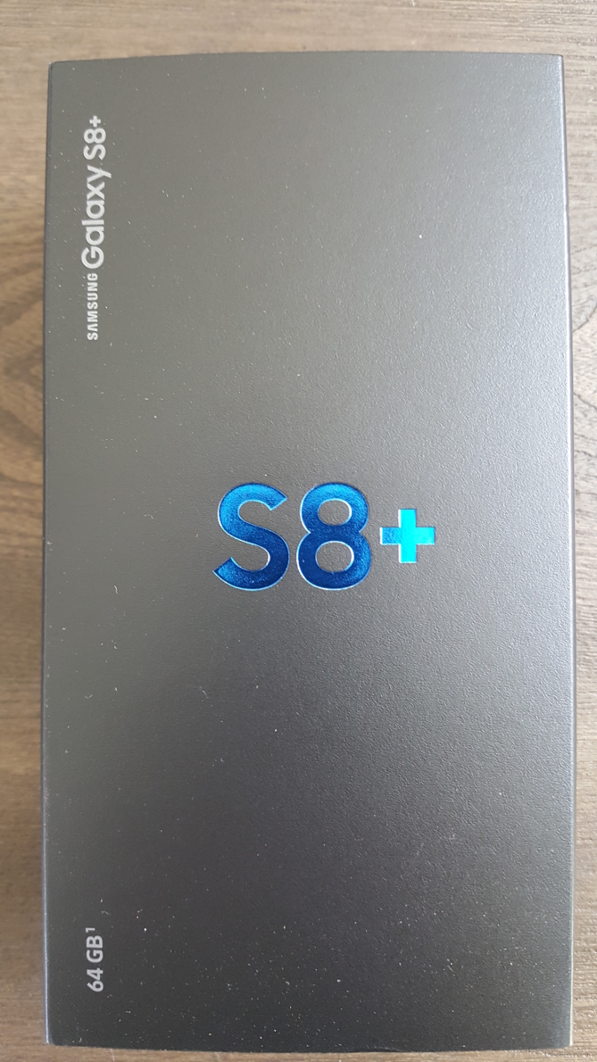
The new Samsung Galaxy S8+
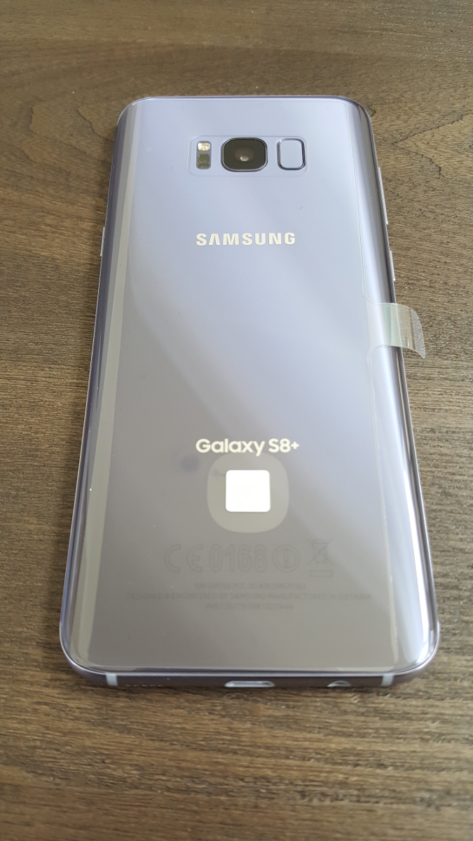
I’ve been using my new Samsung Galaxy 8+ for a few weeks now, and must say I like it. It has a slew of new features such as the occasionally functional face-recognition method of login, which according to Samsung I should not use if I have a twin, and I end up using the login PIN about half the time anyway, since wearing sunglasses, being in bright/low light, having your head at a different angle than what the phone expects, or wearing a Freddy Kreuger mask all seem to interfere with its accuracy. It also eschews the previous models’ physical home button for an on-screen equivalent, which can sometimes get lost in app overlays, and the back button rotates with the orientation of the phone which means it sometimes points up, not back. Plus it no longer comes in glorious gold, but I did get a neat metallic grey-blue.
Samsung Galaxy S8+
The metallic blue branding on the box let me know I was in for something special. I wasn’t such a big fan of the quick start card telling me to follow the instructions on the phone, which in turn told me to follow the instructions on the card. I was almost stuck in an infinite loop.
Lovely Blue Lettering
Hmm…
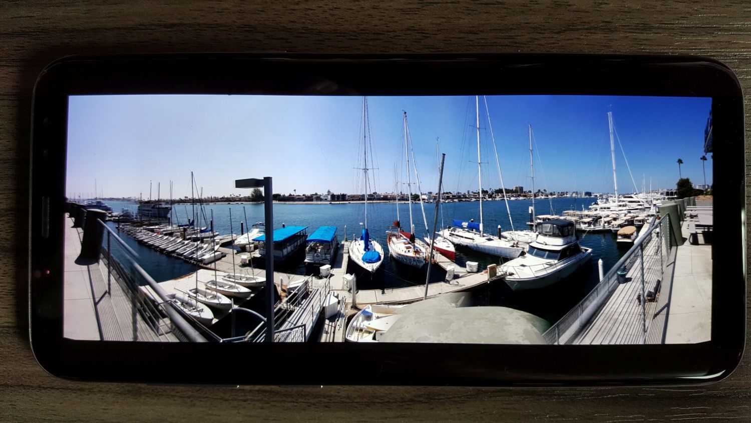
Even with those caveats, it’s a great phone. It comes standard with 64GB of internal storage, however I popped in a 256GB MicroSD and have enough storage for everything. While other Galaxy’s supported this, my previous S5 did not and I ran out of space almost immediately, which caused repeated battles with those pesky storage demons for months on end. On the front, the S8+ is adorned with a magnificent 6.2 inch AMOLED screen that wraps around the edges, an ‘Infinity Screen’ as Samsung brands it, and you can slide in panels from the edge that house frequently-used apps. I never do that, but you can.
In the US, the phone runs on an 8-core Qualcomm Snapdragon at 2.35 GHz, which is powerful but on-par with competitors. International markets get Samsung’s own 8-core, ARM-based Exynos processor running at the same speed. Both are plenty fast and more than capable for most mobile applications, especially with 4GB of RAM packed in alongside. I was hoping to use Qualcomm’s own Vellamo benchmarking suite to put it through its paces, however it was nowhere to be found, so I fell back on the stalwart and well-established GeekBench 4, which provided a comparatively average single-score of 1830, but a scorching, second-place multi-core score of 6032, placing it only behind Huawei Honor V9. I should also mention that the scores earned by the phone are much higher than what they are reporting for the S8+ on their site.

GeekBench 4
(It needs to be mentioned as a warning that I also intended to use the well-known and oft-utilized AnTuTu mobile benchmark, however on boot it insisted I download an additional ‘phone verification app’ and even loaded the Play store to do so. I don’t know why it would require that, I’ve never heard of such a thing, it sounded very fishy, and the reviews of it were foreboding. Therefore, although I like AnTuTu generally, I must recommend that you not use it for mobile bench marking purposes.)
I was also quite pleased at the 3500 milliamp battery life: Using Google Maps for navigation, after an hour of use my battery power was still in the high 80 percentile, whereas the Galaxy S5 would have been long dead by then. Speaking of which, it also supports Qi wireless charging, however be aware that is a misnomer: While you can rest the phone in a dock and have it charge thanks to two coils in the back, the dock itself still has to be plugged in. It doesn’t just magically charge from the air, although I am still waiting for that feature. The 12-megapixel rear camera takes stunning photos, and you can even elect to have them stored in RAW format. May as well, you’ll have the room. I don’t use the front camera except for the once-in-a-blue-moon mobile Skype call, so I can’t comment in any meaningful way on its quality, however it’s an 8 megapixel component.
In the first image below, taken at a mid-level setting and moving at ~70 miles an hour, the wind farm comes out quite clear with separation among colors from the rich blue at the top to the white of the mills in the center (even considering the haze that muddies the contrast along the horizontal center) and the darker colors of the earth and road at the bottom. Minimal blur with good color even at speed. Below that, a few pictures from my trip to Monsterpalooza in Anaheim, and even in low light conditions there is still sharp contrast and detail, except when an area of the image was in competition from multiple light sources as can be seen in the sign to the right of Frankenstein.

Wind Farm
-

- Horror Heads

-

- Frankenstein (note competing lights on sign)

-

- Captain Quint

-

- Nosferatu

Another aspect of the phone I really appreciate this time around is when a known or suspected scam call comes in, the phone displays the contact name either as ‘Potential Fraud’ or ‘Potential Spam.’ I don’t know what the difference is, and like to think I could guess it anyway, but there have been no false positives or missed calls because of it so far. Also note the beautiful 1080P screenshots the phone takes.
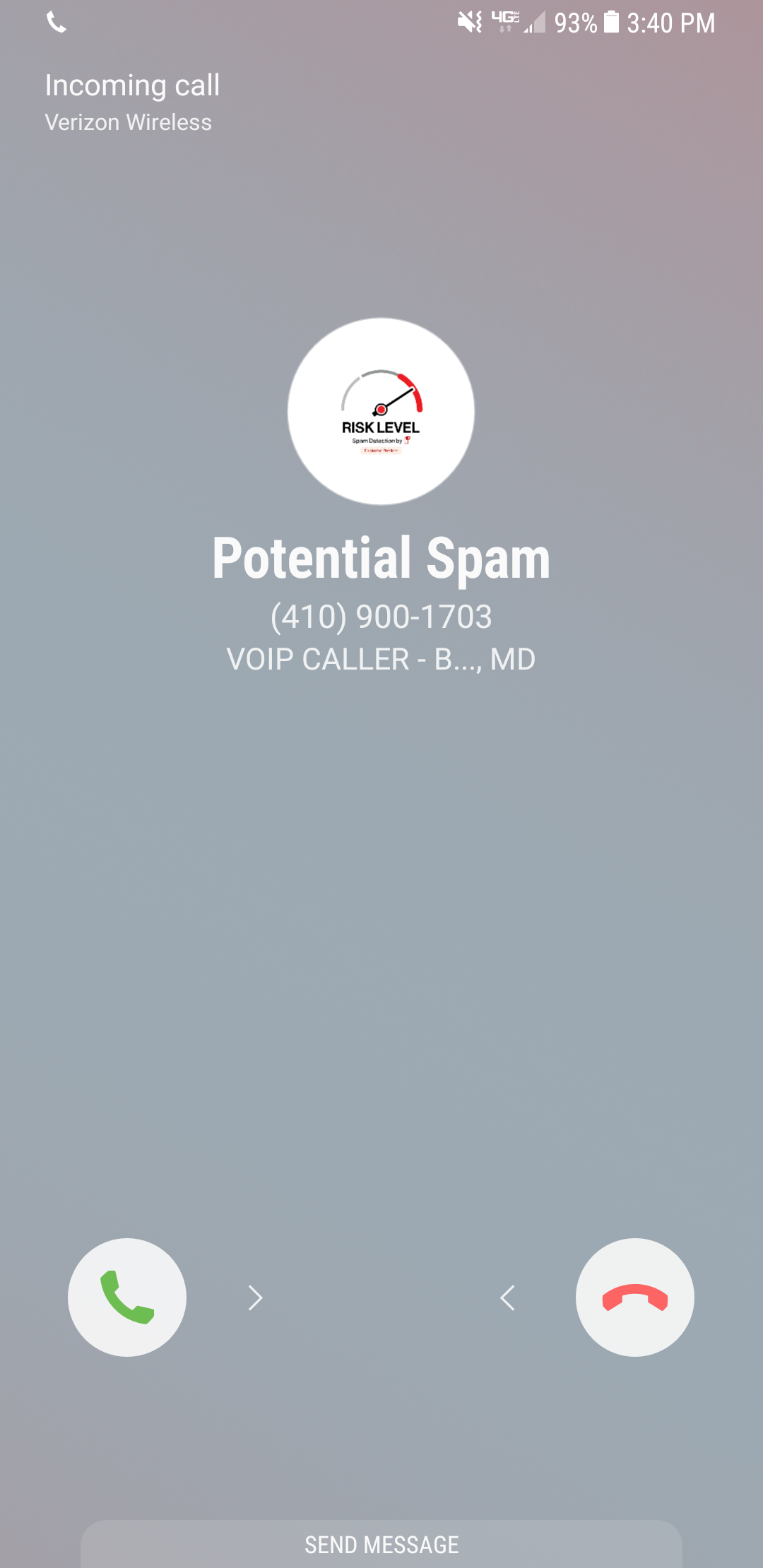
Potential Spam
I’ve been very happy with it so far. I haven’t had the chance to run it though its paces save for some movie streaming from my Plex server, which worked flawlessly, and with everything else it hasn’t hiccuped, stuttered, or frozen up yet. It doesn’t even get as hot. I’m still not thrilled about the lack of a physical home button, and once I transfer over all 13,672 files in my music library and see how it handles that in terms of performance and usability I’ll have a better idea of its overall capabilities. They’re also sending a complementary GearVR version 3, but every two weeks they inform me it will take six to eight weeks so I don’t know when it will get here, but with the S8’s USB type C connector, it won’t work with my old version 1, but I’ll update as soon as I can put it through it’s VR paces too.
Poke the Bunny!

Before I get to the main thrust of this post, it’s important to provide some perspective for those unfamiliar. As you all should know, my Ph.D. is in Human Computer Interaction, my undergrad in Cognitive Psych, I teach multiple interaction design and interface development and analysis courses (game design as well!), so when I see a well-designed interface, or anything that’s inherently usable as a result of its construction, it just makes me feel all giddy inside.
What, then, is a good example of a well-designed interface? I’ll show you. It’s an example I’ve been using for some time, all the way back since it was a Flash animation on a website called platinumgrit.com, which was a showcase for an Australian Flash animation series. The site is long since dead, or more appropriately, dormant, but it once hosted what I consider to be the best, most pure example of interface design I have ever seen. In fact, I was reminded of it because of a conversation thread on a message board for my graduate class in advanced design and prototyping.
It’s called, no joke, Poke the Bunny.

Push it!
Before I show you the rest of interface and give away the surprise, let me explain why it is so good. One of the cardinal rules of interface design is clarity; speaking clearly to the user. Don’t label links ‘click here,’ don’t label buttons ‘push me,’ don’t call an error ‘error 0x14323929.’ State what the user can do, and make it clear what the consequence of that action will be. Of course, cardinal rules are meant to be broken since so many interfaces break them.
But not this one. The interface is comprised of exactly three elements. The first element is a graphic of a bunny that frankly looks pissed off. The next is a fist with an extended pointer finger aimed squarely at the bunny’s backside. And the third element is a button labeled ‘Poke the Bunny.’ It is clearly labeled in reference to its action. It leaves no doubt or question in the mind of the user what it’s function is and what will happen when you push it. Not only is it a beautiful example of interaction design, there is such a direct link between all the elements on the screen that the role of each is immediately apparent, specific, and isolated. It’s the most pure interface I’ve ever seen.
Not only that, the effectiveness of the action/response is very satisfying. Because it’s easy to use, obvious to figure out, impossible to get lost, it makes the actual use of the interface, even though it has just a single interactive element, a joy to use. Even though all you’re doing is poking the bunny, the nature of the design combined with the absurdity of the situation make it oddly addicting and fun. And that is a desirable goal for an interface; You want it to be fun, exciting, enjoyable, interesting, educational, all the positive aspects that make people feel good should be elicited from your design, And in this case, it is. it’s just plain fun.
(There’s also a surprise, though, if you work for it).
And it’s available on Android! As I mentioned, the site has been sadly dormant for some time, however I was overjoyed to discover that if you have an Android phone you can download it from the Play store! There used to be a version for iOS, however I have the sneaking suspicion it’s no longer available (although I don’t know. If anyone can check I’d appreciate it). It’s a shame if not; it’s a brilliant example of exactly how an interface should work.
The Android version isn’t quite as exceptional as the original Flash app; the skeumorphic nature of the button isn’t there, the font is unnecessarily cartoonish, and sound isn’t quite right. Still, the pure core of the interface is rock solid.
So with all of that fanfare, I present a video of Poke the Bunny recorded off my very own Note 5. If you’re on Android (or iOS and it’s still available), then download it and give it a try. You’ll be hooked, I promise. Poke the Bunny!
Microsoft’s smartphone division hit hard in upcoming layoffs
After having already laid off 7500 workers last year, and currently trailing badly in the smartphone market, it appears Microsoft is one step away from throwing in the towel in the smartphone market.
If you’ve ever taken a college-level accounting class, then you’re familiar with regulatory filings that lay out a company’s financial strength and weakness both in written and spreadsheet form. In this case, we are talking about a form 10-K, and the one just provided by Microsoft shows that while their personal computing, cloud, gaming and enterprise divisions are doing well, their smartphone business is not.
When news sites inform you of this, though, they never tell you where exactly you can find the specific numbers indicating how many are being laid off, and the report is 103 pages of tables, explanations, credits, debits, and analysis!
But never fear, I am here to help you weave through it all. You can view the whole thing at this link, and if you would like to see the specific mention of the layoffs you will want to look at page 84, under the heading 2016 restructuring. The first paragraph lays it all out. In fact, all of page 84, under the main heading ‘Restructuring Charges,’ is interesting yet sad to read.
If you don’t mind heavy accounting and corporate speak, the document is really quite interesting to read overall. It goes into detail about all their divisions, how well they’re doing (or not), their unclaimed revenue, profits and losses, writeoffs, even their acquisition of Minecraft. It’s not an easy read, but it’s informative.
Even I, the most diehard fan of Microsoft and their phone (Mine was an original Nokia, and I even still have a Zune!), finally had to break down and get an Android-powered Galaxy Note. I still wish Microsoft the best and hope, somehow, miraculously, that they can turn it all around.
A post from the new phone
Just a couple of posts ago I wrote about how I was feeling rather melancholy over having finally given up my beloved Windows phone, which I have used for many years and did so with pride. It had served me well, and I actually am still using it for some of its offline functions, but I broke down and finally jumped ship to the Android-powered Galaxy Note 5.
Why am I telling you this if I already told you a couple of posts ago? Along with the vastly improved selection of apps (confession: I’ve been playing Pinball Arcade – almost perfect recreations of actual pinball machines. Don’t miss out!), I discovered a WordPress app that lets me post from my phone. I can’t imagine I’ll be doing that a lot, but I figured I may as well give it a try. Incidentally, those links should link to the Google Play store which was a test of this platform and my ability to use it, but depending on how you’re reading this they may not work. So be forewarned!
Today I am sad (over a phone)
It finally happened, and how bittersweet it was. After having been a champion for Windows phone and the potential it had, and as a rebuke to the cult of Mac and unquestioning expansion of Android, it was finally time to say goodbye and put my beloved Nokia Lumia (that’s right – it’s an original Nokia phone from before the Microsoft buyout) out to pasture and become an Android myself. Hello Galaxy Note 5.
The Lumia still worked, sort of, but it was starting to experience freeze-ups in both the hard buttons and the screen. Additionally, the quality of the images taken with its camera, once ranked as the best phone camera in existence as you can see with the picture of my parent’s back yard below, were not as high quality as they once were, and let’s face it – although I’m not an app junkie, the app selection is anemic at best.

Taken with Nokia Lumia
This is why we can’t have nice things

As you can see in my previous post, I have a new PC in the office. This involves logging back in to all my accounts and setting things up just the way I like them, which can take a significant amount of time if you happen to be particular about it, which I am.
One of the things I did was copy my music library over to the second hard drive so i can have access to it here. I don’t use it all that much, I tend to rely on YouTube more often (although I’m not sure why when I have local copies), but that’s how it is.
Anyway, I decided to fire up Groove, a service I have never used before as that is what Windows 10 wanted my music player to be, and as I was scrolling through my list I found the late, great John Denver’s hit “Country Roads, Take Me Home.”
That sounded good, so I fired it up. Except I couldn’t play the song, and Bam! I was hit in the face with why I don’t like digital distribution and have gone so far as to set up my own personal Netflix. To explain what happened, have a look at this picture: