
Tag Archives: Design
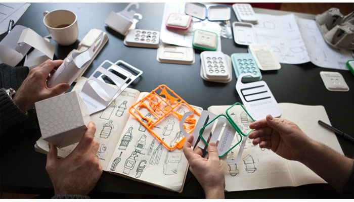
Becoming a designer

Boy, it’s been a while. An oxymoronic combination of being lazy and busy, I guess.
Anyway, for this post I wanted to talk about design. It’s a topic that comes up a lot in my classes, especially ones that have a heavy design component such as Human-Computer Interaction, The Capstones (the graduate version of which is actually in a Masters of Human-Computer Design and interaction program), and all game development courses. The word itself is used in the title and description of many of the courses we offer, including courses I teach, and that’s true for any university.
I also want to clarify that I’m not talking about a particular type of design. As I tell my students, there are many: Interior design, fashion design, architectural design, landscape design, industrial design, automotive design, product design, Interaction design, and the list goes on and on. Regardless of the type of design being discussed, the challenges are the same: Working with a client, trying to come up with a functional and aesthetic solution, arranging items and elements in a useful and pleasing way, and so on, and each of those has its own considerations and concerns.
Keeping all of that in mind, I am going to share a personal design rule with you that I tell all my students, and I feel it helps them think about their own approaches to design and helps coalesce the ways in which they think about it.
‘You should be able to sum up your design philosophy in one word.’
In other words, your core design philosophy.
This is very important. It’s how you know you have come into your own as a designer: created your own method, your own tastes, and most importantly, your own style. Just as a client will go to (or return to) any designer because they know that designer’s style, once you have determined your one-word philosophy, so will they return to you, and they will know why.
You don’t need to do this right away. When you are just starting out, you are unlikely to have a design philosophy, or a unified approach, and that’s fine. On the other hand, you may feel you have one already, however it is ripe for the influence of others you may be working with, those who have been designers for a long time, and the design experiences you are yet to have. As you go on, you will start to notice that you gravitate towards certain incorporated styles yet utilize others much less. You’ll work with other designers, including those who mentor and guide you, and learn from them what works for you and what doesn’t; to agree or disagree with them is expected. For example, you may find that you consistently return to a modernist approach and design, or one that’s more traditional, or perhaps you’re more form over function, or maybe function over form. Maybe you prefer smooth surfaces over textured finishes. You’ll find you tend to prefer things be one way, as opposed to another designer who prefers them the other way around. And all of that is how it should be. It’s why a client would come to you as opposed to another, or go to them instead of you. They’ll know and understand your approach and feel you’re a perfect fit or not, and either in completely acceptable. You must be a proper fit with a client.
Eventually, your design philosophy will have formed, an then you’ll be able to describe it in one word. And that’s how you, and everyone, will know.
It is a clear, unambiguous, easy to digest summation of everything that you will do during the design process. It helps everything, even before a client has decided to come to you.
However, even after all this, there are some important caveats.
First, because you have a core design philosophy does not mean you cannot veer from it. Indeed, you should be able to accentuate and compliment any of your designs with elements and influences outside of your scope and sphere. Just because something is traditional, doesn’t mean it can’t also have a modern influence. If something is meant to convey playfulness, that doesn’t mean it can’t also have an industrial side. Nothing is out of bounds in design; your philosophy will happen naturally, organically, but the very nature of design is creativity and being able to work outside your bounds is, in my opinion, one of the hallmarks of a great designer.
Second, your core philosophy can very easily change. You don’t have to pick one and stick with it until the heat death of the universe, fervently gripping it and refusing to let go. Tastes change, popular ideas change, what’s fringe and what’s common and what’s acceptable and not changes. Design is always, and rightly, in flux. It would be antithetical to design to not grow and change and reimagine what your own tastes and styles are, and what you bring as a designer.
Likewise, you don’t need to replace your approach whole hog either. You can bring in new influences, adding them to your current tastes. Or, for whatever reason, you may wake up one day simply wanting to try something new, to branch out, to attempt a new tack, and that’s also good. However you grow, or morph, or change, it happens for a reason, and that should be embraced.
Unsurprisingly, that’s true of any creative medium. Consider a musician or band. You’ll know their genre (in other words, their core style), but as you listen to more of their work, you may hear additional influences coming to the surface, hear new styles and techniques, and in fact when that happens with popular recording artists it’s often described as the artist or the band ‘growing as an artist.’ Just because they may be rock or rap or blues or whatever doesn’t mean you won’t hear other sounds mixed in as well, especially as they continue to write and record.
I’ll wrap this up by giving you my own design philosophy and how it has changed over time and how I sometimes veer from it.
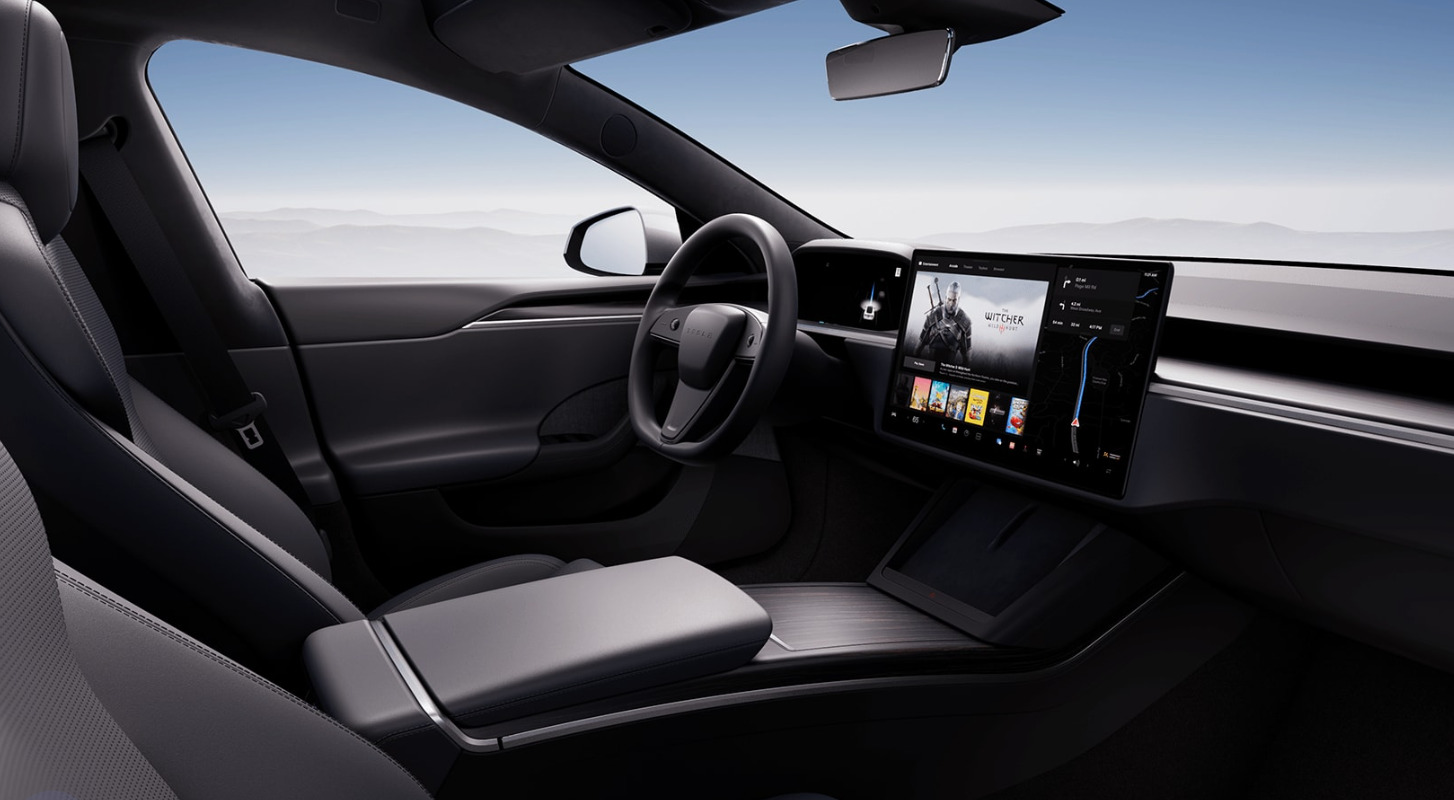
My philosophy is ‘Integration.’ I like to see all form and functionality integrated into a seamless, continuous whole. That can be in terms of the design of the product, or a common theme that runs through a space. For example, I am no fan of the new designs I see in some cars where it looks as though a tablet has been glued onto the dash of car; it is not integrated, it’s a protruding growth, out of place and imposing itself into the interior space of the car. Lines are much cleaner when everything is a seamless part of cockpit design.
Ouch. Like the rest of it though. Talk about clean lines!
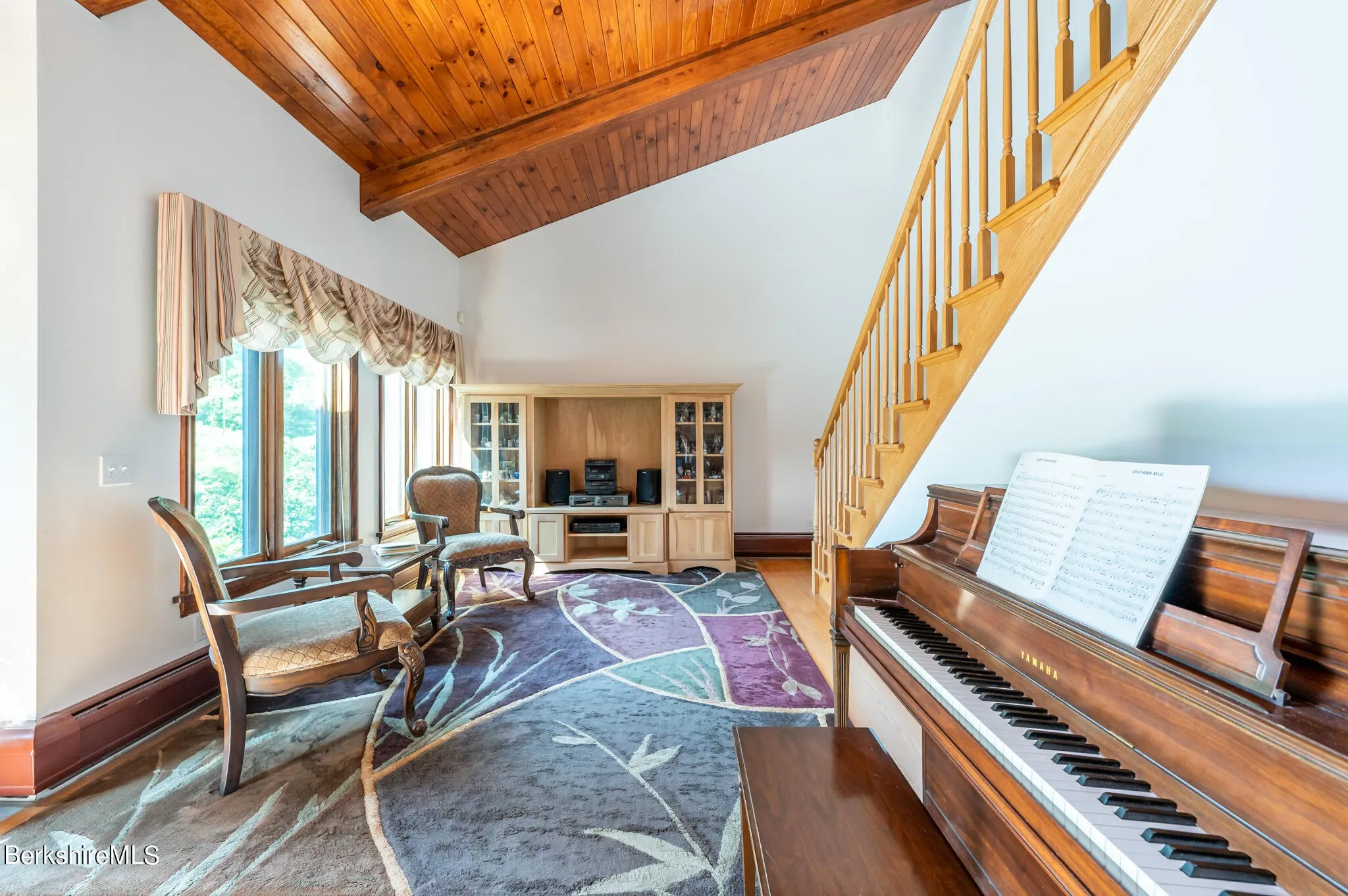
An interior design issue I see commonly is placing a cabinet or hutch of some sort against a big, plain wall. This is grossly non-integral, and every time I see that I wonder why it is there. Curiously, there are places where that can work, which makes it even more baffling that it rests there, alone, when it’s clearly out of place. The pic below is a double offender. At least it’s not in the center of the wall, but it’s pushed up against a corner which blocks a portion of the window, and it’s a TV hutch being used as a stereo table. This might not be a big deal, but this could be easily fixed by adding a couple of smaller display cases and a simple table for the stereo, whose speakers will be much better served outside of that closed space. As a triple bonus, it’s not facing anyone, there are at least six different colors of wood in the room, and the piano should be where the hutch is anyway. What’s really insidious is that this creeps up on you; it doesn’t jump out as bad design right away.
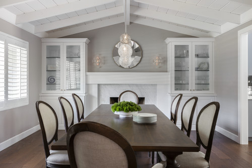
That leads to an important point I mentioned earlier; you don’t have to stick religiously to your core philosophy. Hutches work in some cases, such as colonial or Victorian homes (They look great in the image below, and I like the bonus arrow that’s formed from their placement; nicely done). Integration in a car is great, but I still prefer physical buttons. In fact, one of the main selling points of the car I drive now is a pair of control knobs right by my hand where it naturally rests, that allows me to control almost all aspects of the car’s entertainment system including Android Auto. From a design standpoint, it’s wonderfully integrated, yet not completely – it’s physical buttons for a digital screen, yet it provides intuitive control without requiring I take my eyes off the road. An elegant and subtle solution, especially considering the screen in the car sticks up off the dash like a tiny drive-in.
This works
Another personal example of both integration and the evolution of change in philosophy over time is how I approach music. For many many many years I believed strongly in component stereo systems (which, to be fair, I still do in principle). This is the type of system where each function has its own component. A dedicated pre-amp and amp, tuner, EQ, power conditioner, etc. For the hardcore, and rich, sound enthusiast, this is still the best way to go. Generally, however, a unified device is a solid choice and will provide most with a more than satisfactory listening experience. It’s easier, cheaper, and more convenient to use. I do think it’s possible to be too unified, though, which is why I prefer dedicated devices instead of jack-of-all-trades things, but such are the days in which we live.
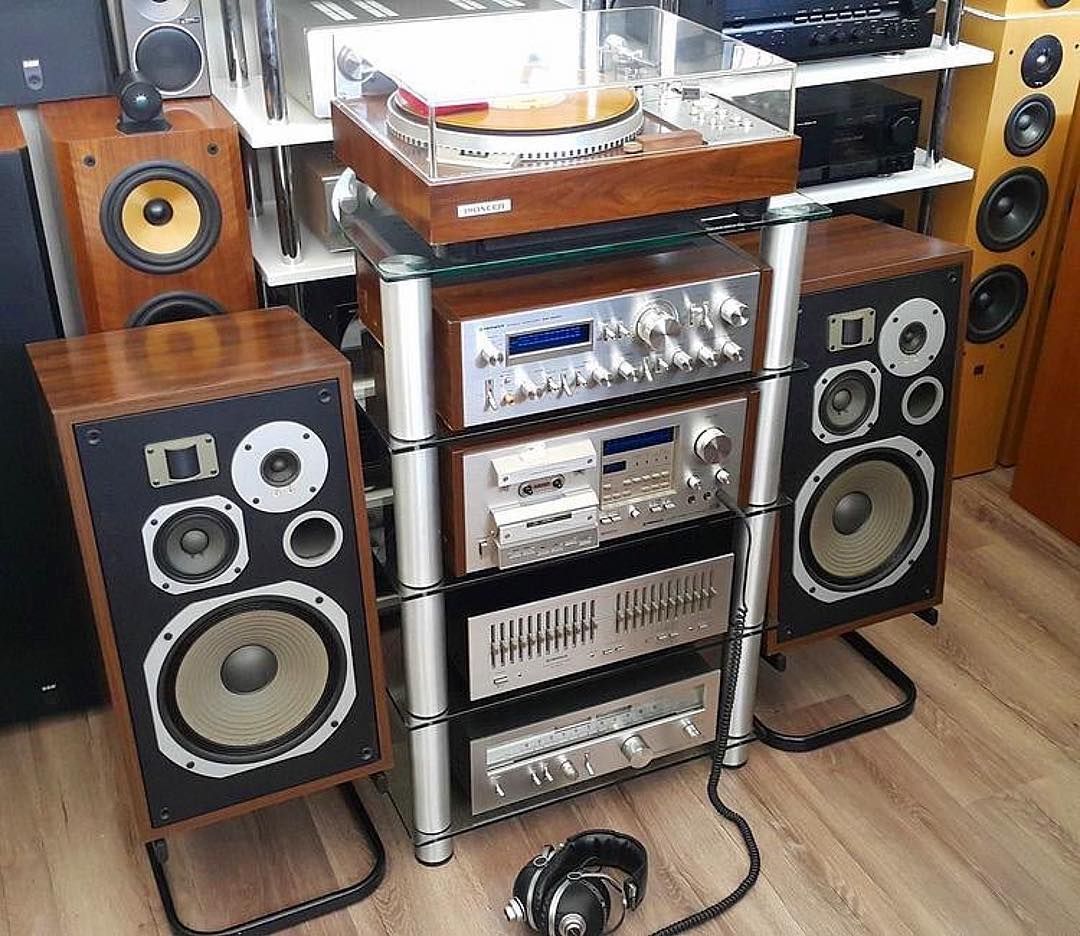
Remember these?
The final example I’ll give is, of all things, guitar pedals. Nowadays, you can buy quite good integrated pedals that have everything built in and no need for the individual stomp boxes we all know and love. But to me, even though I love integration, that type of pedal design is too limiting and takes away control. There are thousands of different effects pedals, so many they even made a movie made about it (if you watch the trailer you’ll even hear the word ‘integrated’) and I prefer each box to have a single function. That allows me pinpoint control over every aspect of the sound.
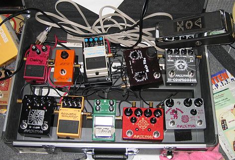
That’s the stuff (source: analogman.com)
Integrated pedals do that in theory, but I feel that the result is just the opposite. They do work great, and are good for an easy pick-up-and-go solution and I am definitely not saying they are bad, in fact some are truly excellent. But for me personally, I prefer the swamp of stomp boxes, like you see above, that always has me doing the stomp-dance whenever I play. It’s just part of the experience, like driving a manual transmission.
I love those too.
So the ultimate lesson here is don’t force a design style, let it happen naturally. Be open to influences, allow yourself to prefer or not prefer what speaks to you, be willing to step outside your core way of doing things, and in time you’ll find your own design style, design language, design philosophy. And you’ll describe it in one word.
An evaluation of my new Mazda CX-5. What’s good, what’s not, the decision-making process, and their curious approach to automotive design and technology
I don’t normally talk about cars in and of themselves on this site, so despite that, or perhaps because of it, this post will cover a lot. Decision making, design, automotive technology, corporate perspective, individualism, aesthetics v. functionality v. pragmatism, collaborative filtering, and others. It’s quite interesting to me the complexities of making such a big decision as buying a new car and what goes into it. This was not an easy decision.
About two months ago, as I was shooting down the 405 south through Irvine, my 2008 Ford Escape hybrid suddenly lurched forward as though I had dumped the clutch, lost all power (which is especially bad in a hybrid), and forced me to fight the loss of steering to get it off to the shoulder. It was then that I noticed it had also displayed a message on the dash: “Stop Safely Now.”

This sounds bad
The red exclamation point was a nice, added touch. I did stop safely, but it was a little late for that message. That little event could have been fatal, however after shutting off then restarting the car, everything seemed to be fine. I was hoping that would be the end of it, considering a similar event happened years earlier and restarting the car appeared to have eliminated the problem. This time, however, would be different.
It happened again. And again. After some research, I learned the problem, and a much bigger potential problem: A component used to cool other electronic components in the car had gone bad. Not only that, someone had died because of it and there was a class-action lawsuit in progress because of it. As the car already had over 100K miles, and other aspects of it had never worked properly, I determined it was time to start the hunt for a new car.
I considered many, and for many reasons. I’m not the luxury car type, and didn’t want to overspend, but looked at all my options. Ultimately, the decision came down to the Hyundai Tuscon and the Mazda CX-5. I decided on the latter, but not without some hesitation that I still carry. When there are many options, there is rarely a clear-cut winner, and this particular decision shows the nuanced nature of, and requirement for, an individualistic approach.
To set some groundwork, I wanted a crossover SUV, sometimes known as a CUV, or more colloquially – and derogatory, I assume – a cute-ute. (To clarify some terms, an actual SUV uses a unibody truck frame, whereas a crossover utilizes the crossover body on a car frame). At the same time, while I have always driven cars that seem somehow ‘rugged,’ like a Jeep Wrangler, Jeep Cherokee, Dodge Dakota, then the Escape, this time I wanted something that was a little more upscale, something that had elegance to it, while maintaining a slight, subtle edge.
There wasn’t much that met those criteria. It was easy to narrow down the search to the Hyndai Tuscon, which has an aggressive theme line, and comes with a lot of options, however while I was researching it, I kept seeing reviews – stellar reviews – for the Mazda CX-5. I was ready to buy, but for something like a car you want to evaluate all your options, and I felt I should at least look at the Mazda before making a final decision.
I knew nothing about Mazda. I don’t know anyone who drives a Mazda, and I have never known anyone who drives a Mazda. I am, however, beholden to design, and that will become important very quickly.
On first approach, the vehicles didn’t move me, metaphorically speaking. I walked around the car to set a baseline for myself, yet nothing stood out. However, as I returned to the front of the car, I noticed something: A chrome trim running along the bottom frame of the grill. It made a nice accent, especially when the sun hit it, and the floating, prominent Mazda logo, which hides the radar for the radar cruise control, has a nice presence in an understated mesh grill.

View from the front, at dealership
Following the line of the chrome accent, I now noticed the lines of the car itself, and what do you know; understated yet still with a subtle, aggressive edge. Narrow, down-sloped headlights, slightly wider at the hips, an ever-so-slightly reclined greenhouse and canted grill gives it a look of movement. In my search I had also been looking for some kind of pearlescent black, but Mazda’s new three-coat metallic red really shines, both literally and figuratively. I have never been a fan of red cars, but this one is beautiful; absurdly, almost comically chrome red.
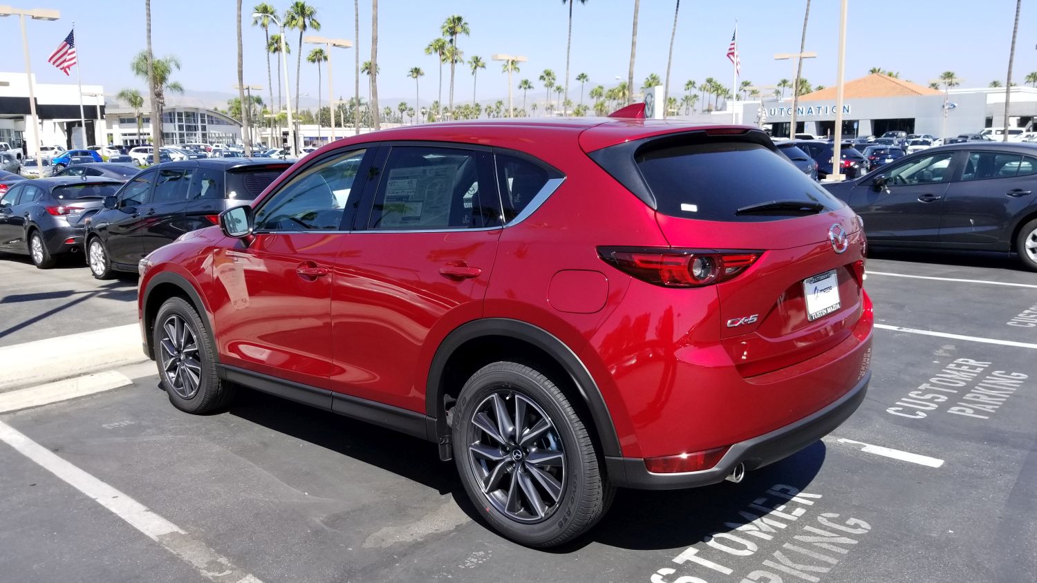
Side view of car
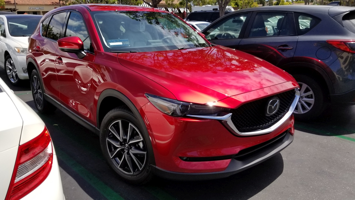
Front. Note floating emblem and pearlescent chrome red
In the previous two images, be sure to note the commonalities in thematic design between the front and rear lights; I do love a consistent design approach. I was already coming around to the design, but it was the interior that really grabbed me. A wide center console with chrome trim and leatherette boot evokes a luxury-car feel, which is exactly what I was looking for. Chrome-lined air vents, leveled door handles and center console, a dead pedal (totally unnecessary with an automatic transmission, unless you, what, always ride the brake?), and a tri-spoke steering wheel that looks more sports car than CUV. Additionally, unlike most other cars in the class which have two gauges and an info screen in between, this has three gauges, chrome-outlined, with the rightmost gauge being the info screen. That puts the speedometer front-and-center which is exactly where I like it. There’s also double-stitched leatherette and soft-touch everywhere in the black-and white interior which contributes further to the experience. Indeed, the CX-5 is often compared to Audi in terms of its interior feel, and having looked at Audi I honestly believe the Mazda outdoes it thanks to the symmetry and width of the center console.
Here’s a shot of the instrument cluster. Remember how I was just talking about consistent, thematic design? The gauge on the right with the MPG rating, trip odometer and gas gauge is all digital, however you wouldn’t know it at first glance. It matches almost perfectly with the other two gauges and leads to a unified, integrated theme, but with the additional functionalities of a digital display (this is also the gauge that is used to set the radar cruise control and contains some other informational screens). It’s beautifully done, even with the physical protrusion used to reset the trip odometer.

Instrument Cluster
The CX-5 is compared to the Audi for two other reasons, one of which almost solely sold me on the car, and one of which will likely take some significant getting used to.
The first is that unlike almost every other car company out there, Audi being a notable exception, there is a physical knob mounted directly in front of the center console that is used to navigate the infotainment system. You can only use the top-of-dash mounted screen as a touchscreen if the car is stopped. Otherwise you have to use the knob, and I love it. I have always preferred physical interaction methods over digital, and it is because of the desire to have that in areas where it is no longer practical, such as smartphones, that we have haptic feedback and vibration and the like. People like the immediate, organic response, the feel of a physical button that responds notably and demonstrably to a press, as opposed to a tacked on vibration, if at all.
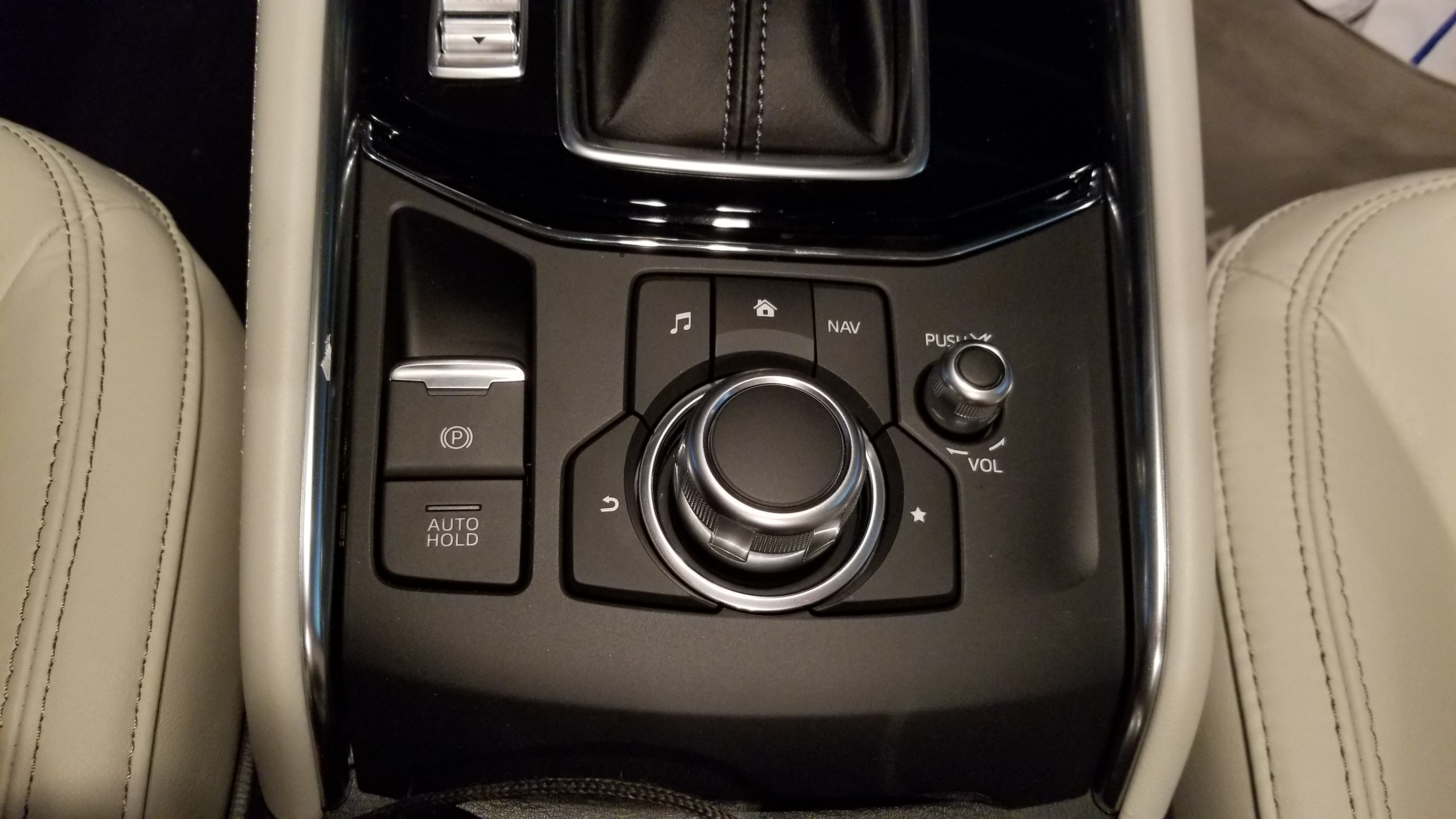
The dial, in all its glory
The dial is both textured and grooved, enhancing usability, and clicks with each turn, just like a well-designed mouse wheel will do, and can be used as a pseudo-joypad for moving up, down, right and left. It can also be pressed in as a selection confirmation. It’s responsive and tactile; you always know that an input has been received. Mounted around it are physical buttons with long-standard iconography that you can use to go home, back, or direct to any one of the main screens (Media, Communication, Navigation). Being able to control all aspects of the screen via physical input that’s easy to reach, where your hand naturally rests, and not having to reach out to a dash-mounted touchscreen, is wonderful.
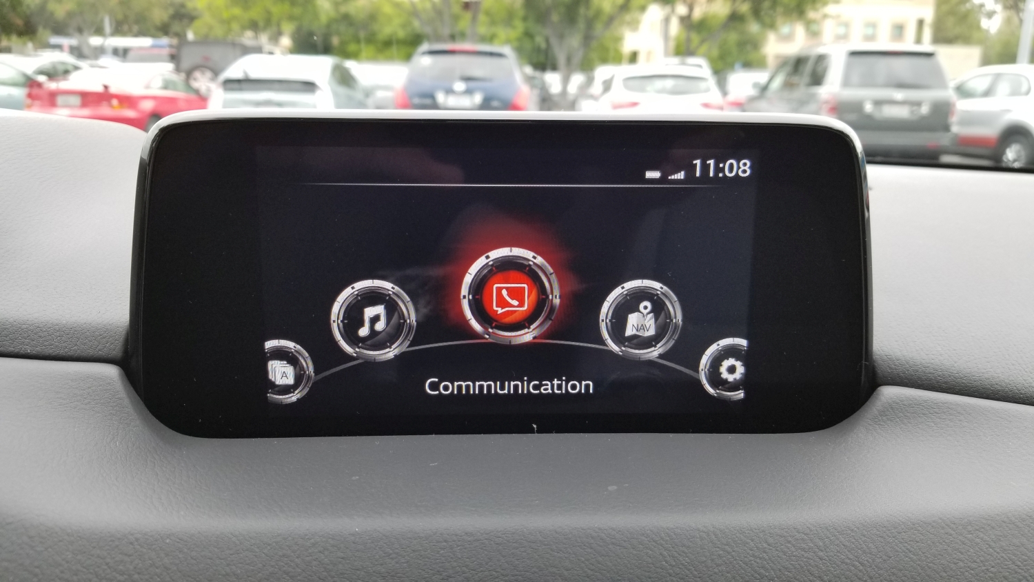
The other reason the car is often compared to Audi, although Mercedes-Benz does this as well, is that rather than have the screen of the infotainment system in the dash itself, it is mounted on top of the dash, as though someone just smashed its vertical edge right in there. At first I really didn’t like it, it looked clumsy and tacked-on, and I am all about integration in design, but once I overheard someone describe it as ‘looking like a drive-in movie screen,’ I was hooked.
I think I’ll add some tiny plastic cars and a little drive-in marquee.
The thing I didn’t realize at first is that by having the screen mounted in such a way, your eyes don’t have to travel too far to see it. To look at a dash-mounted screen your eyes travel almost twice as far, and are off the road for longer. The way Mazda has mounted the screen is actually safer, and I find it to be much more comfortable as well.
Even with the endless praise I have for the physical input methods the car employs, and the location of the infotainment – a word I really don’t like – screen, the system itself leaves much to be desired.
While almost every other auto manufacturer on earth has adopted Apple’s Car Play and Android Auto systems, Mazda stubbornly continues to resist, and this leads to a number of issues that go beyond the lacking software integration.
The fact is, Mazda’s system is behind the times. WAY behind the times. It’s slow to boot up, and chugs and skips while doing so. While on first glance it looks quite clean, with only 5 options, navigating within those options can be a chore. For example, I connected my phone via Bluetooth, something they had me do at the dealership, and while the process was easy and worked the first time, issues became apparent almost immediately. Text alerts and calls worked fine, with clear sound on both ends and snappy response, however when streaming music the usability, or lack thereof, rears its ugly head. I have about 700 artists in my music collection, and there is no way to jump to a particular one, or even navigate by letters of the alphabet. So if I wish to listen to, say, Thin Lizzy, I have to use the knob to scroll, and scroll, and scroll, and scroll, and scroll, and scroll, and scroll, and scroll, and scroll, and scroll…you get the idea. You also can’t wrap the scroll, meaning scroll off the top and have the list appear at the bottom or vice-versa, and the tiny red handle in the below image really illustrates how long the list is. The system menus are byzantine but that’s no different from any automaker, or any software at all for that matter.
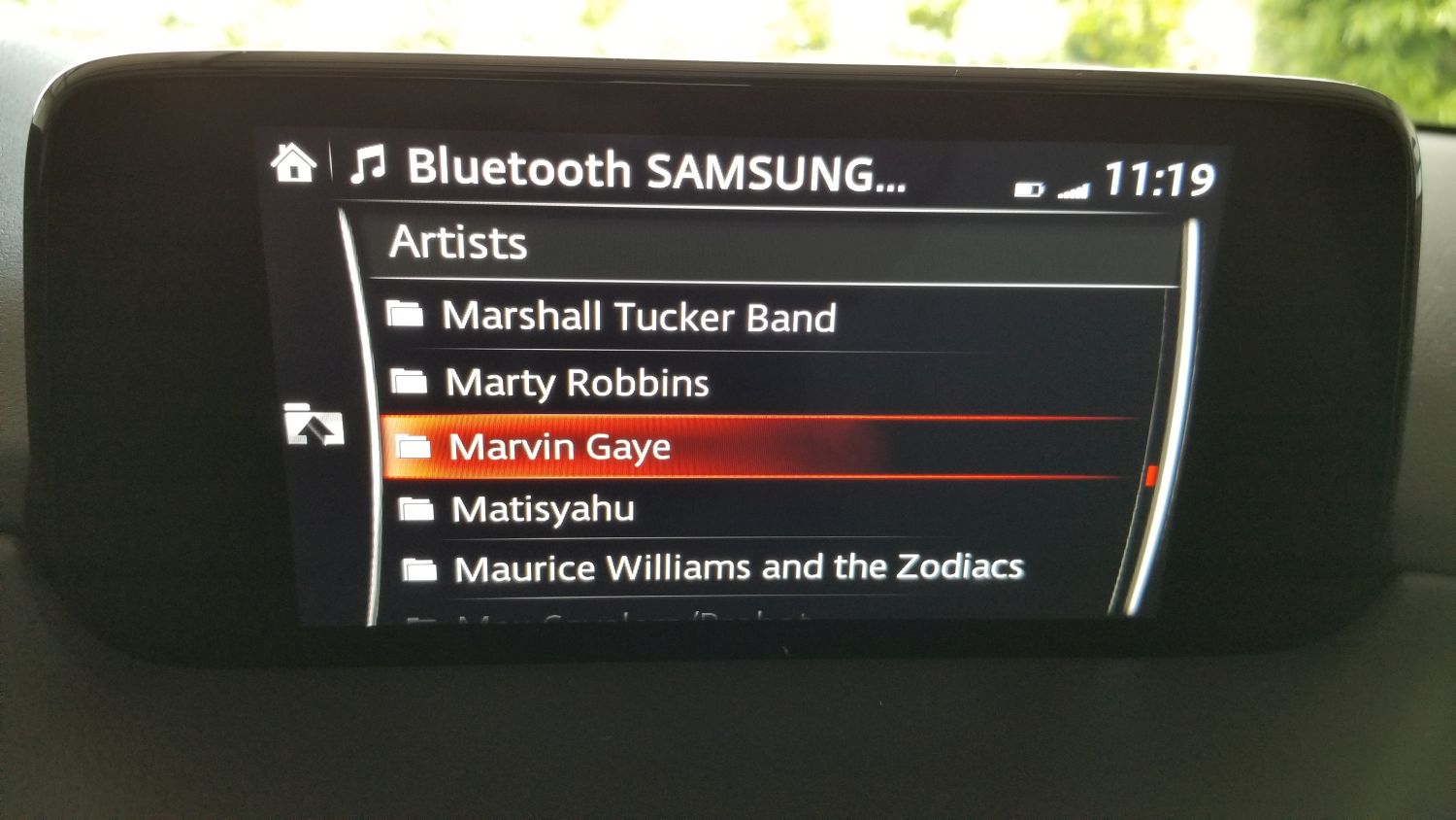
Scrollin’ Scrollin’ Scrollin, keep that songlist scrollin’.
Another odd experience is at one point my phone connected, but the car said it couldn’t access media on the phone. It could make calls and receive alerts, but couldn’t see the music and threw an error. However if I played a song on my phone, the song info came up on the car screen and the song played through the car stereo. Very weird. Eventually, and without rhyme or reason, it connected again and all was working fine.
Design concerns continue to abound in the interface, with the main being there’s no flash to the screen. What I mean is, the display is very pedestrian. While others (like the Tucson) will show full color images of the XM stations’ logos and has a graphic that looks like a radio dial if you’re tuning the radio, Mazda’s screen is very bland. On top of that, when listening to XM it bizarrely cuts off information about song and artist, even though there’s plenty of room left on the screen. The navigation screen is more lively and functional, but still tough to navigate (get it?) although it does work well once information is entered. When one considers the time and effort they put in to the overall design of the rest of the car, something they call Kodo, it is baffling they have slacked so much with this. Their information screen in the instrument cluster is full color and informative, using images and text to convey information from cruise control to fuel economy, so I am at a loss as to why the dash-based system is the way it is. Again going back to the Tucson, their screen on the top models is eight inches, full-color, and beautiful, although to be fair on lower models, the screen is only a four-incher and much more difficult to see. Of course, their screen is also exclusively touch, and navigating up and down on one of those is pure hell.
To top it all off, the actual display area of the Mazda’s screen doesn’t utilize the entire surface of the enclosure as you can see in an earlier image.
But I hold out hope. There has been significant vocalization from owners regarding this, and earlier this year Mazda informed Cars.com that they would be coming out with an Apple CarPlay and Android Auto update in the future. They didn’t give any exact dates, however the rumor is later this year. The thing is, they would have to overhaul the system to do it. They wouldn’t be able to shoehorn that functionality into the current interface in any meaningful, or non-crap way, so I am hoping when (if) the update comes, it will be a complete refresh to the whole system that reinvents it from the ground up. That would enhance the experience of this car in a big way.
Even with all my criticisms, there is so much to like. Along with my praise for the interior and exterior design discussed earlier, it has keyless ignition and entry with a detachable valet key, the car locks automatically and unlocks via a button in the handle if the key fob is in your pocket. The doors open wider than its competitors to make getting in and getting out – or, if you’re an engineer or designer, ingress and egress – easier. The radar cruise control will allow you to set a car-length distance to the car in front of you, and the Mazda will follow that car exactly without you having to do anything. It will speed up and slow down, even stop, then start again as the car in front of you does. It has a pseudo heads-up display that will show when the car shifts, blind spot alerts, the speed limit, any street signs in view (it will actually show graphics that look like red stop signs, yellow yield signs, speed limit signs with the actual speed limit, etc. It’s a neat feature), your current speed, and navigation arrows if using that feature, and amazingly does it without feeling cluttered. This is a significant safety feature as it doesn’t require taking eyes off the road for status information. The drive is by far the best driving experience of its class, with smooth shifts and almost no roll around corners, which is due to the vehicle’s unnoticeable transfer of weight to the front wheels when making turns, which keeps the car responsive and easy to control; the most apparent indicator of this is that the people inside the car don’t feel a compelling urge to lean into turns. I programmed my garage-door opener to a button on the mirror, so now the mirror opens the door and I don’t need to have the thing clipped to my visor. I have two different garage door openers for two different doors, and the mirror has three buttons, so I’m set. It has a sport mode that holds the gears longer for somewhat higher revs and offers up a little more power, and a weird manual shifting ability that I can’t imagine anyone would actually use.
Speaking of the Heads-Up Display, in the picture below, if you look closely you can see it as it appears while parked in the garage. When driving it contains much more information yet is still easy to read and interpret.

Heads-up display
In the following image taken while driving (don’t do this, kids), you can see the speed limit sign and the current speed, as well as the indicators telling me I’m in the lane which is always good. Control signs such as stop and yield can be shown, in full color and shape, concurrently with the speed limit along with the other status indicators listed above.
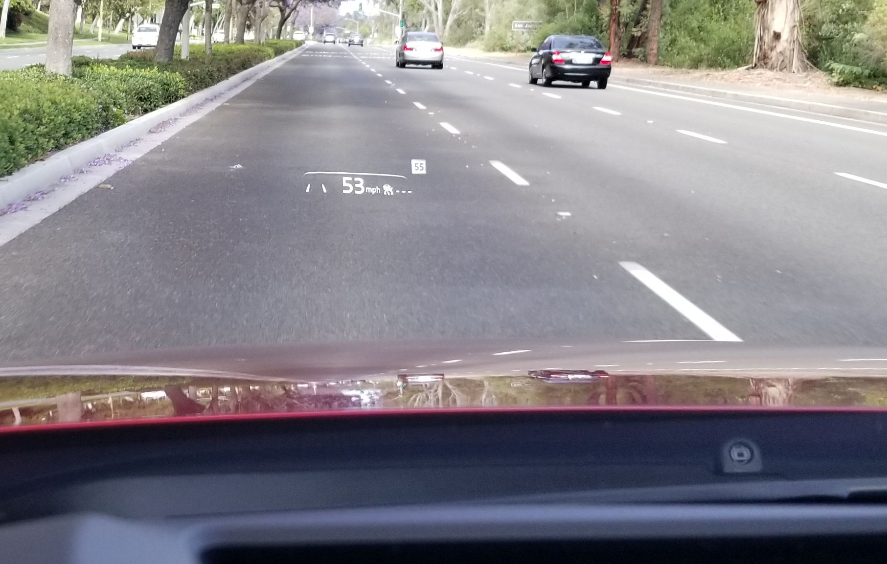
HUD while moving

HUD with Navigation
So what about the Tucson? The one I was all ready to buy? I still like it, and I’ll even confess that it gives you much more for about the same money. It has a nice outer design, ventilated seats (not cooled, as some will say), the far superior infotainment screen and system, a rear hatch that opens if you just stand next to it, a 360-degree camera and backup camera that will show you where your car is and where it will be based on how you turn the wheel (the Mazda has a backup camera that works very well, but without that added future prediction bit). The Tucson also has a panoramic sunroof, which while nice, doesn’t actually open all the way and I have heard it suffers from some mechanical problems. The CX-5 has a moonroof and I rarely used the one in the Escape anyhow, so I suspect I’ll be fine with that.
Even so, driving the Tucson just didn’t grab me. It drove well enough, but wasn’t exciting, and the interior was functional and pragmatic, but not special in any way. It offered more, but the experience of being in it and driving it just didn’t excite me or make me want to drive it, and while I can more than understand why someone would choose it over the Mazda as I almost did, I am beholden to the design, the experience, the feel of something, and in that regard Mazda just blew it away as it does to all its competitors at this price point, and some even higher.
It will take some getting used to. I drove the Escape for 10 years and put a lot of miles on it. The washers never worked, all the power-window risers broke at one point or another with a loud crash as the window collapsed into the door frame, the interior lights became stuck on at one point and I had to pull the fuse, the hatch didn’t always close all the way, the electronic clock didn’t even give the correct date. It told the right time and day, but not date. I think it might even have driven around on its own at night committing crimes. Yet I still felt a pang of sadness seeing it sitting in the dealer lot, dirty and looking dejected; I had to tell it goodbye. When they took away my beloved Dodge Dakota, back in 2008, I shed a tear. Curious how we become attached to, and even empathize / sympathize with inanimate objects, something we talk about in several of my classes.

The old and the new. I feel sad looking at this picture.
If Mazda follows through with their system / firmware update, something that should be doable through one of the car’s many USB ports, I will update this. I am following any little bit of news I get and am hoping we hear something more concrete in the near future.
Journey with me back to the early days of the Internet with ReoCities, the GeoCities archive
In my graduate design class this week, the additional discussion topic (bonus, as I refer to it, although I suspect my students might disagree) involves the attempt to archive one of the early web’s most important communities. Indeed, I wanted to go back in time to the early days of the World Wide Web, circa 1993, and as a technology historian, indulge that aspect as well. The Internet, like me, was brought online in the glorious year of 1968, however it remained the domain of scholars and governments for over two decades before becoming available via the World Wide Web to the riff raff public and its clammy tendrils (by the way, ‘Internet’ is always capitalized, regardless of what the Oxford English Dictionary says). Remember also that the Internet and the WWW are not the same thing; the Internet is the technologies, hardware, software and protocols on which the web sits – the Web didn’t come online until around 1990. Getting back on track, to say design was at its nadir at that point would be a severe understatement; while interaction methods had been developed and attempted over the years (light pens, for example), that was by specialists in specific domains, and when I say specialists I don’t mean interaction specialists, I mean engineers and programmers, but now web design was about to be attempted by everyone.
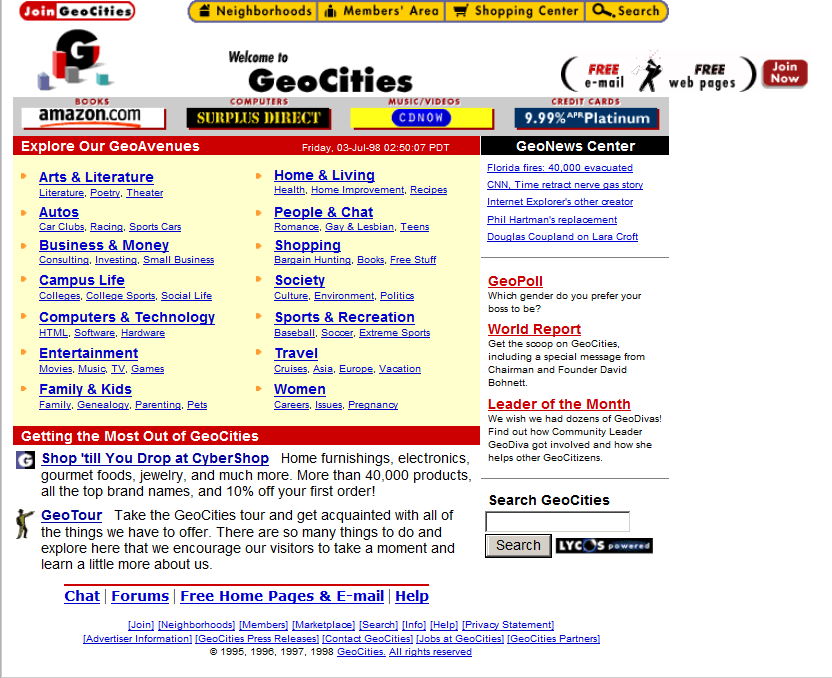
When everyday people began to experiment with what the Web offered, they did so from an adventurous, new, exciting perspective. Interaction methods, organizing elements, color, layout, usability, nobody cared about this stuff, we were amazed at the accessibility of it all. We hadn’t even learned it was bad form to hotlink images! Almost none of the technologies, platforms, infrastructure, anything, really, we have today was available back then other than base protocols, and even those have evolved significantly. But one thing we did see, very early on, was a foreshadowing of the idea of a web 2.0, in which user generated content and communities guided the growth of one particular website far beyond what anyone expected. Before the design disaster that was MySpace, anyone who was anyone cut their teeth on GeoCities.
GeoCities page
Everyone knows GeoCities was the equivalent of a design traffic accident with its animated gifs and auto-play MIDI tunes (and was the inspiration for the landing page for this very course), but that’s looking at it through the-opposite-of-rose-colored glasses. We know that *now.* Back then, the ability for anyone to have a presence online and represent yourself immediately all over the world was almost too much to process. No one cared about design, they just wanted to create. As anyone now looking at a GeoCities page could tell you, design would come later. Much later.
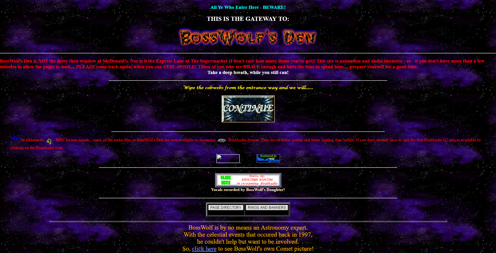
BossWolf’s Den
GeoCities divided their content up into towns, each of which represented a particular interest. Whether it was fantasy, health, sports, the arts, or whatever else, there was a neighborhood for it where a community of like-minded individuals could set up a shingle, as it were, and have a presence…perhaps even make some new acquaintances or even friends with the same interests.
The site’s growth and eventual buyout by Yahoo and unavoidable death is beyond the scope of what is intended to be a design history, however it is a fascinating story and very interesting if you get the chance – you can read about it on this Computer History Museum page (look at that GeoCities landing page!).
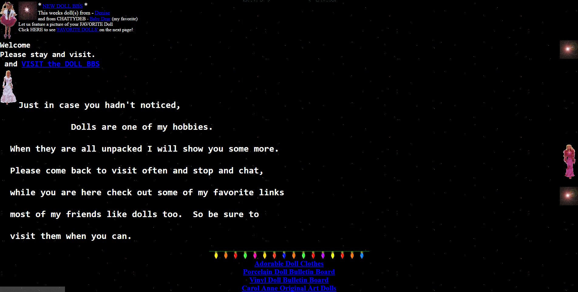
Instead, this long narrative is to let you know that you can still experience GeoCities in all its poor-design glory thanks to the project known as ReoCities. They have archived millions of pages from GeoCities, and while the usability leaves a lot to be desired, it is a fascinating look at web design back then, and looking back through time at these pages I feel like an astronomer looking back in time at a star. It gives a frozen-in-time glimpse into not just where we were, but how far we’ve come. I used ReoCities for all the screenshots in this post.
GeoCities Page
I have to be honest, some of the pages are difficult to view, the design is that wacky. In terms of expression, in terms of digital explorers mapping out a new, unexplored land, however, it’s mesmerizing. I can’t tell you how long I spent not only exploring the myriad pages archived by the service, but seeing how many of the external links still worked (not many, although some GeoCities page redirect to a proper hosted site; very smart), and even doing some research to see if any of the people or organizations are still around and updated their web presence. It was a pleasant surprise to see some of them actually had!

Friends
It’s a really fascinating time capsule not just of early web design, but also of where the web was its infancy. Seeing how design has changed, what was considered acceptable design back then versus now when we have so many rules and standards and guidelines is enlightening. And if, on the off chance, you have a link that points to a GeoCities site that they’ve archived, a simple letter change can update your link!
I’m a big fan of historical preservation of digital property (archive.org is another glorious monument to what was). Start your wayback voyage to GeoCities over at ReoCities.
My Carnegie Mellon rec letter submission adventure
Try saying *that* three times fast. Also, keep in mind that Carnegie Mellon is actually a prestigious and well-respected university and dersrvedly so. That’s why the story I am about to regale you in is so bizarre. It just keeps falling down a HCI rabbit hole form which it never escapes.
I had originally intended to post something different for this week’s random design example, however yesterday I was asked to submit a letter of recommendation for one of my former students to Carnegie Mellon’s MSIT eBusiness Technology graduate program, which by itself is a mouthful.
No problem; I have done many of these before. Little did I realize that I was going to be in for an adventure.
Right off the bat, it had me submit my letter, which had to be either in Word or pdf format, which was their restriction. I uploaded a Word document, and was told that format was not valid. I converted it to pdf, and that worked.
Next, I was asked to fill out some pseudo-Likert-scale questions which is common, and at the bottom of the page was a button labeled [Save Info], as seen below.
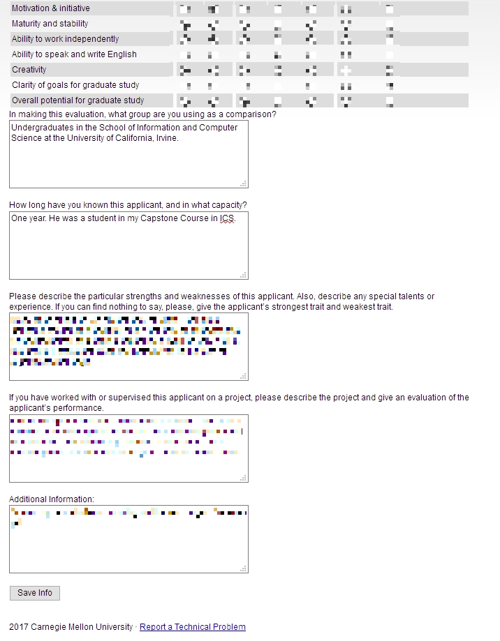
Save info button
The thing is, when I clicked that button, it just reloaded the page, putting me back at the top with a button labeled [Return to Recommendations]. No submit, no send, just…return.
Clicking that took me back to the main page where I started, and where it still said “Select a student to provide a letter of recommendation.’ But I had already done that, and in fact it indicated the submission date right underneath, next to the student’s name. I received no confirmation, no clue as to the status of the application, or whether it had actually been completed and gone through. How many of Neilsen’s or Schneiderman’s rules does that violate?

So, being the person I am, I decided I would click the link labeled ‘Report a Technical problem’ at the bottom, not minding their free-spirited use of capital letters. Doing so took me to a page that declared in bright yellow highlighting ‘Invalid e-mail address.’ Keep in mind I had not entered an email address, I only clicked the link. Did something happen I’m not aware of? Which e-mail address, if any, is it considering to be invalid? Could it even be the one to which the form submits? On top of that, the text box is red! This just gets better and better.

Is that a red (pink, actually) text box?
To top it all off, the message I entered in the red text box above ultimately got sent to…you guessed it…me.

Well hello there
I sent another email to a contact email I found on the main page, and the follwing day received a response that all had gone through. What a travail. This was the most excruciating recommendation process I’ve ever experienced. I expect more from such a prestigious university as Carnegie Mellon. At least it made for a good learning experience for us all.
(Originally written for my graduate Advanced Design and Prototyping course at UCI).
It’s still a clever idea.
Have any of you heard of Christine? You may think of the car that killed people, I think of my friend’s ex who we think also killed people, but in this case we should be thinking of a very clever idea for PC design by none other than the purveyors of premium performance PC peripherals, Razer.
Well known for their outstanding, competition-grade mice and keyboards, they decided they would get into the custom PC market with the concept of a modular PC they dubbed project Christine. It’s a unique idea for a PC, in that whatever you need to add or swap out can be done so with modules that are easily replaceable, and adding or removing one doesn’t affect the rest of the PC or require complex installation. Not only that, it’s fanless and silent thanks to its liquid cooling.
The concept of modularity is not new, in fact Google is right now working on a cell phone with a similar modular design known as Project ARA, which allows the user to upgrade parts as necessary; for example you could upgrade the camera just by swapping out the module rather than replacing the whole phone. If it can work there, it makes just as much sense for a PC. Plus, Razer’s concept just looks incredible – a true vision of the future. Here is a great video that goes into great depth about the machine.
Unfortunately, it also looks like it is now on indefinite hold. Apparently, in order to get it designed and built Razer would have to partner with other PC manufacturers, however those PC manufacturers are, according to Razer CEO Min-Liang Tan, more interested in selling what they have rather than designing something new.
That’s too bad. I love this concept and want to see it succeed. The language used is dire, but not terminal, so I will hold out the thinnest sliver of hope. In the meantime, I am more excited about their Nabu project than I am about any other wearable tech. So I’ll latch on to that instead.