
Category Archives: Opinion
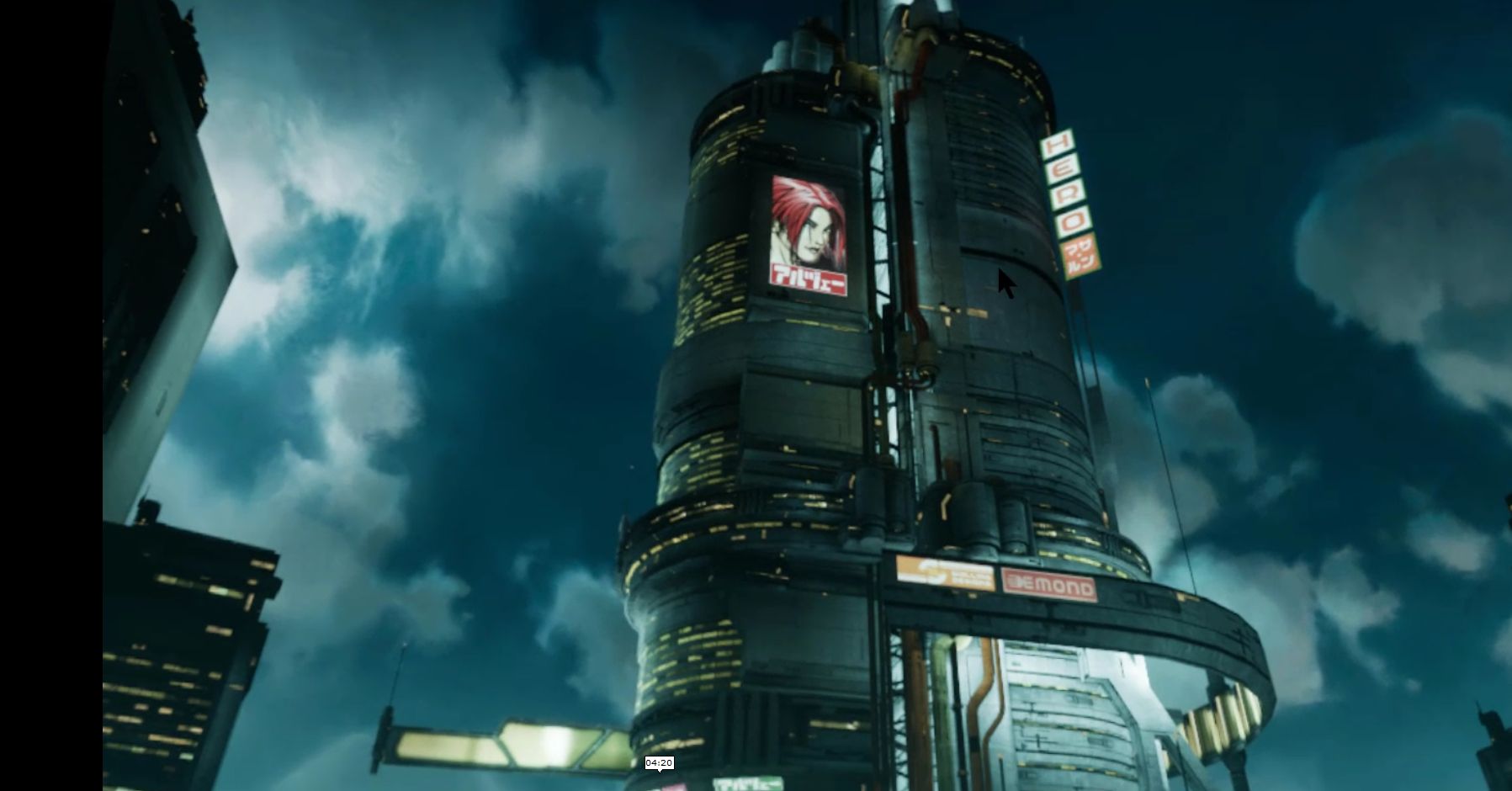
Returning Home: World of Warcraft Classic Comes Online
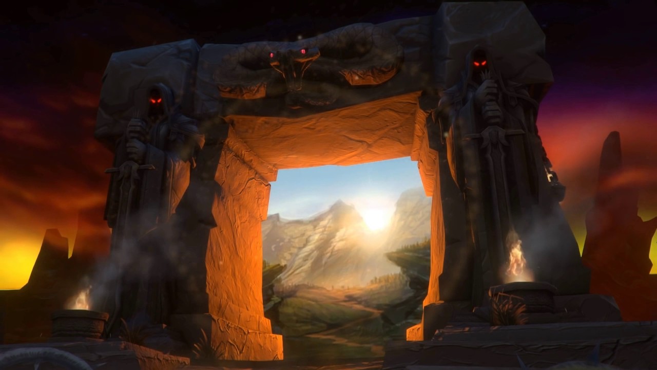
On August 26th, fans of the original World of Warcraft (henceforth referred to as WoW), and those who are just curious to see what all the hubbub is about, were finally able to re-experience the original game as it was when it first came online back in 2004, now colloquially known as ‘vanilla’. And boy did Blizzard deliver, complete with massive queues, disconnects, and crowding. But they have also provided what many people have been asking for for many years: The authentic and original WoW experience.
World of Warcraft was first released in 2004, a Massively Multiplayer Online Role Playing Game (MMORPG) in the vein of Everquest and Ultima Online before it. However WoW streamlined the gameplay process and created something accessible, that anyone could play, and eased players into the experience without being overwhelming. It was an instant, massive hit, and has continued to be a juggernaut even to this day. Attempts to topple it, even using popular franchises with similar gameplay such as Age of Conan and Star Wars Galaxies, couldn’t come close to WoW’s success.
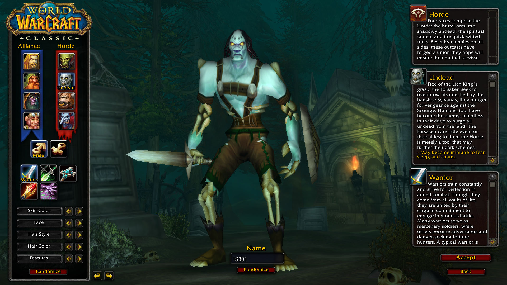
In the game, there are two main factions: The Horde, comprised of Orcs, Trolls, Tauren, and the Undead, and the Alliance, comprised of Elves, Gnomes, Dwarves and Humans. Depending on your race, you could be one of several classes: A paladin, mage, warlock, rogue, warrior, priest, druid, hunter, or shaman, each with their own unique abilities and approaches to gameplay.
They don’t actually allow numbers in names. But I tried!
As the years went on, WoW evolved. What started out as a world with two continents, eight races, nine classes and a tight story to tell, ended up as what many consider to be a mess in terms of overly-streamlined gameplay (e.g.: quest markers and highlighted objectives / objects), homogeneous races and classes (e.g.: many classes were limited to certain races, but now that’s generally not the case; anyone can be anything. Another example: Undead could ‘breathe’ underwater, now anyone can breathe underwater for a comically long time), and simplified specializations that don’t allow for really exploring a particular class.
Combine that with the original story of the Horde V. the Alliance morphing into them working together and sharing quests and zones, a rambling main story with red herring side quests and endless grinding with things such as daily quests, as well as a confusing world structure (A new capital city, Dalaran, now has two separate locations in the game: One in Northrend and one in the Broken Isles. It’s the same city, but in two places, although there is lore for that), and people started to get weary.
Not that it was all bad, mind you. The ‘Mists of Pandaria‘ expansion, which introduced a continent known as Pandaria based on Chinese lore, along with a race of humanoid pandas known as the Pandaren, and the new class of monk, was very well received. Additionally, flying mounts and pets of many types became available as nice additions. But overall, the gameplay itself, the core experience, lacked.

Mists of Pandaria
While all this was going on, something known as private servers began to appear. These were privately run WoW servers that there recreated that original version of the game as it was when it was first released. There was no charge, and people flocked to them. The largest was Nostalrius, which at its peak had, according to Wikipedia, 800,000 subscribers and 5000 – 8000 concurrent players. Blizzard hit them with a cease & desist order, but the coverage of that was severe and intense, and it appeared that Blizzard noticed. I myself played on Nostalrius, and wished it to continue. An interesting aside about it is that when I dowloaded the client, which had to be done as a torrent, I was immediately – while the download was still happening! – sent an email from Cox telling me they had received an official complaint about my IP from Blizzard stating I was pirating the game.
But I digress. Blizard may have noticed, but also said very publicly during a live conference, that ‘you may think you want vanilla WoW, but you don’t.’ They had to eat crow on that, but they did so with grace and humility, and I respect them for being good about it.
They eventually announced that would be creating a classic WoW experience, and it finally came online August 26th, 2019.
I was excited for this too. Seeing the announcement of original WoW gave me chills. I loved original WoW, and was even in the beta so many years ago. It’s strange, because as I would read magazine articles and online posts about it, I didn’t have much interest. I heard the beta was coming and thought ‘why not?’ Well, it turned out to be lifechanging. I’ll never forget creating my first character, an undead warlock of course and of course on the server named ‘Bloodscalp,’ and venturing out into Deathknell, the undead starting zone. The purplish tint of my shadowbolt, the civilized undead, the unique, not-quite-cartoony but surprisingly colorful and detailed environments, and as I would eventually learn the incredible backstory and unique races, including the Native-American styled large bipedal bovines known as Tauren, a really unique offering for a game of this type. So much did I love it that I bought the Bloodscalp server on which I used to play when they were retired for an upgrade.
Eventually, though, after years of playing, it was sadly no longer the game I remembered. I stopped playing for a good number of years after I heard someone yelling in general chat that if they wanted to group with him for a raid, they ‘SHOULD LINE UP FOR GEAR CHECK’ and ‘DO NOT WASTE MY TIME’ and ‘KNOW YOUR ROLE AND DON’T ASK QUESTIONS.’ Remembering how the game was when it started, how everyone was incredibly helpful and pleasant, that one jackass really discouraged me, and he wasn’t even talking to me. That was after a couple of expansions had released, and for those of you familiar with the game it happened in Shattrath, a city and storyline I just could not get into anyway, and I logged off that moment and didn’t play again for five years at least.
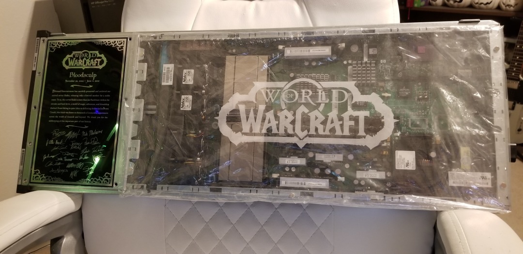
My original Bloodscalp server. Many memories here.
Not only were these hardcore players becoming more common in current WoW, enemies became easy to defeat, everything is signposted, there’s no sense of accomplishment or earning your way, and the story, for me anyway, was just confusing and I couldn’t figure out what was going on. Original WoW does not hold your hand in any way; it’s unforgiving, and expects you to read the quest text and figure out what to do. When it was announced, to paraphrase an infamous in-game proclamation, I was definitely prepared.
There was some drama leading up to the event that I myself was caught up in. It was announced that two weeks ahead of release, players could log in and create / name their characters. I have characters I have played with for FIFTEEN YEARS. When I logged in to create my characters on the Whitemane server, which was my server of choice as it is PvP and PST, I was hit with a 45 minute queue and by the time I managed to get in all my names were already taken! Wheels was the name I desperately wanted, and I made numerous posts on the classic WoW reddit sub and in the Whitemane server sub as well asking if the person who had it would be willing to trade or even sell, but no luck. I ended up with Kneecap, which I actually like, but it’s not Wheels.
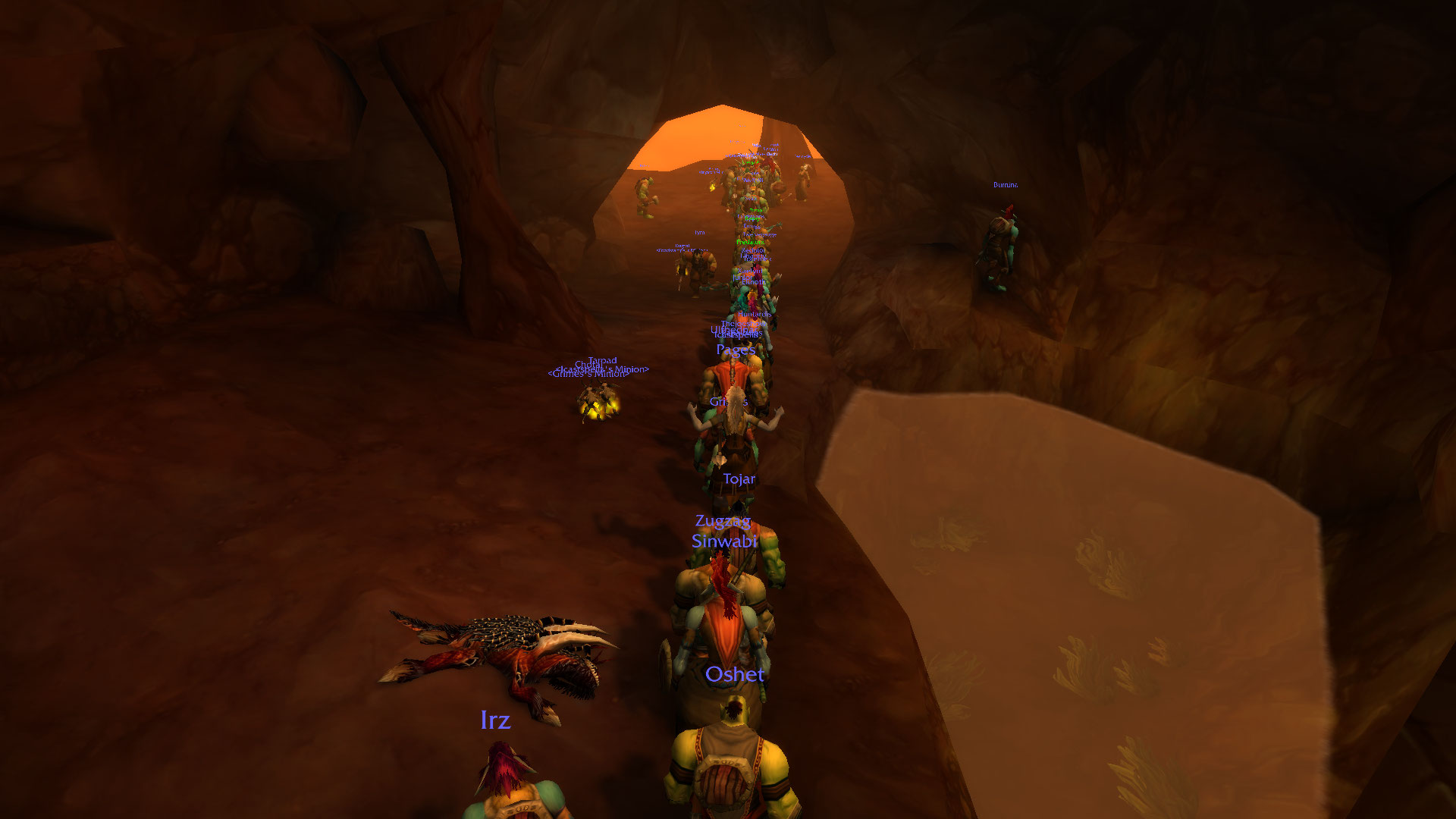
Well, once the servers came online, while waiting in the ENORMOUS Whitemane queue (see image below), I just happened to also be in the classic WoW Discord watching the live feed of people trying to get in drama when I saw a post shoot by stating Blizzard would be bringing three new servers online, including a PST PvP server named Smolderweb. Smolderweb! I liked Whitemane, but Smolderweb was far more badass than I could have hoped, so I waited. Waited…waited…and the second it came online I pounced, created all my characters, and got all the names I wanted! I couldn’t believe my luck. There was also no login queue, I got right in and grouped up with some great people and had a blast running around the troll / orc starting area. Players even lined up for specific quest targets in a very orderly and polite way. Everything ran very smoothly, there was absolutely no lag, and I couldn’t have been happier with the experience.
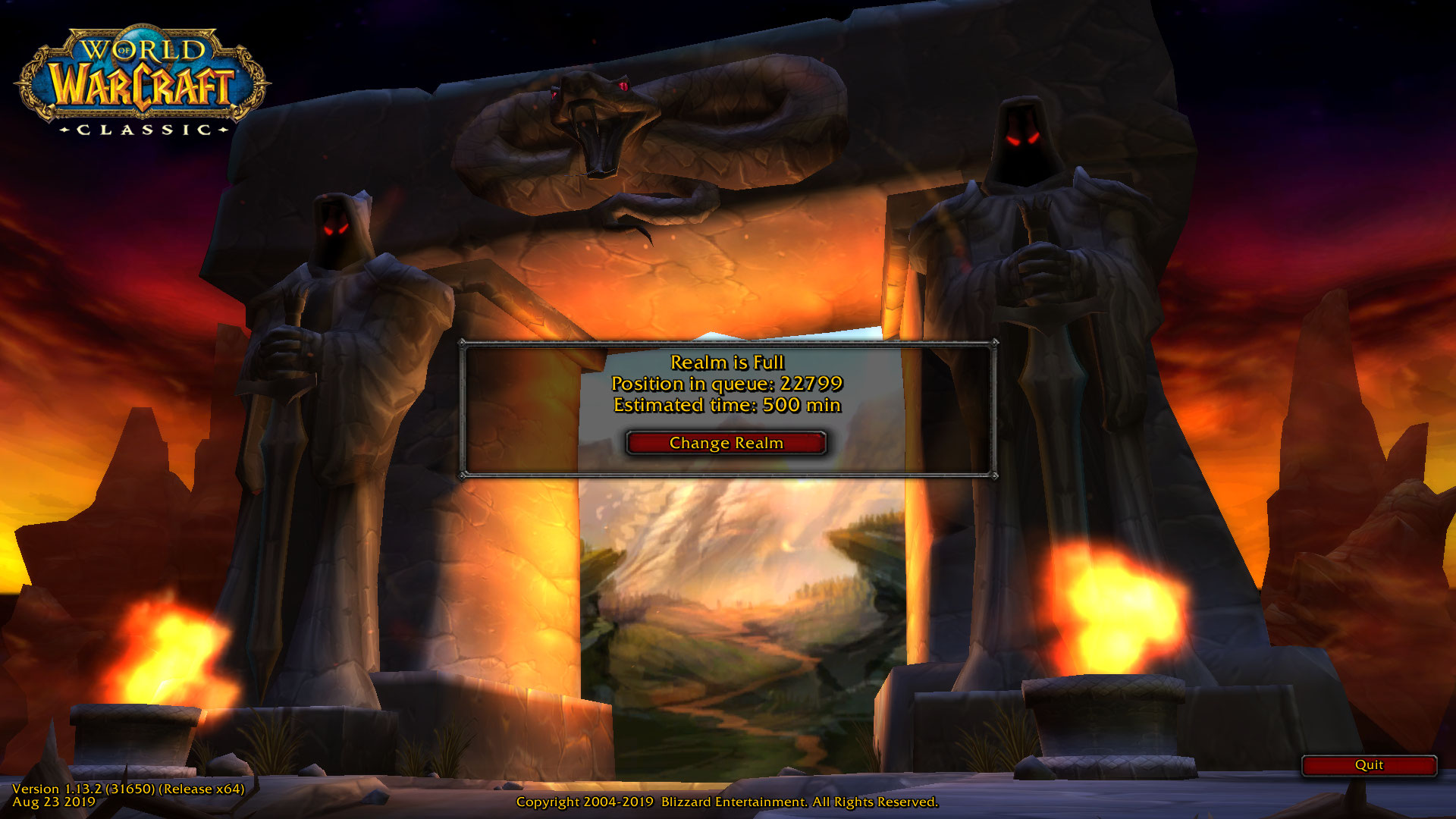
Waiting…
The Horde are such good people. Not like the dirty Alliance.
To be fair, I saw posts that showed the Alliance also lined up for their quest objectives, so it was good all around.
I find it telling that even though this is no longer WoW easy mode, and that everything has to be worked for (your first ten levels will be hard, until your class specializations start to kick in, and then it will be less hard but still hard), I’ve had the most fun I’ve had in WoW for many, MANY years, and I’m very glad to be back in the world that I left so long ago.
Happy Birthday TRS-80!
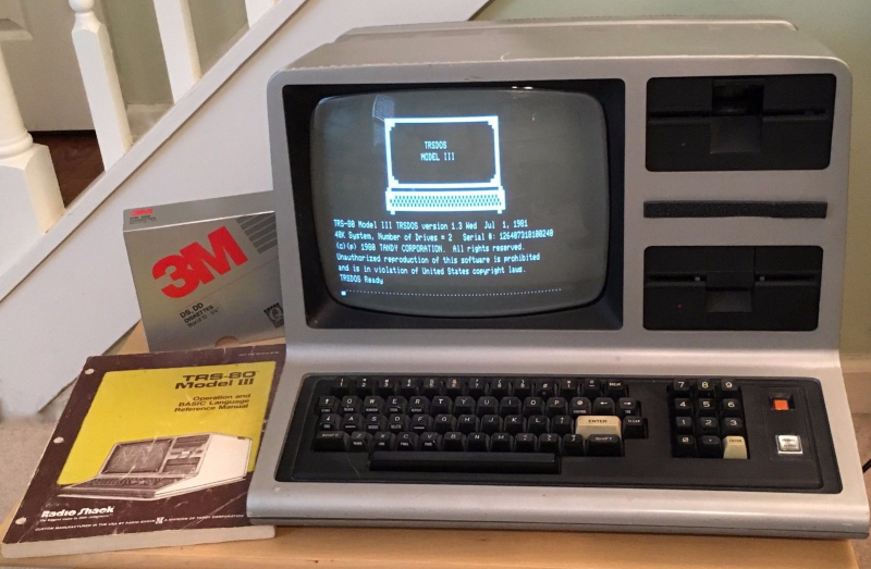
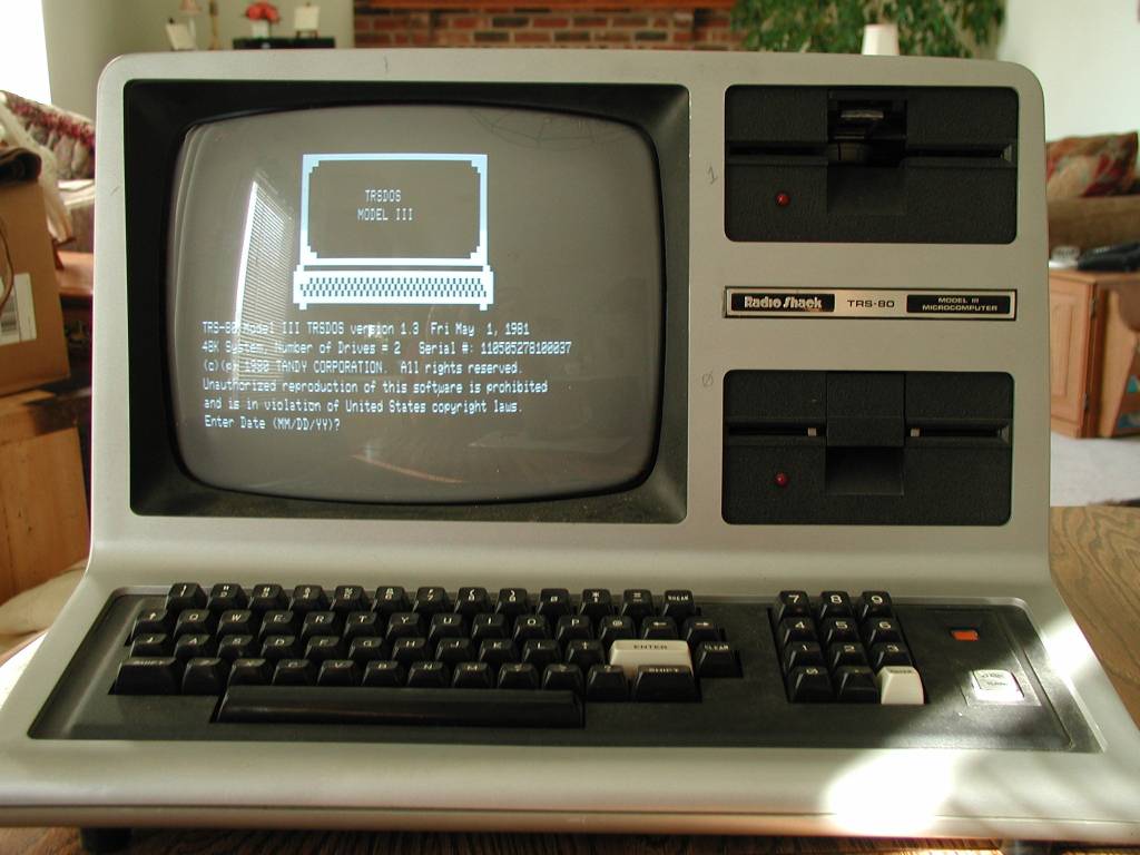
Today, August 3rd, is the 41st anniversary of the release of the Tandy / Radio Shack TRS-80 personal computer, originally released back in 1977 (Tandy was a leather company of all things, and bought out Radio Shack WAY back in 1962 – TRS is an acronym for Tandy Radio Shack). I have a personal place in my heart for this particular machine, the Model III specifically which is shown in the header image, but the whole line, which included pocket-sized, handhelds, portables, luggables, and multiple desktop models over the years, is easily one of my favorites.
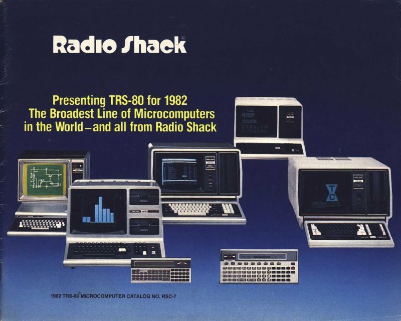
TRS-80 model line (for 1982, anyway)
You see, there is a trinity of devices and systems in the history of computing that just give me chills when I think about them, and along with the Commodore PET and Apple IIe, the TRS-80 is one of them. Although it wasn’t the first true PC I ever used – that would be the PET – it was the first on which I had significant exposure to what a machine could do. It was the machine of choice for a computer summer camp – don’t judge! – that I attended while but a wee lad. Using cassette tape as magnetic storage via an external cassette player often also bought at Radio Shack, we learned about computers and programming and wrote programs in line-number BASIC. They weren’t terribly sophisticated, but even at that young age, I managed to write a text-based adventure game in which you explored a haunted house solving what I thought were pretty well-thought out puzzles: I was most proud of the skeleton who was willing to help you, but only if you retrieved his missing golden-ringed femur which had been stolen by a dog – a golden retriever. I’m STILL proud of that one.
Even though it was colloquially referred to back then as the “Trash-80,” showing that system wars have existed for far longer than anyone would imagine, it was a surprisingly robust machine. Being the pre-GUI era, and even the pre-OS era, like the PET it came only with BASIC pre-loaded; there was no true operating system. An attempt was made to address that with the later release of TRS-DOS, although even that wasn’t a true operating system; it was merely a limited expansion of the capabilities of BASIC. The most efficient thing to do if you wanted to run programs was to buy them on cassette and load them into memory via the play button on a standard cassette player. If you wanted to save a program you wrote, you’d use the record function, but be sure to skip past the leader tape (a mistake I made once and never again).
Oh, did I mention that much of the system code for the TRS-80 was written by Bill Gates? It’s true! In fact, here’s a neat side-by-side of Bill Gates and Microsoft co-founder Paul Allen in 2013, recreating a famous photo originally taken in 1981, in which they are surrounded by, among other things, an Apple, Commodore Pet, and TRS-80! These images were taken from a Forbes article about the event that’s interesting reading.
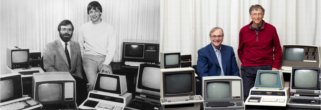
Bill Gates and Paul Allen
Versions of the TRS-80 were released and in operation up until around 1991, which is a pretty good lifespan for a PC line, especially one that was never considered much competition for the other powerhouse lines from Commodore, with the C64 still being the most successful personal computer ever made, or Apple, a company that’s still so successful it just became the first to have a trillion-dollar valuation. Meanwhile Radio Shack, a chain that could at one time claim 95% of the US population lived within three miles of one of its stores, sadly closed down permanently in 2017.
Even so, the time in my life it represents, the sheer force of discovery it provided, the capabilities it displayed, the potential it showed, the experiences it allowed, even now as I get older it provides an incredible rush of nostalgia and reminds me of the excitement I felt for technology as it was a new and exciting thing in the consumer space. I don’t feel it so much these days, but at least there’s something that provides such a reminder.
I am also happy to announce that there is a fully-functioning Windows-based TRS-80 emulator, Sharp-80. It works amazingly well and shows exactly what kind of interfaces and accessibility we had to work with back then. Be warned: It’s fun to use and of course I’ve spent a long time with it reminiscing about the bad old days, but it’s also not for the faint of heart, and if you’ve been raised in the coddled, cushioned world of GUIs, you’ll be in for a shock. A wonderful, text-based shock.
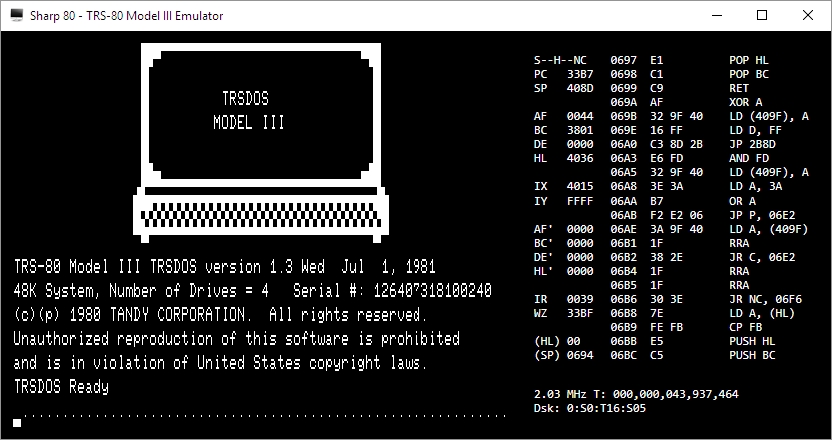
Sharp-80 emulator
Happy birthday TRS-80, and thanks for everything. I’ll always remember.
So long Toys R Us, my old friend
As many of you may already know, Toys R Us is finally closing down for good. While this post is outside the normal scope of this blog, it’s also relevant in so many ways, because it illustrates not just an upheaval in the retail landscape that has been brewing for some time, but also how failure to respond to those kind of tectonic shifts in market trends, consumer demand, fiscal realities, and not exploiting the second most enviable on-line presence can tank a company like Toys R Us. Even now, it still has enough market presence that the closings will have significant upstream and downstream impacts.
More than that, I used to work there many moons ago. I loved it, so this has a powerful personal angle for me.
And they sold games. Rows of glorious games.
I first started working at the Sunnyvale, California Toys R Us back around, what, 1988 or so, in the stockroom, and the header image for this post is the front of the very store where I used to work (added bonus: It was haunted!). My secret plan was to eventually get to the game cage in the front of the store – those of you who have been around for a while may remember that cage, but if not, fear not: I’ll take you there in a moment, but when I started I worked in the stock room in back, and even there I loved it. It was a two-story, seemingly endless room with rows and rows and stacks and stacks of boxes; big items on the top floor and smaller boxes filled with merchandise to be put on shelves on the bottom. And when someone would order something big, like a plastic above-ground pool or a bike or a swingset or something, they would have to drive around the building to receiving, and we would pull the box from stock and put it on a slide – yes, a slide like you’d see in a playground – and send it down to the lower floor, then slide down ourselves and have the customer take it to their car.
We’d also unload the semis that pulled in, filled to the top with boxes in a not-at-all organized manner. The boxes were just thrown in haphazardly, not stacked, we’d have a manifest on paper, and we’d have to climb up into the back of the semi, climb to the top of the pile, and start checking off each box on the manifest, and throw it out of the truck on to the landing, where someone else would, or possibly would not, take it back to the stockroom. And those semis are BIG; they could have hundreds and hundreds of boxes. We never knew what we would get, it was completely random, and it was great. Good times. I saw on Google maps the semis still pull up to the back like always, I just hope now they have at least somewhat automated the progress, although I guess it doesn’t matter anymore.
Just like old times
After a while, I was moved out to bikes, then for some reason to baby stuff which was, surprisingly, still pretty fun – all the excited new parents made it enjoyable (crib recalls were *not* enjoyable, though), and then, I started getting asked to man the game cage.
Finally, I had arrived.
You see, in the 8-bit and 16-bit eras, and even into the 32-bit eras, games were simply represented by their covers in the game aisle. There would be a card that had a picture of the front of the box and the back of the box, and underneath each card were slips of paper with the name of the game and the price printed on them; it’s very similar to how Office Depot does furniture sales now, if you’ve ever seen those. Anyway, if you wanted a particular game, you would take the paper up to the register, pay, and they would give you a ticket you would take to a small booth at the front of the store, and inside that booth was nothing but games. Games everywhere. So many games! You’d give the ticket to the person in the booth, often me, and they’d give you your game. For me, it was a paradise being in there, seeing all the games that were available, reading the boxes and looking at screenshots, getting the excited kids – and sometimes adults – their games, even keeping it clean and organized was a joy. At that time in my life, there was nowhere else I would ever rather be. As I started school on the east coast, I would occasionally work over the summer, but eventually I had to dedicate more time to school and life, including summers, but I never forgot how much fun that job was at Toys R Us.
Also, I looked high and low for a picture of the game cage, but amazingly, I could not find a single one. I did find a couple of the game isles with their paper tags, though, although I’m surprised that even they are hard to find. If anyone out there,anyone reading this has any pictures of TRU game cage, please send it/them along – even Reddit couldn’t help!
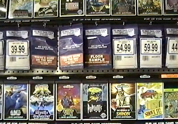
Sega Genesis games in Toys R Us, circa 1990
I suspected something was wrong all the way back around 2001 or so, when the stores were redesigned to be more ‘playful’ and less like narrow grocery-store isles, only taller. I don’t recall anyone have much of an issue with it, but I suspected that it was a response to ‘something;’ you don’t embark on a complete redesign of an iconic store without being motivated to do so. Later I learned it was because of slagging sales, something that has plagued the chain for a very long time. They tried again in 2015, and we all see where that went.
It took them clear until 2017 to realize the importance of a well-designed, functional, aesthetic website, yet this is also a result of an epic, colossal screw-up on their part many years earlier. See, when Toys R Us first developed their online presence, they did so by partnering with -wait for it – Amazon, all the way back in 2000! That’s when the Internet was still in its fledgling stages, although to the point that e-commerce was starting to take off. If Toys R Us had taken a different path, they could have ridden a wave that saw Amazon become the behemoth, retail landscape-shifting e-commerce megacompany it is today, so much so that Jeff Bezos is now the richest man in HISTORY.
But no, they screwed up, and screwed up big. Instead of leveraging their partnership, in 2006 they sued to get out of their agreement with Amazon in 2006 by saying Amazon breached the terms by allowing other vendors to sell toys as well, which prompted Amazon to countersue claiming TRU didn’t fulfill its obligations and left many orders unfulfilled. It ended badly for Amazon at that time, but it foreshadowed a bad ending for TRU in the future. My guess is they wanted to create their own online presence, although Amazon was, even then, generally king of the hill for this kind of thing, and TRU never did get it right. Other companies had partnered with Amazon as well then broken away, TRU was not the only one, but those other companies, such as Circuit City, well, we see where they are now. Not that leaving Amazon was the sole cause of their demise, but they could have utilized those partnerships much better than they did.
There was also Bain Capital. Yes, Mitt Romney’s Bain Capital. In 2005, they made a leveraged buyout of TRU, shifting all assets to a holding company. The problem is, the toy market has always had narrow margins, and with a leveraged buyout using the assets of the bought out company to leverage (hence the name) the huge loan that is used for the buyout, the assets themselves need to be worth something. Toys aren’t a good asset group in that in that way, and it ended up dumping an enormous amount of debt on top of the company, about $5 billion, and I would have thought anyone could see that would never work out. With $400,000 annual payments towards that loan, they were crushed form the get go. Ironically, or more saddening and angrily, it was Bain Capital that also bought out KB Toys, only to force them to sell thanks to crushing debt as well, and who did they sell to? Toys R Us! Those two aren’t the only ones Bain has impacted, either. Although in fairness, Bain has also had many successes; they wouldn’t exist otherwise. It’s just that these hit close to home for me.
Even so, none of it would have been necessary if Toys R Us hadn’t been mismanaged to this point. To me, they are the Sears of toy stores. Grossly overpriced, absolutely not competitive in any way, worrying on store design instead of competitiveness, yet also haveing been, at one point, the trend setter (remember the Sears catalog?). They couldn’t see the forest for the trees, and focused on the wrong things at the wrong time, allowing competition to blindside them. What could one expect when they bring in the former head of F.A.O. Schwarz, the most expensive toy store to ever exist, to turn things around? Oh right, TRU bought F.A.O. Schwarz in 2009, along with KB Toys, then closed it down. Oh the irony. I think the writing was on the wall a while ago.
Many people online are lamenting the closure of TRU, however it seems many of them never actually went to TRU, but they don’t want it to close either because of overpowering nostalgia. That’s me; I haven’t actually been inside a TRU in years, and the last time I went it was quiet, a little dirty, the people working there seemed like they wanted to be somewhere else, I didn’t find anything of interest, I usually just went to the Target across the street. But I can understand how these people feel, I of all people can understand, and it has also hit me hard, perhaps harder than those who went there as customers. I loved it there, I could tell so many stories, from both the employee and customer perspective, and I am very sad to see it go.
OpenOffice Writer: Good, better, but not yet great
People are always looking for a free alternative to costly productivity software, and never has that been more true than with Microsoft’s Office Suite. While they now have their subscription-based, $99/year Office365 Software as a Service offering, it used to be that regular updates to Office could cost hundreds of dollars, especially if you were including Access in the package. People didn’t like the repeated substantial costs associated with new versions of software, and that was not a sentiment limited to Microsoft.
The thing is, while free options, substitutes, are often available, they are also often simply not as good as the software they’re attempting to replace. Consider GIMP (GNU Image Manipulation program). Intended to be a free option for those who don’t want to purchase Photoshop, as well as for those who would like to experiment with image manipulation and the like, it’s also much more cumbersome to use. Not that Photoshop is easy, but in terms of usability GIMP isn’t an ideal. Simply drawing a straight line is a process, dragging handles is awkward, finding the right tool dock can be confusing, and if you’re just experimenting with it to get a taste of what image manipulation software is like, that taste will be bitter. Even the name itself is difficult, with GIMP being an acronym for “GNU Image Manipulation Program,” and GNU itself being the awkward acronym “GNU’s Not Linux.” It used to be the General Image Manipulation Program, and I’m not actually sure when the name change took place.
Not that isn’t effective – it is. In fact, I often use it myself for the images on this very site that require some touchup, such as adding text or combining multiple images into one or adding illustrations to name a few, and I even have an academic license for Photoshop! Quick and dirty manipulations are easier with GIMP, but as a functional, full-featured piece of software it’s functionality, not so much usability, that drives the development of GIMP. For very simple things like batch resizing / converting, pixeling out info, or cropping, I just use the IrfanView image viewer, which is much more effective and easy to use for that type of thing. But not adding text. it’s terrible for that.

This is how GIMP starts up on my machine
So why do I mention all of this? A friend who recently lost her job needed to get her resume updated and out to potential employers fast. However, as she doesn’t make boatloads of money she had an older laptop and no Microsoft Office installed or available to her. She was trying to edit said resume in a reader, not realizing it doesn’t work like that, and without having the finances to acquire Office, she asked me for help.
My first bit of advice was to use Zoho online, a remarkably feature-packed online office suite that deserves its own, dedicated post, so I will add a followup soon with screenshots, samples and impressions. The problem is, they don’t offer a locally-installed solution and she doesn’t have Internet access, so that solution was out. I then suggested OpenOffice, a free Office alternative that has been around for a long time, and that I hadn’t tried out in years and years. I guess I should refer to it by its proper name, Apache OpenOffice, as the original OpenOffice, originally developed by a company called StarDivision, which was acquired by Sun, which was acquired by Oracle, no longer exists. Did you follow all that? It’s like a software soap opera. Anyway, OpenOffice was turned over to the Apache Foundation, which is dedicated to community-built open-sourced projects, and it has a staggering number of them. Their web server is, and has been for a long time, the most widely-used web-server on earth.
When I last used OpenOffice, long before it was taken over by the Apache Foundation, it was bad. This would have been back in the late 90s, and even then it couldn’t hold a candle to Office. The icons were unintuitive, the functionality limited, the compatibility wonky, it just wasn’t a good alternative. I’m glad to say that after twenty years it’s better than it was, it’s good, but it’s still not great and has one glaring flaw that really holds it back.
First, the good: The interface is much closer to what one would expect from a standard word processor. You can see in the image below the standard toolbar, which is also replicated in the ‘Properties’ dialog located in the sidebar. While the icons are much better, meaning much more standardized, the duplication of them across the top and side can cause issues. Functional and graphical replication is poor interface design, one you often see on webpages. And while the icons are generally much better, they’re not completely standardized. The top menu, however, uses the standard “File | Edit | View | etc.” menu with expected submenus under each entry (see ‘text boundaries’ image at end of post). You can also see in the below image(s) the icon for ‘Properties,’ one of four down the far right side, is a green and blue cube, bespoke for this program, while underneath it are the icons for ‘Styles,’ ‘Gallery,’ and ‘Navigator,’ which is ultimately used to move through the document itself via various elements. All of these are unique in function and design to OpenOffice.

OpenOffice Properties
OpenOffice Styles

OpenOffice Gallery
OpenOffice Navigator
It also has an extensive array of settings that covers every aspect of the program you could hope for, even how you allocate memory and VBA integration.

OpenOffice Settings
Using a sample resume I downloaded from the Internet, I tested how well it handled inserting elements, specifically an image and a table. This is something that can even trip up Word itself, but I am happy to say it handled both swimmingly, accurately integrating, aligning and formatting both with ease. The text adapted to any changes in size or position easily and the results were always pleasing. It also pops up a task-relevant toolbar to help further with fine tuning or further formatting the element being inserted.
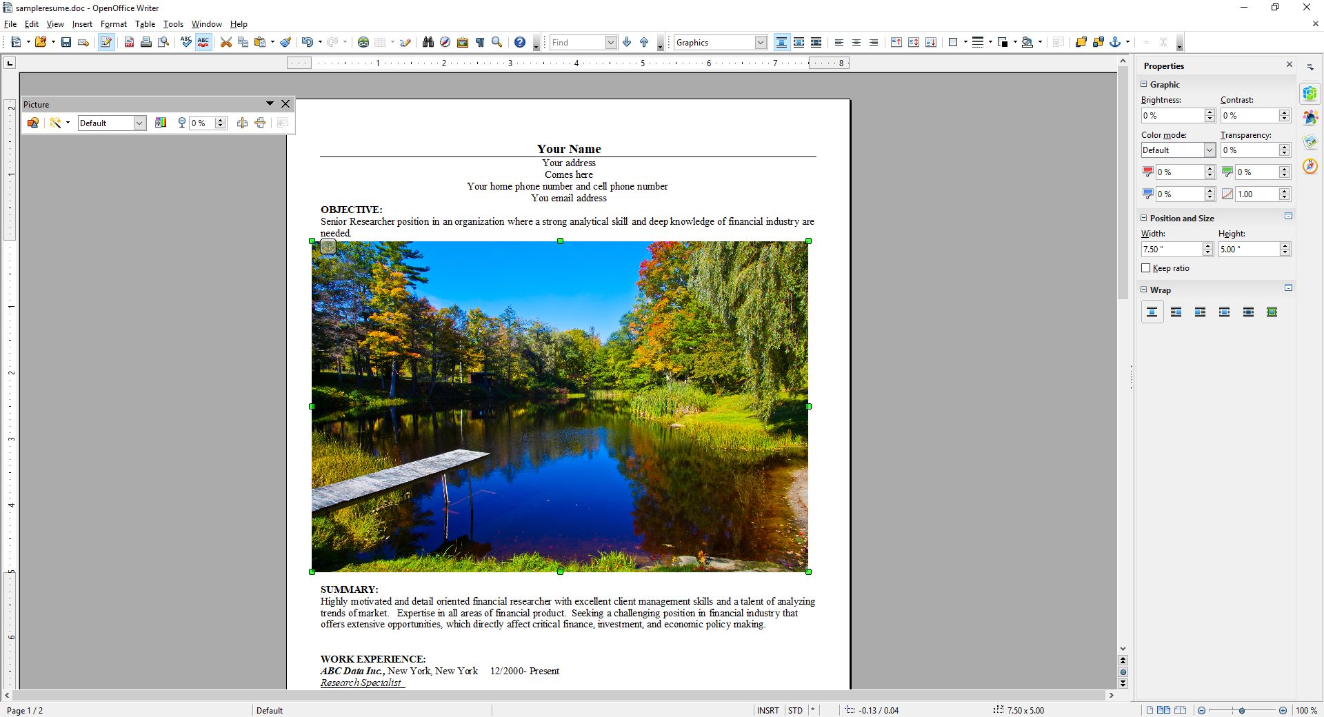
OpenOffice Insert Picture
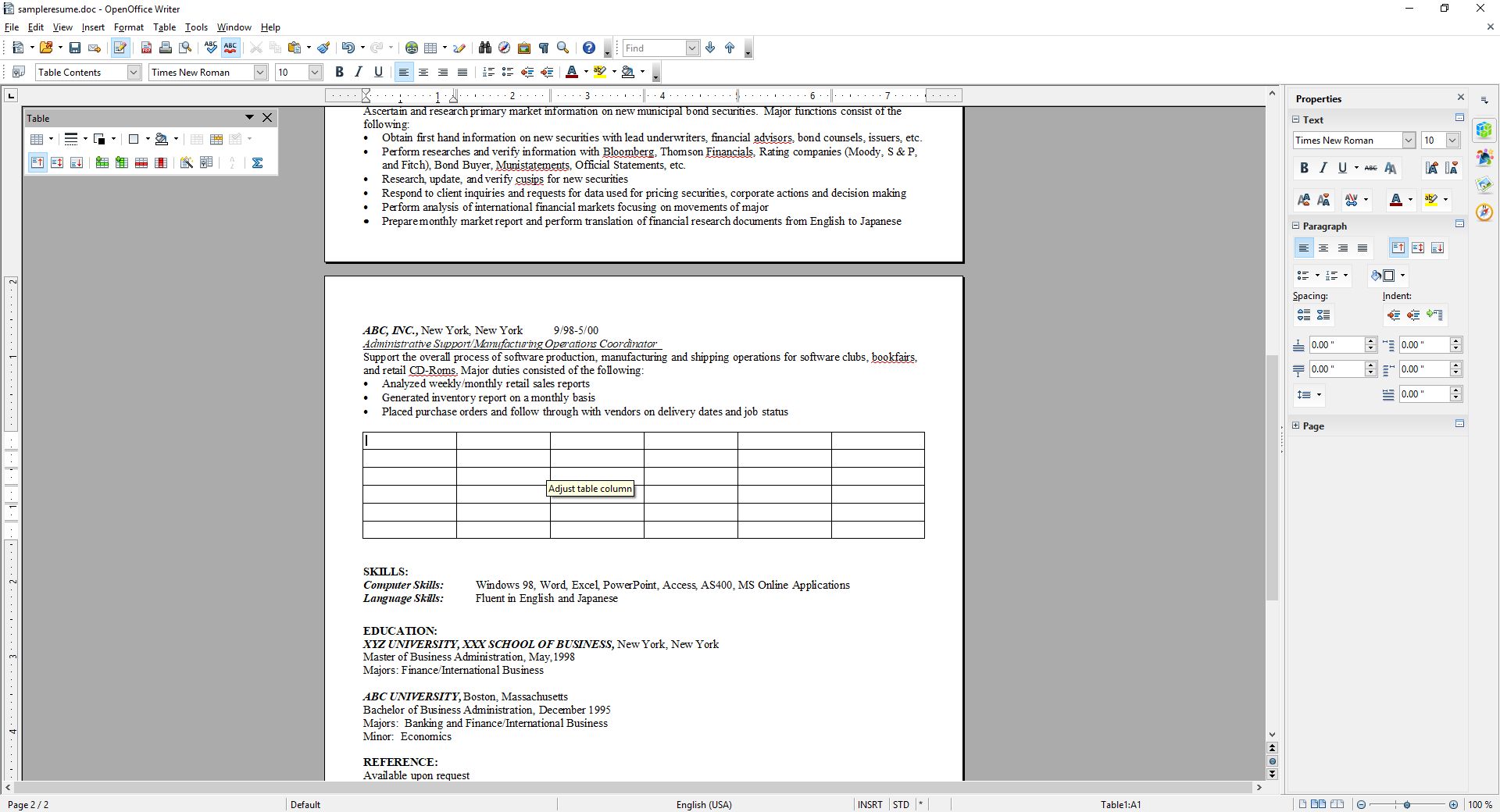
OpenOffice Insert Table
Again, after insertion both of them were easy to adjust and format, and the rest of the document was very responsive to those changes. While this post doesn’t cover all you can do with Writer (you can imagine how long a post covering everything you can do in Word would be, and it’s the same here), you can get an idea from the images, specifically the ‘Navigator’ image included above.
I’m also not a big fan of the text boundaries that are shown by default; they make the whole document look as though it is too small on the page. I get that they are trying to illustrate the margins as well as provide a quick and dirty print preview, but ultimately I find them distracting. Fortunately, they can be turned off completely (which makes it look more like Word, and the familiarity is welcome).
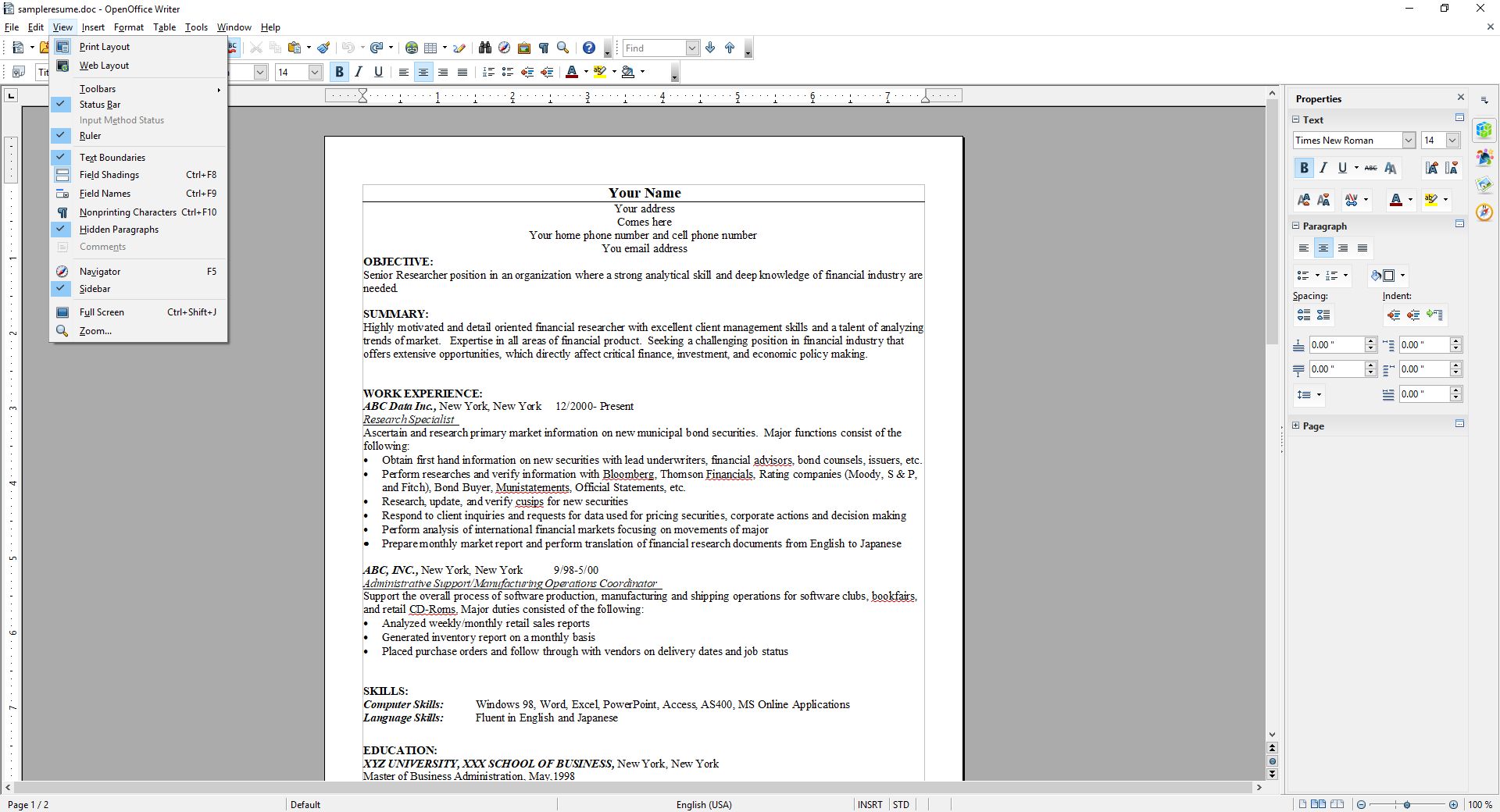
OpenOffice Text Boundaries
The two big problems with OpenOffice are, unfortunately, major issues that prevent me from recommending it completely, especially as there are other programs and online options that don’t have these concerns.
The first is an issue primarily if you are importing a .docx (Word 2007 – present) file to work on a document. If you create your document from scratch in OpenOffice, it works quite well and is feature rich enough to complete even if you are doing fancy stuff. On the other hand, if you’re importing in Word’s latest format, forget it – processing hidden Word formatting codes is not Writer’s forte. Writer will destroy enough of the formating that fixing it is not worth the effort, and copy – pasting without formatting and re-formatting is likely, but not always, the only viable option. Even so, the common outcome is that no amount of tweaking will right the formatting ship: You can recenter and re-format and unbullet and rebullet and tab all over the place all you like, but it will never get back to the way it was; it will simply not play nice with undoing damage from an import.
Building on that is the most glaring issue of all: Writer simply doesn’t recognize the .docx extension. You can’t save using that extension, only .doc, a format that hasn’t been used for about ten years. Writer has its own format, .odt, that is unique enough that trying to go the other way, and opening a Writer file in Word will also yield unfortunate formatting issues. Other alternatives like the aforementioned Zoho handle them easily, but not OpenOffice. In fact, when creating a new document in Writer, it asks if you want to create a new Text document, which in Windows or Mac has a specific meaning, and it’s not a fully formatted, functional, professional document.
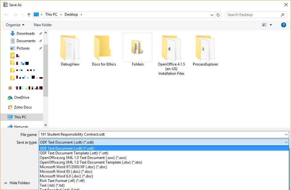
OpenOffice Save As
This post only covered OpenOffice’s word processor, Writer, although the other applications exhibit similar behaviors and limitations. They work well if you are working solely within OpenOffice, but not if importing or exporting.
I want to see OpenOffice succeed, especially under the Apache umbrella, but as of now I simply can’t recommend it as it is. That’s distressing, since I haven’t been able to ever recommend it over the last twenty years, although it’s always been very, very close. It works well on its own and with its sister programs, and has incredible potential, but the fact is it doesn’t play well with others, and until it does it simply won’t be a viable alternative.
And now it’s Opera’s turn

In a recent post, I lauded the new release of Firefox, known as Firefox Quantum, or Firefox 57.0 if you’re in to numbers. The release introduced new features and fixed many issues that have plagued it, in some cases, for years (memory leaks, I’m looking at you). One of the things I really appreciated was the ability to take a full-page screenshot that would capture the whole page, regardless of how much of it was off-screen. For someone like me who uses screenshots in class and on this blog frequently, it’s a godsend.
Having said all that, I also mentioned right at the beginning of that linked post that I’m an Opera guy even though the new Firefox has really narrowed the gap, and since Opera just released version 50.0 with some features of note, I thought it would be only prudent to mention a couple of them here. It won’t get the same coverage as Firefox because it’s not as significant of an upgrade.
Indeed, I’m only going to mention a couple of its features: full-page PDF capture and anti-Bitcoin mining technology.
As I mentioned, Firefox allows for a full-page screencap of a webpage, even if you can’t see it all in the browser window, and the cap is then saved as a .jpg image. As I mentioned, since I use screenshots extensively in my classes and on this very site, that’s invaluable. Now, Opera has the ability to do the same thing except it captures the page as a pdf. It works perfectly, I’ve had no trouble at all, and I can see how it would be useful, especially as opposed to a .jpg. If you wanted a hardcopy version of a recipe, or a series of lessons, or set of instructions then it’s ideal. If you wanted to have a permanent copy of a webpage, or send a copy of it that could be used at a meeting or for whatever reason can’t send a link then it would be very useful there as well, as it would certainly be easier to read then an image. I’m quite impressed with its functionality, and it offers a nice other option alongside Firefox’s full-page .jpg image capture. Both options are fantastic, work flawlessly, and definitely have their own specific use cases. The image below shows a multiple-page post from this site that was saved as a pdf and how it appears; it’s exactly like reading the site itself, but without links. I should also add that Firefox has an advanced ability to select page regions for capture and editing features, a feature not shared by Opera.

Reading a full, multiple-page post as a pdf
The other interesting feature Opera has developed is anti-Bitcoin mining technology. Bitcoins are obviously all the rage, and whether that’s because of the nature of buzzwords or legitimate hype, mining them (a topic far beyond the scope of this post but you can read about at this obvious site) requires extensive use of a PCs resources, somewhere in the neighborhood of one hundred percent, and while smart people will simply build dedicated machines for the task, other smart but misguided people instead want to use yours, and will hijack it through scripts to do so. The obvious downside is that your machine will slow to a crawl and use up insane amounts of power while it tries to mine Bitcoin for someone else. Never fear though, Opera to the rescue. According to their blog, simply turning on their built-in adblocker – another nice feature by the way along with their built-in VPN – will prevent drive-by Bitcoin-mining hijackers.
By the way, I say Bitcoin as a proprietary eponym, like Q-tip or Kleenex, however it’s any type of cryptocurrency mining that gets blocked, and Bitcoin is hardly the only one out there. I should just start saying cryptocurrency as it’s the better, general term, and I’m sure someday I will. Just know that there are many viable brands of this digital currency, but that’s a post for a later time.
So the eternal tug-of-war between Opera and Firefox continues, at least for me, and I couldn’t be happier. I’m thrilled at the way they’ve developed and hope they both keep pushing browsers forward.
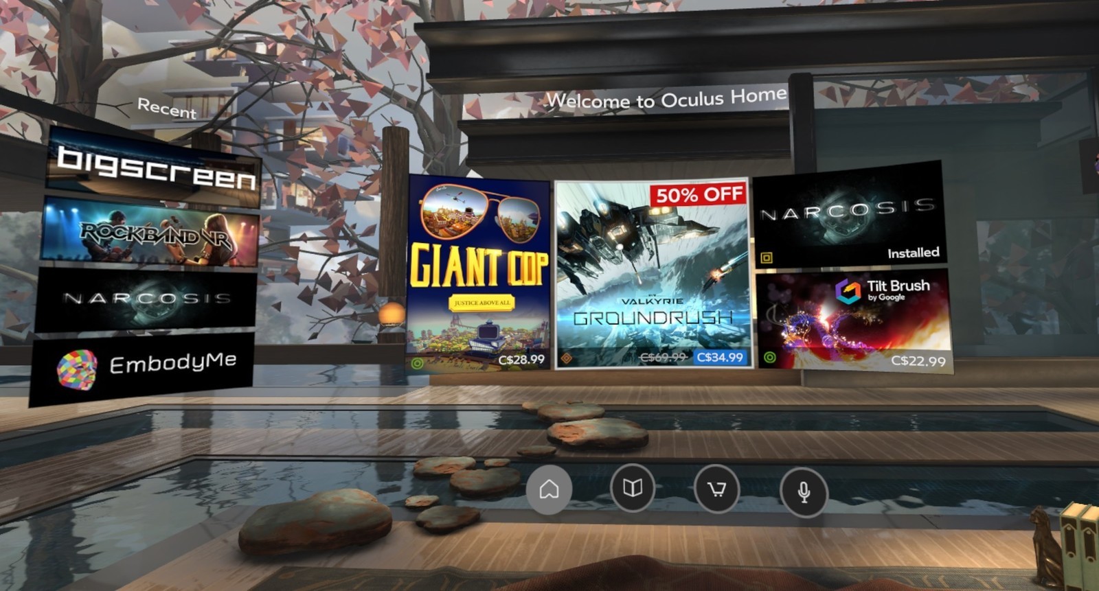
The new oculus home and store experience

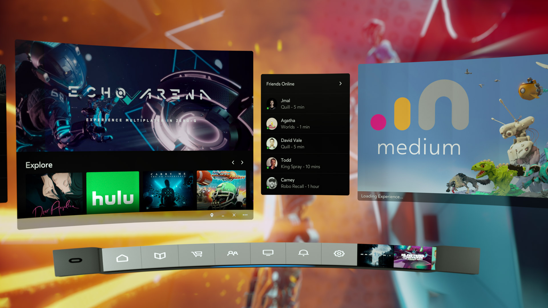
Facebook-owned Oculus released their Rift Core 2.0 software a couple of days ago, completely revamping the out-of-app experience users have when they don their Rift headset. It’s a vastly improved experience over the original Oculus home (which wasn’t all that bad, to be honest); much more feature-rich, streamlined, and user-friendly, however it is still clearly in beta, which is a good thing because it is also still, bafflingly, missing some foundational functionality. According to the Oculus developer blog, there is much more coming and I am very much looking forward to it.
I have made a video, embedded at the end of this post, however that was not without some strange difficulty. You see, when you are in a VR app, the app is automatically mirrored to a window on the desktop, but not when you are in Home or the store. For reasons we may never know, the developers made that window a hidden window, and it required a third-party app, cleverly named HomeUnhider, to make it visible. I would have used the more popular OculusMirror.exe, supplied with the Oculus software itself, however unlike everyone else on earth, my Oculus program folder was empty, with none of the software that was supposed to be installed along with the core experience, and it’s not available for download.
“No problem,” I thought confidently, “I’ll just use HomeUnhider.” Great idea, except HomeUnhider doesn’t work with the new beta experience, giving an error that reads ‘Oculus Home not found.’ It required a complete uninstall and reinstall of the Oculus software, but I did then get the mirror program that allowed me to capture the video (for those interested, the complete path is C:\Program Files\Oculus\Support\oculus-diagnostics\OculusMirror.exe). Camtasia then proceeded to cut off the bottom bit of the video so you can’t see the dashboard as much as I’d hoped. It’s also a weirdly low-res video, which is strange as I use Camtasia a lot and don’t normally have that issue. Here’s a pic of the original Oculus home, lifted from the Windows Central forums, to set a baseline.
Original Oculus Home
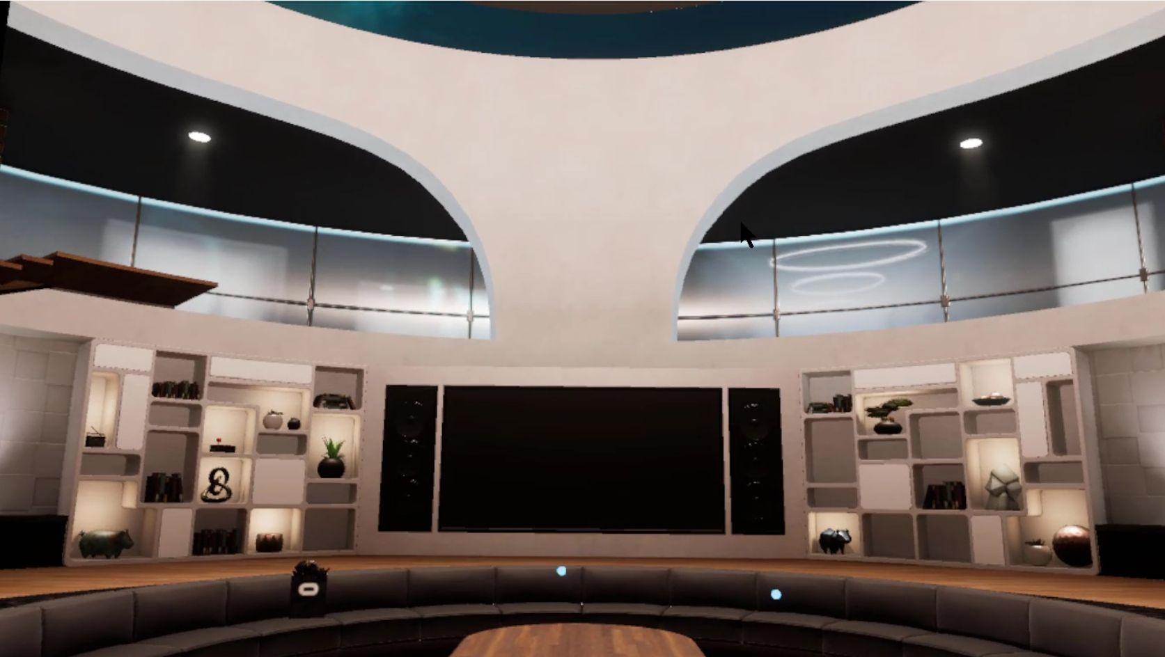
As you can see, it’s not bad. It has a nifty, pseudo-futuristic-while-simultaneously-rustic vibe going on, and the home and store functionality is combined into a single interface. You can see yourself, your friends (yeah, right), highlights from the store, and recently accessed apps. The image is actually an older version of home; it had been upgraded from the design you see in the image above, with additional navigation, categories, and so on. It looked generally the same, but with some additional functionality. Of course, you could look around your home if you just wanted to chill, as the kids say.
In the just released beta, however, it has been completely revamped. Your house now sits on what appears to be the cliffs of a…Mediterranean, perhaps, or maybe Spanish inlet, part of a larger coastal village, with your balcony looking out over the water, which also happens to have some pirate ships. Can’t argue with the view!
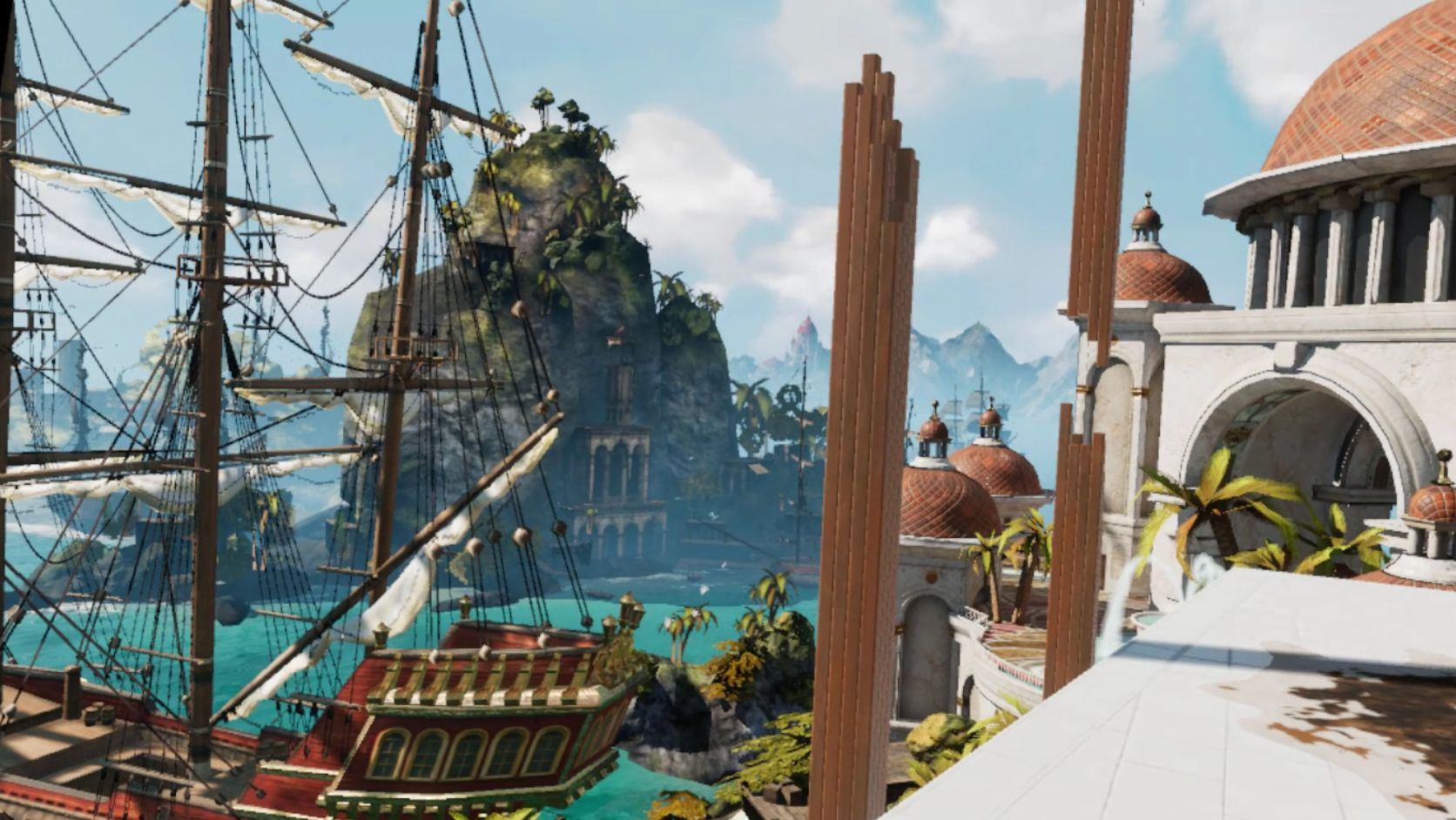
My new (virtual) view
There are also some activities you can do, such as shoot a bow and arrow at nothing in particular, shoot what appears to be a virtual incarnation of the Sega Master System Light Phaser (which could be dangerous in the wrong hands) at similarly 8-bit targets, or lob golf balls into the water. For being such simple activities, they’re oddly fun. You can navigate around your house, something you couldn’t do before, and you can now do some limited decorating. By selecting different patterns you can change the look of the ceiling and walls, and other accouterments can be placed around as well. The carrot here is that by playing games and using apps, or simply spending time in Home, you’ll earn additional items and decorations that you can use to further spice up your space. And don’t worry, there are no lootboxes here.
Shooting 8-bit targets
I suspect that there will eventually be many more ‘homes’ from which one may choose: On the developer blog linked earlier, there is what appears to be a house in outer space as opposed to the seaside location it’s in currently, and my guess is there will be more than that. The blog states they’ll be rolling out content over the course of the next year, and I suspect further on past that. Hey, Sony’s Playstation Home may not have been a hit, but the homes you could buy were spectacular, and it never came out of beta! I can only imagine what it will be like if we can get homes like that in VR – I’d buy every single one. They even had one that was completely underwater with whales and whatnot swimming outside massive windows…Now I’m nostalgic and I can’t find a single picture of that house, so instead here’s a picture of an underwater, Bioshock-themed apartment you could get. Still pretty impressive, and apparently there’s some weird version of Playstation Home that still exists on the PS4.
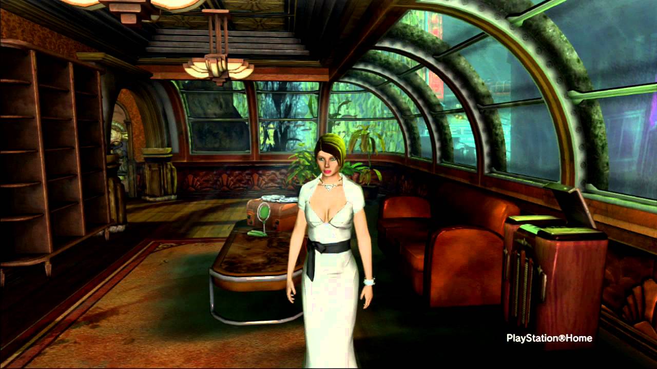
Bioshock Apartment from Playstation Home
GLORIOUS UPDATE: It turns out the environments are already available! I wasn’t aware you could scroll through decoration options within categories, however I began to suspect something was up earlier today when it said I had 78 objects but was only showing a few. After figuring out how to scroll, guess what appeared! That’s right: A space environment, and my new favorite, a city environment called ‘Vertigo.’ I made an additional video just to show them. They’re very impressive, and now I can’t wait to see the others that I’m certain will be available in the future – fingers crossed for an underwater theme!
So back to Oculus – there is the new dashboard, which I think is a huge, and much needed, improvement. It now curves around you like a futuristic control panel, offering access to settings, recently used apps, some status info, the store, and social info. It’s easier to use, especially if you’re standing up; using it while sitting requires you do some contortions with your wrists to get the pointers in the proper place. There is also a Desktop button that mirrors your monitor right there in VR, and if you have multiple monitors it will ask which one you’d like to see. The insanely nifty thing about that is that you can pin programs to the curved dash just like you can with the Windows or Mac taskbar, and even pull windows off of your desktop and pin them right in the air in your virtual house! They’ll follow you around – you can watch YouTube videos, play a game, browse the web, all as you mosey through your virtual environment. It’s an incredibly useful feature, however you can’t pin them, say, to the wall like a picture, which I think would push it over the edge into unparalleled awesomeness. Rather, they hover right next to you, although they can even overlay over an app you’re using, so you never have to be away from that admittedly very important video that finally proved the existence of life on another planet.
Oculus Dash (from Oculus – notice the different home in the background)
The store has been separated out as its own location, designed as a post-modern, I don’t know, office lobby? There’s a very natural theme to it with an Oculus-branded waterfall, wooden curved steps on either side of the round room, metal balls rolling along tracks under a glass floor, and you can even see silhouettes wandering around behind the upstairs windows. Oddly, and at the same time pretty awesomely, if you turn around you’ll see a very futuristic, yet also immersion-ruining unanimated cityscape. No blinking lights in windows, animated billboards, blinking stars, nothing. But it is an interesting contrast between what’s in front of you and what’s behind, one you can see below.
The new store location
Looking behind you in the store
The store functionality is generally the same as it was before, which is a problem. They have finally added video previews of apps you’re viewing, something the Gear, the mobile version of the Rift, has had forever – the fact it’s been added to Rift now is just playing catch-up. Additionally, although it’s not an addition at all, it’s a maddening omission, there is still no search function, which is as basic a usability function as there is, especially when the list of apps can, in some categories, go for 100 pages! While apps are normally listed six at a time, their ‘Gallery’ titles, which are described only with the very vague ‘A broad, less-filtered collection from VR creators,’ are for some reason listed three at a time, and there a hundreds of them! I also have no idea what ‘less-filtered’ means, and when I clicked on ‘Learn More,’ Oculus crashed and wouldn’t restart without a reboot or taskkill because its background process simply wouldn’t quit, even from TaskManager. Anyway, you can sort, but you may still have to scroll through pages and pages and pages and pages of apps to get to the one you want.
There is also no browser, something its little brother the Gear has had for a good while now. It’s very strange; these improvements to Home and new environments for Home and Store are great, but it still lags behind the version that you use by plugging in a phone. The Gear version of home also has voice search, and other things like events, highlighted videos and better social integration, something that even I, with no friends on this or any other game platform, can see is much better on the Gear. That the Rift still lacks the basic functionality that its phone-based counterpart has enjoyed for so long is unforgivable. I’m overjoyed at this new Rift experience, and I have very high hopes, not only for its continued future development and what that will bring us, but also that it can simply be brought on par with what you would expect would be its much less capable sibling.
It’s important to also add that regardless of my complaints and concerns, Oculus is light years ahead of Valve / HTC and their Vive in terms of the interface. The Vive interface, a Frankenstein-like mashup of three, maybe four, maybe as many as seven separate interfaces (it’s hard to tell, it’s so badly designed), is overpoweringly difficult, cumbersome and unintuitive to use. So awful is the Vive interface, and impossible to navigate, that it may be, and I say this in complete seriousness and without hyperbole, the single worst interface I have ever used. In my line of work I use a lot of terrible interfaces, so Vive has really accomplished something here. Not only that, Steam VR incorporates beautifully into Oculus, so there’s no need to use the Vive at all, at least not in my household.
Below are two videos from Oculus, one highlighting the new Home and its potential options for customization, the other introducing the new interface which they call ‘Dash.’ The third video is the one I took on my own Rift in Home and the store.
The new Firefox browser seems pretty good so far

I’m an Opera guy. Not an ‘opera’ guy, although I have nothing against that particular type of theater, but an Opera browser guy. Many years ago I was a Mozilla Firefox guy, especially as they rose from the once-great Netscape Navigator, however for many years now Opera has been the Samsung Galaxy to Firefox’s iPhone; in other words, Opera always had features that Firefox offered much later or didn’t have at all except through add-ons, and was simply faster, more responsive, more stable, and easier to use. Not only that, Firefox has been infamous for its memory leaks, a problem it was never able to solve (Chrome, too, let’s not forget about Chrome). I should also mention in the issue of fairness that plugins could exacerbate the problem, however the base browser always struggled with the issue as well.
Now, however, Mozilla has released the latest version of its Firefox browser, named Firefox Quantum, and it is the first major update for the browser in almost thirteen years; you can read the blog entry straight from the horse’s mouth here. They claim it’s faster, better, has more features, is better able to manage resources, is compatible with new and emerging web technologies, and has many options for customization and configuration. It’s been redeveloped from the ground up, and it shows.
I gave it a run to see how it is, and it certainly does appear to be better. Very fast, very responsive, clean interface whose elements can be dragged-and-dropped to rearrange them anyway you like, which is very nice. I started up some test sites to see how they loaded, including UCI’s homepage, IS301.com, Amazon, Plex’s homepage as well as my Plex home server, Hackaday.com, eBay, and Rotten Tomatoes. I also left up the default start page.

Firefox Quantum
The tabs loaded quickly, although plex.tv and this site took longer than expected, however while comparing response times with Opera, they loaded slowly there as well so the problem was obviously server-side and not an issue with the browser itself; testing them later resulted in equally speedy load times. That wasn’t the case with actually playing videos using Plex, though – Firefox took much, much longer to buffer than did Opera, almost three times as long; I was unable to discern why but the issue was repeatable and consistent. Barring that anomaly, everything else was very snappy and without hesitation. One thing I should add about measuring response times: It is very difficult to do client-side, and is often done via what is known as a stopwatch test, doable in code or with an actual stopwatch. Needless to say, I find those both very unreliable and so went with my own observation to get a general sense of how Opera and the new Firefox compared.
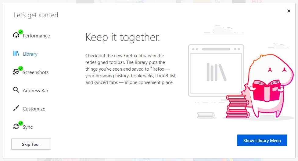
Firefox also has many new features, including deeper integration of Pocket, a personal web-content aggregator that Mozilla bought and integrated a while ago. I have never used it, but can understand how it could be quite beneficial for some. It also has an excellent snapshot feature that allows you to take a screenshot of all or part of a page and save it locally or share it to their cloud service. I don’t know why someone would use the latter, but the former is something I use quite a bit with Opera, and as we will see Firefox does it much better. There is also the aforementioned interface configurations, the library which is just a collection of your browsing history and bookmarks, syncing across devices, and more. As the header image shows, they even have a new icon!
Firefox Features
Of course, that’s where the important issue comes up. The fact is, while the new Firefox browser appears to be much faster, more responsive, more stable, everything I said about Opera earlier, what that essentially does is bring it on par with Opera, except in the case of Firefox’s better screenshot functionality which I will discuss later in the post. I tested each page I loaded in Firefox against the same page as it loads in Opera (with three times as many tabs open in Opera, no less) and the performance was the same. Opera wasn’t better as it had been in the past, it was simply the same. That’s a comment on both Firefox and Opera; how well Opera has been in the past, and the catching up Firefox had to do, and did quite effectively and impressively, to reach it.
As mentioned earlier, there is one big difference in which Firefox easily takes the lead, and regarding a feature I use often – the screenshot feature. Both Opera and Firefox have had this feature for some time, and as stated I use it frequently, although now Firefox’s implementation is much better (MUCH better) – it can identify sections of a screen, such as a headline or picture or other element, as you move your mouse, and snip that out, while Opera requires you to adjust a selection box. Additionally, Firefox has the neat ability to capture a whole webpage as a snapshot, even if parts of it are not visible in your browser – the image below was taken in Firefox even though the entire footer and about 20 percent of the header were not visible when I did. That is a great feature, one that surpasses Opera’s full-screen (note: not full-page) capture, and might be the clincher for some; it almost is for me.

Full-page snapshot using Firefox
Opera, on the other hand, allows for screencaps to be marked up in a very limited fashion right in the capture window, something Firefox does not, however this is less of an issue for me as I usually use GIMP if I need to make extensive edits, and IrfanView if I need to make any size adjustments, batch actions, or simple crops. Good thing, too, since all Opera allows one to do is add some arrows or stickers; Regardless of what Opera says, it’s not actually editing at all. In terms of flexibility, Firefox is the clear winner in this category.
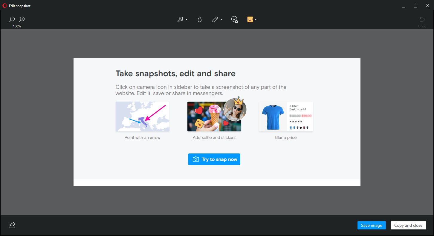
Nice try, Opera
For these reasons, I can and will whole-heartedly recommend Firefox to anyone interested as I think the improvements are significant, but I won’t stop using Opera as it already had many of these features, as well as unit conversion that happens automatically when you highlight a measurement. It also has a customizable, tiled home screen that I find to be very useful; it’s one of my favorite features of Opera and the one I use most often. The new Firefox has something similar, with a single row of six, or double row of twelve, small tiles representing your ‘top sites,’ which can be edited or added to, but not rearranged; ultimately, it’s not as configurable as Opera’s landing page, and very curiously its screenshot functionality is disabled there also.

Opera start page

Firefox Start Page
Whichever you prefer, they are now both very good browsers, with the choice being one left up to the preference of the user. I haven’t used Firefox in forever, but I am very pleased to see it in this new form and I hope it continues to get better and better. As I mentioned earlier, I can wholeheartedly recommend it now, something I couldn’t do before, and I will likely use it as a back up browser in place of Chrome, my current backup. There are of course many other choices in browsers, including Vivaldi, Pale Moon (don’t let the terrible web page scare you), and Brave, to name a few, as well as the more well knowns, however here I was only comparing the new Firefox to my main choice. Speaking of which, I was just notified that an update is available for Opera! Here we go…
Bing does Halloween Right

Everyone knows I am a big fan of Microsoft. I always have been, even when their products were of questionable quality; what can I say, I like the company. But now, their products are masterfully designed and fully capable, a pleasure to use. Never mind they come with pricing to match, something that was once the sole domain of Apple (as were those other qualities, ahem).
Even so, I am not here to extol the virtues of Microsoft’s products or even software. No, I am here to compliment their masterwork on one of their services that, sadly, is often targeted for derision: Bing. Fan I am of Microsoft, and user of Bing, the fact is it simply doesn’t provide strong results when I do a search. It will give me results that are ten years old, not relevant to what I’m asking, or just plain bizarre. I’m no fan of Google, but I will say they do search better. So you’ll understand my elation when I can finally give Bing high praise for easily blowing Google out of the water at something search related.
Well not search related per se, but more their search page. This year, for Halloween 2017, Bing absolutely nails what a Halloween page should be, and destroys Google’s feeble video in the process. Score one for Bing! Their (almost) fully interactive homepage shows living portraits hanging on a staircase wall, and most of them have, shall we say, a unique personality when you click on them. You can view the page at any time of year by following this link, however if for whatever valid reason you have an aversion to Bing, you can also see it in the video below. Well done Bing! The fact you do Halloween right makes up for all the ineffective searches I’ve done with you over the prior year.
(I tried to research how specifically this page was created but found nothing. Probably because I searched on Bing. Still, I love the page, and I’ll always be a fan, Microsoft!).
On this day, the TRS-80 was born!
Today, August 3rd, is the 40th anniversary of the TRS line of PCs, manufactured by Tandy and sold through Radio Shack.
Ah, Radio Shack. My eulogy for your passing continues to this day. When you were actually a ‘radio shack,’ a place I could go to buy electronics, transistors, capacitors, soldering irons, when you catered to the people who made you what you were. At one point, Radio Shack was so ubiquitous, one could be found within three miles of almost all American households. Now, however, they were reduced to this before disappearing completely. Even with 70 stores apparently remaining, for all intents and purposes it is gone, considering it lost its way and identity long ago.
But I remember quite fondly the Radio Shack of yore. When I started college at my mostly-beloved Alma Mater UMBC, my significant other at the time worked at a Radio Shack right around the corner. They sold electronics for real enthusiasts and hobbyists, and even PCs from their Tandy line. Tandy, a leather company that still exists today, bought the struggling Radio Shack back in the 60s in attempt to diversify. In fact, the TRS portion on many of their computer model names was an acronym for Tandy Radio Shack. It was glorious for me to go in to the store on a dark and snowy winter night, when the store was open but no customers were about, to play Space Quest One on one of the Tandy machines they had on display.
But my affinity for the TRS line goes back much, much further than that. I actually learned to program, using line-number basic no less, on a TRS-80 model III. I actually took programming classes using this machine, which would have been around 1981 or so. Normally I would just hyperlink to a page about it as I have indeed done, but I feel it is important enough that I must also include an image whose glory in which you should bask (The header image is a Model III as well).
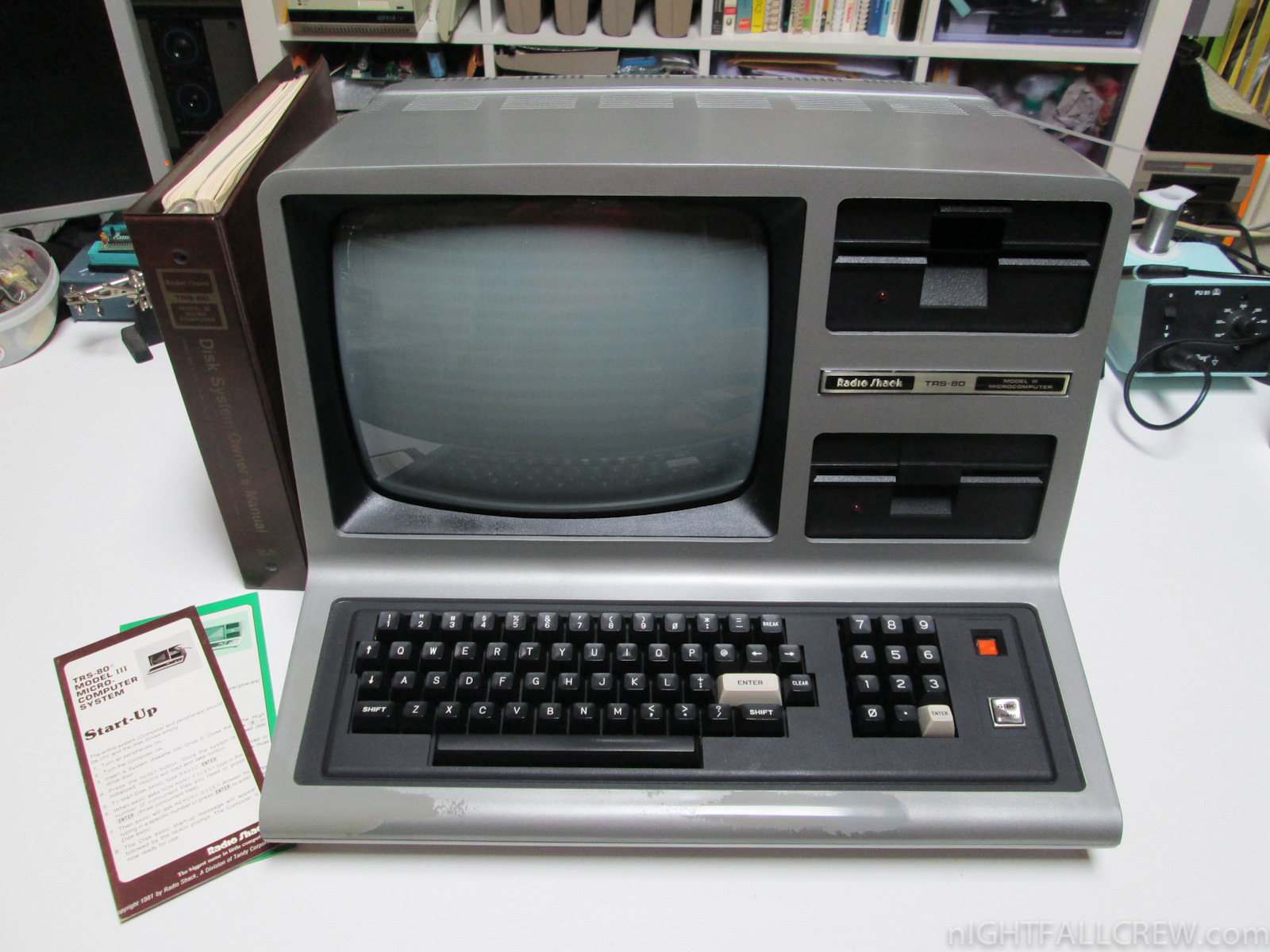
TRS-80 Model III
Isn’t it beautiful? It was a great machine for the time, with a speedy 2MHz Zilog processor, the same one found in all TRS-80 desktop models, however its 4K of ram could be boosted to 48K which was ludicrous overkill at the time. Even though it had dual disk drives, which was a feature shared by the Apple IIe, it also had external cassette storage, which is what I mainly used. $600 would get you the whole shebang, cassette storage and monitor included.
I also find it strange that model numbers are often left off when people describe these machines. Earlier models had all components as separate items, and less memory, and a slower processor, and reduced functionality. When referring to the TRS-80 line, the model number is very important.
I programmed my first game on one of these very machines, a model III. It was a text adventure through a haunted house from which you were trying to escape. You had to find items, using some and combining others. I even went out of my way to have everything make logical sense, if not be overly challenging; for example, at one point you come across a skeleton who is searching for his lost femur. You later discover a dog trying to bury a bone. Hmm. I must say it was pretty fun! I would save the code to cassette – that’s right, audio cassette – and load it to play or edit. It was also because of that that I learned another valuable lesson which was not taught in programming classes at that time: save your work. You see, to save onto a cassette, you had to manually wind the tape past the leader tape that was not magnetic and can’t hold data, or else the computer would try to save some of what you were doing to that, and the whole thing would fail, of course.
Valuable lesson to learn, that.
So it bears repeating: as the headline states, the reason I am telling you all about one of my favorite vintage PCs (an honor shared with the Commodore Pet and Apple IIe), is because today, August 3, is the anniversary of the TRS line of PCs! They were first announced in 1977. This is one of the machines that had a major impact and influence on me, and amplified my love of and interest in technology. I’d like to get one and do some tinkering once again. Unfortunately, TRS-80s have also, along with others including the aforementioned Commodore Pet, become sad victims of the Ebay economy, in which everything is worth a fortune if you’re selling it on Ebay. Here’s the going rate for a Model III, which isn’t as bad as it has been in the past (remember this post from 2014? Of course you do!). For good measure, here’s a Commodore Pet and an Apple IIe.
Even so, I’ll keep an eye out for a chance to relive my childhood, and celebrate this day. If anyone finds one cheap, let me know!
A workstation for us all
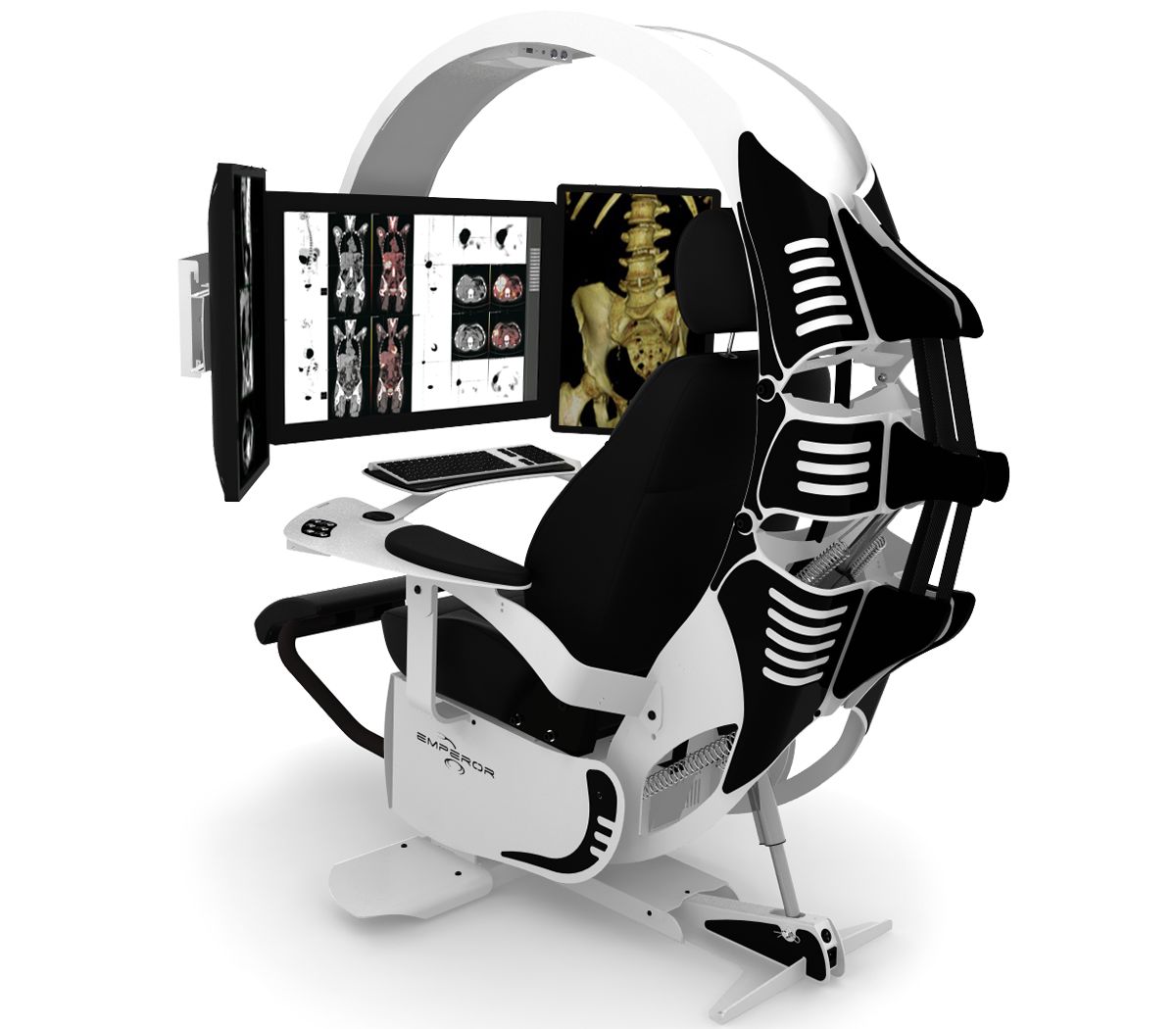
Forget working at your desk, even one of those fancy hydraulic desks that lifts up and down. No, you need one that is fully immersive, looks like it belongs on the set of Alien, but is also eminently affordable. Hey, to quote Meatloaf, two out of three ain’t bad!
Thanks to MWE Labs, you can have the ultimate PC workspace they call The Emperor. A self-contained pod-like setup that surrounds you with your monitors and controls. Not only that, you can customize it with an array of nice touches, such as color and accent, accent lighting, even custom engraving, your logo on the seat and even a logo backlit front plate! Standard PC customization practices also make an appearance, with RGB and accent lighting available. I especially like how the one on their main page and used in the header of this post is being used for medical purposes and is designed to look like a skeleton. That’s clever.
Of course I had to max one out and see how much it would run, and I was not disappointed. I customized the color (black and orange, of course, although they have many colors for both the main and accents), and added in all lights and accouterments. The upgraded seat, which they will stitch your signature into in place of the Emperor logo added $2500 onto the price, the leg rest and heating added $500, and an integrated USB 3.0 hub is $315. After piling on all the other options, including lighting, logos, and two laptop trays, I finally had my dream chair, and only for a pittance. In fact, I’ll take two!
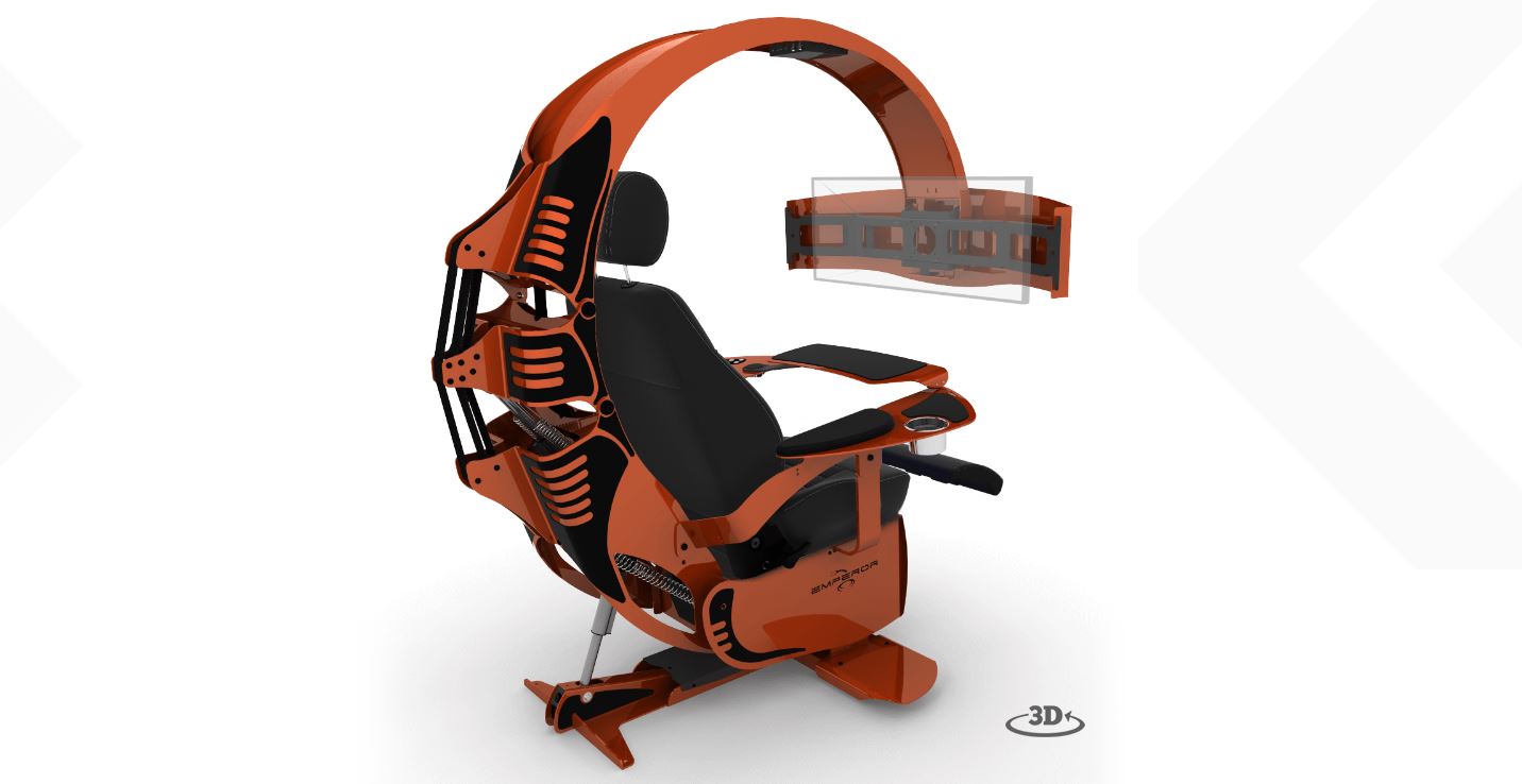
Now this is a chair
That’s a good-lookin’ setup if I do say so myself. It has all the bells and whistles, custom paint, everything someone who avoids physical activity could ever want. Of course, they practically give them away! I don’t know how they can offer them for this low price.
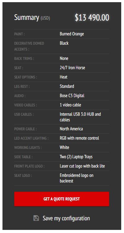
Total cost, totally reasonable!
If you have a lot of disposable income, what I like to call ‘Notch money,’ then why not? It is probably quite comfortable and a neat experience. You’ll have to supply your own PC and monitor(s), of course, but if you’re buying a chair like this, I’m sure that won’t be a problem. May I recommend Falcon Northwest? If you get one, let me know; we’ll be instant friends.