

Becoming a designer
Boy, it’s been a while. An oxymoronic combination of being lazy and busy, I guess. Anyway, for this post I wanted to talk about design. It’s a topic that comes up a More »

Support for Windows 7 ends today
It is a sad day, as Microsoft is officially ending updates and security patches for Windows 7, the popular OS still being used by a large majority of PCs. Windows 7’s popularity More »
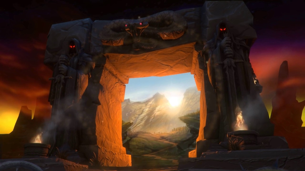
Returning Home: World of Warcraft Classic Comes Online
On August 26th, fans of the original World of Warcraft (henceforth referred to as WoW), and those who are just curious to see what all the hubbub is about, were finally able More »

The Lawnmower Man, and Vintage CGI
Inspired by a couple of Reddit forums to which I am subscribed, VintagePixelArt and VintageCGI, and being a fan of all things historical as it pertains to technology, I uploaded to the More »

Jony Ive leaves Apple
As someone who teaches extensively about design as it intersects with technology, and is also a computer and technology historian, I am conflicted about Jonathan (Jony) Ive leaving Apple. Mainly because he’s More »
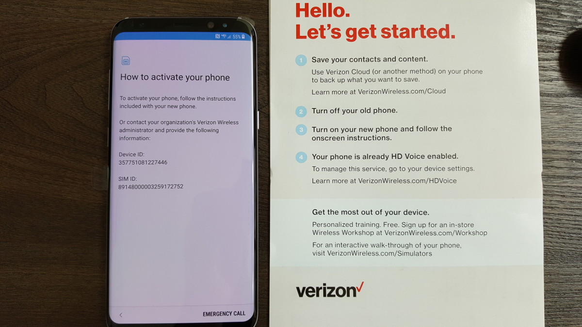
The new Samsung Galaxy S8+
I’ve been using my new Samsung Galaxy 8+ for a few weeks now, and must say I like it. It has a slew of new features such as the occasionally functional face-recognition method of login, which according to Samsung I should not use if I have a twin, and I end up using the login PIN about half the time anyway, since wearing sunglasses, being in bright/low light, having your head at a different angle than what the phone expects, or wearing a Freddy Kreuger mask all seem to interfere with its accuracy. It also eschews the previous models’ physical home button for an on-screen equivalent, which can sometimes get lost in app overlays, and the back button rotates with the orientation of the phone which means it sometimes points up, not back. Plus it no longer comes in glorious gold, but I did get a neat metallic grey-blue.
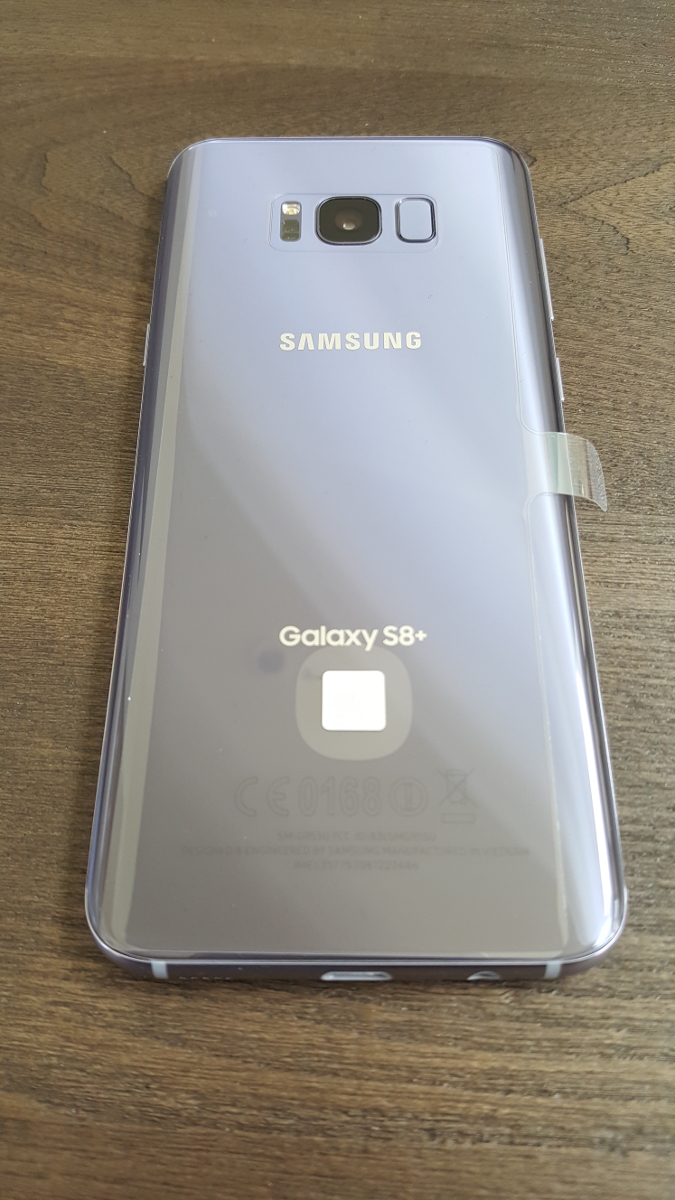
Samsung Galaxy S8+
The metallic blue branding on the box let me know I was in for something special. I wasn’t such a big fan of the quick start card telling me to follow the instructions on the phone, which in turn told me to follow the instructions on the card. I was almost stuck in an infinite loop.
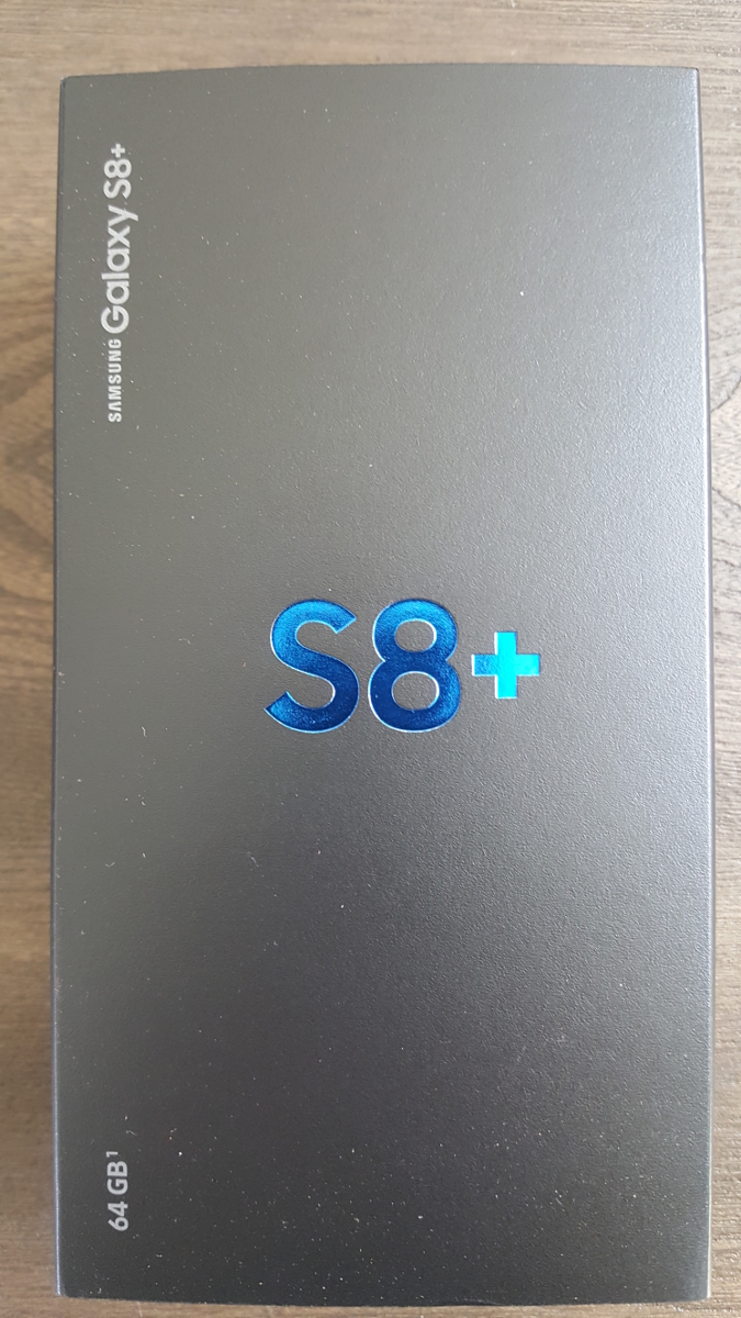
Lovely Blue Lettering
Hmm…
Even with those caveats, it’s a great phone. It comes standard with 64GB of internal storage, however I popped in a 256GB MicroSD and have enough storage for everything. While other Galaxy’s supported this, my previous S5 did not and I ran out of space almost immediately, which caused repeated battles with those pesky storage demons for months on end. On the front, the S8+ is adorned with a magnificent 6.2 inch AMOLED screen that wraps around the edges, an ‘Infinity Screen’ as Samsung brands it, and you can slide in panels from the edge that house frequently-used apps. I never do that, but you can.
In the US, the phone runs on an 8-core Qualcomm Snapdragon at 2.35 GHz, which is powerful but on-par with competitors. International markets get Samsung’s own 8-core, ARM-based Exynos processor running at the same speed. Both are plenty fast and more than capable for most mobile applications, especially with 4GB of RAM packed in alongside. I was hoping to use Qualcomm’s own Vellamo benchmarking suite to put it through its paces, however it was nowhere to be found, so I fell back on the stalwart and well-established GeekBench 4, which provided a comparatively average single-score of 1830, but a scorching, second-place multi-core score of 6032, placing it only behind Huawei Honor V9. I should also mention that the scores earned by the phone are much higher than what they are reporting for the S8+ on their site.

GeekBench 4
(It needs to be mentioned as a warning that I also intended to use the well-known and oft-utilized AnTuTu mobile benchmark, however on boot it insisted I download an additional ‘phone verification app’ and even loaded the Play store to do so. I don’t know why it would require that, I’ve never heard of such a thing, it sounded very fishy, and the reviews of it were foreboding. Therefore, although I like AnTuTu generally, I must recommend that you not use it for mobile bench marking purposes.)
I was also quite pleased at the 3500 milliamp battery life: Using Google Maps for navigation, after an hour of use my battery power was still in the high 80 percentile, whereas the Galaxy S5 would have been long dead by then. Speaking of which, it also supports Qi wireless charging, however be aware that is a misnomer: While you can rest the phone in a dock and have it charge thanks to two coils in the back, the dock itself still has to be plugged in. It doesn’t just magically charge from the air, although I am still waiting for that feature. The 12-megapixel rear camera takes stunning photos, and you can even elect to have them stored in RAW format. May as well, you’ll have the room. I don’t use the front camera except for the once-in-a-blue-moon mobile Skype call, so I can’t comment in any meaningful way on its quality, however it’s an 8 megapixel component.
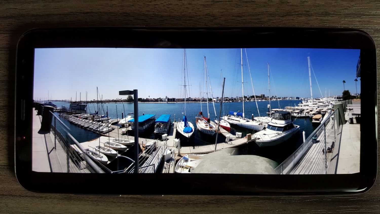
In the first image below, taken at a mid-level setting and moving at ~70 miles an hour, the wind farm comes out quite clear with separation among colors from the rich blue at the top to the white of the mills in the center (even considering the haze that muddies the contrast along the horizontal center) and the darker colors of the earth and road at the bottom. Minimal blur with good color even at speed. Below that, a few pictures from my trip to Monsterpalooza in Anaheim, and even in low light conditions there is still sharp contrast and detail, except when an area of the image was in competition from multiple light sources as can be seen in the sign to the right of Frankenstein.
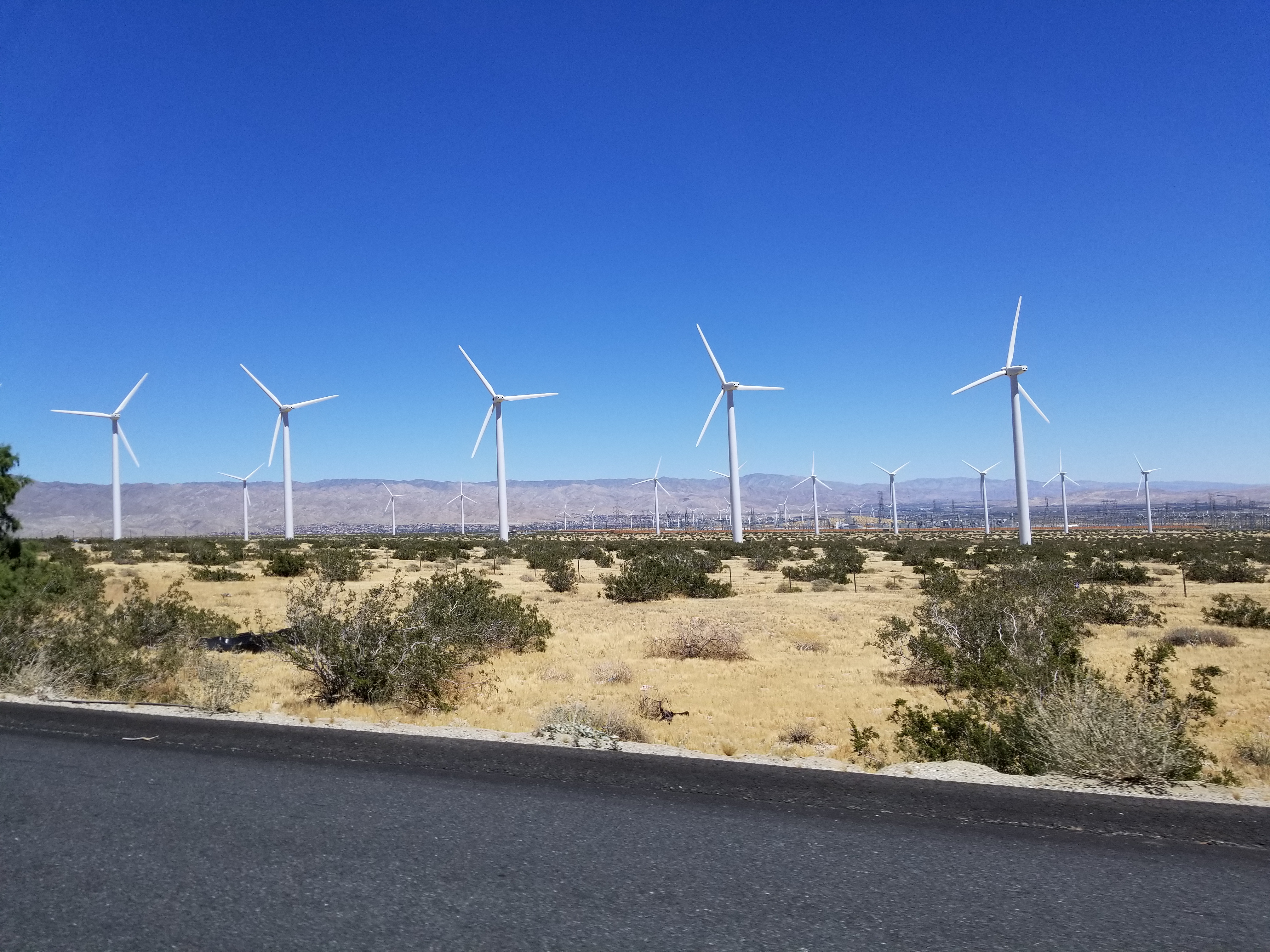
Wind Farm
-

- Horror Heads

-

- Frankenstein (note competing lights on sign)

-

- Captain Quint

-

- Nosferatu

Another aspect of the phone I really appreciate this time around is when a known or suspected scam call comes in, the phone displays the contact name either as ‘Potential Fraud’ or ‘Potential Spam.’ I don’t know what the difference is, and like to think I could guess it anyway, but there have been no false positives or missed calls because of it so far. Also note the beautiful 1080P screenshots the phone takes.

Potential Spam
I’ve been very happy with it so far. I haven’t had the chance to run it though its paces save for some movie streaming from my Plex server, which worked flawlessly, and with everything else it hasn’t hiccuped, stuttered, or frozen up yet. It doesn’t even get as hot. I’m still not thrilled about the lack of a physical home button, and once I transfer over all 13,672 files in my music library and see how it handles that in terms of performance and usability I’ll have a better idea of its overall capabilities. They’re also sending a complementary GearVR version 3, but every two weeks they inform me it will take six to eight weeks so I don’t know when it will get here, but with the S8’s USB type C connector, it won’t work with my old version 1, but I’ll update as soon as I can put it through it’s VR paces too.
IoT skills, deployment lagging behind expectations

Because I am teaching a project class in ubiquitous computing this quarter, I was struck by a post on the BPI (Business Performance Innovation) network discussing the results of a survey they conducted along with Nerdery and the Internet of Things Institute that states while industry does genuinely wish to adopt IoT strategies and deployments, they’re not happening as quickly as their enthusiasm might make it seem.
I can’t say I’m surprised by this. The most striking statistic as one reads through the report is that “…just 1.5 percent of executives at large companies say they have a clear vision with implementation well underway, while another 57 percent are either beginning implementation, have pilots underway or are committed and in the planning stages.” It’s the ‘clear vision’ aspect of this that is truly telling, especially when paired with the rest of the sentence. Immediately the question that presents itself is ‘If only 1.5 percent of executives have a clear IoT vision, how is it that 57 percent can be at various stages of design and/or implementation if they don’t?’
One clarification: In my class, and for the purposes of simplicity, we use Ubiquitous Computing and Internet of Things (IoT) interchangeably, however they’re not quite the same and I do let my students know that. The IoT is a subset of the concept of Ubiquitous Computing, the platform on which it’s enabled, similar to how the Internet is the technical foundation on which the Web operates. With that out of the way, the one issue I run into more than any other in this course is the belief of a small contingent of students that it should be a programming course, that they should be learning how to program sensors and the IoT protocols and whatnot. What I explain to them is that anyone can buy a book on how to program for the IoT; what they can’t buy is a book on how to think about the IoT. Like all technologies, IoT technologies can’t, as I tell them ad nauseum, be developed in a metaphorical vacuum. The technical issues of networking, the pragmatic issues of security and privacy, the enterprise issues of data collection and management, as well as many others, all must be considered as well when developing and deploying IoT strategies. After all, they’re not called strategies for nothing.
The second most common issue that comes up in this course is the question of what exactly the Internet of Things is. What defines it? What separates it from the regular Internet? Is that not an Internet of Things as well? How are they delineated? And where does ‘The Cloud’ fit in to all of this, if at all? Is that part of it? As is the case with all definitions, it can often depend on who you talk to. generally, in my class we define it terms of its low-power devices (sensors being the big ones) and lightweight protocols. However even in that case there can be disagreement and confusion. Do we need to make those delineations? The Internet is the Internet, yes? Do we need to divide it into TWO Internets, one for regular electronic devices and one for low-power sensors? What about our phones? Our TVs? They may be using Bluetooth but they certainly are not low-power, lightweight devices. And while this post isn’t meant to be about the technology per se, there are no fewer than twenty different protocols that can call themselves IoT protocols which has almost immediately led to standards overload. The image below gives and idea of this, although it contains both lightweight IoT as well as heavyweight regular networking protocols and where they fall in the TCP/IP stack.
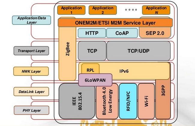
Some IoT and non-IoT protocols
And here’s this, for good measure, since we’re long past this moment in terms of the IoT. I rail against this all the time, but it never ceases to happen (and you should all read XKCD anyway):

Yep
True to this idea, The Technology Partnership in the UK states it should be called the Internet of Sensors, not the Internet of Things, since the Internet has always been an Internet of Things. A valid point, in my opinion, but then there’s also this. Let’s make up our minds, people!
And that brings me back to my introductory statistic. The linked article above has the following quote: “In my view, far too much attention is focused on getting the ‘Things” connected and not enough time is spent understanding the data insights that will actually drive the business forward.” That’s exactly right. Everyone is trying to figure out how they’ll get ‘things’ connected and get sensors out there and have an IoT strategy, but to what end? They’re so busy thinking about doing it that that they’re not thinking about why they’re doing it, what it all means, or if they need it, or how it will impact their business, or how it might impact their customers not just in terms of, say, improved customer service but also in terms of privacy and data collection and retention / distribution.
It’s important to take a step back and consider the gestalt of the IoT, and all the concerns and considerations that go along with it. It’s not a programming exercise; that’s just one low-hanging leaf on a vast tree of issues. I would hope that some people would be willing to take a step back for a moment, away from the headlong rush to have an ill-defined IoT strategy or deployment, and simply consider what it all means. We can all rush forward after that.
Animate your desktop
I’ve always wondered why we don’t have animated wallpapers for desktop machines. After all, if Android phones can have them, why not the big guys? There are valid, pragmatic reasons; they’re distracting, they drain system resources, and they can be hell on a laptop battery or other device that isn’t plugged in. But perfectly reasonable caveats don’t interest us, we know the risks, we want animated wallpapers, and now we can have them.
Incidentally, the idea of animating desktop elements has been around forever. Back in the early 1990s there was an add-on program for Windows 3.1 called Icon Hear-It that added animated cursors, animated icons, and additional sounds to the GUI. Of course, that early in the computer revolution, none of us realized how truly gaudy and resource-intensive all that nonsense was.
But a tasteful, animated wallpaper can make for an elegant display. I was going to talk about the way I do it on Windows 10, but I suppose I should also talk about Windows 7 and 8. Regardless of the version of Windows you are running, you’re going to need a third-party program; no OS offers animated wallpaper functionality. For the latter versions, there is a program by Stardock called DeskScapes that provides a selection of animated wallpapers, and even allows you to create your own from gifs, videos, or other animations. It’s not terribly resource dependent and ran relatively smooth on Windows 8 in a Virtual Machine.
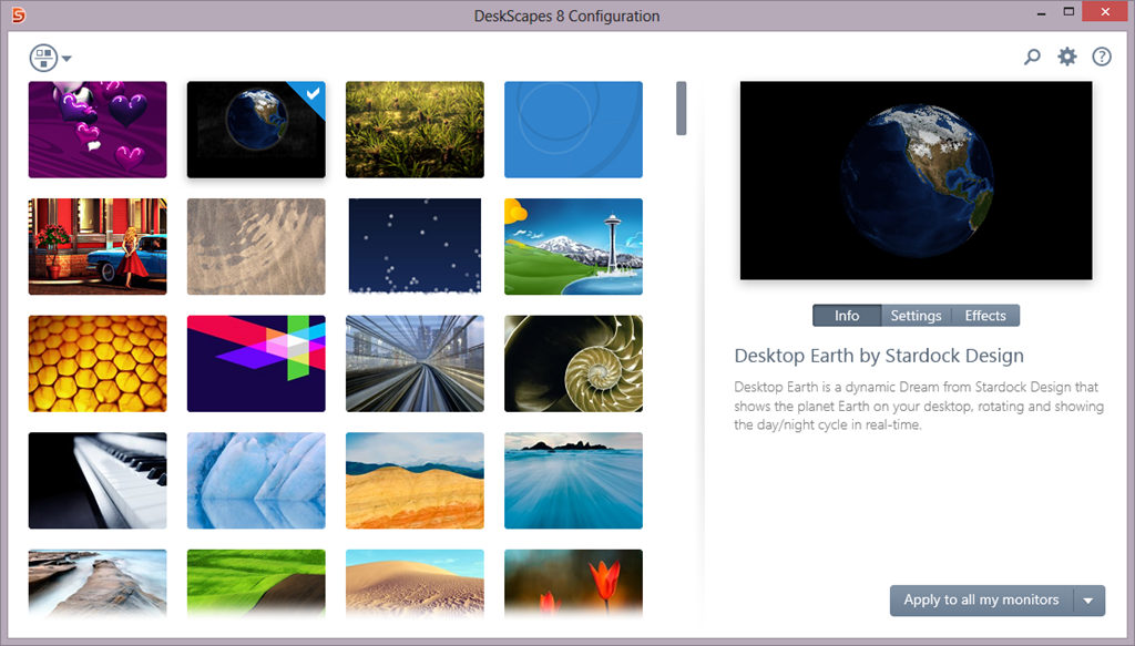
Stardock Deskscapes
I recently learned of another program, however, called Wallpaper Engine, that is (supposedly) designed to have a very small resource footprint, and is even available through Steam for a measly $4.00 (as opposed to DeskScapes’ $9.99). Another big plus for it is that some of its wallpapers support triple-monitor setups, which I have, so I wanted to look into it further.
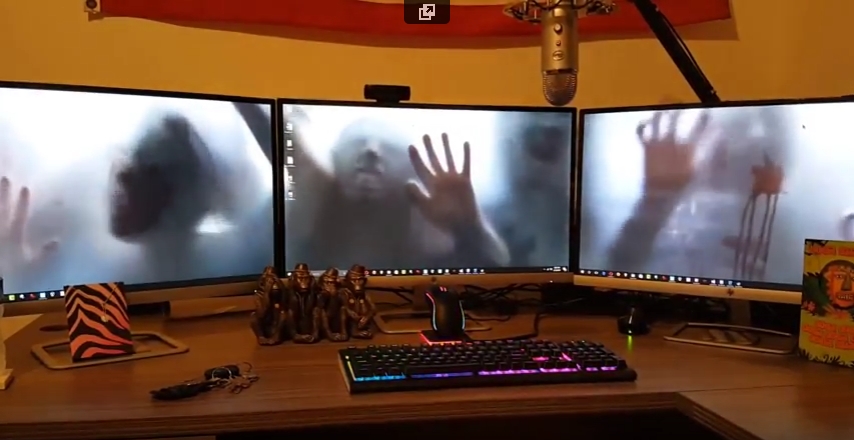
It has been working quite well so far. Interestingly, in my graduate design class this week we are discussing ethics, and it turns out that there are some ethically questionable ways in which this program can be used. For example: Of course the first animated wallpaper I downloaded was of zombies. But it turns out they’re not just any zombies, they’re from a video created by a company called AtmosFX (formerly Atmosfear), which creates videos to be used around Halloween by projecting them on a sheet hanging over a window or similar. They do have a lot of neat videos, I’ve considered using them myself and buying a projector just for their videos, and you may seen have seen some on display around that time of year at Spirit Halloween.

AtmosFX decorations
Apparently, AtmosFX has filed a complaint with Valve, who runs steam, and with Wallpaper Engine, stating that the background is copyrighted material and shouldn’t be downloadable for free with their program, although Wallpaper Engine didn’t provide it, only the capability to create it from existing video. Therefore, determining who is actually for the alleged copyright violation, if there is one, will be difficult. I suspect Valve will simply remove the offending wallpaper from the Wallpaper Engine workshop, however there are many, many, MANY more options for one to choose from, with the expected heavy emphasis on things like Anime and, you know, related things.
Here is a video of my three-screen setup running the zombies animated wallpaper. Also note: Not all wallpapers work across three screens, and I have had some real problems with scaling, in which Wallpaper Engine will only show the top 40 percent of the animation rather than scale it properly across screens. Single-screen setups and most dual-screen setups do not have this issue (as far as I can tell).
Journey with me back to the early days of the Internet with ReoCities, the GeoCities archive
In my graduate design class this week, the additional discussion topic (bonus, as I refer to it, although I suspect my students might disagree) involves the attempt to archive one of the early web’s most important communities. Indeed, I wanted to go back in time to the early days of the World Wide Web, circa 1993, and as a technology historian, indulge that aspect as well. The Internet, like me, was brought online in the glorious year of 1968, however it remained the domain of scholars and governments for over two decades before becoming available via the World Wide Web to the riff raff public and its clammy tendrils (by the way, ‘Internet’ is always capitalized, regardless of what the Oxford English Dictionary says). Remember also that the Internet and the WWW are not the same thing; the Internet is the technologies, hardware, software and protocols on which the web sits – the Web didn’t come online until around 1990. Getting back on track, to say design was at its nadir at that point would be a severe understatement; while interaction methods had been developed and attempted over the years (light pens, for example), that was by specialists in specific domains, and when I say specialists I don’t mean interaction specialists, I mean engineers and programmers, but now web design was about to be attempted by everyone.
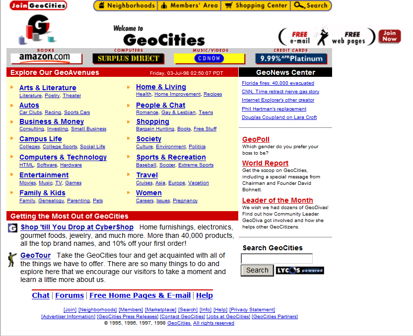
When everyday people began to experiment with what the Web offered, they did so from an adventurous, new, exciting perspective. Interaction methods, organizing elements, color, layout, usability, nobody cared about this stuff, we were amazed at the accessibility of it all. We hadn’t even learned it was bad form to hotlink images! Almost none of the technologies, platforms, infrastructure, anything, really, we have today was available back then other than base protocols, and even those have evolved significantly. But one thing we did see, very early on, was a foreshadowing of the idea of a web 2.0, in which user generated content and communities guided the growth of one particular website far beyond what anyone expected. Before the design disaster that was MySpace, anyone who was anyone cut their teeth on GeoCities.
GeoCities page
Everyone knows GeoCities was the equivalent of a design traffic accident with its animated gifs and auto-play MIDI tunes (and was the inspiration for the landing page for this very course), but that’s looking at it through the-opposite-of-rose-colored glasses. We know that *now.* Back then, the ability for anyone to have a presence online and represent yourself immediately all over the world was almost too much to process. No one cared about design, they just wanted to create. As anyone now looking at a GeoCities page could tell you, design would come later. Much later.
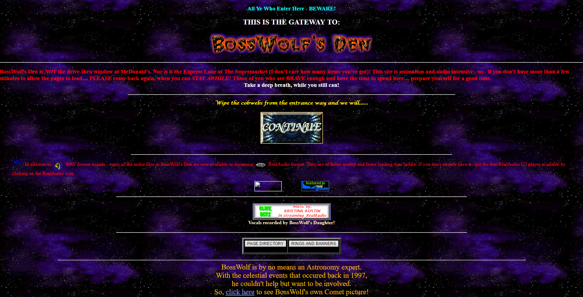
BossWolf’s Den
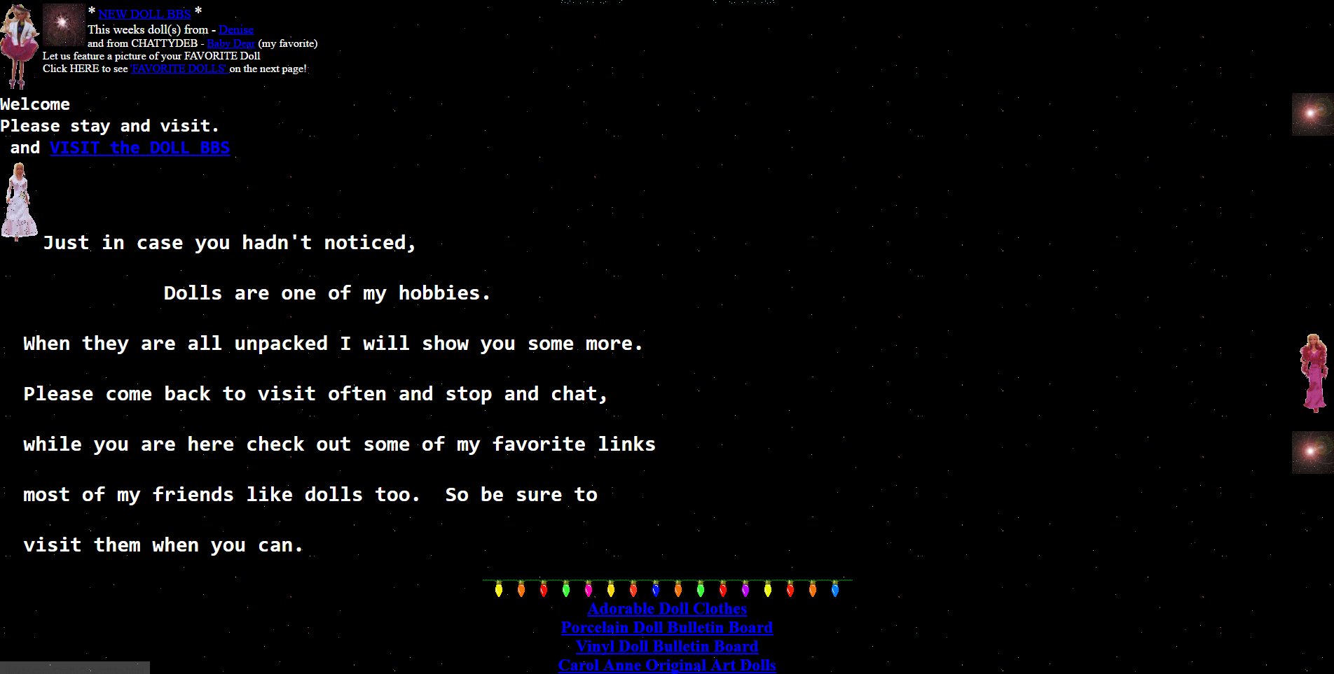
GeoCities divided their content up into towns, each of which represented a particular interest. Whether it was fantasy, health, sports, the arts, or whatever else, there was a neighborhood for it where a community of like-minded individuals could set up a shingle, as it were, and have a presence…perhaps even make some new acquaintances or even friends with the same interests.
The site’s growth and eventual buyout by Yahoo and unavoidable death is beyond the scope of what is intended to be a design history, however it is a fascinating story and very interesting if you get the chance – you can read about it on this Computer History Museum page (look at that GeoCities landing page!).
Instead, this long narrative is to let you know that you can still experience GeoCities in all its poor-design glory thanks to the project known as ReoCities. They have archived millions of pages from GeoCities, and while the usability leaves a lot to be desired, it is a fascinating look at web design back then, and looking back through time at these pages I feel like an astronomer looking back in time at a star. It gives a frozen-in-time glimpse into not just where we were, but how far we’ve come. I used ReoCities for all the screenshots in this post.
GeoCities Page
I have to be honest, some of the pages are difficult to view, the design is that wacky. In terms of expression, in terms of digital explorers mapping out a new, unexplored land, however, it’s mesmerizing. I can’t tell you how long I spent not only exploring the myriad pages archived by the service, but seeing how many of the external links still worked (not many, although some GeoCities page redirect to a proper hosted site; very smart), and even doing some research to see if any of the people or organizations are still around and updated their web presence. It was a pleasant surprise to see some of them actually had!

Friends
It’s a really fascinating time capsule not just of early web design, but also of where the web was its infancy. Seeing how design has changed, what was considered acceptable design back then versus now when we have so many rules and standards and guidelines is enlightening. And if, on the off chance, you have a link that points to a GeoCities site that they’ve archived, a simple letter change can update your link!
I’m a big fan of historical preservation of digital property (archive.org is another glorious monument to what was). Start your wayback voyage to GeoCities over at ReoCities.
My Carnegie Mellon rec letter submission adventure
Try saying *that* three times fast. Also, keep in mind that Carnegie Mellon is actually a prestigious and well-respected university and dersrvedly so. That’s why the story I am about to regale you in is so bizarre. It just keeps falling down a HCI rabbit hole form which it never escapes.
I had originally intended to post something different for this week’s random design example, however yesterday I was asked to submit a letter of recommendation for one of my former students to Carnegie Mellon’s MSIT eBusiness Technology graduate program, which by itself is a mouthful.
No problem; I have done many of these before. Little did I realize that I was going to be in for an adventure.
Right off the bat, it had me submit my letter, which had to be either in Word or pdf format, which was their restriction. I uploaded a Word document, and was told that format was not valid. I converted it to pdf, and that worked.
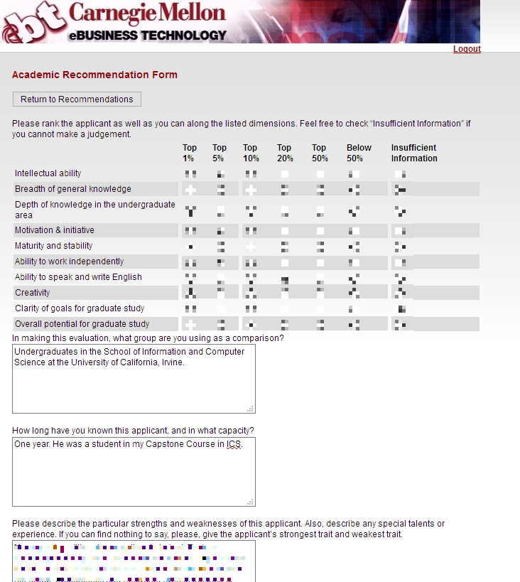
Next, I was asked to fill out some pseudo-Likert-scale questions which is common, and at the bottom of the page was a button labeled [Save Info], as seen below.
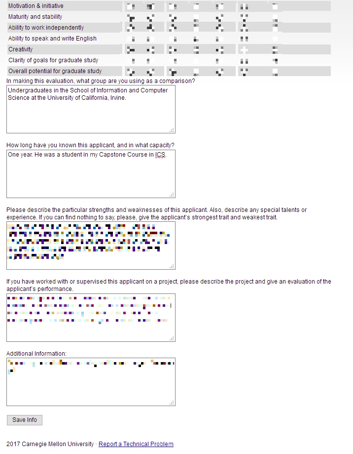
Save info button
The thing is, when I clicked that button, it just reloaded the page, putting me back at the top with a button labeled [Return to Recommendations]. No submit, no send, just…return.
Clicking that took me back to the main page where I started, and where it still said “Select a student to provide a letter of recommendation.’ But I had already done that, and in fact it indicated the submission date right underneath, next to the student’s name. I received no confirmation, no clue as to the status of the application, or whether it had actually been completed and gone through. How many of Neilsen’s or Schneiderman’s rules does that violate?

So, being the person I am, I decided I would click the link labeled ‘Report a Technical problem’ at the bottom, not minding their free-spirited use of capital letters. Doing so took me to a page that declared in bright yellow highlighting ‘Invalid e-mail address.’ Keep in mind I had not entered an email address, I only clicked the link. Did something happen I’m not aware of? Which e-mail address, if any, is it considering to be invalid? Could it even be the one to which the form submits? On top of that, the text box is red! This just gets better and better.
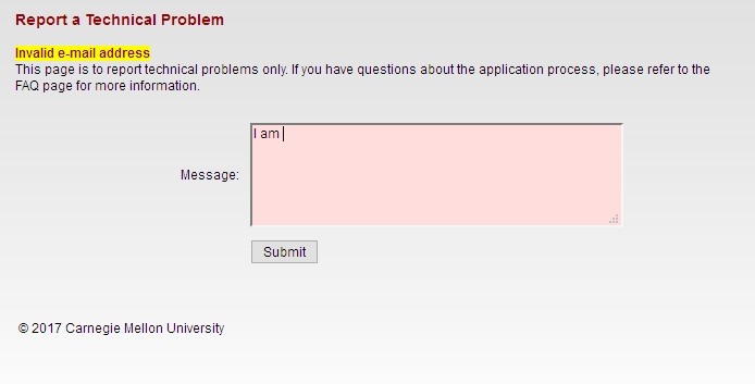
Is that a red (pink, actually) text box?
To top it all off, the message I entered in the red text box above ultimately got sent to…you guessed it…me.

Well hello there
I sent another email to a contact email I found on the main page, and the follwing day received a response that all had gone through. What a travail. This was the most excruciating recommendation process I’ve ever experienced. I expect more from such a prestigious university as Carnegie Mellon. At least it made for a good learning experience for us all.
(Originally written for my graduate Advanced Design and Prototyping course at UCI).
I guess no one tested this
Some rules for interface design: Don’t allow users to make obvious errors, don’t provide them the means to make errors, limit their choices to only the ones that are relevant (or even correct), provide them flexibility within the confines of their task or goal, don’t introduce unnecessary complexity or redundancy (in terms of information or elements – the arrows I’m using in the video have no reason to exist), adhere to accepted conventions, and that’s just to name a few. How, then, did this travesty of a birthdate entry form come into existence? Who bothered to spawn it, and why? How bad could it possibly be? See for yourself, and marvel at what it provides.
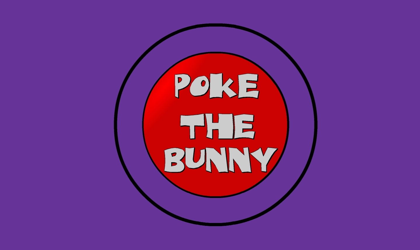
Poke the Bunny!

Before I get to the main thrust of this post, it’s important to provide some perspective for those unfamiliar. As you all should know, my Ph.D. is in Human Computer Interaction, my undergrad in Cognitive Psych, I teach multiple interaction design and interface development and analysis courses (game design as well!), so when I see a well-designed interface, or anything that’s inherently usable as a result of its construction, it just makes me feel all giddy inside.
What, then, is a good example of a well-designed interface? I’ll show you. It’s an example I’ve been using for some time, all the way back since it was a Flash animation on a website called platinumgrit.com, which was a showcase for an Australian Flash animation series. The site is long since dead, or more appropriately, dormant, but it once hosted what I consider to be the best, most pure example of interface design I have ever seen. In fact, I was reminded of it because of a conversation thread on a message board for my graduate class in advanced design and prototyping.
It’s called, no joke, Poke the Bunny.
Push it!
Before I show you the rest of interface and give away the surprise, let me explain why it is so good. One of the cardinal rules of interface design is clarity; speaking clearly to the user. Don’t label links ‘click here,’ don’t label buttons ‘push me,’ don’t call an error ‘error 0x14323929.’ State what the user can do, and make it clear what the consequence of that action will be. Of course, cardinal rules are meant to be broken since so many interfaces break them.
But not this one. The interface is comprised of exactly three elements. The first element is a graphic of a bunny that frankly looks pissed off. The next is a fist with an extended pointer finger aimed squarely at the bunny’s backside. And the third element is a button labeled ‘Poke the Bunny.’ It is clearly labeled in reference to its action. It leaves no doubt or question in the mind of the user what it’s function is and what will happen when you push it. Not only is it a beautiful example of interaction design, there is such a direct link between all the elements on the screen that the role of each is immediately apparent, specific, and isolated. It’s the most pure interface I’ve ever seen.
Not only that, the effectiveness of the action/response is very satisfying. Because it’s easy to use, obvious to figure out, impossible to get lost, it makes the actual use of the interface, even though it has just a single interactive element, a joy to use. Even though all you’re doing is poking the bunny, the nature of the design combined with the absurdity of the situation make it oddly addicting and fun. And that is a desirable goal for an interface; You want it to be fun, exciting, enjoyable, interesting, educational, all the positive aspects that make people feel good should be elicited from your design, And in this case, it is. it’s just plain fun.
(There’s also a surprise, though, if you work for it).
And it’s available on Android! As I mentioned, the site has been sadly dormant for some time, however I was overjoyed to discover that if you have an Android phone you can download it from the Play store! There used to be a version for iOS, however I have the sneaking suspicion it’s no longer available (although I don’t know. If anyone can check I’d appreciate it). It’s a shame if not; it’s a brilliant example of exactly how an interface should work.
The Android version isn’t quite as exceptional as the original Flash app; the skeumorphic nature of the button isn’t there, the font is unnecessarily cartoonish, and sound isn’t quite right. Still, the pure core of the interface is rock solid.
So with all of that fanfare, I present a video of Poke the Bunny recorded off my very own Note 5. If you’re on Android (or iOS and it’s still available), then download it and give it a try. You’ll be hooked, I promise. Poke the Bunny!
Fixed! Or maybe not.
UPDATE: The error returned, so I restored a backup and recreated this post and the previous post. As sheer luck would have it, I had this site opened in another browser pre-backup, so I just copied the posts over from there. I’m not sure what is causing it although I am certain it has something to do with image caching. I will continue to investigate.
ORIGINAL POST:
One of the longstanding issues I’ve had with this site is that it is slow to respond and slow to load. Sometimes it’s very slow. My host, GoDaddy, is a great host and always very responsive, and even convinced me to upgrade my service but it never helped.
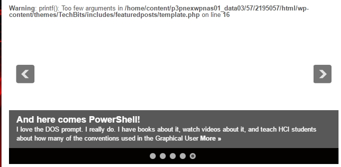
Recently, we determined it was a problem with image caching, and they suggested I do some back-end general caching to speed things up; it’s the first bit of bad advice they’ve given. I installed a plug-in that claimed it would do that, and the reviews were good, and it had 50,000 installs, so I thought ‘this seems ok.’
It didn’t improve performance, but at least it borked my featured post slideshow up there at the top as you can see in the header image. What was especially strange is that I couldn’t access that file mentioned in the error through the WP CMS editor; I would have had to download it via ftp, then edit and reupload it the same way. Luckily, rather than go in and edit the source, which can lead to further, much more significant problems, GoDaddy was able to restore a recent backup. Not only that, since I already had my most recent post – which was lost in the backup – open in another browser, I just copied it over and here we are! It’s still slow to load, but faster than it was, so we’re moving in the right direction.
Apparently I can do the backups myself if I wish (edit: I just did!), so next time there’s and error I’ll likely do that, although it will take some learning since I have to do it through my account page with my hosting provider. Anyway, crisis (not quite) averted, everything is working again.
I am completely OK with this
Now this I have no problem with whatsoever, although it hints at a larger issue. Researchers at University College London have discovered a dormant but massive Twitter botnet comprised of an estimated 350,000 fake accounts that does nothing but tweet out random quotes from Star Wars novels.
They discovered it quite by accident while taking a pure random sample of English-speaking Twitter accounts. It’s important to note the importance of this sampling method, as other methods of sampling might bias the results in favor of those accounts that are more active or have more followers. Their one percent sample resulted in approximately six million accounts.
Once their random sample was complete, they plotted the geographic distribution of these users, and they discovered something curious. Many of the tweets formed an almost perfect rectangle along latitude/longitude lines, including open, uninhabitable places like frozen tundra and bodies of water. They conjecture the shape was deliberate to mimic where English-language tweets are most likely to originate, and hide them within the clutter of legitimate Twitter users Tweet flood.
Upon further investigation, the researchers found another surprise. All these Twitter accounts did was tweet out random passages from Star Wars novels. They also never retweet, they send out very few tweets (around ten total) and list ‘Twitter for Windows Phone’ as the tweet source. As much as I hate to say it, that is also likely a ploy to get them to stay under the radar as much as possible because of that platform’s significantly low user base.

It’s not Twitter, but Darth Vader actually posted this on Instagram. Seriously. He doesn’t even care about that stormtrooper behind him.
Using a machine-learning word association approach (a ‘classifier,’ although classifiers are not limited to word association), it found that actual users had a very wide distribution of word choice, while the bots used words almost entirely related to Star Wars. Additionally, the platform percentages were evenly distributed for the most part among real users while the botnet was one hundred percent Twitter for Windows Phone. When the numbers are examined, the botnet is easy to see.
The authors then discuss the implications. Clearly, a dormant, low-activity Star Wars-themed Twitter botnet is not a big deal. However, if the creator decided to reactivate the botnet in order to create a spam network, send malicious messages, or use it for other nefarious purposes, they could. I personally don’t believe that will happen as it likely would have already, however as the authors also note, the botnet went out of its way to stay under the radar.
One of the things I find most interesting about it all is that the authors hint they found another, even more massive Twitter botnet using the same approach, which they will be reporting on at a later date.
Really interesting stuff, and touches on the impact of social media, machine learning and AI, cybersecurity, and geolocation/geotagging just to start (as well as the curious motivations of this particular botnet’s creator). I very much recommend giving it a read.
I am not ok with this

I have nothing against delivery, not all. Especially food delivery. I don’t utilize it that much, but if others do more power to them. What I do have a problem with is Amazon getting its clammy tendrils in yet another industry.
I received an email letting me know that somehow Amazon has partnered up with local restaurants to deliver food to my house, and the link took me to the page you see in the title image. To borrow the headline from my previous post, “Why Not,” right? For me, it’s because I have a great fear of Amazon simply taking over everything to the point where we’ll never need to leave our house again. We already worry about immobility, isolation, lack of exercise, conversations using technology instead of speaking face to face, etc., and Amazon’s ability to cater to your needs plays a large role in much of that. They can deliver everything we need, so why do we need local stores, or malls, or movie theaters, and now restaurants? We’ll no longer need to go outside because Amazon will just deliver everything straight to our door. Need shoes? Shampoo? A movie? New SD card? Guitar Strings? Ken doll? Oil filter? Even groceries or gourmet food? Don’t leave the house! Order from Amazon! Never mind local shoe stores, drug stores, theaters, tech retailers, music stores etc. will wither and die under the might of Amazon, something we’ve already seen with Border’s, and that’s only one.
I should also add that I am very aware technology can help with much of those issues as well. In fact, if you’re going to be home anyway, order exercise equipment, a protein shake and pedometer from Amazon!
Back to restaurant delivery. If restaurants want to offer a delivery service, I’m all for it, although I prefer to actually go to the restaurant, or at least do carry out. It’s nice to stand up from my chair every once in a while. Even after the rant in the previous paragraph, I should add that I use Aamzon. They have good prices and and an almost limitless selection; the WalMart of online retailers. And therein lies the concern: just as WalMart has been responsible for the death of numerous local businesses, so it goes with Amazon as seen in both the previously linked article.
Again, I use Amazon occasionally and have nothing against the idea of eCommerce. I will, however leave you with this image from Wall-e, and hope it never comes to pass, no matter how much Amazon tries to ensure it does.

Wall-e