Category Archives: Reviews
Returning Home: World of Warcraft Classic Comes Online

On August 26th, fans of the original World of Warcraft (henceforth referred to as WoW), and those who are just curious to see what all the hubbub is about, were finally able to re-experience the original game as it was when it first came online back in 2004, now colloquially known as ‘vanilla’. And boy did Blizzard deliver, complete with massive queues, disconnects, and crowding. But they have also provided what many people have been asking for for many years: The authentic and original WoW experience.
World of Warcraft was first released in 2004, a Massively Multiplayer Online Role Playing Game (MMORPG) in the vein of Everquest and Ultima Online before it. However WoW streamlined the gameplay process and created something accessible, that anyone could play, and eased players into the experience without being overwhelming. It was an instant, massive hit, and has continued to be a juggernaut even to this day. Attempts to topple it, even using popular franchises with similar gameplay such as Age of Conan and Star Wars Galaxies, couldn’t come close to WoW’s success.
In the game, there are two main factions: The Horde, comprised of Orcs, Trolls, Tauren, and the Undead, and the Alliance, comprised of Elves, Gnomes, Dwarves and Humans. Depending on your race, you could be one of several classes: A paladin, mage, warlock, rogue, warrior, priest, druid, hunter, or shaman, each with their own unique abilities and approaches to gameplay.
As the years went on, WoW evolved. What started out as a world with two continents, eight races, nine classes and a tight story to tell, ended up as what many consider to be a mess in terms of overly-streamlined gameplay (e.g.: quest markers and highlighted objectives / objects), homogeneous races and classes (e.g.: many classes were limited to certain races, but now that’s generally not the case; anyone can be anything. Another example: Undead could ‘breathe’ underwater, now anyone can breathe underwater for a comically long time), and simplified specializations that don’t allow for really exploring a particular class.
Combine that with the original story of the Horde V. the Alliance morphing into them working together and sharing quests and zones, a rambling main story with red herring side quests and endless grinding with things such as daily quests, as well as a confusing world structure (A new capital city, Dalaran, now has two separate locations in the game: One in Northrend and one in the Broken Isles. It’s the same city, but in two places, although there is lore for that), and people started to get weary.
Not that it was all bad, mind you. The ‘Mists of Pandaria‘ expansion, which introduced a continent known as Pandaria based on Chinese lore, along with a race of humanoid pandas known as the Pandaren, and the new class of monk, was very well received. Additionally, flying mounts and pets of many types became available as nice additions. But overall, the gameplay itself, the core experience, lacked.

Mists of Pandaria
While all this was going on, something known as private servers began to appear. These were privately run WoW servers that there recreated that original version of the game as it was when it was first released. There was no charge, and people flocked to them. The largest was Nostalrius, which at its peak had, according to Wikipedia, 800,000 subscribers and 5000 – 8000 concurrent players. Blizzard hit them with a cease & desist order, but the coverage of that was severe and intense, and it appeared that Blizzard noticed. I myself played on Nostalrius, and wished it to continue. An interesting aside about it is that when I dowloaded the client, which had to be done as a torrent, I was immediately – while the download was still happening! – sent an email from Cox telling me they had received an official complaint about my IP from Blizzard stating I was pirating the game.
But I digress. Blizard may have noticed, but also said very publicly during a live conference, that ‘you may think you want vanilla WoW, but you don’t.’ They had to eat crow on that, but they did so with grace and humility, and I respect them for being good about it.
They eventually announced that would be creating a classic WoW experience, and it finally came online August 26th, 2019.
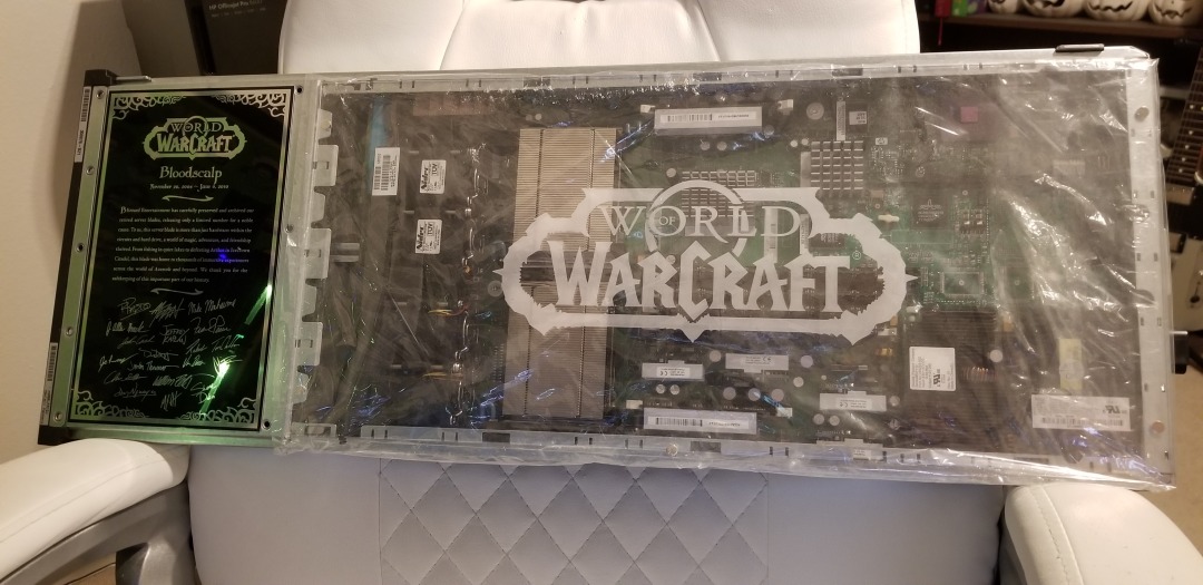
I was excited for this too. Seeing the announcement of original WoW gave me chills. I loved original WoW, and was even in the beta so many years ago. It’s strange, because as I would read magazine articles and online posts about it, I didn’t have much interest. I heard the beta was coming and thought ‘why not?’ Well, it turned out to be lifechanging. I’ll never forget creating my first character, an undead warlock of course and of course on the server named ‘Bloodscalp,’ and venturing out into Deathknell, the undead starting zone. The purplish tint of my shadowbolt, the civilized undead, the unique, not-quite-cartoony but surprisingly colorful and detailed environments, and as I would eventually learn the incredible backstory and unique races, including the Native-American styled large bipedal bovines known as Tauren, a really unique offering for a game of this type. So much did I love it that I bought the Bloodscalp server on which I used to play when they were retired for an upgrade.
Eventually, though, after years of playing, it was sadly no longer the game I remembered. I stopped playing for a good number of years after I heard someone yelling in general chat that if they wanted to group with him for a raid, they ‘SHOULD LINE UP FOR GEAR CHECK’ and ‘DO NOT WASTE MY TIME’ and ‘KNOW YOUR ROLE AND DON’T ASK QUESTIONS.’ Remembering how the game was when it started, how everyone was incredibly helpful and pleasant, that one jackass really discouraged me, and he wasn’t even talking to me. That was after a couple of expansions had released, and for those of you familiar with the game it happened in Shattrath, a city and storyline I just could not get into anyway, and I logged off that moment and didn’t play again for five years at least.
Not only were these hardcore players becoming more common in current WoW, enemies became easy to defeat, everything is signposted, there’s no sense of accomplishment or earning your way, and the story, for me anyway, was just confusing and I couldn’t figure out what was going on. Original WoW does not hold your hand in any way; it’s unforgiving, and expects you to read the quest text and figure out what to do. When it was announced, to paraphrase an infamous in-game proclamation, I was definitely prepared.
There was some drama leading up to the event that I myself was caught up in. It was announced that two weeks ahead of release, players could log in and create / name their characters. I have characters I have played with for FIFTEEN YEARS. When I logged in to create my characters on the Whitemane server, which was my server of choice as it is PvP and PST, I was hit with a 45 minute queue and by the time I managed to get in all my names were already taken! Wheels was the name I desperately wanted, and I made numerous posts on the classic WoW reddit sub and in the Whitemane server sub as well asking if the person who had it would be willing to trade or even sell, but no luck. I ended up with Kneecap, which I actually like, but it’s not Wheels.
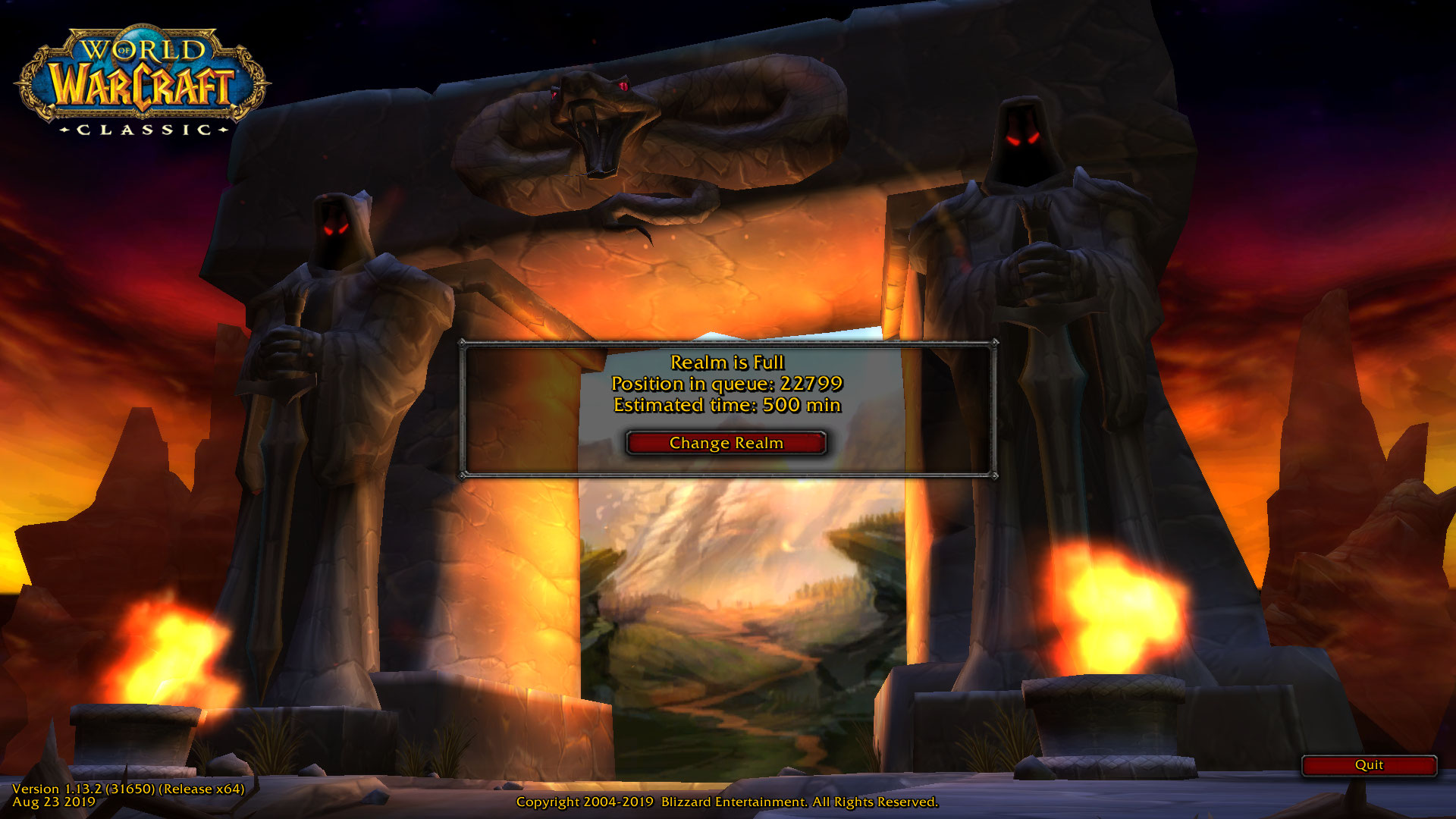
Well, once the servers came online, while waiting in the ENORMOUS Whitemane queue (see image below), I just happened to also be in the classic WoW Discord watching the live feed of people trying to get in drama when I saw a post shoot by stating Blizzard would be bringing three new servers online, including a PST PvP server named Smolderweb. Smolderweb! I liked Whitemane, but Smolderweb was far more badass than I could have hoped, so I waited. Waited…waited…and the second it came online I pounced, created all my characters, and got all the names I wanted! I couldn’t believe my luck. There was also no login queue, I got right in and grouped up with some great people and had a blast running around the troll / orc starting area. Players even lined up for specific quest targets in a very orderly and polite way. Everything ran very smoothly, there was absolutely no lag, and I couldn’t have been happier with the experience.
To be fair, I saw posts that showed the Alliance also lined up for their quest objectives, so it was good all around.
I find it telling that even though this is no longer WoW easy mode, and that everything has to be worked for (your first ten levels will be hard, until your class specializations start to kick in, and then it will be less hard but still hard), I’ve had the most fun I’ve had in WoW for many, MANY years, and I’m very glad to be back in the world that I left so long ago.
My experience with the Lifx no-hub smart light

Note: Review follows video
Disclaimer: I have no connection to this company, in fact never heard of them until about four months ago. They didn’t ask me for this review, they didn’t pay me, didn’t send me the bulbs, I bought them on my own, this is all my own opinion, as it always is.
I recently needed to get a smart light, one I could control remotely. You know the kind of thing; turn it off and on once in a while, make it look like someone’s home, give the illusion of life. The thing was, I had never looked into these kinds of lights too deeply, and I still haven’t so this isn’t a condoning or condemnation of other brands, but rather my impressions of the one I ended up getting.
I went to the local Best Buy, a store I rarely visit, because I knew they had a lot of them and I was going to be shooting into the wind. My need for this light happened rather suddenly, so I didn’t have time to research and just went in blind. I looked around at the options on display, from well known brands like Philips Hue and lesser known brands like Sengled. At least I think the latter is lesser known..I had never heard of them, but they have a lot of options, and to be fair I’d never heard of the brand I ended up deciding on either.
The issue I have with most of these lighting systems is that they require a hub, or as Philips refers to it, a bridge. I explicitly did not want that, as I was only intending to get a single bulb; no need to complicate it. That’s why I ended up taking a chance on another brand with which I was unfamiliar: Lifx.
Let’s just get this out of the way right now: I had no idea how to pronounce that. “Life-x?” “Liff-x?” No clue. After some Wikipedia-ing, I discovered it’s “Life-x,” and it’s a company that grew out of a successful Kickstarter campaign. I chose them because they do not require a hub and offered the basic functionality that I needed on short notice, and it turned out to be a good choice, with some important caveats.
The specific model of Lifx light I decided on was the Mini Color, which advertised a light output of 800 lumens. That’s pretty good; many LED lights advertise themselves as the equivalent of some wattage, but their lumens are absurdly low, sometimes rating at 300 or 450, which is very dim. 800 lumens is the actual equivalent of a 60-watt bulb, and that’s exactly what I was looking for.
I also liked the fact there was no hub. I wasn’t looking to set up some centrally-controlled network of devices, I just wanted a light bulb, and Lifx fit that bill. In fact, if I recall correctly, it was the only one that did; all the others required some kind of central device to which they would connect, yet since IoT devices like these form a mesh network anyway, the need for a hub when simply using light bulbs just isn’t necessary.
I took it home, screwed it in, and was guided through a relatively simple process (on Android; I can’t speak to IoS) to connect my phone to the light and the light to the network. Once that was complete, I was up and running.
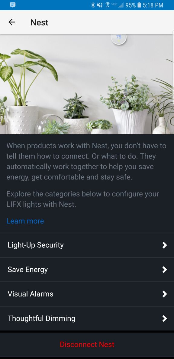
I only wanted to get a light for a garage, but once it was set up I couldn’t help but go through the options available to me in the app. There are four separate screens for normal operation: ‘Colors,’ ‘Create,’ ‘Effects,’ and ‘Day & Dusk.’ There is also a main screen from where you can access groups, Nest integration, IFTTT features, as well as some other integrations and even buy more lights.
I discovered there was much to like about this bulb, and the more I experimented with the app the more pleased I became, even though I had no real need for any of the more esoteric features. I’ll start with the app’s individual feature screens and come back to the main page at the end, because one of the major issues I have manifests there.
The first screen, ‘Colors,’ actually gives you two choices: You can control the white temperature of the bulb, measured in Kelvin, which ranges from a very cold, blue 9000K, like the blue LEDs you see in icicle lights around the holidays, to a very warm 2500K that represents the more amber tone of an incandescent bulb, or even a candle. Incidentally, I know that the higher temperature is referred to as cold and the lower warm, but that’s just the convention here. Also, the ranges this light bulb offer are way past the choices you normally have, giving a much wider set of options for temperature.
You can select the color temperature by spinning a wheel of temperatures, as it were, to select the temp you’d like. It’s very easy, however it’s also discreet selections, so choosing along a continuum isn’t available; you’d have to do that on the actual color screen discussed next. Not only that, when switching between the coldest blue and warmest warm, a sort of amberish, yellowish hue, the bulb flashed a BRIGHT yellow, which was curious.
Even with the choices it provides for white temperature, I still didn’t find the warm setting to be terribly accurate in terms of its similarity to a warm incandescent, or standard bulb. It isn’t bad, and it’s bright, but it still comes off as artificial. The cold temps, though, the blues, holy cow: They are BLUE. If that’s what you’re looking for, this bulb delivers in spades.
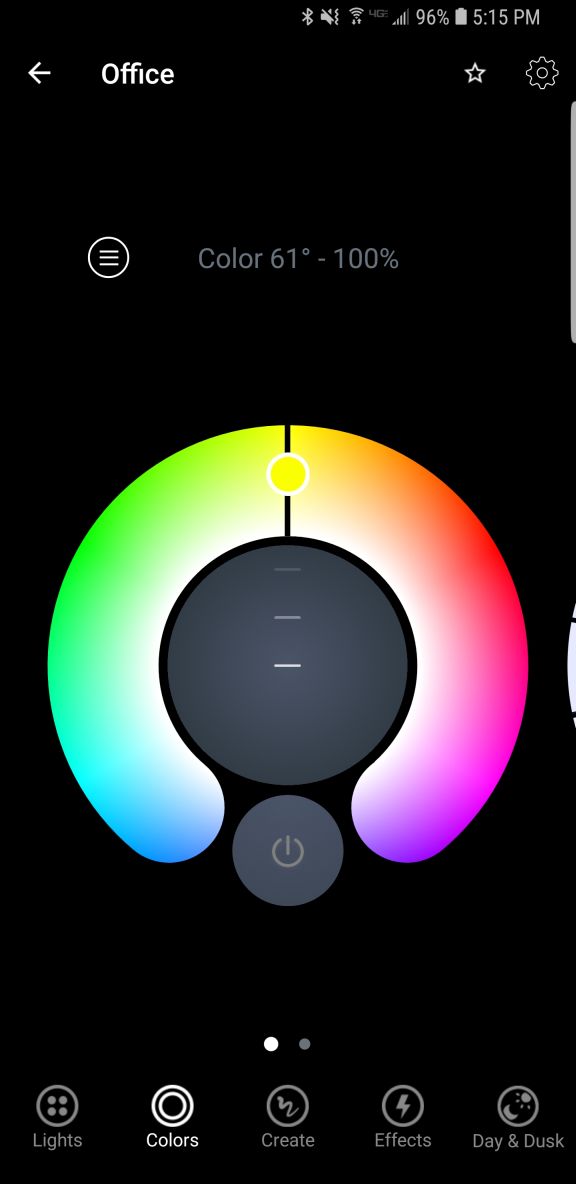
If you are feeling more festive, a Tinder-esque thumb-swipe to the right and you can select from a range of actual colors. It works the same as the white temp screen, by rotating a hue wheel and determining the saturation of the color you select by adjusting a slider on the color wheel. It’s ingenious, really, in its simplicity: Rotate the ring to the color you want, slide the slider to select intensity, and that’s it. It’s very responsive, easy to make adjustments, and easy to use.
Another nice thing about these screens is that you can dim the light from them as well, using a simple slider. It dims quite far, something not all LEDs can do. Normally, a light bulb dims by reducing power to it, but LEDs can often only dim to about 10% before being cut completely. The Lifx app claims the dimming goes to 1 percent, but it doesn’t look like that to me, although it does seem to dim further than most other LEDs.
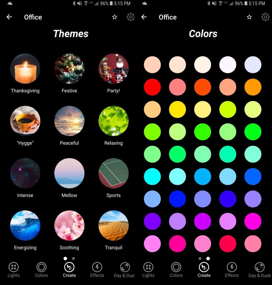
The next option, ‘Create,’ I don’t use that much. It’s misnamed, as you don’t actually create anything here but select from pre-designed themes such as ‘Relaxing,’ ‘Energizing,’ ‘Peaceful,’ and ‘Powerful,’ the image for which is a tropical sunset for some reason. Doesn’t quite match up with Powerful but it’s a minor issue. There are others, and selecting one just changes the color of the light to match up to what I suppose will enhance the chosen mood, and you can change these in a different screen. The second screen under ‘Create’ is just a matrix of colored circles in a ROYGBIV arrangement that you can choose, although I don’t know why you would use this as opposed to the color wheel. Perhaps if you just wanted, say, pure orange and didn’t want to have to make fine adjustments to get it.
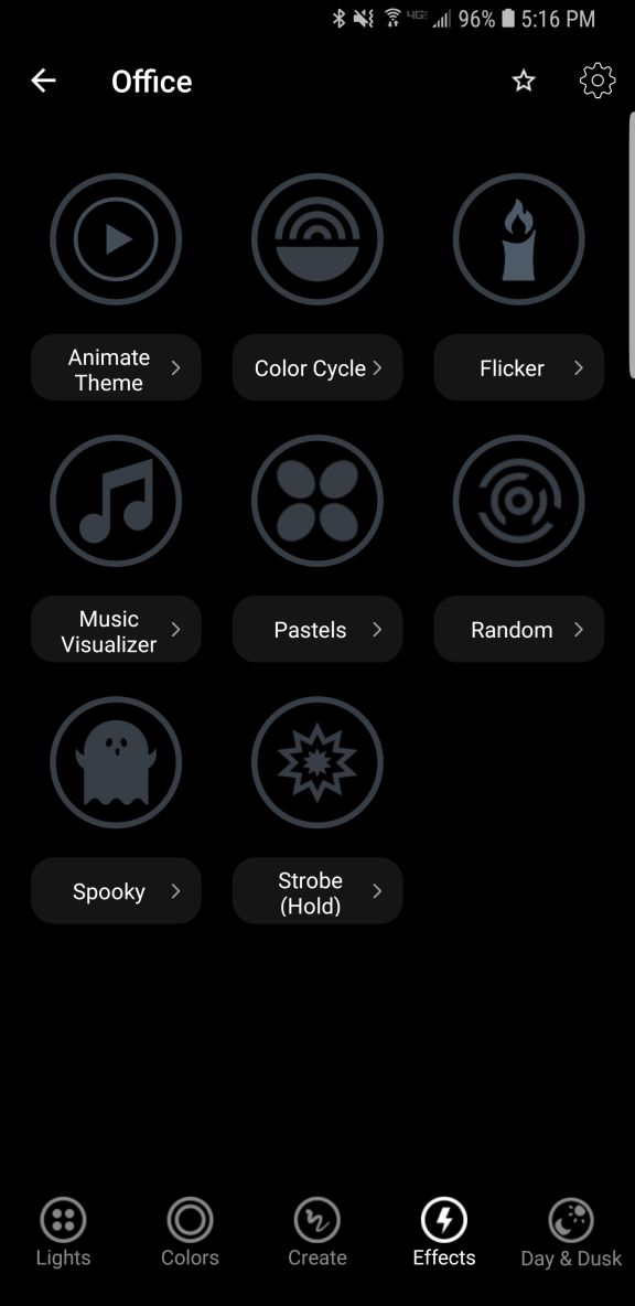
The next screen, ‘Effects,’ is my favorite because of one in particular. There are eight effects to choose from: ‘Animate theme,’ which allows you to modify themes from the previous screen, ‘Color cycle,’ ‘Flicker,’ ‘Music Visualizer,’ ‘Pastels,’ which I would never, ever use, ‘Random,’ ‘Spooky,’ and ‘Strobe.’ Because of the potential health issues that come with strobe lights, you have to hold that one down to use it.
They’re all self-explanatory, but I have to highlight one and call out another. I loved the ‘Spooky’ effect: Being a fan of horror movies, this one emulates the horror movie trope of the abandoned hospital or car park that has the flickering, randomly flashing light. When selected, it flashes the light randomly for 60 seconds (the minimum, which I REALLY wish could be shortened), then go bright red, then turn off. Beautiful. The big problem with it is that when controlling a grouping of two lights, the ‘Spooky’ effect only worked with one light, even when controlling them as a group. That needs to be fixed.
‘Music Visualizer’ is the one I have to call out. It flashes the lights all over the place when it hears noise, monitored, as it claims, through the phone’s mic. However, when I shut off all music and all sounds, and covered the phones mic, they still flashed randomly. Also, while testing using songs with a heavy rhythmic component from AC/DC and Metallica, the lights flashed randomly, not rhythmically. Therefore, I can only surmise that it is not actually monitoring the sound and just making random color changes. That’s a shame if true, because a visualizer would be a neat feature.
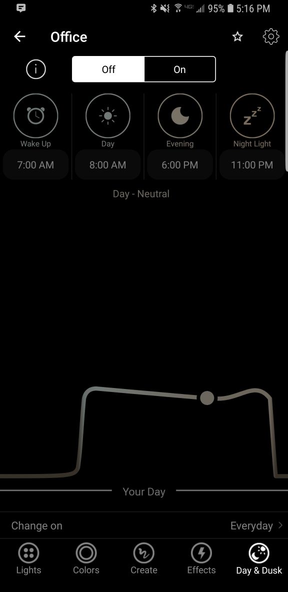
Finally, there is Day & Dusk, which gives options to have the lights come on and go off at certain times of day, intended as a wake up and sleep thing. You can also set timers to change color or temperature at certain times of day, which may be necessary based on ambient light, working conditions, or other factors. I don’t use this feature, but I like it, and feel it would be very useful to many people.
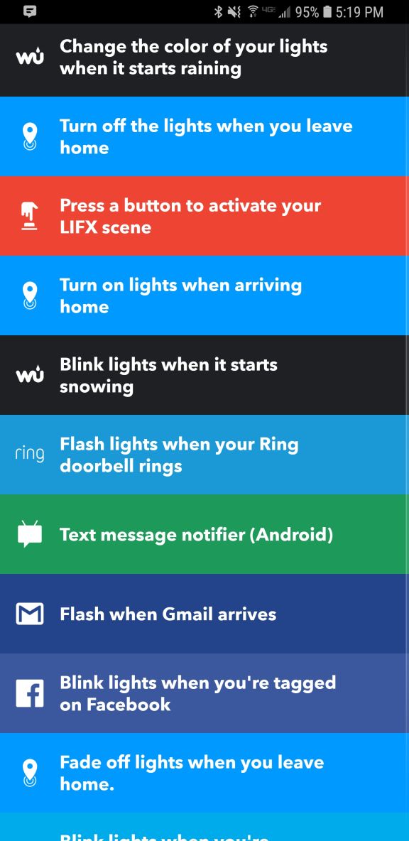
Finally comes the main screen. This shows you your lights, your groups (you can group lights together so any changes affect all lights in that group; it’s a fantastic feature and one that really elevates the usefulness of the app, as does being able to switch between multiple locations using a dropdown), create IFTTT (If This Then That) rules, and buy new bulbs. The IFTTT integration makes me worry for humanity: You can set the lights to react to various events, some of which are very useful like blink lights when your Uber arrives, or turn off the lights when you leave home. You can even blink the lights if it starts snowing! But blink when you’re tagged on Facebook? Or mentioned on Twitter? You might have a social media addiction if…
What I really liked, though, and what turned out to be the biggest flaw in this whole setup, is the Nest integration that happens through a program called ‘Works with Nest.’ Lifx lights can be set to flash when a paired Nest smoke / CO2 alarm detects something amiss. As someone who barely survived a high-rise fire, I loved this feature, think it’s incredibly useful and potentially lifesaving, and as I have Nest smoke detectors in both locations where I use these Lifx bulbs, I couldn’t have been happier. HOWEVER: It appears you can only set up this connection at one location. Once you’ve done that, you can’t connect any others. So I connected the light to the detector in my office, but when I use the app to switch my location to home, there’s no option to connect the lights to the Nest detector there: Only to disconnect the other connection already made. I experimented and tested and connected and disconnected and reconnected and switched locations in the app and really tried to find a solution, but was unable, and I find this implementation to be absolutely baffling. So if this is a circumstance that applies to you, choose wisely: You can only connect these lights to a smoke detector at one location regardless of how many you have. This is a major oversight and desperately needs to be addressed.
Other than the fake visualizer, the single-light spooky thing, and the grossly limiting Nest integration, these are good lights and I’m happy with them. Even bought more after using the first one for a while. Bright, easily grouped and controlled, usable app, not overly expensive, and ultimately it’s the app and its features and functionality that needs some fixing, while the bulbs themselves are great.
Recommended.
Zoho Writer: An excellent online alternative

I recently gave my opinions on OpenOffice.org’s word processing software Writer. My conclusion was that while they have certainly made improvements over the last twenty years, it still just doesn’t hold up to Microsoft’s behemoth package, either online or off. However, that doesn’t mean there isn’t an alternative for those who seek: I also mentioned in that post I would be reviewing Zoho Writer, the online word processor from (obviously) Zoho, which turns out to be a very competent competitor to Word. It’s not the perfect replacement, but it comes pretty close for everyday use, and then some.
Zoho offers many applications and services, all of which are relatively competent. And I’m not talking just basic office suite stuff either; they have everything from CRM platforms to retail inventory management. For an online service, they have a surprising breadth of applications on order.
As you can see, there is a lot there. For this review I’ll be focusing on their word processor Writer, which I feel is a highlight of their office productivity suite, but it’s important to note the range of capabilities they have, especially as compared to other online options. I also want to mention that their PowerPoint equivalent, Show, is absolutely fantastic as well, while their version of Excel, Sheet, is also very good. It doesn’t quite live up to the rest of the suite in terms of functionality or design, but that’s not to say it’s not good – it is. But it has significant room for improvement, especially considering its less involved and less usable interface, with sparsely-populated toolbars, buried commands, and no sidebar, especially when considering it’s for such a powerful program as a spreadsheet. Indeed, it’s the one instance in which I can say OpenOffice’s alternative, Calc, is the better option, with more features, a more familiar interface, and better design all around.
That being said, Zoho is the superior option for everything else, and OpenOffice doesn’t provide any enterprise functionality or features beyond the basic office suite anyway. Here we’ll be talking about Writer, a name shared with the OpenOffice equivalent (so don’t mix them up!) and it will hopefully give a good impression of how it all works.
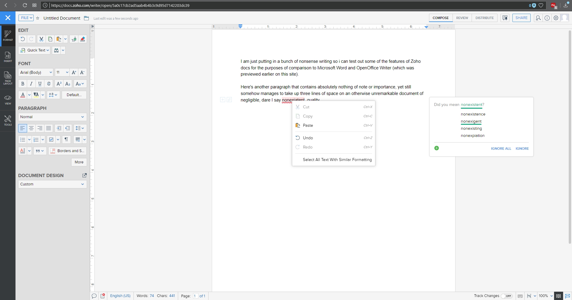
I threw together a nonsense document to mouse around with, and below you can see the spell check, which gives the initial suggestion as well as alternate suggestions, which is nice, although it doesn’t offer meanings / definitions as does Word. You can also see the Format menu in the sidebar to the left with all the functionality you would expect, including Cut / Paste / Format Painter / etc., as well as standard font and paragraph formatting options. Two additional features I think are very useful are the Quick Text option, which allows you to specify a particular piece of text that can be inserted with the click of a button or shortcut key; very good if you frequently use the same phrase or sentence or whatnot in a document. The other nice feature is evidenced by the very faint two boxes you can see in the left margin; the plus and text boxes. See those? You might have to look closely. The box with the plus is an insert menu, and the text box opens a formatting menu. They follow your insertion point automatically, and they turned out to be quite a convenience.
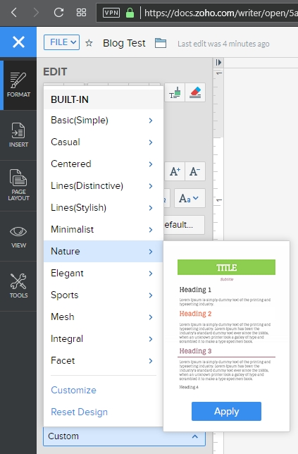
A variety of page layout templates are also readily available, with more available for download and very easy to implement.
Although this document is hardly complex, inserting an image and table is something that can trip up even stalwart word processors, and that was true here as well. Inserting the image was easy and worked fine, however arranging it for word wrap was more problematic. Smaller images resulted in much more layout success.
Inserting a table was also quite easy, and I especially like the live preview it provided as I hovered the mouse over the design options, all of which were neatly contained in the Design tab of the table options window. This is very similar to how Word will open custom contextual tabs that provide additional functionality depending on the specific element you’re working with.
Manipulating the table was much easier than manipulating the picture, which wanted to jump around the page, and even manipulating individual cells was very smooth; everything from changing their dimensions to their color to their alignment and everything in between worked perfectly the first time.
Now is when I need to mention the biggest advantage of (Zoho) Writer over (OpenOffice) Writer: .docx compatibility. OO Writer doesn’t have it, and that’s a huge knock, a terminal knock, actually, against it. With Zoho Writer, when saving a document, you have multiple options: You can save to a cloud service, and Zoho has collaborated with many as you can see (although I couldn’t help but notice the logo for OneDrive is oddly blurry, while the others are very clear), or you can download the file as a Microsoft Word .docx, or even as an .odt file, which is the open standard used by OpenOffice itself.
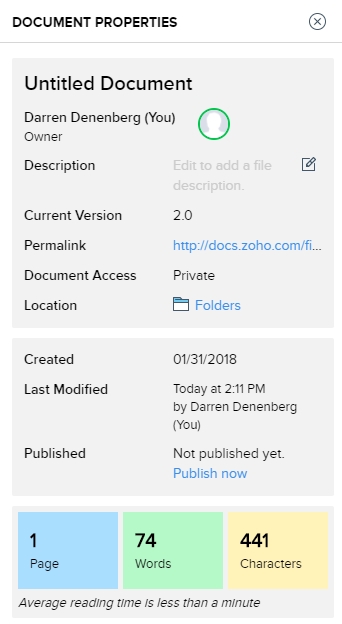
As one would hope, there are also multiple ways to get some statistics about your document. They run along the bottom as one would expect, but I am also a big fan of the Document Properties as accessed by clicking on the ‘i’ with a circle around it at the upper right of the window. Not only does this provide a wealth of information about the document itself, but coming from an HCI perspective, having the page count, word count and character count in individually shaded, easy to see and immediately locate, is genius. In terms of information presentation and information availability it puts those interrelated metrics right next to each other yet separated visually and thereby forces them in a cognitive whole.
Not to get too far off topic, but the reason I’m so enamored with this design choice is that humans, in order to make sense of, and order out of, information and stimuli presented to them, engage in several practices that help them in organizing what they see. One of them is known as Proximity, in which spatially similar images are considered as part of a larger group, even if they’re not related, so when they are related, as these three metrics are, our ability to process them, their meaning and their relation to each other is increased even more. Another is Similarity, in which when considering multiple individual field objects, those that are similar in some dimension, whether it be shape, color, orientation, or whatever else, are considered to be part of the same group, again even if they aren’t. Those are two reasons presenting that specific document information is so brilliant – it addresses the way we as humans process information.
Consider the Windows logo below. This is an example of both proximity and similarity. We consider the logo as a single shape because the four smaller squares that comprise it are both similar and proximal.
This is the Writer document properties pane, that uses these concepts to such great effect.
It even estimates the average reading time. There is nothing I don’t like about this information window, it’s one of the best interface designs I’ve ever seen, and I’ve seen a lot.
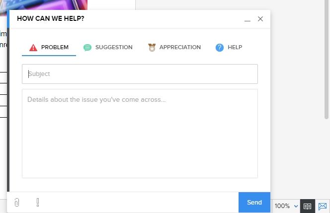
Before I just put up the rest of the menu dialogs for your perusal to give you an idea of how they’re implemented, I also want to address a nice usability touch they have incorporated in the form of a support icon. See that little blue envelope there way on the right hand side?
That’s the Writer support icon, and it opens up a window that allows you to offer feedback or ask questions directly. For a free service, that’s pretty remarkable. It really gives the idea – true or not – that they are at least receptive to feedback or requests for help. I was very surprised by that, and pleasantly so.
As you can probably tell, I think Writer is a great program. It’s not often I get to gush over software, but this company is so unknown, comparatively, yet they have such a well-designed and functional, free service, I’m surprised we don’t hear about it much more often. According to their webpage, they are a private company but one with five thousand employees! They hold user conferences and expos – that is not small time, yet their name recognition, even with millions of users, is small. If I may be so bold, even sacrilegious to some, I’ll even go so far as to say it destroys the offerings from Google. The only service that can compete is Microsoft’s Office 365, and even then it’s just a little better, plus Zoho integrates with all of them anyhow. Zoho has really created something great, and I encourage anyone interested in alternatives to standard office suites to give it a try.
Here are some functional dialogs if you’re interested in seeing all the options available before taking the plunge.
[Best_Wordpress_Gallery id=”8″ gal_title=”Zoho Dialogs”]
The new Samsung Galaxy S8+
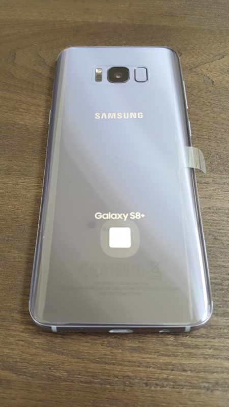
I’ve been using my new Samsung Galaxy 8+ for a few weeks now, and must say I like it. It has a slew of new features such as the occasionally functional face-recognition method of login, which according to Samsung I should not use if I have a twin, and I end up using the login PIN about half the time anyway, since wearing sunglasses, being in bright/low light, having your head at a different angle than what the phone expects, or wearing a Freddy Kreuger mask all seem to interfere with its accuracy. It also eschews the previous models’ physical home button for an on-screen equivalent, which can sometimes get lost in app overlays, and the back button rotates with the orientation of the phone which means it sometimes points up, not back. Plus it no longer comes in glorious gold, but I did get a neat metallic grey-blue.
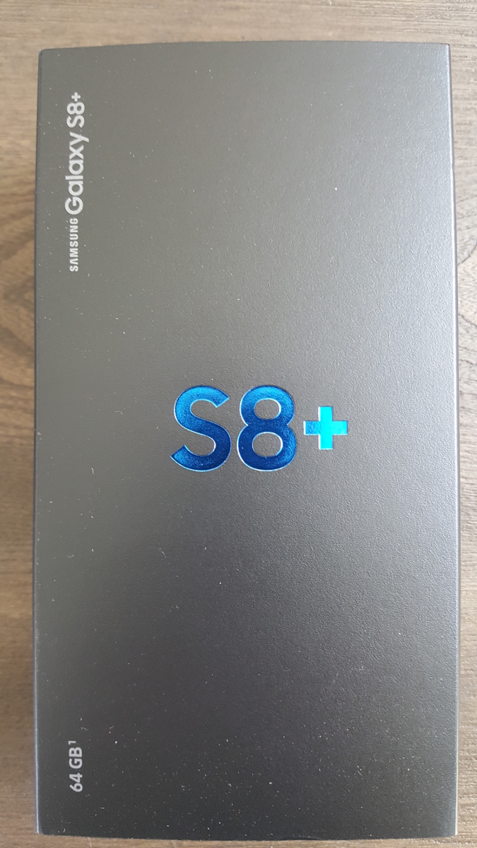
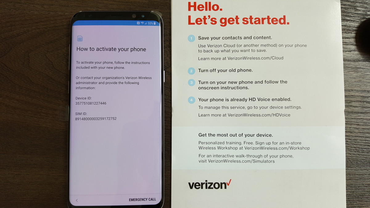
The metallic blue branding on the box let me know I was in for something special. I wasn’t such a big fan of the quick start card telling me to follow the instructions on the phone, which in turn told me to follow the instructions on the card. I was almost stuck in an infinite loop.
Even with those caveats, it’s a great phone. It comes standard with 64GB of internal storage, however I popped in a 256GB MicroSD and have enough storage for everything. While other Galaxy’s supported this, my previous S5 did not and I ran out of space almost immediately, which caused repeated battles with those pesky storage demons for months on end. On the front, the S8+ is adorned with a magnificent 6.2 inch AMOLED screen that wraps around the edges, an ‘Infinity Screen’ as Samsung brands it, and you can slide in panels from the edge that house frequently-used apps. I never do that, but you can.
In the US, the phone runs on an 8-core Qualcomm Snapdragon at 2.35 GHz, which is powerful but on-par with competitors. International markets get Samsung’s own 8-core, ARM-based Exynos processor running at the same speed. Both are plenty fast and more than capable for most mobile applications, especially with 4GB of RAM packed in alongside. I was hoping to use Qualcomm’s own Vellamo benchmarking suite to put it through its paces, however it was nowhere to be found, so I fell back on the stalwart and well-established GeekBench 4, which provided a comparatively average single-score of 1830, but a scorching, second-place multi-core score of 6032, placing it only behind Huawei Honor V9. I should also mention that the scores earned by the phone are much higher than what they are reporting for the S8+ on their site.
(It needs to be mentioned as a warning that I also intended to use the well-known and oft-utilized AnTuTu mobile benchmark, however on boot it insisted I download an additional ‘phone verification app’ and even loaded the Play store to do so. I don’t know why it would require that, I’ve never heard of such a thing, it sounded very fishy, and the reviews of it were foreboding. Therefore, although I like AnTuTu generally, I must recommend that you not use it for mobile bench marking purposes.)
I was also quite pleased at the 3500 milliamp battery life: Using Google Maps for navigation, after an hour of use my battery power was still in the high 80 percentile, whereas the Galaxy S5 would have been long dead by then. Speaking of which, it also supports Qi wireless charging, however be aware that is a misnomer: While you can rest the phone in a dock and have it charge thanks to two coils in the back, the dock itself still has to be plugged in. It doesn’t just magically charge from the air, although I am still waiting for that feature. The 12-megapixel rear camera takes stunning photos, and you can even elect to have them stored in RAW format. May as well, you’ll have the room. I don’t use the front camera except for the once-in-a-blue-moon mobile Skype call, so I can’t comment in any meaningful way on its quality, however it’s an 8 megapixel component.
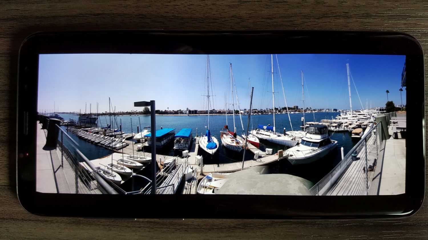
In the first image below, taken at a mid-level setting and moving at ~70 miles an hour, the wind farm comes out quite clear with separation among colors from the rich blue at the top to the white of the mills in the center (even considering the haze that muddies the contrast along the horizontal center) and the darker colors of the earth and road at the bottom. Minimal blur with good color even at speed. Below that, a few pictures from my trip to Monsterpalooza in Anaheim, and even in low light conditions there is still sharp contrast and detail, except when an area of the image was in competition from multiple light sources as can be seen in the sign to the right of Frankenstein.
- Horror Heads
- Frankenstein (note competing lights on sign)
- Captain Quint
- Nosferatu
Another aspect of the phone I really appreciate this time around is when a known or suspected scam call comes in, the phone displays the contact name either as ‘Potential Fraud’ or ‘Potential Spam.’ I don’t know what the difference is, and like to think I could guess it anyway, but there have been no false positives or missed calls because of it so far. Also note the beautiful 1080P screenshots the phone takes.
I’ve been very happy with it so far. I haven’t had the chance to run it though its paces save for some movie streaming from my Plex server, which worked flawlessly, and with everything else it hasn’t hiccuped, stuttered, or frozen up yet. It doesn’t even get as hot. I’m still not thrilled about the lack of a physical home button, and once I transfer over all 13,672 files in my music library and see how it handles that in terms of performance and usability I’ll have a better idea of its overall capabilities. They’re also sending a complementary GearVR version 3, but every two weeks they inform me it will take six to eight weeks so I don’t know when it will get here, but with the S8’s USB type C connector, it won’t work with my old version 1, but I’ll update as soon as I can put it through it’s VR paces too.
This is so very strange
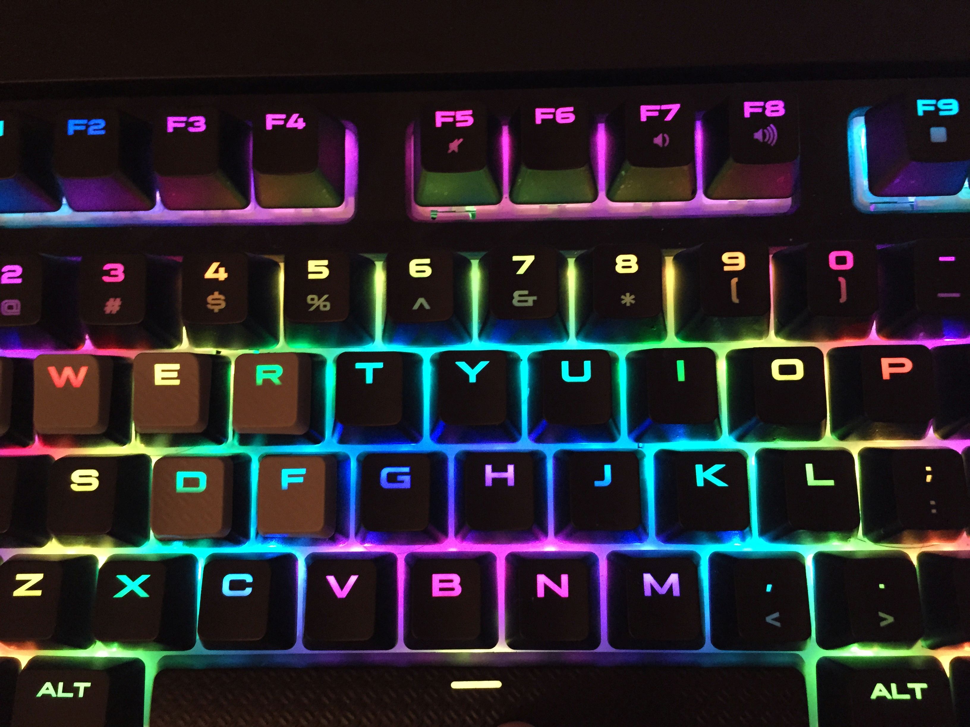
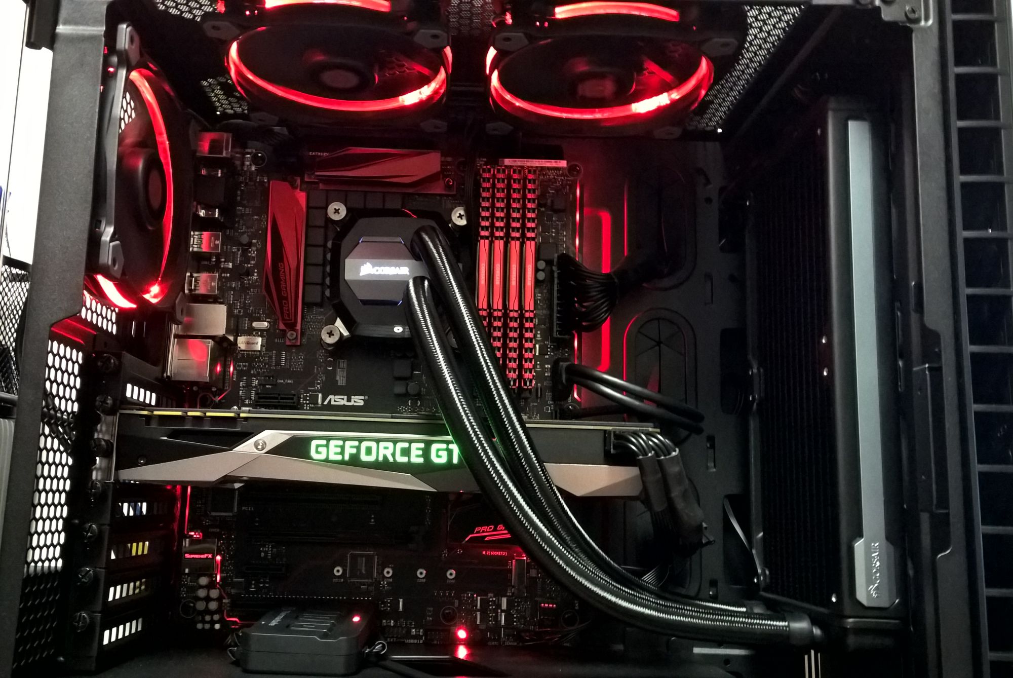
I recently built a new PC, and decided I wanted some flash to go along with it. I put in a motherboard and fans that have some LED elements, and kept the inside to a generally red theme. The nice thing is, the fans are RGB so I can switch them to any color I want, or even have them cycle through colors. No functional application, but nifty to look at.
I’ll be doing a video walkthrough of it soon, but here’s a picture to hold you over until then. And yes, that’s a reference GeForce 1080. It’s by Zotac, a brand I’ve never dealt with before, but it seems to be doing fine so far. Of course, it’s only an office machine.

