
Category Archives: Editorial
Congratulations to the first graduating cohort from UCI’s Master’s in Human Computer Interaction and Design

It is with no small sense of fulfillment and pride that I congratulate our first graduating cohort in the new MHCID program here at UCI.
Although I was brought into it relatively late, about two years after initial planning had begun, I have been part of the program for over a year and developed / taught the Advanced Design and Prototyping course, as well as the second half of the two-quarter capstone course. Next year I will be teaching the full two-quarters of the capstone course, likely because I do the same at the undergrad level and having two faculty teach part of the same course is difficult.
As this was a newly developed program, the students we admitted for the first go round were strong personalities, risk takers, enthusiastic and driven, and it showed. Highs and lows, tough times and hard roads, late nights and online meetings, yet they all made it through to the end, surpassing every challenge and task they faced, and ultimately created capstone projects that were highly praised by their corporate (and in one case, educational) partners as well as their peers. That’s them in the header image, by the way, and the jubilation you can see is real, and earned.
They presented their projects on Friday to all the program’s corporate partners, peers, colleagues, faculty, and our incoming second cohort, and they were all very well received. The partners they worked with had nothing but praise for the quality of the work, and with only one rehearsal run-through and critique the previous day, everyone did a superb job. There was a wide range of projects; everything from healthcare (robot-assisted healthcare, with Mabu!) to wine to education to materials engineering. It was the groups’ day to shine, and they did. They were able to brag, to impress, to highlight, to inform, and with the varied nature of the projects it never became dry or dragged.
Commencement was also wonderful. Of course, I have many favorite parts when it comes to commencement, the biggest of which is seeing all my former students receive their diploma and the huge smiles on their face knowing they have made the journey successfully to this point. It’s a highlight of my career and a privilege I take quite seriously to be able to sit on the stage and be part of the ceremony that they earned. To see any of my students walk across the stage and formally graduate, but with this being our first cohort, it was a secret triumph for all involved; faculty, staff, students, support, everyone.
I have to also say, however, that I always really enjoy seeing the wide range of regalia the faculty brings to these events. So many different designs, colors, symbols, it’s always fantastic and adds a real splash of excitement to the proceedings.

A rainbow of regalia
And with it being a design program, our students were equally involved in creating unique, individual and personalized mortarboards. My favorite was the one that actually lit up and had a Disney theme. The battery pack was underneath on top of her head, so i can’t imagine it was too comfortable, but that’s the price you pay, the sacrifice you make, for fashion!

Cap design
So when it all came together and they were finally able to present their projects at our big career fair on Friday, and graduate at commencement on Saturday, to say their sense of accomplishment, and no doubt relief, was palpable, would be an understatement. they deserve all the congratulations, the praise, the high-fives, the future jobs they’ll have, and all the recognition that results from their time in the program. My personal congratulations to everyone involved, the students most of all.
(If you would ike more information about the program, I have linked it in the first sentence of this post, but I’ll do it again here because I’m all about usability! UCI’s Master of Human Computer Interaction and Design).
On this day, the TRS-80 was born!
Today, August 3rd, is the 40th anniversary of the TRS line of PCs, manufactured by Tandy and sold through Radio Shack.
Ah, Radio Shack. My eulogy for your passing continues to this day. When you were actually a ‘radio shack,’ a place I could go to buy electronics, transistors, capacitors, soldering irons, when you catered to the people who made you what you were. At one point, Radio Shack was so ubiquitous, one could be found within three miles of almost all American households. Now, however, they were reduced to this before disappearing completely. Even with 70 stores apparently remaining, for all intents and purposes it is gone, considering it lost its way and identity long ago.
But I remember quite fondly the Radio Shack of yore. When I started college at my mostly-beloved Alma Mater UMBC, my significant other at the time worked at a Radio Shack right around the corner. They sold electronics for real enthusiasts and hobbyists, and even PCs from their Tandy line. Tandy, a leather company that still exists today, bought the struggling Radio Shack back in the 60s in attempt to diversify. In fact, the TRS portion on many of their computer model names was an acronym for Tandy Radio Shack. It was glorious for me to go in to the store on a dark and snowy winter night, when the store was open but no customers were about, to play Space Quest One on one of the Tandy machines they had on display.
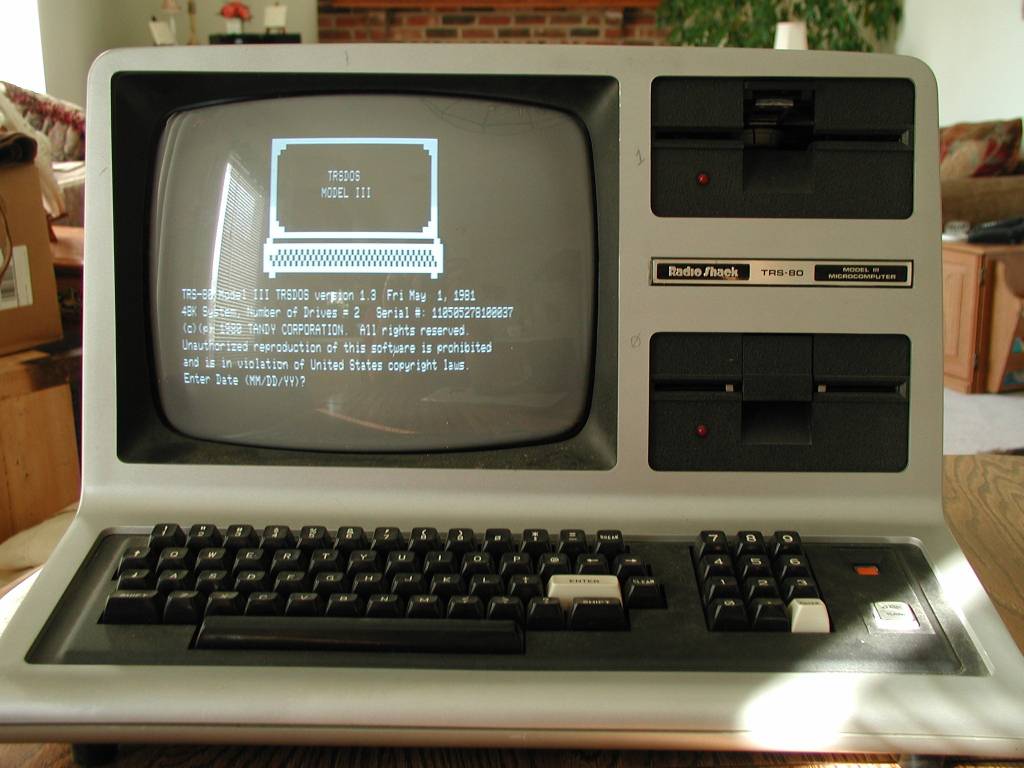
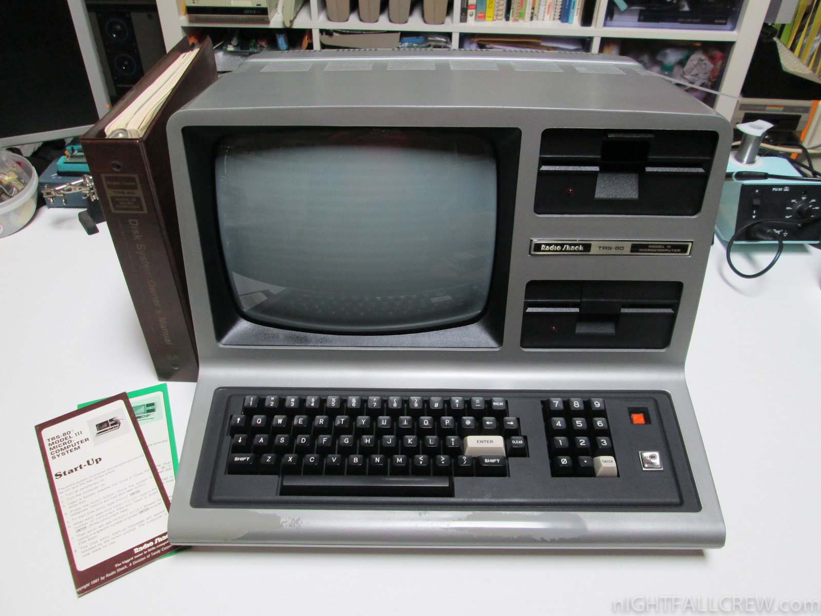
But my affinity for the TRS line goes back much, much further than that. I actually learned to program, using line-number basic no less, on a TRS-80 model III. I actually took programming classes using this machine, which would have been around 1981 or so. Normally I would just hyperlink to a page about it as I have indeed done, but I feel it is important enough that I must also include an image whose glory in which you should bask (The header image is a Model III as well).
TRS-80 Model III
Isn’t it beautiful? It was a great machine for the time, with a speedy 2MHz Zilog processor, the same one found in all TRS-80 desktop models, however its 4K of ram could be boosted to 48K which was ludicrous overkill at the time. Even though it had dual disk drives, which was a feature shared by the Apple IIe, it also had external cassette storage, which is what I mainly used. $600 would get you the whole shebang, cassette storage and monitor included.
I also find it strange that model numbers are often left off when people describe these machines. Earlier models had all components as separate items, and less memory, and a slower processor, and reduced functionality. When referring to the TRS-80 line, the model number is very important.
I programmed my first game on one of these very machines, a model III. It was a text adventure through a haunted house from which you were trying to escape. You had to find items, using some and combining others. I even went out of my way to have everything make logical sense, if not be overly challenging; for example, at one point you come across a skeleton who is searching for his lost femur. You later discover a dog trying to bury a bone. Hmm. I must say it was pretty fun! I would save the code to cassette – that’s right, audio cassette – and load it to play or edit. It was also because of that that I learned another valuable lesson which was not taught in programming classes at that time: save your work. You see, to save onto a cassette, you had to manually wind the tape past the leader tape that was not magnetic and can’t hold data, or else the computer would try to save some of what you were doing to that, and the whole thing would fail, of course.
Valuable lesson to learn, that.
So it bears repeating: as the headline states, the reason I am telling you all about one of my favorite vintage PCs (an honor shared with the Commodore Pet and Apple IIe), is because today, August 3, is the anniversary of the TRS line of PCs! They were first announced in 1977. This is one of the machines that had a major impact and influence on me, and amplified my love of and interest in technology. I’d like to get one and do some tinkering once again. Unfortunately, TRS-80s have also, along with others including the aforementioned Commodore Pet, become sad victims of the Ebay economy, in which everything is worth a fortune if you’re selling it on Ebay. Here’s the going rate for a Model III, which isn’t as bad as it has been in the past (remember this post from 2014? Of course you do!). For good measure, here’s a Commodore Pet and an Apple IIe.
Even so, I’ll keep an eye out for a chance to relive my childhood, and celebrate this day. If anyone finds one cheap, let me know!
Private WoW server Felmyst shut down in one day
There is, perhaps, a not-so-unknown secret in the World of Warcraft community that many people are unhappy with the way the game has evolved. Streamlined interactions, fast travel, the loss of talent trees, major changes to the landscape (such as the now-flooded Thousand Needles), rapid leveling, repetitious quests, questionable lore addons, and so on. It is also relatively well known that because of the longing some players have for the much more involved, grindier, slower-paced, talent-centric nature of the original WoW, private servers, meaning ones not run by WoW developer Blizzard, have popped up all over the place.
One of the best and most stable of these private servers was Felmyst, a four-year labor of love by a developer known as Gummy, who suffers from Musular Dystrophy and is for all intents and purposes, homebound. Well known in the private server community, both Gummy and Felmyst were doing well, with a stable build and a solid user base. However, a mere one day after the Felmyst servers finally went live, Gummy received a Cease and Desist order from Blizzard. You can read the gory details over at Ars Technica, and I should also mention that I was going to post Gummy’s formal announcement about the shutdown that he posted to his website, however the website went offline just one day after he posted that. For a four year project, it vanished into thin air very quickly.
UPDATE: Apparently his response is back up on felmyst.com, but for how much longer I can’t say. Here it is:

Gummy’s response
If you’re the lazy type who doesn’t like to click on images, here is what he wrote:
Felmyst
I began this project roughly four years ago and last year when Blizzard began taking action more seriously it weighed heavily on me as not only was I already heavily invested into the work but others around me were as well. Because of my health situation I wasn’t in a position to cut losses and start over on something different, at least not something that would take four years to make. Last year’s news of what Blizzard was doing came at the absolute worst time for me, frankly, with so many years already invested. To explain what may appear as an odd series of decisions it seems worthwhile to disclose my condition, muscular dystrophy, which only one other person in the online sphere knew of until now.
Of course, that is why I’m not able to pick up and move to another country as an alternative means to host the server since I’m not really able to live on my own. That is also the reason I’ve been able to work mostly full time on this project as I’m unemployed, though I have sacrificed much of my well being dedicating everything I have to this. Why am I disclosing this? I’m not really sure, but I feel compelled to.
So the question instead becomes: why host it yourself? The problem with that is our popularity snowballed way too fast once the release date was set.
Before the release date was declared, most people expected the server to flounder with a small population, the irony of which quickly became a meme. Therefore, months ago I saw no reason to hand all of our work over to someone I didn’t know when the project had a reasonable chance to stay small enough to avoid the need. Though I have no problem contributing to honest developers, the market to wrongfully profit from this stuff is much too lucrative to hand it out on a whim. Had we time to smooth out the release, this certainly would have been something to explore. The warning signs to expect notice from Blizzard were there but receiving it that quickly was something I don’t think many expected.
So why did I make this project? I love the game and community, especially the community. The old game was a great way to meet people and see new faces. It makes me happy, and programming makes me happy. Of course, I am sad that things didn’t turn out the way I’d hoped but I don’t think I’d change any of the decisions I made. I gambled that we could cap the servers at 3k and enjoy a close community. Sadly, I did not win that gamble, though on some level it was nice to see so many people eager to enjoy something I worked on. This project gave the last four years of my life a sense of purpose that I thoroughly enjoyed.
So why not tell people of that plan ahead of time to stifle hype? The problem with private servers is that there is no middle ground. If people expect a server to “only” have 3000 (real) players then they just won’t play and you’ll instead end up with 300, which isn’t playable.
A lot of people are of course asking for the source code. Although it may not be in my best interest to distribute the whole thing in its entirety at this point, I’ll see what I can manage that would be beneficial to other programmers who are still learning.
Gummy
gummy52facebook@gmail.com
All of this rubs me the wrong way. The fact that the C&D order was delivered just one day after the servers went live even though Blizzard must have known about it years ago, that the servers went down so fast, that the website went offline so fast (but is now back), it was just scrubbed into nothing immediately after such a long development cycle. Maybe Gummy simply was spooked by having a multi-billion dollar company com after him. Some in the community said he should move his servers to another country to circumvent Blizzard’s attempt at shutting him down, however Gummy claims he doesn’t have the resources for that. Others were and are still imploring him to release the source code, however he states there are legal implications and ramifications to doing that and has therefore made no such commitment.
Another interesting legal wrinkle is that it is apparently not illegal to run a private server, the issue is distributing the client along with it that causes the problem. I don’t know the technicalities, but there has even been the argument that if you kept the servers up without including a client, which the Felmyst download did, there wouldn’t have been a problem. Again, I don’t know the specifics of the case and Blizzard’s claim to IP so I can’t comment on that. I can say that Gummy claims to have done most of the coding to get the thing up and running.
Frankly, I don’t know what Blizzard’s obsession is over not setting up a vanilla server themselves. They shut down Nostalrius, claiming the whole time they would work with the team to set up an officially-sanctioned legacy server, then just…nothing. Frankly, Blizzard lied to them, to us, and did so deliberately. On Nostalrius’ official site, you can read the latest announcement, from all the way back in May of 2016 – and note there has been nothing since – of how Nostalrius thought they would be part of something great and working with Blizzard to set up a legitimate vanilla server, not realizing they were being misled. To show how big the demand is for something like this, which incidentally would cost Blizzard very little to implement, this is a no joke screenshot from the last minutes of Nostalrius:

The last moments of Nostalrius
Seems like something people want.
So what can you do now if you wish to play the informally-labeled ‘vanilla WoW?’ You can do what I did, and switch over to Elysium. You have to get the client via torrent, but it’s stable, works beautifully, and for someone like me who still remembers being blown away when they first saw WoW, and longs for the difficult, slow, plodding, yet rewarding gameplay experience original WoW offered, it’s glorious going back to those early days; before Thousand Needles was flooded, before Durotar was as well, before the great sundering, before all of that. When Barrens Chat was as lively as ever, the Defias roamed free, you had to train skills, and find Mankrik’s wife, when some wore a Big Blue Dress and Alterac Valley could go on for days, when you had to suffer abysmal drop rates to earn your levels in order to pay 40 gold for a horse, it brought a tear of joy to my eye to relive those opening cinematics for the Undead and Tauren that hooked me right from the beginning. Its default graphics settings made the game look like I was back in its 2004 release date, but after cranking everything to max, the game looked beautiful.
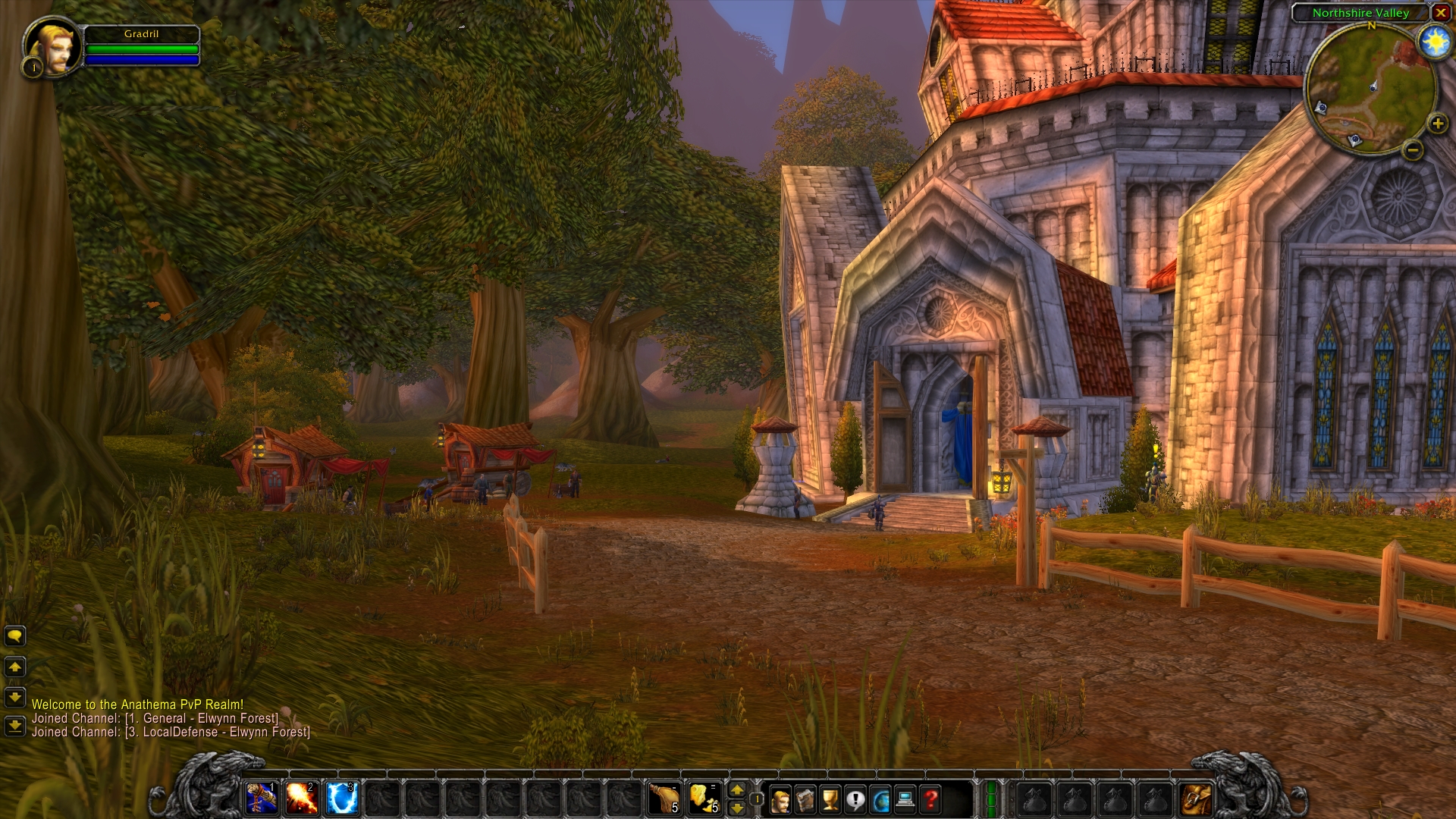
Elysium WoW Screen
Additionally, I set up characters on their Anathema server, which was recommended to me, however their Elysium server is much more populated. That’s good on the one hand as the opportunity for groups and simply interaction is higher, but it comes at the expense of gameplay as it can lag severely, although I suppose that is quite reminiscent of original WoW. On the Anathema server, things are better, but it is still well populated, runs smooth, and I personally feel has a better balance, plus I still get to experience groups, Barrens chat, and and interaction. Here is a pic from Orgrimmar on Anathema, and as you can see it’s bustling with activity.
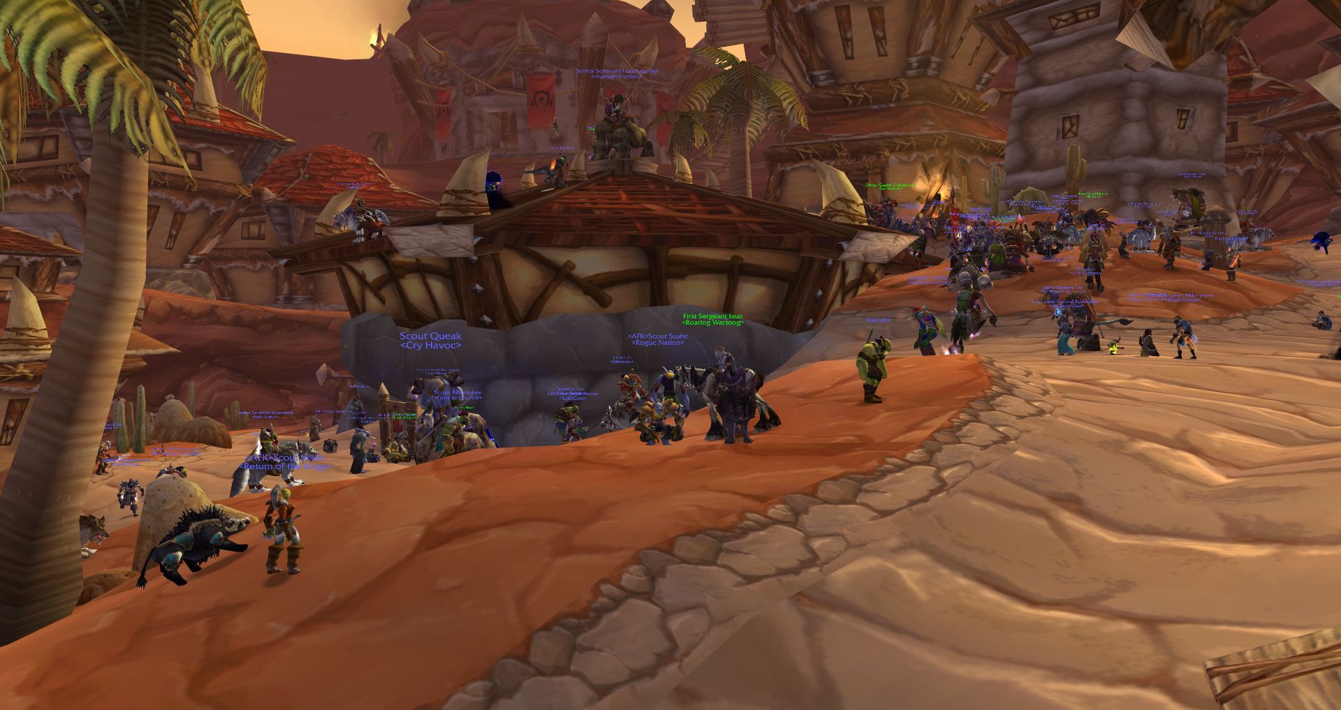
Orgrimmar on Anathema
There’s even whisper spam from gold farmers!

Just like vanilla
The only real problem I had was naming my character. Every single name I typed in gave a ‘That name is unavailable” error, even some of the ones it recommended to me did the same! There were some other minor, non-gameplay related things: At one point I repeatedly took fire damage although I wasn’t near a fire, an NPC referred to me by the wrong name, and an NPC clipping through the world; he came back though. There is also only one server, so server time never lines up with actual time. Other than that, no troubles so far.
Well, except for this:
UPDATE: Recently there have been some major server crashes. Actually, I don’t know what the specific issue is, but today all action stopped, and never started again. I wasn’t kicked back to the character select or login screen, it didn’t freeze up, it just stopped responding. My character could run around, but that’s all. All other players in the vicinity vanished. It also was unable to login to the character select screen afterwards, and had to x-out (I play in window mode) to try again. This happened multiple times today, my third day in. It has been smooth until now, and a patch was just rolled out earlier, which may have something to do with it.
UPDATE II: The issue was fixed, however I lost about 40 minutes of progress.
As great as it all is, be warned: it is not for the faint of heart. It is the grindiest grind in grindville, however because it is (I think) Burning Crusade, you level up a little faster than pure vanilla. But it is also very unforgiving ear;y on for some classes. For a while, as a Tauren hunter, around level 8 I was dying more than I was questing. I spent a lot of time in black and white (meaning dead), and I would get stomped by same-level mobs. For every one I killed, I would be the loser multiple times. Enemies are densely packed, it’s very easy to draw multiple aggros, and you often have to proceed very carefully. Once I got a pet, however, the whole dynamic changed and it became much more balanced. In the brief time I spent with some other classes, rogues, druids and warlocks made it much easier to progress early on. Warriors and priests, not so much. I didn’t try the mage or shaman classes.
It’s been very fun returning to almost-original WoW. When it was first being hyped all the way back in 2004, I didn’t pay it much attention, reading about it in game magazines with only passing interest. When the beta rolled around I thought “What the hell, I’ll give it a whirl” and was floored by what I saw. Immediately hooked, I knew I was witnessing something, experiencing something monumental; both literally and figuratively game-changing.
In fact, I got so much out of original WoW, had so many good experiences (I’ll never forget a higher-level Alliance chasing me all the way from Thousand Needles to Un’Goro crater, where I jumped over the edge and slowfell to the ground below, escaping my pursuer, only to be immediately devoured by a dinosaur. Good times.), I actually bought the Bloodscalp server on which I used to play when Blizzard auctioned it. It’s a prized possession.
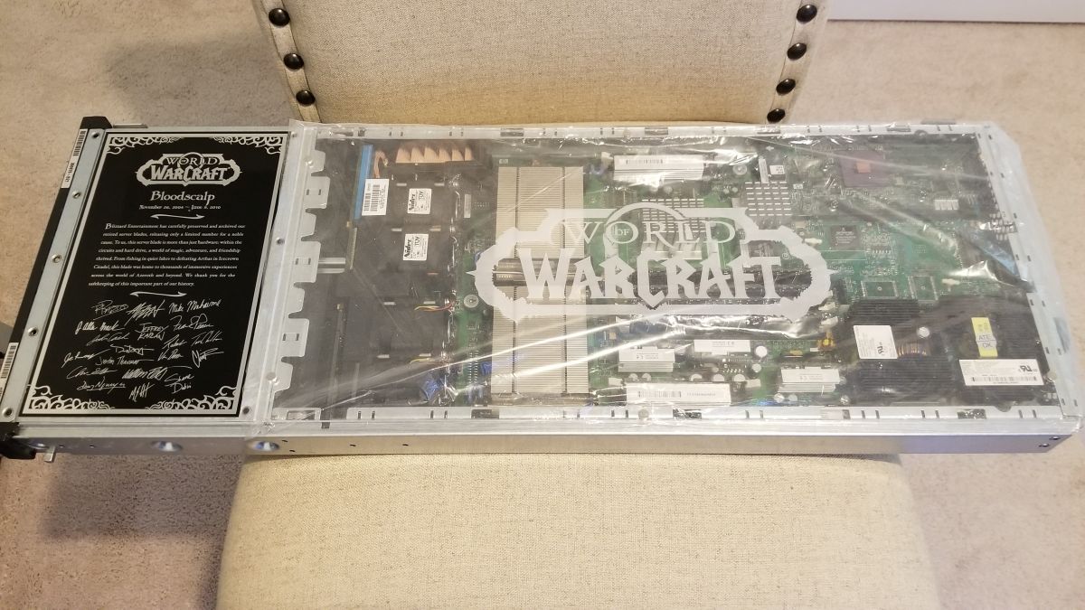
Bloodscalp WoW Server
I never played Alliance because they’re the dirty, stinking Alliance.
So if you have never experienced original WoW, if you are a latecomer, if you want to know what all the fuss is about, if you wax nostalgic for the more pure version of the game, then I encourage you to try out a vanilla server and see what you think.
I’ll update as I continue on. In the meantime, here are the original intros for the Human, Tauren, and Undead races, all recorded at max settings off Elysium’s Anathema server. I also included a very brief bit of running around to give an idea how it looks.
Goodbye, MS Paint
Microsoft is removing a big collection of stalwart programs that were part of all our…well, my and my peers’…childhoods when they release the Fall Creator’s Update later this year. Screensavers are on their way out, as is Outlook Express. Some functionality such as Reader is being rolled up into Microsoft’s Edge browser. To be clear, many of these features are being deprecated, which means they are no longer being developed. In big-technology corporate-speak, however, that means they are soon to be removed altogether, although in fairness some Windows features have been deprecated for decades but are still part of Windows. Plus, the Creator’s Update will also introduce neat new features such as picking up on one device where you left off on another, as well as VR / AR features currently in development, including hardware and controllers. If you’re interested, you can read all about the Update straight from Microsoft.
The part of this that everyone is up in arms about, however, is the impending removal of MS Paint. This seems to be the thing that is garnering the most response, and causing people the most grief, or at least the most coverage. Originally developed by ZSoft as PC Paintbrush, it was licensed by Microsoft and included with Windows as Microsoft paintbrush, later changed to MS Paint. It was even originally sold with a mouse, as they weren’t such a common input method at the time.
Here’s CGA PC Paintbrush, with four colors on the screen at a a time, out of 16 possible colors. Note the way they tried to increase the available colors with textures and patterns. Good times.
CGA PC Paintbrush
Here’s a VGA version:
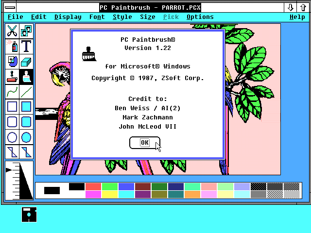
VGA PC Paintbrush
Of course, the reason Paint is causing such a stir is because so many people have used it for so much. We all used it just to make nonsense little drawings, and in its more recent versions it was not too bad for cropping, resizing, even making small notations like arrows and circles and whatnot. One person was even able to use it to draw the Mona Lisa. We’ll keep all the memes, rage comics, country balls, and everthing else out of this discussion, we’re trying to be serious here!
It’s being replaced with Paint3D, which is already included in Windows. In many ways it’s the same as Paint, and in many ways it isn’t, but it works well enough for cropping and resizing, and of course you can make nifty 3D scenes. I personally use IrfanView for cropping and resizing, which is quite easy and offers a lot of features, but to each their own.
Even so, the removal of Paint – if it does actually get removed – is the end of an era for Windows. I’ve been messing with it for longer than thirty years, and I’m sad to see it go. Not because it was an important part of my toolbox, at least not anymore, but because it had simply been around so long, and I always knew it was there; it’s like when the neighbors who always smile and wave, yet you never talk to, move away. Oh well, time marches on. I’m sure it’ll always be there in spirit, and available for download for the die-hards.
Amazing LED backsplash tiles

Now here is something beyond nifty. A company called All Things LED (Be aware: The site is very slow, probably because it’s from Canada, eh) is apparently in the process of developing LED backsplash tiles that can show animations as they they were a pseudo movie screen. Before I get in to more detail, take a look at this video and be amazed:
According to their FAQ page, they did not expect their invention to become as popular as it did, and therefore they don’t have a lot of specifics regarding mounting, availability, installation, etc. They do say it will run $150 per square foot, so be prepared to pay out the sap hole. Additionally, I had read on their site that they have a bespoke controller to control the animations, similar to what is used to control Christmas light animations, and that you can upload your own animations as well, however very curiously both pages that had that information now lead to 404s. I wonder why, perhaps it has something to do with being overwhelmed by the response.
Anyway, I love this kind of stuff, the animations are remarkable, when i designed my kitchen I wanted something very warm and subtle so this probably would not have been terribly appropriate, but I wouldn’t have been able to resist, I’m sure. The snowflakes, the underwater video, the skull motif, at one point they’re even showing a hockey game, of course. I could probably do without the fire, though, that’s something my kitchen can do without. Very neat overall.
And here we go
it begins. Everyone knows that cable / Internet companies are shady, shifty organizations whose disgusting practices (did I mention their disgusting practices?) have made them the most despised companies in America, among all industries. That means if you took the worst companies from every industry; cars, sandwiches, grocery stores, clothing manufacturers, everything, and then chose the worst of those, cable / Internet companies would still be on top of the list. They are monopolies that do everything in their power to stifle competition and make you pay for it. I always have to emit a disdainful sneer when they tell me how fast their service is, yet limit how much I can use it.
On the other hand, I’ve always been relatively happy with Cox Communications, who was my provider when I lived in Las Vegas, and is again now that I am here in Irvine. They always tended to keep out of my business, and while the other cable companies were wallowing in a swere of poor cutsomer service and poor performace, Cox just trudged along.
Now, however, it appears they are becoming emboldened, and I suspect that is because of the appointment of Ajit Pai as head of the FCC, which is the worst news that could happen in this domain. When Tom Wheeler, a former cable company lobbyist, was appointed, everyone thought it would be the end of net neutrality, however he happily surprised us all. I suspect we will not be so lucky with Pai in place, and if this email from Cox is anything to go by, we could be in some real trouble.
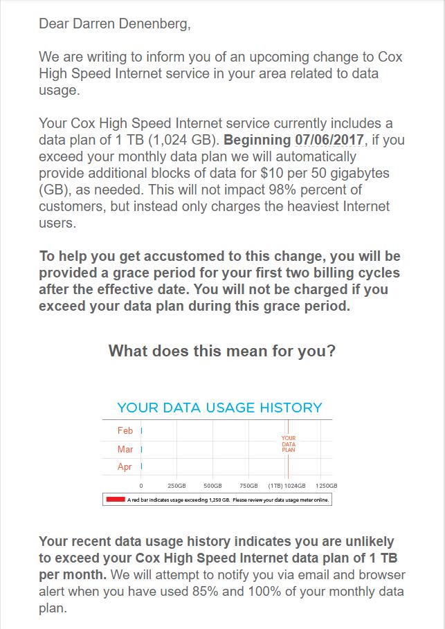
Note the email states they will automatically charge for additional 50GB blocks, something my cel phone provider does as well, and provides what was supposed to be an evaluation of my Internet usage but shows a bunch of zeros instead. I wonder if that was deliberate, or a simple oversight. At least they try to assure me that I shouldn’t have any problems with this based on past usage, although I am a heavy user of Steam (although not so much a heavy downloader).
I’ll just leave it here for you to read in fear, and hope we can fix the incoming storm that is sure to happen.
Uh Oh
A workstation for us all
Forget working at your desk, even one of those fancy hydraulic desks that lifts up and down. No, you need one that is fully immersive, looks like it belongs on the set of Alien, but is also eminently affordable. Hey, to quote Meatloaf, two out of three ain’t bad!
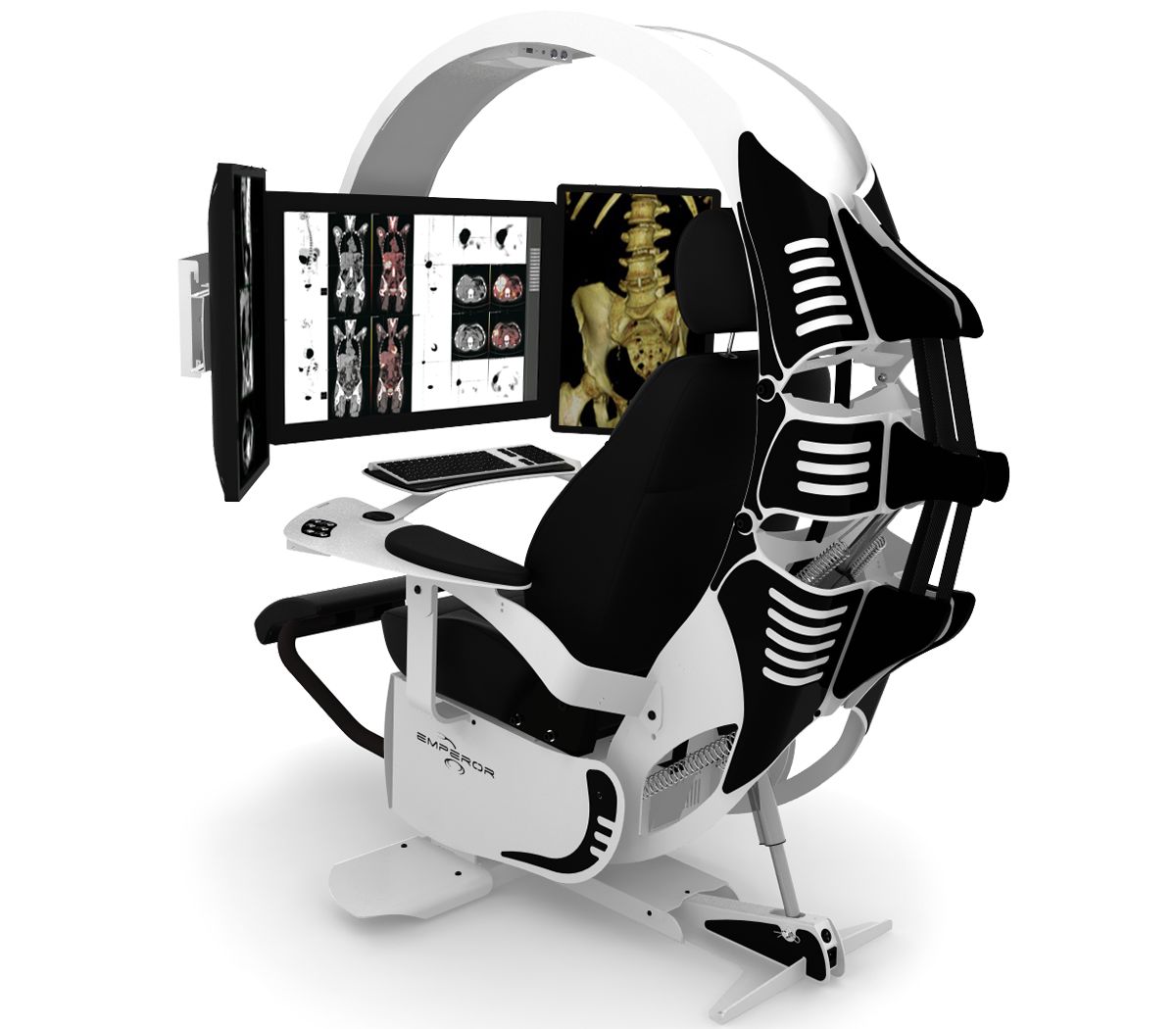
Thanks to MWE Labs, you can have the ultimate PC workspace they call The Emperor. A self-contained pod-like setup that surrounds you with your monitors and controls. Not only that, you can customize it with an array of nice touches, such as color and accent, accent lighting, even custom engraving, your logo on the seat and even a logo backlit front plate! Standard PC customization practices also make an appearance, with RGB and accent lighting available. I especially like how the one on their main page and used in the header of this post is being used for medical purposes and is designed to look like a skeleton. That’s clever.
Of course I had to max one out and see how much it would run, and I was not disappointed. I customized the color (black and orange, of course, although they have many colors for both the main and accents), and added in all lights and accouterments. The upgraded seat, which they will stitch your signature into in place of the Emperor logo added $2500 onto the price, the leg rest and heating added $500, and an integrated USB 3.0 hub is $315. After piling on all the other options, including lighting, logos, and two laptop trays, I finally had my dream chair, and only for a pittance. In fact, I’ll take two!
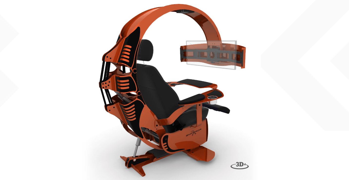
Now this is a chair
That’s a good-lookin’ setup if I do say so myself. It has all the bells and whistles, custom paint, everything someone who avoids physical activity could ever want. Of course, they practically give them away! I don’t know how they can offer them for this low price.
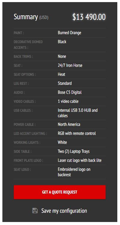
Total cost, totally reasonable!
If you have a lot of disposable income, what I like to call ‘Notch money,’ then why not? It is probably quite comfortable and a neat experience. You’ll have to supply your own PC and monitor(s), of course, but if you’re buying a chair like this, I’m sure that won’t be a problem. May I recommend Falcon Northwest? If you get one, let me know; we’ll be instant friends.
An evaluation of my new Mazda CX-5. What’s good, what’s not, the decision-making process, and their curious approach to automotive design and technology

I don’t normally talk about cars in and of themselves on this site, so despite that, or perhaps because of it, this post will cover a lot. Decision making, design, automotive technology, corporate perspective, individualism, aesthetics v. functionality v. pragmatism, collaborative filtering, and others. It’s quite interesting to me the complexities of making such a big decision as buying a new car and what goes into it. This was not an easy decision.
About two months ago, as I was shooting down the 405 south through Irvine, my 2008 Ford Escape hybrid suddenly lurched forward as though I had dumped the clutch, lost all power (which is especially bad in a hybrid), and forced me to fight the loss of steering to get it off to the shoulder. It was then that I noticed it had also displayed a message on the dash: “Stop Safely Now.”

This sounds bad
The red exclamation point was a nice, added touch. I did stop safely, but it was a little late for that message. That little event could have been fatal, however after shutting off then restarting the car, everything seemed to be fine. I was hoping that would be the end of it, considering a similar event happened years earlier and restarting the car appeared to have eliminated the problem. This time, however, would be different.
It happened again. And again. After some research, I learned the problem, and a much bigger potential problem: A component used to cool other electronic components in the car had gone bad. Not only that, someone had died because of it and there was a class-action lawsuit in progress because of it. As the car already had over 100K miles, and other aspects of it had never worked properly, I determined it was time to start the hunt for a new car.
I considered many, and for many reasons. I’m not the luxury car type, and didn’t want to overspend, but looked at all my options. Ultimately, the decision came down to the Hyundai Tuscon and the Mazda CX-5. I decided on the latter, but not without some hesitation that I still carry. When there are many options, there is rarely a clear-cut winner, and this particular decision shows the nuanced nature of, and requirement for, an individualistic approach.
To set some groundwork, I wanted a crossover SUV, sometimes known as a CUV, or more colloquially – and derogatory, I assume – a cute-ute. (To clarify some terms, an actual SUV uses a unibody truck frame, whereas a crossover utilizes the crossover body on a car frame). At the same time, while I have always driven cars that seem somehow ‘rugged,’ like a Jeep Wrangler, Jeep Cherokee, Dodge Dakota, then the Escape, this time I wanted something that was a little more upscale, something that had elegance to it, while maintaining a slight, subtle edge.
There wasn’t much that met those criteria. It was easy to narrow down the search to the Hyndai Tuscon, which has an aggressive theme line, and comes with a lot of options, however while I was researching it, I kept seeing reviews – stellar reviews – for the Mazda CX-5. I was ready to buy, but for something like a car you want to evaluate all your options, and I felt I should at least look at the Mazda before making a final decision.
I knew nothing about Mazda. I don’t know anyone who drives a Mazda, and I have never known anyone who drives a Mazda. I am, however, beholden to design, and that will become important very quickly.
On first approach, the vehicles didn’t move me, metaphorically speaking. I walked around the car to set a baseline for myself, yet nothing stood out. However, as I returned to the front of the car, I noticed something: A chrome trim running along the bottom frame of the grill. It made a nice accent, especially when the sun hit it, and the floating, prominent Mazda logo, which hides the radar for the radar cruise control, has a nice presence in an understated mesh grill.

View from the front, at dealership
Following the line of the chrome accent, I now noticed the lines of the car itself, and what do you know; understated yet still with a subtle, aggressive edge. Narrow, down-sloped headlights, slightly wider at the hips, an ever-so-slightly reclined greenhouse and canted grill gives it a look of movement. In my search I had also been looking for some kind of pearlescent black, but Mazda’s new three-coat metallic red really shines, both literally and figuratively. I have never been a fan of red cars, but this one is beautiful; absurdly, almost comically chrome red.

Side view of car
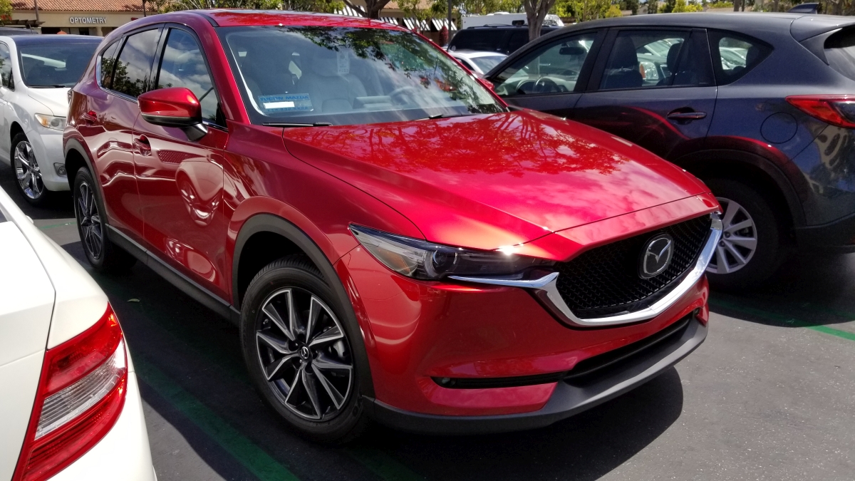
Front. Note floating emblem and pearlescent chrome red
In the previous two images, be sure to note the commonalities in thematic design between the front and rear lights; I do love a consistent design approach. I was already coming around to the design, but it was the interior that really grabbed me. A wide center console with chrome trim and leatherette boot evokes a luxury-car feel, which is exactly what I was looking for. Chrome-lined air vents, leveled door handles and center console, a dead pedal (totally unnecessary with an automatic transmission, unless you, what, always ride the brake?), and a tri-spoke steering wheel that looks more sports car than CUV. Additionally, unlike most other cars in the class which have two gauges and an info screen in between, this has three gauges, chrome-outlined, with the rightmost gauge being the info screen. That puts the speedometer front-and-center which is exactly where I like it. There’s also double-stitched leatherette and soft-touch everywhere in the black-and white interior which contributes further to the experience. Indeed, the CX-5 is often compared to Audi in terms of its interior feel, and having looked at Audi I honestly believe the Mazda outdoes it thanks to the symmetry and width of the center console.
Here’s a shot of the instrument cluster. Remember how I was just talking about consistent, thematic design? The gauge on the right with the MPG rating, trip odometer and gas gauge is all digital, however you wouldn’t know it at first glance. It matches almost perfectly with the other two gauges and leads to a unified, integrated theme, but with the additional functionalities of a digital display (this is also the gauge that is used to set the radar cruise control and contains some other informational screens). It’s beautifully done, even with the physical protrusion used to reset the trip odometer.

Instrument Cluster
The CX-5 is compared to the Audi for two other reasons, one of which almost solely sold me on the car, and one of which will likely take some significant getting used to.
The first is that unlike almost every other car company out there, Audi being a notable exception, there is a physical knob mounted directly in front of the center console that is used to navigate the infotainment system. You can only use the top-of-dash mounted screen as a touchscreen if the car is stopped. Otherwise you have to use the knob, and I love it. I have always preferred physical interaction methods over digital, and it is because of the desire to have that in areas where it is no longer practical, such as smartphones, that we have haptic feedback and vibration and the like. People like the immediate, organic response, the feel of a physical button that responds notably and demonstrably to a press, as opposed to a tacked on vibration, if at all.

The dial, in all its glory
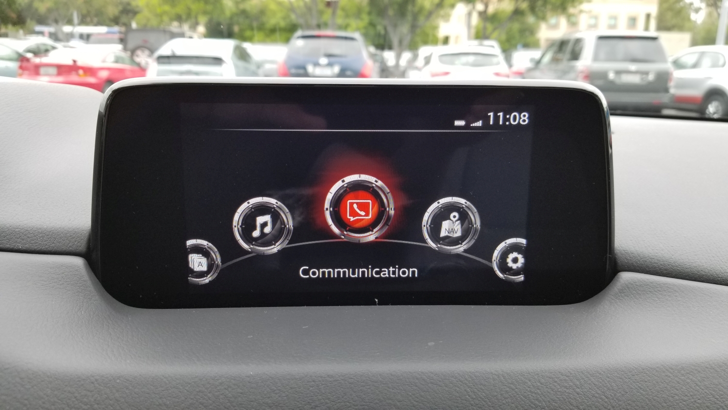
The dial is both textured and grooved, enhancing usability, and clicks with each turn, just like a well-designed mouse wheel will do, and can be used as a pseudo-joypad for moving up, down, right and left. It can also be pressed in as a selection confirmation. It’s responsive and tactile; you always know that an input has been received. Mounted around it are physical buttons with long-standard iconography that you can use to go home, back, or direct to any one of the main screens (Media, Communication, Navigation). Being able to control all aspects of the screen via physical input that’s easy to reach, where your hand naturally rests, and not having to reach out to a dash-mounted touchscreen, is wonderful.
The other reason the car is often compared to Audi, although Mercedes-Benz does this as well, is that rather than have the screen of the infotainment system in the dash itself, it is mounted on top of the dash, as though someone just smashed its vertical edge right in there. At first I really didn’t like it, it looked clumsy and tacked-on, and I am all about integration in design, but once I overheard someone describe it as ‘looking like a drive-in movie screen,’ I was hooked.
I think I’ll add some tiny plastic cars and a little drive-in marquee.
The thing I didn’t realize at first is that by having the screen mounted in such a way, your eyes don’t have to travel too far to see it. To look at a dash-mounted screen your eyes travel almost twice as far, and are off the road for longer. The way Mazda has mounted the screen is actually safer, and I find it to be much more comfortable as well.
Even with the endless praise I have for the physical input methods the car employs, and the location of the infotainment – a word I really don’t like – screen, the system itself leaves much to be desired.
While almost every other auto manufacturer on earth has adopted Apple’s Car Play and Android Auto systems, Mazda stubbornly continues to resist, and this leads to a number of issues that go beyond the lacking software integration.
The fact is, Mazda’s system is behind the times. WAY behind the times. It’s slow to boot up, and chugs and skips while doing so. While on first glance it looks quite clean, with only 5 options, navigating within those options can be a chore. For example, I connected my phone via Bluetooth, something they had me do at the dealership, and while the process was easy and worked the first time, issues became apparent almost immediately. Text alerts and calls worked fine, with clear sound on both ends and snappy response, however when streaming music the usability, or lack thereof, rears its ugly head. I have about 700 artists in my music collection, and there is no way to jump to a particular one, or even navigate by letters of the alphabet. So if I wish to listen to, say, Thin Lizzy, I have to use the knob to scroll, and scroll, and scroll, and scroll, and scroll, and scroll, and scroll, and scroll, and scroll, and scroll…you get the idea. You also can’t wrap the scroll, meaning scroll off the top and have the list appear at the bottom or vice-versa, and the tiny red handle in the below image really illustrates how long the list is. The system menus are byzantine but that’s no different from any automaker, or any software at all for that matter.
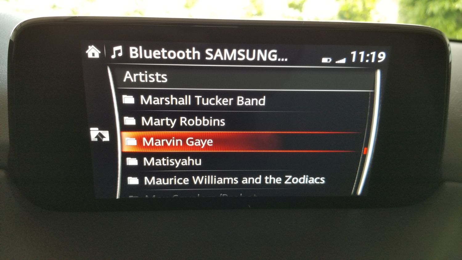
Scrollin’ Scrollin’ Scrollin, keep that songlist scrollin’.
Another odd experience is at one point my phone connected, but the car said it couldn’t access media on the phone. It could make calls and receive alerts, but couldn’t see the music and threw an error. However if I played a song on my phone, the song info came up on the car screen and the song played through the car stereo. Very weird. Eventually, and without rhyme or reason, it connected again and all was working fine.
Design concerns continue to abound in the interface, with the main being there’s no flash to the screen. What I mean is, the display is very pedestrian. While others (like the Tucson) will show full color images of the XM stations’ logos and has a graphic that looks like a radio dial if you’re tuning the radio, Mazda’s screen is very bland. On top of that, when listening to XM it bizarrely cuts off information about song and artist, even though there’s plenty of room left on the screen. The navigation screen is more lively and functional, but still tough to navigate (get it?) although it does work well once information is entered. When one considers the time and effort they put in to the overall design of the rest of the car, something they call Kodo, it is baffling they have slacked so much with this. Their information screen in the instrument cluster is full color and informative, using images and text to convey information from cruise control to fuel economy, so I am at a loss as to why the dash-based system is the way it is. Again going back to the Tucson, their screen on the top models is eight inches, full-color, and beautiful, although to be fair on lower models, the screen is only a four-incher and much more difficult to see. Of course, their screen is also exclusively touch, and navigating up and down on one of those is pure hell.
To top it all off, the actual display area of the Mazda’s screen doesn’t utilize the entire surface of the enclosure as you can see in an earlier image.
But I hold out hope. There has been significant vocalization from owners regarding this, and earlier this year Mazda informed Cars.com that they would be coming out with an Apple CarPlay and Android Auto update in the future. They didn’t give any exact dates, however the rumor is later this year. The thing is, they would have to overhaul the system to do it. They wouldn’t be able to shoehorn that functionality into the current interface in any meaningful, or non-crap way, so I am hoping when (if) the update comes, it will be a complete refresh to the whole system that reinvents it from the ground up. That would enhance the experience of this car in a big way.
Even with all my criticisms, there is so much to like. Along with my praise for the interior and exterior design discussed earlier, it has keyless ignition and entry with a detachable valet key, the car locks automatically and unlocks via a button in the handle if the key fob is in your pocket. The doors open wider than its competitors to make getting in and getting out – or, if you’re an engineer or designer, ingress and egress – easier. The radar cruise control will allow you to set a car-length distance to the car in front of you, and the Mazda will follow that car exactly without you having to do anything. It will speed up and slow down, even stop, then start again as the car in front of you does. It has a pseudo heads-up display that will show when the car shifts, blind spot alerts, the speed limit, any street signs in view (it will actually show graphics that look like red stop signs, yellow yield signs, speed limit signs with the actual speed limit, etc. It’s a neat feature), your current speed, and navigation arrows if using that feature, and amazingly does it without feeling cluttered. This is a significant safety feature as it doesn’t require taking eyes off the road for status information. The drive is by far the best driving experience of its class, with smooth shifts and almost no roll around corners, which is due to the vehicle’s unnoticeable transfer of weight to the front wheels when making turns, which keeps the car responsive and easy to control; the most apparent indicator of this is that the people inside the car don’t feel a compelling urge to lean into turns. I programmed my garage-door opener to a button on the mirror, so now the mirror opens the door and I don’t need to have the thing clipped to my visor. I have two different garage door openers for two different doors, and the mirror has three buttons, so I’m set. It has a sport mode that holds the gears longer for somewhat higher revs and offers up a little more power, and a weird manual shifting ability that I can’t imagine anyone would actually use.
Speaking of the Heads-Up Display, in the picture below, if you look closely you can see it as it appears while parked in the garage. When driving it contains much more information yet is still easy to read and interpret.

Heads-up display
In the following image taken while driving (don’t do this, kids), you can see the speed limit sign and the current speed, as well as the indicators telling me I’m in the lane which is always good. Control signs such as stop and yield can be shown, in full color and shape, concurrently with the speed limit along with the other status indicators listed above.
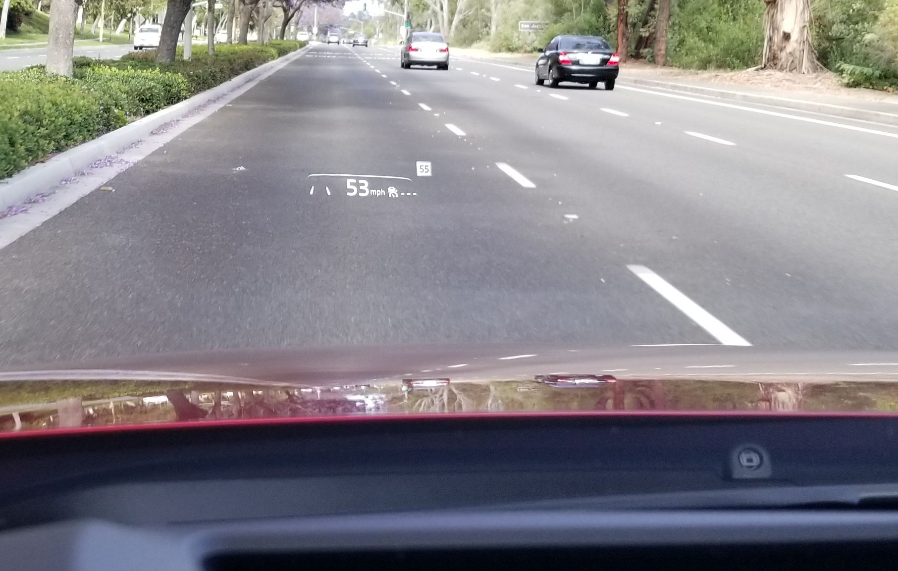
HUD while moving

HUD with Navigation
So what about the Tucson? The one I was all ready to buy? I still like it, and I’ll even confess that it gives you much more for about the same money. It has a nice outer design, ventilated seats (not cooled, as some will say), the far superior infotainment screen and system, a rear hatch that opens if you just stand next to it, a 360-degree camera and backup camera that will show you where your car is and where it will be based on how you turn the wheel (the Mazda has a backup camera that works very well, but without that added future prediction bit). The Tucson also has a panoramic sunroof, which while nice, doesn’t actually open all the way and I have heard it suffers from some mechanical problems. The CX-5 has a moonroof and I rarely used the one in the Escape anyhow, so I suspect I’ll be fine with that.
Even so, driving the Tucson just didn’t grab me. It drove well enough, but wasn’t exciting, and the interior was functional and pragmatic, but not special in any way. It offered more, but the experience of being in it and driving it just didn’t excite me or make me want to drive it, and while I can more than understand why someone would choose it over the Mazda as I almost did, I am beholden to the design, the experience, the feel of something, and in that regard Mazda just blew it away as it does to all its competitors at this price point, and some even higher.
It will take some getting used to. I drove the Escape for 10 years and put a lot of miles on it. The washers never worked, all the power-window risers broke at one point or another with a loud crash as the window collapsed into the door frame, the interior lights became stuck on at one point and I had to pull the fuse, the hatch didn’t always close all the way, the electronic clock didn’t even give the correct date. It told the right time and day, but not date. I think it might even have driven around on its own at night committing crimes. Yet I still felt a pang of sadness seeing it sitting in the dealer lot, dirty and looking dejected; I had to tell it goodbye. When they took away my beloved Dodge Dakota, back in 2008, I shed a tear. Curious how we become attached to, and even empathize / sympathize with inanimate objects, something we talk about in several of my classes.

The old and the new. I feel sad looking at this picture.
If Mazda follows through with their system / firmware update, something that should be doable through one of the car’s many USB ports, I will update this. I am following any little bit of news I get and am hoping we hear something more concrete in the near future.
IoT skills, deployment lagging behind expectations

Because I am teaching a project class in ubiquitous computing this quarter, I was struck by a post on the BPI (Business Performance Innovation) network discussing the results of a survey they conducted along with Nerdery and the Internet of Things Institute that states while industry does genuinely wish to adopt IoT strategies and deployments, they’re not happening as quickly as their enthusiasm might make it seem.
I can’t say I’m surprised by this. The most striking statistic as one reads through the report is that “…just 1.5 percent of executives at large companies say they have a clear vision with implementation well underway, while another 57 percent are either beginning implementation, have pilots underway or are committed and in the planning stages.” It’s the ‘clear vision’ aspect of this that is truly telling, especially when paired with the rest of the sentence. Immediately the question that presents itself is ‘If only 1.5 percent of executives have a clear IoT vision, how is it that 57 percent can be at various stages of design and/or implementation if they don’t?’
One clarification: In my class, and for the purposes of simplicity, we use Ubiquitous Computing and Internet of Things (IoT) interchangeably, however they’re not quite the same and I do let my students know that. The IoT is a subset of the concept of Ubiquitous Computing, the platform on which it’s enabled, similar to how the Internet is the technical foundation on which the Web operates. With that out of the way, the one issue I run into more than any other in this course is the belief of a small contingent of students that it should be a programming course, that they should be learning how to program sensors and the IoT protocols and whatnot. What I explain to them is that anyone can buy a book on how to program for the IoT; what they can’t buy is a book on how to think about the IoT. Like all technologies, IoT technologies can’t, as I tell them ad nauseum, be developed in a metaphorical vacuum. The technical issues of networking, the pragmatic issues of security and privacy, the enterprise issues of data collection and management, as well as many others, all must be considered as well when developing and deploying IoT strategies. After all, they’re not called strategies for nothing.
The second most common issue that comes up in this course is the question of what exactly the Internet of Things is. What defines it? What separates it from the regular Internet? Is that not an Internet of Things as well? How are they delineated? And where does ‘The Cloud’ fit in to all of this, if at all? Is that part of it? As is the case with all definitions, it can often depend on who you talk to. generally, in my class we define it terms of its low-power devices (sensors being the big ones) and lightweight protocols. However even in that case there can be disagreement and confusion. Do we need to make those delineations? The Internet is the Internet, yes? Do we need to divide it into TWO Internets, one for regular electronic devices and one for low-power sensors? What about our phones? Our TVs? They may be using Bluetooth but they certainly are not low-power, lightweight devices. And while this post isn’t meant to be about the technology per se, there are no fewer than twenty different protocols that can call themselves IoT protocols which has almost immediately led to standards overload. The image below gives and idea of this, although it contains both lightweight IoT as well as heavyweight regular networking protocols and where they fall in the TCP/IP stack.
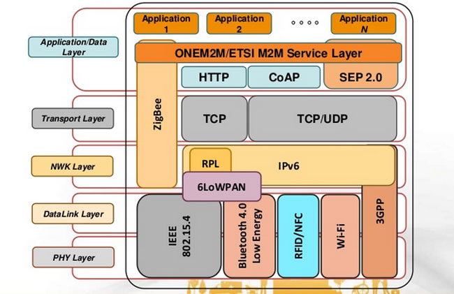
Some IoT and non-IoT protocols
And here’s this, for good measure, since we’re long past this moment in terms of the IoT. I rail against this all the time, but it never ceases to happen (and you should all read XKCD anyway):

Yep
True to this idea, The Technology Partnership in the UK states it should be called the Internet of Sensors, not the Internet of Things, since the Internet has always been an Internet of Things. A valid point, in my opinion, but then there’s also this. Let’s make up our minds, people!
And that brings me back to my introductory statistic. The linked article above has the following quote: “In my view, far too much attention is focused on getting the ‘Things” connected and not enough time is spent understanding the data insights that will actually drive the business forward.” That’s exactly right. Everyone is trying to figure out how they’ll get ‘things’ connected and get sensors out there and have an IoT strategy, but to what end? They’re so busy thinking about doing it that that they’re not thinking about why they’re doing it, what it all means, or if they need it, or how it will impact their business, or how it might impact their customers not just in terms of, say, improved customer service but also in terms of privacy and data collection and retention / distribution.
It’s important to take a step back and consider the gestalt of the IoT, and all the concerns and considerations that go along with it. It’s not a programming exercise; that’s just one low-hanging leaf on a vast tree of issues. I would hope that some people would be willing to take a step back for a moment, away from the headlong rush to have an ill-defined IoT strategy or deployment, and simply consider what it all means. We can all rush forward after that.
My Carnegie Mellon rec letter submission adventure

Try saying *that* three times fast. Also, keep in mind that Carnegie Mellon is actually a prestigious and well-respected university and dersrvedly so. That’s why the story I am about to regale you in is so bizarre. It just keeps falling down a HCI rabbit hole form which it never escapes.
I had originally intended to post something different for this week’s random design example, however yesterday I was asked to submit a letter of recommendation for one of my former students to Carnegie Mellon’s MSIT eBusiness Technology graduate program, which by itself is a mouthful.
No problem; I have done many of these before. Little did I realize that I was going to be in for an adventure.
Right off the bat, it had me submit my letter, which had to be either in Word or pdf format, which was their restriction. I uploaded a Word document, and was told that format was not valid. I converted it to pdf, and that worked.
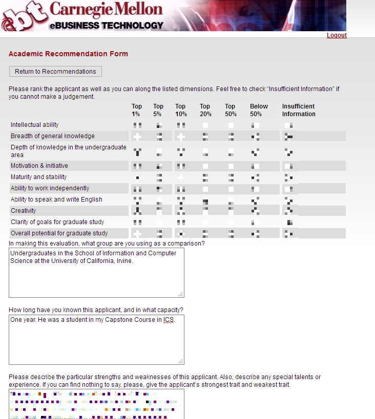
Next, I was asked to fill out some pseudo-Likert-scale questions which is common, and at the bottom of the page was a button labeled [Save Info], as seen below.
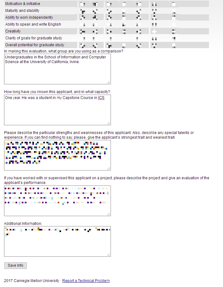
Save info button
The thing is, when I clicked that button, it just reloaded the page, putting me back at the top with a button labeled [Return to Recommendations]. No submit, no send, just…return.
Clicking that took me back to the main page where I started, and where it still said “Select a student to provide a letter of recommendation.’ But I had already done that, and in fact it indicated the submission date right underneath, next to the student’s name. I received no confirmation, no clue as to the status of the application, or whether it had actually been completed and gone through. How many of Neilsen’s or Schneiderman’s rules does that violate?

So, being the person I am, I decided I would click the link labeled ‘Report a Technical problem’ at the bottom, not minding their free-spirited use of capital letters. Doing so took me to a page that declared in bright yellow highlighting ‘Invalid e-mail address.’ Keep in mind I had not entered an email address, I only clicked the link. Did something happen I’m not aware of? Which e-mail address, if any, is it considering to be invalid? Could it even be the one to which the form submits? On top of that, the text box is red! This just gets better and better.

Is that a red (pink, actually) text box?
To top it all off, the message I entered in the red text box above ultimately got sent to…you guessed it…me.

Well hello there
I sent another email to a contact email I found on the main page, and the follwing day received a response that all had gone through. What a travail. This was the most excruciating recommendation process I’ve ever experienced. I expect more from such a prestigious university as Carnegie Mellon. At least it made for a good learning experience for us all.
(Originally written for my graduate Advanced Design and Prototyping course at UCI).