
Category Archives: Featured
An evaluation of my new Mazda CX-5. What’s good, what’s not, the decision-making process, and their curious approach to automotive design and technology

I don’t normally talk about cars in and of themselves on this site, so despite that, or perhaps because of it, this post will cover a lot. Decision making, design, automotive technology, corporate perspective, individualism, aesthetics v. functionality v. pragmatism, collaborative filtering, and others. It’s quite interesting to me the complexities of making such a big decision as buying a new car and what goes into it. This was not an easy decision.
About two months ago, as I was shooting down the 405 south through Irvine, my 2008 Ford Escape hybrid suddenly lurched forward as though I had dumped the clutch, lost all power (which is especially bad in a hybrid), and forced me to fight the loss of steering to get it off to the shoulder. It was then that I noticed it had also displayed a message on the dash: “Stop Safely Now.”

This sounds bad
The red exclamation point was a nice, added touch. I did stop safely, but it was a little late for that message. That little event could have been fatal, however after shutting off then restarting the car, everything seemed to be fine. I was hoping that would be the end of it, considering a similar event happened years earlier and restarting the car appeared to have eliminated the problem. This time, however, would be different.
It happened again. And again. After some research, I learned the problem, and a much bigger potential problem: A component used to cool other electronic components in the car had gone bad. Not only that, someone had died because of it and there was a class-action lawsuit in progress because of it. As the car already had over 100K miles, and other aspects of it had never worked properly, I determined it was time to start the hunt for a new car.
I considered many, and for many reasons. I’m not the luxury car type, and didn’t want to overspend, but looked at all my options. Ultimately, the decision came down to the Hyundai Tuscon and the Mazda CX-5. I decided on the latter, but not without some hesitation that I still carry. When there are many options, there is rarely a clear-cut winner, and this particular decision shows the nuanced nature of, and requirement for, an individualistic approach.
To set some groundwork, I wanted a crossover SUV, sometimes known as a CUV, or more colloquially – and derogatory, I assume – a cute-ute. (To clarify some terms, an actual SUV uses a unibody truck frame, whereas a crossover utilizes the crossover body on a car frame). At the same time, while I have always driven cars that seem somehow ‘rugged,’ like a Jeep Wrangler, Jeep Cherokee, Dodge Dakota, then the Escape, this time I wanted something that was a little more upscale, something that had elegance to it, while maintaining a slight, subtle edge.
There wasn’t much that met those criteria. It was easy to narrow down the search to the Hyndai Tuscon, which has an aggressive theme line, and comes with a lot of options, however while I was researching it, I kept seeing reviews – stellar reviews – for the Mazda CX-5. I was ready to buy, but for something like a car you want to evaluate all your options, and I felt I should at least look at the Mazda before making a final decision.
I knew nothing about Mazda. I don’t know anyone who drives a Mazda, and I have never known anyone who drives a Mazda. I am, however, beholden to design, and that will become important very quickly.
On first approach, the vehicles didn’t move me, metaphorically speaking. I walked around the car to set a baseline for myself, yet nothing stood out. However, as I returned to the front of the car, I noticed something: A chrome trim running along the bottom frame of the grill. It made a nice accent, especially when the sun hit it, and the floating, prominent Mazda logo, which hides the radar for the radar cruise control, has a nice presence in an understated mesh grill.

View from the front, at dealership
Following the line of the chrome accent, I now noticed the lines of the car itself, and what do you know; understated yet still with a subtle, aggressive edge. Narrow, down-sloped headlights, slightly wider at the hips, an ever-so-slightly reclined greenhouse and canted grill gives it a look of movement. In my search I had also been looking for some kind of pearlescent black, but Mazda’s new three-coat metallic red really shines, both literally and figuratively. I have never been a fan of red cars, but this one is beautiful; absurdly, almost comically chrome red.

Side view of car
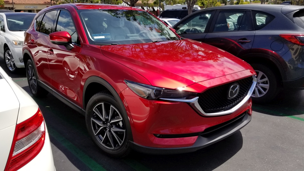
Front. Note floating emblem and pearlescent chrome red
In the previous two images, be sure to note the commonalities in thematic design between the front and rear lights; I do love a consistent design approach. I was already coming around to the design, but it was the interior that really grabbed me. A wide center console with chrome trim and leatherette boot evokes a luxury-car feel, which is exactly what I was looking for. Chrome-lined air vents, leveled door handles and center console, a dead pedal (totally unnecessary with an automatic transmission, unless you, what, always ride the brake?), and a tri-spoke steering wheel that looks more sports car than CUV. Additionally, unlike most other cars in the class which have two gauges and an info screen in between, this has three gauges, chrome-outlined, with the rightmost gauge being the info screen. That puts the speedometer front-and-center which is exactly where I like it. There’s also double-stitched leatherette and soft-touch everywhere in the black-and white interior which contributes further to the experience. Indeed, the CX-5 is often compared to Audi in terms of its interior feel, and having looked at Audi I honestly believe the Mazda outdoes it thanks to the symmetry and width of the center console.
Here’s a shot of the instrument cluster. Remember how I was just talking about consistent, thematic design? The gauge on the right with the MPG rating, trip odometer and gas gauge is all digital, however you wouldn’t know it at first glance. It matches almost perfectly with the other two gauges and leads to a unified, integrated theme, but with the additional functionalities of a digital display (this is also the gauge that is used to set the radar cruise control and contains some other informational screens). It’s beautifully done, even with the physical protrusion used to reset the trip odometer.

Instrument Cluster
The CX-5 is compared to the Audi for two other reasons, one of which almost solely sold me on the car, and one of which will likely take some significant getting used to.
The first is that unlike almost every other car company out there, Audi being a notable exception, there is a physical knob mounted directly in front of the center console that is used to navigate the infotainment system. You can only use the top-of-dash mounted screen as a touchscreen if the car is stopped. Otherwise you have to use the knob, and I love it. I have always preferred physical interaction methods over digital, and it is because of the desire to have that in areas where it is no longer practical, such as smartphones, that we have haptic feedback and vibration and the like. People like the immediate, organic response, the feel of a physical button that responds notably and demonstrably to a press, as opposed to a tacked on vibration, if at all.

The dial, in all its glory
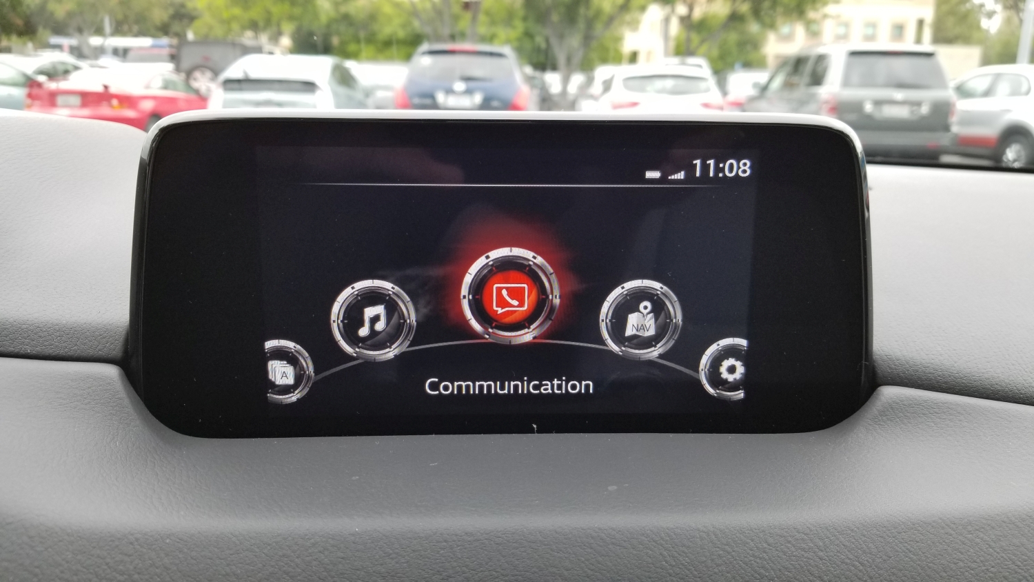
The dial is both textured and grooved, enhancing usability, and clicks with each turn, just like a well-designed mouse wheel will do, and can be used as a pseudo-joypad for moving up, down, right and left. It can also be pressed in as a selection confirmation. It’s responsive and tactile; you always know that an input has been received. Mounted around it are physical buttons with long-standard iconography that you can use to go home, back, or direct to any one of the main screens (Media, Communication, Navigation). Being able to control all aspects of the screen via physical input that’s easy to reach, where your hand naturally rests, and not having to reach out to a dash-mounted touchscreen, is wonderful.
The other reason the car is often compared to Audi, although Mercedes-Benz does this as well, is that rather than have the screen of the infotainment system in the dash itself, it is mounted on top of the dash, as though someone just smashed its vertical edge right in there. At first I really didn’t like it, it looked clumsy and tacked-on, and I am all about integration in design, but once I overheard someone describe it as ‘looking like a drive-in movie screen,’ I was hooked.
I think I’ll add some tiny plastic cars and a little drive-in marquee.
The thing I didn’t realize at first is that by having the screen mounted in such a way, your eyes don’t have to travel too far to see it. To look at a dash-mounted screen your eyes travel almost twice as far, and are off the road for longer. The way Mazda has mounted the screen is actually safer, and I find it to be much more comfortable as well.
Even with the endless praise I have for the physical input methods the car employs, and the location of the infotainment – a word I really don’t like – screen, the system itself leaves much to be desired.
While almost every other auto manufacturer on earth has adopted Apple’s Car Play and Android Auto systems, Mazda stubbornly continues to resist, and this leads to a number of issues that go beyond the lacking software integration.
The fact is, Mazda’s system is behind the times. WAY behind the times. It’s slow to boot up, and chugs and skips while doing so. While on first glance it looks quite clean, with only 5 options, navigating within those options can be a chore. For example, I connected my phone via Bluetooth, something they had me do at the dealership, and while the process was easy and worked the first time, issues became apparent almost immediately. Text alerts and calls worked fine, with clear sound on both ends and snappy response, however when streaming music the usability, or lack thereof, rears its ugly head. I have about 700 artists in my music collection, and there is no way to jump to a particular one, or even navigate by letters of the alphabet. So if I wish to listen to, say, Thin Lizzy, I have to use the knob to scroll, and scroll, and scroll, and scroll, and scroll, and scroll, and scroll, and scroll, and scroll, and scroll…you get the idea. You also can’t wrap the scroll, meaning scroll off the top and have the list appear at the bottom or vice-versa, and the tiny red handle in the below image really illustrates how long the list is. The system menus are byzantine but that’s no different from any automaker, or any software at all for that matter.
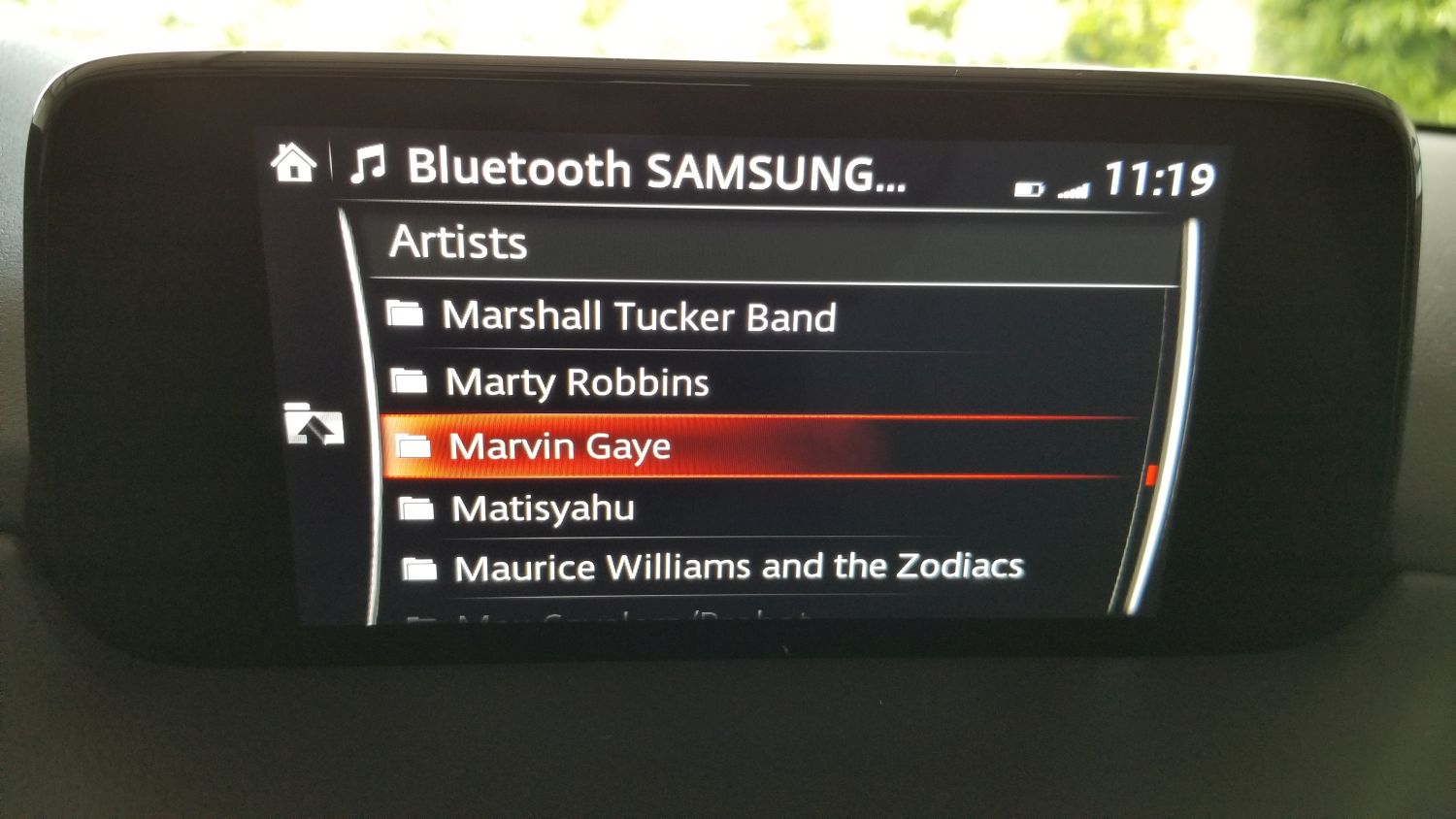
Scrollin’ Scrollin’ Scrollin, keep that songlist scrollin’.
Another odd experience is at one point my phone connected, but the car said it couldn’t access media on the phone. It could make calls and receive alerts, but couldn’t see the music and threw an error. However if I played a song on my phone, the song info came up on the car screen and the song played through the car stereo. Very weird. Eventually, and without rhyme or reason, it connected again and all was working fine.
Design concerns continue to abound in the interface, with the main being there’s no flash to the screen. What I mean is, the display is very pedestrian. While others (like the Tucson) will show full color images of the XM stations’ logos and has a graphic that looks like a radio dial if you’re tuning the radio, Mazda’s screen is very bland. On top of that, when listening to XM it bizarrely cuts off information about song and artist, even though there’s plenty of room left on the screen. The navigation screen is more lively and functional, but still tough to navigate (get it?) although it does work well once information is entered. When one considers the time and effort they put in to the overall design of the rest of the car, something they call Kodo, it is baffling they have slacked so much with this. Their information screen in the instrument cluster is full color and informative, using images and text to convey information from cruise control to fuel economy, so I am at a loss as to why the dash-based system is the way it is. Again going back to the Tucson, their screen on the top models is eight inches, full-color, and beautiful, although to be fair on lower models, the screen is only a four-incher and much more difficult to see. Of course, their screen is also exclusively touch, and navigating up and down on one of those is pure hell.
To top it all off, the actual display area of the Mazda’s screen doesn’t utilize the entire surface of the enclosure as you can see in an earlier image.
But I hold out hope. There has been significant vocalization from owners regarding this, and earlier this year Mazda informed Cars.com that they would be coming out with an Apple CarPlay and Android Auto update in the future. They didn’t give any exact dates, however the rumor is later this year. The thing is, they would have to overhaul the system to do it. They wouldn’t be able to shoehorn that functionality into the current interface in any meaningful, or non-crap way, so I am hoping when (if) the update comes, it will be a complete refresh to the whole system that reinvents it from the ground up. That would enhance the experience of this car in a big way.
Even with all my criticisms, there is so much to like. Along with my praise for the interior and exterior design discussed earlier, it has keyless ignition and entry with a detachable valet key, the car locks automatically and unlocks via a button in the handle if the key fob is in your pocket. The doors open wider than its competitors to make getting in and getting out – or, if you’re an engineer or designer, ingress and egress – easier. The radar cruise control will allow you to set a car-length distance to the car in front of you, and the Mazda will follow that car exactly without you having to do anything. It will speed up and slow down, even stop, then start again as the car in front of you does. It has a pseudo heads-up display that will show when the car shifts, blind spot alerts, the speed limit, any street signs in view (it will actually show graphics that look like red stop signs, yellow yield signs, speed limit signs with the actual speed limit, etc. It’s a neat feature), your current speed, and navigation arrows if using that feature, and amazingly does it without feeling cluttered. This is a significant safety feature as it doesn’t require taking eyes off the road for status information. The drive is by far the best driving experience of its class, with smooth shifts and almost no roll around corners, which is due to the vehicle’s unnoticeable transfer of weight to the front wheels when making turns, which keeps the car responsive and easy to control; the most apparent indicator of this is that the people inside the car don’t feel a compelling urge to lean into turns. I programmed my garage-door opener to a button on the mirror, so now the mirror opens the door and I don’t need to have the thing clipped to my visor. I have two different garage door openers for two different doors, and the mirror has three buttons, so I’m set. It has a sport mode that holds the gears longer for somewhat higher revs and offers up a little more power, and a weird manual shifting ability that I can’t imagine anyone would actually use.
Speaking of the Heads-Up Display, in the picture below, if you look closely you can see it as it appears while parked in the garage. When driving it contains much more information yet is still easy to read and interpret.

Heads-up display
In the following image taken while driving (don’t do this, kids), you can see the speed limit sign and the current speed, as well as the indicators telling me I’m in the lane which is always good. Control signs such as stop and yield can be shown, in full color and shape, concurrently with the speed limit along with the other status indicators listed above.
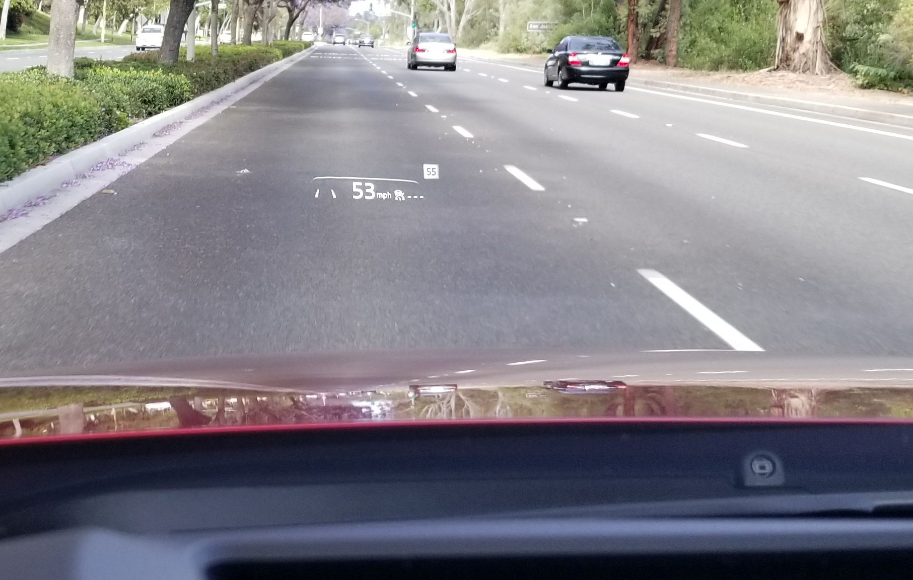
HUD while moving

HUD with Navigation
So what about the Tucson? The one I was all ready to buy? I still like it, and I’ll even confess that it gives you much more for about the same money. It has a nice outer design, ventilated seats (not cooled, as some will say), the far superior infotainment screen and system, a rear hatch that opens if you just stand next to it, a 360-degree camera and backup camera that will show you where your car is and where it will be based on how you turn the wheel (the Mazda has a backup camera that works very well, but without that added future prediction bit). The Tucson also has a panoramic sunroof, which while nice, doesn’t actually open all the way and I have heard it suffers from some mechanical problems. The CX-5 has a moonroof and I rarely used the one in the Escape anyhow, so I suspect I’ll be fine with that.
Even so, driving the Tucson just didn’t grab me. It drove well enough, but wasn’t exciting, and the interior was functional and pragmatic, but not special in any way. It offered more, but the experience of being in it and driving it just didn’t excite me or make me want to drive it, and while I can more than understand why someone would choose it over the Mazda as I almost did, I am beholden to the design, the experience, the feel of something, and in that regard Mazda just blew it away as it does to all its competitors at this price point, and some even higher.
It will take some getting used to. I drove the Escape for 10 years and put a lot of miles on it. The washers never worked, all the power-window risers broke at one point or another with a loud crash as the window collapsed into the door frame, the interior lights became stuck on at one point and I had to pull the fuse, the hatch didn’t always close all the way, the electronic clock didn’t even give the correct date. It told the right time and day, but not date. I think it might even have driven around on its own at night committing crimes. Yet I still felt a pang of sadness seeing it sitting in the dealer lot, dirty and looking dejected; I had to tell it goodbye. When they took away my beloved Dodge Dakota, back in 2008, I shed a tear. Curious how we become attached to, and even empathize / sympathize with inanimate objects, something we talk about in several of my classes.

The old and the new. I feel sad looking at this picture.
If Mazda follows through with their system / firmware update, something that should be doable through one of the car’s many USB ports, I will update this. I am following any little bit of news I get and am hoping we hear something more concrete in the near future.
IoT skills, deployment lagging behind expectations

Because I am teaching a project class in ubiquitous computing this quarter, I was struck by a post on the BPI (Business Performance Innovation) network discussing the results of a survey they conducted along with Nerdery and the Internet of Things Institute that states while industry does genuinely wish to adopt IoT strategies and deployments, they’re not happening as quickly as their enthusiasm might make it seem.
I can’t say I’m surprised by this. The most striking statistic as one reads through the report is that “…just 1.5 percent of executives at large companies say they have a clear vision with implementation well underway, while another 57 percent are either beginning implementation, have pilots underway or are committed and in the planning stages.” It’s the ‘clear vision’ aspect of this that is truly telling, especially when paired with the rest of the sentence. Immediately the question that presents itself is ‘If only 1.5 percent of executives have a clear IoT vision, how is it that 57 percent can be at various stages of design and/or implementation if they don’t?’
One clarification: In my class, and for the purposes of simplicity, we use Ubiquitous Computing and Internet of Things (IoT) interchangeably, however they’re not quite the same and I do let my students know that. The IoT is a subset of the concept of Ubiquitous Computing, the platform on which it’s enabled, similar to how the Internet is the technical foundation on which the Web operates. With that out of the way, the one issue I run into more than any other in this course is the belief of a small contingent of students that it should be a programming course, that they should be learning how to program sensors and the IoT protocols and whatnot. What I explain to them is that anyone can buy a book on how to program for the IoT; what they can’t buy is a book on how to think about the IoT. Like all technologies, IoT technologies can’t, as I tell them ad nauseum, be developed in a metaphorical vacuum. The technical issues of networking, the pragmatic issues of security and privacy, the enterprise issues of data collection and management, as well as many others, all must be considered as well when developing and deploying IoT strategies. After all, they’re not called strategies for nothing.
The second most common issue that comes up in this course is the question of what exactly the Internet of Things is. What defines it? What separates it from the regular Internet? Is that not an Internet of Things as well? How are they delineated? And where does ‘The Cloud’ fit in to all of this, if at all? Is that part of it? As is the case with all definitions, it can often depend on who you talk to. generally, in my class we define it terms of its low-power devices (sensors being the big ones) and lightweight protocols. However even in that case there can be disagreement and confusion. Do we need to make those delineations? The Internet is the Internet, yes? Do we need to divide it into TWO Internets, one for regular electronic devices and one for low-power sensors? What about our phones? Our TVs? They may be using Bluetooth but they certainly are not low-power, lightweight devices. And while this post isn’t meant to be about the technology per se, there are no fewer than twenty different protocols that can call themselves IoT protocols which has almost immediately led to standards overload. The image below gives and idea of this, although it contains both lightweight IoT as well as heavyweight regular networking protocols and where they fall in the TCP/IP stack.
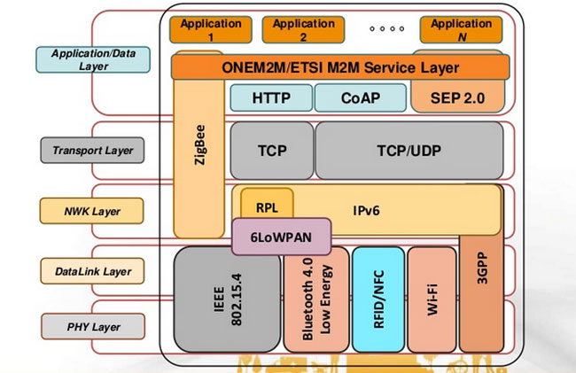
Some IoT and non-IoT protocols
And here’s this, for good measure, since we’re long past this moment in terms of the IoT. I rail against this all the time, but it never ceases to happen (and you should all read XKCD anyway):

Yep
True to this idea, The Technology Partnership in the UK states it should be called the Internet of Sensors, not the Internet of Things, since the Internet has always been an Internet of Things. A valid point, in my opinion, but then there’s also this. Let’s make up our minds, people!
And that brings me back to my introductory statistic. The linked article above has the following quote: “In my view, far too much attention is focused on getting the ‘Things” connected and not enough time is spent understanding the data insights that will actually drive the business forward.” That’s exactly right. Everyone is trying to figure out how they’ll get ‘things’ connected and get sensors out there and have an IoT strategy, but to what end? They’re so busy thinking about doing it that that they’re not thinking about why they’re doing it, what it all means, or if they need it, or how it will impact their business, or how it might impact their customers not just in terms of, say, improved customer service but also in terms of privacy and data collection and retention / distribution.
It’s important to take a step back and consider the gestalt of the IoT, and all the concerns and considerations that go along with it. It’s not a programming exercise; that’s just one low-hanging leaf on a vast tree of issues. I would hope that some people would be willing to take a step back for a moment, away from the headlong rush to have an ill-defined IoT strategy or deployment, and simply consider what it all means. We can all rush forward after that.
Animate your desktop
I’ve always wondered why we don’t have animated wallpapers for desktop machines. After all, if Android phones can have them, why not the big guys? There are valid, pragmatic reasons; they’re distracting, they drain system resources, and they can be hell on a laptop battery or other device that isn’t plugged in. But perfectly reasonable caveats don’t interest us, we know the risks, we want animated wallpapers, and now we can have them.
Incidentally, the idea of animating desktop elements has been around forever. Back in the early 1990s there was an add-on program for Windows 3.1 called Icon Hear-It that added animated cursors, animated icons, and additional sounds to the GUI. Of course, that early in the computer revolution, none of us realized how truly gaudy and resource-intensive all that nonsense was.
But a tasteful, animated wallpaper can make for an elegant display. I was going to talk about the way I do it on Windows 10, but I suppose I should also talk about Windows 7 and 8. Regardless of the version of Windows you are running, you’re going to need a third-party program; no OS offers animated wallpaper functionality. For the latter versions, there is a program by Stardock called DeskScapes that provides a selection of animated wallpapers, and even allows you to create your own from gifs, videos, or other animations. It’s not terribly resource dependent and ran relatively smooth on Windows 8 in a Virtual Machine.
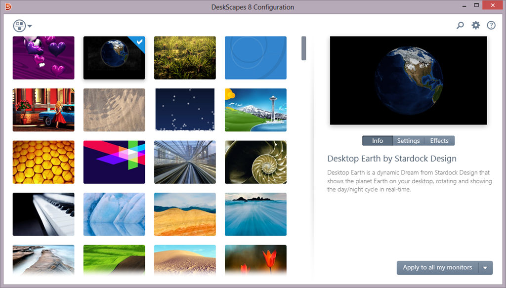
Stardock Deskscapes
I recently learned of another program, however, called Wallpaper Engine, that is (supposedly) designed to have a very small resource footprint, and is even available through Steam for a measly $4.00 (as opposed to DeskScapes’ $9.99). Another big plus for it is that some of its wallpapers support triple-monitor setups, which I have, so I wanted to look into it further.
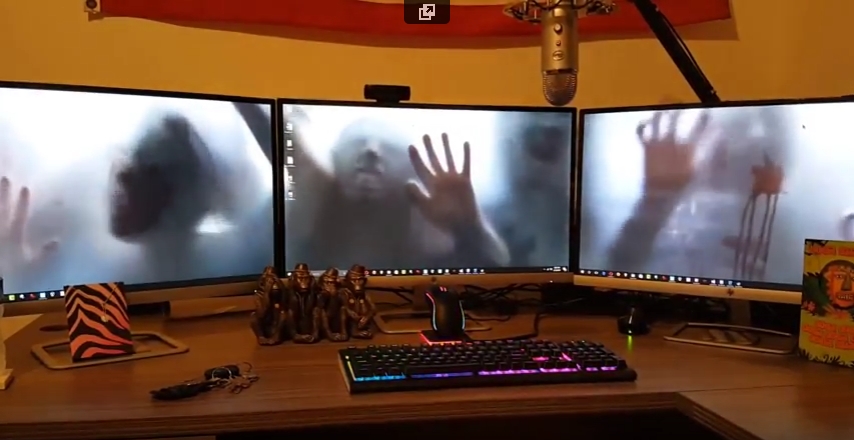
It has been working quite well so far. Interestingly, in my graduate design class this week we are discussing ethics, and it turns out that there are some ethically questionable ways in which this program can be used. For example: Of course the first animated wallpaper I downloaded was of zombies. But it turns out they’re not just any zombies, they’re from a video created by a company called AtmosFX (formerly Atmosfear), which creates videos to be used around Halloween by projecting them on a sheet hanging over a window or similar. They do have a lot of neat videos, I’ve considered using them myself and buying a projector just for their videos, and you may seen have seen some on display around that time of year at Spirit Halloween.

AtmosFX decorations
Apparently, AtmosFX has filed a complaint with Valve, who runs steam, and with Wallpaper Engine, stating that the background is copyrighted material and shouldn’t be downloadable for free with their program, although Wallpaper Engine didn’t provide it, only the capability to create it from existing video. Therefore, determining who is actually for the alleged copyright violation, if there is one, will be difficult. I suspect Valve will simply remove the offending wallpaper from the Wallpaper Engine workshop, however there are many, many, MANY more options for one to choose from, with the expected heavy emphasis on things like Anime and, you know, related things.
Here is a video of my three-screen setup running the zombies animated wallpaper. Also note: Not all wallpapers work across three screens, and I have had some real problems with scaling, in which Wallpaper Engine will only show the top 40 percent of the animation rather than scale it properly across screens. Single-screen setups and most dual-screen setups do not have this issue (as far as I can tell).
Journey with me back to the early days of the Internet with ReoCities, the GeoCities archive
In my graduate design class this week, the additional discussion topic (bonus, as I refer to it, although I suspect my students might disagree) involves the attempt to archive one of the early web’s most important communities. Indeed, I wanted to go back in time to the early days of the World Wide Web, circa 1993, and as a technology historian, indulge that aspect as well. The Internet, like me, was brought online in the glorious year of 1968, however it remained the domain of scholars and governments for over two decades before becoming available via the World Wide Web to the riff raff public and its clammy tendrils (by the way, ‘Internet’ is always capitalized, regardless of what the Oxford English Dictionary says). Remember also that the Internet and the WWW are not the same thing; the Internet is the technologies, hardware, software and protocols on which the web sits – the Web didn’t come online until around 1990. Getting back on track, to say design was at its nadir at that point would be a severe understatement; while interaction methods had been developed and attempted over the years (light pens, for example), that was by specialists in specific domains, and when I say specialists I don’t mean interaction specialists, I mean engineers and programmers, but now web design was about to be attempted by everyone.
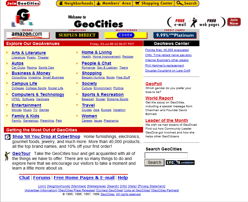
When everyday people began to experiment with what the Web offered, they did so from an adventurous, new, exciting perspective. Interaction methods, organizing elements, color, layout, usability, nobody cared about this stuff, we were amazed at the accessibility of it all. We hadn’t even learned it was bad form to hotlink images! Almost none of the technologies, platforms, infrastructure, anything, really, we have today was available back then other than base protocols, and even those have evolved significantly. But one thing we did see, very early on, was a foreshadowing of the idea of a web 2.0, in which user generated content and communities guided the growth of one particular website far beyond what anyone expected. Before the design disaster that was MySpace, anyone who was anyone cut their teeth on GeoCities.
GeoCities page
Everyone knows GeoCities was the equivalent of a design traffic accident with its animated gifs and auto-play MIDI tunes (and was the inspiration for the landing page for this very course), but that’s looking at it through the-opposite-of-rose-colored glasses. We know that *now.* Back then, the ability for anyone to have a presence online and represent yourself immediately all over the world was almost too much to process. No one cared about design, they just wanted to create. As anyone now looking at a GeoCities page could tell you, design would come later. Much later.
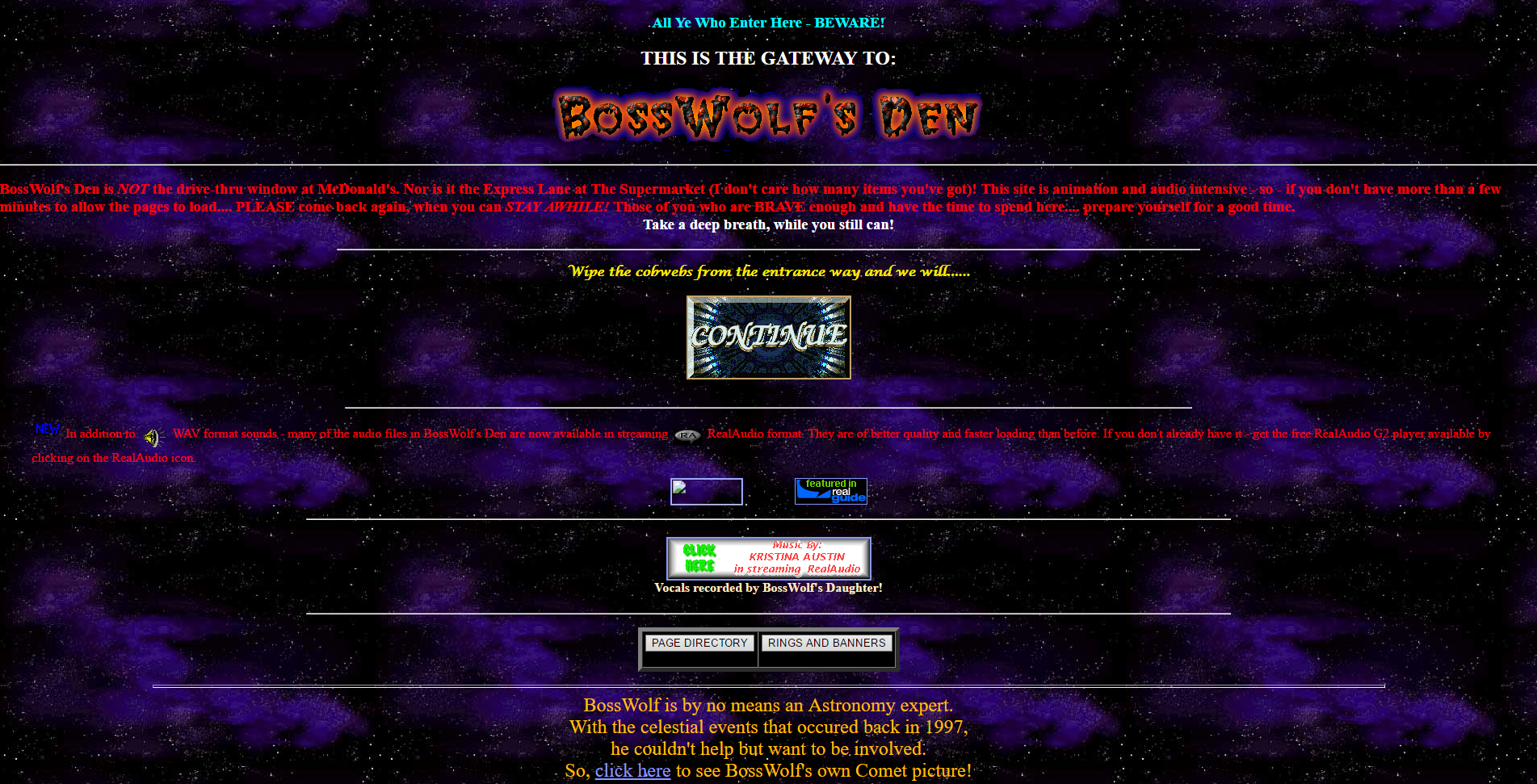
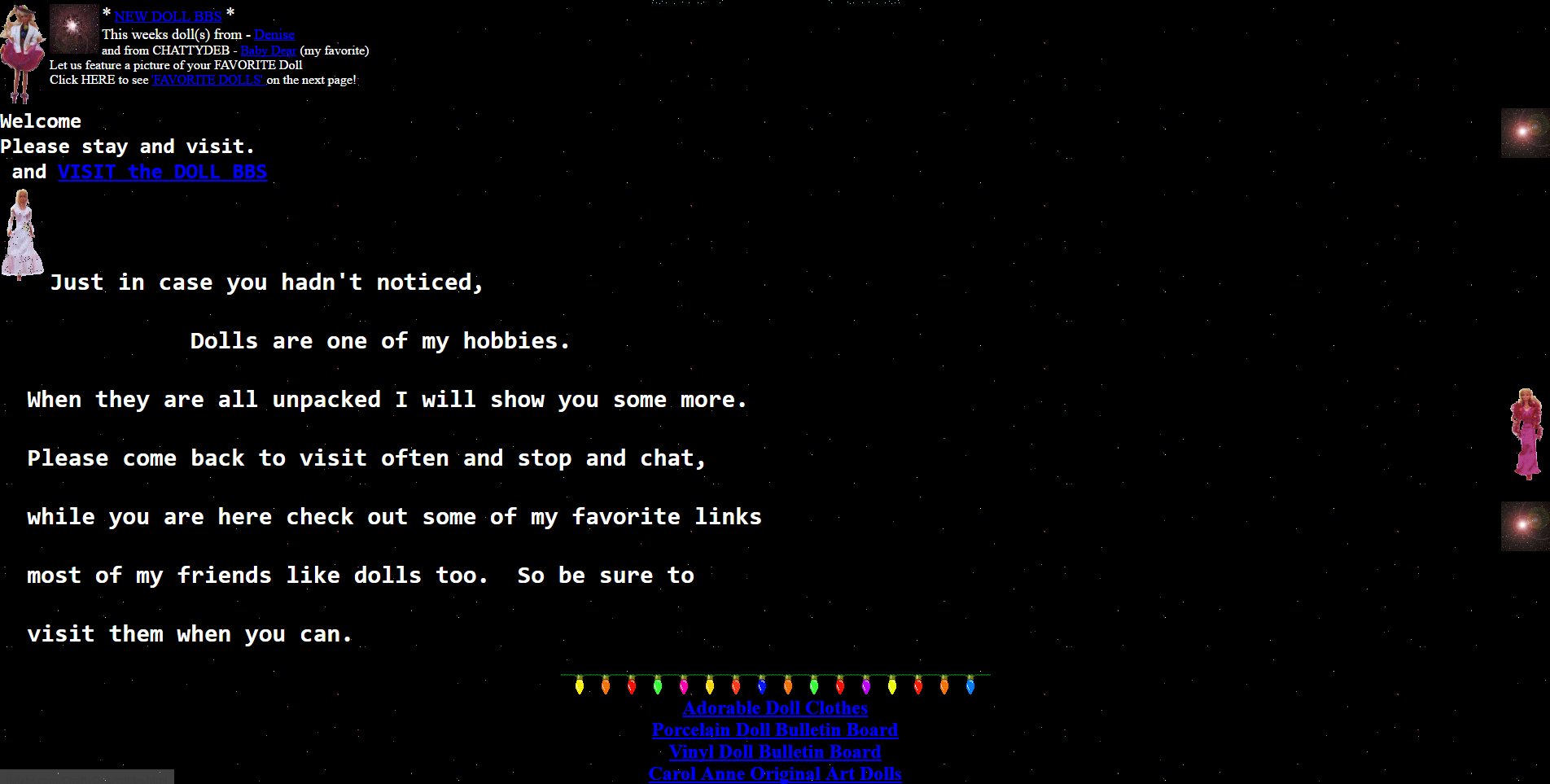
BossWolf’s Den
GeoCities divided their content up into towns, each of which represented a particular interest. Whether it was fantasy, health, sports, the arts, or whatever else, there was a neighborhood for it where a community of like-minded individuals could set up a shingle, as it were, and have a presence…perhaps even make some new acquaintances or even friends with the same interests.
The site’s growth and eventual buyout by Yahoo and unavoidable death is beyond the scope of what is intended to be a design history, however it is a fascinating story and very interesting if you get the chance – you can read about it on this Computer History Museum page (look at that GeoCities landing page!).
Instead, this long narrative is to let you know that you can still experience GeoCities in all its poor-design glory thanks to the project known as ReoCities. They have archived millions of pages from GeoCities, and while the usability leaves a lot to be desired, it is a fascinating look at web design back then, and looking back through time at these pages I feel like an astronomer looking back in time at a star. It gives a frozen-in-time glimpse into not just where we were, but how far we’ve come. I used ReoCities for all the screenshots in this post.
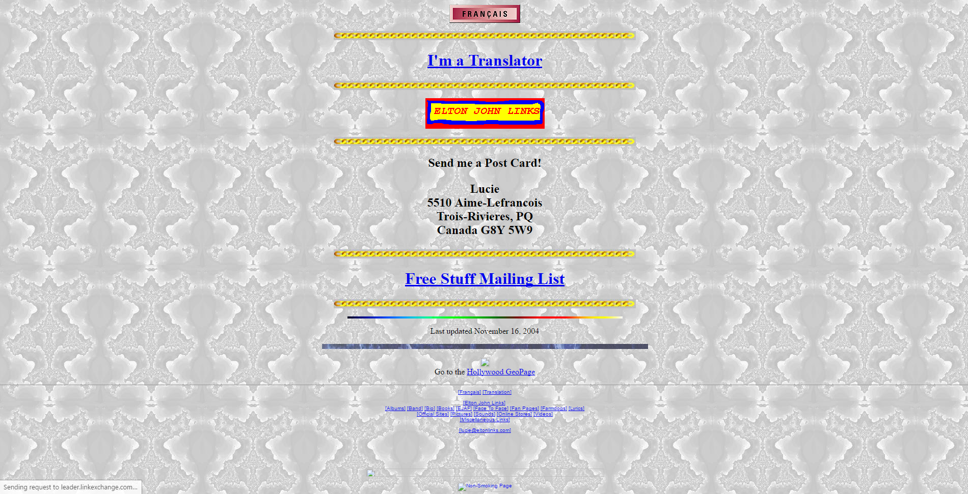
GeoCities Page
I have to be honest, some of the pages are difficult to view, the design is that wacky. In terms of expression, in terms of digital explorers mapping out a new, unexplored land, however, it’s mesmerizing. I can’t tell you how long I spent not only exploring the myriad pages archived by the service, but seeing how many of the external links still worked (not many, although some GeoCities page redirect to a proper hosted site; very smart), and even doing some research to see if any of the people or organizations are still around and updated their web presence. It was a pleasant surprise to see some of them actually had!

Friends
It’s a really fascinating time capsule not just of early web design, but also of where the web was its infancy. Seeing how design has changed, what was considered acceptable design back then versus now when we have so many rules and standards and guidelines is enlightening. And if, on the off chance, you have a link that points to a GeoCities site that they’ve archived, a simple letter change can update your link!
I’m a big fan of historical preservation of digital property (archive.org is another glorious monument to what was). Start your wayback voyage to GeoCities over at ReoCities.
My Carnegie Mellon rec letter submission adventure
Try saying *that* three times fast. Also, keep in mind that Carnegie Mellon is actually a prestigious and well-respected university and dersrvedly so. That’s why the story I am about to regale you in is so bizarre. It just keeps falling down a HCI rabbit hole form which it never escapes.
I had originally intended to post something different for this week’s random design example, however yesterday I was asked to submit a letter of recommendation for one of my former students to Carnegie Mellon’s MSIT eBusiness Technology graduate program, which by itself is a mouthful.
No problem; I have done many of these before. Little did I realize that I was going to be in for an adventure.
Right off the bat, it had me submit my letter, which had to be either in Word or pdf format, which was their restriction. I uploaded a Word document, and was told that format was not valid. I converted it to pdf, and that worked.
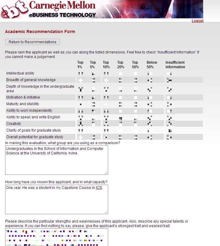
Next, I was asked to fill out some pseudo-Likert-scale questions which is common, and at the bottom of the page was a button labeled [Save Info], as seen below.
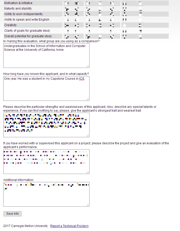
Save info button
The thing is, when I clicked that button, it just reloaded the page, putting me back at the top with a button labeled [Return to Recommendations]. No submit, no send, just…return.
Clicking that took me back to the main page where I started, and where it still said “Select a student to provide a letter of recommendation.’ But I had already done that, and in fact it indicated the submission date right underneath, next to the student’s name. I received no confirmation, no clue as to the status of the application, or whether it had actually been completed and gone through. How many of Neilsen’s or Schneiderman’s rules does that violate?

So, being the person I am, I decided I would click the link labeled ‘Report a Technical problem’ at the bottom, not minding their free-spirited use of capital letters. Doing so took me to a page that declared in bright yellow highlighting ‘Invalid e-mail address.’ Keep in mind I had not entered an email address, I only clicked the link. Did something happen I’m not aware of? Which e-mail address, if any, is it considering to be invalid? Could it even be the one to which the form submits? On top of that, the text box is red! This just gets better and better.
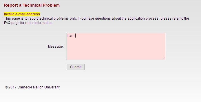
Is that a red (pink, actually) text box?
To top it all off, the message I entered in the red text box above ultimately got sent to…you guessed it…me.

Well hello there
I sent another email to a contact email I found on the main page, and the follwing day received a response that all had gone through. What a travail. This was the most excruciating recommendation process I’ve ever experienced. I expect more from such a prestigious university as Carnegie Mellon. At least it made for a good learning experience for us all.
(Originally written for my graduate Advanced Design and Prototyping course at UCI).
Poke the Bunny!

Before I get to the main thrust of this post, it’s important to provide some perspective for those unfamiliar. As you all should know, my Ph.D. is in Human Computer Interaction, my undergrad in Cognitive Psych, I teach multiple interaction design and interface development and analysis courses (game design as well!), so when I see a well-designed interface, or anything that’s inherently usable as a result of its construction, it just makes me feel all giddy inside.
What, then, is a good example of a well-designed interface? I’ll show you. It’s an example I’ve been using for some time, all the way back since it was a Flash animation on a website called platinumgrit.com, which was a showcase for an Australian Flash animation series. The site is long since dead, or more appropriately, dormant, but it once hosted what I consider to be the best, most pure example of interface design I have ever seen. In fact, I was reminded of it because of a conversation thread on a message board for my graduate class in advanced design and prototyping.
It’s called, no joke, Poke the Bunny.

Push it!
Before I show you the rest of interface and give away the surprise, let me explain why it is so good. One of the cardinal rules of interface design is clarity; speaking clearly to the user. Don’t label links ‘click here,’ don’t label buttons ‘push me,’ don’t call an error ‘error 0x14323929.’ State what the user can do, and make it clear what the consequence of that action will be. Of course, cardinal rules are meant to be broken since so many interfaces break them.
But not this one. The interface is comprised of exactly three elements. The first element is a graphic of a bunny that frankly looks pissed off. The next is a fist with an extended pointer finger aimed squarely at the bunny’s backside. And the third element is a button labeled ‘Poke the Bunny.’ It is clearly labeled in reference to its action. It leaves no doubt or question in the mind of the user what it’s function is and what will happen when you push it. Not only is it a beautiful example of interaction design, there is such a direct link between all the elements on the screen that the role of each is immediately apparent, specific, and isolated. It’s the most pure interface I’ve ever seen.
Not only that, the effectiveness of the action/response is very satisfying. Because it’s easy to use, obvious to figure out, impossible to get lost, it makes the actual use of the interface, even though it has just a single interactive element, a joy to use. Even though all you’re doing is poking the bunny, the nature of the design combined with the absurdity of the situation make it oddly addicting and fun. And that is a desirable goal for an interface; You want it to be fun, exciting, enjoyable, interesting, educational, all the positive aspects that make people feel good should be elicited from your design, And in this case, it is. it’s just plain fun.
(There’s also a surprise, though, if you work for it).
And it’s available on Android! As I mentioned, the site has been sadly dormant for some time, however I was overjoyed to discover that if you have an Android phone you can download it from the Play store! There used to be a version for iOS, however I have the sneaking suspicion it’s no longer available (although I don’t know. If anyone can check I’d appreciate it). It’s a shame if not; it’s a brilliant example of exactly how an interface should work.
The Android version isn’t quite as exceptional as the original Flash app; the skeumorphic nature of the button isn’t there, the font is unnecessarily cartoonish, and sound isn’t quite right. Still, the pure core of the interface is rock solid.
So with all of that fanfare, I present a video of Poke the Bunny recorded off my very own Note 5. If you’re on Android (or iOS and it’s still available), then download it and give it a try. You’ll be hooked, I promise. Poke the Bunny!
I am completely OK with this
Now this I have no problem with whatsoever, although it hints at a larger issue. Researchers at University College London have discovered a dormant but massive Twitter botnet comprised of an estimated 350,000 fake accounts that does nothing but tweet out random quotes from Star Wars novels.
They discovered it quite by accident while taking a pure random sample of English-speaking Twitter accounts. It’s important to note the importance of this sampling method, as other methods of sampling might bias the results in favor of those accounts that are more active or have more followers. Their one percent sample resulted in approximately six million accounts.
Once their random sample was complete, they plotted the geographic distribution of these users, and they discovered something curious. Many of the tweets formed an almost perfect rectangle along latitude/longitude lines, including open, uninhabitable places like frozen tundra and bodies of water. They conjecture the shape was deliberate to mimic where English-language tweets are most likely to originate, and hide them within the clutter of legitimate Twitter users Tweet flood.
Upon further investigation, the researchers found another surprise. All these Twitter accounts did was tweet out random passages from Star Wars novels. They also never retweet, they send out very few tweets (around ten total) and list ‘Twitter for Windows Phone’ as the tweet source. As much as I hate to say it, that is also likely a ploy to get them to stay under the radar as much as possible because of that platform’s significantly low user base.

It’s not Twitter, but Darth Vader actually posted this on Instagram. Seriously. He doesn’t even care about that stormtrooper behind him.
Using a machine-learning word association approach (a ‘classifier,’ although classifiers are not limited to word association), it found that actual users had a very wide distribution of word choice, while the bots used words almost entirely related to Star Wars. Additionally, the platform percentages were evenly distributed for the most part among real users while the botnet was one hundred percent Twitter for Windows Phone. When the numbers are examined, the botnet is easy to see.
The authors then discuss the implications. Clearly, a dormant, low-activity Star Wars-themed Twitter botnet is not a big deal. However, if the creator decided to reactivate the botnet in order to create a spam network, send malicious messages, or use it for other nefarious purposes, they could. I personally don’t believe that will happen as it likely would have already, however as the authors also note, the botnet went out of its way to stay under the radar.
One of the things I find most interesting about it all is that the authors hint they found another, even more massive Twitter botnet using the same approach, which they will be reporting on at a later date.
Really interesting stuff, and touches on the impact of social media, machine learning and AI, cybersecurity, and geolocation/geotagging just to start (as well as the curious motivations of this particular botnet’s creator). I very much recommend giving it a read.
I am not ok with this

I have nothing against delivery, not all. Especially food delivery. I don’t utilize it that much, but if others do more power to them. What I do have a problem with is Amazon getting its clammy tendrils in yet another industry.
I received an email letting me know that somehow Amazon has partnered up with local restaurants to deliver food to my house, and the link took me to the page you see in the title image. To borrow the headline from my previous post, “Why Not,” right? For me, it’s because I have a great fear of Amazon simply taking over everything to the point where we’ll never need to leave our house again. We already worry about immobility, isolation, lack of exercise, conversations using technology instead of speaking face to face, etc., and Amazon’s ability to cater to your needs plays a large role in much of that. They can deliver everything we need, so why do we need local stores, or malls, or movie theaters, and now restaurants? We’ll no longer need to go outside because Amazon will just deliver everything straight to our door. Need shoes? Shampoo? A movie? New SD card? Guitar Strings? Ken doll? Oil filter? Even groceries or gourmet food? Don’t leave the house! Order from Amazon! Never mind local shoe stores, drug stores, theaters, tech retailers, music stores etc. will wither and die under the might of Amazon, something we’ve already seen with Border’s, and that’s only one.
I should also add that I am very aware technology can help with much of those issues as well. In fact, if you’re going to be home anyway, order exercise equipment, a protein shake and pedometer from Amazon!
Back to restaurant delivery. If restaurants want to offer a delivery service, I’m all for it, although I prefer to actually go to the restaurant, or at least do carry out. It’s nice to stand up from my chair every once in a while. Even after the rant in the previous paragraph, I should add that I use Aamzon. They have good prices and and an almost limitless selection; the WalMart of online retailers. And therein lies the concern: just as WalMart has been responsible for the death of numerous local businesses, so it goes with Amazon as seen in both the previously linked article.
Again, I use Amazon occasionally and have nothing against the idea of eCommerce. I will, however leave you with this image from Wall-e, and hope it never comes to pass, no matter how much Amazon tries to ensure it does.

Wall-e
Why Not?
I know people are mocking this, but my opinion is “who am I to judge?” If anything, I’m surprised it has taken so long.
The idea of virtual or holographic companions has been the stuff of science fiction for some time now. Cortana from Halo is one of the most well known, and now one of the most well-realized in her (its?) implementations within the Windows ecosystem, and the movie Her expanded on this very idea in a very moving and relatable way, presenting it as an evolution of society and technology that are merging closer and closer together. Of course, we can’t forget about Siri who, in fairness, was doing it to us first. And they’re hardly the only ones.
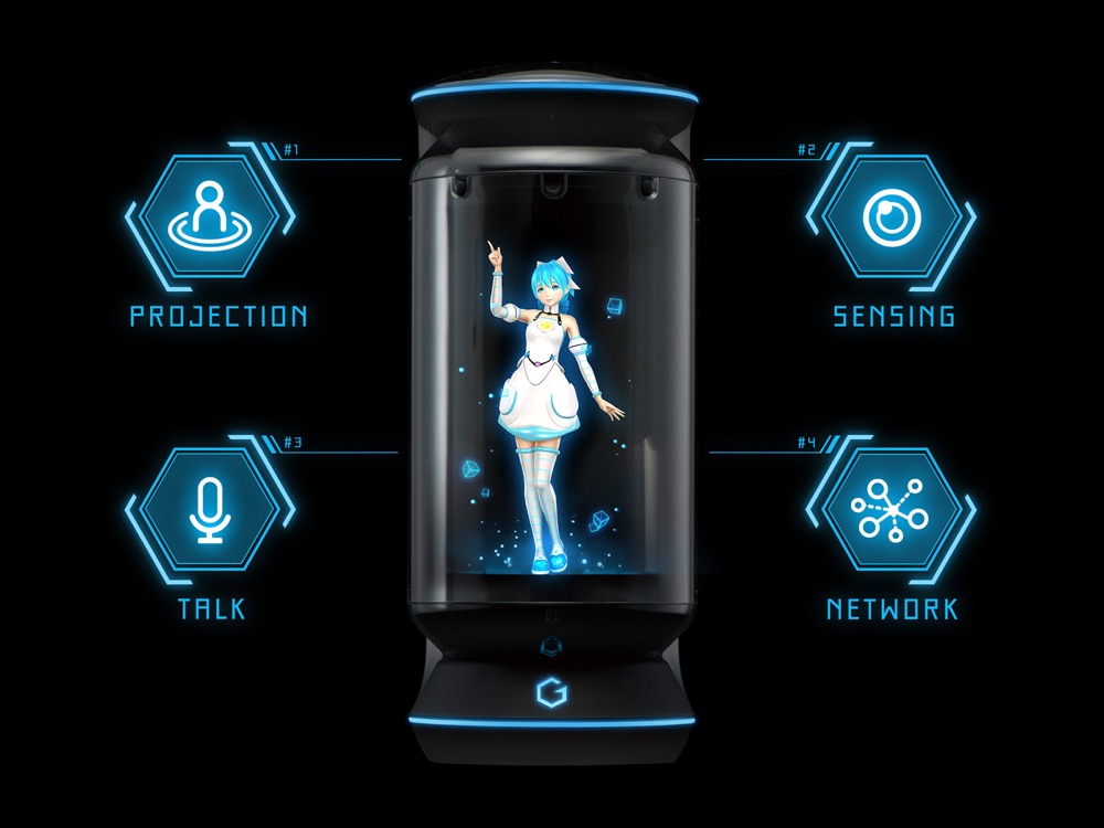
So now, a company called Gatebox has developed a sort-of holographic companion (it uses rear projection, a common technique for pseudo-holograms) that can act as a regular virtual assistant, however this one can be more…personal and adds a visual component that we haven’t seen before. It sounds unnerving at first. Taking on the appearance of an anime-inspired girl named Azuma Hikari, and living in a tank on your desk, she can provide not just assistantship, but companionship as well.
That’s right, for around $2,700 she will remind you of important events and dates and appointments, but she has been imbued with her own dreams and desires, hopes and wishes, just like a person. She’ll send you text messages, ask how your day was, tell you about herself and her thoughts. She can turn on lights and appliances, and connect to the Internet and talk about the weather or events or sports, or whatever else you’d like.
Most, but not all, articles talking about it have mocked it and its development, but I just can’t criticize it. it’s for release in Japan with no North American or European release in sight, and in my opinion that speaks to the Japanese culture, one of which I am very fond, but they dedicate themselves so much to work and school that there is little time for investment into personal relationships. This was designed and developed in part as a response to that, to give (generally) men who would otherwise be wanting for companionship a way to have someone with whom they can interact. People have pets for that very reason, so if someone doesn’t mind a holographic anime girl, then why not?
Perhaps there will even be additional characters. Maybe a snarky robot, or imp, or angry Australian guy, or a long-haired heavy-metal fan who converses in the same vernacular as I, or a sentient toaster; the possibilities are endless. For many of us, something like this would be a pure novelty, but if someone is genuinely lonely, or perhaps has an aversion to crowds or social spaces, or simply doesn’t have the time currently to invest in relationships, then I can’t find fault. If there is a demand for this type of technology, then as I said before, why not? Who am I to judge?
I genuinely encourage you to visit their website, it’s actually well-designed and gives you an almost first-person view of the device. I’m strangely interested in where this technology goes, and what its development says about us as people and a society.
Here’s the promo video. Make your own judgement.
A Successful Game Development Class
AUTHOR’S NOTE: Because many of the groups mentioned in this article may continue development of the games mentioned and with respect to their work and designs, I am limited in what I can show of many of them.
This quarter, I was asked to take over our department’s ‘Computer Game Development’ class from another faculty who was retiring. I guess it had something to do with that donation I made, but I was happy to do it, the retiring faculty recommended me personally, and offered all his materials for my use and adoption.
With absolutely no disrespect meant to him at all, I learned subsequently that he wasn’t actually a gamer, he was a programmer who developed this course as more of a technical overview of some coding techniques that could be applied to games, such as client-side prediction and some GPU tricks. Ultimately, much of the class was given over to project development time as opposed to formal instruction, as is common in a project class.
I decided to take the class in a different direction. We did talk about those things and other technical issues (and Thursdays were scheduled as project times as had been done before me), however as I always tell all my students, ‘you can’t develop technology in a vacuum.’ Or in this case, games. In other words, there is so much more to developing games than writing code and using unity. There are artists, musicians, writers (I made a HUGE deal about writing for games), level designers, and on top pf that, as my students also know, an understanding of how the industry and games themselves evolved is important; that context helps inform your decisions today.
So we talked about history, we talked about writing, we talked about level design, we talked about morals and ethics, we talked about the engines available today as opposed to the assembly languages available back when, we talked about character design and plot progression and player investment and balance and honing. All the while, students developed their own projects.
It is still a project-based course, as it was before I came along. Students are expected to develop a game using any platform and approach they wish, as long as it showed technical prowess and creativity in design. It is expected that students in this class have a background in Python and Java at least, although most have solid C# backgrounds as well.
My main directive to the groups was “Don’t build an ashtray.” I tell that to a lot of my project classes. You see, when I was in high school, I took a woodshop class, and the teacher – Mr. Cagle – went around the room asking each student what they would like to build that session. The responses were thoughtful; one kid wanted to build a full archery bow, another a roll top desk, and yet another a soap-box racer kind of thing. However one kid, when asked, said with his head down “I don’t know, I’ll build an ashtray.”
An ashtray? AN ASHTRAY? Everyone in the class had these great ideas, ones they had thought about and developed, but this guy who I guess didn’t care or wasn’t interested or wasn’t motivated or perhaps just lacked the fluid thought necessary could only come up with an ashtray, a single-component item that could be made out of clay in about two minutes. He had an opportunity to create something really interesting and unique and that’s all the better he could, or was willing, to do.
I always remembered that kid, and so even now I tell my project groups to not be that kid, don’t build an ashtray. In other words, be creative, be unique take this opportunity to explore your ideas and test your abilities.
They did not let me down.
One group developed a game about someone suffering from Irritable Bowel Syndrome, and the entire game had a timer that counted down continuously until a bathroom was found, which only served to reset the timer.
Another group developed a platform game in which the player had to switch back and forth between light and dark worlds in order to traverse levels. Another involved a pirate with a hook hand swinging through levels to gather gold and still another group created a game in which two brothers navigated through their own individual levels, with the effects of what one brother did (stopping time or causing rain) manifesting at the same time in the other brother’s level. And there was also one that was pseudo-text based and emulated a greenscreen of yore, with the player using actual Linux commands to solve some of the puzzles and minigames.
There was also a mobile game about a dog fending off a flea attack, Harambe escaping his captors, some flashlight-based games, a dungeon crawl, an RPG with unconventional characters, a ghost coming to terms with his infamous past, and a fantastic card game in which you navigated a 3D town and the group designed all the card graphics using a stained-glass aesthetic which was understated yet beautiful.
It was also required that teams develop websites and promotional materials for their games, and even many of those were outstanding. Some allowed for the downloading of demos and other materials, while others were more informational.
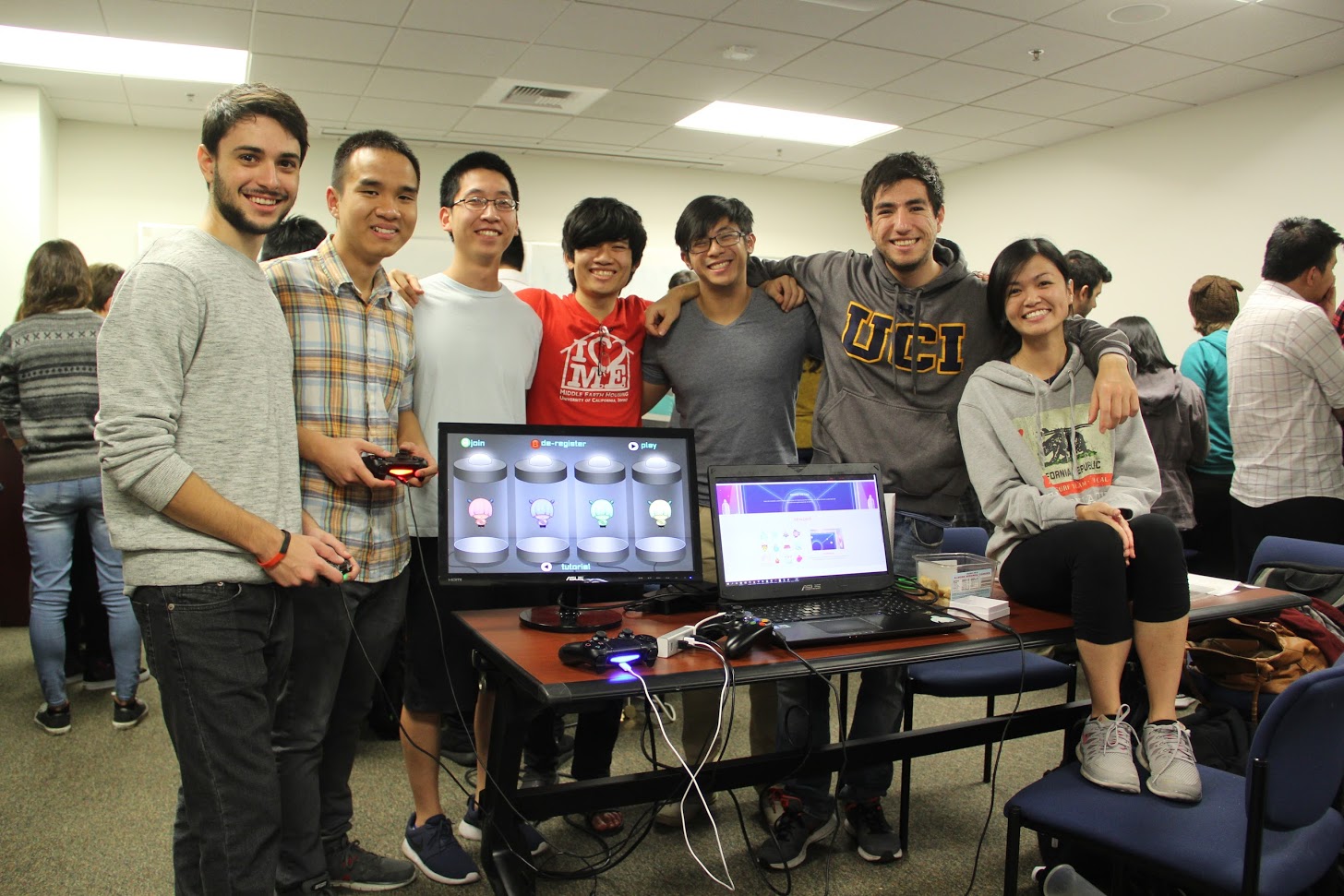
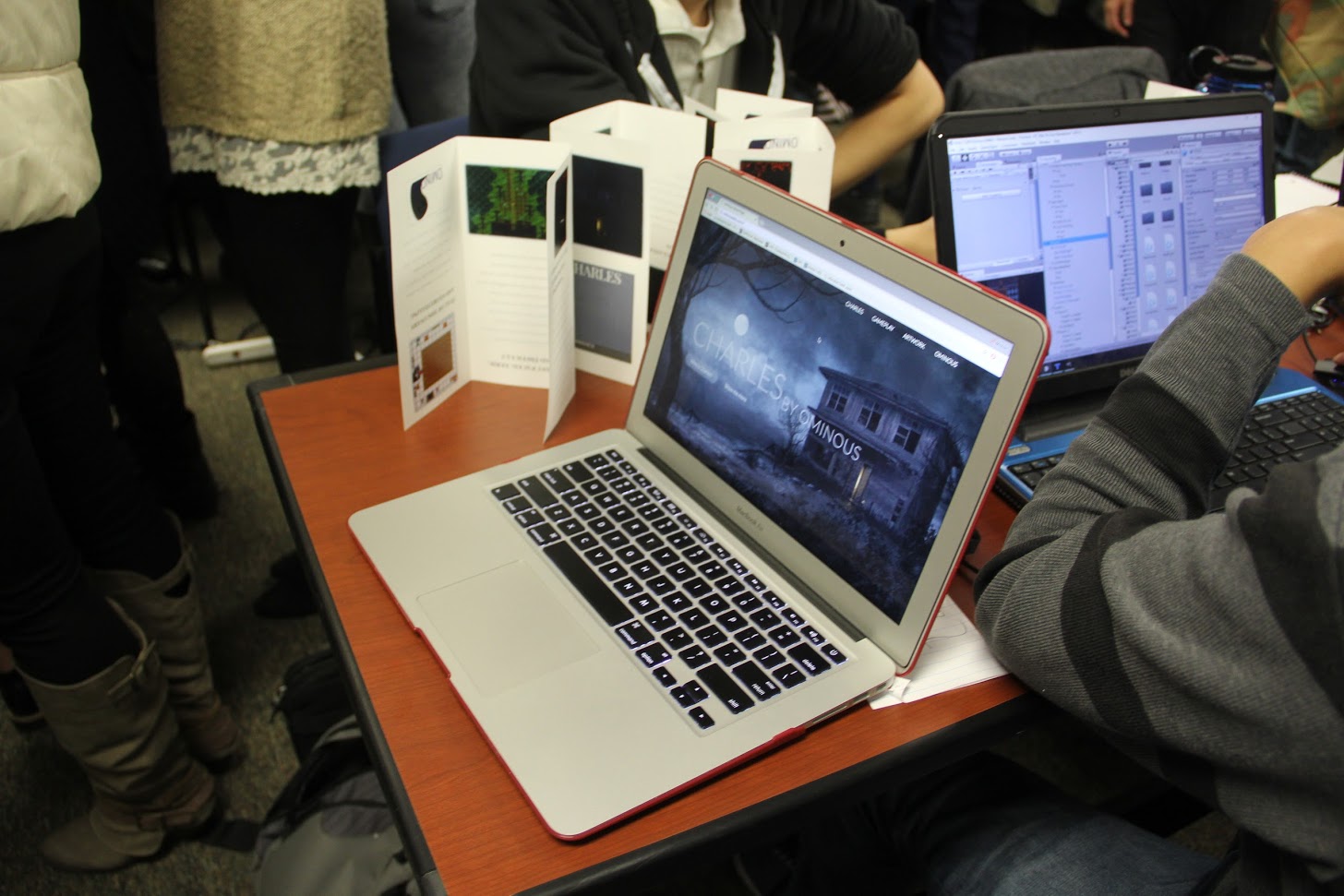
One group, pictured in the header and below, developed a party game so complete and well-polished that I felt, and from what I heard others did as well, that with just a little more work it could go up on Steam or the Xbox/PS stores. Because of that, the name of the game had to be blurred out.
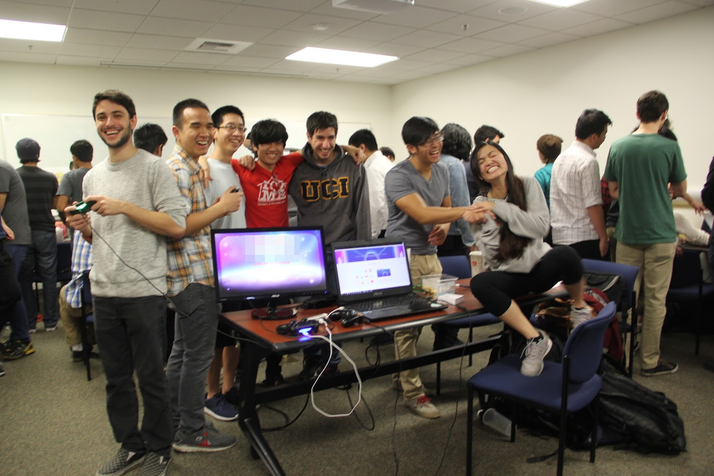
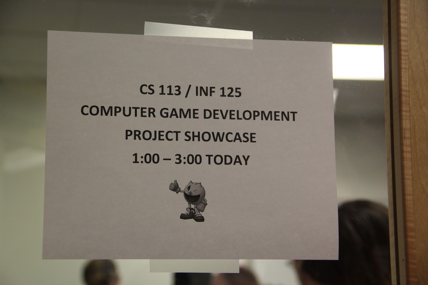
At the end of the quarter we held a showcase that was open to the public, and in which every team was able to show off their creation. It was a great success, especially considering all 121 students, 21 teams, were crammed into the same moderately sized conference room. It was hot in there!
A couple of the games are playable online, so I’ll link to those here:
CoinUp, a game in which two players remove coins from either end of a row, with the goal being to have more money at the end of the session. It can be played as one game, best of three, or best of five, and the powerups add a tense twist to the action. It’s a simple game that can be frustrating in a just-one-more kind of way. EDIT: No longer online, I’ll see about the executable.
Another is Quadris, which is a Tetris clone in which gameplay takes place in each of the four compass points, and has you constantly switching perspective. It’s hard to explain but a blast to play. You can play it here.
I’m very proud of all of them; despite the nature of the course it’s very stressful as they only have 10 weeks to design and develop their game. Regardless, they all came though magnificently, and while I certainly learned that some structural changes will have to be made for next time, I’m already looking forward to what the next class is able to create.