Category Archives: Education
UCI team wins the 2018 IEEE GameSig competition!
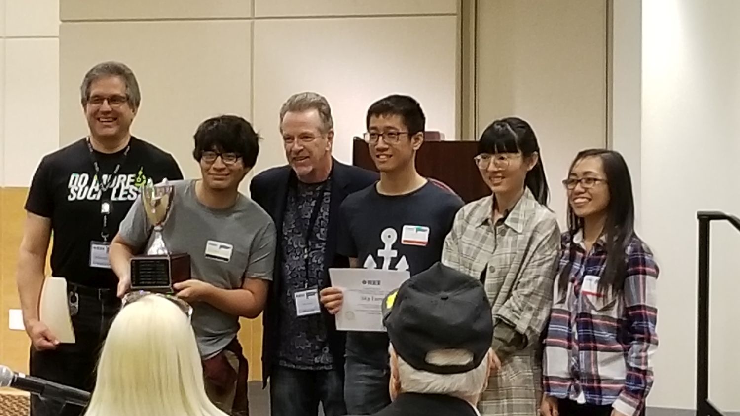
Once again, a student-based game development team from UCI has been declared the winner of the annual IEEE GameSIG game development competition; that’s them in the main image. The competition, held every year and featuring games developed by student teams from multiple regional colleges and universities including UCI, Fullerton, Chapman, Cal State Long Beach, USC, and others, brings a narrowed-down field of ten finalists from this year’s original field of twenty; these ten games were the ones the review and selection committee, of which yours truly, meaning me, is a member, felt were the cream of a very rich crop. Yet even with all that fierce competition, UCI won, and in fact has won for the last seven years straight. It’s held at a different campus every year, each hosting the competition on a rotating schedule, but no matter where it’s held, UCI always brings home the trophy. I’m co-Chair of the reviewer committee along with professor Dan Frost who has been doing it since the beginning but recently retired, and one of the organizers, so I’ll have my work cut out for me next year as the 2019 competition will be held at UCI.
The final award winners, their respective institutions, and the awards they won for this year were:
Another outstanding Computer Game Development showcase!
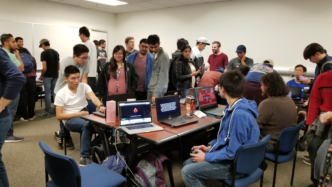
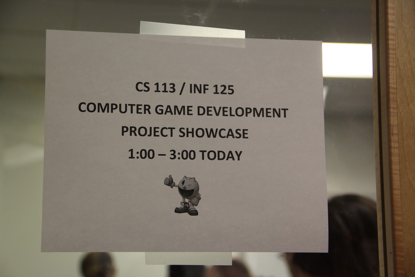
The quarter has finally ended, and with that comes this year’s Computer Game Development (CS 113 / INF 125) showcase, open to everyone – all faculty, staff, students, and others interested in game development. As always, the titles on display were, overall, of very high quality. Some were absolutely incredible, and I’ll highlight one of them at the end of this post, but I am always incredibly impressed with the range of concepts, ideas, and designs students come up with. From a potato trying to escape a kitchen, to an engineer who can hop back and forth between our world and the spirit world, to a game where you play as one of several geometric shapes each with their own ability, to a VR game – our first ever – to teach people musical intervals, all the games on display were incredibly unique. Along with having our first VR project, this was also the first time ever that anyone in the class used the Unreal Engine; I’ve been trying to get that to happen for years, and this quarter two groups, including the VR group, used it!
The standard is still Unity, of course, which is perfectly fine. Hey, if there was no Unity, there’d be no Rocket League, and we can’t have that.
Even more than the games that are incredibly polished and advanced, I come away most impressed with the groups who began the quarter with no knowledge whatsoever of game design or the tools to create something interactive and playable, and in a mere ten weeks created a game that could be played and that was even enjoyable is the most rewarding part of the class. They are the most proud of what they accomplished, and deservedly so.
There is always a game that stands out among the rest, and this time was no exception. Before I mention them, however, I need to say this is no way a denigration of the other projects. Everyone did a great job, presented creative ideas, put in a lot of effort, scrambled to learn new technologies, and they all deserve praise and credit. That being said, there is always one project that is all but ready for public release, and this quarter’s winner in that category is a visual and storytelling triumph, The Taking of the SS Amusement. Did I mention I suggested that name in a nod to The Taking of Pelham One Two Three?
The team named themselves CrayonFire games. The story behind that is a perfect example of the way all names should be decided; in a completely accidental and organic manner. During a Slack chat, someone mentioned a canyon fire that was happening here in SoCal, and another group member misread ‘canyon fire’ as ‘crayon fire’ and became understandable confused. And that, my friend, is how great company (and band) names are born.
The group was also lucky in that everyone involved was a gamer, and passionately so, and double lucky in that one of their group members had extensive Unity experience and coded games as a hobby, and triply lucky in that his roommate was an art major who agreed to the pixel art for them and created multiple masterpieces, as least as far as pixel art goes. The animations and behaviors of each enemy, which are robot chefs and stewards, by the way, is absolutely perfect, with my favorite being the food cart-pushing robots who charge the player then stop to wipe their brow even though they’re robots, and the final boss who presses the appropriate colored button to launch an attach which drains a battery meter. There are also parallax stars visible through windows, and a subtle before and after in the title screen. The game is challenging, expertly designed, and beautiful. Again, this is not to take away from other projects, I was happy with them all. But this game is special.
Their website is crayonfiregames.wordpress.com (they had to create a website as part of the course requirements), and I have embedded their promotional video below. I’ll see if I can make the game available for download – it’s definitely worth a play.
But again, congratulations to everyone in the class, there was so much good stuff on display it took longer than the two-hour showcase to go around and evaluate them all. I look forward to it every year, and for all the hard work the students have put in over the course of the quarter I know they really appreciate the opportunity to show off their achievements and accomplishments to everyone, and the feedback, both internal and external, was very positive all around.
On a relevant side note: I am trying to set up a repository of all the games that groups created for the class, however that is still in planning stages so it’s just a sidenote for now, however I have high hopes we can use it as a central hub to highlight all the games created in this class over all quarters. If it happens, there will definitely be an announcement made here.
Congratulations to the first graduating cohort from UCI’s Master’s in Human Computer Interaction and Design

It is with no small sense of fulfillment and pride that I congratulate our first graduating cohort in the new MHCID program here at UCI.
Although I was brought into it relatively late, about two years after initial planning had begun, I have been part of the program for over a year and developed / taught the Advanced Design and Prototyping course, as well as the second half of the two-quarter capstone course. Next year I will be teaching the full two-quarters of the capstone course, likely because I do the same at the undergrad level and having two faculty teach part of the same course is difficult.
As this was a newly developed program, the students we admitted for the first go round were strong personalities, risk takers, enthusiastic and driven, and it showed. Highs and lows, tough times and hard roads, late nights and online meetings, yet they all made it through to the end, surpassing every challenge and task they faced, and ultimately created capstone projects that were highly praised by their corporate (and in one case, educational) partners as well as their peers. That’s them in the header image, by the way, and the jubilation you can see is real, and earned.
They presented their projects on Friday to all the program’s corporate partners, peers, colleagues, faculty, and our incoming second cohort, and they were all very well received. The partners they worked with had nothing but praise for the quality of the work, and with only one rehearsal run-through and critique the previous day, everyone did a superb job. There was a wide range of projects; everything from healthcare (robot-assisted healthcare, with Mabu!) to wine to education to materials engineering. It was the groups’ day to shine, and they did. They were able to brag, to impress, to highlight, to inform, and with the varied nature of the projects it never became dry or dragged.
Commencement was also wonderful. Of course, I have many favorite parts when it comes to commencement, the biggest of which is seeing all my former students receive their diploma and the huge smiles on their face knowing they have made the journey successfully to this point. It’s a highlight of my career and a privilege I take quite seriously to be able to sit on the stage and be part of the ceremony that they earned. To see any of my students walk across the stage and formally graduate, but with this being our first cohort, it was a secret triumph for all involved; faculty, staff, students, support, everyone.
I have to also say, however, that I always really enjoy seeing the wide range of regalia the faculty brings to these events. So many different designs, colors, symbols, it’s always fantastic and adds a real splash of excitement to the proceedings.
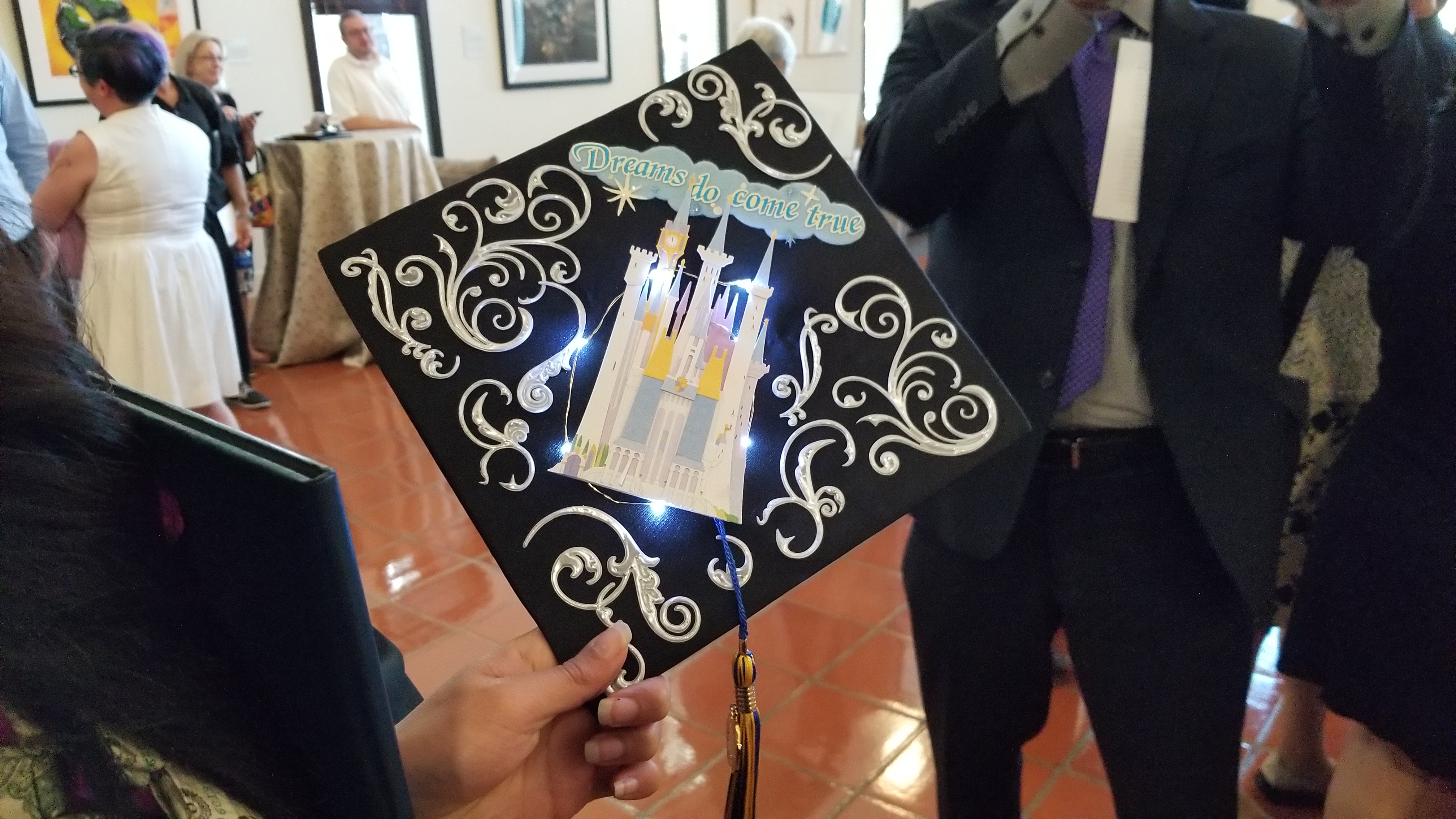
And with it being a design program, our students were equally involved in creating unique, individual and personalized mortarboards. My favorite was the one that actually lit up and had a Disney theme. The battery pack was underneath on top of her head, so i can’t imagine it was too comfortable, but that’s the price you pay, the sacrifice you make, for fashion!
So when it all came together and they were finally able to present their projects at our big career fair on Friday, and graduate at commencement on Saturday, to say their sense of accomplishment, and no doubt relief, was palpable, would be an understatement. they deserve all the congratulations, the praise, the high-fives, the future jobs they’ll have, and all the recognition that results from their time in the program. My personal congratulations to everyone involved, the students most of all.
(If you would ike more information about the program, I have linked it in the first sentence of this post, but I’ll do it again here because I’m all about usability! UCI’s Master of Human Computer Interaction and Design).
Journey with me back to the early days of the Internet with ReoCities, the GeoCities archive
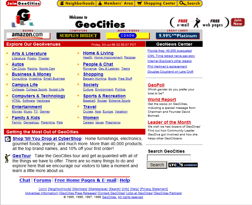
In my graduate design class this week, the additional discussion topic (bonus, as I refer to it, although I suspect my students might disagree) involves the attempt to archive one of the early web’s most important communities. Indeed, I wanted to go back in time to the early days of the World Wide Web, circa 1993, and as a technology historian, indulge that aspect as well. The Internet, like me, was brought online in the glorious year of 1968, however it remained the domain of scholars and governments for over two decades before becoming available via the World Wide Web to the riff raff public and its clammy tendrils (by the way, ‘Internet’ is always capitalized, regardless of what the Oxford English Dictionary says). Remember also that the Internet and the WWW are not the same thing; the Internet is the technologies, hardware, software and protocols on which the web sits – the Web didn’t come online until around 1990. Getting back on track, to say design was at its nadir at that point would be a severe understatement; while interaction methods had been developed and attempted over the years (light pens, for example), that was by specialists in specific domains, and when I say specialists I don’t mean interaction specialists, I mean engineers and programmers, but now web design was about to be attempted by everyone.
When everyday people began to experiment with what the Web offered, they did so from an adventurous, new, exciting perspective. Interaction methods, organizing elements, color, layout, usability, nobody cared about this stuff, we were amazed at the accessibility of it all. We hadn’t even learned it was bad form to hotlink images! Almost none of the technologies, platforms, infrastructure, anything, really, we have today was available back then other than base protocols, and even those have evolved significantly. But one thing we did see, very early on, was a foreshadowing of the idea of a web 2.0, in which user generated content and communities guided the growth of one particular website far beyond what anyone expected. Before the design disaster that was MySpace, anyone who was anyone cut their teeth on GeoCities.
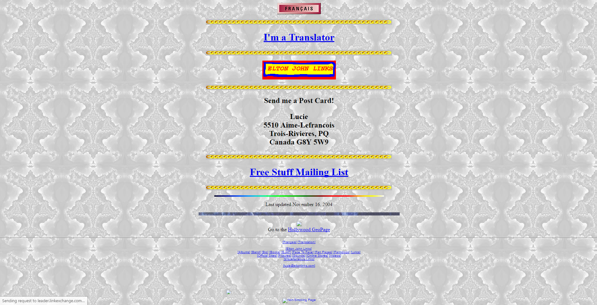
Everyone knows GeoCities was the equivalent of a design traffic accident with its animated gifs and auto-play MIDI tunes (and was the inspiration for the landing page for this very course), but that’s looking at it through the-opposite-of-rose-colored glasses. We know that *now.* Back then, the ability for anyone to have a presence online and represent yourself immediately all over the world was almost too much to process. No one cared about design, they just wanted to create. As anyone now looking at a GeoCities page could tell you, design would come later. Much later.
GeoCities divided their content up into towns, each of which represented a particular interest. Whether it was fantasy, health, sports, the arts, or whatever else, there was a neighborhood for it where a community of like-minded individuals could set up a shingle, as it were, and have a presence…perhaps even make some new acquaintances or even friends with the same interests.
The site’s growth and eventual buyout by Yahoo and unavoidable death is beyond the scope of what is intended to be a design history, however it is a fascinating story and very interesting if you get the chance – you can read about it on this Computer History Museum page (look at that GeoCities landing page!).
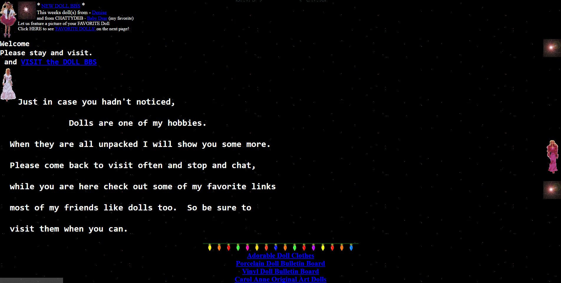
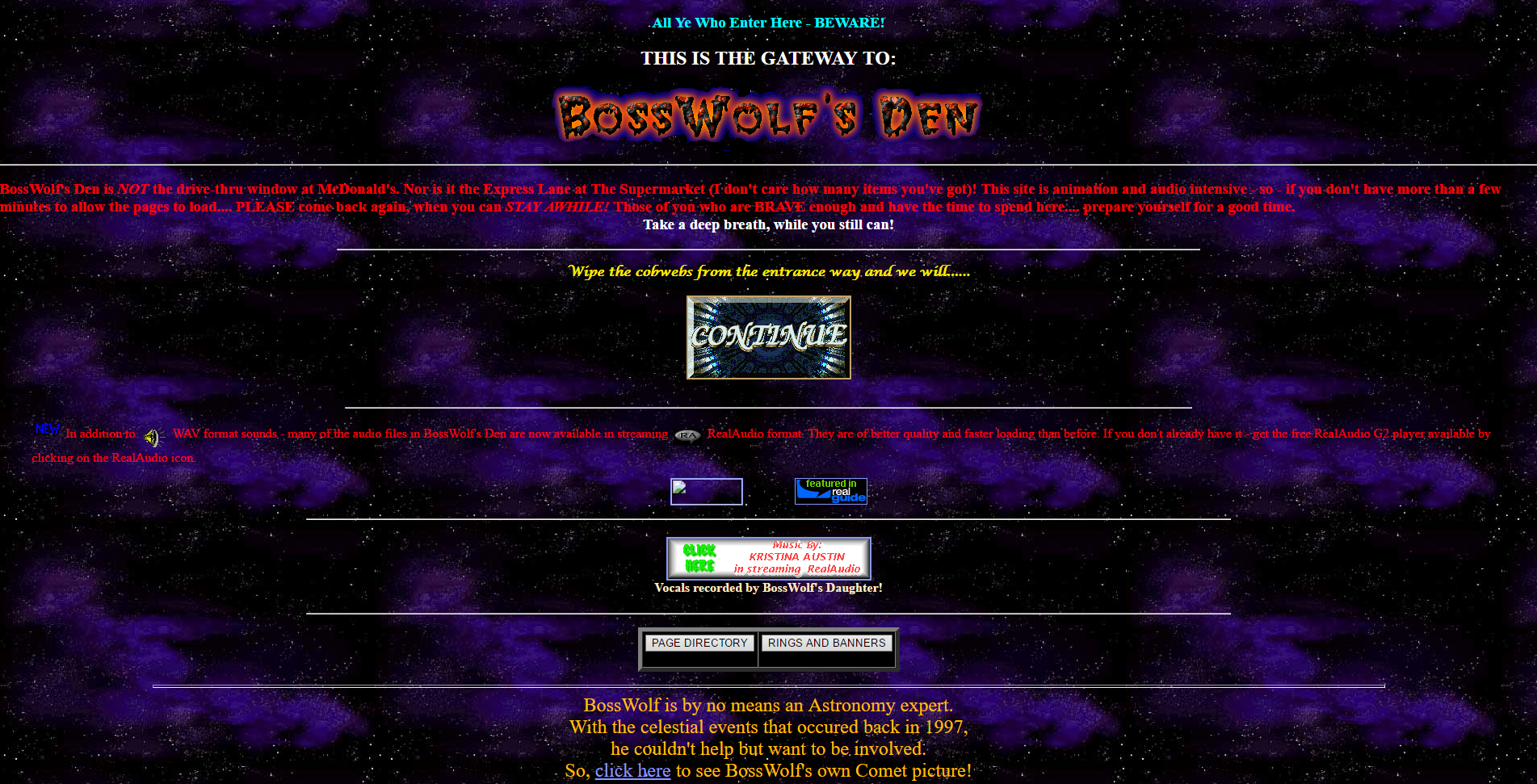
Instead, this long narrative is to let you know that you can still experience GeoCities in all its poor-design glory thanks to the project known as ReoCities. They have archived millions of pages from GeoCities, and while the usability leaves a lot to be desired, it is a fascinating look at web design back then, and looking back through time at these pages I feel like an astronomer looking back in time at a star. It gives a frozen-in-time glimpse into not just where we were, but how far we’ve come. I used ReoCities for all the screenshots in this post.
I have to be honest, some of the pages are difficult to view, the design is that wacky. In terms of expression, in terms of digital explorers mapping out a new, unexplored land, however, it’s mesmerizing. I can’t tell you how long I spent not only exploring the myriad pages archived by the service, but seeing how many of the external links still worked (not many, although some GeoCities page redirect to a proper hosted site; very smart), and even doing some research to see if any of the people or organizations are still around and updated their web presence. It was a pleasant surprise to see some of them actually had!
It’s a really fascinating time capsule not just of early web design, but also of where the web was its infancy. Seeing how design has changed, what was considered acceptable design back then versus now when we have so many rules and standards and guidelines is enlightening. And if, on the off chance, you have a link that points to a GeoCities site that they’ve archived, a simple letter change can update your link!
I’m a big fan of historical preservation of digital property (archive.org is another glorious monument to what was). Start your wayback voyage to GeoCities over at ReoCities.
My Carnegie Mellon rec letter submission adventure

Try saying *that* three times fast. Also, keep in mind that Carnegie Mellon is actually a prestigious and well-respected university and dersrvedly so. That’s why the story I am about to regale you in is so bizarre. It just keeps falling down a HCI rabbit hole form which it never escapes.
I had originally intended to post something different for this week’s random design example, however yesterday I was asked to submit a letter of recommendation for one of my former students to Carnegie Mellon’s MSIT eBusiness Technology graduate program, which by itself is a mouthful.
No problem; I have done many of these before. Little did I realize that I was going to be in for an adventure.
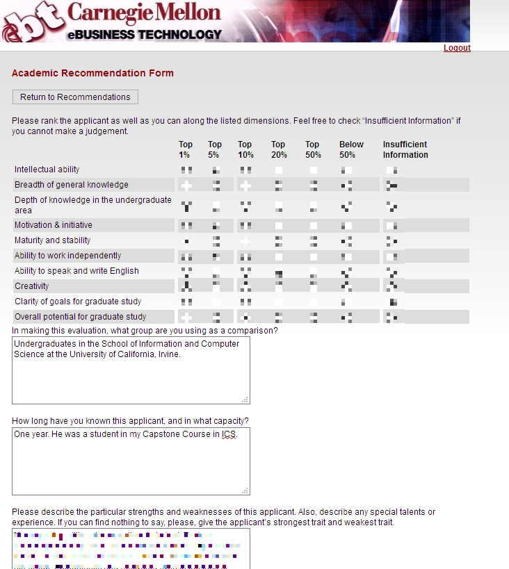
Right off the bat, it had me submit my letter, which had to be either in Word or pdf format, which was their restriction. I uploaded a Word document, and was told that format was not valid. I converted it to pdf, and that worked.
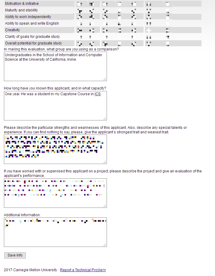
Next, I was asked to fill out some pseudo-Likert-scale questions which is common, and at the bottom of the page was a button labeled [Save Info], as seen below.
The thing is, when I clicked that button, it just reloaded the page, putting me back at the top with a button labeled [Return to Recommendations]. No submit, no send, just…return.
Clicking that took me back to the main page where I started, and where it still said “Select a student to provide a letter of recommendation.’ But I had already done that, and in fact it indicated the submission date right underneath, next to the student’s name. I received no confirmation, no clue as to the status of the application, or whether it had actually been completed and gone through. How many of Neilsen’s or Schneiderman’s rules does that violate?
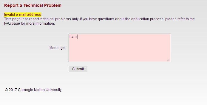
So, being the person I am, I decided I would click the link labeled ‘Report a Technical problem’ at the bottom, not minding their free-spirited use of capital letters. Doing so took me to a page that declared in bright yellow highlighting ‘Invalid e-mail address.’ Keep in mind I had not entered an email address, I only clicked the link. Did something happen I’m not aware of? Which e-mail address, if any, is it considering to be invalid? Could it even be the one to which the form submits? On top of that, the text box is red! This just gets better and better.
To top it all off, the message I entered in the red text box above ultimately got sent to…you guessed it…me.
I sent another email to a contact email I found on the main page, and the follwing day received a response that all had gone through. What a travail. This was the most excruciating recommendation process I’ve ever experienced. I expect more from such a prestigious university as Carnegie Mellon. At least it made for a good learning experience for us all.
(Originally written for my graduate Advanced Design and Prototyping course at UCI).
A Successful Game Development Class
AUTHOR’S NOTE: Because many of the groups mentioned in this article may continue development of the games mentioned and with respect to their work and designs, I am limited in what I can show of many of them.
This quarter, I was asked to take over our department’s ‘Computer Game Development’ class from another faculty who was retiring. I guess it had something to do with that donation I made, but I was happy to do it, the retiring faculty recommended me personally, and offered all his materials for my use and adoption.
With absolutely no disrespect meant to him at all, I learned subsequently that he wasn’t actually a gamer, he was a programmer who developed this course as more of a technical overview of some coding techniques that could be applied to games, such as client-side prediction and some GPU tricks. Ultimately, much of the class was given over to project development time as opposed to formal instruction, as is common in a project class.
I decided to take the class in a different direction. We did talk about those things and other technical issues (and Thursdays were scheduled as project times as had been done before me), however as I always tell all my students, ‘you can’t develop technology in a vacuum.’ Or in this case, games. In other words, there is so much more to developing games than writing code and using unity. There are artists, musicians, writers (I made a HUGE deal about writing for games), level designers, and on top pf that, as my students also know, an understanding of how the industry and games themselves evolved is important; that context helps inform your decisions today.
So we talked about history, we talked about writing, we talked about level design, we talked about morals and ethics, we talked about the engines available today as opposed to the assembly languages available back when, we talked about character design and plot progression and player investment and balance and honing. All the while, students developed their own projects.
It is still a project-based course, as it was before I came along. Students are expected to develop a game using any platform and approach they wish, as long as it showed technical prowess and creativity in design. It is expected that students in this class have a background in Python and Java at least, although most have solid C# backgrounds as well.
My main directive to the groups was “Don’t build an ashtray.” I tell that to a lot of my project classes. You see, when I was in high school, I took a woodshop class, and the teacher – Mr. Cagle – went around the room asking each student what they would like to build that session. The responses were thoughtful; one kid wanted to build a full archery bow, another a roll top desk, and yet another a soap-box racer kind of thing. However one kid, when asked, said with his head down “I don’t know, I’ll build an ashtray.”
An ashtray? AN ASHTRAY? Everyone in the class had these great ideas, ones they had thought about and developed, but this guy who I guess didn’t care or wasn’t interested or wasn’t motivated or perhaps just lacked the fluid thought necessary could only come up with an ashtray, a single-component item that could be made out of clay in about two minutes. He had an opportunity to create something really interesting and unique and that’s all the better he could, or was willing, to do.
I always remembered that kid, and so even now I tell my project groups to not be that kid, don’t build an ashtray. In other words, be creative, be unique take this opportunity to explore your ideas and test your abilities.
They did not let me down.
One group developed a game about someone suffering from Irritable Bowel Syndrome, and the entire game had a timer that counted down continuously until a bathroom was found, which only served to reset the timer.
Another group developed a platform game in which the player had to switch back and forth between light and dark worlds in order to traverse levels. Another involved a pirate with a hook hand swinging through levels to gather gold and still another group created a game in which two brothers navigated through their own individual levels, with the effects of what one brother did (stopping time or causing rain) manifesting at the same time in the other brother’s level. And there was also one that was pseudo-text based and emulated a greenscreen of yore, with the player using actual Linux commands to solve some of the puzzles and minigames.
There was also a mobile game about a dog fending off a flea attack, Harambe escaping his captors, some flashlight-based games, a dungeon crawl, an RPG with unconventional characters, a ghost coming to terms with his infamous past, and a fantastic card game in which you navigated a 3D town and the group designed all the card graphics using a stained-glass aesthetic which was understated yet beautiful.
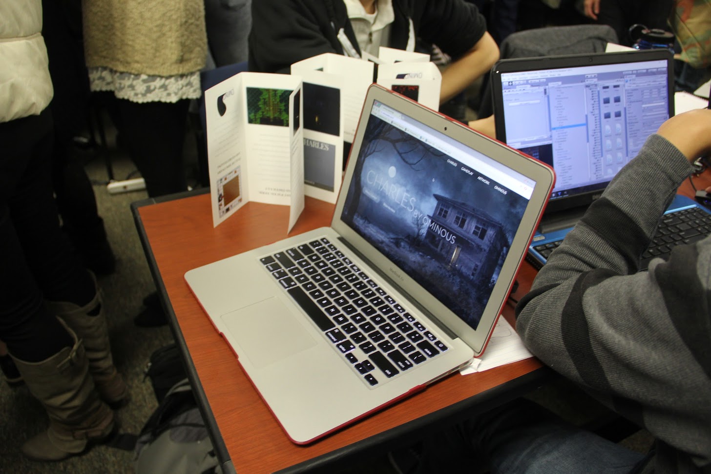
It was also required that teams develop websites and promotional materials for their games, and even many of those were outstanding. Some allowed for the downloading of demos and other materials, while others were more informational.
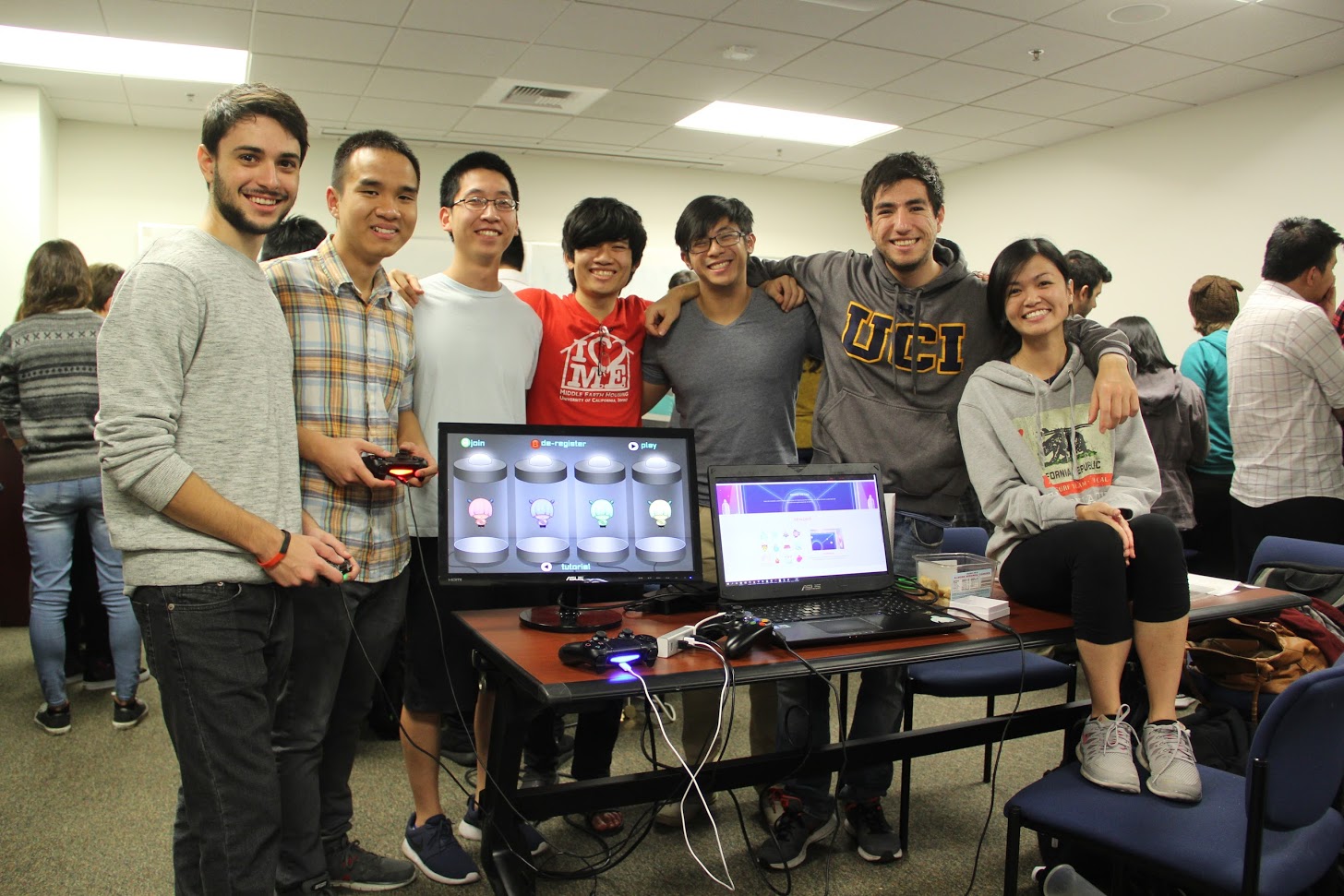
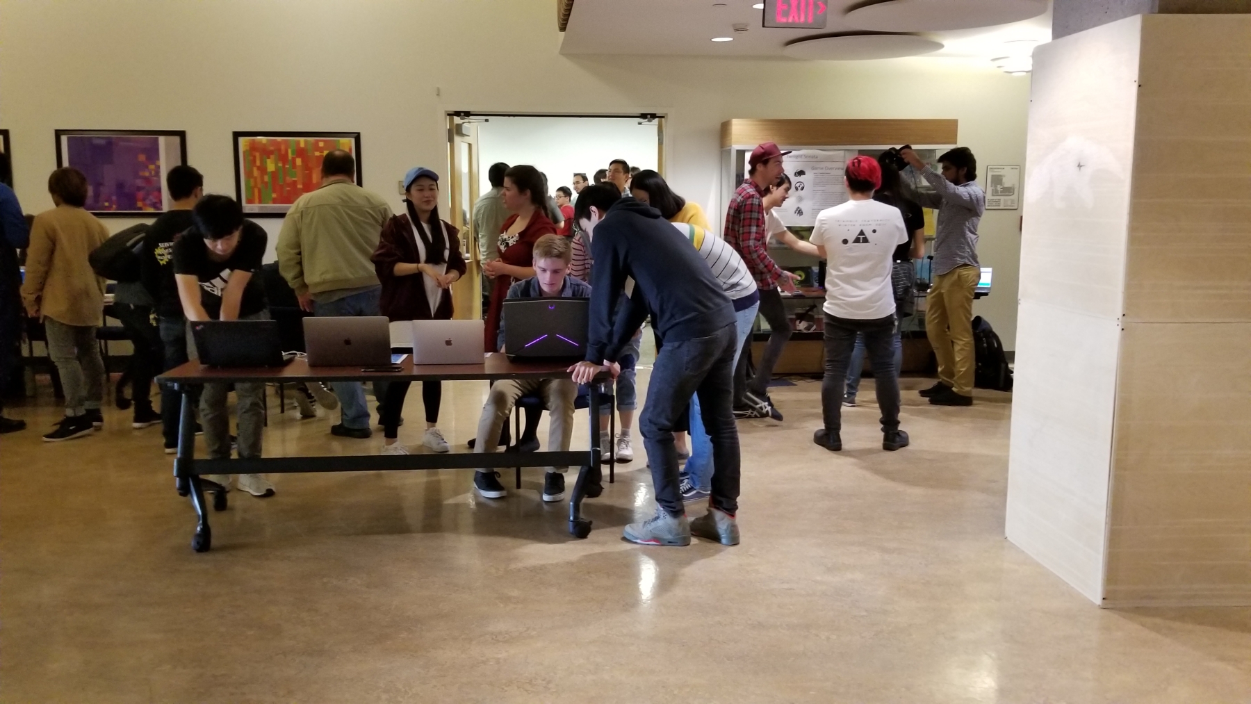
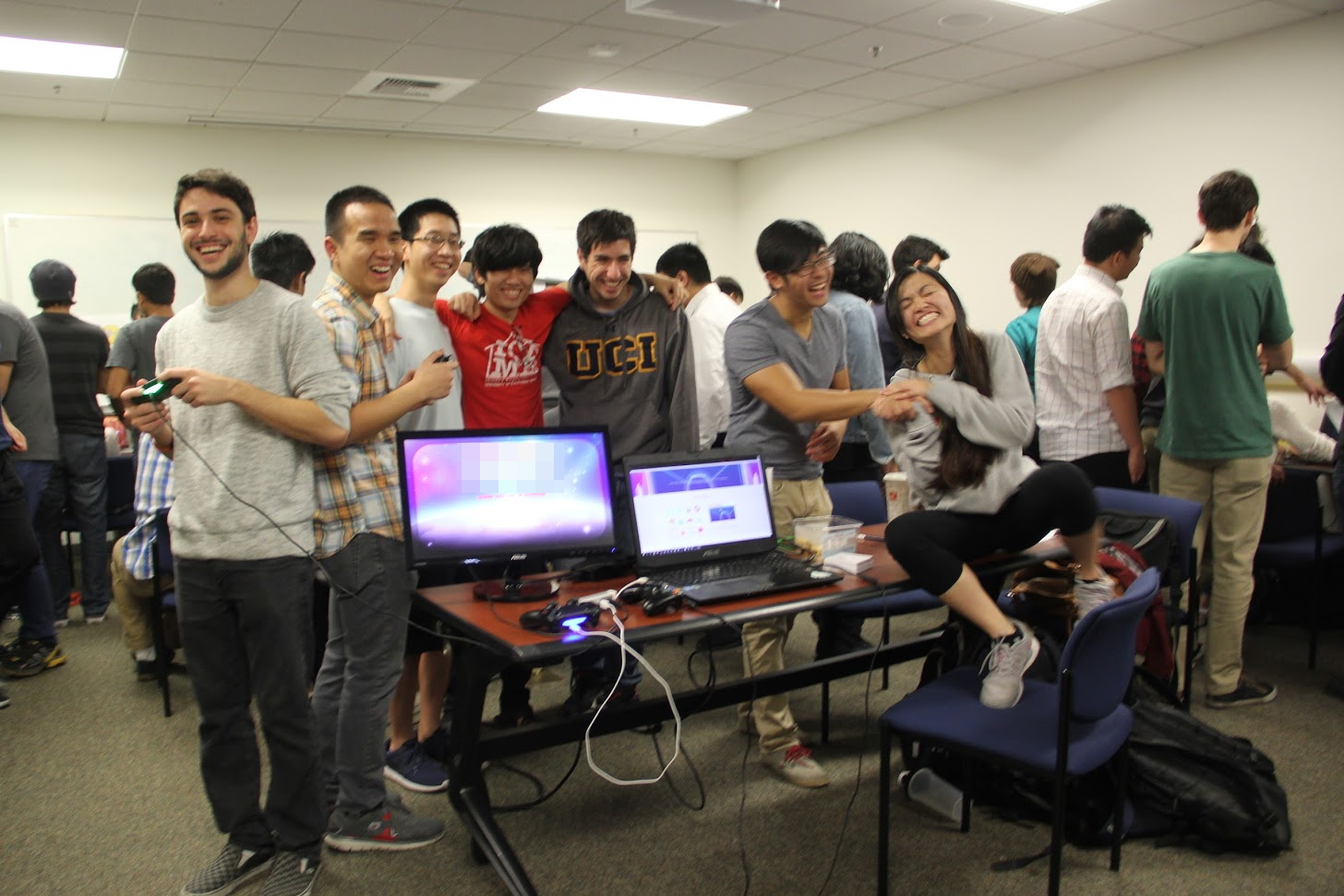
One group, pictured in the header and below, developed a party game so complete and well-polished that I felt, and from what I heard others did as well, that with just a little more work it could go up on Steam or the Xbox/PS stores. Because of that, the name of the game had to be blurred out.
At the end of the quarter we held a showcase that was open to the public, and in which every team was able to show off their creation. It was a great success, especially considering all 121 students, 21 teams, were crammed into the same moderately sized conference room. It was hot in there!
A couple of the games are playable online, so I’ll link to those here:
CoinUp, a game in which two players remove coins from either end of a row, with the goal being to have more money at the end of the session. It can be played as one game, best of three, or best of five, and the powerups add a tense twist to the action. It’s a simple game that can be frustrating in a just-one-more kind of way. EDIT: No longer online, I’ll see about the executable.
Another is Quadris, which is a Tetris clone in which gameplay takes place in each of the four compass points, and has you constantly switching perspective. It’s hard to explain but a blast to play. You can play it here.
I’m very proud of all of them; despite the nature of the course it’s very stressful as they only have 10 weeks to design and develop their game. Regardless, they all came though magnificently, and while I certainly learned that some structural changes will have to be made for next time, I’m already looking forward to what the next class is able to create.
University of California, Irvine, becomes leader in eSports
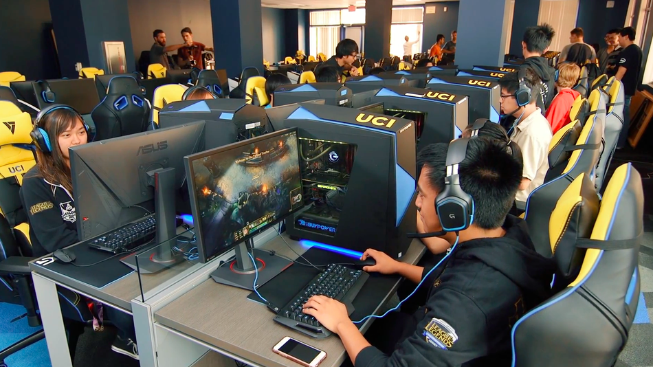
My employer, the University of California, Irvine, has become the first university to open an eSports arena, which is really just a big room with a bunch of high-end PCs in it for networked game play, and have a top-ranked League of Legends team that will be awarded scholarships for their participation.
Other colleges and universities have had school-sponsored eSports teams before; Robert Morris University did so back in 2014, and others followed suit, however the arena is what sets us apart. A dedicated gaming facility created with the blessings and support of League of Legends developers Riot Games and machines supplied by boutique PC source iBuyPower (terrible website design trigger warning).
The arena can also be used by students who just want to do some gaming. And because we’re a university, there will be many, many opportunities for game-based research, something my own department does from many perspectives.
The official opening will be on Friday, September 23rd, and they are expecting about 1000 people. I’ve been in that room and that area of campus, and that would be quite the crowd, but it speaks highly of what they’re doing and what they’ve already accomplished.
The 191 Spring student showcase
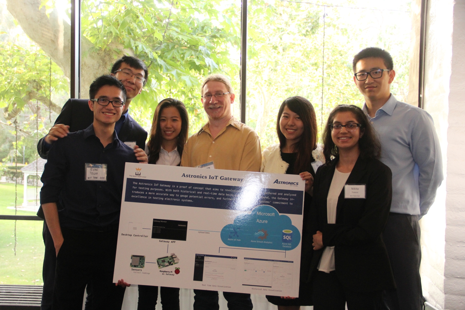
So what have I been doing since my last post? Well I’ll tell you.
I taught a 2-quarter capstone course, 191, in which students formed groups and were partnered with a sponsor company or organization that needed something technical done. For the next twenty weeks, the groups would meet both with each other and their partner companies, strategize, hash out details, technical specs, scope, time, and everything else involved in a project.
I should also say they did fantastic work. From a project that streams live data from sensors attached to industrial equipment through the cloud to a mobile app, to a project creating a VR marketplace, to a project that connects isolated seniors with volunteers, and many others, they all did outstanding work. I told them many times how impressed I was with their progress and how proud I was of their overcoming challenges and obstacles to create great projects, and I meant it. Here are the teams and what they did (Obviously I’m leaving out individual names, but they know who they are!):
Installing VirtualBox and Windows 10 on a Mac
Instructional video time!
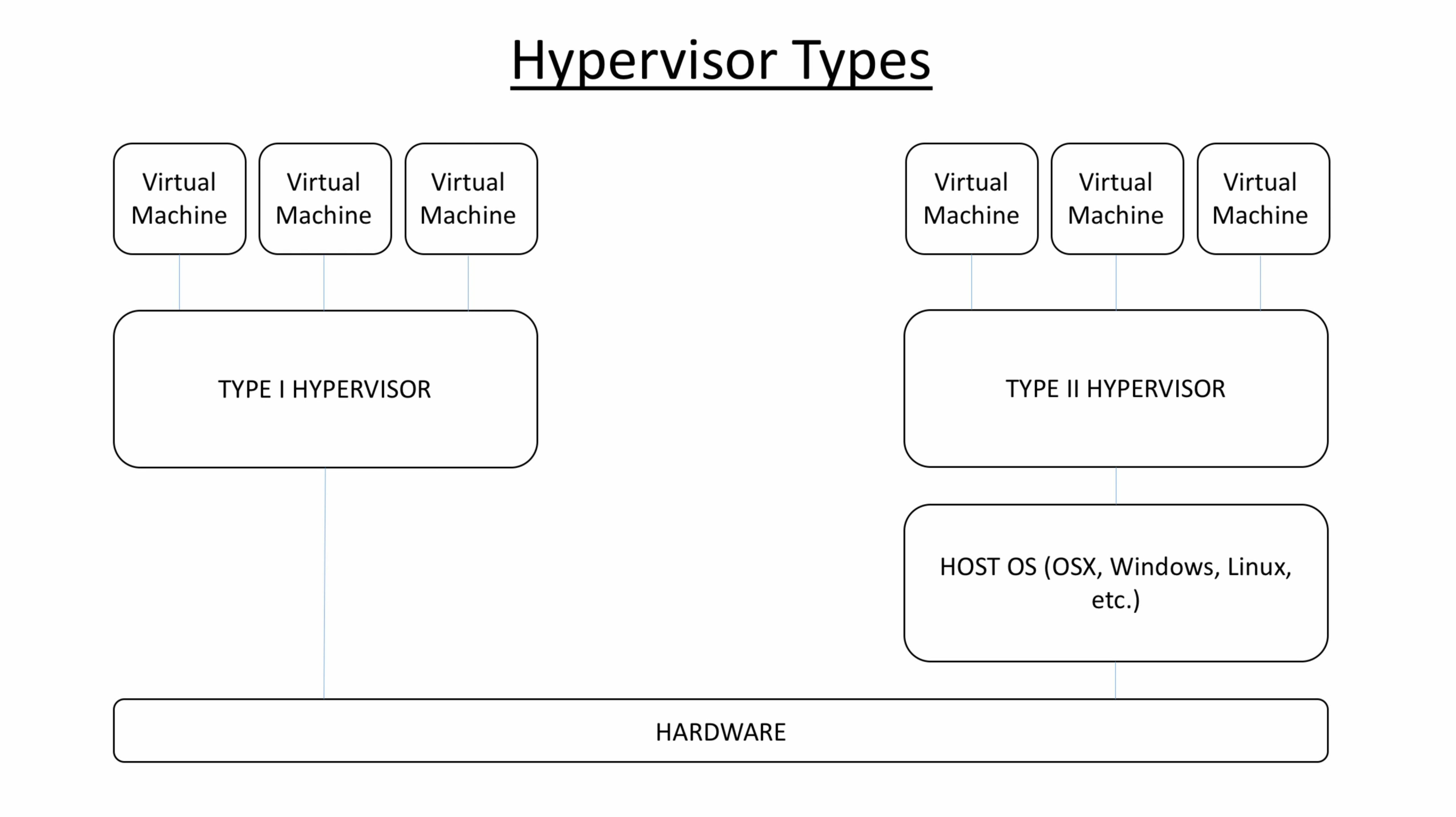
I have created a video that walks you through the process of setting up Oracle’s VirtualBox hypervisor on a Mac, and using it to run Windows 10. In a window. On your Mac.
It sounds complicated, but it’s not. I explain it all in the video, however a hypervisor simply allows you to set up logical machines, each of which can run an operating system and act as a separate PC! You can have a machine running Windows, a machine running Linux, and even multiple machines each running a version of an OS (On my Mac, I have a machine running Windows 10, a machine running Windows 7, and a machine running Linux Mint, as you will see).
You can use VirtualBox on any OS, so you don’t have to use it just on a Mac. If you’ve always wanted to experiment with Linux and find out what the deal is, you can set up a VM and have at it! It’s insanely useful, not terribly difficult to set up, and free, so I encourage you to give it a try.
Links shown in video:
VirtualBox and extensions: https://www.virtualbox.org/
Download Windows 10: https://www.microsoft.com/en-us/software-download/windows10ISO





A small update to the site’s functionality (and learn some PHP!)
There has been so much to write about, however I have been beyond busy especially with the quarter drawing to a close. There is a showcase to plan and schedule for, and industry people will be there so I want my students to shine. From what I’ve seen, they will. On top of that I’m mentoring a group for a business competition and of course there’s the regular teaching, grading, meetings and other stuff that goes on.
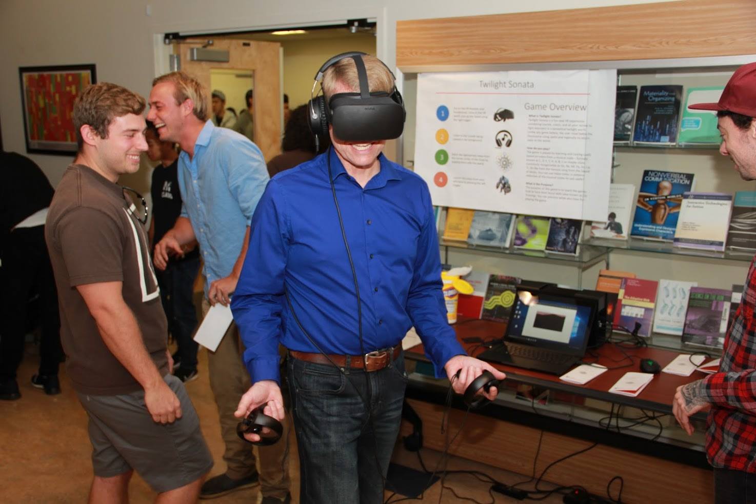
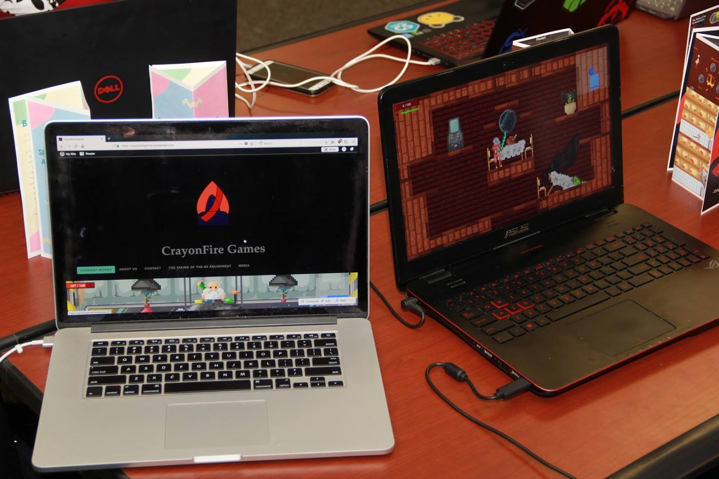
Nevertheless, it had been nagging at me that the site’s comment functionality never worked quite right. I’ve been made aware of it before, so why it started to gnaw at me two weeks ago I’m not certain, but it did. What I wanted it to do was give visitors an option of commenting via WordPress login, Facebook, Twitter, or other social media accounts they may prefer rather than having to sign up specifically with WordPress. Normally on a WordPress site there is an option for this, however for whatever reason – and I never understand why WP themes do this – my theme overrode this, forcing visitors to log in through WordPress if they wanted to comment (hence one of the reasons for the dearth of comments). You can see how it should look in the header image. Luckily, the fix was beyond easy, but shows the lengths the theme designer went through to ensure a broken commenting system.
Here’s what I had to do to fix it. You aren’t going to believe it, but here we go:
WordPress uses a file called ‘comments.php’ to provide comment functionality. Here’s what my original comment.php file looked like:
<?php if ( post_password_required() ) { ?>
<p><?php _e( ‘This post is password protected. Enter the password to view any comments.’, ‘themater’ ); ?></p>
<?php return; } ?>
<?php if ( have_comments() ) { ?>
<div id=”comments”>
<h3 id=”comments-title”><?php
printf( _n( ‘One Response to %2$s’, ‘%1$s Responses to %2$s’, get_comments_number(), ‘themater’ ),
number_format_i18n( get_comments_number() ), ‘<em>’ . get_the_title() . ‘</em>’ );
?></h3>
<ol class=”commentlist”>
<?php wp_list_comments(); ?>
</ol>
<?php if ( get_comment_pages_count() > 1 ) { ?>
<div class=”navigation clearfix”>
<div class=”alignleft”><?php previous_comments_link( __( ‘<span class=”meta-nav”>←</span> Older Comments’, ‘themater’ ) ); ?></div>
<div class=”alignright”><?php next_comments_link( __( ‘Newer Comments <span class=”meta-nav”>→</span>’, ‘themater’ ) ); ?></div>
</div><!– .navigation .clearfix –>
<?php } ?>
</div><!– #comments –>
<?php } ?>
<?php comment_form(); ?>
A lot there, yes? You may be wondering if the comments functionality needs all that PHP, and the answer is no. Actually, it’s because it was all there that the comment functionality was broken in the first place. In fact, to INCREASE the functionality of the comment system and allow people to comment using any social media login they prefer, I had to make the following changes. Be sure to pay very close attention, because the change is subtle and hard to notice; see if you can see it in the new code:
<?php comment_form(); ?>
Did you see it? You may want to read through it again to be sure. I’ll wait.
So there you have it. By deleting the entirety of what was there before and only leaving the final line, full functionality was restored, the attempts at subverting the proper order of things was thwarted, and all is right with the world. Now, anyone who wants to leave a comment can do so in a way that is quick and easy, just like the code that allows it.