
Why your screen just went black and white: Windows 10 color settings and color-blindness
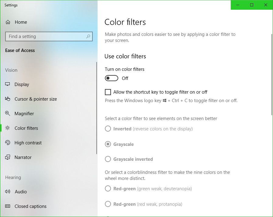
UPDATE: I’m leaving the original post up, however the latest Windows update changes some of this around. The ‘Windows key-ctrl-c’ shortcut for setting filters is no longer enabled by default, and while you can still use the ‘right-click on desktop and select Personalize’ technique, in settings you now have to choose ‘Ease of Access’ to access these settings, which does make more sense. Additionally, high-contrast settings are where they’ve always been, but black and white / color-blind settings are now under the ‘Color filters’ option.
Here’s the new screen in settings, and the original post follows:
New Windows 10 color and filter settings
If you’re using Windows 10 and looking for a fix as to why your screen has suddenly gone black and white, or if it hasn’t and you’re looking simply to learn something new and interesting and fun (and what can be used as a cruel trick on your friends / acquaintances / enemies, but please don’t do that), try the following: Hold down the Windows key, then Control, then C. If your screen was black and white, problem solved! If it wasn’t, well, now it is. Do the combo again and you’ll be good as new. Spoiler: You can choose other visual settings for that shortcut; black and white is simply the default. More on that in a moment, and here’s the companion video I recorded for this post.
I’d also like to briefly talk about the importance of color. It is a vital tool in communicating information, although it should never be used as the sole communicator: if someone can’t distinguish red, a red sign will serve no purpose if there isn’t text that also communicates what’s up. But there is no such thing as a green stop sign or a red ‘everything’s ok’ light, and there is a reason for that. For you programmers, you know that you tweak the colors of your IDE to enhance readability and comfort. Never underestimate the purpose of color in design. Also, my Ph.D. was in this very subject so I’m especially passionate about it, as you can tell.

I don’t think so
But black and white? You may be wondering why something like this is even a feature. The reason is readability and accessibility, a primary focus of HCI, interaction design, and the larger field of human factors, and remember it’s not the only setting – it’s just the default. The point is to make the screen easier to see for those with visual impairments, particularly color blindness, but these adjustments can also be used by those who simply find stock Windows color settings to be too much. And let’s face it – sometimes they can really be too much.
It reminds me of the old Atari 2600 and it’s B*W / Color switch, which is as far as I can tell the first time a dedicated option was provided to select between one or the other. This wasn’t an accessibility issue, however, it was used because in 1977 black and white TVs were still quite prevalent, and using the black and white setting would adjust the contrast by switching the palettes used, thus making the game easier to see. Without that, in other words if it just switched to a standard black and white with no consideration given to their original colors, on-screen objects that were easily distinguishable in color might be very difficult to distinguish with just shades of gray. So the idea was the same, but the reason was quite different.
The image below shows the B*W / Color switch taken from one of our 2600 consoles in the gameroom here at UCI, while the other two screens show Slot Machine for the 2600, running in the Stella emulator, and how it displays in color and in switched black and white.
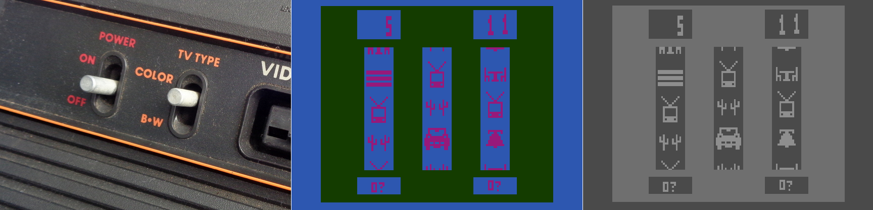
Atari 2600 Slot Machine in color and black and white
Yet that was back in 1977. With todays monitors having HD and 4K capabilities, why on earth would we need a black and white setting? There are several reasons, the most obvious being that black and white photography, which adds an ethereal, ageless quality to a photo, and in my opinion often requires the viewer to focus more on the content and composition of the image, is still very common today. However you can’t simply switch from color to black and white for the same reasons we had a switch on the old Atari; what works well and is easily distinguishable in color may blend into a single shade in black and white. No, unless you are shooting in black and white natively, and if you are you should use the RAW setting to get as much contrast and separation as possible, you have to convert an image from color to black and white, manually adjusting for all those settings that would have been done automatically otherwise. That’s one use for the setting in Windows. Of course, it’s possible that a user might have complete color-blindness, and even though that is extremely rare, it does happen: estimates are, for men, between 1:30,000 and 1:100,000 depending on type.
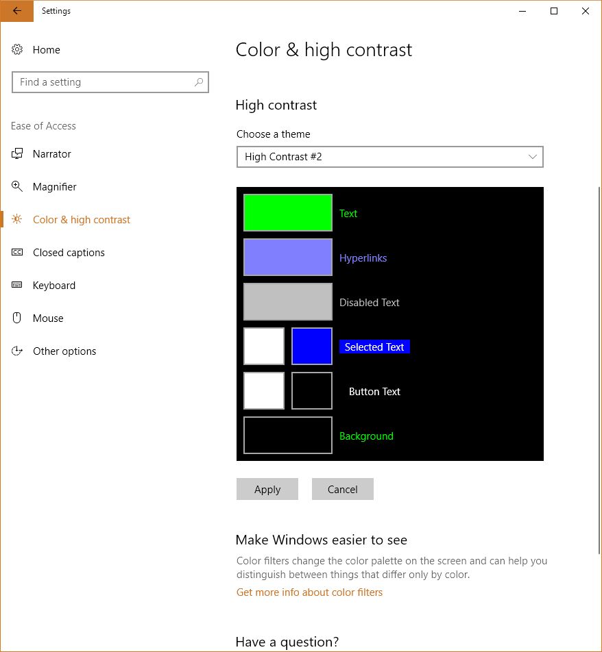
There is much more to this feature than simply switching between color and shades of gray, however. That capability in Windows is simply foreshadowing for much more important color-based adjustments that can be made. To see what they are, go into settings, select ‘Colors,’ (Alternatively: Right-click on your desktop and select ‘Personalize’), and scroll down until you see ‘High Contrast Settings.’ Click that, and whatever is selected under the heading ‘Choose a Filter’ is what will Windows will switch to when the shortcut Windows key – Ctrl – C is pressed. You can see the choices below.

High contrast settings

Color filters
So what do these do? The first three should be obvious; grayscale converts to shades of gray, or black and white informally, ‘Invert’ inverts the colors on the screen, although what ‘Invert’ actually means cans be complicated. Factors to consider include whether you are using RGB or CMYK color standards, the former being additive and the latter being subtractive, and what you’re trying to invert. Normally, when colors are inverted they are switched to their Complementary Colors, which are those opposite each other on the color wheel and offer the highest contrast to each other, although that high contrast can be a nightmare for text (red and green are complementary on a CMY color wheel, for example), so always consider application and the color scheme you’re using.
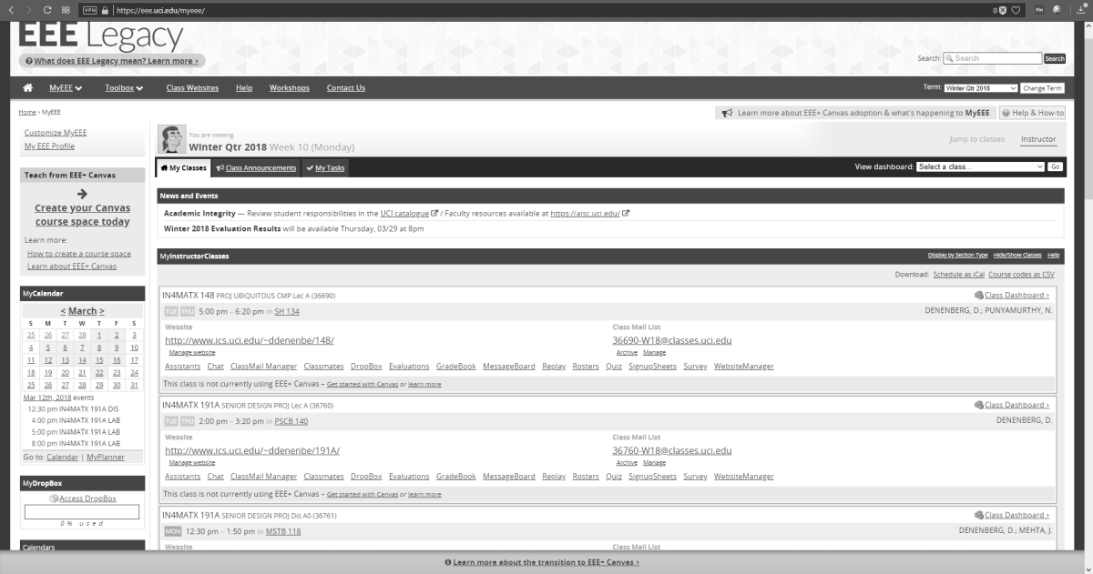
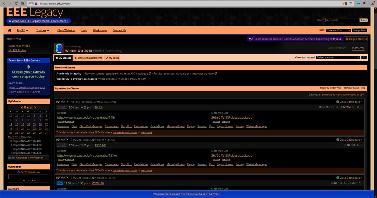
I’ll be using UCI’s EEE page as I see it to show what these selections do, since it has an interesting combination of colors including various shades of blue and yellow which are sort-of-but-not-quite complimentary, my avatar has red hair, the ‘Learn about’ box in the upper right is green, and if you look closely you can see the ‘MON’ in the lower left is a shade of orange.

EEE in its natural state
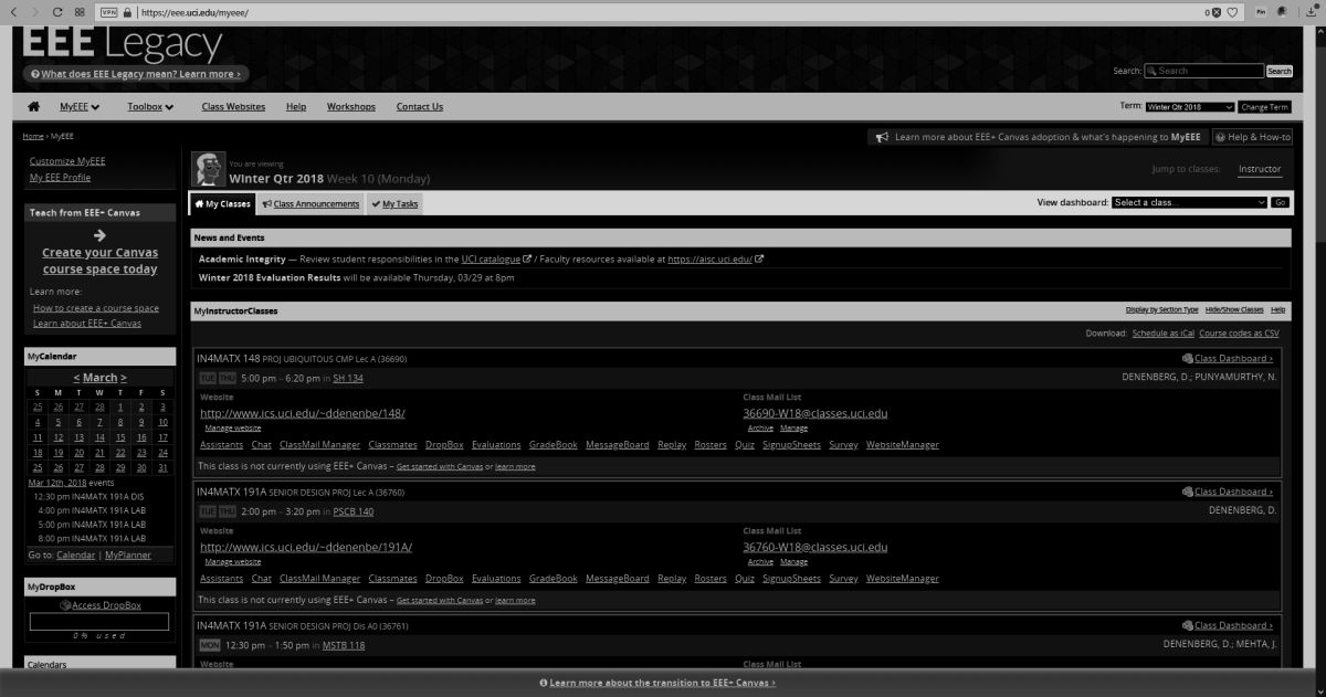
EEE with Windows color filter set to ‘Grayscale’
EEE with Windows color filter set to ‘Grayscale Inverted’
EEE with Windows color filter set to ‘Inverted’
As you can see, these allow a user to change the color scheme to fit their particular needs for viewing web pages or images or whatever, however it is the next three options that deserve our attention, as they are a cornerstone of accessibility and design in the user interface and HCI in general.
If you look back at the earlier image showing the filter options, you’ll notice the last three are ‘Deuteranopia,’ ‘Protanopia,’ and ‘Tritanopia.’ These are types of color blindness – a term that I really don’t like even though it’s accurate – that affect someone’s ability to process colors. We also need to distinguish between some terms here, as they are often, at least from my experience, misused. All of these conditions can manifest in two primary ways: -opia and -omaly. The former, which are the ones indicated in Windows’ color settings, mean you are missing the related cones altogether. In other words, Deuteranopia is a complete lack of red cones (known as L-cones, for long-wavelength), Protanopia is a complete lack of green cones (known as M-cones, for medium wavelength), and Tritanopia is a lack of blue cones (known as S-cones, for short wavelength). The latter is a form of blue-yellow color blindness, although Tritanopes don’t confuse those two colors so it’s not an appropriate name, while the former two are versions of red-green color blindness.
In contrast to the previous circumstances in which the cones are entirely absent, it’s also possible that the cones are present but weak to a particular color stimulus; those cases use the ‘-omaly’ suffix. So Deuteranomaly is a weakness to red, Protanomaly is a weakness to green, and Tritanomaly is a weakness to blue, and very rare; about 1:1,000,000. But the cones are not missing as they are in the previous cases; they are simply weak or mutated. Therefore, one way to address it is to increase the amount of or saturation of the color in which a person is weak, although this in itself is not a complete solution. Additionally, how these manifest in someone’s vision can be wide-ranging, from little impact on color-vision to something very close to the -opia variant.
These types of color deficiencies can cause real problems in distinguishing elements in any visual field, especially a computer screen. Research into accessibility has not only been ongoing for many years, but guidelines for the use of color are in place for all large companies such as Microsoft, Apple, Google, and all the way to the U.S. Government (Usability.gov is overseen by the Department of Health and Human Services, by the way).
So in returning to the color / filter settings in Windows 10, I can’t say with certainty whether Microsoft actually means, for example, Deuteranopia, as indicated, or Deuteranomaly, or is using it as an umbrella term. They aren’t the same, and can only be addressed as such through design to a certain, limited extent, but there aren’t separate settings so…I don’t know.
When switching among these filters on EEE, there was no impact as there is no red or green, however there was a noticeable effect when applying the ‘Tritanopia’ setting, as that refers to an absence of blue cones. As you can see, the yellow sections were switched to green, which makes sense as Tritanopes have generally normal red-green vision.
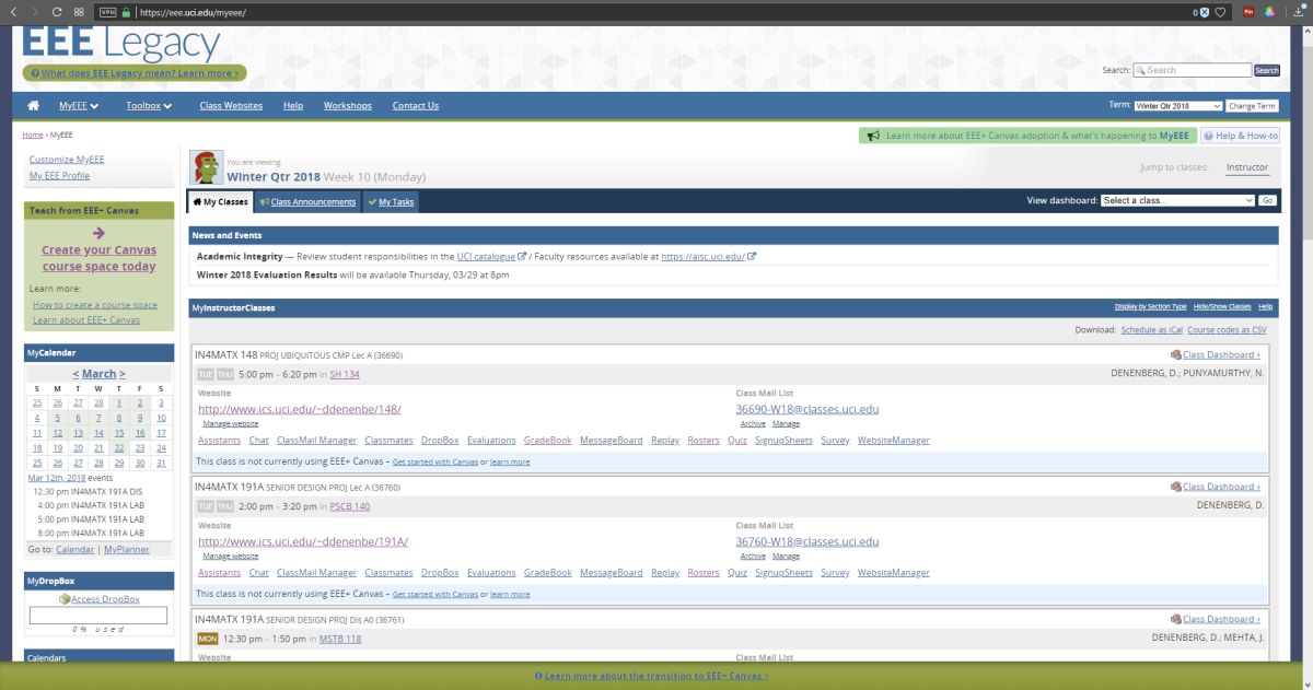
EEE with Windows color filter set to ‘Tritanope’
For the Protanopia setting, a good example to use instead of EEE is IS301.com itself. because this condition results in a weakness to red light, and IS301 has a strong red background, the setting reduced the saturation of red in all elements on screen for a noticeable change.
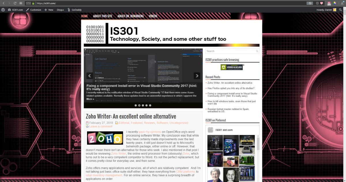
IS301.com with Windows color filter set to ‘Protanope’
When set to ‘Deuteranope,’ the only change was an increase in saturation of the red elements of the screen, but nothing dramatic.
I also want to mention that you can set up your own high-contrast color themes, tweaking the color for every aspect of the display so it fits your needs perfectly; there are a lot of options for configuration.
Prebuilt but editable contrast themes
On the other hand, apps and programs and everything else have to be designed with that in mind or else they will be negatively impacted by your adjustments, and that results in another problem: Windows will natively adapt to your specification, but it doesn’t mean any of the programs you run under Windows will. That’s something that needs to be enforced more clearly and strictly in Microsoft’s design guidelines.
So what was s simple fix of a black and white screen turns into a deep dive about accessibility and color blindness – I love it when that kind of thing happens. If you just wanted to fix your screen, then you’re not reading this anyway, but we really need to be aware, especially software and interface designers and developers, that for usability and accessibility these options and many others need to be available so everyone can benefit from the functionality your software brings.
On a related side note for those who may be reading and and are living with color-blindness, I discovered that there are glasses that claim to fix the problem. Apparently they create a bespoke filter on the lens for your particular condition and severity, and can bring you to almost normal. I’m not affiliated with the company, I have no idea how well they work, but for the cost they’d better work pretty well. if your’e interested, the company is called EnChroma. If anyone tries them, let me know how it goes!