Tag Archives: Rift
The new oculus home and store experience

Facebook-owned Oculus released their Rift Core 2.0 software a couple of days ago, completely revamping the out-of-app experience users have when they don their Rift headset. It’s a vastly improved experience over the original Oculus home (which wasn’t all that bad, to be honest); much more feature-rich, streamlined, and user-friendly, however it is still clearly in beta, which is a good thing because it is also still, bafflingly, missing some foundational functionality. According to the Oculus developer blog, there is much more coming and I am very much looking forward to it.
I have made a video, embedded at the end of this post, however that was not without some strange difficulty. You see, when you are in a VR app, the app is automatically mirrored to a window on the desktop, but not when you are in Home or the store. For reasons we may never know, the developers made that window a hidden window, and it required a third-party app, cleverly named HomeUnhider, to make it visible. I would have used the more popular OculusMirror.exe, supplied with the Oculus software itself, however unlike everyone else on earth, my Oculus program folder was empty, with none of the software that was supposed to be installed along with the core experience, and it’s not available for download.
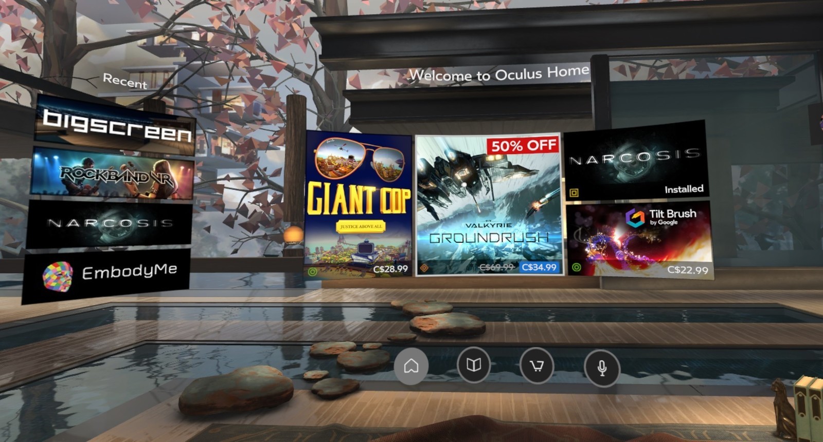
“No problem,” I thought confidently, “I’ll just use HomeUnhider.” Great idea, except HomeUnhider doesn’t work with the new beta experience, giving an error that reads ‘Oculus Home not found.’ It required a complete uninstall and reinstall of the Oculus software, but I did then get the mirror program that allowed me to capture the video (for those interested, the complete path is C:\Program Files\Oculus\Support\oculus-diagnostics\OculusMirror.exe). Camtasia then proceeded to cut off the bottom bit of the video so you can’t see the dashboard as much as I’d hoped. It’s also a weirdly low-res video, which is strange as I use Camtasia a lot and don’t normally have that issue. Here’s a pic of the original Oculus home, lifted from the Windows Central forums, to set a baseline.
As you can see, it’s not bad. It has a nifty, pseudo-futuristic-while-simultaneously-rustic vibe going on, and the home and store functionality is combined into a single interface. You can see yourself, your friends (yeah, right), highlights from the store, and recently accessed apps. The image is actually an older version of home; it had been upgraded from the design you see in the image above, with additional navigation, categories, and so on. It looked generally the same, but with some additional functionality. Of course, you could look around your home if you just wanted to chill, as the kids say.
In the just released beta, however, it has been completely revamped. Your house now sits on what appears to be the cliffs of a…Mediterranean, perhaps, or maybe Spanish inlet, part of a larger coastal village, with your balcony looking out over the water, which also happens to have some pirate ships. Can’t argue with the view!
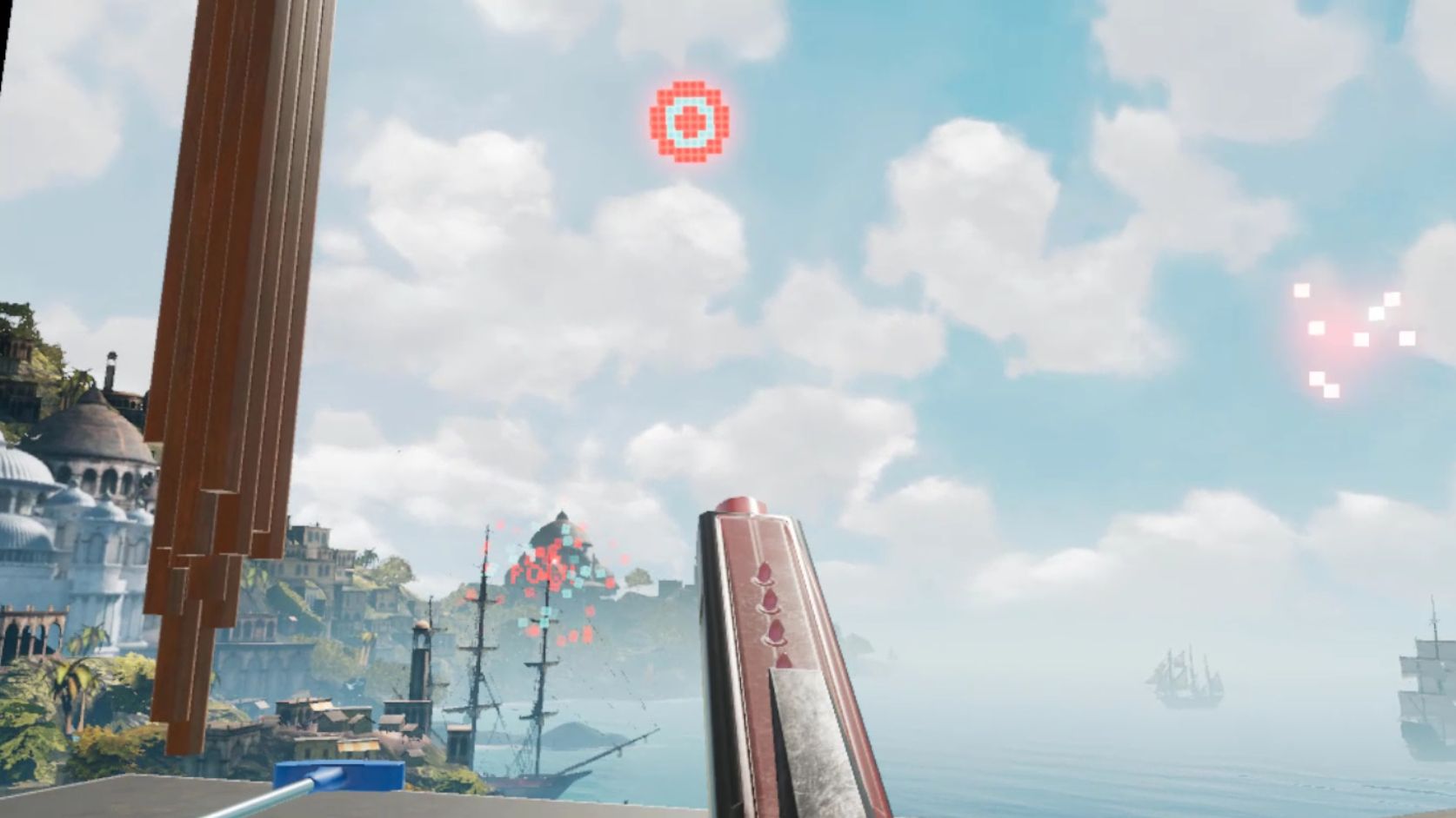
There are also some activities you can do, such as shoot a bow and arrow at nothing in particular, shoot what appears to be a virtual incarnation of the Sega Master System Light Phaser (which could be dangerous in the wrong hands) at similarly 8-bit targets, or lob golf balls into the water. For being such simple activities, they’re oddly fun. You can navigate around your house, something you couldn’t do before, and you can now do some limited decorating. By selecting different patterns you can change the look of the ceiling and walls, and other accouterments can be placed around as well. The carrot here is that by playing games and using apps, or simply spending time in Home, you’ll earn additional items and decorations that you can use to further spice up your space. And don’t worry, there are no lootboxes here.
I suspect that there will eventually be many more ‘homes’ from which one may choose: On the developer blog linked earlier, there is what appears to be a house in outer space as opposed to the seaside location it’s in currently, and my guess is there will be more than that. The blog states they’ll be rolling out content over the course of the next year, and I suspect further on past that. Hey, Sony’s Playstation Home may not have been a hit, but the homes you could buy were spectacular, and it never came out of beta! I can only imagine what it will be like if we can get homes like that in VR – I’d buy every single one. They even had one that was completely underwater with whales and whatnot swimming outside massive windows…Now I’m nostalgic and I can’t find a single picture of that house, so instead here’s a picture of an underwater, Bioshock-themed apartment you could get. Still pretty impressive, and apparently there’s some weird version of Playstation Home that still exists on the PS4.
GLORIOUS UPDATE: It turns out the environments are already available! I wasn’t aware you could scroll through decoration options within categories, however I began to suspect something was up earlier today when it said I had 78 objects but was only showing a few. After figuring out how to scroll, guess what appeared! That’s right: A space environment, and my new favorite, a city environment called ‘Vertigo.’ I made an additional video just to show them. They’re very impressive, and now I can’t wait to see the others that I’m certain will be available in the future – fingers crossed for an underwater theme!
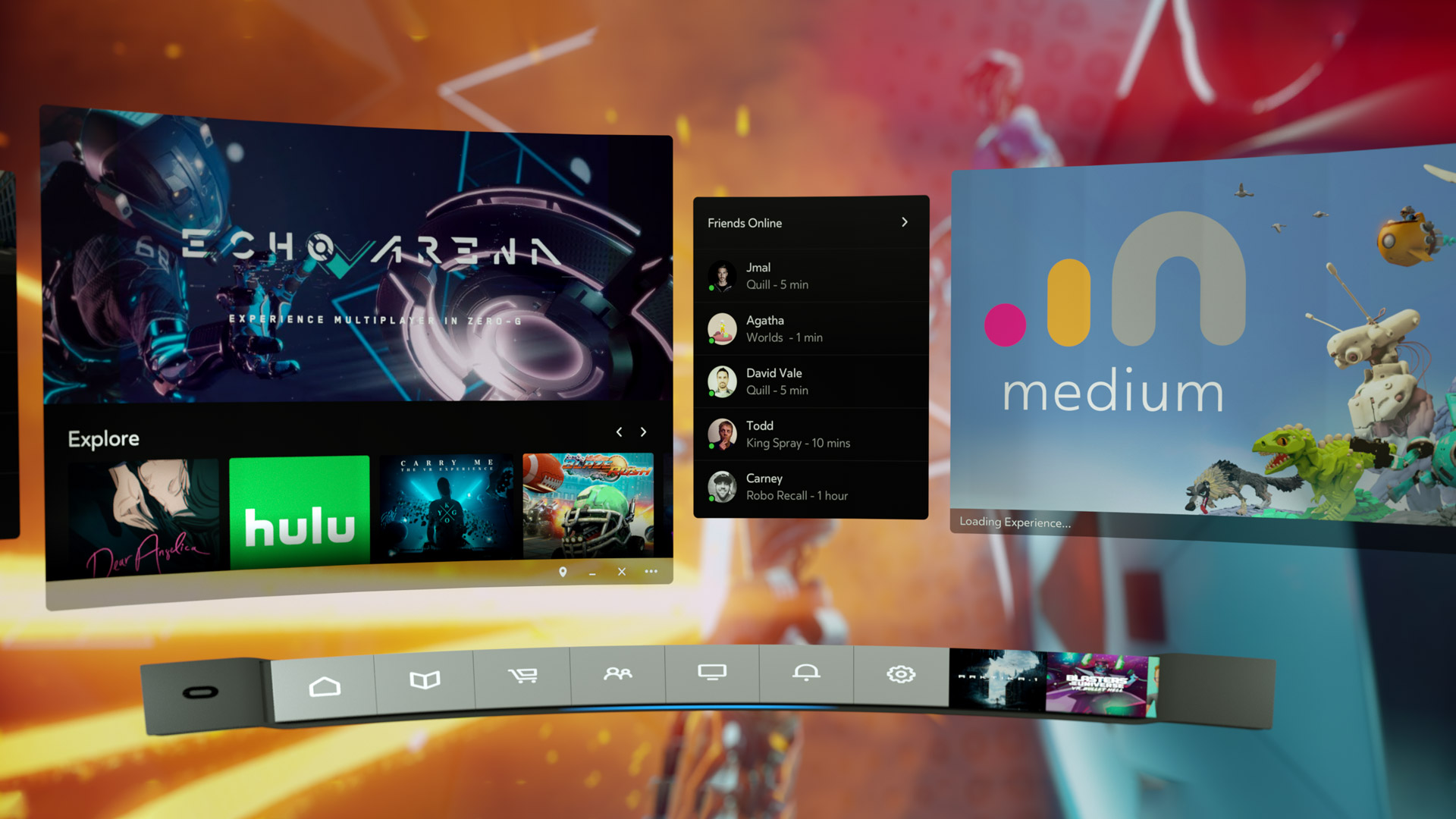
So back to Oculus – there is the new dashboard, which I think is a huge, and much needed, improvement. It now curves around you like a futuristic control panel, offering access to settings, recently used apps, some status info, the store, and social info. It’s easier to use, especially if you’re standing up; using it while sitting requires you do some contortions with your wrists to get the pointers in the proper place. There is also a Desktop button that mirrors your monitor right there in VR, and if you have multiple monitors it will ask which one you’d like to see. The insanely nifty thing about that is that you can pin programs to the curved dash just like you can with the Windows or Mac taskbar, and even pull windows off of your desktop and pin them right in the air in your virtual house! They’ll follow you around – you can watch YouTube videos, play a game, browse the web, all as you mosey through your virtual environment. It’s an incredibly useful feature, however you can’t pin them, say, to the wall like a picture, which I think would push it over the edge into unparalleled awesomeness. Rather, they hover right next to you, although they can even overlay over an app you’re using, so you never have to be away from that admittedly very important video that finally proved the existence of life on another planet.
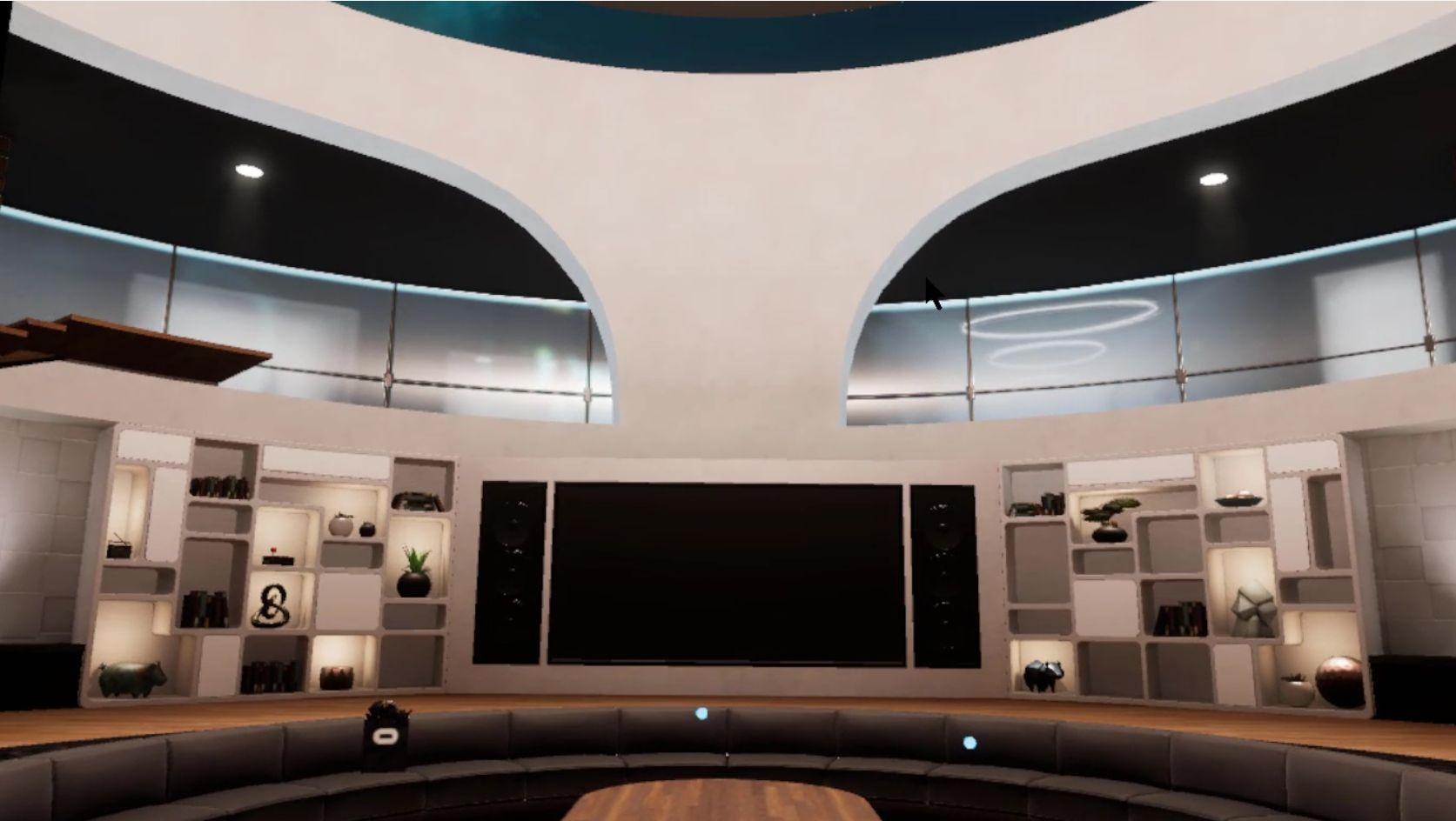
The store has been separated out as its own location, designed as a post-modern, I don’t know, office lobby? There’s a very natural theme to it with an Oculus-branded waterfall, wooden curved steps on either side of the round room, metal balls rolling along tracks under a glass floor, and you can even see silhouettes wandering around behind the upstairs windows. Oddly, and at the same time pretty awesomely, if you turn around you’ll see a very futuristic, yet also immersion-ruining unanimated cityscape. No blinking lights in windows, animated billboards, blinking stars, nothing. But it is an interesting contrast between what’s in front of you and what’s behind, one you can see below.
The store functionality is generally the same as it was before, which is a problem. They have finally added video previews of apps you’re viewing, something the Gear, the mobile version of the Rift, has had forever – the fact it’s been added to Rift now is just playing catch-up. Additionally, although it’s not an addition at all, it’s a maddening omission, there is still no search function, which is as basic a usability function as there is, especially when the list of apps can, in some categories, go for 100 pages! While apps are normally listed six at a time, their ‘Gallery’ titles, which are described only with the very vague ‘A broad, less-filtered collection from VR creators,’ are for some reason listed three at a time, and there a hundreds of them! I also have no idea what ‘less-filtered’ means, and when I clicked on ‘Learn More,’ Oculus crashed and wouldn’t restart without a reboot or taskkill because its background process simply wouldn’t quit, even from TaskManager. Anyway, you can sort, but you may still have to scroll through pages and pages and pages and pages of apps to get to the one you want.
There is also no browser, something its little brother the Gear has had for a good while now. It’s very strange; these improvements to Home and new environments for Home and Store are great, but it still lags behind the version that you use by plugging in a phone. The Gear version of home also has voice search, and other things like events, highlighted videos and better social integration, something that even I, with no friends on this or any other game platform, can see is much better on the Gear. That the Rift still lacks the basic functionality that its phone-based counterpart has enjoyed for so long is unforgivable. I’m overjoyed at this new Rift experience, and I have very high hopes, not only for its continued future development and what that will bring us, but also that it can simply be brought on par with what you would expect would be its much less capable sibling.
It’s important to also add that regardless of my complaints and concerns, Oculus is light years ahead of Valve / HTC and their Vive in terms of the interface. The Vive interface, a Frankenstein-like mashup of three, maybe four, maybe as many as seven separate interfaces (it’s hard to tell, it’s so badly designed), is overpoweringly difficult, cumbersome and unintuitive to use. So awful is the Vive interface, and impossible to navigate, that it may be, and I say this in complete seriousness and without hyperbole, the single worst interface I have ever used. In my line of work I use a lot of terrible interfaces, so Vive has really accomplished something here. Not only that, Steam VR incorporates beautifully into Oculus, so there’s no need to use the Vive at all, at least not in my household.
Below are two videos from Oculus, one highlighting the new Home and its potential options for customization, the other introducing the new interface which they call ‘Dash.’ The third video is the one I took on my own Rift in Home and the store.
A New Oculus Rift
You know, the Oculus Rift is a real Marmite thing to me: On the one hand, I’m really getting tired of hearing about it. Tired of hearing how great it is, tired of hearing about the development kits that are being released, tired of hearing no dates for release, I’m just getting tired of all the in-a-vacuum hype (no-one criticizes the thing, so I couldn’t add a link there).
On the other hand, I can’t [profanity redacted] wait for it to be released. It’s one of the few bits of technology that I believe will be revolutionary, a game changer in more ways than one.
And now they’ve just released a milestone new development kit called “Crescent Bay,” and big surprise, it’s pretty great.
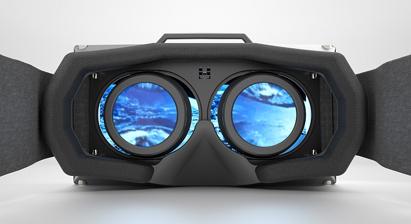
In case you’re not familiar with the Rift, it’s a virtual-reality headset that you wear over your eyes and actually works, perhaps the first of its kind. It supports 360-degree movement and head tracking, so if you spin around, or look up, or down, or wherever, it tracks that and adjusts the view accordingly. From what I’ve heard, it’s so insanely immersive and unbelievable an experience that I have yet to hear a single bad review.
Here’s someone exploring Tuscany using the Rift
But all that is the problem. There’s no release date. They keep releasing development kits, with each one having vast improvements over the previous. Bloggers and journalists keep talking about how fantastic the experience is. They even have legendary programer John Carmack on board as Chief Technology Officer, for which he left his position at id Software, the company he founded and where he programmed the games that made him a millionaire like Doom and Quake, and who also programs software for low-earth orbit spacecraft at his other company Armadillo Aerospace. If a guy like that believes in it, it must be fantastic.
Of course, there was a huge, and I mean HUGE brouhaha when it was announced Facebook of all companies was buying Oculus, the company that makes the Rift headset, for $2 billion. No one knew why a company like Facebook would want a technology like the Rift, who would want to explore Facebook using VR? Exploring the ocean, or outer space, or a (not so) derelict spaceship, now that sounds more like it. In case you think it is no more than a game system, it is also seeing educational applications on the level of teaching surgeons their techniques, and in one instance allowed a terminally-ill woman experience a place she had always wanted to go (warning: the video in the linked article is touching but very sad).
In what may be a threat to the Rift, out of nowhere came Sony with a product called Project Morpheus that actually looks like it will be just as capable if not more so, and likely released sooner. Plus, it looks cooler, in as much you want to look like the person they never let join Daft Punk.
Here’s a video of Project Morpheus title The Deep:
The huge, and in my opinion very bigly huge problem with Sony’s plan is Morpheus only works with the Playstation 4 (for now) and will require the Sony camera and motion controllers. That seems very limiting in many different ways, but the PS4 sales have been doing well so who knows.
The Rift has a lot of potential, I think it’s one of the main future directions we’ll see technology go, if they would just [expletive deleted] release it already.

