Tag Archives: New Layout
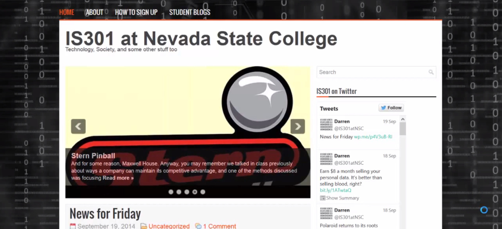
Welcome to the new site layout! What do you think?

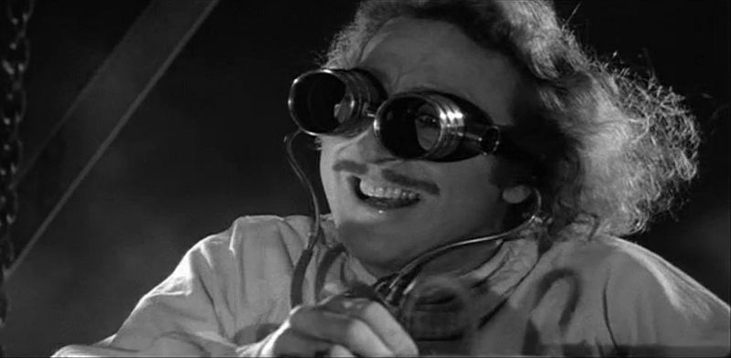
As is painfully, overpoweringly obvious, I have found another reason to use my screenshot from Young Frankenstein. Also, the site has switched over to the new layout as previewed in the blog post here. The feedback was very positive even though I was only able to show a video, and there were some good suggestions as well, some of which I will try to address right here.
While the enthusiasm was almost universal, one of the most commented aspects was the background. Some loved it, some liked it, some thought it was too dark. Two suggestions were made regarding the background about which I’d like to comment (Remember, you have to click on the post title or ‘Read More’ to read more):
An almost new blog layout

(If all has gone right this post is sticky, and new posts will appear underneath it. WordPress is funny about it though, so be sure to check for new posts below even though this remains the top one.)
I mentioned a couple of weeks ago that I was thinking about revamping the layout of the blog, the page you are reading right now, to make it what I hope will be better organized, more professional, more dynamic, and, to use a popular web metric, more sticky.
UPDATE: This post is no longer sticky
Unfortunately, I’m not able to upload a test version of the site to give you all hands on experience, so the next best thing I can do is make a video of the site running on a virtual server I have at home and letting you take a look at that instead. Many of the points I make here are reiterated in the video itself.
