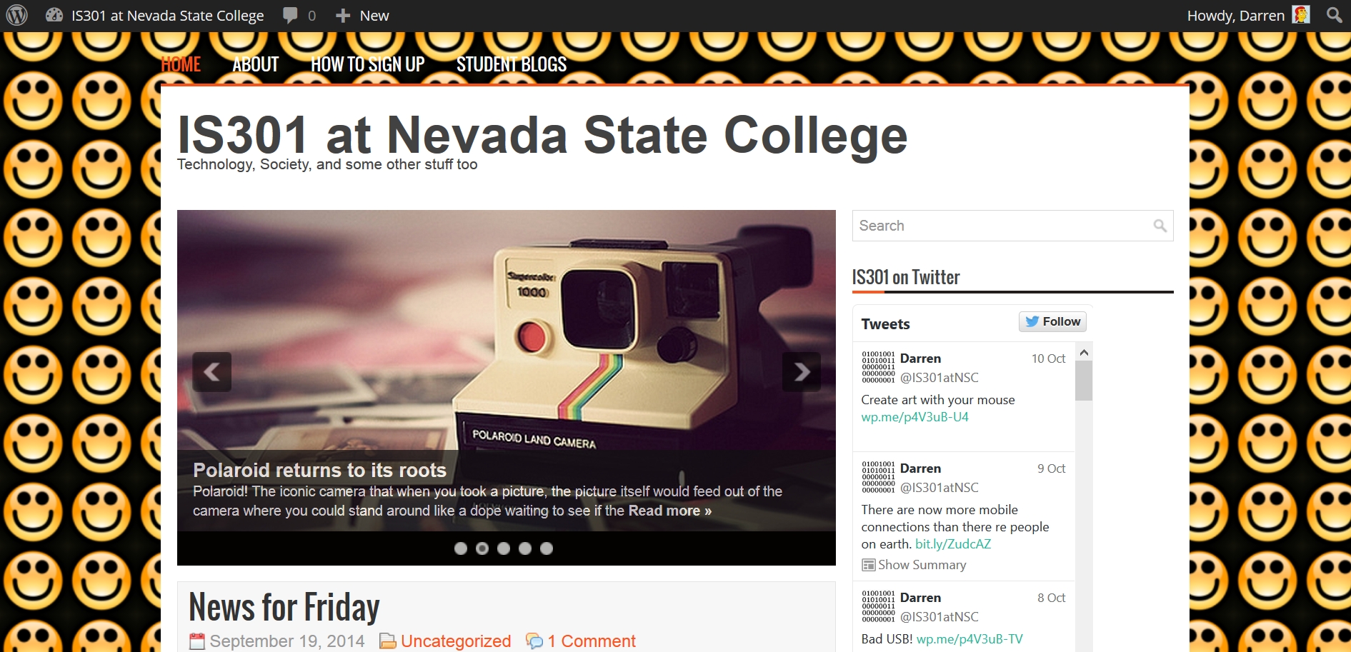
Welcome to the new site layout! What do you think?

As is painfully, overpoweringly obvious, I have found another reason to use my screenshot from Young Frankenstein. Also, the site has switched over to the new layout as previewed in the blog post here. The feedback was very positive even though I was only able to show a video, and there were some good suggestions as well, some of which I will try to address right here.
While the enthusiasm was almost universal, one of the most commented aspects was the background. Some loved it, some liked it, some thought it was too dark. Two suggestions were made regarding the background about which I’d like to comment (Remember, you have to click on the post title or ‘Read More’ to read more):
First, it was suggested by multiple commenters that I rotate the background occasionally. It isn’t that the background wasn’t complimented, but some thought switching the background up now and then might assist with engagement, so I will consider rotating the background on, maybe, a weekly basis. If you see an image that you think might make a good background, you can send me the link or the image and I will consider it. Keep in mind there are considerations for readability and navigation that make some backgrounds unusable, and a background image has to be big, but I’ll always consider any submissions and use them if I can.
Another suggestion was letting users select their own backgrounds. That’s a good idea, and some sites let their visitors do that, but WordPress doesn’t support that functionality and I haven’t been able to find any plug-ins or add-ons that allow for it. Additionally, no functionality exists for allowing commenters to upload images in their comments; that’s a major security risk and I understand why WordPress forbids it. Even so, I also feel both of these functions would be beneficial for everyone so I’ll keep looking, but they will probably have to be put off until the site becomes mainstream and is bought out by AOL.
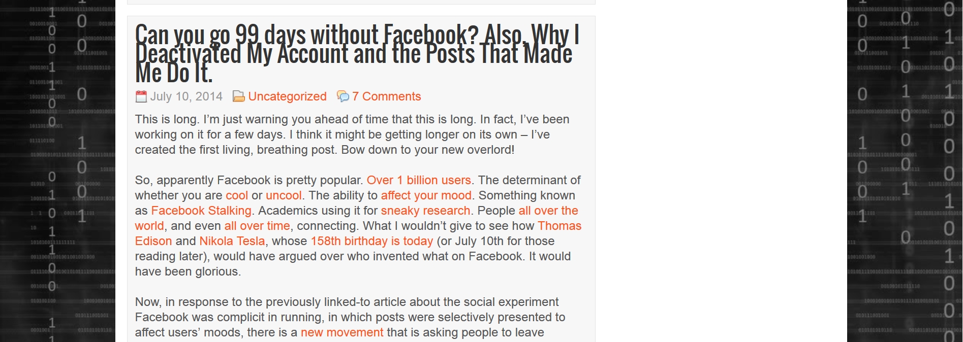
As I mentioned in the preview video, the site functionality is exactly the same; click on post titles to get to the whole post, see recent posts and comments, everything. The only real changes are the slider bar at the top of the main page, and the truncation of the posts. We’ll see how that goes and I’ll decide if I would like to keep doing that. Other than that, the posts, the Twitter feed, the support pages, everything is still there, it’s only the layout that’s changed. That being said, there are some bugs and layout issues that still need to be squashed, and there may be a slight adjustment period. For example, if a post title is too long, it wraps to the next line and the spacing is thrown off (example below). Although I already increased the size of all the fonts which were way too small originally, I’m still working on the spacing, the size of post header images, and some other little things, but none of that affects the functionality of the site in any way.
So mess around with it, click, scroll, navigate, comment, please let me know what you think. If you run into anything showstopping, or perhaps not showstopping but a minor glitch or annoyance, please let me know either in the comments or via Canvas. I’ll keep-fine tuning it to make it the best it can be.


