Category Archives: Firefox
Has Firefox opted you into any of its studies?

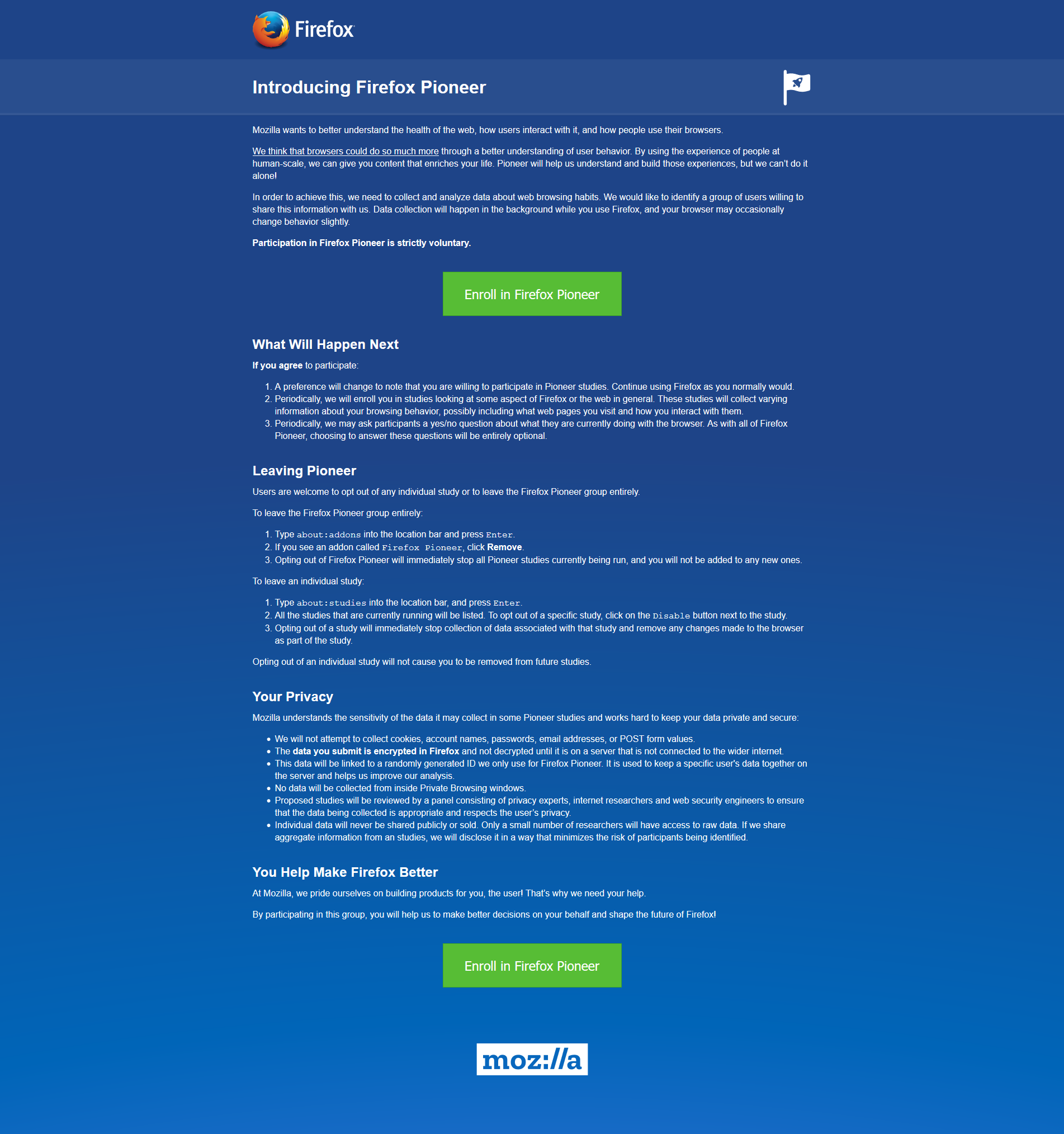
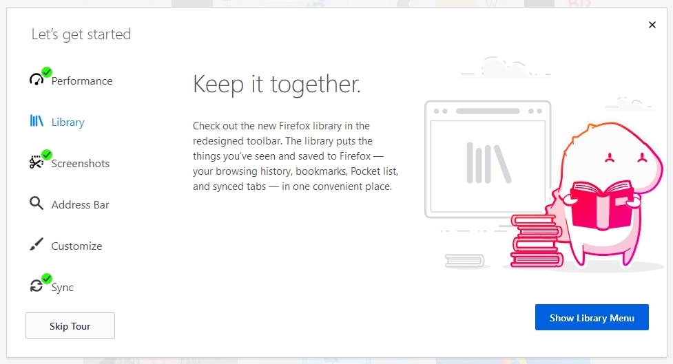
Remember my previous post that talked about the fantastic new version of Firefox, especially the full-screen screenshot capability? I still haven’t adopted it as my main browser, but I was so impressed with th overall changes that were made, I’ve found myself using it more and more; certainly more often than I have in the past. High five for no more memory leaks! Anyway, when I started it up today, it opened to the screen you see below. I was intrigued, especially considering the great improvements they’ve made so far, but as I read through it I also became a little curious. It’s talking about tracking us for usability study purposes, which I’m completely for, but is there anything they perhaps are not telling us? I had no idea the drill down that was about to happen.
This is a new initiative called Firefox Pioneer, which aims to discover how people use their browsers, as well as what they vaguely refer to as ‘health of the web.’ They are careful to note that you need to opt in, which is good, and they are pretty clear about what they will and will not do, and what you can expect in terms of privacy, monitoring, opting out, how private sessions play in, and so on. I do get the feeling they are striving for high-level transparency here and acting in good faith, but perhaps a deeper dive into what they could do is warranted.
I should also mention that while Firefox allows for full page screenshots, that option was not available here. I had to open the page in Opera, save it as a pdf which Opera allows compared to Firefox’s screencap capability, open the pdf in Firefox, and then I could save a full-page screenshot. Very curious, but a triumph for ingenuity.
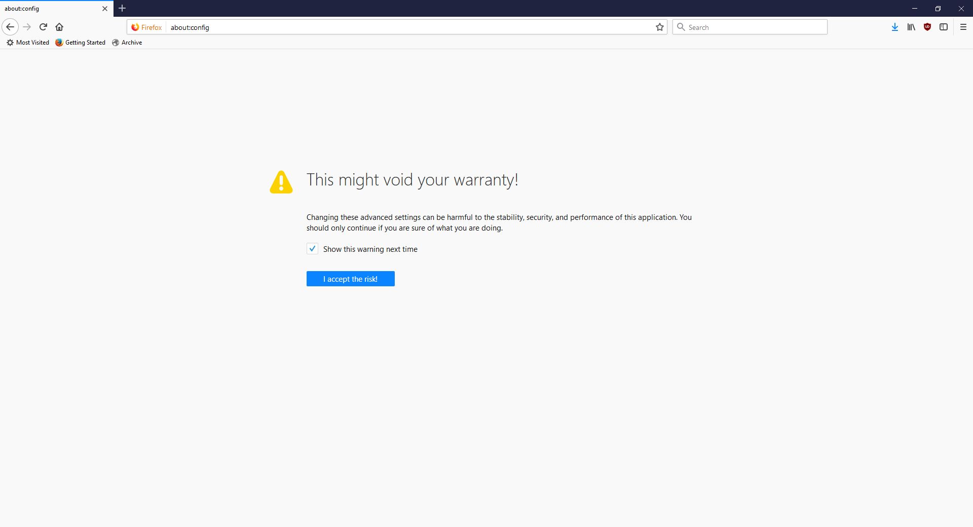
As the page indicates, you can type about:studies into the address bar and see which studies you’re part of, which have completed, and which are available. In fact, you can type about:[topic] into the address bar to discover many interesting things. To see how extensive this capability is, you can see a list at this link. For a real fun time, try about:config – it shows this not at all scary warning, which is really just trying to be funny before letting you access settings. I would normally be for this, however it’s incredibly unclear as to what’s going on if someone isn’t familiar (it fooled me too), especially as it says ‘this application’ and not ‘Firefox.’ Why the pseudo-third person?
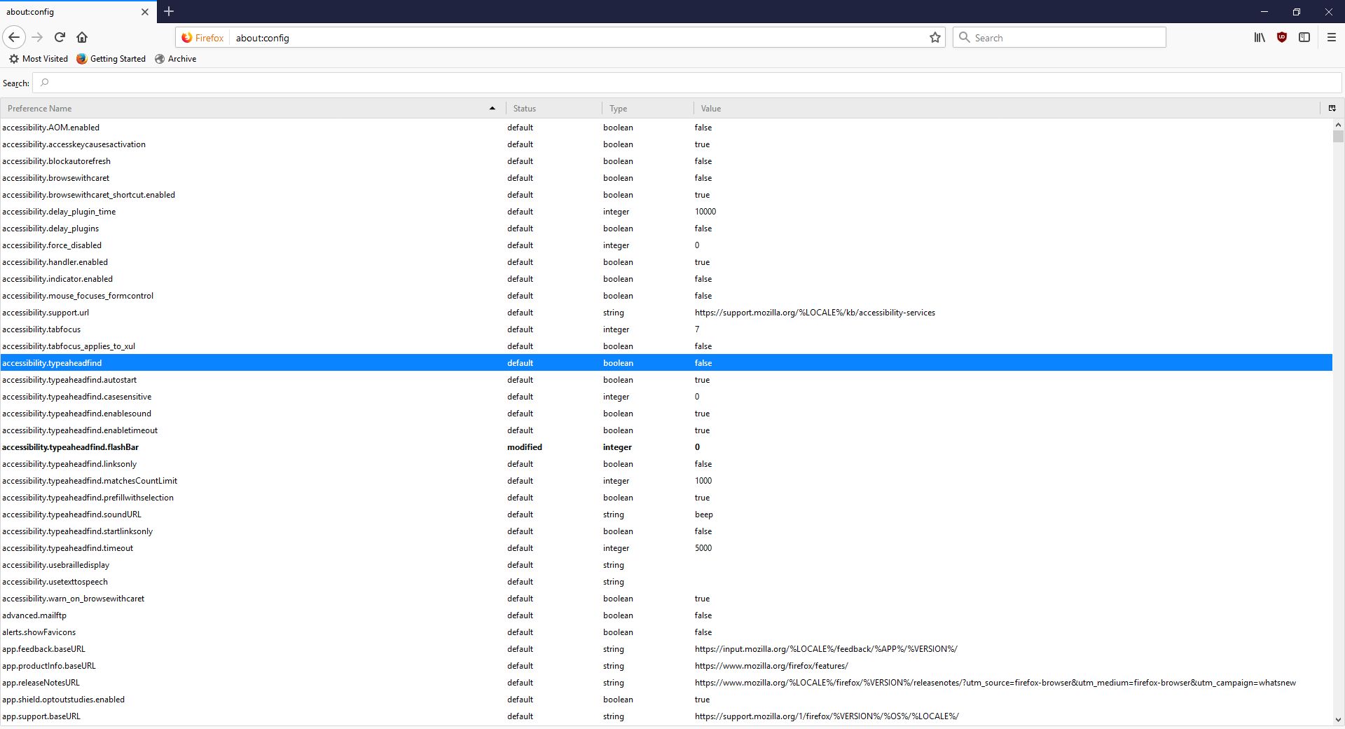
Clicking ‘I accept the risk!’ takes you to a configuration page that isn’t much better in terms of readability or functionality.
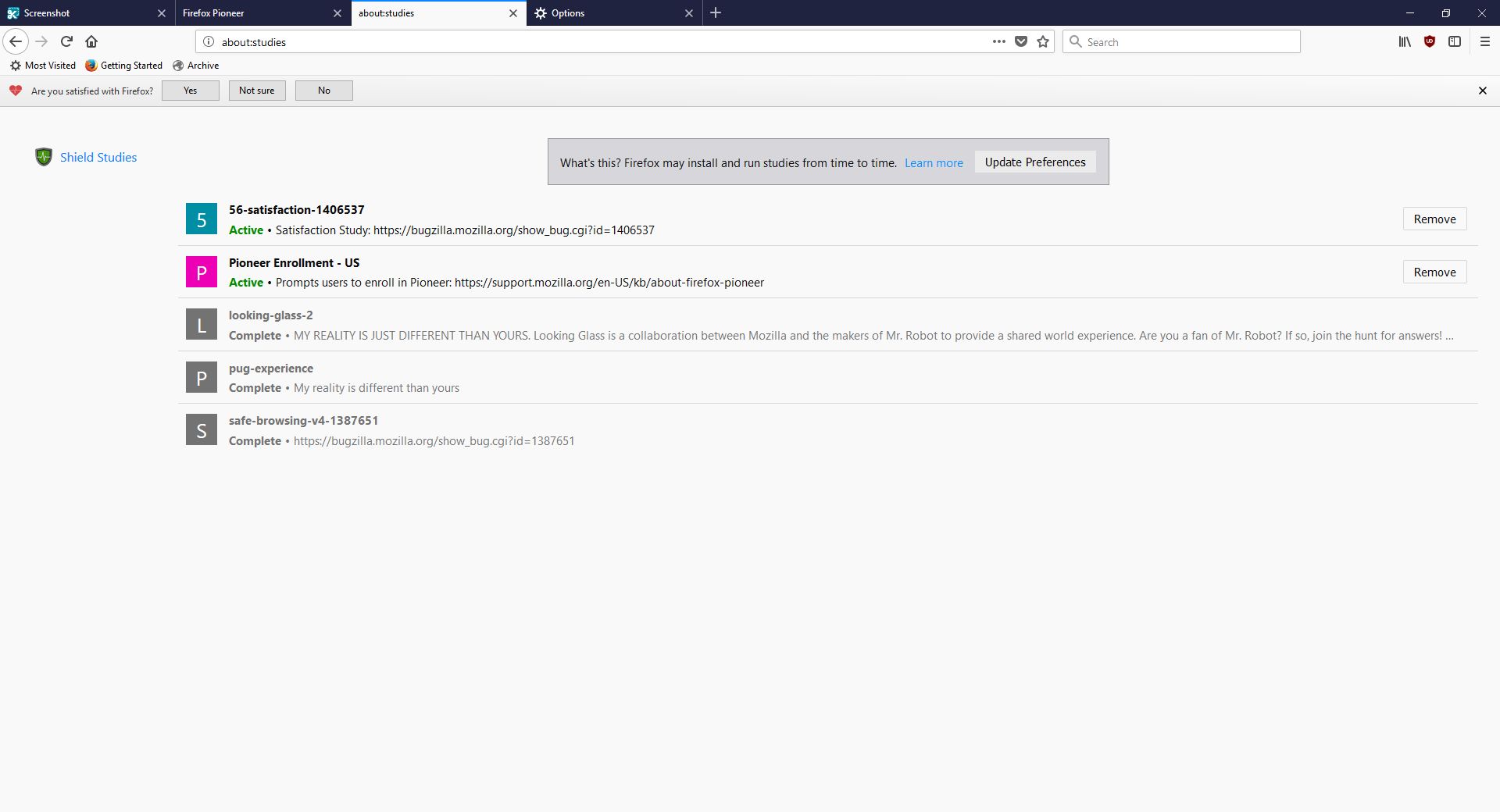
I don’t usually check this kind of thing, but I certainly should. We all know that companies use your data for many things, sometimes not asking first, so it’s important to keep an eye on what any program you’re using is doing. Typing about:studies showed me this screen, which I have to admit got me to wondering what exactly has been going on behind my back:
A collaboration between Mozilla and the creators of Mr. Robot? Someone’s reality is different than mine? What is going on here exactly? I clicked on Learn More and was taken to their SHIELD page where I learned all about their SHIELD studies, which they claim are to test new features, however from the original request it’s clear they test more than that. I also can’t figure out why it’s capitalized in such a way; I found no evidence it’s an acronym. A deeper dive led me to another Shield page where it’s maddeningly no longer capitalized, and that’s where I found, towards the bottom, a very concerning entry called ‘Normandy – User Profile Matching and Recipe Deployment.’ I wasn’t completely sure what that meant, but it stood out as sounding perhaps not so good. Just the name is curious: If you’re not familiar, and you should be, Normandy happens to be the location in France where the United States, Britain, Canada, and some of France itself launched the D-Day invasion against the Nazis in 1944. Did you ever see Saving Private Ryan? The opening scene was Normandy. I can’t help but wonder why Mozilla has named this bit of its process in such a way. It may be common knowledge, I don’t know, but it was new – and enlightening – to me.
You’ll notice the first item there, “Filters for Shield Targeting.” That took me to another interesting page, the very first paragraph of which states how certain users can be pegged for recipe execution in their browser, and the means by which that is done has access to location and locale (I’m uncertain as to how those differ in Mozilla parlance). It’s further down the page that you begin to see all the ways you can be tracked and monitored.
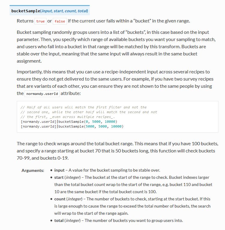
I was going to take a screenshot and crop in the sections that were most troublesome, but there are SO MANY it simply was not possible. To give you an idea, here’s what a screenshot of the page looked like in my image editor. I should also add that from a pure design perspective, they are really not using space efficiently.
So there’s a Normandy server, and Normandy is also an object that contains what they call ‘general information’ about the client. Client in a case like this should indicate the browser itself, not the person using it, but separating the two is not so easily done, and as a designer / developer, you’re ultimately trying to learn about the user, about their wants, needs and habits, so you can provide a better product. I have no problem with that, and in fact am completely on board with their Heartbeat initiative, but that is relatively benign.
Anyway, back to the above screenshot. They can track a lot, and in the crop below, you’ll see they do something interesting called bucket sampling. I’m intrigued by what this would be used for and how / why / when / etc., so I will have to dig even deeper. I’m guessing it’s some kind of parsing via demographics / usage statistics, but I’m not completely sure. I only found one mention of it on Mozilla’s site, on this page towards the bottom under the heading “Filling the Gap,” but it does lend credence to my assumption. While there’s no formal method known as bucket sampling, it’s something we do, in effect, all the time. I’m looking at you, marketing!
So what does all of this have to do with the study that started this whole post? To be quite honest, this rabbit hole didn’t tell me anything I, or any of you, didn’t already know: It’s very easy to track you online, and not just the websites you visit. Where you are, what software you use, what OS you have, whether you’re a new user or experienced, how many mobile and desktop clients you have, how long you stayed at a site, they can even track if you’ve enabled Do Not Track!
And while this sounds like a conspiratorial, tinfoil-hat rant, I actually am not overly bothered by it. I don’t do anything outrageous online other than download Sega Genesis ROMs, because I’m dangerous and like to live life on the edge. But other than that it’s all pretty boring. My issue was mainly that Mozilla may be opting us in to studies without formally informing anyone, and that I just can’t get behind. This was originally going to be a very short post that I thought could be whipped up in about fifteen minutes, but it instead turned into a downhill slalom.
If you’re interested in reading more about Normandy, Mozilla has a helpful website where you can learn all about it and what it can (and does) do, and it really is an interesting, dare I say fascinating, read. http://normandy.readthedocs.io/en/latest/
Oh, one ore thing – In the latest build of Firefox, Mozilla has also made individual cookie management much more cumbersome. I don’t use that feature a lot, but it is definitely not something people should have to go in to the developer console to access. I love the new Firefox, but this isn’t good – user control should be at the center of all commercial software development. Get it together, Mozilla.
The new Firefox browser seems pretty good so far

I’m an Opera guy. Not an ‘opera’ guy, although I have nothing against that particular type of theater, but an Opera browser guy. Many years ago I was a Mozilla Firefox guy, especially as they rose from the once-great Netscape Navigator, however for many years now Opera has been the Samsung Galaxy to Firefox’s iPhone; in other words, Opera always had features that Firefox offered much later or didn’t have at all except through add-ons, and was simply faster, more responsive, more stable, and easier to use. Not only that, Firefox has been infamous for its memory leaks, a problem it was never able to solve (Chrome, too, let’s not forget about Chrome). I should also mention in the issue of fairness that plugins could exacerbate the problem, however the base browser always struggled with the issue as well.
Now, however, Mozilla has released the latest version of its Firefox browser, named Firefox Quantum, and it is the first major update for the browser in almost thirteen years; you can read the blog entry straight from the horse’s mouth here. They claim it’s faster, better, has more features, is better able to manage resources, is compatible with new and emerging web technologies, and has many options for customization and configuration. It’s been redeveloped from the ground up, and it shows.
I gave it a run to see how it is, and it certainly does appear to be better. Very fast, very responsive, clean interface whose elements can be dragged-and-dropped to rearrange them anyway you like, which is very nice. I started up some test sites to see how they loaded, including UCI’s homepage, IS301.com, Amazon, Plex’s homepage as well as my Plex home server, Hackaday.com, eBay, and Rotten Tomatoes. I also left up the default start page.
The tabs loaded quickly, although plex.tv and this site took longer than expected, however while comparing response times with Opera, they loaded slowly there as well so the problem was obviously server-side and not an issue with the browser itself; testing them later resulted in equally speedy load times. That wasn’t the case with actually playing videos using Plex, though – Firefox took much, much longer to buffer than did Opera, almost three times as long; I was unable to discern why but the issue was repeatable and consistent. Barring that anomaly, everything else was very snappy and without hesitation. One thing I should add about measuring response times: It is very difficult to do client-side, and is often done via what is known as a stopwatch test, doable in code or with an actual stopwatch. Needless to say, I find those both very unreliable and so went with my own observation to get a general sense of how Opera and the new Firefox compared.
Firefox also has many new features, including deeper integration of Pocket, a personal web-content aggregator that Mozilla bought and integrated a while ago. I have never used it, but can understand how it could be quite beneficial for some. It also has an excellent snapshot feature that allows you to take a screenshot of all or part of a page and save it locally or share it to their cloud service. I don’t know why someone would use the latter, but the former is something I use quite a bit with Opera, and as we will see Firefox does it much better. There is also the aforementioned interface configurations, the library which is just a collection of your browsing history and bookmarks, syncing across devices, and more. As the header image shows, they even have a new icon!
Of course, that’s where the important issue comes up. The fact is, while the new Firefox browser appears to be much faster, more responsive, more stable, everything I said about Opera earlier, what that essentially does is bring it on par with Opera, except in the case of Firefox’s better screenshot functionality which I will discuss later in the post. I tested each page I loaded in Firefox against the same page as it loads in Opera (with three times as many tabs open in Opera, no less) and the performance was the same. Opera wasn’t better as it had been in the past, it was simply the same. That’s a comment on both Firefox and Opera; how well Opera has been in the past, and the catching up Firefox had to do, and did quite effectively and impressively, to reach it.
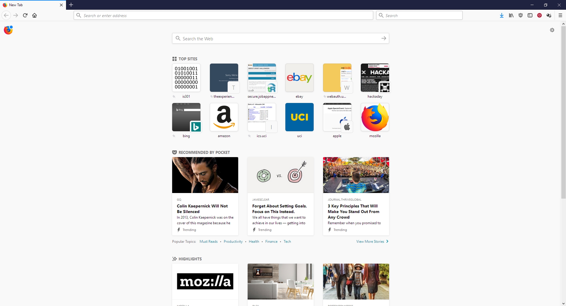
As mentioned earlier, there is one big difference in which Firefox easily takes the lead, and regarding a feature I use often – the screenshot feature. Both Opera and Firefox have had this feature for some time, and as stated I use it frequently, although now Firefox’s implementation is much better (MUCH better) – it can identify sections of a screen, such as a headline or picture or other element, as you move your mouse, and snip that out, while Opera requires you to adjust a selection box. Additionally, Firefox has the neat ability to capture a whole webpage as a snapshot, even if parts of it are not visible in your browser – the image below was taken in Firefox even though the entire footer and about 20 percent of the header were not visible when I did. That is a great feature, one that surpasses Opera’s full-screen (note: not full-page) capture, and might be the clincher for some; it almost is for me.
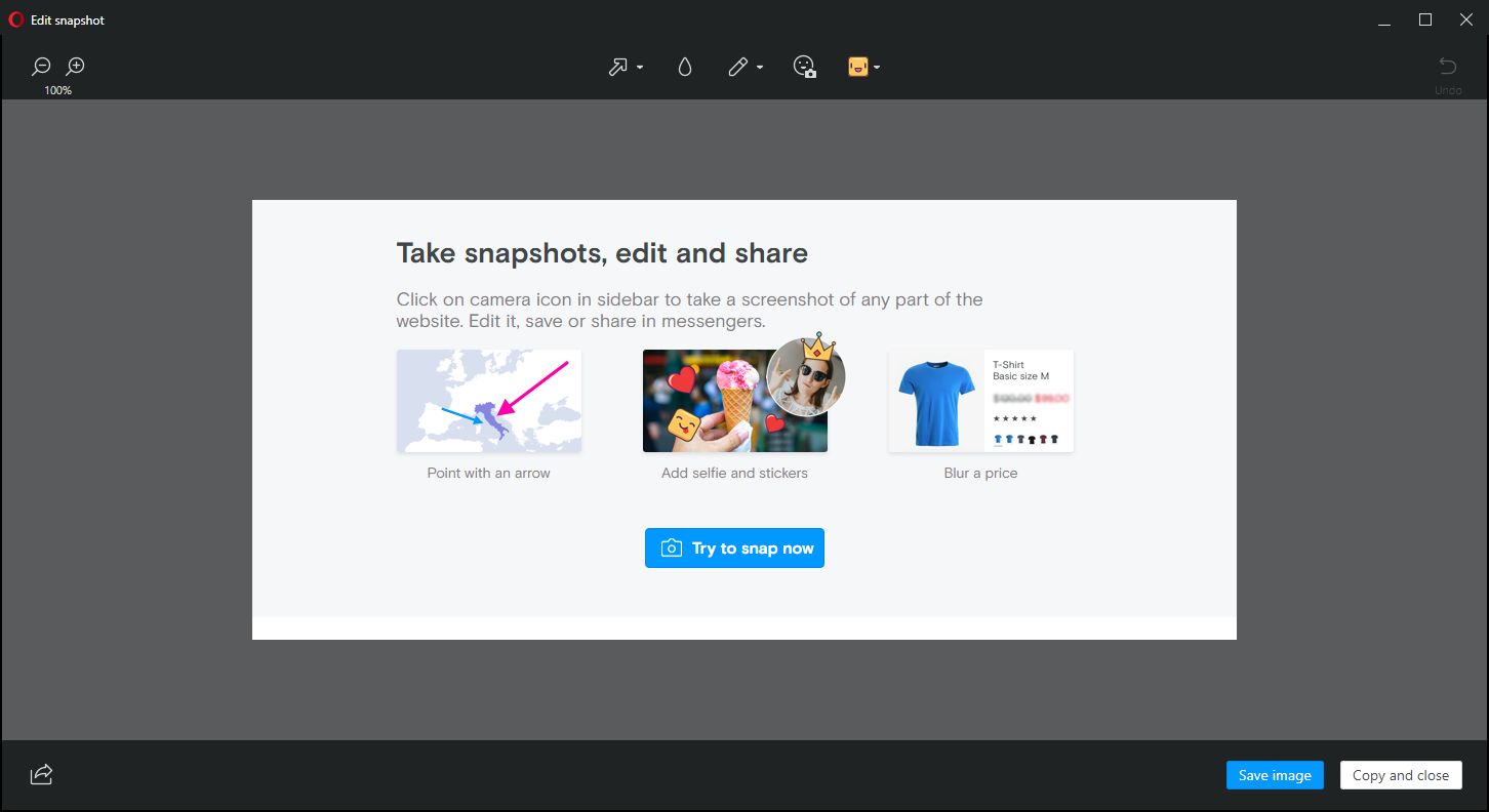
Opera, on the other hand, allows for screencaps to be marked up in a very limited fashion right in the capture window, something Firefox does not, however this is less of an issue for me as I usually use GIMP if I need to make extensive edits, and IrfanView if I need to make any size adjustments, batch actions, or simple crops. Good thing, too, since all Opera allows one to do is add some arrows or stickers; Regardless of what Opera says, it’s not actually editing at all. In terms of flexibility, Firefox is the clear winner in this category.
For these reasons, I can and will whole-heartedly recommend Firefox to anyone interested as I think the improvements are significant, but I won’t stop using Opera as it already had many of these features, as well as unit conversion that happens automatically when you highlight a measurement. It also has a customizable, tiled home screen that I find to be very useful; it’s one of my favorite features of Opera and the one I use most often. The new Firefox has something similar, with a single row of six, or double row of twelve, small tiles representing your ‘top sites,’ which can be edited or added to, but not rearranged; ultimately, it’s not as configurable as Opera’s landing page, and very curiously its screenshot functionality is disabled there also.
Whichever you prefer, they are now both very good browsers, with the choice being one left up to the preference of the user. I haven’t used Firefox in forever, but I am very pleased to see it in this new form and I hope it continues to get better and better. As I mentioned earlier, I can wholeheartedly recommend it now, something I couldn’t do before, and I will likely use it as a back up browser in place of Chrome, my current backup. There are of course many other choices in browsers, including Vivaldi, Pale Moon (don’t let the terrible web page scare you), and Brave, to name a few, as well as the more well knowns, however here I was only comparing the new Firefox to my main choice. Speaking of which, I was just notified that an update is available for Opera! Here we go…
Want to see something really amazing?
Have you ever wondered exactly how web pages are developed? What coding is involved, or plug-ins at either the client-side or server-side allow for the various elements you see on a page? You can always view the code of a web page by right-clicking on a web-page and select ‘View source,’ but that doesn’t tell you much if you’re uncertain of what you’re actually viewing.
You all know I’m not the hugest fan of Firefox, but it has a feature that can be very useful for developers, and super-nifty to look at for those who aren’t. Here’s what you should do, and I am using Amazon.com as an example:
Bring up Firefox, go to any site you want other than Google (because the page is so sparse) and press the [F12] key (You might possibly need to press [Fn]+[F12] if nothing happens). You will see a developer’s window open at the bottom of the page as you can see in the image below.
On the right side of the menu bar for this new window, you will see an icon that looks like a cube. It is the second one from the left in the right-side group of icons. I have circled it and indicated with an arrow in the image below.

