Tag Archives: OpenOffice
Zoho Writer: An excellent online alternative

I recently gave my opinions on OpenOffice.org’s word processing software Writer. My conclusion was that while they have certainly made improvements over the last twenty years, it still just doesn’t hold up to Microsoft’s behemoth package, either online or off. However, that doesn’t mean there isn’t an alternative for those who seek: I also mentioned in that post I would be reviewing Zoho Writer, the online word processor from (obviously) Zoho, which turns out to be a very competent competitor to Word. It’s not the perfect replacement, but it comes pretty close for everyday use, and then some.
Zoho offers many applications and services, all of which are relatively competent. And I’m not talking just basic office suite stuff either; they have everything from CRM platforms to retail inventory management. For an online service, they have a surprising breadth of applications on order.
As you can see, there is a lot there. For this review I’ll be focusing on their word processor Writer, which I feel is a highlight of their office productivity suite, but it’s important to note the range of capabilities they have, especially as compared to other online options. I also want to mention that their PowerPoint equivalent, Show, is absolutely fantastic as well, while their version of Excel, Sheet, is also very good. It doesn’t quite live up to the rest of the suite in terms of functionality or design, but that’s not to say it’s not good – it is. But it has significant room for improvement, especially considering its less involved and less usable interface, with sparsely-populated toolbars, buried commands, and no sidebar, especially when considering it’s for such a powerful program as a spreadsheet. Indeed, it’s the one instance in which I can say OpenOffice’s alternative, Calc, is the better option, with more features, a more familiar interface, and better design all around.
That being said, Zoho is the superior option for everything else, and OpenOffice doesn’t provide any enterprise functionality or features beyond the basic office suite anyway. Here we’ll be talking about Writer, a name shared with the OpenOffice equivalent (so don’t mix them up!) and it will hopefully give a good impression of how it all works.
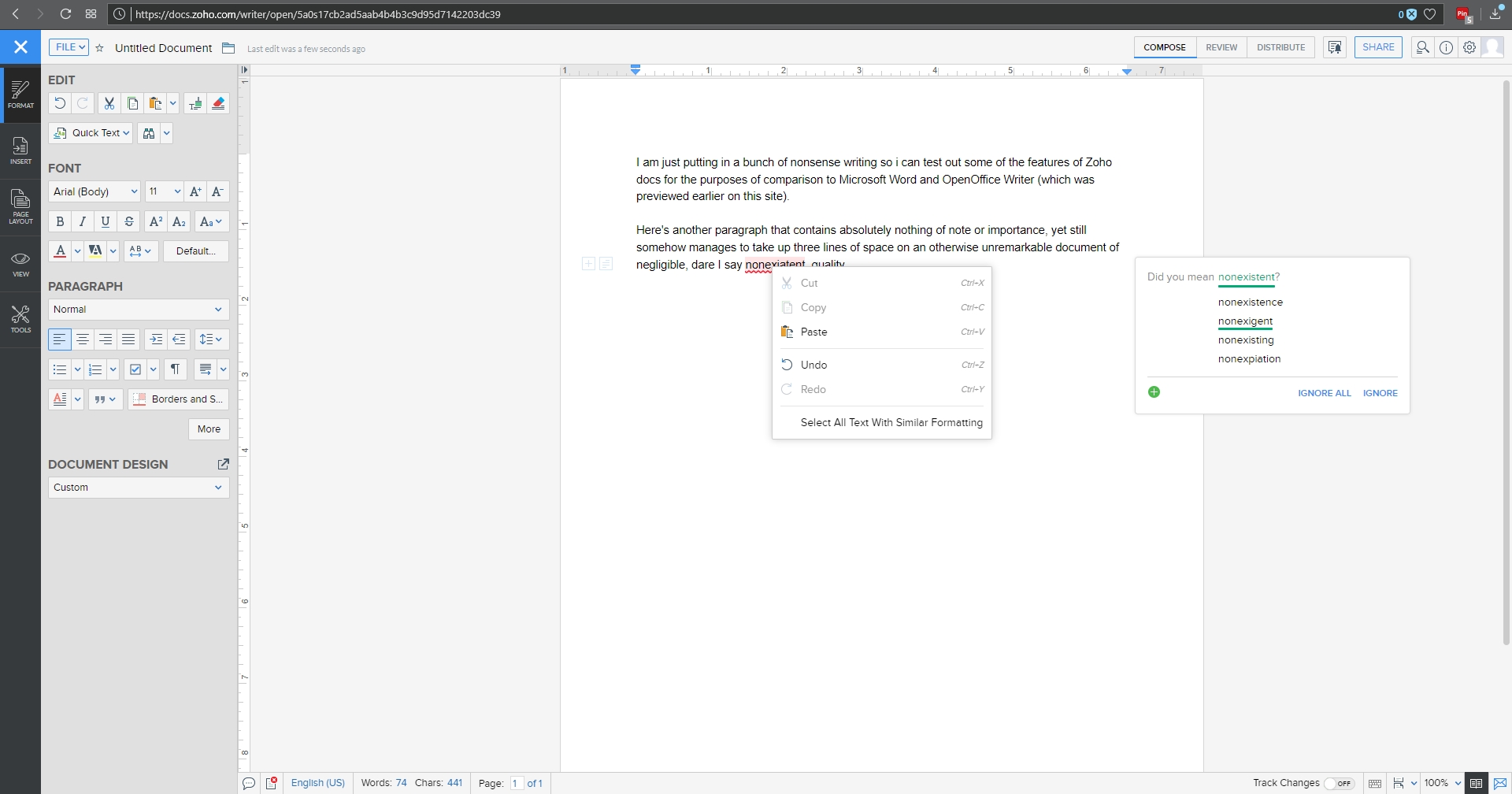
I threw together a nonsense document to mouse around with, and below you can see the spell check, which gives the initial suggestion as well as alternate suggestions, which is nice, although it doesn’t offer meanings / definitions as does Word. You can also see the Format menu in the sidebar to the left with all the functionality you would expect, including Cut / Paste / Format Painter / etc., as well as standard font and paragraph formatting options. Two additional features I think are very useful are the Quick Text option, which allows you to specify a particular piece of text that can be inserted with the click of a button or shortcut key; very good if you frequently use the same phrase or sentence or whatnot in a document. The other nice feature is evidenced by the very faint two boxes you can see in the left margin; the plus and text boxes. See those? You might have to look closely. The box with the plus is an insert menu, and the text box opens a formatting menu. They follow your insertion point automatically, and they turned out to be quite a convenience.
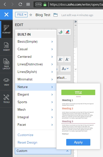
A variety of page layout templates are also readily available, with more available for download and very easy to implement.
Although this document is hardly complex, inserting an image and table is something that can trip up even stalwart word processors, and that was true here as well. Inserting the image was easy and worked fine, however arranging it for word wrap was more problematic. Smaller images resulted in much more layout success.
Inserting a table was also quite easy, and I especially like the live preview it provided as I hovered the mouse over the design options, all of which were neatly contained in the Design tab of the table options window. This is very similar to how Word will open custom contextual tabs that provide additional functionality depending on the specific element you’re working with.
Manipulating the table was much easier than manipulating the picture, which wanted to jump around the page, and even manipulating individual cells was very smooth; everything from changing their dimensions to their color to their alignment and everything in between worked perfectly the first time.
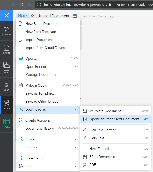
Now is when I need to mention the biggest advantage of (Zoho) Writer over (OpenOffice) Writer: .docx compatibility. OO Writer doesn’t have it, and that’s a huge knock, a terminal knock, actually, against it. With Zoho Writer, when saving a document, you have multiple options: You can save to a cloud service, and Zoho has collaborated with many as you can see (although I couldn’t help but notice the logo for OneDrive is oddly blurry, while the others are very clear), or you can download the file as a Microsoft Word .docx, or even as an .odt file, which is the open standard used by OpenOffice itself.
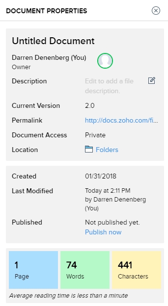
As one would hope, there are also multiple ways to get some statistics about your document. They run along the bottom as one would expect, but I am also a big fan of the Document Properties as accessed by clicking on the ‘i’ with a circle around it at the upper right of the window. Not only does this provide a wealth of information about the document itself, but coming from an HCI perspective, having the page count, word count and character count in individually shaded, easy to see and immediately locate, is genius. In terms of information presentation and information availability it puts those interrelated metrics right next to each other yet separated visually and thereby forces them in a cognitive whole.
Not to get too far off topic, but the reason I’m so enamored with this design choice is that humans, in order to make sense of, and order out of, information and stimuli presented to them, engage in several practices that help them in organizing what they see. One of them is known as Proximity, in which spatially similar images are considered as part of a larger group, even if they’re not related, so when they are related, as these three metrics are, our ability to process them, their meaning and their relation to each other is increased even more. Another is Similarity, in which when considering multiple individual field objects, those that are similar in some dimension, whether it be shape, color, orientation, or whatever else, are considered to be part of the same group, again even if they aren’t. Those are two reasons presenting that specific document information is so brilliant – it addresses the way we as humans process information.
Consider the Windows logo below. This is an example of both proximity and similarity. We consider the logo as a single shape because the four smaller squares that comprise it are both similar and proximal.
This is the Writer document properties pane, that uses these concepts to such great effect.
It even estimates the average reading time. There is nothing I don’t like about this information window, it’s one of the best interface designs I’ve ever seen, and I’ve seen a lot.
Before I just put up the rest of the menu dialogs for your perusal to give you an idea of how they’re implemented, I also want to address a nice usability touch they have incorporated in the form of a support icon. See that little blue envelope there way on the right hand side?
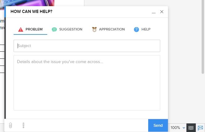
That’s the Writer support icon, and it opens up a window that allows you to offer feedback or ask questions directly. For a free service, that’s pretty remarkable. It really gives the idea – true or not – that they are at least receptive to feedback or requests for help. I was very surprised by that, and pleasantly so.
As you can probably tell, I think Writer is a great program. It’s not often I get to gush over software, but this company is so unknown, comparatively, yet they have such a well-designed and functional, free service, I’m surprised we don’t hear about it much more often. According to their webpage, they are a private company but one with five thousand employees! They hold user conferences and expos – that is not small time, yet their name recognition, even with millions of users, is small. If I may be so bold, even sacrilegious to some, I’ll even go so far as to say it destroys the offerings from Google. The only service that can compete is Microsoft’s Office 365, and even then it’s just a little better, plus Zoho integrates with all of them anyhow. Zoho has really created something great, and I encourage anyone interested in alternatives to standard office suites to give it a try.
Here are some functional dialogs if you’re interested in seeing all the options available before taking the plunge.
[Best_Wordpress_Gallery id=”8″ gal_title=”Zoho Dialogs”]
OpenOffice Writer: Good, better, but not yet great

People are always looking for a free alternative to costly productivity software, and never has that been more true than with Microsoft’s Office Suite. While they now have their subscription-based, $99/year Office365 Software as a Service offering, it used to be that regular updates to Office could cost hundreds of dollars, especially if you were including Access in the package. People didn’t like the repeated substantial costs associated with new versions of software, and that was not a sentiment limited to Microsoft.
The thing is, while free options, substitutes, are often available, they are also often simply not as good as the software they’re attempting to replace. Consider GIMP (GNU Image Manipulation program). Intended to be a free option for those who don’t want to purchase Photoshop, as well as for those who would like to experiment with image manipulation and the like, it’s also much more cumbersome to use. Not that Photoshop is easy, but in terms of usability GIMP isn’t an ideal. Simply drawing a straight line is a process, dragging handles is awkward, finding the right tool dock can be confusing, and if you’re just experimenting with it to get a taste of what image manipulation software is like, that taste will be bitter. Even the name itself is difficult, with GIMP being an acronym for “GNU Image Manipulation Program,” and GNU itself being the awkward acronym “GNU’s Not Linux.” It used to be the General Image Manipulation Program, and I’m not actually sure when the name change took place.
Not that isn’t effective – it is. In fact, I often use it myself for the images on this very site that require some touchup, such as adding text or combining multiple images into one or adding illustrations to name a few, and I even have an academic license for Photoshop! Quick and dirty manipulations are easier with GIMP, but as a functional, full-featured piece of software it’s functionality, not so much usability, that drives the development of GIMP. For very simple things like batch resizing / converting, pixeling out info, or cropping, I just use the IrfanView image viewer, which is much more effective and easy to use for that type of thing. But not adding text. it’s terrible for that.
So why do I mention all of this? A friend who recently lost her job needed to get her resume updated and out to potential employers fast. However, as she doesn’t make boatloads of money she had an older laptop and no Microsoft Office installed or available to her. She was trying to edit said resume in a reader, not realizing it doesn’t work like that, and without having the finances to acquire Office, she asked me for help.
My first bit of advice was to use Zoho online, a remarkably feature-packed online office suite that deserves its own, dedicated post, so I will add a followup soon with screenshots, samples and impressions. The problem is, they don’t offer a locally-installed solution and she doesn’t have Internet access, so that solution was out. I then suggested OpenOffice, a free Office alternative that has been around for a long time, and that I hadn’t tried out in years and years. I guess I should refer to it by its proper name, Apache OpenOffice, as the original OpenOffice, originally developed by a company called StarDivision, which was acquired by Sun, which was acquired by Oracle, no longer exists. Did you follow all that? It’s like a software soap opera. Anyway, OpenOffice was turned over to the Apache Foundation, which is dedicated to community-built open-sourced projects, and it has a staggering number of them. Their web server is, and has been for a long time, the most widely-used web-server on earth.
When I last used OpenOffice, long before it was taken over by the Apache Foundation, it was bad. This would have been back in the late 90s, and even then it couldn’t hold a candle to Office. The icons were unintuitive, the functionality limited, the compatibility wonky, it just wasn’t a good alternative. I’m glad to say that after twenty years it’s better than it was, it’s good, but it’s still not great and has one glaring flaw that really holds it back.
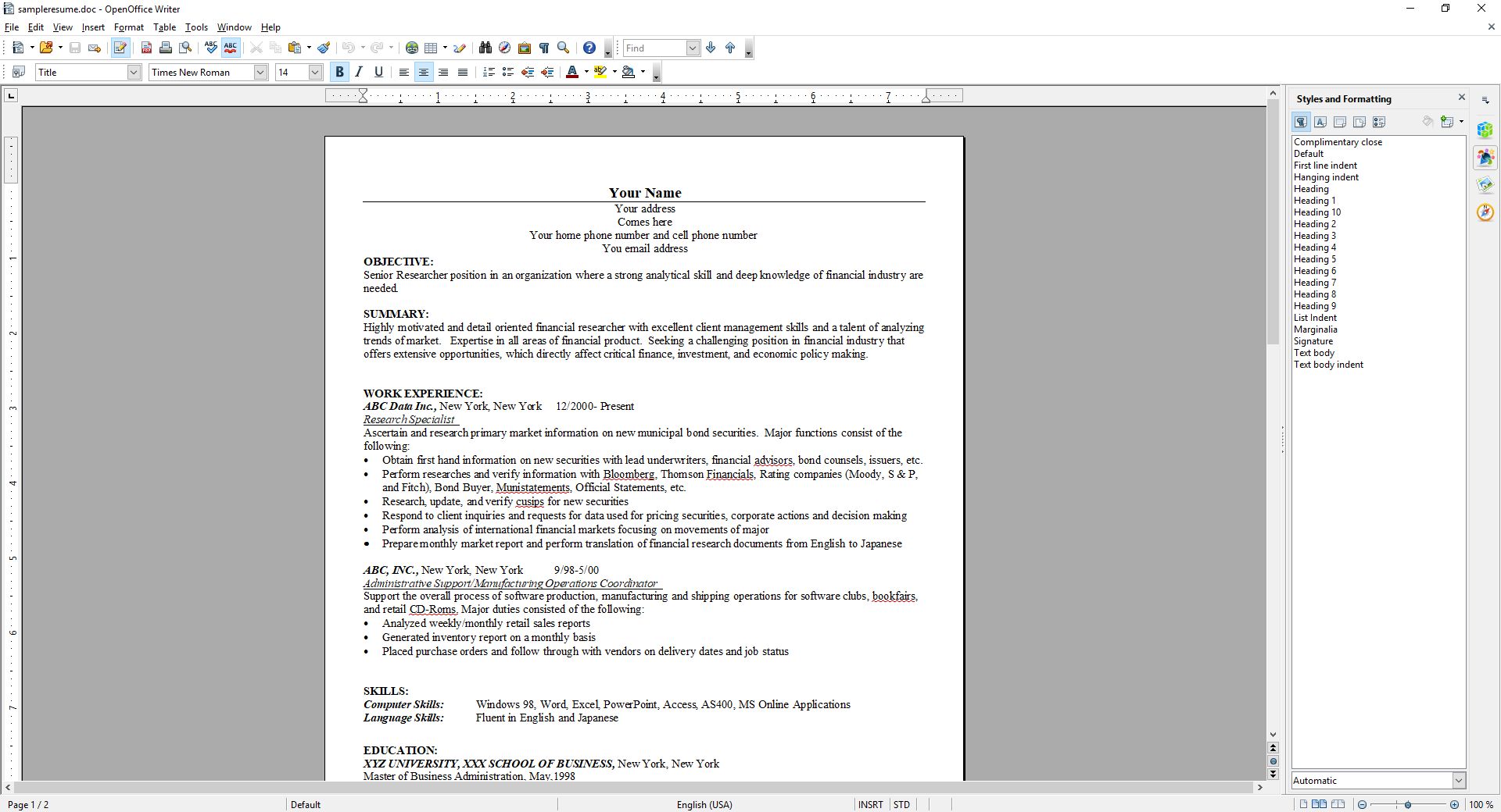
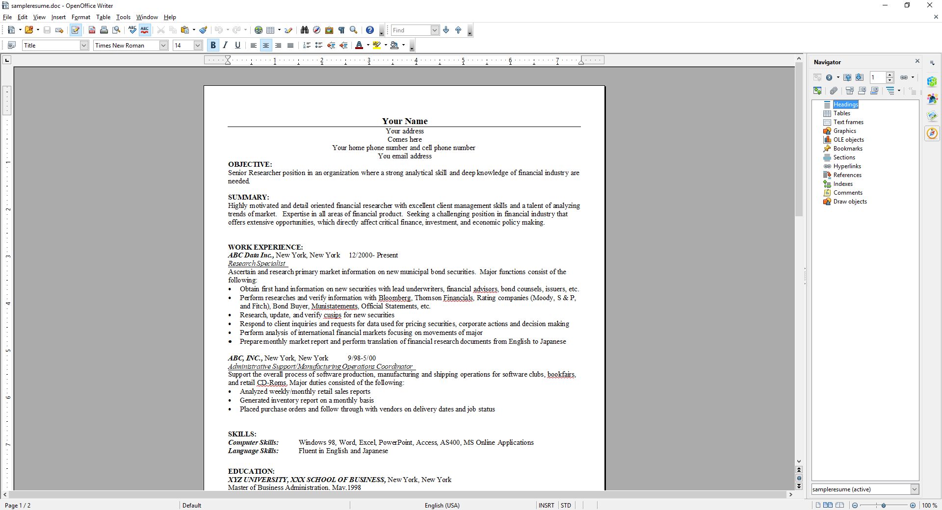
First, the good: The interface is much closer to what one would expect from a standard word processor. You can see in the image below the standard toolbar, which is also replicated in the ‘Properties’ dialog located in the sidebar. While the icons are much better, meaning much more standardized, the duplication of them across the top and side can cause issues. Functional and graphical replication is poor interface design, one you often see on webpages. And while the icons are generally much better, they’re not completely standardized. The top menu, however, uses the standard “File | Edit | View | etc.” menu with expected submenus under each entry (see ‘text boundaries’ image at end of post). You can also see in the below image(s) the icon for ‘Properties,’ one of four down the far right side, is a green and blue cube, bespoke for this program, while underneath it are the icons for ‘Styles,’ ‘Gallery,’ and ‘Navigator,’ which is ultimately used to move through the document itself via various elements. All of these are unique in function and design to OpenOffice.
It also has an extensive array of settings that covers every aspect of the program you could hope for, even how you allocate memory and VBA integration.
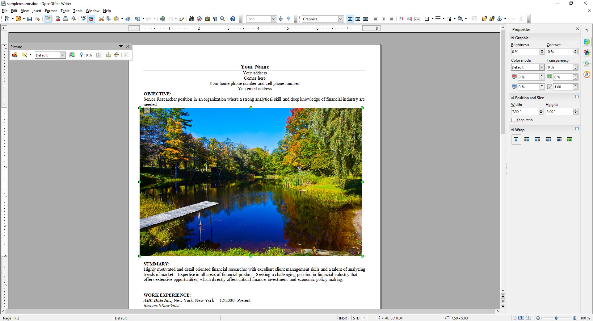
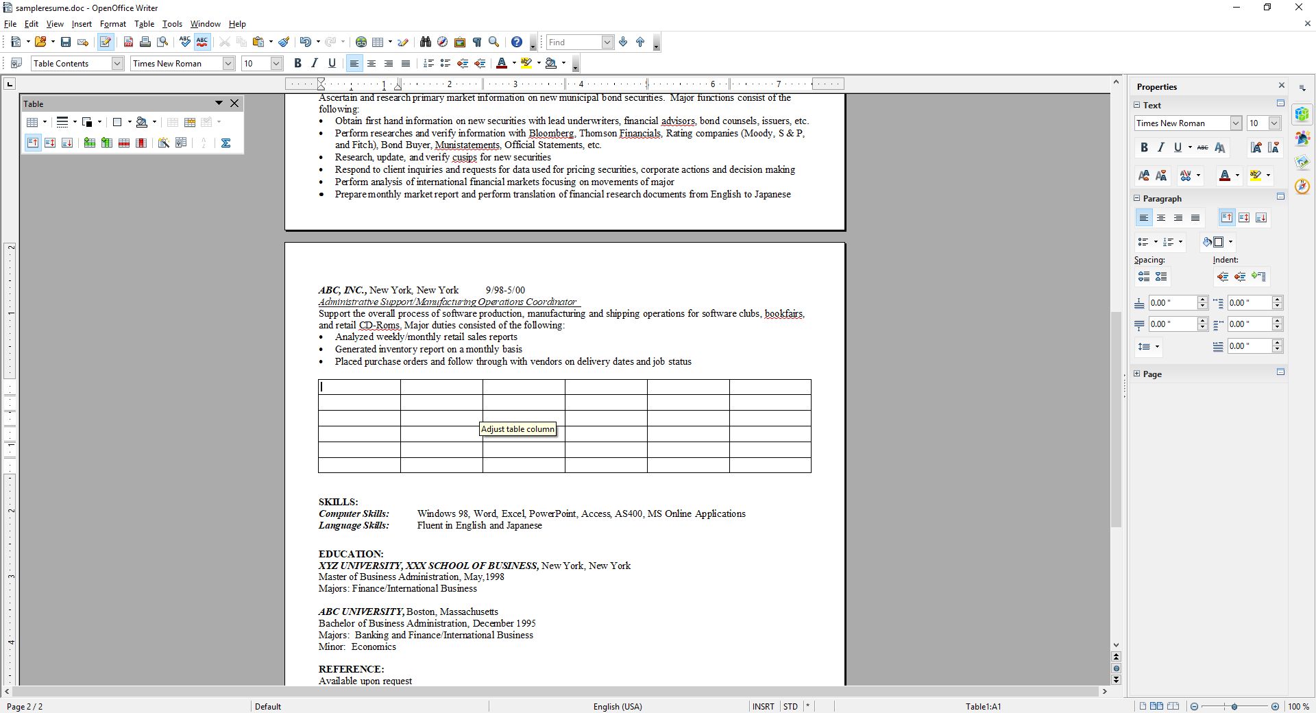
Using a sample resume I downloaded from the Internet, I tested how well it handled inserting elements, specifically an image and a table. This is something that can even trip up Word itself, but I am happy to say it handled both swimmingly, accurately integrating, aligning and formatting both with ease. The text adapted to any changes in size or position easily and the results were always pleasing. It also pops up a task-relevant toolbar to help further with fine tuning or further formatting the element being inserted.
Again, after insertion both of them were easy to adjust and format, and the rest of the document was very responsive to those changes. While this post doesn’t cover all you can do with Writer (you can imagine how long a post covering everything you can do in Word would be, and it’s the same here), you can get an idea from the images, specifically the ‘Navigator’ image included above.
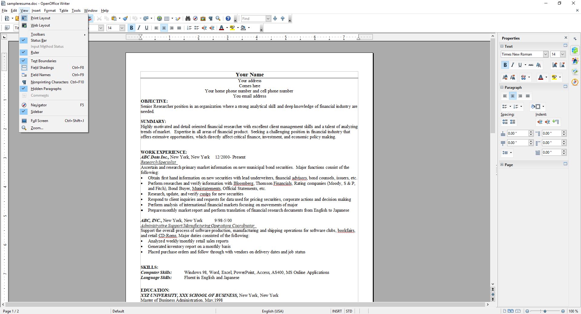
I’m also not a big fan of the text boundaries that are shown by default; they make the whole document look as though it is too small on the page. I get that they are trying to illustrate the margins as well as provide a quick and dirty print preview, but ultimately I find them distracting. Fortunately, they can be turned off completely (which makes it look more like Word, and the familiarity is welcome).
The two big problems with OpenOffice are, unfortunately, major issues that prevent me from recommending it completely, especially as there are other programs and online options that don’t have these concerns.
The first is an issue primarily if you are importing a .docx (Word 2007 – present) file to work on a document. If you create your document from scratch in OpenOffice, it works quite well and is feature rich enough to complete even if you are doing fancy stuff. On the other hand, if you’re importing in Word’s latest format, forget it – processing hidden Word formatting codes is not Writer’s forte. Writer will destroy enough of the formating that fixing it is not worth the effort, and copy – pasting without formatting and re-formatting is likely, but not always, the only viable option. Even so, the common outcome is that no amount of tweaking will right the formatting ship: You can recenter and re-format and unbullet and rebullet and tab all over the place all you like, but it will never get back to the way it was; it will simply not play nice with undoing damage from an import.
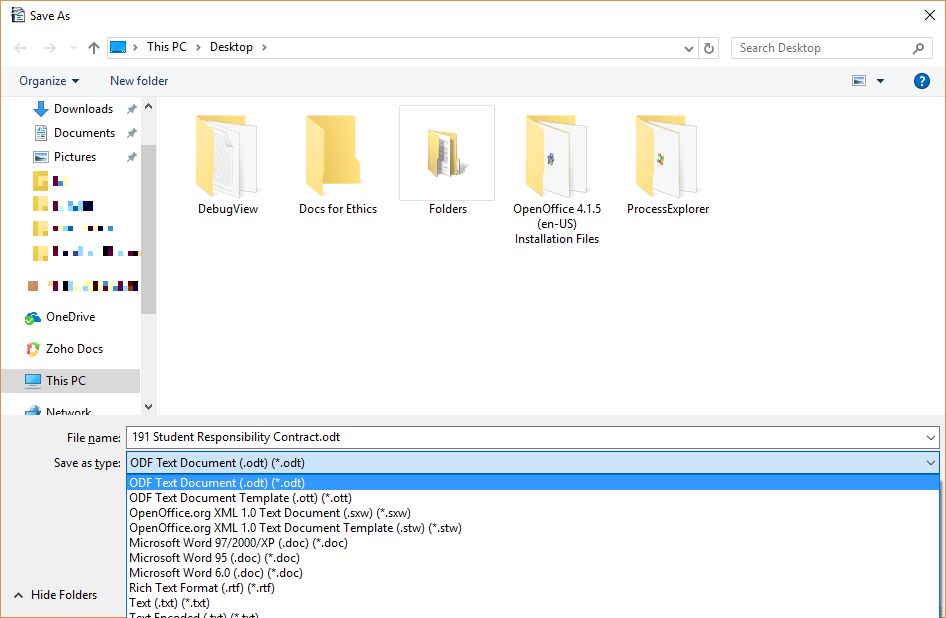
Building on that is the most glaring issue of all: Writer simply doesn’t recognize the .docx extension. You can’t save using that extension, only .doc, a format that hasn’t been used for about ten years. Writer has its own format, .odt, that is unique enough that trying to go the other way, and opening a Writer file in Word will also yield unfortunate formatting issues. Other alternatives like the aforementioned Zoho handle them easily, but not OpenOffice. In fact, when creating a new document in Writer, it asks if you want to create a new Text document, which in Windows or Mac has a specific meaning, and it’s not a fully formatted, functional, professional document.
This post only covered OpenOffice’s word processor, Writer, although the other applications exhibit similar behaviors and limitations. They work well if you are working solely within OpenOffice, but not if importing or exporting.
I want to see OpenOffice succeed, especially under the Apache umbrella, but as of now I simply can’t recommend it as it is. That’s distressing, since I haven’t been able to ever recommend it over the last twenty years, although it’s always been very, very close. It works well on its own and with its sister programs, and has incredible potential, but the fact is it doesn’t play well with others, and until it does it simply won’t be a viable alternative.


