Tag Archives: Human Computer Interaction
Poke the Bunny!

Before I get to the main thrust of this post, it’s important to provide some perspective for those unfamiliar. As you all should know, my Ph.D. is in Human Computer Interaction, my undergrad in Cognitive Psych, I teach multiple interaction design and interface development and analysis courses (game design as well!), so when I see a well-designed interface, or anything that’s inherently usable as a result of its construction, it just makes me feel all giddy inside.
What, then, is a good example of a well-designed interface? I’ll show you. It’s an example I’ve been using for some time, all the way back since it was a Flash animation on a website called platinumgrit.com, which was a showcase for an Australian Flash animation series. The site is long since dead, or more appropriately, dormant, but it once hosted what I consider to be the best, most pure example of interface design I have ever seen. In fact, I was reminded of it because of a conversation thread on a message board for my graduate class in advanced design and prototyping.
It’s called, no joke, Poke the Bunny.
Before I show you the rest of interface and give away the surprise, let me explain why it is so good. One of the cardinal rules of interface design is clarity; speaking clearly to the user. Don’t label links ‘click here,’ don’t label buttons ‘push me,’ don’t call an error ‘error 0x14323929.’ State what the user can do, and make it clear what the consequence of that action will be. Of course, cardinal rules are meant to be broken since so many interfaces break them.
But not this one. The interface is comprised of exactly three elements. The first element is a graphic of a bunny that frankly looks pissed off. The next is a fist with an extended pointer finger aimed squarely at the bunny’s backside. And the third element is a button labeled ‘Poke the Bunny.’ It is clearly labeled in reference to its action. It leaves no doubt or question in the mind of the user what it’s function is and what will happen when you push it. Not only is it a beautiful example of interaction design, there is such a direct link between all the elements on the screen that the role of each is immediately apparent, specific, and isolated. It’s the most pure interface I’ve ever seen.
Not only that, the effectiveness of the action/response is very satisfying. Because it’s easy to use, obvious to figure out, impossible to get lost, it makes the actual use of the interface, even though it has just a single interactive element, a joy to use. Even though all you’re doing is poking the bunny, the nature of the design combined with the absurdity of the situation make it oddly addicting and fun. And that is a desirable goal for an interface; You want it to be fun, exciting, enjoyable, interesting, educational, all the positive aspects that make people feel good should be elicited from your design, And in this case, it is. it’s just plain fun.
(There’s also a surprise, though, if you work for it).
And it’s available on Android! As I mentioned, the site has been sadly dormant for some time, however I was overjoyed to discover that if you have an Android phone you can download it from the Play store! There used to be a version for iOS, however I have the sneaking suspicion it’s no longer available (although I don’t know. If anyone can check I’d appreciate it). It’s a shame if not; it’s a brilliant example of exactly how an interface should work.
The Android version isn’t quite as exceptional as the original Flash app; the skeumorphic nature of the button isn’t there, the font is unnecessarily cartoonish, and sound isn’t quite right. Still, the pure core of the interface is rock solid.
So with all of that fanfare, I present a video of Poke the Bunny recorded off my very own Note 5. If you’re on Android (or iOS and it’s still available), then download it and give it a try. You’ll be hooked, I promise. Poke the Bunny!
Create art with your mouse

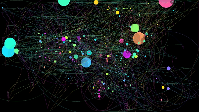
See that nifty work of art to the left there? That’s actually all the mouse movements I made over the course of just under 90 minutes while using my PC. It’s the result of a tiny program called IOGraph, and it doesn’t even require an install. You simply download it, double-click the .exe, click the button to start, and it uses very little resources (I couldn’t find it at all in Process Monitor, which is disconcerting) while it runs in the background graphing your mouse movements.
The lines represent mouse movements, and the circles indicate when and how long the mouse is at rest (the larger the circle, the longer the mouse was resting).

