Tag Archives: Android
Poke the Bunny!

Before I get to the main thrust of this post, it’s important to provide some perspective for those unfamiliar. As you all should know, my Ph.D. is in Human Computer Interaction, my undergrad in Cognitive Psych, I teach multiple interaction design and interface development and analysis courses (game design as well!), so when I see a well-designed interface, or anything that’s inherently usable as a result of its construction, it just makes me feel all giddy inside.
What, then, is a good example of a well-designed interface? I’ll show you. It’s an example I’ve been using for some time, all the way back since it was a Flash animation on a website called platinumgrit.com, which was a showcase for an Australian Flash animation series. The site is long since dead, or more appropriately, dormant, but it once hosted what I consider to be the best, most pure example of interface design I have ever seen. In fact, I was reminded of it because of a conversation thread on a message board for my graduate class in advanced design and prototyping.
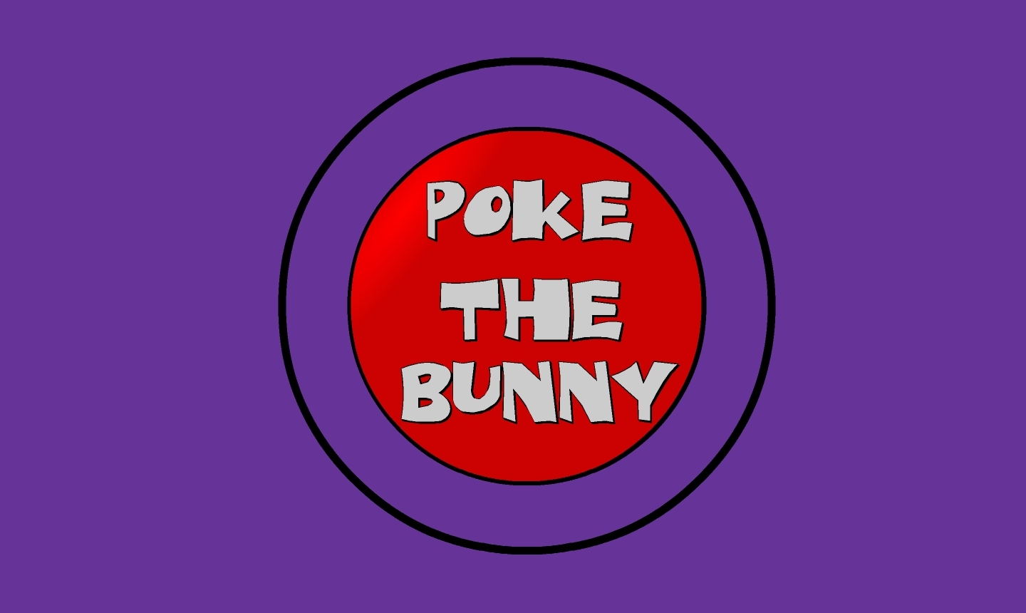
It’s called, no joke, Poke the Bunny.
Before I show you the rest of interface and give away the surprise, let me explain why it is so good. One of the cardinal rules of interface design is clarity; speaking clearly to the user. Don’t label links ‘click here,’ don’t label buttons ‘push me,’ don’t call an error ‘error 0x14323929.’ State what the user can do, and make it clear what the consequence of that action will be. Of course, cardinal rules are meant to be broken since so many interfaces break them.
But not this one. The interface is comprised of exactly three elements. The first element is a graphic of a bunny that frankly looks pissed off. The next is a fist with an extended pointer finger aimed squarely at the bunny’s backside. And the third element is a button labeled ‘Poke the Bunny.’ It is clearly labeled in reference to its action. It leaves no doubt or question in the mind of the user what it’s function is and what will happen when you push it. Not only is it a beautiful example of interaction design, there is such a direct link between all the elements on the screen that the role of each is immediately apparent, specific, and isolated. It’s the most pure interface I’ve ever seen.
Not only that, the effectiveness of the action/response is very satisfying. Because it’s easy to use, obvious to figure out, impossible to get lost, it makes the actual use of the interface, even though it has just a single interactive element, a joy to use. Even though all you’re doing is poking the bunny, the nature of the design combined with the absurdity of the situation make it oddly addicting and fun. And that is a desirable goal for an interface; You want it to be fun, exciting, enjoyable, interesting, educational, all the positive aspects that make people feel good should be elicited from your design, And in this case, it is. it’s just plain fun.
(There’s also a surprise, though, if you work for it).
And it’s available on Android! As I mentioned, the site has been sadly dormant for some time, however I was overjoyed to discover that if you have an Android phone you can download it from the Play store! There used to be a version for iOS, however I have the sneaking suspicion it’s no longer available (although I don’t know. If anyone can check I’d appreciate it). It’s a shame if not; it’s a brilliant example of exactly how an interface should work.
The Android version isn’t quite as exceptional as the original Flash app; the skeumorphic nature of the button isn’t there, the font is unnecessarily cartoonish, and sound isn’t quite right. Still, the pure core of the interface is rock solid.
So with all of that fanfare, I present a video of Poke the Bunny recorded off my very own Note 5. If you’re on Android (or iOS and it’s still available), then download it and give it a try. You’ll be hooked, I promise. Poke the Bunny!
HBO orders series based on Westworld

A lot of entertainment news that’s also relevant to class this week. While there are scant few details, it has been announced that HBO has ordered a TV series for next year based on the early-70’s Yul Brynner movie Westworld, whose plot revolved around a fantasy amusement park in which the actors are all androids. As you can guess, something goes wrong and the androids start running amok.
The movie was one of the very early looks at the potentialities of future technology, and of what we are beginning to face today in terms of robotics and artificial intelligence. In what was very forward-looking at the time, the androids actually started to act wacky because of something similar to a computer virus, an idea that was virtually unknown at the time. Remember that androids are different from robots, in that robots are mechanical devices whereas androids, supposedly, can look and act like humans, with skin, organs, and everything.
Now here’s a surprise

I have a Windows phone. Many people, when they find out, are surprised to hear that. On the other hand, I’m surprised that they’re surprised. Why would someone be surprised over someone else’s choice of anything; phone, food, clothes, or anything else?
When I inquire, the common response is “Windows doesn’t have as many apps.”
That’s true, or at least what they mean is true. They mean the Windows phone ecosystem doesn’t have as many apps as does the iOS or Android ecosystem. And on that point they’re correct. At last count, Apple’s app store had 1.2 million apps (June 4th), Google Play had 1.34 million apps (August 24th), while Windows Store trails behind with 300,000 apps (August 8th), although in their defense that’s over double the amount they had at the beginning of the year.
I chose my phone for many reasons, however when it comes to apps specifically, there have been sacrifices. Or perhaps ‘compromises’ would be a better word. Google is notoriously reluctant to release apps for Windows, which results in third-party, and arguably better, apps like MetroTube, and some apps that would likely be much better if developed by the original company, like Facebook, who is also unwilling – at least for now – to publish on the platform.
But here are the three big catches: One, I do actually have most of the apps I need and want; USAA, Flixster, web browser, Outlook, bar code/QR code scanner, CNN/NBC/Sky news, Plex, Runtastic, Netflix, Twitter, Skype, Wallbase and Zillow to name a few, along with the afore-mentioned third party MetroTube (which I rarely use, to be honest) and a few others.
Two, attention needs to be paid to the quality v. quantity of apps. To use the old comparison, if you have a million apps in your store but 500,000 of them are fart apps then do they all really count (They may; one was ranked the #1 app and raked in $10,000 a day)? The number two app in the iPhone app store, set to earn $200 million, is one that lets you accompany Kim Kardashian!
Even with all of that, and coming in at number three, is something I found most surprising of all: It turns out many people don’t download any apps anyway. The article points to a ComScore whitepaper that indicated over 65 percent of smartphone users download zero apps a month (infographic pasted below). In my case I download the occasional app, but it’s more like one app every two or three months. Of course, that zero-download percentage also means the remainder are responsible for the $10,000 a month the fart app earned and the $200 million the Kim Kardashian app will earn, and that is scary.


