Tag Archives: Zoho
Zoho Writer: An excellent online alternative

I recently gave my opinions on OpenOffice.org’s word processing software Writer. My conclusion was that while they have certainly made improvements over the last twenty years, it still just doesn’t hold up to Microsoft’s behemoth package, either online or off. However, that doesn’t mean there isn’t an alternative for those who seek: I also mentioned in that post I would be reviewing Zoho Writer, the online word processor from (obviously) Zoho, which turns out to be a very competent competitor to Word. It’s not the perfect replacement, but it comes pretty close for everyday use, and then some.
Zoho offers many applications and services, all of which are relatively competent. And I’m not talking just basic office suite stuff either; they have everything from CRM platforms to retail inventory management. For an online service, they have a surprising breadth of applications on order.
As you can see, there is a lot there. For this review I’ll be focusing on their word processor Writer, which I feel is a highlight of their office productivity suite, but it’s important to note the range of capabilities they have, especially as compared to other online options. I also want to mention that their PowerPoint equivalent, Show, is absolutely fantastic as well, while their version of Excel, Sheet, is also very good. It doesn’t quite live up to the rest of the suite in terms of functionality or design, but that’s not to say it’s not good – it is. But it has significant room for improvement, especially considering its less involved and less usable interface, with sparsely-populated toolbars, buried commands, and no sidebar, especially when considering it’s for such a powerful program as a spreadsheet. Indeed, it’s the one instance in which I can say OpenOffice’s alternative, Calc, is the better option, with more features, a more familiar interface, and better design all around.
That being said, Zoho is the superior option for everything else, and OpenOffice doesn’t provide any enterprise functionality or features beyond the basic office suite anyway. Here we’ll be talking about Writer, a name shared with the OpenOffice equivalent (so don’t mix them up!) and it will hopefully give a good impression of how it all works.
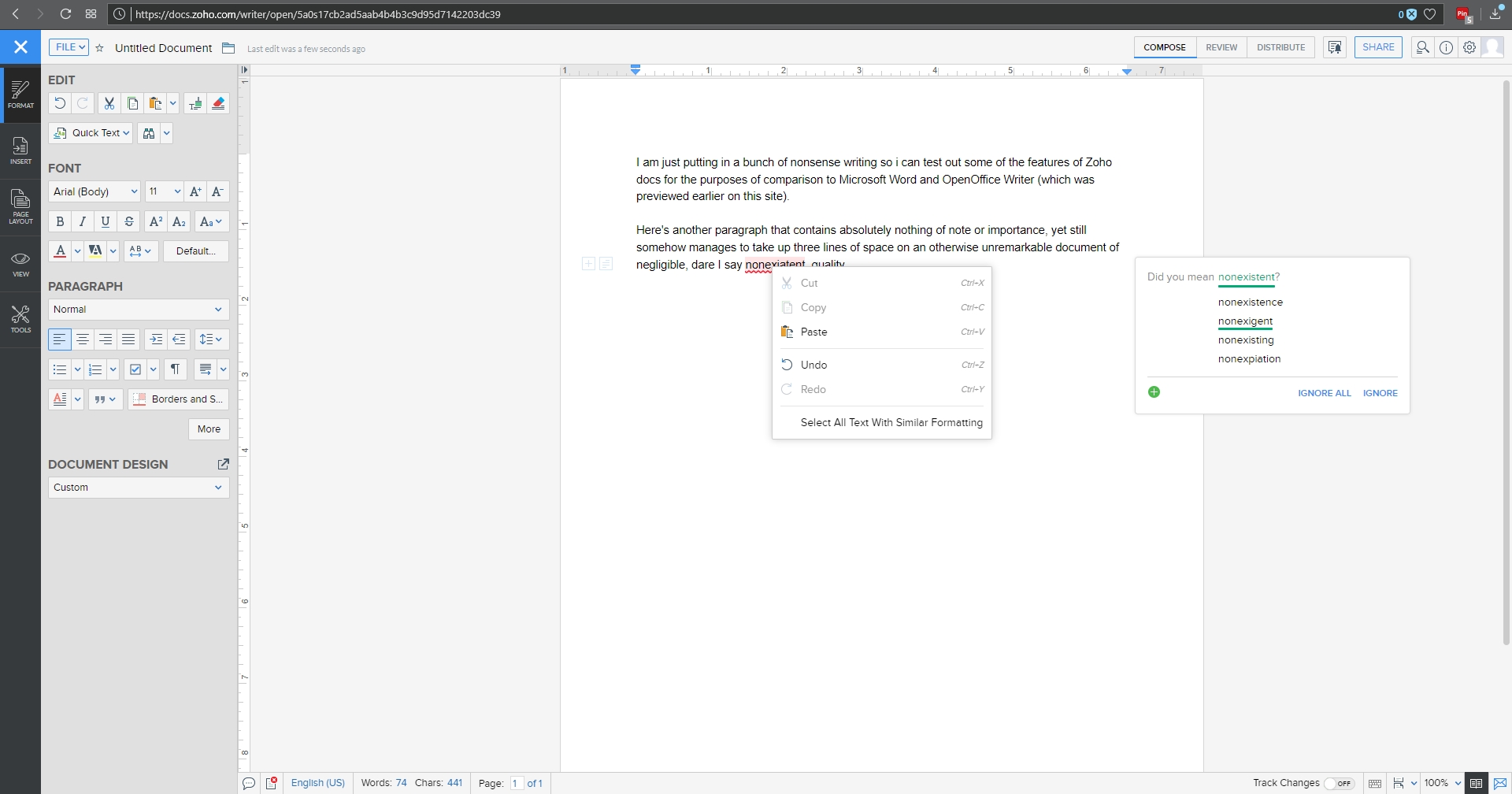
I threw together a nonsense document to mouse around with, and below you can see the spell check, which gives the initial suggestion as well as alternate suggestions, which is nice, although it doesn’t offer meanings / definitions as does Word. You can also see the Format menu in the sidebar to the left with all the functionality you would expect, including Cut / Paste / Format Painter / etc., as well as standard font and paragraph formatting options. Two additional features I think are very useful are the Quick Text option, which allows you to specify a particular piece of text that can be inserted with the click of a button or shortcut key; very good if you frequently use the same phrase or sentence or whatnot in a document. The other nice feature is evidenced by the very faint two boxes you can see in the left margin; the plus and text boxes. See those? You might have to look closely. The box with the plus is an insert menu, and the text box opens a formatting menu. They follow your insertion point automatically, and they turned out to be quite a convenience.
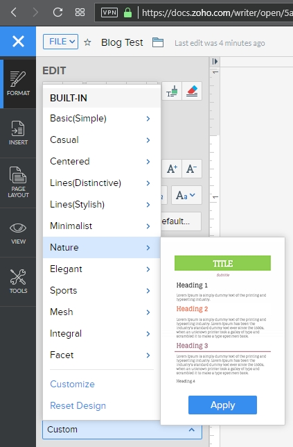
A variety of page layout templates are also readily available, with more available for download and very easy to implement.
Although this document is hardly complex, inserting an image and table is something that can trip up even stalwart word processors, and that was true here as well. Inserting the image was easy and worked fine, however arranging it for word wrap was more problematic. Smaller images resulted in much more layout success.
Inserting a table was also quite easy, and I especially like the live preview it provided as I hovered the mouse over the design options, all of which were neatly contained in the Design tab of the table options window. This is very similar to how Word will open custom contextual tabs that provide additional functionality depending on the specific element you’re working with.
Manipulating the table was much easier than manipulating the picture, which wanted to jump around the page, and even manipulating individual cells was very smooth; everything from changing their dimensions to their color to their alignment and everything in between worked perfectly the first time.
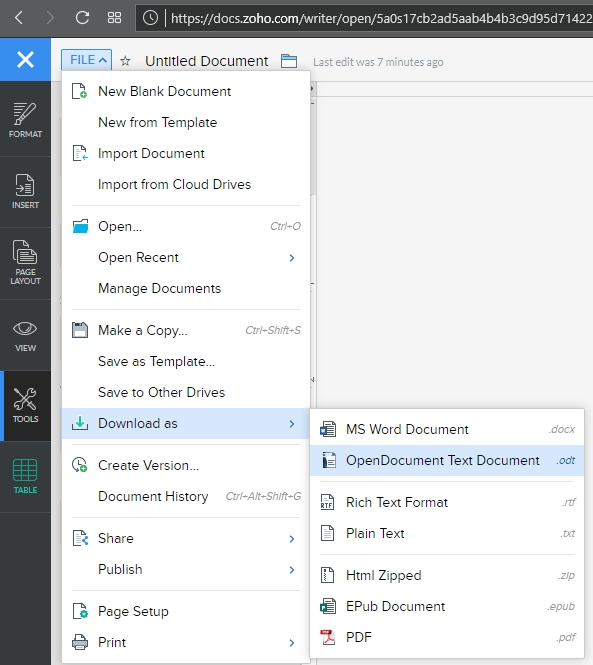
Now is when I need to mention the biggest advantage of (Zoho) Writer over (OpenOffice) Writer: .docx compatibility. OO Writer doesn’t have it, and that’s a huge knock, a terminal knock, actually, against it. With Zoho Writer, when saving a document, you have multiple options: You can save to a cloud service, and Zoho has collaborated with many as you can see (although I couldn’t help but notice the logo for OneDrive is oddly blurry, while the others are very clear), or you can download the file as a Microsoft Word .docx, or even as an .odt file, which is the open standard used by OpenOffice itself.
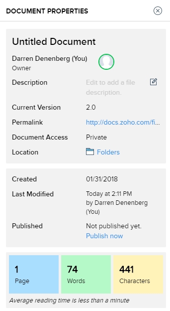
As one would hope, there are also multiple ways to get some statistics about your document. They run along the bottom as one would expect, but I am also a big fan of the Document Properties as accessed by clicking on the ‘i’ with a circle around it at the upper right of the window. Not only does this provide a wealth of information about the document itself, but coming from an HCI perspective, having the page count, word count and character count in individually shaded, easy to see and immediately locate, is genius. In terms of information presentation and information availability it puts those interrelated metrics right next to each other yet separated visually and thereby forces them in a cognitive whole.
Not to get too far off topic, but the reason I’m so enamored with this design choice is that humans, in order to make sense of, and order out of, information and stimuli presented to them, engage in several practices that help them in organizing what they see. One of them is known as Proximity, in which spatially similar images are considered as part of a larger group, even if they’re not related, so when they are related, as these three metrics are, our ability to process them, their meaning and their relation to each other is increased even more. Another is Similarity, in which when considering multiple individual field objects, those that are similar in some dimension, whether it be shape, color, orientation, or whatever else, are considered to be part of the same group, again even if they aren’t. Those are two reasons presenting that specific document information is so brilliant – it addresses the way we as humans process information.
Consider the Windows logo below. This is an example of both proximity and similarity. We consider the logo as a single shape because the four smaller squares that comprise it are both similar and proximal.
This is the Writer document properties pane, that uses these concepts to such great effect.
It even estimates the average reading time. There is nothing I don’t like about this information window, it’s one of the best interface designs I’ve ever seen, and I’ve seen a lot.
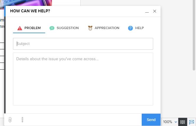
Before I just put up the rest of the menu dialogs for your perusal to give you an idea of how they’re implemented, I also want to address a nice usability touch they have incorporated in the form of a support icon. See that little blue envelope there way on the right hand side?
That’s the Writer support icon, and it opens up a window that allows you to offer feedback or ask questions directly. For a free service, that’s pretty remarkable. It really gives the idea – true or not – that they are at least receptive to feedback or requests for help. I was very surprised by that, and pleasantly so.
As you can probably tell, I think Writer is a great program. It’s not often I get to gush over software, but this company is so unknown, comparatively, yet they have such a well-designed and functional, free service, I’m surprised we don’t hear about it much more often. According to their webpage, they are a private company but one with five thousand employees! They hold user conferences and expos – that is not small time, yet their name recognition, even with millions of users, is small. If I may be so bold, even sacrilegious to some, I’ll even go so far as to say it destroys the offerings from Google. The only service that can compete is Microsoft’s Office 365, and even then it’s just a little better, plus Zoho integrates with all of them anyhow. Zoho has really created something great, and I encourage anyone interested in alternatives to standard office suites to give it a try.
Here are some functional dialogs if you’re interested in seeing all the options available before taking the plunge.
[Best_Wordpress_Gallery id=”8″ gal_title=”Zoho Dialogs”]


