Becoming a designer
Boy, it’s been a while. An oxymoronic combination of being lazy and busy, I guess.
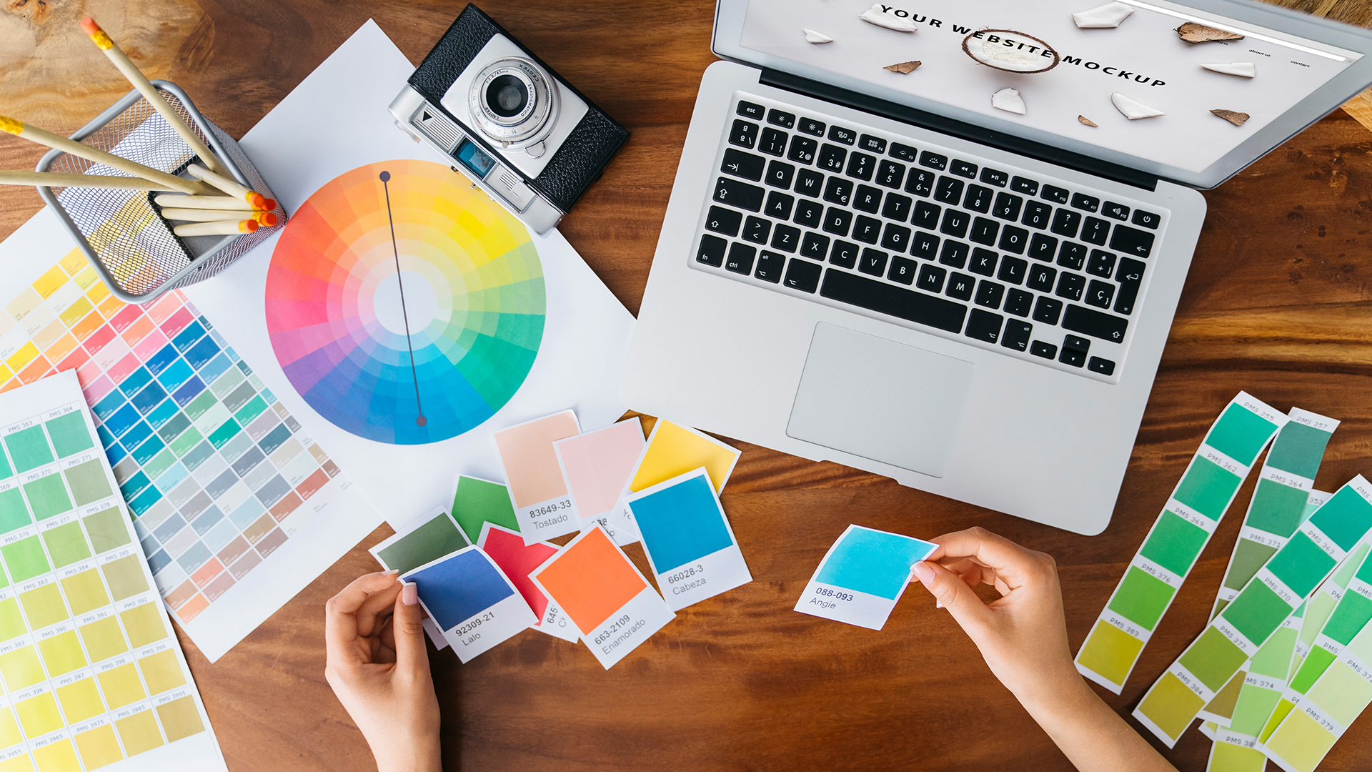
Anyway, for this post I wanted to talk about design. It’s a topic that comes up a lot in my classes, especially ones that have a heavy design component such as Human-Computer Interaction, The Capstones (the graduate version of which is actually in a Masters of Human-Computer Design and interaction program), and all game development courses. The word itself is used in the title and description of many of the courses we offer, including courses I teach, and that’s true for any university.
I also want to clarify that I’m not talking about a particular type of design. As I tell my students, there are many: Interior design, fashion design, architectural design, landscape design, industrial design, automotive design, product design, Interaction design, and the list goes on and on. Regardless of the type of design being discussed, the challenges are the same: Working with a client, trying to come up with a functional and aesthetic solution, arranging items and elements in a useful and pleasing way, and so on, and each of those has its own considerations and concerns.
Keeping all of that in mind, I am going to share a personal design rule with you that I tell all my students, and I feel it helps them think about their own approaches to design and helps coalesce the ways in which they think about it.
‘You should be able to sum up your design philosophy in one word.’
In other words, your core design philosophy.
This is very important. It’s how you know you have come into your own as a designer: created your own method, your own tastes, and most importantly, your own style. Just as a client will go to (or return to) any designer because they know that designer’s style, once you have determined your one-word philosophy, so will they return to you, and they will know why.
You don’t need to do this right away. When you are just starting out, you are unlikely to have a design philosophy, or a unified approach, and that’s fine. On the other hand, you may feel you have one already, however it is ripe for the influence of others you may be working with, those who have been designers for a long time, and the design experiences you are yet to have. As you go on, you will start to notice that you gravitate towards certain incorporated styles yet utilize others much less. You’ll work with other designers, including those who mentor and guide you, and learn from them what works for you and what doesn’t; to agree or disagree with them is expected. For example, you may find that you consistently return to a modernist approach and design, or one that’s more traditional, or perhaps you’re more form over function, or maybe function over form. Maybe you prefer smooth surfaces over textured finishes. You’ll find you tend to prefer things be one way, as opposed to another designer who prefers them the other way around. And all of that is how it should be. It’s why a client would come to you as opposed to another, or go to them instead of you. They’ll know and understand your approach and feel you’re a perfect fit or not, and either in completely acceptable. You must be a proper fit with a client.
Eventually, your design philosophy will have formed, an then you’ll be able to describe it in one word. And that’s how you, and everyone, will know.
It is a clear, unambiguous, easy to digest summation of everything that you will do during the design process. It helps everything, even before a client has decided to come to you.
However, even after all this, there are some important caveats.
First, because you have a core design philosophy does not mean you cannot veer from it. Indeed, you should be able to accentuate and compliment any of your designs with elements and influences outside of your scope and sphere. Just because something is traditional, doesn’t mean it can’t also have a modern influence. If something is meant to convey playfulness, that doesn’t mean it can’t also have an industrial side. Nothing is out of bounds in design; your philosophy will happen naturally, organically, but the very nature of design is creativity and being able to work outside your bounds is, in my opinion, one of the hallmarks of a great designer.
Second, your core philosophy can very easily change. You don’t have to pick one and stick with it until the heat death of the universe, fervently gripping it and refusing to let go. Tastes change, popular ideas change, what’s fringe and what’s common and what’s acceptable and not changes. Design is always, and rightly, in flux. It would be antithetical to design to not grow and change and reimagine what your own tastes and styles are, and what you bring as a designer.
Likewise, you don’t need to replace your approach whole hog either. You can bring in new influences, adding them to your current tastes. Or, for whatever reason, you may wake up one day simply wanting to try something new, to branch out, to attempt a new tack, and that’s also good. However you grow, or morph, or change, it happens for a reason, and that should be embraced.
Unsurprisingly, that’s true of any creative medium. Consider a musician or band. You’ll know their genre (in other words, their core style), but as you listen to more of their work, you may hear additional influences coming to the surface, hear new styles and techniques, and in fact when that happens with popular recording artists it’s often described as the artist or the band ‘growing as an artist.’ Just because they may be rock or rap or blues or whatever doesn’t mean you won’t hear other sounds mixed in as well, especially as they continue to write and record.
I’ll wrap this up by giving you my own design philosophy and how it has changed over time and how I sometimes veer from it.
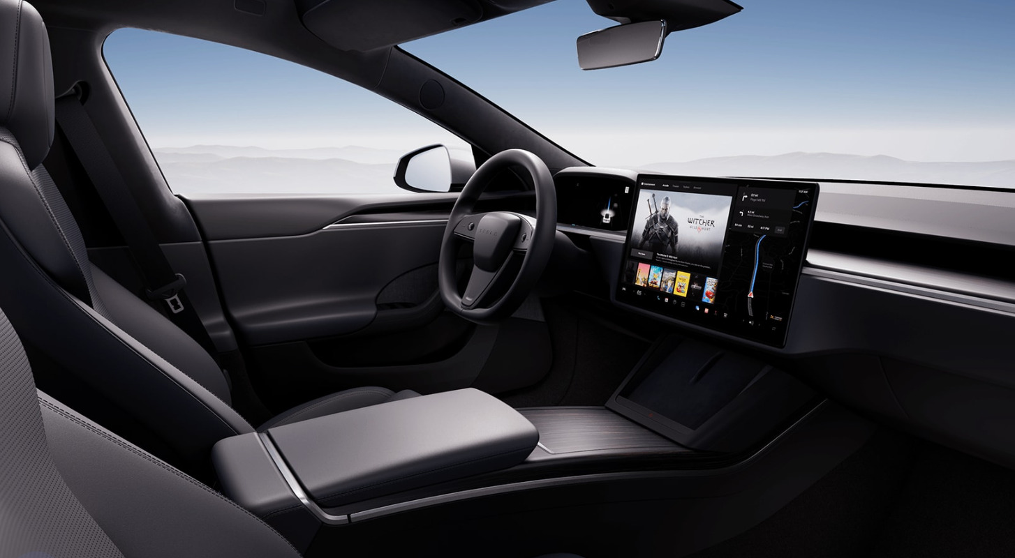
My philosophy is ‘Integration.’ I like to see all form and functionality integrated into a seamless, continuous whole. That can be in terms of the design of the product, or a common theme that runs through a space. For example, I am no fan of the new designs I see in some cars where it looks as though a tablet has been glued onto the dash of car; it is not integrated, it’s a protruding growth, out of place and imposing itself into the interior space of the car. Lines are much cleaner when everything is a seamless part of cockpit design.
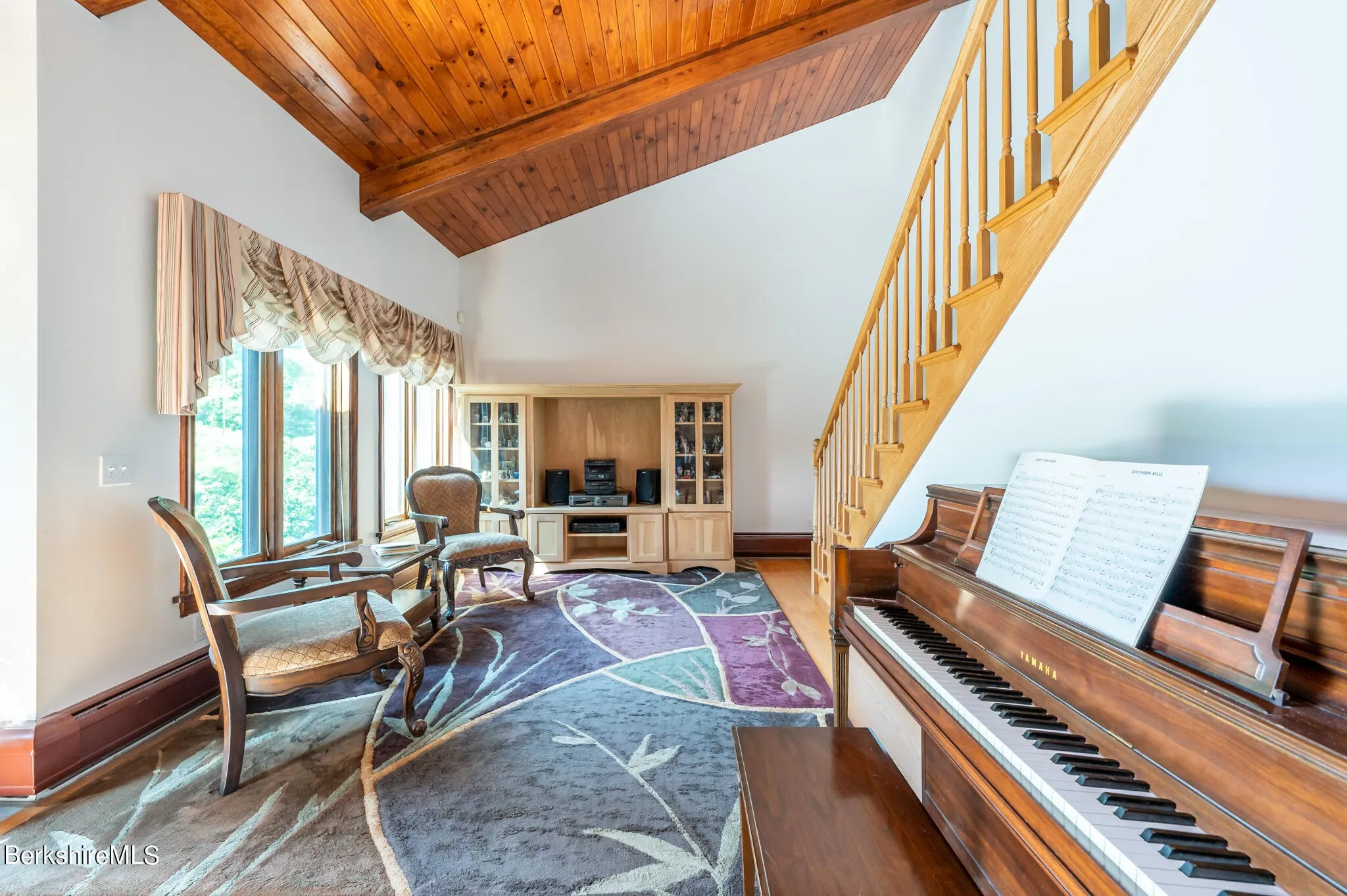
An interior design issue I see commonly is placing a cabinet or hutch of some sort against a big, plain wall. This is grossly non-integral, and every time I see that I wonder why it is there. Curiously, there are places where that can work, which makes it even more baffling that it rests there, alone, when it’s clearly out of place. The pic below is a double offender. At least it’s not in the center of the wall, but it’s pushed up against a corner which blocks a portion of the window, and it’s a TV hutch being used as a stereo table. This might not be a big deal, but this could be easily fixed by adding a couple of smaller display cases and a simple table for the stereo, whose speakers will be much better served outside of that closed space. As a triple bonus, it’s not facing anyone, there are at least six different colors of wood in the room, and the piano should be where the hutch is anyway. What’s really insidious is that this creeps up on you; it doesn’t jump out as bad design right away.
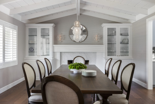
That leads to an important point I mentioned earlier; you don’t have to stick religiously to your core philosophy. Hutches work in some cases, such as colonial or Victorian homes (They look great in the image below, and I like the bonus arrow that’s formed from their placement; nicely done). Integration in a car is great, but I still prefer physical buttons. In fact, one of the main selling points of the car I drive now is a pair of control knobs right by my hand where it naturally rests, that allows me to control almost all aspects of the car’s entertainment system including Android Auto. From a design standpoint, it’s wonderfully integrated, yet not completely – it’s physical buttons for a digital screen, yet it provides intuitive control without requiring I take my eyes off the road. An elegant and subtle solution, especially considering the screen in the car sticks up off the dash like a tiny drive-in.
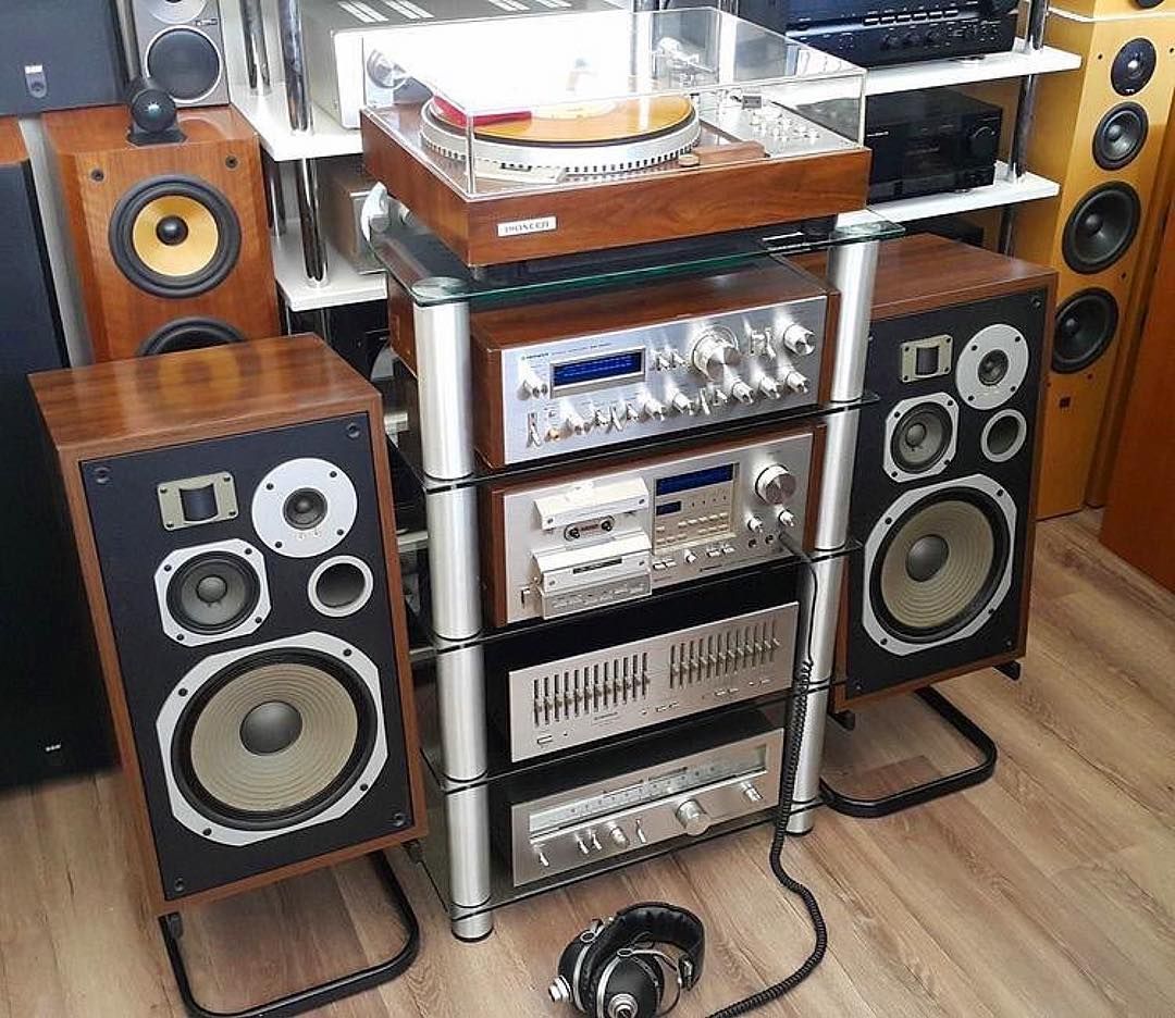
Another personal example of both integration and the evolution of change in philosophy over time is how I approach music. For many many many years I believed strongly in component stereo systems (which, to be fair, I still do in principle). This is the type of system where each function has its own component. A dedicated pre-amp and amp, tuner, EQ, power conditioner, etc. For the hardcore, and rich, sound enthusiast, this is still the best way to go. Generally, however, a unified device is a solid choice and will provide most with a more than satisfactory listening experience. It’s easier, cheaper, and more convenient to use. I do think it’s possible to be too unified, though, which is why I prefer dedicated devices instead of jack-of-all-trades things, but such are the days in which we live.
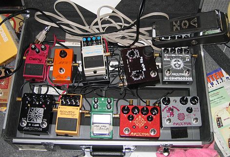
The final example I’ll give is, of all things, guitar pedals. Nowadays, you can buy quite good integrated pedals that have everything built in and no need for the individual stomp boxes we all know and love. But to me, even though I love integration, that type of pedal design is too limiting and takes away control. There are thousands of different effects pedals, so many they even made a movie made about it (if you watch the trailer you’ll even hear the word ‘integrated’) and I prefer each box to have a single function. That allows me pinpoint control over every aspect of the sound.
Integrated pedals do that in theory, but I feel that the result is just the opposite. They do work great, and are good for an easy pick-up-and-go solution and I am definitely not saying they are bad, in fact some are truly excellent. But for me personally, I prefer the swamp of stomp boxes, like you see above, that always has me doing the stomp-dance whenever I play. It’s just part of the experience, like driving a manual transmission.
I love those too.
So the ultimate lesson here is don’t force a design style, let it happen naturally. Be open to influences, allow yourself to prefer or not prefer what speaks to you, be willing to step outside your core way of doing things, and in time you’ll find your own design style, design language, design philosophy. And you’ll describe it in one word.

