About the slow death of the Sony Vita
I don’t care. I really don’t. It might be dead, it might not, I just don’t care. As someone who loves the industry and wants to see it thrive on all fronts, that’s saying something.
I wanted to like the Vita, I really tried, but it never grabbed me the way the original PSP did. Now that was a system; great games all over the place, simple controls, UMDs (one of TWO proprietary formats on the device, but I loved them anyway) the effective XMB which it shared with the PS3, which led to an easy-to-use system, and it had interesting, fun games like epic RPG Ys or quirky music game Every Extend Extra, to the glorious re-release of PC Engine classic Castlevania: Dracula X – Rondo of Blood, formerly a Japan-only release.
They even had the surprisingly fun Snoopy vs. The Red Baron, for Pete’s sake. Please don’t forget about Pete!
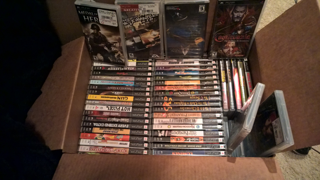
And when I say I loved it, I mean it. Here’s the box of PSP games in my closet:
The Vita? it’s all over the place, except when it comes to games. I like the idea of the game cards, but none of the games moved me. Complex, graphically intensive games are too busy on the small screen, and the simpler games don’t require something like the Vita to play.
I strongly suspected the system would never catch on, because Sony didn’t appear to be supporting it right out of the gate. The games weren’t coming fast and furious, they weren’t terribly interesting (to me, anyway), they weren’t taking many risks or chances, relying mainly on established franchises, and they never seemed to be pushing it in any meaningful way.
I never once said, in response to a game announcement for the Vita, “Wow, I can’t wait for that!” I know other people got excited for some games but I just couldn’t.
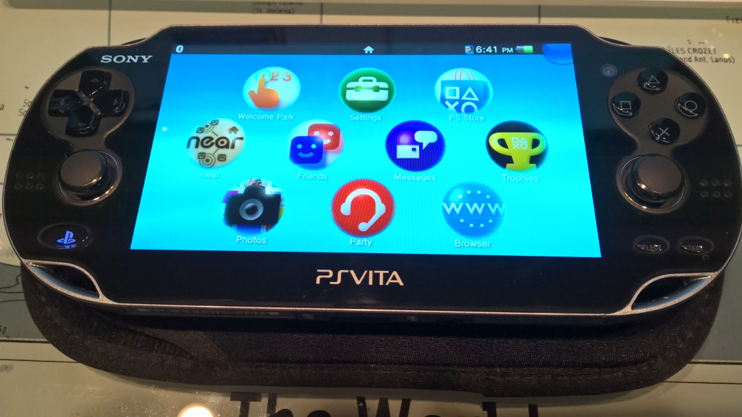
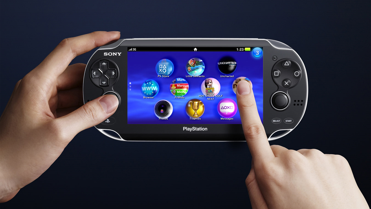
But the big kicker for me was the interface. The Vita has what was is easily the worst console interface I have ever seen. I instantly despised the Mentos-esque icons, and in fact thought they were SO terrible I was sure people would complain, forcing them to change. But I guess not. It was terrible, though. So terrible. You see, there are many components that make an interface well-designed and usable. Included in those are visual appeal and consistency. The Vita has neither. For example, here is a picture of the home screen on my own Vita.
First off, I normally would have just taken a screenshot (Hello PS button + start), but I wanted to show the icons as they relate to the screen. See, the screen is square yet the icons – those aggravating, mocking, floaty icons – are round. That is a terrible use of screen real estate. You know what would be better? Square Icons! No matter how you arrange them there is a ton of wasted screen space as you can see in the lower right and left corners of the screen, just a huge amount of unusable, empty space. Additionally, there are no categories, no groups, no organization or arrangement, the best you could try to do is have each screen represent a grouping, but one too many or too few would throw it off.
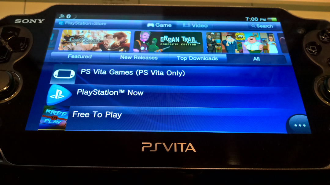
If you go to the store, there’s a completely different, globally inconsistent interface.
It’s not as woeful as the home screen, but it’s inconsistent with the home screen. And frankly, I’d have preferred something like this for the home because it fits the shape of the screen itself so much better. Far better. Horizontal navigation across the top, vertical along the bottom, categories, this is what a screen should be. In fact, they keep with this type of square design all over the place, you even swipe down the corner to close a screen, like you’re folding down a page in a (square) book.
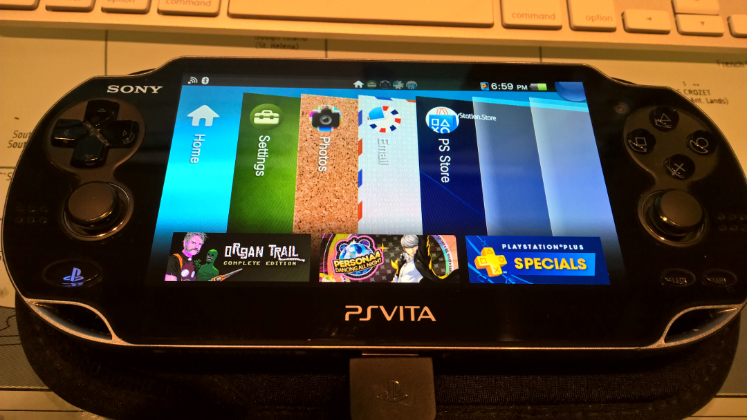
Here’s what it looks like when you’re selecting among open tasks:
See that? Square! Like our aforementioned pages in a book, this follows the same square theme as everything else, except for those idiotic round icons. This isn’t consistent, mind you, but it’s much more consistent than what we see on startup. Actually, that screen is square too!
Again, I know many people loved it and that’s fine. it does actually have a pretty good list of titles regardless of what I’ve said here, but nothing that compels me to use the system itself. If it works for others, more power to them.
So never mind the snoozy approach Sony has always taken to this device and the unconfirmed (back in 2012, by the way) then confirmed then re-unconfirmed reports that Sony is abandoning it. Never mind its innovative yet overly complex and chronically underutilized controls. Never mind that the occasional random game release doesn’t signal that’s it’s doing fine as fanboys will tell you, especially when said game was also released on 5 additional platforms. Mind it’s schizophrenic design that never gels to make it a singular, unified experience. It’s the console equivalent of being pushed down the stairs, a jarring, bumpy, uncomfortable experience during which you try to find some center, but ultimately results in a headache and no desire to go through it again. I wanted to get into it, I really did, I gave it every chance I could, but it never bit me and I’ll just stick with the original PSP.

