My Windows 10 upgrade experience
Overall, it went quite smoothly. I expected some problems, but at this early hour everything seems to be working very well, with only some minor feature-based quibbles. No fatal problems, and everything (so far) is running not just smoothly, it appears to be much faster overall.
In fact, the only real issue I encountered was is301.com itself going down for an hour!
The process took about an hour to go fully from Windows 8.1 to Windows 10, which is much faster than I expected. The Windows 10 beta that I mentioned in class I was running in a virtual machine on a Mac could take hours to upgrade, but this was very efficient.
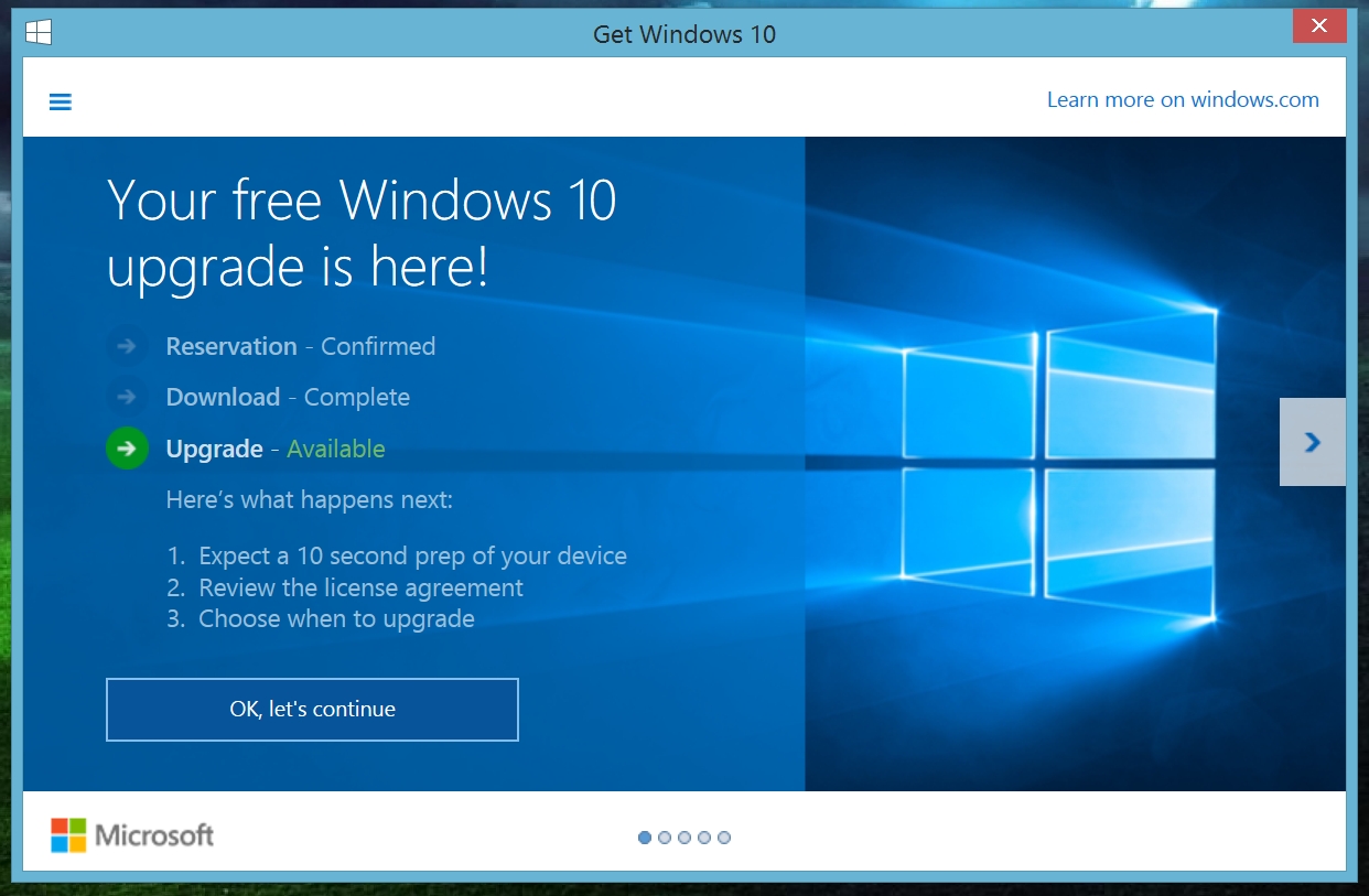
I clicked on the little Windows logo in the lower-right of the taskbar (you may or may not have one), and a window popped up telling me my upgrade was ready.
Clicking on the “OK, let’s continue” button started the process, and while I expected to whisper “what have I done?” I was eager to see how it all went. Right away it started the process:
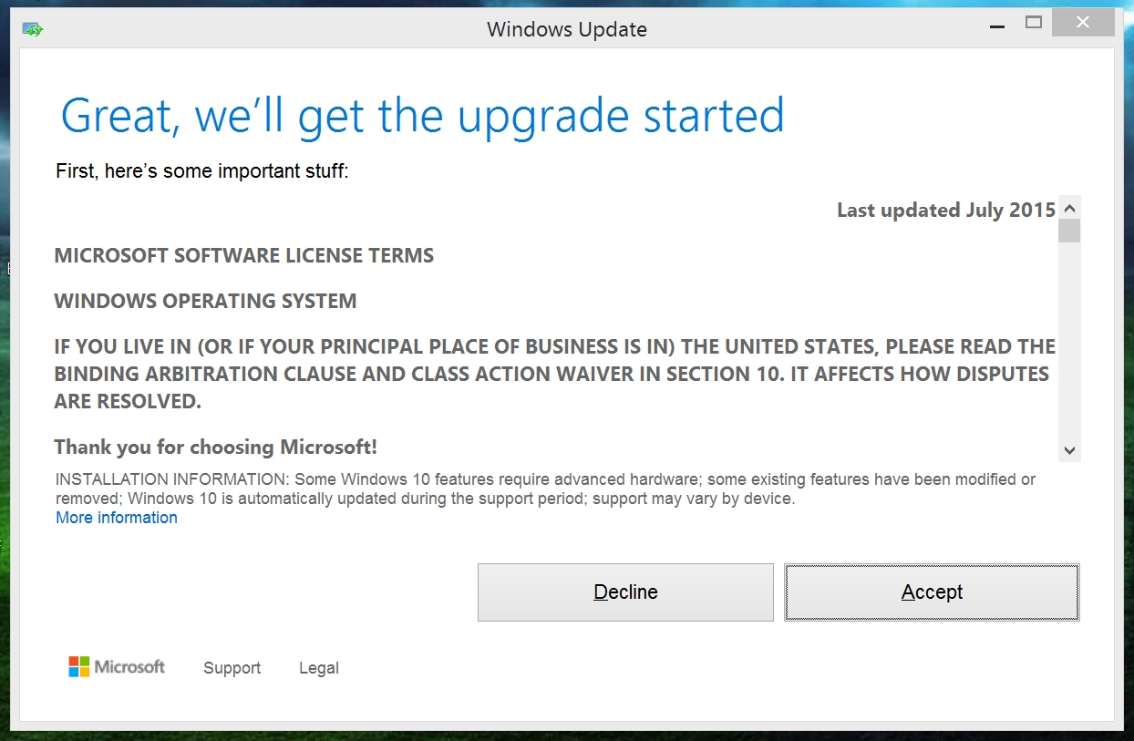
Of course, any time a major upgrade like this happens, regardless of who the company is or what the software is, you have to agree to some pretty lengthy legalese. So I did what we all do – I clicked ‘Accept’ without actually reading any of it.
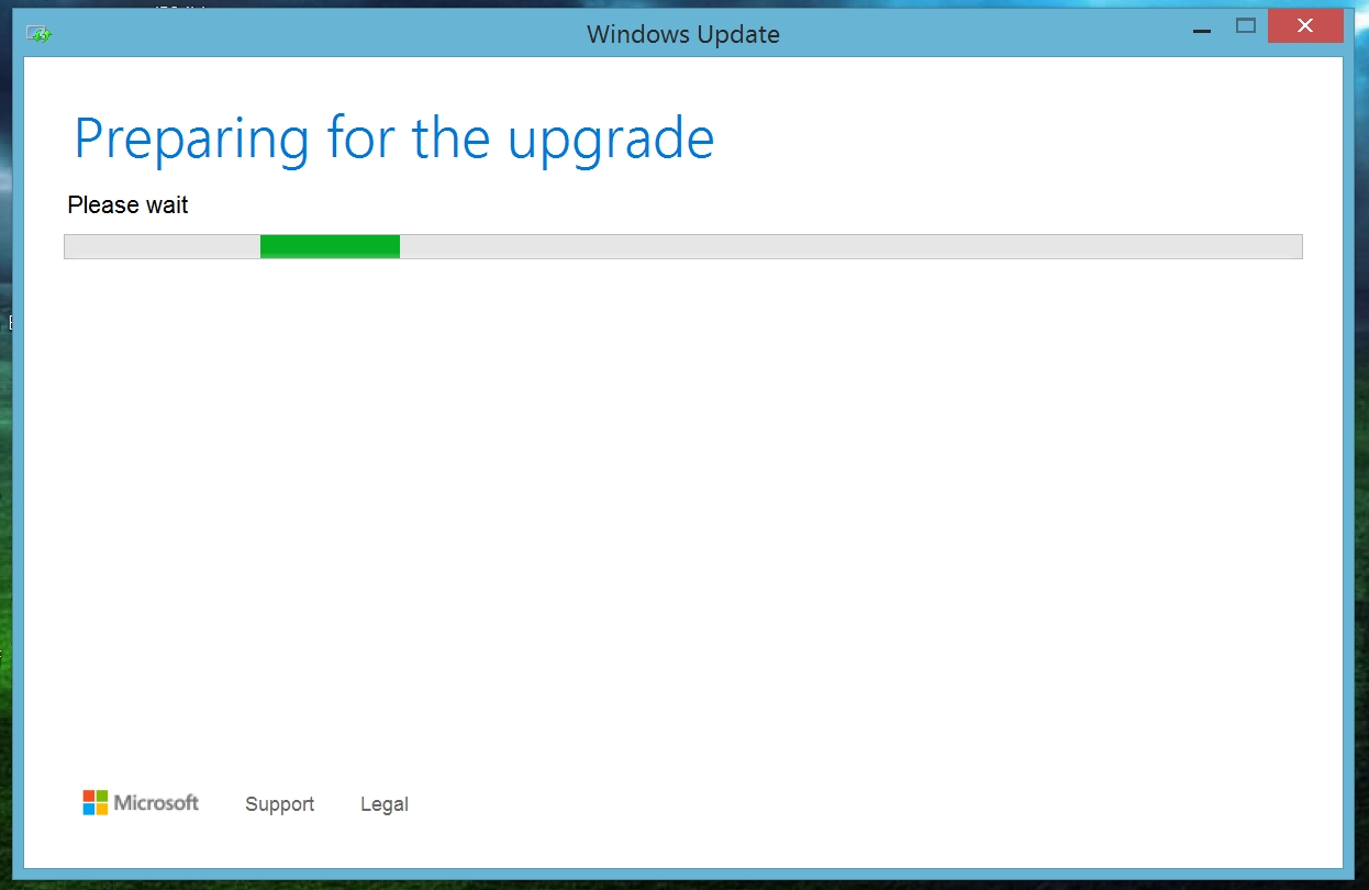
Once I did that, another preparatory process began:
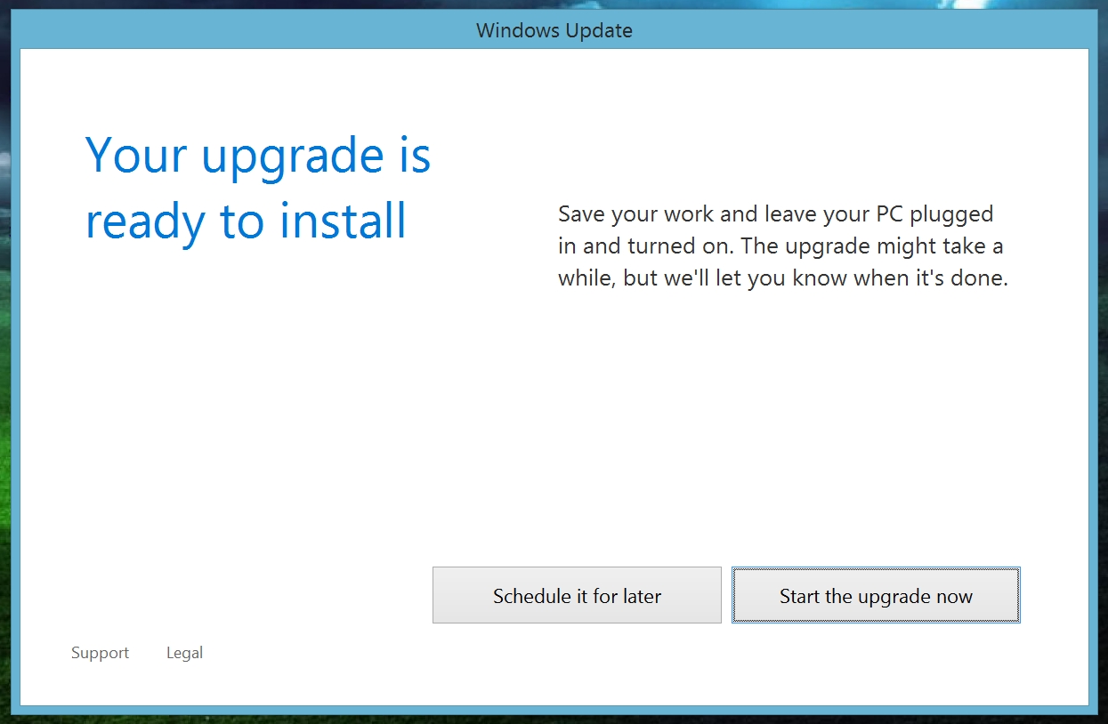
All this was just preparation. Once the above screen did whatever it did, it was time to really commit, and begin the process of switching over completely to Windows 10. I invoked the name of several deities, asked for blessings of the patron saint of computers and non-crashing, and clicked “Start the upgrade now.”
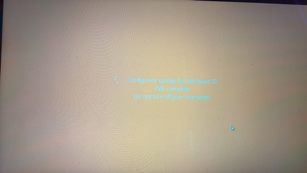
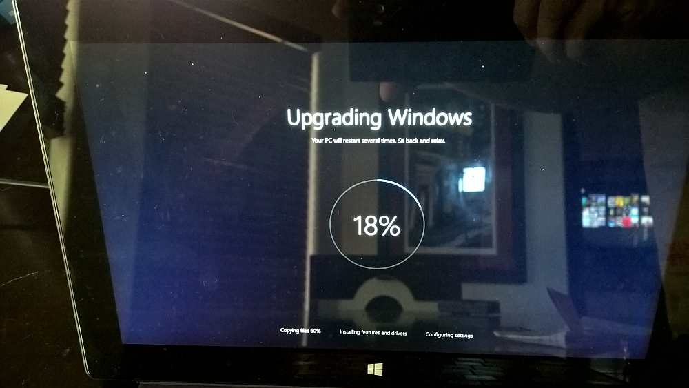
I just need to let everyone know that for the next few screens I’m going to show you, I had to take photos of them with my phone (my awesome Windows phone!) because I couldn’t take within-system screenshots since the system was going through the upgrade process. They aren’t great photos, it’s very difficult to take a picture of a reflective screen with a phone. We’ll have some proper screenshots once the upgrade is complete.
So the upgrade process went through a few steps, as you can see in these photos from said process:
Once that was done, phase two began. I expected it to take a very long time, but it didn’t!
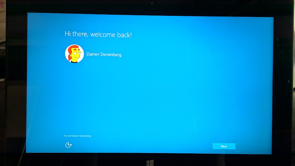
Once that was all complete, and after a few automatic reboots, the initial login screen appeared:
For some reason, I love that bit of text in the lower left: “I’m not Darren Denenberg.” I don’t know why that makes me laugh so, but it does.
Once I clicked on ‘Next,’ some options were presented to me, and while the overall setup process is relatively automatic, it’s here where you need to really pay attention to the choices you make. These cover some options that can impact your overall privacy and security. How you set these up is up to you, just give it all some thought before you move on.
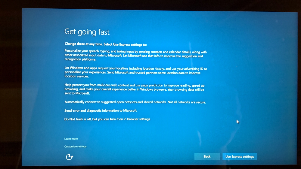
The first screen is, honestly, somewhat misleading. It says “Get going fast” and provides a narrative as to how windows will handle some operations if you use the express settings, and there’s even a button that says “Use express settings.”
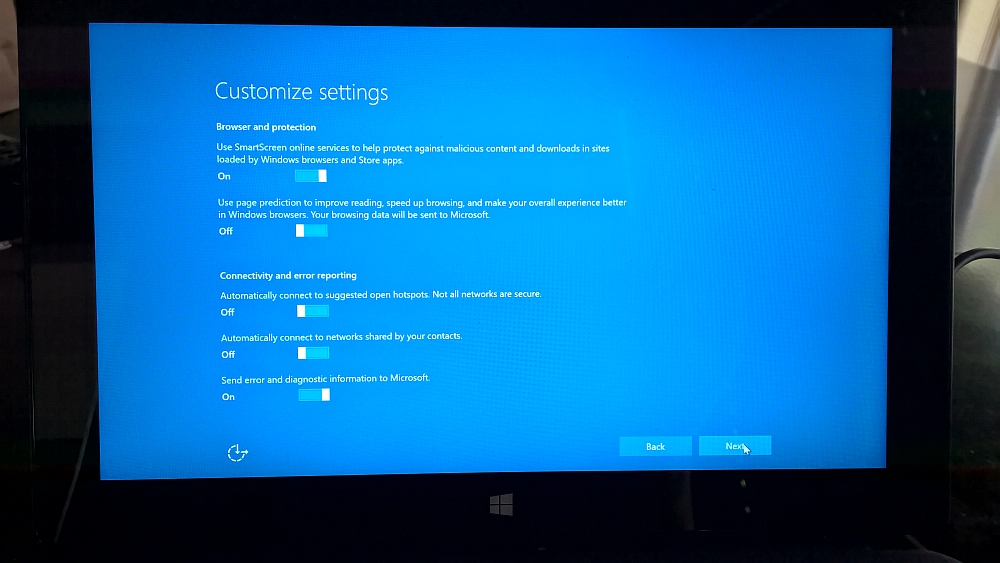
HOWEVER: if you don’t want to use express settings and configure each option individually, you have to click the tiny link in the lower left that says “Customize settings.” I would recommend doing that. An image of the screen is below:
Notice the tiny “Customize settings” link down there. That’s what you want to click on. The first page of settings it shows you is innocuous enough:
The nest screen, however, is a little more troubling. There are settings here involving networks, passwords, and automatic connections. You don’t want to automatically connect to anything ever, and you ESPECIALLY don’t want to connect to “Networks shared by your contacts.” My advice is to make the following changes, however it is totally up to you:
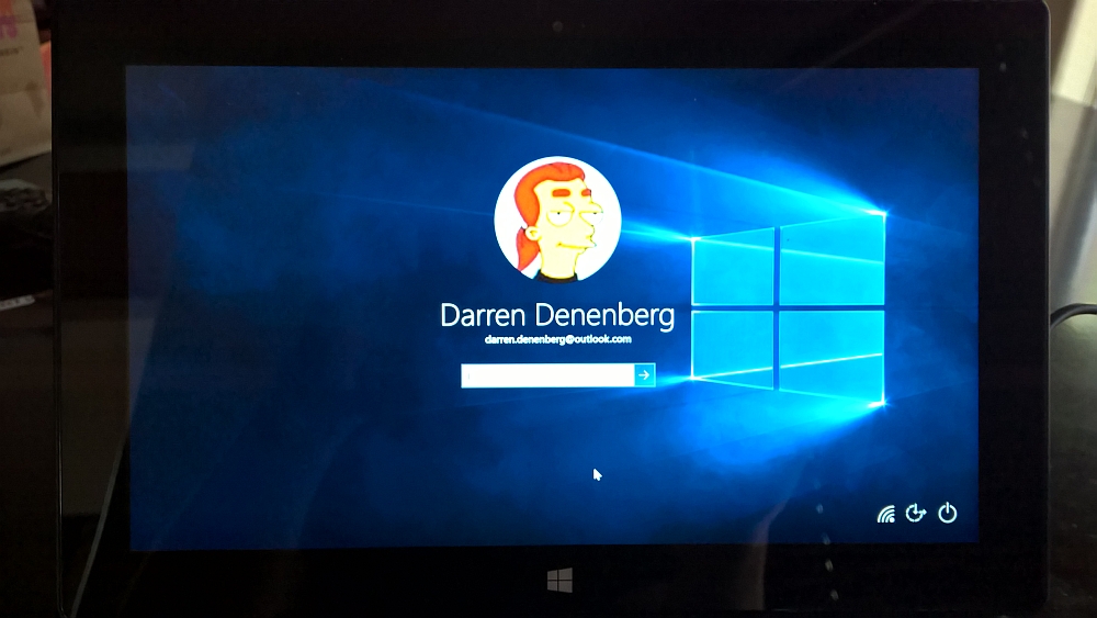
Once that is done, the actual, factual, legitimate login screen comes up:
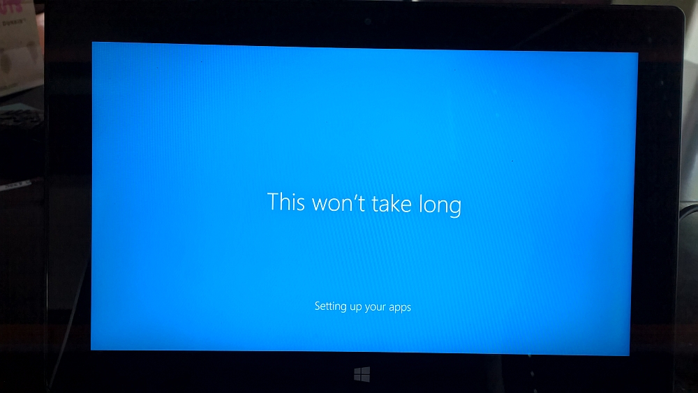
Of course, there are still some configurations that have to be done, and the system will download and configure all your apps. Strangely enough, this usually has the screen cycle through a spectrum of colors while the process takes place, however this time it only cycled through shades of blue. *That* made me worry more than anything else that happened during the upgrade.
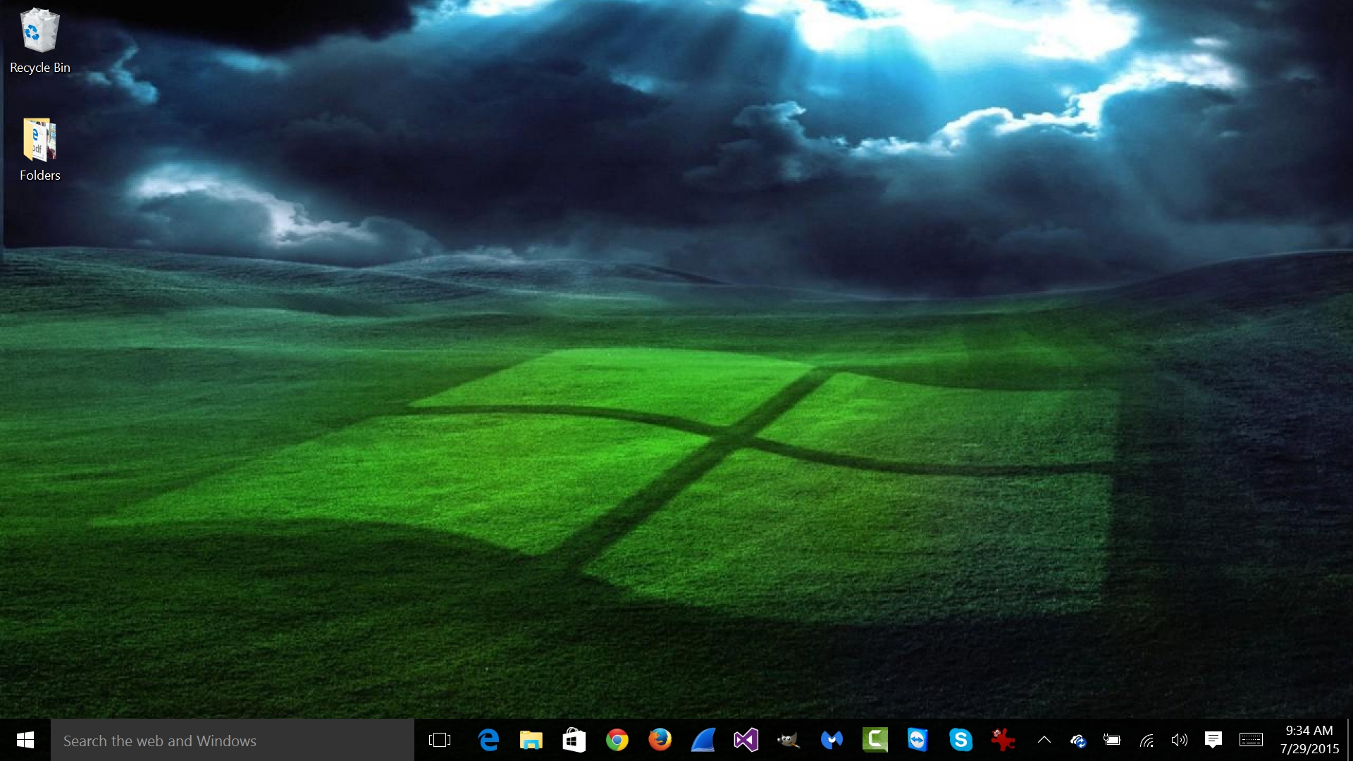
Once that was done, it was finally time to login and see my brand-new, first-time upgrade Windows 10 desktop!
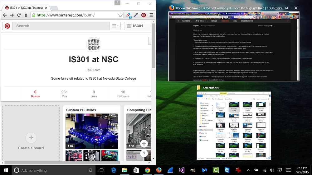
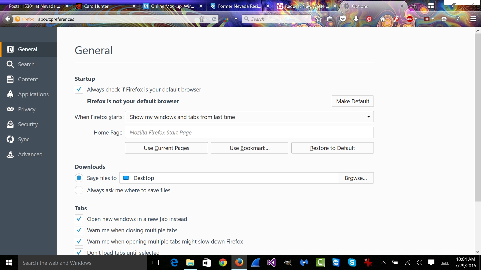
Everything from my Windows 8 desktop remained, including items pinned to the taskbar, as well as bookmarks and settings in my browsers, in fact when I opened Firefox, the tabs I had opened when I started the upgrade process from Windows 8.1 opened right back to where they were in Windows 10! Speaking of which, you can snap windows to various sides of the screen, making all apps visible on the screen at once.
Naturally, there are things I like and things that I feel will need work (like what happened to my icons in the start menu? Many just have a generic folder icon). There haven’t been any show-stopping issues, however I’m sill early in my experimentation.
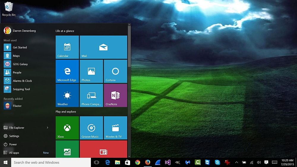
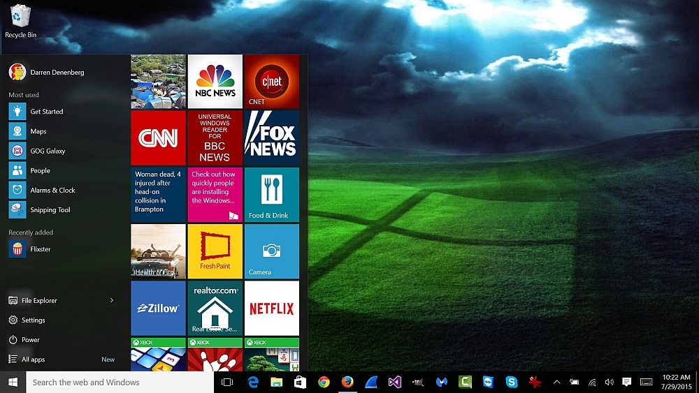
The biggest thing that people wanted was the return of the start menu, and Windows delivered. The new start menu is a combination of the old start menu and the Metro (modern) interface that everyone either loved or hated in Windows 8. It has the standard list of apps, however it also contains live tiles, which can be added, removed, and resized to your heart’s configurable content. Any apps you had in Windows 8 will be present in Windows 10, as you can see in the screenshots below:
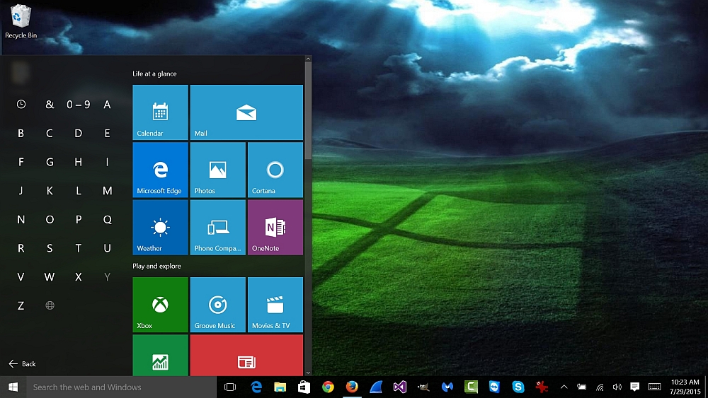
If you click on “All apps” at the bottom of the menu, a standard list of apps arranged alphabetically opens up, and if you click on one of the letters you can select all apps that begin with that letter.
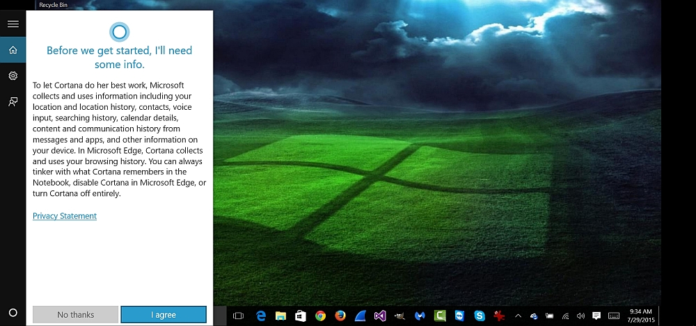
Another huge addition is the integration of Cortana, Windows’ personal assistant. I haven’t used it too terribly much since the upgrade, however it seems to be responsive. If you notice in the above picture, at the bottom of the image it says “Search the web and Windows.” Clicking on that brings up a window asking you to allow Cortana to access some of your info, which I did, and then it provides info it thinks would be of importance to you. That information is sorted in a notebook which you can edit things out of if you don’t want that particular thing being tracked.
As time goes on, Cortana will watch what you do and tailor its suggestions to your particular interests. That explains why it wants to show me a pizza place, when I haven’t been to one in about two years.
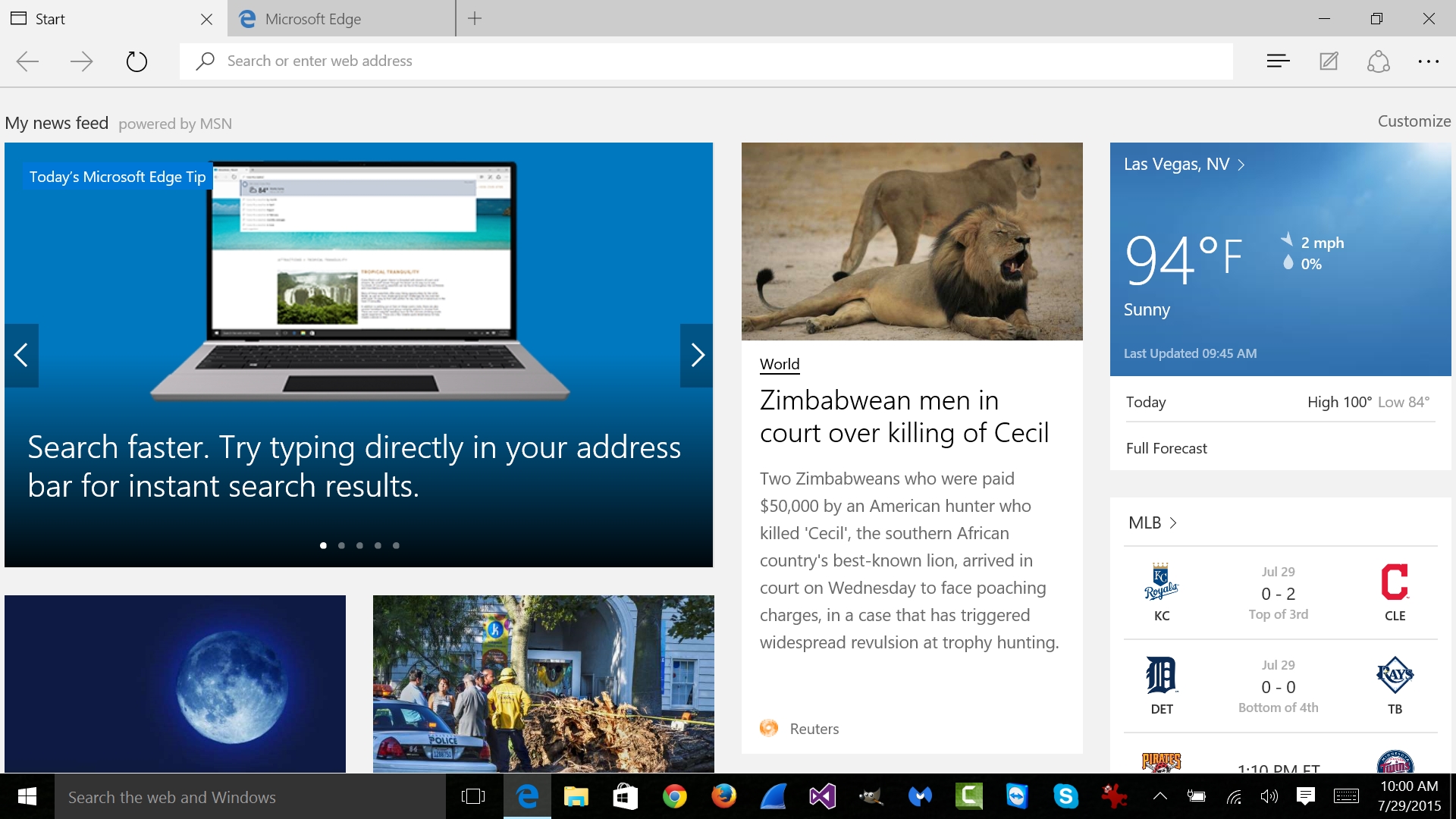
Then there is the Edge browser. I’m not a huge fan of it yet, although it is very snappy, much more so that it was in the beta, however it doesn’t yet support plug-ins in any meaningful way, and I suspect it will undergo significant upgrades in the near future. On the other hand, you’ll notice in the screenshot of Firefox, the Minimize, Maximize, and ‘X’ icons in the upper right don’t display properly. They’re there, but difficult to access. I sincerely hope that gets fixed, and soon, as it has already become a real nuisance.
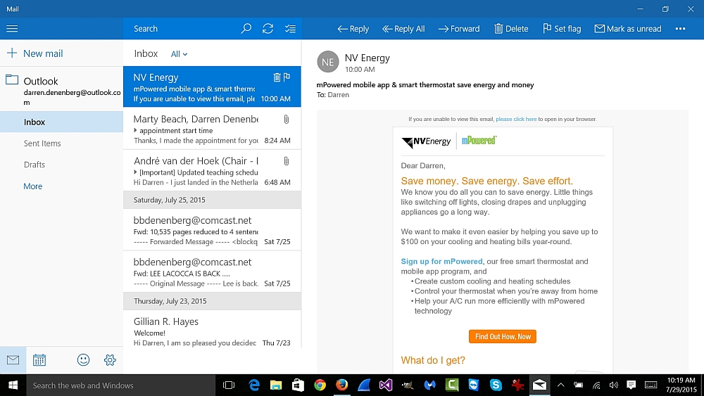
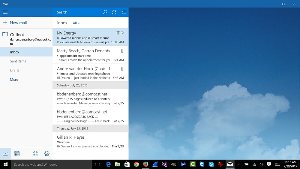
I’m a very big fan of the new built-in mail client. It’s very sleek, easy to use, and I especially like that clicking on a message will either show it, if it’s not already shown, or if it is, it will hide it again. It’s one of the best-designed apps in the new OS.
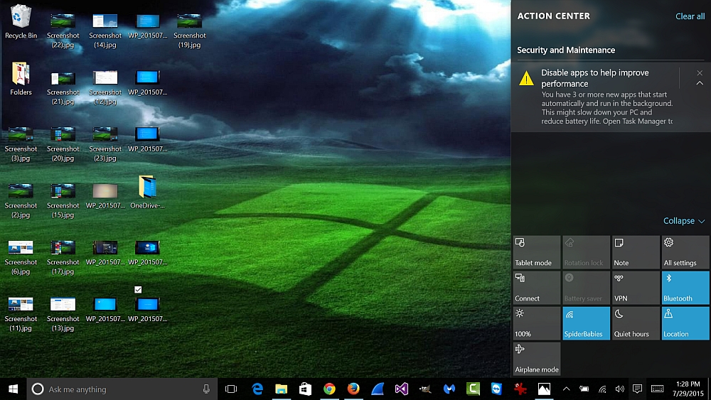
The one final thing I’d like to point out kills two birds with one stone. The little talk balloon in the very lower right of the screen is the notification center, and it can inform you of various alerts including new mail, system messages, weather conditions, along with a myriad of other things. If it is solid white, there is something it wants to tell you. One of the issues I had is that it would be white even when there were no messages, and I assume this will be fixed, although whether sooner or later I can’t say.
If you remember our discussion about memory and programs using it, you’ll notice that when I clicked on the message icon, it told me some programs loaded and are running in the background, which may impact performance. Just like we learned! I love it when things come together like that.
This is just my initial experience. I’ve been using it for a few hours, and I haven’t yet touched on the app store, virtual desktops, the vastly improved photos app and maps app, Xbox One streaming, memory management, or many of the other changes incorporated into the new OS.
Hopefully what is here will give those of you who are thinking about upgrading an idea of what to expect. You do have to be careful about jumping in to something like this, although everything has gone very well so far. If you’ve upgraded, and have anything to add, I’d be very interested to hear it in the comments.
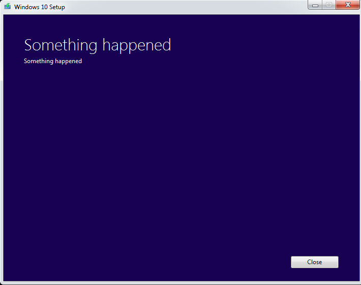
Oh, and if you upgrade, let’s hope you don’t run into this:

