Internet Explorer’s Swan Song

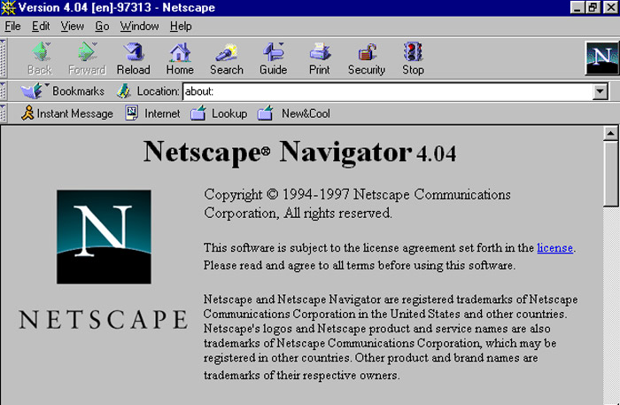
It’s been a long time. A very long time. Back in the halcyon days of the Web, circa early ’90s, we had the early browsers such as Lynx (a text-based browser that predates the graphical front-end of the Web, and you can see what current websites look like as text-only at this page), along with NCSA Mosaic and Netscape Navigator.
At that time, Bill Gates felt the Internet was only a fad and didn’t put much thought into a browser. But it didn’t take long for him to realize that he might be wrong. Very wrong. When he realized it was the future, he wrote that memo that turned the entirety of Microsoft towards integrating with the potential of the Internet.
Of course, there were two significant negatives to that decision: One, Microsoft was sued senseless by competitors and governments alike for bundling their Internet Explorer browser in with the operating system, something that’s OK to do today. The second was, well, Internet Explorer itself. Frankly, it was terrible. Netscape was better, everything was better, Internet Explorer tried to use non-standard standards for web-page development and it just became a mess with developers having to develop their websites for multiple browsers.
Although the last few versions of IE have actually been pretty good, apparently even Microsoft knows that Internet Explorer is forever attached to the stink of its early versions, and so it has finally decided to abandon it once and for all.
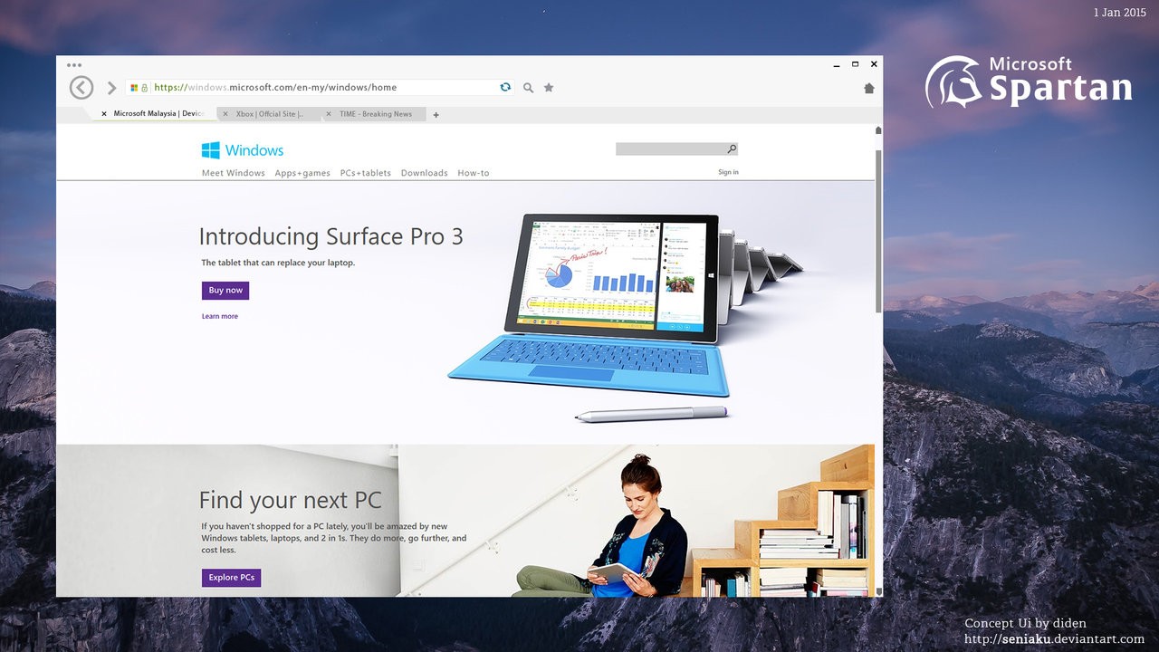
In January, Microsoft showed off their new browser – Project Spartan – that they intend to include with Windows 10. It appears they are now dumping IE for good and will be switching over to Project Spartan once and for all. It’s a smart move; the bad taste left by years of poor browser design can’t be easily washed away, so with the new browser comes a new name and hopefully a new beginning for Microsoft’s browser future.
Project Spartan is a (mostly) new approach to browser design, at least for Microsoft. It will have Cortana and stylus integration, as well as a cleaner look, streamlined reader, and better adherence to web standards; you can read more about it here. I think there’s still too much space on top, but it’s a good name that further conveys it’s an efficient browser and browsing experience.
I’m excited for Windows 10, I’ve been running it in a VirtualBox on my Mac for a while now and very much like the way its shaping up. Hopefully incorporating this new approach to their browser will help cement the overall quality of their new OS.


