Firefox, some alternative browsers, and a nifty trick
Last night in class we talked about the nasty memory leak that has plagued the Firefox browser for years. We learned that ‘memory leak’ is a misnomer because it happens when a program doesn’t release the memory it was using when you close it down. It’s because of that that I moved to what I felt has been the best browser for a long time, Opera. You can read all about the browser in this post I made all the way back in January. I was also a fan of the Pale Moon browser, which is the Firefox browser only without the developer tools and therefore without the resultant memory leaks.
That being said, I always had a fondness for Firefox. A product of the Mozilla Corporation, itself a part of the non-profit Mozilla Foundation, which had developed the first publicly successful browser, Netscape, it represented a rebirth of sorts for browsers. It also just celebrated its 20th anniversary. Internet Explorer had dominated through what some considered the heavy-handed and even illegal business practices of Microsoft, exacerbated by the fact that Internet Explorer is not, and never has been, a good browser. It’s better now, but it’s still not good. Either way, it successfully defeated Netscape in the first-ever browser wars.
Even so, with the breaking away of the Mozilla foundation and its subsidiaries from parent company America Online, development continued on its internal project, Firefox, and from it was born one of the most successful post-Netscape browsers. It was the first to truly offer competition to Microsoft’s Internet Explorer, and was very popular. A user could download add-ons that enhanced the browser’s functionality (I personally run one that blocks flash ads, automatically starts YouTube videos at their highest available resolution, and provides a very customizable speed dial with multiple groupings which you can see in the image below).
 Then the memory leaks started. Version after version was released, and with each one the leaks became worse. Complaints were lodged to message boards and forums, blog posts and guides were made, articles were written, yet for years and for reasons unknown, they were never addressed. They became so bad that I was forced to choose other browsers, my machines just couldn’t handle the oppressive commandeering of their RAM.
Now, however, version 30.0 has been released and I am cautiously optimistic that the problem has been solved. I have gone back to it after years and years, I am very pleased with its interface, its functionality, and most of all its utilization of system resources.
Even with all this, one of Firefox’s most valuable capabilities is the developer tools it provides to allow website designers to evaluate many aspects of a webpage. And now that this release appears to be stable, I have decided to show you a neat Firefox trick using those tools that will let you see the construction of a webpage from a very unique perspective.
First, you’ll need to bring up the developer dashboard. You can do this pressing the Function (Fn) and F12 keys together, or you can click on the options menu which is the three horizontal bars in the upper-right corner of the browser. That will open up the options menu as seen in the screenshot below:
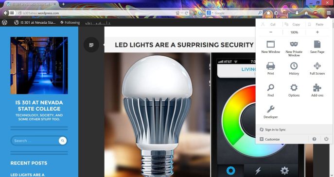 Click on the ‘Developer Wrench’ at the bottom of that window, then in the new menu that appears click ‘Toggle Tools’ and the developer dashboard will open.
Once the dashboard is open, if you are using the newest version of Firefox you will need to click on the small gear at the far left of the developer toolbar, circled in the following screenshot (If you’re using an older version, you can skip this and the next step):
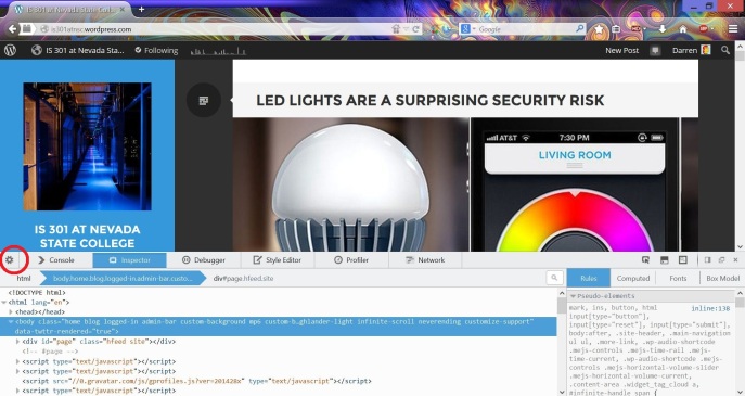 That will open up a menu with some checkboxes on the left hand side. Scroll down until you see ‘3D view’ under ‘Available Toolbox Buttons’ and check that box if it is unchecked.
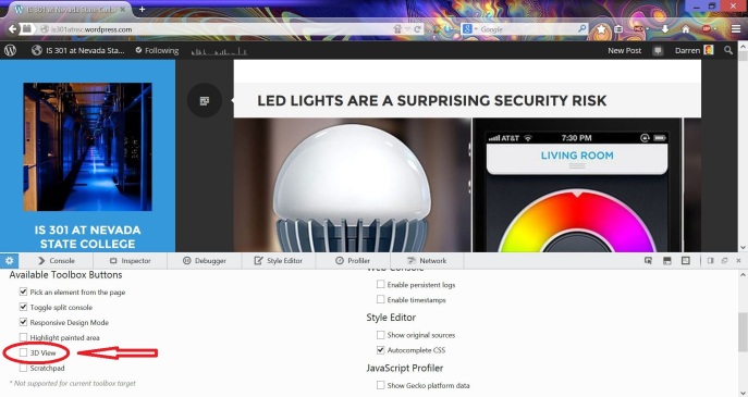 Once you do that, you will notice a little 3D cube has appeared in the toolbar icons on the right. Again, if you are using an older version of Firefox it will be there by default. I have circled it in the following screenshot:
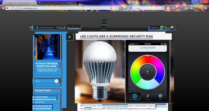
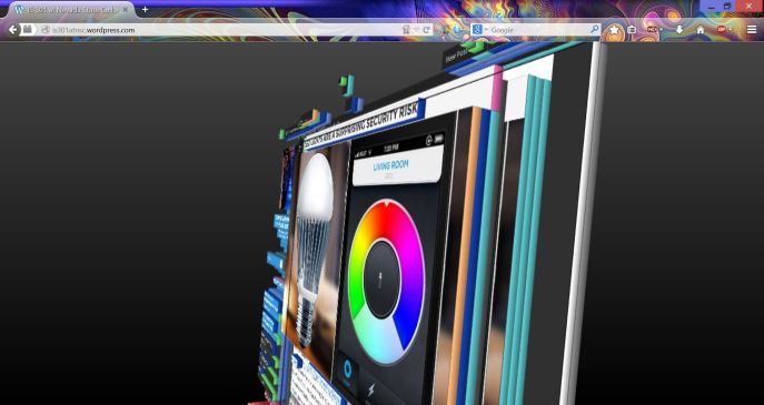
 Now the fun begins. If you click on that little cube, your page will fall back into the browser and be rendered in 3D. Using your mouse, you can spin the page, you can see it from the top or bottom or even from behind. You can click the little ‘x’ to the far right of the cube to see the page in all its 3D glory, or you can leave the developer tools up. The advantage to developers is that the 3D view actually shows all the individual elements of the page and how much nested HTML (Hypertext Markup Language, the base language in which web pages are developed) they use. In other words, to display an ad, there may be HTML that allocates the space, more HTML that selects an ad, more HTML that ensures the ad is appropriate, more HTML that positions the ad, more HTML that displays the ad, and so on. Each of those layers would be represented. If you click on an element and have the developer dashboard open, the relevant code will be highlighted in the dashboard. Clicking the cube again or pressing escape will return the page to normal (NOTE: Only once that didn’t work, and I had to close then restart the browser, so be aware).
But don’t listen to me! Try it, and be amazed. It works on any page. Here are some screenshots of this blog with the 3D view in full force.
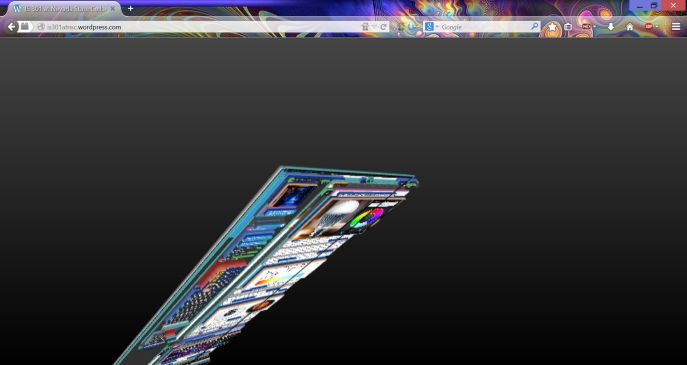
You can even view the page from behind!
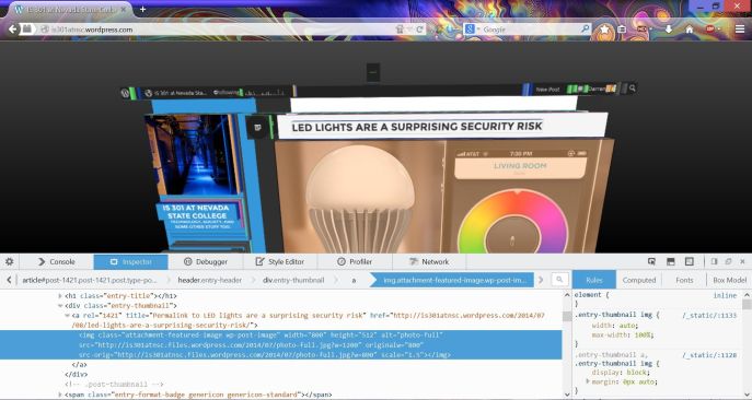
Below you can see a page element highlighted, and the related HTML highlighted in the dashboard underneath.

