
New logos for Microsoft Edge and Logitech
Both of which are bad. In case you haven’t guessed, this will be dripping with my opinion. I always say I don’t inject opinion into these posts, and then this happens. Feel free to disagree in the comments!
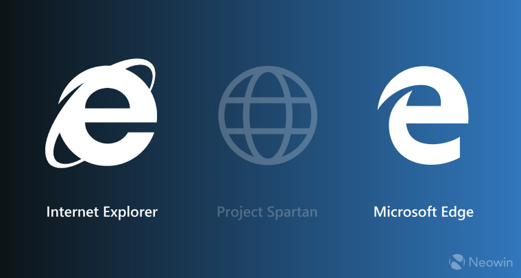
As you may know, in the upcoming release of Windows 10, Internet Explorer is being replaced with Microsoft’s Edge browser. That brings many changes including the end of support for Silverlight, and a completely redone rendering engine that hopefully makes the browser very lightweight, and…a new logo.
As you may know, I have been beta-testing Windows 10 on the fast-track, using a virtual machine on a Mac. I know that sounds like a lot, but the first linked post will tell you all about it.
That post also shows an older version of Windows 10. Many changes have been made, from Cortana to the log-in screen wallpaper to the new browser (Edge). I haven’t been blown away by it, it’s a little *too* lightweight and still has issues with configurability and usability, but they’re moving in the right direction.
What I do have a problem with, and this may sound petty, is their new logo. The old one was well balanced, symmetrical, had the look of a logo but of the universal nature of the Web as indicated by the rings. This new one…this new one is gaunt, unbalanced, misaligned, it looks like Cookie Monster after he tried to go on a tofu diet. You can see it in my taskbar in the following image, which is form the latest build of Windows 10:
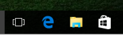
Ouch
I just really, really dislike it. In fact, that’s the most random collection of icons I think I’ve ever seen. As much as I like Microsoft and like what they’ve been doing lately, let’s keep the design department form Playskool out of it, huh?
To be fair, some people like it, some are saying it’s purposely similar to the old logos because some people see that icon as *the* Internet, and some even go so far as to say they can see the word “Edge” within the logo itself.
They’re all wrong. It’s bad.
And what was Logitech thinking?
Logitech has long made some really great peripherals for consoles and PCs, in fact for my media center I use their K810 keyboard, which works flawlessly, it’s perfect for my needs (I used the Amazon link because the Logitech site plays loud, jarring music).
Their logo, seen below, has never been great. It looks like what you’d find stuck to the bottom of your show if you stepped on a tiny clown:
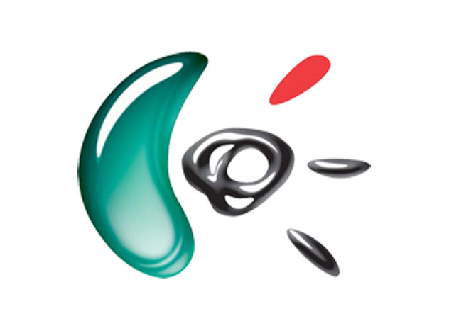
Logitech logo
I don’t mind they feel they’re in need for a change, but they apparently now feel that the term ‘tech’ is meaningless, so now they will simply refer to themselves as ‘Logi.’
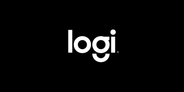
Logi…
First of all, Logitech has been an iconic brand for decades, this change makes no sense. You don’t simply make a change to something so powerful without damaging what’s been built up over years.
Secondly, how exactly do you pronounce that? A hard G, like low-ghi, or a soft G, like low-gee? I wouldn’t confuse it with loogie as some have said, although it’s pretty close, but one thing I haven’t heard anyone say is that Logitech is apparently not aware there is a word, logy, that I don’t think they’d want to associate with their brand.
When you come up with a new brand name or identity or acronym or whatever, you have to make sure it can’t be taken in a prurient light, or be easily misinterpreted or criticized. Microsoft and Logitech (I will NEVER call them Logi!) have made some curious choices here. We’ll all adapt, but I wonder if the changes were necessary in the first place.