
Category Archives: Software
Has Firefox opted you into any of its studies?
Remember my previous post that talked about the fantastic new version of Firefox, especially the full-screen screenshot capability? I still haven’t adopted it as my main browser, but I was so impressed with th overall changes that were made, I’ve found myself using it more and more; certainly more often than I have in the past. High five for no more memory leaks! Anyway, when I started it up today, it opened to the screen you see below. I was intrigued, especially considering the great improvements they’ve made so far, but as I read through it I also became a little curious. It’s talking about tracking us for usability study purposes, which I’m completely for, but is there anything they perhaps are not telling us? I had no idea the drill down that was about to happen.

FireFox Pioneer
This is a new initiative called Firefox Pioneer, which aims to discover how people use their browsers, as well as what they vaguely refer to as ‘health of the web.’ They are careful to note that you need to opt in, which is good, and they are pretty clear about what they will and will not do, and what you can expect in terms of privacy, monitoring, opting out, how private sessions play in, and so on. I do get the feeling they are striving for high-level transparency here and acting in good faith, but perhaps a deeper dive into what they could do is warranted.
I should also mention that while Firefox allows for full page screenshots, that option was not available here. I had to open the page in Opera, save it as a pdf which Opera allows compared to Firefox’s screencap capability, open the pdf in Firefox, and then I could save a full-page screenshot. Very curious, but a triumph for ingenuity.
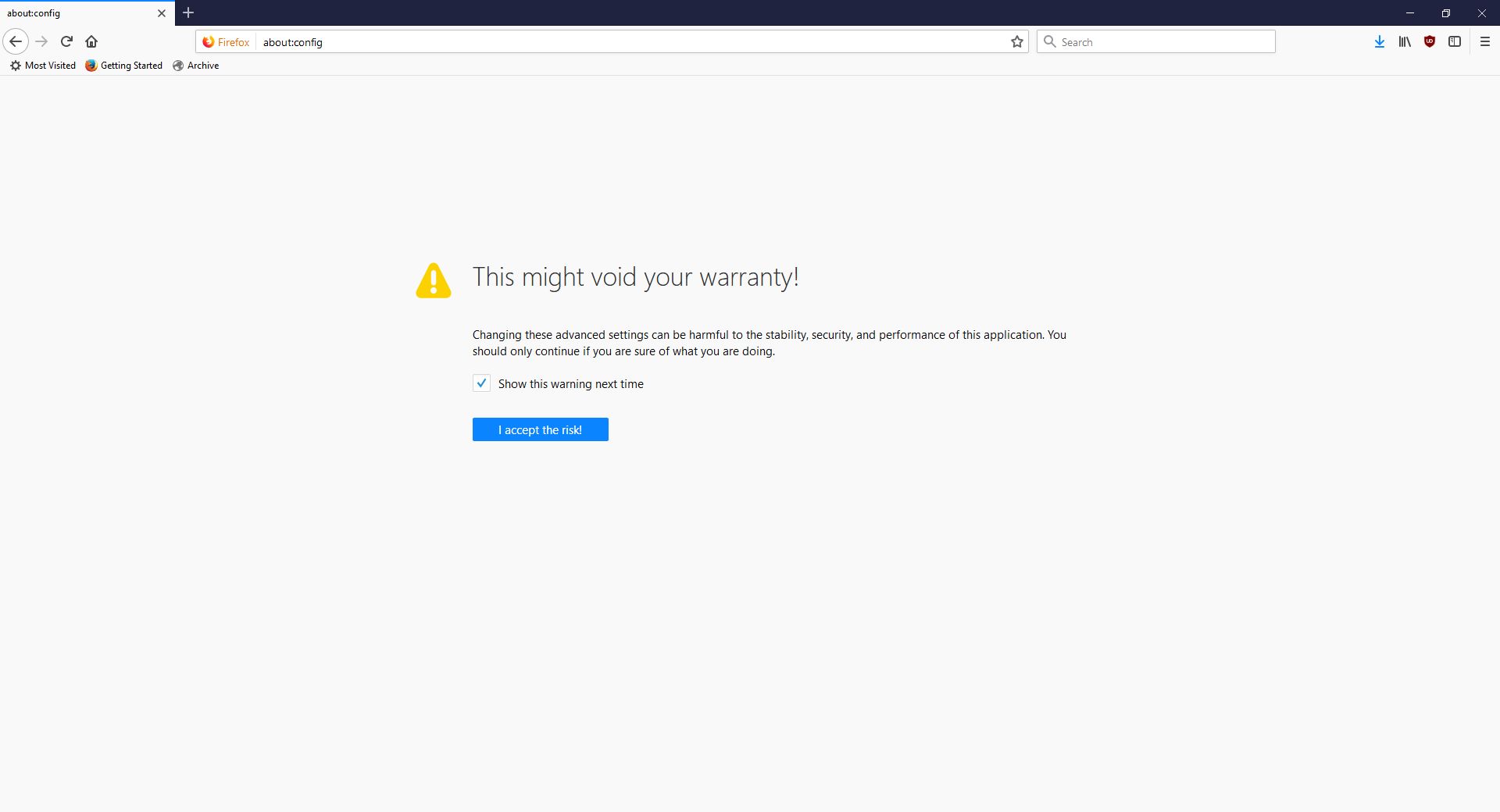
As the page indicates, you can type about:studies into the address bar and see which studies you’re part of, which have completed, and which are available. In fact, you can type about:[topic] into the address bar to discover many interesting things. To see how extensive this capability is, you can see a list at this link. For a real fun time, try about:config – it shows this not at all scary warning, which is really just trying to be funny before letting you access settings. I would normally be for this, however it’s incredibly unclear as to what’s going on if someone isn’t familiar (it fooled me too), especially as it says ‘this application’ and not ‘Firefox.’ Why the pseudo-third person?
Careful now
Clicking ‘I accept the risk!’ takes you to a configuration page that isn’t much better in terms of readability or functionality.
Firefox’s about:config
I don’t usually check this kind of thing, but I certainly should. We all know that companies use your data for many things, sometimes not asking first, so it’s important to keep an eye on what any program you’re using is doing. Typing about:studies showed me this screen, which I have to admit got me to wondering what exactly has been going on behind my back:
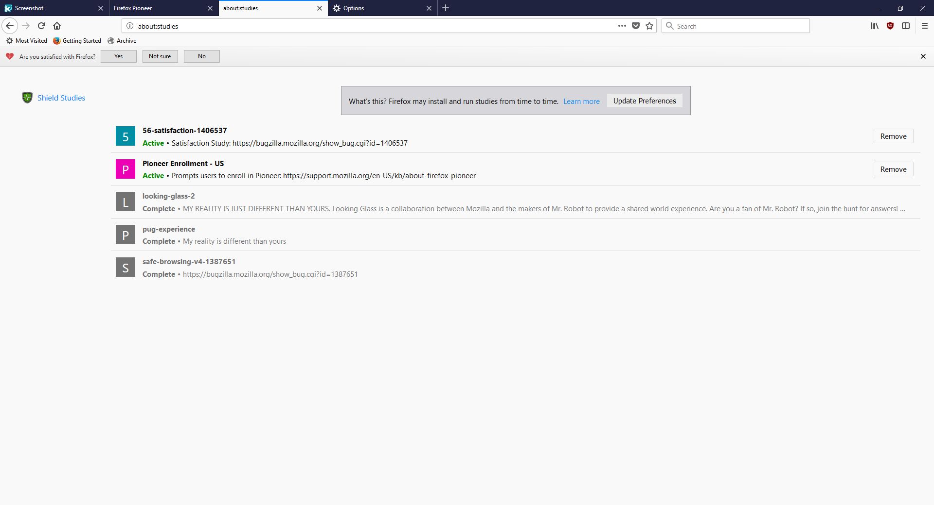
about:studies page in Firefox
A collaboration between Mozilla and the creators of Mr. Robot? Someone’s reality is different than mine? What is going on here exactly? I clicked on Learn More and was taken to their SHIELD page where I learned all about their SHIELD studies, which they claim are to test new features, however from the original request it’s clear they test more than that. I also can’t figure out why it’s capitalized in such a way; I found no evidence it’s an acronym. A deeper dive led me to another Shield page where it’s maddeningly no longer capitalized, and that’s where I found, towards the bottom, a very concerning entry called ‘Normandy – User Profile Matching and Recipe Deployment.’ I wasn’t completely sure what that meant, but it stood out as sounding perhaps not so good. Just the name is curious: If you’re not familiar, and you should be, Normandy happens to be the location in France where the United States, Britain, Canada, and some of France itself launched the D-Day invasion against the Nazis in 1944. Did you ever see Saving Private Ryan? The opening scene was Normandy. I can’t help but wonder why Mozilla has named this bit of its process in such a way. It may be common knowledge, I don’t know, but it was new – and enlightening – to me.
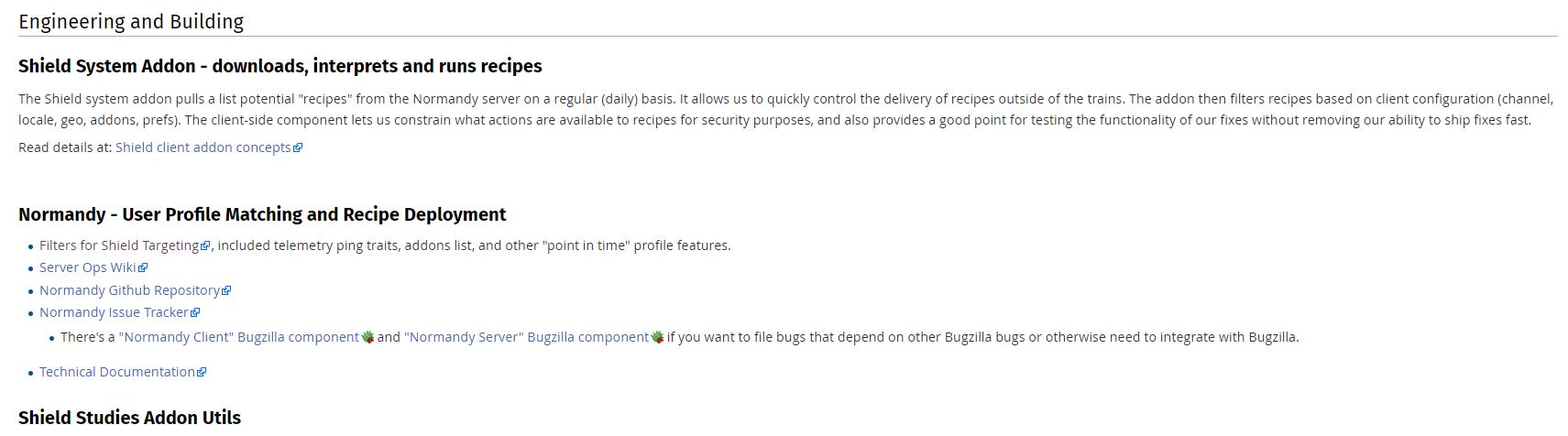
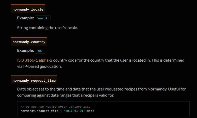
Normandy
You’ll notice the first item there, “Filters for Shield Targeting.” That took me to another interesting page, the very first paragraph of which states how certain users can be pegged for recipe execution in their browser, and the means by which that is done has access to location and locale (I’m uncertain as to how those differ in Mozilla parlance). It’s further down the page that you begin to see all the ways you can be tracked and monitored.

Filter Expressions
I was going to take a screenshot and crop in the sections that were most troublesome, but there are SO MANY it simply was not possible. To give you an idea, here’s what a screenshot of the page looked like in my image editor. I should also add that from a pure design perspective, they are really not using space efficiently.
![]()
So there’s a Normandy server, and Normandy is also an object that contains what they call ‘general information’ about the client. Client in a case like this should indicate the browser itself, not the person using it, but separating the two is not so easily done, and as a designer / developer, you’re ultimately trying to learn about the user, about their wants, needs and habits, so you can provide a better product. I have no problem with that, and in fact am completely on board with their Heartbeat initiative, but that is relatively benign.
Anyway, back to the above screenshot. They can track a lot, and in the crop below, you’ll see they do something interesting called bucket sampling. I’m intrigued by what this would be used for and how / why / when / etc., so I will have to dig even deeper. I’m guessing it’s some kind of parsing via demographics / usage statistics, but I’m not completely sure. I only found one mention of it on Mozilla’s site, on this page towards the bottom under the heading “Filling the Gap,” but it does lend credence to my assumption. While there’s no formal method known as bucket sampling, it’s something we do, in effect, all the time. I’m looking at you, marketing!

Bucket Sample
So what does all of this have to do with the study that started this whole post? To be quite honest, this rabbit hole didn’t tell me anything I, or any of you, didn’t already know: It’s very easy to track you online, and not just the websites you visit. Where you are, what software you use, what OS you have, whether you’re a new user or experienced, how many mobile and desktop clients you have, how long you stayed at a site, they can even track if you’ve enabled Do Not Track!
And while this sounds like a conspiratorial, tinfoil-hat rant, I actually am not overly bothered by it. I don’t do anything outrageous online other than download Sega Genesis ROMs, because I’m dangerous and like to live life on the edge. But other than that it’s all pretty boring. My issue was mainly that Mozilla may be opting us in to studies without formally informing anyone, and that I just can’t get behind. This was originally going to be a very short post that I thought could be whipped up in about fifteen minutes, but it instead turned into a downhill slalom.
If you’re interested in reading more about Normandy, Mozilla has a helpful website where you can learn all about it and what it can (and does) do, and it really is an interesting, dare I say fascinating, read. http://normandy.readthedocs.io/en/latest/
Oh, one ore thing – In the latest build of Firefox, Mozilla has also made individual cookie management much more cumbersome. I don’t use that feature a lot, but it is definitely not something people should have to go in to the developer console to access. I love the new Firefox, but this isn’t good – user control should be at the center of all commercial software development. Get it together, Mozilla.
Fixing a component install error in Visual Studio Community 2017 (hint: It’s really easy)
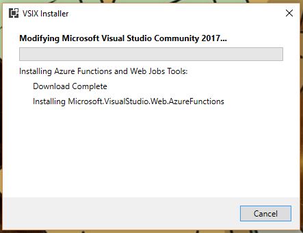
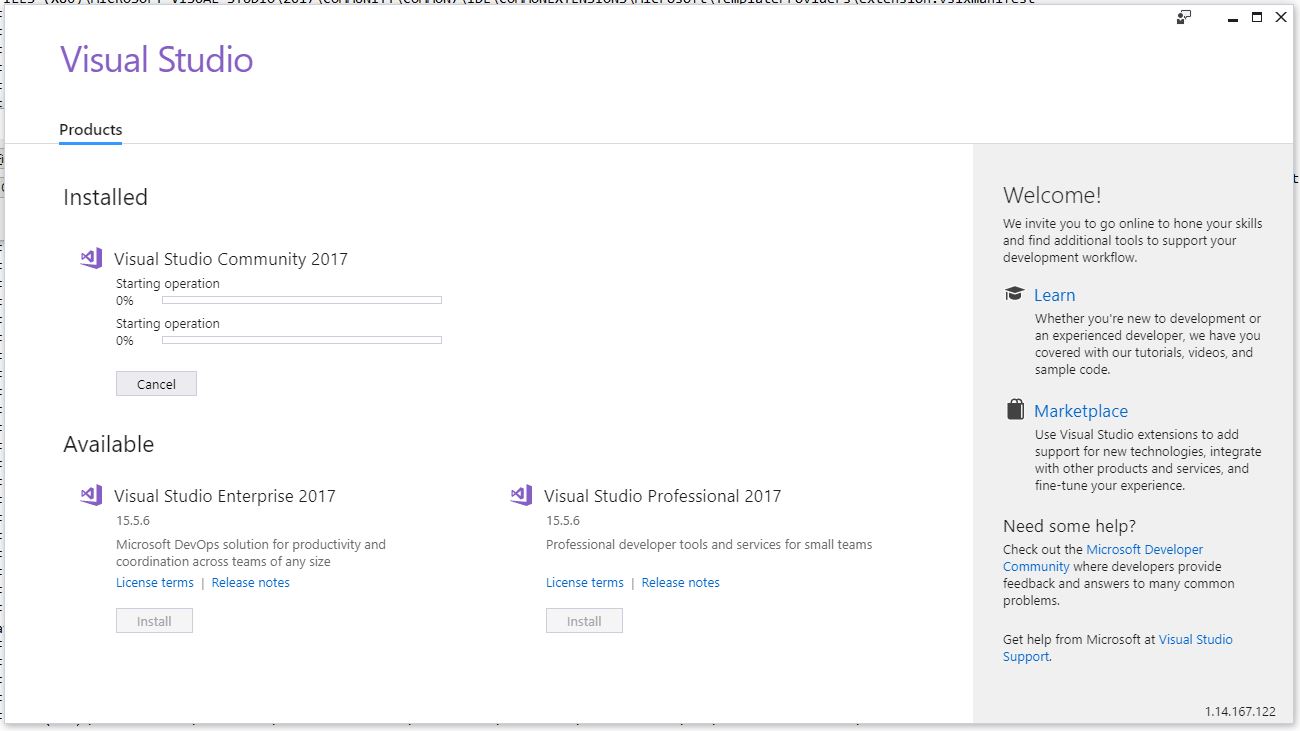
I recently noticed in the notification window of Visual Studio Community ’17 that there were some Azure-related updates available. Normally these updates lead to an uneventful experience in which I approve the updates, VS takes a loooong time to download install said updates, then everything moves forward as planned. This time, however, was slightly different so I thought I’d bring you all on my journey of discovery and illustrate why Visual Studio’s attempt to help me figure out what went wrong was so unhelpful. Even so, it’s an easy fix that I’m guessing many of you could figure out anyway. Indeed, my approach takes the slightly longer way round.
The story begins with the update notifications. This is a very common thing to happen with this particular Integrated Development Environment (IDE), and now that I think about it, I can’t recall a time there weren’t updates to be had. Anyway, as I mentioned they’re normally uneventful, and these two were for components I don’t use too terribly much – Azure Data Lake and Stream Analytics Tools, and Azure Functions and Web Jobs Tools. The former are tools to aid and assist with the streaming, gathering, and analysis of the massive amounts of data gathered from IoT connected devices, and that is an area in which I have significant interest, so these tools will be useful for me soon (I hope). Azure Functions and Web Jobs Tools are of less interest to me, but I can’t have an incomplete update hanging in the air above me. So, without thinking too much about it I clicked the notification, clicked on [Update], and went about my business.
No problem
As expected, the process began without much of a hitch.
Good so far
Still good
I should mention that when it comes to Visual Studio, you don’t ‘update’ or ‘patch,’ you instead ‘Modify.’ All just a big semantics issue. Anyway, although things had gone well up to this point, that was about to change.
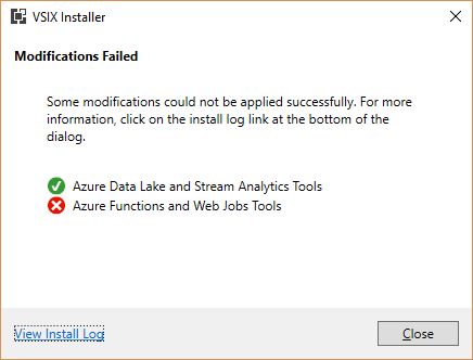
Uh Oh
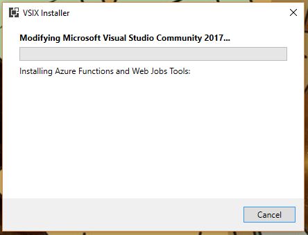
So the Data Lake and Stream Analytics tools installed fine, but the functions and Web Jobs tools was another story. I don’t even need those, and I probably should have let it go, but I just couldn’t. That red X would have haunted my dreams.
The obvious next step was to check the install log, as the Installer so helpfully suggested. Speaking of the installer, and if you’re interested, VSIX is a method of deploying updates to Visual Studio, and does so in the right place with the right components and so on. It’s a compressed file, and you can even rename a VSIX file to .zip and extract it. Just wanted to get that out of the way.
I clicked on “View Install Log,’ and the result was a log that was a breezy 865 lines long, and mainly, but not entirely, comprised of stuff that looked like this:

Thanks for the help, install log
This log punches you in the gut twice, because A) You have to find the part that identifies the problem in those 800+ lines all on your own, and B) the part that identified this particular problem was all the way at the very end. Luckily, ctrl-F helped out significantly here.

There you are
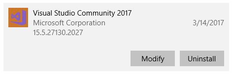
Luckily, I knew, or at least suspected, that from here it would be easy. That the update task didn’t exist and the setup instance was not in a launchable state indicated to me that there was a disagreement between the installer and Visual Studio, and not that some fatal, unrecoverable error had happened. Fortunately, my suspicions turned out to be correct and it was really easy to fix. In fact, I could have just done it from within Visual Studio, but this is more illustrative. At least I think it is. Maybe it’s not.
I didn’t even need to go full control panel on it. I simply went in to the apps section of settings, scrolled down to Visual Studio, and selected ‘Modify.’
That brought up the Modification window with the ‘Workloads’ tab highlighted, but we want ‘Individual Components.’
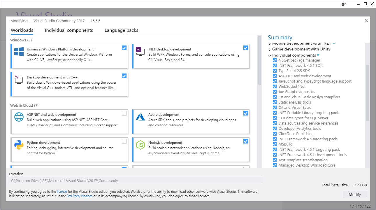
Workload tab in modification window
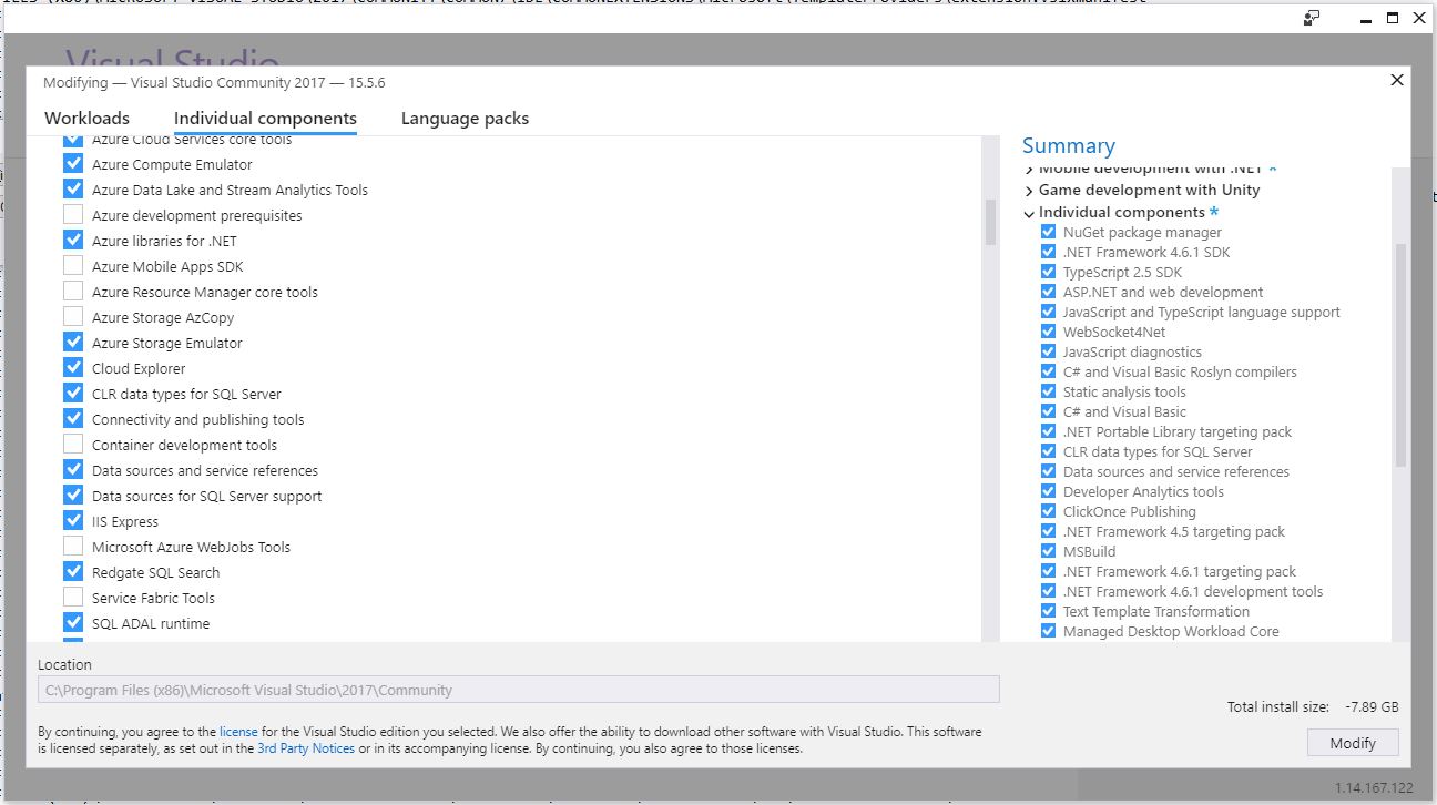
Individual Components tab in modification window
You’ll notice that ‘Microsoft Azure WebJobs Tools’ isn’t highlighted, so easy fix. That’s also the reason I mentioned earlier that it could easily be repaired from within VS itself. Clicking that checkbox caused almost all the other checkboxes to become selected, and after clicking [Modify] there in the lower right-hand corner, the long, slow update process began anew!
It was at zero percent for a long time, but that’s normal for Visual Studio. Its updates are never a quick thing. After it chugged along for a while, success!
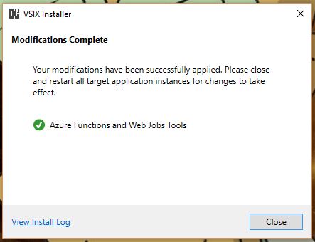
Success!
Remember, I don’t actually need these components, but I was not going to let the VSIX installer win, and now I could raise my head in triumph. Plus, I can experience – for a brief moment anyway, if I know Visual Studio – the blissful Zen of the empty notifications window.
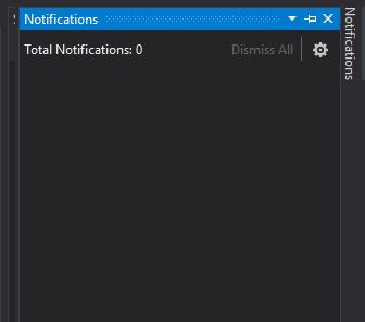
Ahh…
When it comes to a failed component update, I have seen others suggest uninstalling and reinstalling Visual Studio, clearing caches, even making changes to the registry! I have never needed to do any of that for any kind of installation or update hiccup. I don’t know why people think that, especially when a straight repair or modify, as shown here, always works. This is not an advanced technique or a hidden trick Microsoft doesn’t want you to know about; it’s a standard, Occam’s Razor approach that should always be the first line of defense and action for this kind of thing.
If this helps anyone out there avoid all those unnecessary machinations, then I’ve done my part.
How to kill windows tasks, even those that just won’t die

I recently created a video that shows how to kill tasks via the command line, and if that doesn’t work, how to kill them via Process Explorer, and if that doesn’t work how to disable them using the Services window. It’s embedded just below, but if you’re not in a video mood, fear not! I have summed up its contents, although the video shows you the steps and comes complete with witty commentary.
If you’re running Windows, any version of Windows, you know there are what seems like thousands of things going on in the background. All you have to do is bring up the Task Manager ([Ctrl]-[Shift]-[Esc], or the well-known [Ctrl]-[Alt]-[Delete] if you’re old-school and enjoy the extra steps) and you’ll come face-to-face with the process party happening inside your machine.
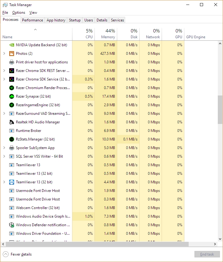
Task Manager – Hello, running tasks!
As you may also know, each of those running tasks requires some of your machine’s resources; sometimes a little, sometimes a lot, and you can see in Task Manager how much of each resource each process is using. If the process is something you don’t use or don’t need, then it’s not a bad idea to stop the process and recover whatever amount of system resources it’s hogging to itself, and it even turns out that while taking the above screenshot I happened to notice Windows’ Photo App, Movies & TV app, and Messaging app were taking up a lot, so away they went! Right-clicking brings up a menu that allows you to ‘End Task.’
But that’s also where an insidious problem lies. Sometimes, when you right click and select End Task, the task just doesn’t end. This can manifest in a couple of ways: The task may continue to run, mocking and taunting you to click End Task again, reveling in your failure to stop it. It might stop for a moment, only to reappear a second later, better, stronger, faster (not really better or stronger or faster, but it will reappear).
This even happens when using the command line to kill tasks. Normally this is done by listing the running tasks using tasklist, then, once the Process ID (PID) is known, using taskkill /PID actualPID, however even here that doesn’t guarantee a termination, with a similarly mocking response from your system.
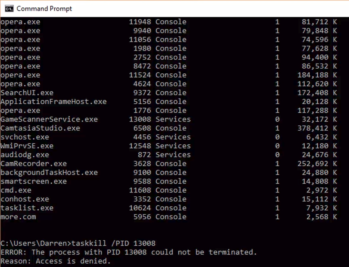
Damn
Why does that happen? The main but not necessarily only reason is that it is actually part of a complex hierarchy of tasks that prevent it from being shut down. Either it is a child spawned from a parent process and upon being stopped, the parent just restarts it, or it’s a parent process that can’t be terminated because we can’t have orphaned tasks.
To determine which of these is the case, I am a big fan of Process Explorer, part of Microsoft’s SysInternals software suite that helps maintain and monitor Windows. If you click on the link, you can see in the left-hand sidebar the other packages available; They’re quite comprehensive.
Process explorer shows you everything that is going on, how many resources are being used by each process including specific and shared memory, the Process ID (PID), the name of the company that developed the software, it color codes by category, it’s a great program that shows a lot and really gives an idea of not just what is going on but how it all relates.
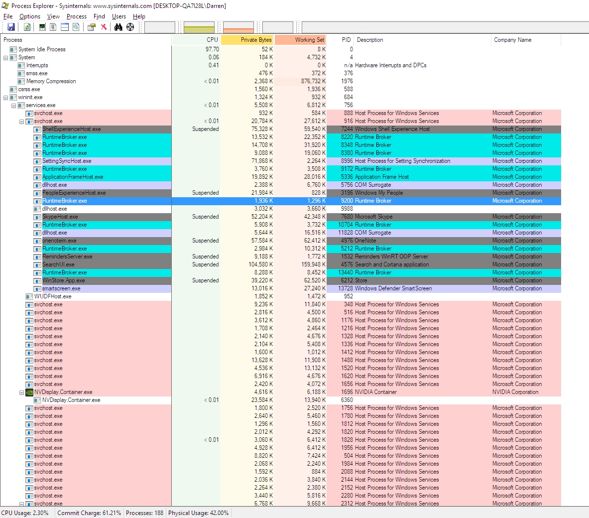
Process Explorer
You can see that some processes are child processes and some are parent processes and whether you can or can’t kill a process is very dependent on the nature of that hierarchy. Trying to stop a task even here will prove futile as the hierarchy is the same. Interestingly, in Task Manager right clicking gives the option to End Task, while in Process Explorer it gives the option to Kill Task. Hmm. The deeper we go, the more violent we get.
Ultimately, if you really want a process to not run, you should first make sure it’s not something you need. Google, even Bing, is your friend. If you are certain the process is just leeching resources, then you’ll have to go into services.msc, which you can run by typing it in to the search bar there by the start menu, and disable the service by right-clicking the service and selecting Properties, then Startup Type. Don’t set it to Automatic, obviously, or even Automatic Delayed Start, but also don’t set it to Manual, because then it will just start up again if the system decides it’s needed. Be sure to set it to Disabled.
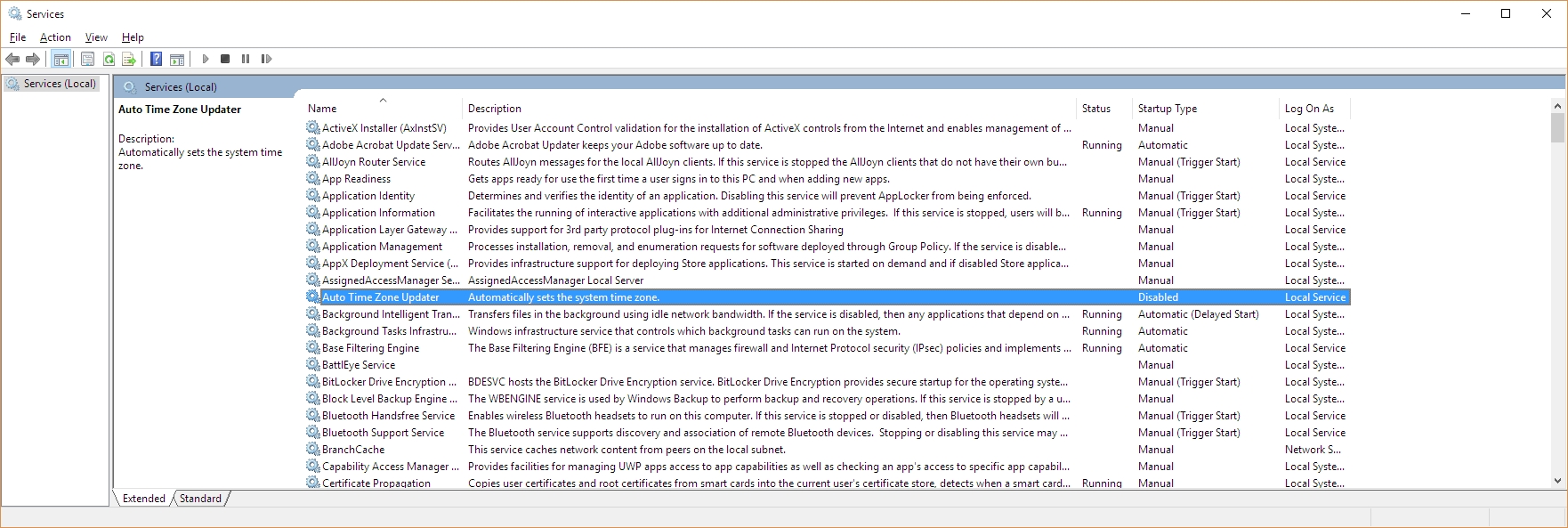
Services.msc
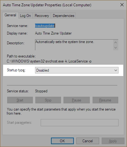
Set Startup Type to ‘Disabled’
That will stop the process from starting up, even if the system thinks it should. Remember, though, that if you *do* end up needing the service, you’ll have to go back into Services.msc and start it up yourself again, as this shuts it down completely. And I have to say it again: be careful about disabling processes. If you disable one that you need, or worse, the system needs, you may find your device acting very strangely, or in a worst-case scenario, software or even hardware not working at all. Even if you don’t disable anything, this is a good way and a good opportunity to learn what your system is actually doing.
Russian botnet master nabbed in Spain, extradited to US

This is a story that has been ongoing for some time. Pyotr Levashov, a well-known and well-established Russian cybercriminal who was arrested in April of last year (2017 if you’re reading this in the distant future – welcome alien overlords!) while vacationing in Spain, has finally been extradited to the U.S. Apparently cybercriminaling does pay well sometimes. The arrest was based on a formal U.S. Department of Justice indictment against him for, among other things, operating the Kelihos Botnet, a long-running, expansive, global botnet that bombarded the world with all kinds of spam for nonsense like get-rich-quick schemes and enhancement medications; if you’re interested, and you should be, you can read the DOJ press release about the indictment and the actual search warrant that allowed for their infiltration of the botnet.
Before we continue, let’s talk about what a botnet is. When malware, or bad software (get it? Mal ware?), is surreptitiously installed on your machine, either through a drive-by attack in which it’s embedded in a Flash ad, or you click on a link or file from a rogue email, or one of many other attack vectors, it will use your machine to carry out tasks without your permission, involvement, or even knowledge. And just to be sure, those tasks it’s carrying out are bad. It can use your machine to send spam, participate in DDoS attacks, store harmful or illegal files, and many other unethical / criminal activities, all without you ever being privy to what’s going on. When that happens, your machine is what’s known as a zombie computer, or more commonly, a bot. Now, imagine hundreds of thousands of these infected machines all acting in unison, for a common goal or under a central control authority. That’s a botnet. Here’s an effective graphic from Reuters that illustrates the architecture of a botnet.
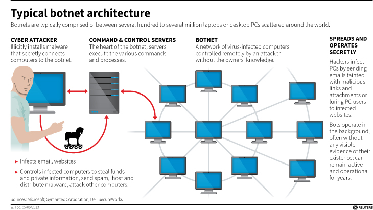
Typical botnet architecture (Source: Reuters)
I wanted to embed an interactive map from Arbor Networks that shows real time attacks happening right now, and provides historical data, but their embed code which uses iframes doesn’t work on WordPress. I find it strange a security firm would still be supplying iframe embed codes, but who am I to judge? No matter; there are other sites that provide similar information using their own honeypot networks, such as Kaspersky’s real-time threat map and the well-known Norsecorp map. Actually, I had intended to use Norsecorp’s IPViking map, however it is now run under HP’s banner, although powered by Norse, and I simply couldn’t get it to work in any browser. Their map linked above works beautifully, though.
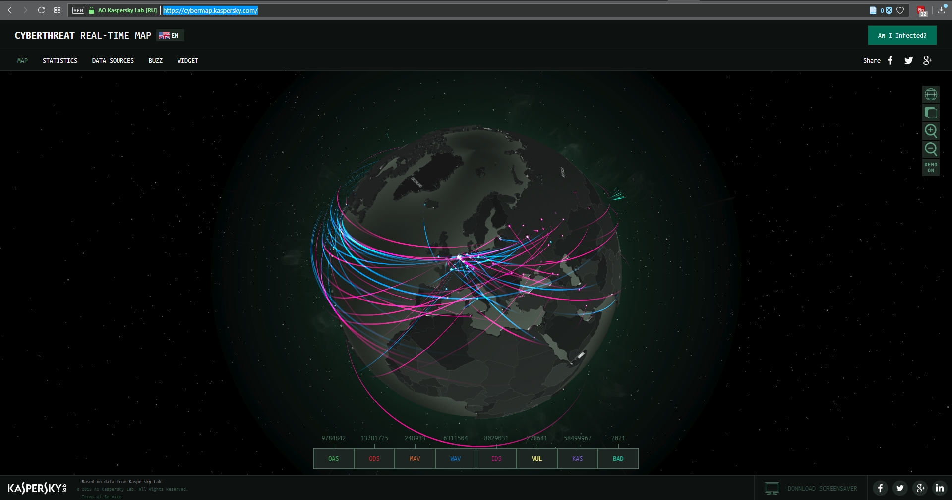
Kaspersky’s Threat Map

Norsecorp’s Threat Map
There are several interesting facets to this case: The first is, this guy has been around a long time and was one of the bad actors behind the Storm botnet that first manifested all the way back in 2007. That botnet was eventually dismantled by the combined efforts of Microsoft, malware firms, and the feds, a partnership and collaboration that continues to this day. We’ll come back to this particular botnet soon, because the architecture of these things is going to become important.
By soon, I mean right now! Another interesting aspect to this case is that the botnet was very sophisticated. It used a hybrid structure that is unusual for this kind of thing. Botnets are typically peer-to-peer, in which all the infected machines communicate with each other to coordinate and carry out their nefarious activities, or they use what’s known as a C&C, or Command and Control server, that oversees the whole thing and controls the botnet form a more centralized location. That allows better control and oversight of the bots.
Kelihos, however, was a hybrid, in which there was a C&C server, but there was also a peer-to-peer aspect as there was some autonomy in the architecture that allowed the bots to continuously update among themselves a list of secondary control servers to which they would report, and those would be directly overseen by the main C&C. This is in direct contrast to the Storm botnet mentioned earlier, which was pure peer to peer. A hybrid network also allows for rapid updates to, and distribution of, associated malware.
That leads to the next neat(?) thing about the botnet: It was aggressively and frequently updated. In fact, when a live sinkholing, in which the bots are redirected to to different targets that can then help track the bots or even deactivate them, took place at a 2013 RSA security conference, a new version of the botnet rapidly took its place which indicated that the creators were prepared for just such an emergency and had pre-planned a contingency.
And this was not just a spamming botnet. Along with pushing spam of both the email and desktop pop-up kind, it also stole bitcoin and targeted banks and other large industry outlets with industry specific malware that could rake in millions of dollars while running undetected. For botnet software, this had a wide range of functionalities, both general and specific, although for all it could do it was not hard to track.
The next interesting aspect of this case is Russia fought vigorously against Levashov’s extradition. Not by attempting to block it, but rather by filing an extradition request of their own based on crimes they say he committed in Russia itself. A smart move, regardless of whether the Russian charges are true or an attempt to protect one of their own, that is a clever way of approaching it. It didn’t work, ultimately, and Levashov is now in U.S. custody, but it was an interesting tactic to counter the original extradition request. Not only that, it has happened before.
A really interesting story all the way around, and I’m curious to see how it concludes. In the meantime, be careful, ensure your OS is up to date and fully patched, be sure you are running up-to-date anti-virus and anti-malware protection, try not to visit questionable sites, don’t activate or respond to emails from unknown sources, use an ad-blocker (uBlock Origin is my preferred choice, and I have no connection to them; purely my own opinion), and just generally practice safe computing.
OpenOffice Writer: Good, better, but not yet great
People are always looking for a free alternative to costly productivity software, and never has that been more true than with Microsoft’s Office Suite. While they now have their subscription-based, $99/year Office365 Software as a Service offering, it used to be that regular updates to Office could cost hundreds of dollars, especially if you were including Access in the package. People didn’t like the repeated substantial costs associated with new versions of software, and that was not a sentiment limited to Microsoft.
The thing is, while free options, substitutes, are often available, they are also often simply not as good as the software they’re attempting to replace. Consider GIMP (GNU Image Manipulation program). Intended to be a free option for those who don’t want to purchase Photoshop, as well as for those who would like to experiment with image manipulation and the like, it’s also much more cumbersome to use. Not that Photoshop is easy, but in terms of usability GIMP isn’t an ideal. Simply drawing a straight line is a process, dragging handles is awkward, finding the right tool dock can be confusing, and if you’re just experimenting with it to get a taste of what image manipulation software is like, that taste will be bitter. Even the name itself is difficult, with GIMP being an acronym for “GNU Image Manipulation Program,” and GNU itself being the awkward acronym “GNU’s Not Linux.” It used to be the General Image Manipulation Program, and I’m not actually sure when the name change took place.
Not that isn’t effective – it is. In fact, I often use it myself for the images on this very site that require some touchup, such as adding text or combining multiple images into one or adding illustrations to name a few, and I even have an academic license for Photoshop! Quick and dirty manipulations are easier with GIMP, but as a functional, full-featured piece of software it’s functionality, not so much usability, that drives the development of GIMP. For very simple things like batch resizing / converting, pixeling out info, or cropping, I just use the IrfanView image viewer, which is much more effective and easy to use for that type of thing. But not adding text. it’s terrible for that.

This is how GIMP starts up on my machine
So why do I mention all of this? A friend who recently lost her job needed to get her resume updated and out to potential employers fast. However, as she doesn’t make boatloads of money she had an older laptop and no Microsoft Office installed or available to her. She was trying to edit said resume in a reader, not realizing it doesn’t work like that, and without having the finances to acquire Office, she asked me for help.
My first bit of advice was to use Zoho online, a remarkably feature-packed online office suite that deserves its own, dedicated post, so I will add a followup soon with screenshots, samples and impressions. The problem is, they don’t offer a locally-installed solution and she doesn’t have Internet access, so that solution was out. I then suggested OpenOffice, a free Office alternative that has been around for a long time, and that I hadn’t tried out in years and years. I guess I should refer to it by its proper name, Apache OpenOffice, as the original OpenOffice, originally developed by a company called StarDivision, which was acquired by Sun, which was acquired by Oracle, no longer exists. Did you follow all that? It’s like a software soap opera. Anyway, OpenOffice was turned over to the Apache Foundation, which is dedicated to community-built open-sourced projects, and it has a staggering number of them. Their web server is, and has been for a long time, the most widely-used web-server on earth.
When I last used OpenOffice, long before it was taken over by the Apache Foundation, it was bad. This would have been back in the late 90s, and even then it couldn’t hold a candle to Office. The icons were unintuitive, the functionality limited, the compatibility wonky, it just wasn’t a good alternative. I’m glad to say that after twenty years it’s better than it was, it’s good, but it’s still not great and has one glaring flaw that really holds it back.
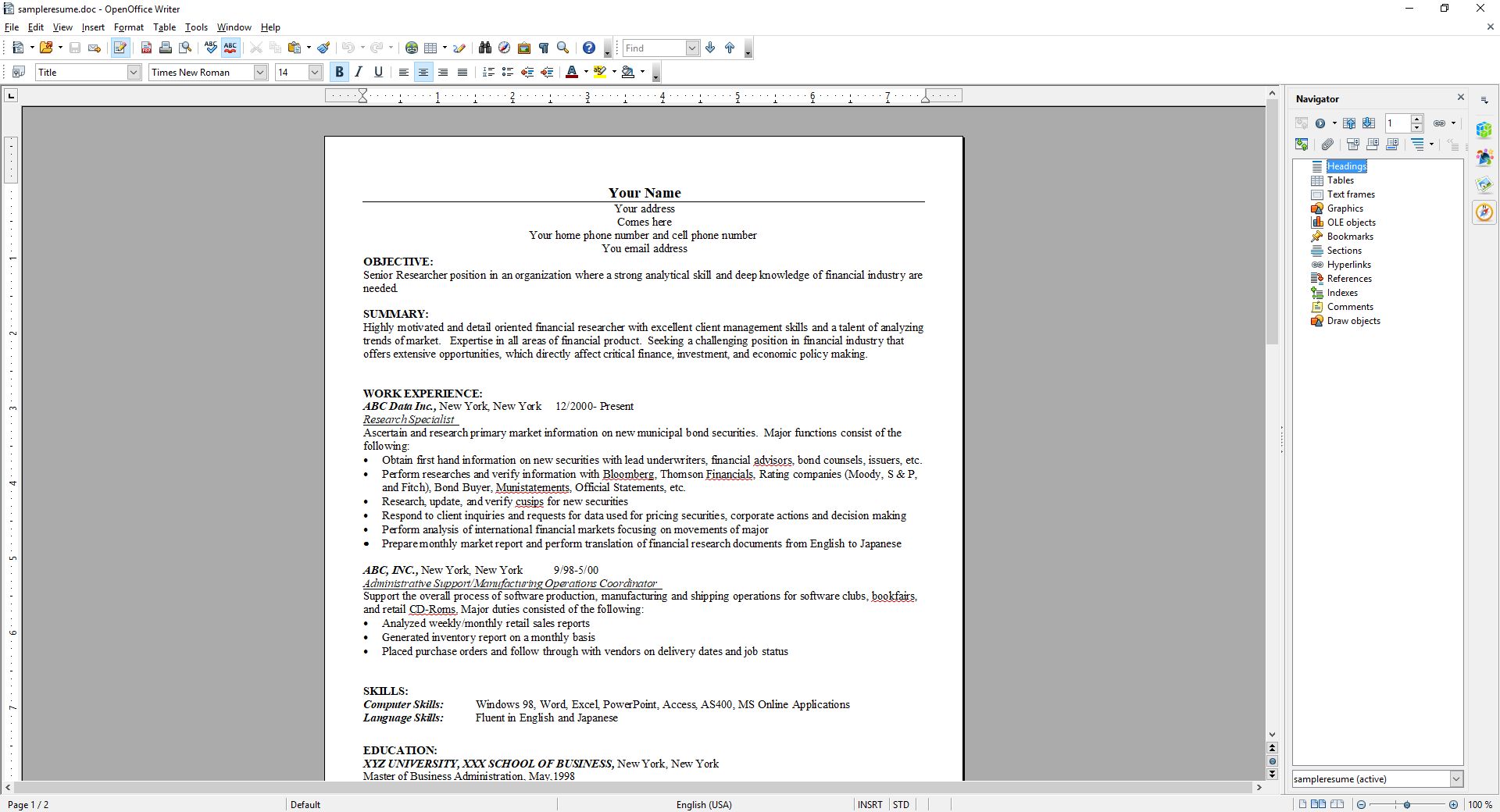
First, the good: The interface is much closer to what one would expect from a standard word processor. You can see in the image below the standard toolbar, which is also replicated in the ‘Properties’ dialog located in the sidebar. While the icons are much better, meaning much more standardized, the duplication of them across the top and side can cause issues. Functional and graphical replication is poor interface design, one you often see on webpages. And while the icons are generally much better, they’re not completely standardized. The top menu, however, uses the standard “File | Edit | View | etc.” menu with expected submenus under each entry (see ‘text boundaries’ image at end of post). You can also see in the below image(s) the icon for ‘Properties,’ one of four down the far right side, is a green and blue cube, bespoke for this program, while underneath it are the icons for ‘Styles,’ ‘Gallery,’ and ‘Navigator,’ which is ultimately used to move through the document itself via various elements. All of these are unique in function and design to OpenOffice.

OpenOffice Properties
OpenOffice Styles

OpenOffice Gallery
OpenOffice Navigator
It also has an extensive array of settings that covers every aspect of the program you could hope for, even how you allocate memory and VBA integration.

OpenOffice Settings
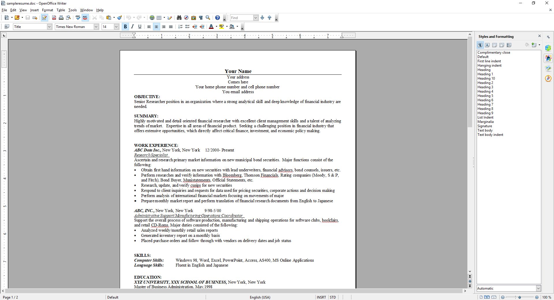
Using a sample resume I downloaded from the Internet, I tested how well it handled inserting elements, specifically an image and a table. This is something that can even trip up Word itself, but I am happy to say it handled both swimmingly, accurately integrating, aligning and formatting both with ease. The text adapted to any changes in size or position easily and the results were always pleasing. It also pops up a task-relevant toolbar to help further with fine tuning or further formatting the element being inserted.
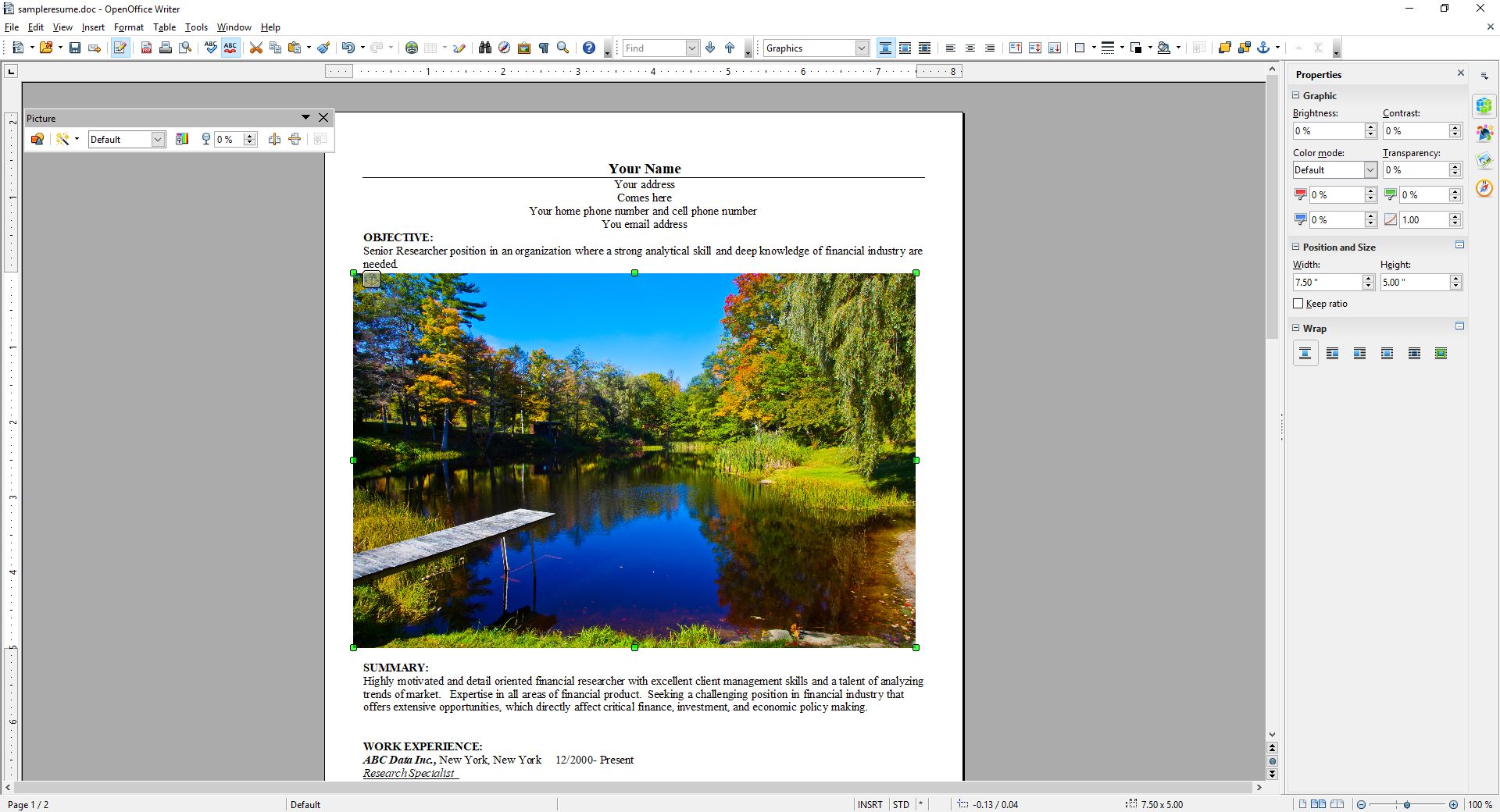
OpenOffice Insert Picture
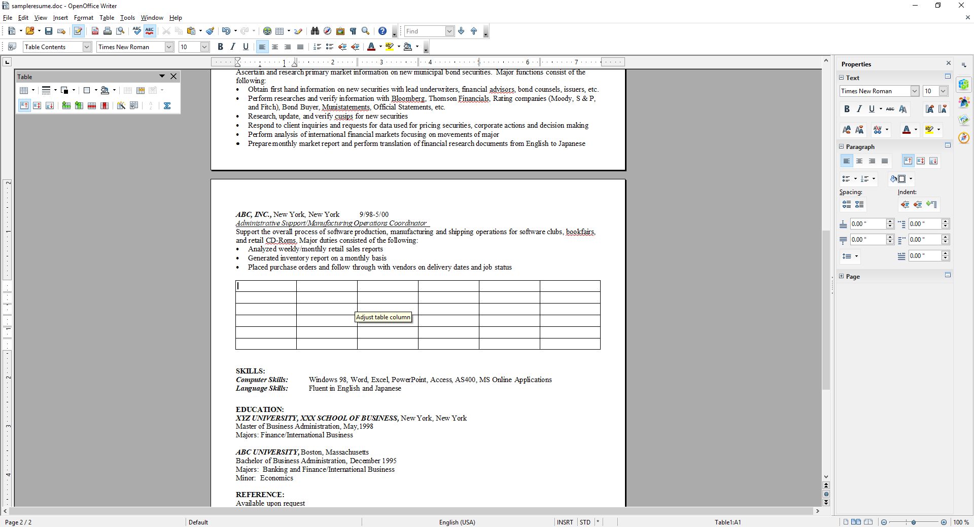
OpenOffice Insert Table
Again, after insertion both of them were easy to adjust and format, and the rest of the document was very responsive to those changes. While this post doesn’t cover all you can do with Writer (you can imagine how long a post covering everything you can do in Word would be, and it’s the same here), you can get an idea from the images, specifically the ‘Navigator’ image included above.
I’m also not a big fan of the text boundaries that are shown by default; they make the whole document look as though it is too small on the page. I get that they are trying to illustrate the margins as well as provide a quick and dirty print preview, but ultimately I find them distracting. Fortunately, they can be turned off completely (which makes it look more like Word, and the familiarity is welcome).
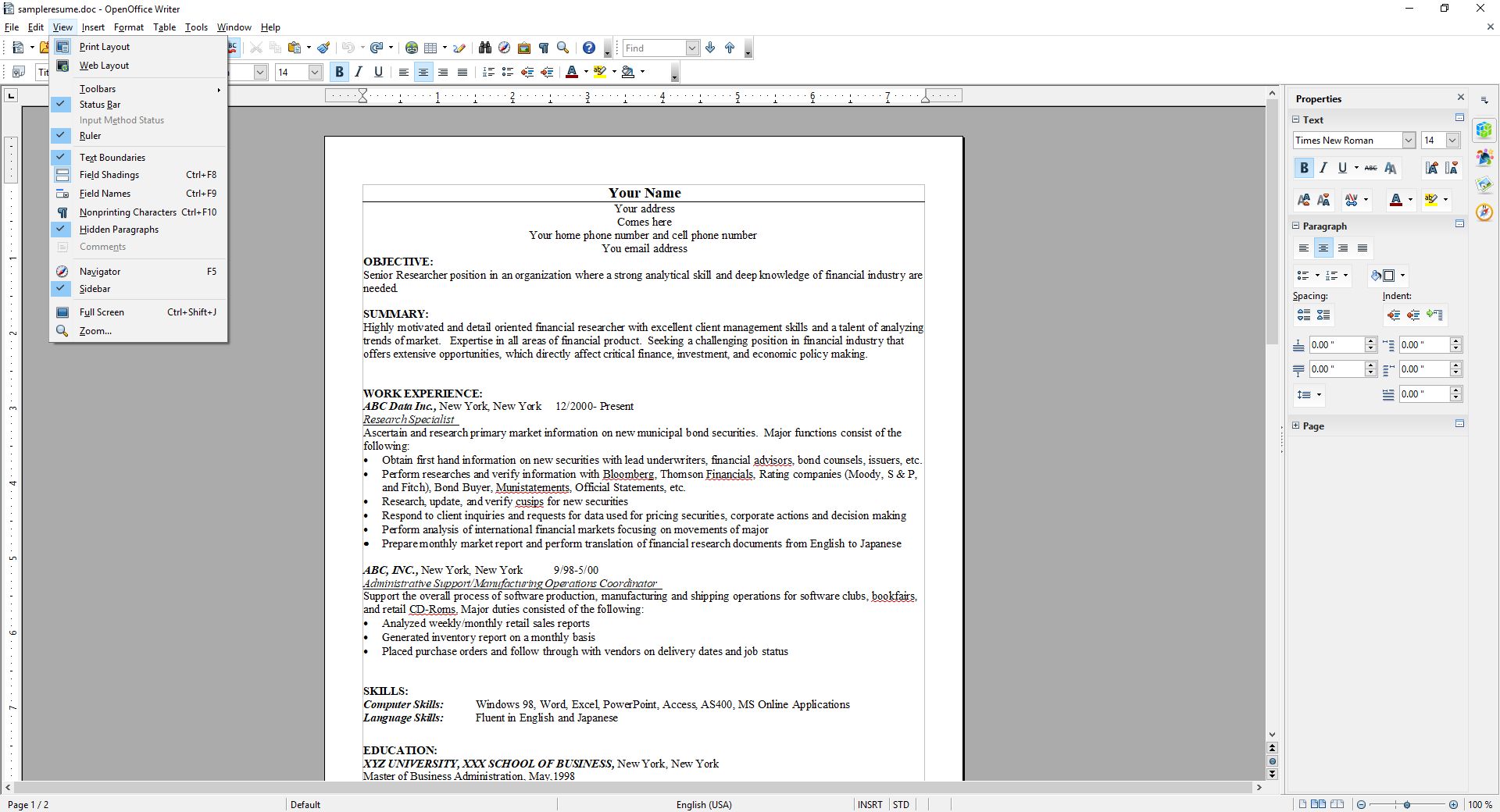
OpenOffice Text Boundaries
The two big problems with OpenOffice are, unfortunately, major issues that prevent me from recommending it completely, especially as there are other programs and online options that don’t have these concerns.
The first is an issue primarily if you are importing a .docx (Word 2007 – present) file to work on a document. If you create your document from scratch in OpenOffice, it works quite well and is feature rich enough to complete even if you are doing fancy stuff. On the other hand, if you’re importing in Word’s latest format, forget it – processing hidden Word formatting codes is not Writer’s forte. Writer will destroy enough of the formating that fixing it is not worth the effort, and copy – pasting without formatting and re-formatting is likely, but not always, the only viable option. Even so, the common outcome is that no amount of tweaking will right the formatting ship: You can recenter and re-format and unbullet and rebullet and tab all over the place all you like, but it will never get back to the way it was; it will simply not play nice with undoing damage from an import.
Building on that is the most glaring issue of all: Writer simply doesn’t recognize the .docx extension. You can’t save using that extension, only .doc, a format that hasn’t been used for about ten years. Writer has its own format, .odt, that is unique enough that trying to go the other way, and opening a Writer file in Word will also yield unfortunate formatting issues. Other alternatives like the aforementioned Zoho handle them easily, but not OpenOffice. In fact, when creating a new document in Writer, it asks if you want to create a new Text document, which in Windows or Mac has a specific meaning, and it’s not a fully formatted, functional, professional document.
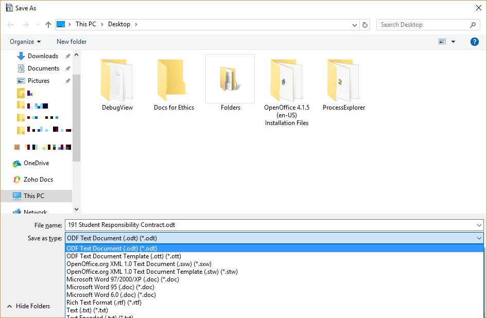
OpenOffice Save As
This post only covered OpenOffice’s word processor, Writer, although the other applications exhibit similar behaviors and limitations. They work well if you are working solely within OpenOffice, but not if importing or exporting.
I want to see OpenOffice succeed, especially under the Apache umbrella, but as of now I simply can’t recommend it as it is. That’s distressing, since I haven’t been able to ever recommend it over the last twenty years, although it’s always been very, very close. It works well on its own and with its sister programs, and has incredible potential, but the fact is it doesn’t play well with others, and until it does it simply won’t be a viable alternative.
And now it’s Opera’s turn

In a recent post, I lauded the new release of Firefox, known as Firefox Quantum, or Firefox 57.0 if you’re in to numbers. The release introduced new features and fixed many issues that have plagued it, in some cases, for years (memory leaks, I’m looking at you). One of the things I really appreciated was the ability to take a full-page screenshot that would capture the whole page, regardless of how much of it was off-screen. For someone like me who uses screenshots in class and on this blog frequently, it’s a godsend.
Having said all that, I also mentioned right at the beginning of that linked post that I’m an Opera guy even though the new Firefox has really narrowed the gap, and since Opera just released version 50.0 with some features of note, I thought it would be only prudent to mention a couple of them here. It won’t get the same coverage as Firefox because it’s not as significant of an upgrade.
Indeed, I’m only going to mention a couple of its features: full-page PDF capture and anti-Bitcoin mining technology.
As I mentioned, Firefox allows for a full-page screencap of a webpage, even if you can’t see it all in the browser window, and the cap is then saved as a .jpg image. As I mentioned, since I use screenshots extensively in my classes and on this very site, that’s invaluable. Now, Opera has the ability to do the same thing except it captures the page as a pdf. It works perfectly, I’ve had no trouble at all, and I can see how it would be useful, especially as opposed to a .jpg. If you wanted a hardcopy version of a recipe, or a series of lessons, or set of instructions then it’s ideal. If you wanted to have a permanent copy of a webpage, or send a copy of it that could be used at a meeting or for whatever reason can’t send a link then it would be very useful there as well, as it would certainly be easier to read then an image. I’m quite impressed with its functionality, and it offers a nice other option alongside Firefox’s full-page .jpg image capture. Both options are fantastic, work flawlessly, and definitely have their own specific use cases. The image below shows a multiple-page post from this site that was saved as a pdf and how it appears; it’s exactly like reading the site itself, but without links. I should also add that Firefox has an advanced ability to select page regions for capture and editing features, a feature not shared by Opera.

Reading a full, multiple-page post as a pdf
The other interesting feature Opera has developed is anti-Bitcoin mining technology. Bitcoins are obviously all the rage, and whether that’s because of the nature of buzzwords or legitimate hype, mining them (a topic far beyond the scope of this post but you can read about at this obvious site) requires extensive use of a PCs resources, somewhere in the neighborhood of one hundred percent, and while smart people will simply build dedicated machines for the task, other smart but misguided people instead want to use yours, and will hijack it through scripts to do so. The obvious downside is that your machine will slow to a crawl and use up insane amounts of power while it tries to mine Bitcoin for someone else. Never fear though, Opera to the rescue. According to their blog, simply turning on their built-in adblocker – another nice feature by the way along with their built-in VPN – will prevent drive-by Bitcoin-mining hijackers.
By the way, I say Bitcoin as a proprietary eponym, like Q-tip or Kleenex, however it’s any type of cryptocurrency mining that gets blocked, and Bitcoin is hardly the only one out there. I should just start saying cryptocurrency as it’s the better, general term, and I’m sure someday I will. Just know that there are many viable brands of this digital currency, but that’s a post for a later time.
So the eternal tug-of-war between Opera and Firefox continues, at least for me, and I couldn’t be happier. I’m thrilled at the way they’ve developed and hope they both keep pushing browsers forward.
The new oculus home and store experience

Facebook-owned Oculus released their Rift Core 2.0 software a couple of days ago, completely revamping the out-of-app experience users have when they don their Rift headset. It’s a vastly improved experience over the original Oculus home (which wasn’t all that bad, to be honest); much more feature-rich, streamlined, and user-friendly, however it is still clearly in beta, which is a good thing because it is also still, bafflingly, missing some foundational functionality. According to the Oculus developer blog, there is much more coming and I am very much looking forward to it.
I have made a video, embedded at the end of this post, however that was not without some strange difficulty. You see, when you are in a VR app, the app is automatically mirrored to a window on the desktop, but not when you are in Home or the store. For reasons we may never know, the developers made that window a hidden window, and it required a third-party app, cleverly named HomeUnhider, to make it visible. I would have used the more popular OculusMirror.exe, supplied with the Oculus software itself, however unlike everyone else on earth, my Oculus program folder was empty, with none of the software that was supposed to be installed along with the core experience, and it’s not available for download.
“No problem,” I thought confidently, “I’ll just use HomeUnhider.” Great idea, except HomeUnhider doesn’t work with the new beta experience, giving an error that reads ‘Oculus Home not found.’ It required a complete uninstall and reinstall of the Oculus software, but I did then get the mirror program that allowed me to capture the video (for those interested, the complete path is C:\Program Files\Oculus\Support\oculus-diagnostics\OculusMirror.exe). Camtasia then proceeded to cut off the bottom bit of the video so you can’t see the dashboard as much as I’d hoped. It’s also a weirdly low-res video, which is strange as I use Camtasia a lot and don’t normally have that issue. Here’s a pic of the original Oculus home, lifted from the Windows Central forums, to set a baseline.
Original Oculus Home
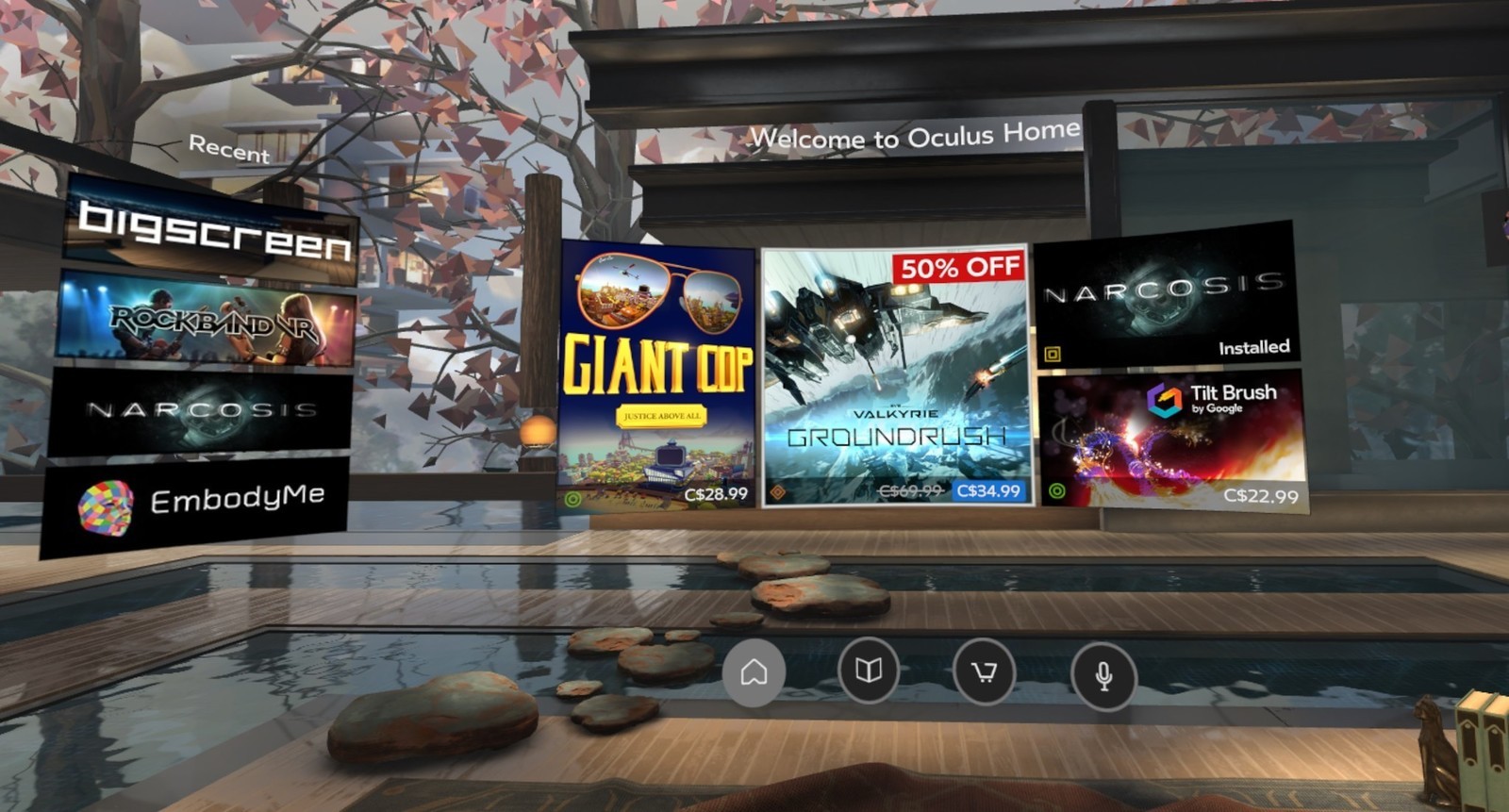
As you can see, it’s not bad. It has a nifty, pseudo-futuristic-while-simultaneously-rustic vibe going on, and the home and store functionality is combined into a single interface. You can see yourself, your friends (yeah, right), highlights from the store, and recently accessed apps. The image is actually an older version of home; it had been upgraded from the design you see in the image above, with additional navigation, categories, and so on. It looked generally the same, but with some additional functionality. Of course, you could look around your home if you just wanted to chill, as the kids say.
In the just released beta, however, it has been completely revamped. Your house now sits on what appears to be the cliffs of a…Mediterranean, perhaps, or maybe Spanish inlet, part of a larger coastal village, with your balcony looking out over the water, which also happens to have some pirate ships. Can’t argue with the view!
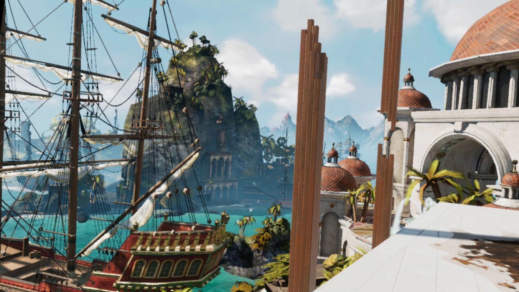
My new (virtual) view
There are also some activities you can do, such as shoot a bow and arrow at nothing in particular, shoot what appears to be a virtual incarnation of the Sega Master System Light Phaser (which could be dangerous in the wrong hands) at similarly 8-bit targets, or lob golf balls into the water. For being such simple activities, they’re oddly fun. You can navigate around your house, something you couldn’t do before, and you can now do some limited decorating. By selecting different patterns you can change the look of the ceiling and walls, and other accouterments can be placed around as well. The carrot here is that by playing games and using apps, or simply spending time in Home, you’ll earn additional items and decorations that you can use to further spice up your space. And don’t worry, there are no lootboxes here.
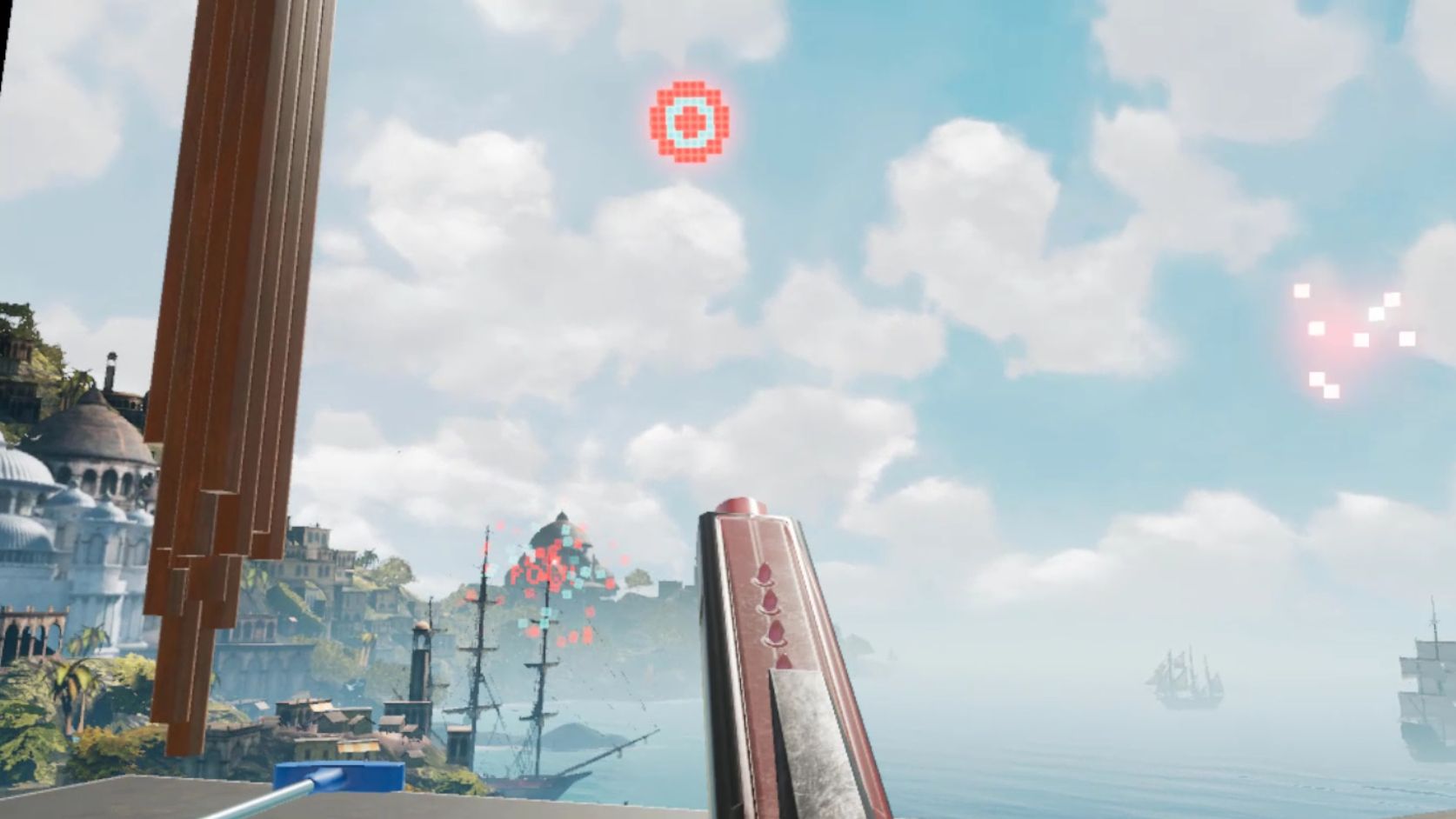
Shooting 8-bit targets
I suspect that there will eventually be many more ‘homes’ from which one may choose: On the developer blog linked earlier, there is what appears to be a house in outer space as opposed to the seaside location it’s in currently, and my guess is there will be more than that. The blog states they’ll be rolling out content over the course of the next year, and I suspect further on past that. Hey, Sony’s Playstation Home may not have been a hit, but the homes you could buy were spectacular, and it never came out of beta! I can only imagine what it will be like if we can get homes like that in VR – I’d buy every single one. They even had one that was completely underwater with whales and whatnot swimming outside massive windows…Now I’m nostalgic and I can’t find a single picture of that house, so instead here’s a picture of an underwater, Bioshock-themed apartment you could get. Still pretty impressive, and apparently there’s some weird version of Playstation Home that still exists on the PS4.
Bioshock Apartment from Playstation Home
GLORIOUS UPDATE: It turns out the environments are already available! I wasn’t aware you could scroll through decoration options within categories, however I began to suspect something was up earlier today when it said I had 78 objects but was only showing a few. After figuring out how to scroll, guess what appeared! That’s right: A space environment, and my new favorite, a city environment called ‘Vertigo.’ I made an additional video just to show them. They’re very impressive, and now I can’t wait to see the others that I’m certain will be available in the future – fingers crossed for an underwater theme!
So back to Oculus – there is the new dashboard, which I think is a huge, and much needed, improvement. It now curves around you like a futuristic control panel, offering access to settings, recently used apps, some status info, the store, and social info. It’s easier to use, especially if you’re standing up; using it while sitting requires you do some contortions with your wrists to get the pointers in the proper place. There is also a Desktop button that mirrors your monitor right there in VR, and if you have multiple monitors it will ask which one you’d like to see. The insanely nifty thing about that is that you can pin programs to the curved dash just like you can with the Windows or Mac taskbar, and even pull windows off of your desktop and pin them right in the air in your virtual house! They’ll follow you around – you can watch YouTube videos, play a game, browse the web, all as you mosey through your virtual environment. It’s an incredibly useful feature, however you can’t pin them, say, to the wall like a picture, which I think would push it over the edge into unparalleled awesomeness. Rather, they hover right next to you, although they can even overlay over an app you’re using, so you never have to be away from that admittedly very important video that finally proved the existence of life on another planet.
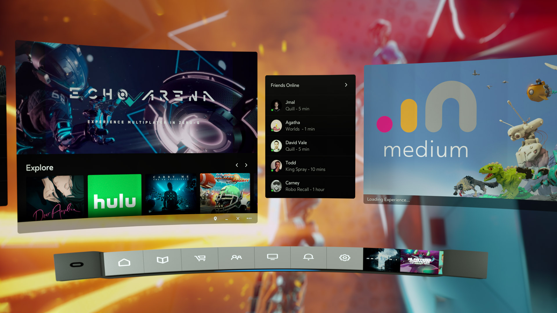
Oculus Dash (from Oculus – notice the different home in the background)
The store has been separated out as its own location, designed as a post-modern, I don’t know, office lobby? There’s a very natural theme to it with an Oculus-branded waterfall, wooden curved steps on either side of the round room, metal balls rolling along tracks under a glass floor, and you can even see silhouettes wandering around behind the upstairs windows. Oddly, and at the same time pretty awesomely, if you turn around you’ll see a very futuristic, yet also immersion-ruining unanimated cityscape. No blinking lights in windows, animated billboards, blinking stars, nothing. But it is an interesting contrast between what’s in front of you and what’s behind, one you can see below.
The new store location

Looking behind you in the store
The store functionality is generally the same as it was before, which is a problem. They have finally added video previews of apps you’re viewing, something the Gear, the mobile version of the Rift, has had forever – the fact it’s been added to Rift now is just playing catch-up. Additionally, although it’s not an addition at all, it’s a maddening omission, there is still no search function, which is as basic a usability function as there is, especially when the list of apps can, in some categories, go for 100 pages! While apps are normally listed six at a time, their ‘Gallery’ titles, which are described only with the very vague ‘A broad, less-filtered collection from VR creators,’ are for some reason listed three at a time, and there a hundreds of them! I also have no idea what ‘less-filtered’ means, and when I clicked on ‘Learn More,’ Oculus crashed and wouldn’t restart without a reboot or taskkill because its background process simply wouldn’t quit, even from TaskManager. Anyway, you can sort, but you may still have to scroll through pages and pages and pages and pages of apps to get to the one you want.
There is also no browser, something its little brother the Gear has had for a good while now. It’s very strange; these improvements to Home and new environments for Home and Store are great, but it still lags behind the version that you use by plugging in a phone. The Gear version of home also has voice search, and other things like events, highlighted videos and better social integration, something that even I, with no friends on this or any other game platform, can see is much better on the Gear. That the Rift still lacks the basic functionality that its phone-based counterpart has enjoyed for so long is unforgivable. I’m overjoyed at this new Rift experience, and I have very high hopes, not only for its continued future development and what that will bring us, but also that it can simply be brought on par with what you would expect would be its much less capable sibling.
It’s important to also add that regardless of my complaints and concerns, Oculus is light years ahead of Valve / HTC and their Vive in terms of the interface. The Vive interface, a Frankenstein-like mashup of three, maybe four, maybe as many as seven separate interfaces (it’s hard to tell, it’s so badly designed), is overpoweringly difficult, cumbersome and unintuitive to use. So awful is the Vive interface, and impossible to navigate, that it may be, and I say this in complete seriousness and without hyperbole, the single worst interface I have ever used. In my line of work I use a lot of terrible interfaces, so Vive has really accomplished something here. Not only that, Steam VR incorporates beautifully into Oculus, so there’s no need to use the Vive at all, at least not in my household.
Below are two videos from Oculus, one highlighting the new Home and its potential options for customization, the other introducing the new interface which they call ‘Dash.’ The third video is the one I took on my own Rift in Home and the store.
The new Firefox browser seems pretty good so far

I’m an Opera guy. Not an ‘opera’ guy, although I have nothing against that particular type of theater, but an Opera browser guy. Many years ago I was a Mozilla Firefox guy, especially as they rose from the once-great Netscape Navigator, however for many years now Opera has been the Samsung Galaxy to Firefox’s iPhone; in other words, Opera always had features that Firefox offered much later or didn’t have at all except through add-ons, and was simply faster, more responsive, more stable, and easier to use. Not only that, Firefox has been infamous for its memory leaks, a problem it was never able to solve (Chrome, too, let’s not forget about Chrome). I should also mention in the issue of fairness that plugins could exacerbate the problem, however the base browser always struggled with the issue as well.
Now, however, Mozilla has released the latest version of its Firefox browser, named Firefox Quantum, and it is the first major update for the browser in almost thirteen years; you can read the blog entry straight from the horse’s mouth here. They claim it’s faster, better, has more features, is better able to manage resources, is compatible with new and emerging web technologies, and has many options for customization and configuration. It’s been redeveloped from the ground up, and it shows.
I gave it a run to see how it is, and it certainly does appear to be better. Very fast, very responsive, clean interface whose elements can be dragged-and-dropped to rearrange them anyway you like, which is very nice. I started up some test sites to see how they loaded, including UCI’s homepage, IS301.com, Amazon, Plex’s homepage as well as my Plex home server, Hackaday.com, eBay, and Rotten Tomatoes. I also left up the default start page.

Firefox Quantum
The tabs loaded quickly, although plex.tv and this site took longer than expected, however while comparing response times with Opera, they loaded slowly there as well so the problem was obviously server-side and not an issue with the browser itself; testing them later resulted in equally speedy load times. That wasn’t the case with actually playing videos using Plex, though – Firefox took much, much longer to buffer than did Opera, almost three times as long; I was unable to discern why but the issue was repeatable and consistent. Barring that anomaly, everything else was very snappy and without hesitation. One thing I should add about measuring response times: It is very difficult to do client-side, and is often done via what is known as a stopwatch test, doable in code or with an actual stopwatch. Needless to say, I find those both very unreliable and so went with my own observation to get a general sense of how Opera and the new Firefox compared.
Firefox also has many new features, including deeper integration of Pocket, a personal web-content aggregator that Mozilla bought and integrated a while ago. I have never used it, but can understand how it could be quite beneficial for some. It also has an excellent snapshot feature that allows you to take a screenshot of all or part of a page and save it locally or share it to their cloud service. I don’t know why someone would use the latter, but the former is something I use quite a bit with Opera, and as we will see Firefox does it much better. There is also the aforementioned interface configurations, the library which is just a collection of your browsing history and bookmarks, syncing across devices, and more. As the header image shows, they even have a new icon!
Firefox Features
Of course, that’s where the important issue comes up. The fact is, while the new Firefox browser appears to be much faster, more responsive, more stable, everything I said about Opera earlier, what that essentially does is bring it on par with Opera, except in the case of Firefox’s better screenshot functionality which I will discuss later in the post. I tested each page I loaded in Firefox against the same page as it loads in Opera (with three times as many tabs open in Opera, no less) and the performance was the same. Opera wasn’t better as it had been in the past, it was simply the same. That’s a comment on both Firefox and Opera; how well Opera has been in the past, and the catching up Firefox had to do, and did quite effectively and impressively, to reach it.
As mentioned earlier, there is one big difference in which Firefox easily takes the lead, and regarding a feature I use often – the screenshot feature. Both Opera and Firefox have had this feature for some time, and as stated I use it frequently, although now Firefox’s implementation is much better (MUCH better) – it can identify sections of a screen, such as a headline or picture or other element, as you move your mouse, and snip that out, while Opera requires you to adjust a selection box. Additionally, Firefox has the neat ability to capture a whole webpage as a snapshot, even if parts of it are not visible in your browser – the image below was taken in Firefox even though the entire footer and about 20 percent of the header were not visible when I did. That is a great feature, one that surpasses Opera’s full-screen (note: not full-page) capture, and might be the clincher for some; it almost is for me.

Full-page snapshot using Firefox
Opera, on the other hand, allows for screencaps to be marked up in a very limited fashion right in the capture window, something Firefox does not, however this is less of an issue for me as I usually use GIMP if I need to make extensive edits, and IrfanView if I need to make any size adjustments, batch actions, or simple crops. Good thing, too, since all Opera allows one to do is add some arrows or stickers; Regardless of what Opera says, it’s not actually editing at all. In terms of flexibility, Firefox is the clear winner in this category.
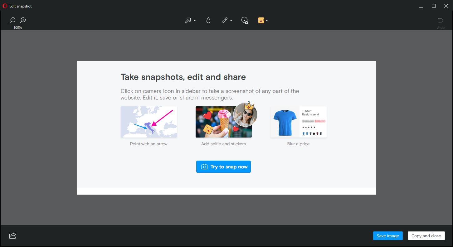
Nice try, Opera
For these reasons, I can and will whole-heartedly recommend Firefox to anyone interested as I think the improvements are significant, but I won’t stop using Opera as it already had many of these features, as well as unit conversion that happens automatically when you highlight a measurement. It also has a customizable, tiled home screen that I find to be very useful; it’s one of my favorite features of Opera and the one I use most often. The new Firefox has something similar, with a single row of six, or double row of twelve, small tiles representing your ‘top sites,’ which can be edited or added to, but not rearranged; ultimately, it’s not as configurable as Opera’s landing page, and very curiously its screenshot functionality is disabled there also.

Opera start page

Firefox Start Page
Whichever you prefer, they are now both very good browsers, with the choice being one left up to the preference of the user. I haven’t used Firefox in forever, but I am very pleased to see it in this new form and I hope it continues to get better and better. As I mentioned earlier, I can wholeheartedly recommend it now, something I couldn’t do before, and I will likely use it as a back up browser in place of Chrome, my current backup. There are of course many other choices in browsers, including Vivaldi, Pale Moon (don’t let the terrible web page scare you), and Brave, to name a few, as well as the more well knowns, however here I was only comparing the new Firefox to my main choice. Speaking of which, I was just notified that an update is available for Opera! Here we go…
Animate your desktop
I’ve always wondered why we don’t have animated wallpapers for desktop machines. After all, if Android phones can have them, why not the big guys? There are valid, pragmatic reasons; they’re distracting, they drain system resources, and they can be hell on a laptop battery or other device that isn’t plugged in. But perfectly reasonable caveats don’t interest us, we know the risks, we want animated wallpapers, and now we can have them.
Incidentally, the idea of animating desktop elements has been around forever. Back in the early 1990s there was an add-on program for Windows 3.1 called Icon Hear-It that added animated cursors, animated icons, and additional sounds to the GUI. Of course, that early in the computer revolution, none of us realized how truly gaudy and resource-intensive all that nonsense was.
But a tasteful, animated wallpaper can make for an elegant display. I was going to talk about the way I do it on Windows 10, but I suppose I should also talk about Windows 7 and 8. Regardless of the version of Windows you are running, you’re going to need a third-party program; no OS offers animated wallpaper functionality. For the latter versions, there is a program by Stardock called DeskScapes that provides a selection of animated wallpapers, and even allows you to create your own from gifs, videos, or other animations. It’s not terribly resource dependent and ran relatively smooth on Windows 8 in a Virtual Machine.
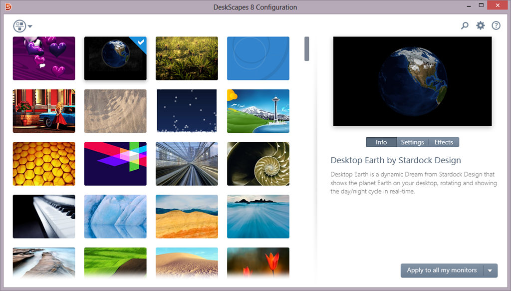
Stardock Deskscapes
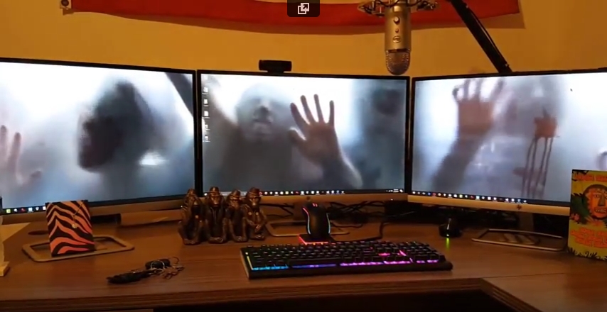
I recently learned of another program, however, called Wallpaper Engine, that is (supposedly) designed to have a very small resource footprint, and is even available through Steam for a measly $4.00 (as opposed to DeskScapes’ $9.99). Another big plus for it is that some of its wallpapers support triple-monitor setups, which I have, so I wanted to look into it further.
It has been working quite well so far. Interestingly, in my graduate design class this week we are discussing ethics, and it turns out that there are some ethically questionable ways in which this program can be used. For example: Of course the first animated wallpaper I downloaded was of zombies. But it turns out they’re not just any zombies, they’re from a video created by a company called AtmosFX (formerly Atmosfear), which creates videos to be used around Halloween by projecting them on a sheet hanging over a window or similar. They do have a lot of neat videos, I’ve considered using them myself and buying a projector just for their videos, and you may seen have seen some on display around that time of year at Spirit Halloween.

AtmosFX decorations
Apparently, AtmosFX has filed a complaint with Valve, who runs steam, and with Wallpaper Engine, stating that the background is copyrighted material and shouldn’t be downloadable for free with their program, although Wallpaper Engine didn’t provide it, only the capability to create it from existing video. Therefore, determining who is actually for the alleged copyright violation, if there is one, will be difficult. I suspect Valve will simply remove the offending wallpaper from the Wallpaper Engine workshop, however there are many, many, MANY more options for one to choose from, with the expected heavy emphasis on things like Anime and, you know, related things.
Here is a video of my three-screen setup running the zombies animated wallpaper. Also note: Not all wallpapers work across three screens, and I have had some real problems with scaling, in which Wallpaper Engine will only show the top 40 percent of the animation rather than scale it properly across screens. Single-screen setups and most dual-screen setups do not have this issue (as far as I can tell).
Poke the Bunny!

Before I get to the main thrust of this post, it’s important to provide some perspective for those unfamiliar. As you all should know, my Ph.D. is in Human Computer Interaction, my undergrad in Cognitive Psych, I teach multiple interaction design and interface development and analysis courses (game design as well!), so when I see a well-designed interface, or anything that’s inherently usable as a result of its construction, it just makes me feel all giddy inside.
What, then, is a good example of a well-designed interface? I’ll show you. It’s an example I’ve been using for some time, all the way back since it was a Flash animation on a website called platinumgrit.com, which was a showcase for an Australian Flash animation series. The site is long since dead, or more appropriately, dormant, but it once hosted what I consider to be the best, most pure example of interface design I have ever seen. In fact, I was reminded of it because of a conversation thread on a message board for my graduate class in advanced design and prototyping.
It’s called, no joke, Poke the Bunny.

Push it!
Before I show you the rest of interface and give away the surprise, let me explain why it is so good. One of the cardinal rules of interface design is clarity; speaking clearly to the user. Don’t label links ‘click here,’ don’t label buttons ‘push me,’ don’t call an error ‘error 0x14323929.’ State what the user can do, and make it clear what the consequence of that action will be. Of course, cardinal rules are meant to be broken since so many interfaces break them.
But not this one. The interface is comprised of exactly three elements. The first element is a graphic of a bunny that frankly looks pissed off. The next is a fist with an extended pointer finger aimed squarely at the bunny’s backside. And the third element is a button labeled ‘Poke the Bunny.’ It is clearly labeled in reference to its action. It leaves no doubt or question in the mind of the user what it’s function is and what will happen when you push it. Not only is it a beautiful example of interaction design, there is such a direct link between all the elements on the screen that the role of each is immediately apparent, specific, and isolated. It’s the most pure interface I’ve ever seen.
Not only that, the effectiveness of the action/response is very satisfying. Because it’s easy to use, obvious to figure out, impossible to get lost, it makes the actual use of the interface, even though it has just a single interactive element, a joy to use. Even though all you’re doing is poking the bunny, the nature of the design combined with the absurdity of the situation make it oddly addicting and fun. And that is a desirable goal for an interface; You want it to be fun, exciting, enjoyable, interesting, educational, all the positive aspects that make people feel good should be elicited from your design, And in this case, it is. it’s just plain fun.
(There’s also a surprise, though, if you work for it).
And it’s available on Android! As I mentioned, the site has been sadly dormant for some time, however I was overjoyed to discover that if you have an Android phone you can download it from the Play store! There used to be a version for iOS, however I have the sneaking suspicion it’s no longer available (although I don’t know. If anyone can check I’d appreciate it). It’s a shame if not; it’s a brilliant example of exactly how an interface should work.
The Android version isn’t quite as exceptional as the original Flash app; the skeumorphic nature of the button isn’t there, the font is unnecessarily cartoonish, and sound isn’t quite right. Still, the pure core of the interface is rock solid.
So with all of that fanfare, I present a video of Poke the Bunny recorded off my very own Note 5. If you’re on Android (or iOS and it’s still available), then download it and give it a try. You’ll be hooked, I promise. Poke the Bunny!