

Becoming a designer
Boy, it’s been a while. An oxymoronic combination of being lazy and busy, I guess. Anyway, for this post I wanted to talk about design. It’s a topic that comes up a More »

Support for Windows 7 ends today
It is a sad day, as Microsoft is officially ending updates and security patches for Windows 7, the popular OS still being used by a large majority of PCs. Windows 7’s popularity More »

Returning Home: World of Warcraft Classic Comes Online
On August 26th, fans of the original World of Warcraft (henceforth referred to as WoW), and those who are just curious to see what all the hubbub is about, were finally able More »

The Lawnmower Man, and Vintage CGI
Inspired by a couple of Reddit forums to which I am subscribed, VintagePixelArt and VintageCGI, and being a fan of all things historical as it pertains to technology, I uploaded to the More »

Jony Ive leaves Apple
As someone who teaches extensively about design as it intersects with technology, and is also a computer and technology historian, I am conflicted about Jonathan (Jony) Ive leaving Apple. Mainly because he’s More »
Becoming a designer
Boy, it’s been a while. An oxymoronic combination of being lazy and busy, I guess.
Anyway, for this post I wanted to talk about design. It’s a topic that comes up a lot in my classes, especially ones that have a heavy design component such as Human-Computer Interaction, The Capstones (the graduate version of which is actually in a Masters of Human-Computer Design and interaction program), and all game development courses. The word itself is used in the title and description of many of the courses we offer, including courses I teach, and that’s true for any university.
I also want to clarify that I’m not talking about a particular type of design. As I tell my students, there are many: Interior design, fashion design, architectural design, landscape design, industrial design, automotive design, product design, Interaction design, and the list goes on and on. Regardless of the type of design being discussed, the challenges are the same: Working with a client, trying to come up with a functional and aesthetic solution, arranging items and elements in a useful and pleasing way, and so on, and each of those has its own considerations and concerns.
Keeping all of that in mind, I am going to share a personal design rule with you that I tell all my students, and I feel it helps them think about their own approaches to design and helps coalesce the ways in which they think about it.
‘You should be able to sum up your design philosophy in one word.’
In other words, your core design philosophy.
This is very important. It’s how you know you have come into your own as a designer: created your own method, your own tastes, and most importantly, your own style. Just as a client will go to (or return to) any designer because they know that designer’s style, once you have determined your one-word philosophy, so will they return to you, and they will know why.
You don’t need to do this right away. When you are just starting out, you are unlikely to have a design philosophy, or a unified approach, and that’s fine. On the other hand, you may feel you have one already, however it is ripe for the influence of others you may be working with, those who have been designers for a long time, and the design experiences you are yet to have. As you go on, you will start to notice that you gravitate towards certain incorporated styles yet utilize others much less. You’ll work with other designers, including those who mentor and guide you, and learn from them what works for you and what doesn’t; to agree or disagree with them is expected. For example, you may find that you consistently return to a modernist approach and design, or one that’s more traditional, or perhaps you’re more form over function, or maybe function over form. Maybe you prefer smooth surfaces over textured finishes. You’ll find you tend to prefer things be one way, as opposed to another designer who prefers them the other way around. And all of that is how it should be. It’s why a client would come to you as opposed to another, or go to them instead of you. They’ll know and understand your approach and feel you’re a perfect fit or not, and either in completely acceptable. You must be a proper fit with a client.

Eventually, your design philosophy will have formed, an then you’ll be able to describe it in one word. And that’s how you, and everyone, will know.
It is a clear, unambiguous, easy to digest summation of everything that you will do during the design process. It helps everything, even before a client has decided to come to you.
However, even after all this, there are some important caveats.
First, because you have a core design philosophy does not mean you cannot veer from it. Indeed, you should be able to accentuate and compliment any of your designs with elements and influences outside of your scope and sphere. Just because something is traditional, doesn’t mean it can’t also have a modern influence. If something is meant to convey playfulness, that doesn’t mean it can’t also have an industrial side. Nothing is out of bounds in design; your philosophy will happen naturally, organically, but the very nature of design is creativity and being able to work outside your bounds is, in my opinion, one of the hallmarks of a great designer.
Second, your core philosophy can very easily change. You don’t have to pick one and stick with it until the heat death of the universe, fervently gripping it and refusing to let go. Tastes change, popular ideas change, what’s fringe and what’s common and what’s acceptable and not changes. Design is always, and rightly, in flux. It would be antithetical to design to not grow and change and reimagine what your own tastes and styles are, and what you bring as a designer.
Likewise, you don’t need to replace your approach whole hog either. You can bring in new influences, adding them to your current tastes. Or, for whatever reason, you may wake up one day simply wanting to try something new, to branch out, to attempt a new tack, and that’s also good. However you grow, or morph, or change, it happens for a reason, and that should be embraced.
Unsurprisingly, that’s true of any creative medium. Consider a musician or band. You’ll know their genre (in other words, their core style), but as you listen to more of their work, you may hear additional influences coming to the surface, hear new styles and techniques, and in fact when that happens with popular recording artists it’s often described as the artist or the band ‘growing as an artist.’ Just because they may be rock or rap or blues or whatever doesn’t mean you won’t hear other sounds mixed in as well, especially as they continue to write and record.
I’ll wrap this up by giving you my own design philosophy and how it has changed over time and how I sometimes veer from it.
My philosophy is ‘Integration.’ I like to see all form and functionality integrated into a seamless, continuous whole. That can be in terms of the design of the product, or a common theme that runs through a space. For example, I am no fan of the new designs I see in some cars where it looks as though a tablet has been glued onto the dash of car; it is not integrated, it’s a protruding growth, out of place and imposing itself into the interior space of the car. Lines are much cleaner when everything is a seamless part of cockpit design.

Ouch. Like the rest of it though. Talk about clean lines!
An interior design issue I see commonly is placing a cabinet or hutch of some sort against a big, plain wall. This is grossly non-integral, and every time I see that I wonder why it is there. Curiously, there are places where that can work, which makes it even more baffling that it rests there, alone, when it’s clearly out of place. The pic below is a double offender. At least it’s not in the center of the wall, but it’s pushed up against a corner which blocks a portion of the window, and it’s a TV hutch being used as a stereo table. This might not be a big deal, but this could be easily fixed by adding a couple of smaller display cases and a simple table for the stereo, whose speakers will be much better served outside of that closed space. As a triple bonus, it’s not facing anyone, there are at least six different colors of wood in the room, and the piano should be where the hutch is anyway. What’s really insidious is that this creeps up on you; it doesn’t jump out as bad design right away.

That leads to an important point I mentioned earlier; you don’t have to stick religiously to your core philosophy. Hutches work in some cases, such as colonial or Victorian homes (They look great in the image below, and I like the bonus arrow that’s formed from their placement; nicely done). Integration in a car is great, but I still prefer physical buttons. In fact, one of the main selling points of the car I drive now is a pair of control knobs right by my hand where it naturally rests, that allows me to control almost all aspects of the car’s entertainment system including Android Auto. From a design standpoint, it’s wonderfully integrated, yet not completely – it’s physical buttons for a digital screen, yet it provides intuitive control without requiring I take my eyes off the road. An elegant and subtle solution, especially considering the screen in the car sticks up off the dash like a tiny drive-in.

This works
Another personal example of both integration and the evolution of change in philosophy over time is how I approach music. For many many many years I believed strongly in component stereo systems (which, to be fair, I still do in principle). This is the type of system where each function has its own component. A dedicated pre-amp and amp, tuner, EQ, power conditioner, etc. For the hardcore, and rich, sound enthusiast, this is still the best way to go. Generally, however, a unified device is a solid choice and will provide most with a more than satisfactory listening experience. It’s easier, cheaper, and more convenient to use. I do think it’s possible to be too unified, though, which is why I prefer dedicated devices instead of jack-of-all-trades things, but such are the days in which we live.
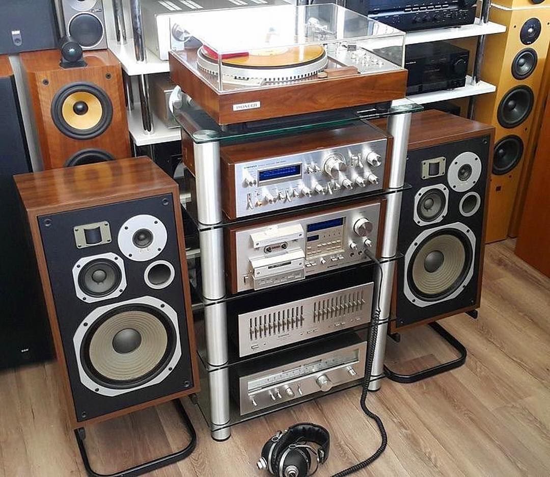
Remember these?
The final example I’ll give is, of all things, guitar pedals. Nowadays, you can buy quite good integrated pedals that have everything built in and no need for the individual stomp boxes we all know and love. But to me, even though I love integration, that type of pedal design is too limiting and takes away control. There are thousands of different effects pedals, so many they even made a movie made about it (if you watch the trailer you’ll even hear the word ‘integrated’) and I prefer each box to have a single function. That allows me pinpoint control over every aspect of the sound.

That’s the stuff (source: analogman.com)
Integrated pedals do that in theory, but I feel that the result is just the opposite. They do work great, and are good for an easy pick-up-and-go solution and I am definitely not saying they are bad, in fact some are truly excellent. But for me personally, I prefer the swamp of stomp boxes, like you see above, that always has me doing the stomp-dance whenever I play. It’s just part of the experience, like driving a manual transmission.
I love those too.
So the ultimate lesson here is don’t force a design style, let it happen naturally. Be open to influences, allow yourself to prefer or not prefer what speaks to you, be willing to step outside your core way of doing things, and in time you’ll find your own design style, design language, design philosophy. And you’ll describe it in one word.
Support for Windows 7 ends today
It is a sad day, as Microsoft is officially ending updates and security patches for Windows 7, the popular OS still being used by a large majority of PCs. Windows 7’s popularity stems in part from the large-scale rejection of Windows Vista (which I never had a problem with, personally), itself an apparent upgrade from Windows XP, which was also widely hailed and widely used.
This will cause some problems for people, small businesses and even large corporations that still heavily rely on the OS, as they will no longer be able to secure the platform after today. The fact that Microsoft is willing to provide continuing security updates for $25 per machine to start is not an effective IT strategy for a business, plus you can use Microsoft’s own upgrade tool to upgrade your machine for free. While we all loved Windows 7, it really is time to move on.
While sad, it’s also understandable, as companies must evaluate where they should delegate resources, especially when they have so many previous versions of Windows. On the other hand, considering the user base is still so strong, almost 33 percent right under Windows 10’s 47 percent, one might think they would still consider it an important horse in the stable, but people aren’t going to upgrade if you don’t give them good reason. Plus, I don’t see any major new versions of Windows (Windows 11? 14?) being released anytime soon, now that Microsoft is moving past CEO Satya Nadella’s ‘Mobile-First, Cloud-First” strategy into “Everything AI,” which still embodies some of the previous mantra.
Microsoft has, in my opinion, made great strides lately in terms of opening their platforms, becoming more accessible, and playing nice with other companies. Plus, you could always run Windows 7, or any other Windows version, in a virtual machine and never have to forget the glory days of the last great operating system.
Plus, you know it will end up available like this or this someday anyway.
Returning Home: World of Warcraft Classic Comes Online
On August 26th, fans of the original World of Warcraft (henceforth referred to as WoW), and those who are just curious to see what all the hubbub is about, were finally able to re-experience the original game as it was when it first came online back in 2004, now colloquially known as ‘vanilla’. And boy did Blizzard deliver, complete with massive queues, disconnects, and crowding. But they have also provided what many people have been asking for for many years: The authentic and original WoW experience.
World of Warcraft was first released in 2004, a Massively Multiplayer Online Role Playing Game (MMORPG) in the vein of Everquest and Ultima Online before it. However WoW streamlined the gameplay process and created something accessible, that anyone could play, and eased players into the experience without being overwhelming. It was an instant, massive hit, and has continued to be a juggernaut even to this day. Attempts to topple it, even using popular franchises with similar gameplay such as Age of Conan and Star Wars Galaxies, couldn’t come close to WoW’s success.
In the game, there are two main factions: The Horde, comprised of Orcs, Trolls, Tauren, and the Undead, and the Alliance, comprised of Elves, Gnomes, Dwarves and Humans. Depending on your race, you could be one of several classes: A paladin, mage, warlock, rogue, warrior, priest, druid, hunter, or shaman, each with their own unique abilities and approaches to gameplay.
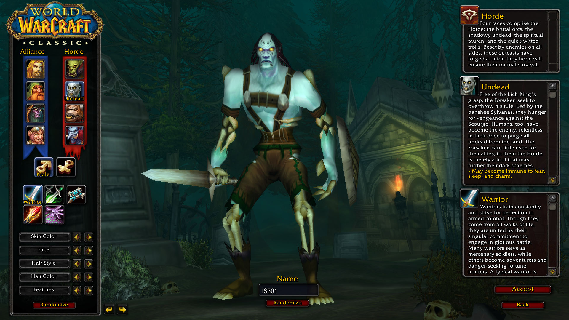
They don’t actually allow numbers in names. But I tried!
As the years went on, WoW evolved. What started out as a world with two continents, eight races, nine classes and a tight story to tell, ended up as what many consider to be a mess in terms of overly-streamlined gameplay (e.g.: quest markers and highlighted objectives / objects), homogeneous races and classes (e.g.: many classes were limited to certain races, but now that’s generally not the case; anyone can be anything. Another example: Undead could ‘breathe’ underwater, now anyone can breathe underwater for a comically long time), and simplified specializations that don’t allow for really exploring a particular class.
Combine that with the original story of the Horde V. the Alliance morphing into them working together and sharing quests and zones, a rambling main story with red herring side quests and endless grinding with things such as daily quests, as well as a confusing world structure (A new capital city, Dalaran, now has two separate locations in the game: One in Northrend and one in the Broken Isles. It’s the same city, but in two places, although there is lore for that), and people started to get weary.
Not that it was all bad, mind you. The ‘Mists of Pandaria‘ expansion, which introduced a continent known as Pandaria based on Chinese lore, along with a race of humanoid pandas known as the Pandaren, and the new class of monk, was very well received. Additionally, flying mounts and pets of many types became available as nice additions. But overall, the gameplay itself, the core experience, lacked.

Mists of Pandaria
While all this was going on, something known as private servers began to appear. These were privately run WoW servers that there recreated that original version of the game as it was when it was first released. There was no charge, and people flocked to them. The largest was Nostalrius, which at its peak had, according to Wikipedia, 800,000 subscribers and 5000 – 8000 concurrent players. Blizzard hit them with a cease & desist order, but the coverage of that was severe and intense, and it appeared that Blizzard noticed. I myself played on Nostalrius, and wished it to continue. An interesting aside about it is that when I dowloaded the client, which had to be done as a torrent, I was immediately – while the download was still happening! – sent an email from Cox telling me they had received an official complaint about my IP from Blizzard stating I was pirating the game.
But I digress. Blizard may have noticed, but also said very publicly during a live conference, that ‘you may think you want vanilla WoW, but you don’t.’ They had to eat crow on that, but they did so with grace and humility, and I respect them for being good about it.
They eventually announced that would be creating a classic WoW experience, and it finally came online August 26th, 2019.
I was excited for this too. Seeing the announcement of original WoW gave me chills. I loved original WoW, and was even in the beta so many years ago. It’s strange, because as I would read magazine articles and online posts about it, I didn’t have much interest. I heard the beta was coming and thought ‘why not?’ Well, it turned out to be lifechanging. I’ll never forget creating my first character, an undead warlock of course and of course on the server named ‘Bloodscalp,’ and venturing out into Deathknell, the undead starting zone. The purplish tint of my shadowbolt, the civilized undead, the unique, not-quite-cartoony but surprisingly colorful and detailed environments, and as I would eventually learn the incredible backstory and unique races, including the Native-American styled large bipedal bovines known as Tauren, a really unique offering for a game of this type. So much did I love it that I bought the Bloodscalp server on which I used to play when they were retired for an upgrade.
Eventually, though, after years of playing, it was sadly no longer the game I remembered. I stopped playing for a good number of years after I heard someone yelling in general chat that if they wanted to group with him for a raid, they ‘SHOULD LINE UP FOR GEAR CHECK’ and ‘DO NOT WASTE MY TIME’ and ‘KNOW YOUR ROLE AND DON’T ASK QUESTIONS.’ Remembering how the game was when it started, how everyone was incredibly helpful and pleasant, that one jackass really discouraged me, and he wasn’t even talking to me. That was after a couple of expansions had released, and for those of you familiar with the game it happened in Shattrath, a city and storyline I just could not get into anyway, and I logged off that moment and didn’t play again for five years at least.
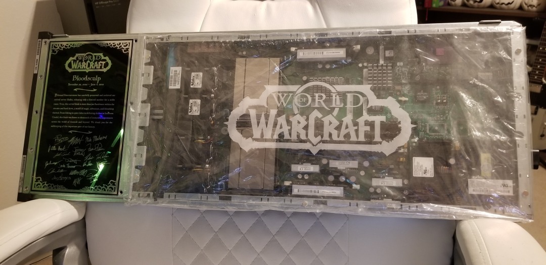
My original Bloodscalp server. Many memories here.
Not only were these hardcore players becoming more common in current WoW, enemies became easy to defeat, everything is signposted, there’s no sense of accomplishment or earning your way, and the story, for me anyway, was just confusing and I couldn’t figure out what was going on. Original WoW does not hold your hand in any way; it’s unforgiving, and expects you to read the quest text and figure out what to do. When it was announced, to paraphrase an infamous in-game proclamation, I was definitely prepared.
There was some drama leading up to the event that I myself was caught up in. It was announced that two weeks ahead of release, players could log in and create / name their characters. I have characters I have played with for FIFTEEN YEARS. When I logged in to create my characters on the Whitemane server, which was my server of choice as it is PvP and PST, I was hit with a 45 minute queue and by the time I managed to get in all my names were already taken! Wheels was the name I desperately wanted, and I made numerous posts on the classic WoW reddit sub and in the Whitemane server sub as well asking if the person who had it would be willing to trade or even sell, but no luck. I ended up with Kneecap, which I actually like, but it’s not Wheels.
Well, once the servers came online, while waiting in the ENORMOUS Whitemane queue (see image below), I just happened to also be in the classic WoW Discord watching the live feed of people trying to get in drama when I saw a post shoot by stating Blizzard would be bringing three new servers online, including a PST PvP server named Smolderweb. Smolderweb! I liked Whitemane, but Smolderweb was far more badass than I could have hoped, so I waited. Waited…waited…and the second it came online I pounced, created all my characters, and got all the names I wanted! I couldn’t believe my luck. There was also no login queue, I got right in and grouped up with some great people and had a blast running around the troll / orc starting area. Players even lined up for specific quest targets in a very orderly and polite way. Everything ran very smoothly, there was absolutely no lag, and I couldn’t have been happier with the experience.

Waiting…

The Horde are such good people. Not like the dirty Alliance.
To be fair, I saw posts that showed the Alliance also lined up for their quest objectives, so it was good all around.
I find it telling that even though this is no longer WoW easy mode, and that everything has to be worked for (your first ten levels will be hard, until your class specializations start to kick in, and then it will be less hard but still hard), I’ve had the most fun I’ve had in WoW for many, MANY years, and I’m very glad to be back in the world that I left so long ago.
The Lawnmower Man, and Vintage CGI
Inspired by a couple of Reddit forums to which I am subscribed, VintagePixelArt and VintageCGI, and being a fan of all things historical as it pertains to technology, I uploaded to the latter a brief scene from the 1992 CGI-fest movie The Lawnmower Man,’ supposedly about a guy who killed people using a lawnmower. Based on a book of the same name by Stephen King, King sued to have his name removed from the movie as it bore – barring one minor scene – absolutely no connection to the book. Rather, the movie was used as a vehicle to show off what the state of CGI, or Computer Generated Imagery, was at the time. The 30-second plotline is Dr. Angelo, a scientist funded by a shadowy company, is researching whether or not Virtual Reality can be used to enhance the human cognitive capabilities, or even unlock potential powers. He recruits Jobe, who helps around the grounds at local church and suffers from cognitive disabilities, and straps him into a complicated VR setup that turns Jobe into a god who ends up not acting very godlike.
The movie was fun, but the real purpose of the thing was to show off what the state of the art was in terms of CGI at the time, and also present what was at that time a still-unknown technology: Virtual Reality. Here is the clip I uploaded; I just clipped the scene out of the movie file:
In 1992 when the movie was released, commercial-grade computer generated imagery was created primarily on Silicon Graphics workstations, which at the time were the powerhouse machines of the day. Now, we have laptops with more computing power, but back then SGI workstations were the top of the line pro setup, and everyone from movie studios to science labs to government agencies wanted them for their ability to do everything we take for granted today: Simulations, animations, visual manipulation, prediction, etc.
They didn’t necessarily use special processors or OSs, in fact many of them ran on Intel processors and Windows NT, although other versions ran on UNIX. The difference was their proprietary hardware architecture, and compared to what commercial PCs had at the time, the SGIs were far more powerful. $4,000 would get you their low-end model: a Pentium II-powered box with 128MB of RAM. You read that right. This is a Linux box SGI, the O2:

SGI O2
Appropriately, the former SGI building in Santa Clara now holds the Computer History Museum.
Movies were used as vessels to show off incredible, and sometimes not so incredible, computer imagery quite often. The absolute king of the hill in this area is the original TRON (1982), which not only used CGI but many other tricks as well, and gave us a glimpse of what life might be like inside a machine when computers and technology were still largely undiscovered country but arcade machines had already left an indelible mark. A perfect example of TRON’s influence is in the famous light cycle scene.\
The first ever use of CGI in a movie was all the way back in 1976’s Futureworld. This movie used a scene of a CGI hand that had originally been developed by Ed Catmull, a computer scientist at – wait for it – teh University of Utah (see below) who went on to create Pixar! Here’s the scene from Futureworld.
Computer capabilities in terms of imagery, visualization and rendering has been the fascination of many for a long time. One image has even gained celebrity status: The Utah Teapot. (Side note: I usually prefer not linking to Wikipedia, however the University of Utah’s own Utah Teapot page links there!).
The Utah Teapot, created in 1975 based on the need for a perfect shape, has since become the introduction to computer graphics, and has been featured extensively in other computer animated environments, with my personal favorite of course being its appearance in the animated sequence from The Simpsons’ Treehouse of Horror episode, titled Homer(3), in which Homer gets sucked into the horrific THIRD DIMENSION. You can see the teapot at 2:21 when Homer realizes he is ‘so bulgy.’ There are many other neat references in the scene. This scene was based on an episode of The Twilight Zone, a prophetic show in and of itself, called ‘Little Girl Lost,’ in which a girl is transported to the fourth dimension from the third.
Because we didn’t have immediate access to the capabilities of technology back then, especially computer animation, seeing it was a revelation. This was capitalized on by a series of (originally) DVDs, later laserdiscs, titled ‘The Mind’s Eye (1990).’ The followups were Beyond the Mind’s Eye (1992), Gate to the Mind’s Eye (1994), and Odyssey Into the Mind’s Eye (1996). Each was about an hour long and contained a series of CGI vignettes set to music. These vignettes were created by graphics firms, advertising firms, and others, and often scenes created by different companies were woven together and set to music to tell a story.
I first saw a scene from The Mind’s Eye being displayed on a giant display TV in front of a store (I don’t even remember which store!) in Security Square Mall in 1990, and I was mesmerized. I should have been amazed by the TV, but it was the visuals on it that really blew me away. It’s not my favorite scene in the series, but it holds a special place in my heart for introducing me to the series and for telling a touching story to boot, about a bird and a fish that destiny has deemed will be together. A hopeful allegory for today. Here it is:
I can’t find any information about who actually created this animation, so if you know, please pass it on! You can also watch the entire movie on The Internet Archive.
My favorite scene from the Series is found on the Second release, Beyond the Mind’s Eye. This one is called ‘Too Far’ and contains multiple scenes from various artists, including what might be my favorite animated character ever, the once famous Clark. There’s a lot going on in this segment, and it’s a masterpiece of CGI of the time.
Now here’s where it all ties together: The CGI created for the Lawnmower Man was also included in scenes from Beyond the Mind’s Eye. Not only that, the movie’s CGI was created by Angel Studios, which would later become part of billion-dollar video game powerhouse Rockstar San Diego. See how it all comes together?
In the years that followed, machines like the Amiga and of course Macs and PCs overcame the need for dedicated workstations, although the term persists. And now easy access to all sorts of graphical capabilities is at our fingertips, with engines being able to calculate what we can see and what we can’t and render accordingly, or cast rays of light based on reflection and refraction, or apply textures to surfaces, and so on. But that’s what makes these creations so much more impressive; using the tools of the time, they still were able to create such magical animations.
Jony Ive leaves Apple
As someone who teaches extensively about design as it intersects with technology, and is also a computer and technology historian, I am conflicted about Jonathan (Jony) Ive leaving Apple. Mainly because he’s not really leaving, however any sense of him doing so makes me think Apple will continue to move away from the designs for which it is so noted.
While he will no longer be part of Apple, he has decided to start his own design firm and will continue to contribute to and work with Apple. This seems like a very smart move, especially considering he was the creative force behind such behemoths as the Ipad, original and subsequent IMacs, everything in the IPod / IPhone line, Apple watch, and who could forget one of his first big projects, the TAM, or Twentieth Anniversary Macintosh, priced at an insane $7500 in 1997, but having many luxury amenities such as a leather wristwrest and no two being the same (none had the same startup chime or color, for example).

The TAM, or Twentieth Anniversary Mac
Not all of his ideas were a success; while the TAM was his first big contribution to Apple design, he had also worked on the Newton, which by the time he got involved was already flailing and clearly on its way out. In fact, it’s one of the first things killed off when Steve Jobs returned to save Apple. It was at the time of that return that Jobs asked Ive to stay on as a designer and help get Apple, who was in financial distress at the time, back on its feet. It’s well known that Jobs and Ive were aligned in terms of what design is and what it should be, and with the two of them working together the result is a company that is now one of, and often the, most highly valued companies not just in the world, but of all time.
In a bittersweet way, Ive’s leaving Apple signals the end of Steve Jobs’ influence in the company he helped found, which may be one of the reasons Ive has decided to now forge his own path. When Jobs returned to help the floundering company, and asked Ive to help him, a powerhouse was formed. With Jobs gone and Ive leaving, it is now the company that it is, and I fear for its future as it moves away from the design principles that made it what it is and into more services that may dilute its brand.
I have a deep and profound admiration of Apple, even as they seemed to have recently lost their way: A focus on subscription services and less of a focus on hardware and design, but they were the company that made computing and technology popular and sort-of accessible back in the day. Believe it or not, Apple, especially with their IIe line, was the computer to have for gaming and productivity, and you can still experience that through multiple online emulators such as VirtualApple.org, AppleIIjs, or using the AppleWin emulator and the massive disk image collection at the Asimov archive or Internet Archive.
They were instrumental in bringing design to what was other fairly mundane technological designs. Indeed, PCs of the day were commonly referred to as ‘beige boxes,’ because that’s just what they were. Have a look (images sourced from the vogons.org message board about showing off your old PCs, and has many other great pictures).
A ‘beige box’ computer

Another ‘beige box’ computer
Side note: Surprisingly, although I consider myself design focused, I don’t hate these. Probably because of nostalgia and the many fond memories I have of the days of manually setting IRQs and needing to display your current processor speed, but nostalgia powers many things.
Side note number two: I actually went to the same high school as both Steve Jobs and Steve Wozniak; Homestead High in Cupertino.
So farewell to Jony and hopefully you give us many more outstanding designs in the future, farewell to the Jobs era of Apple as the company struggles creatively without him, and I am keeping hope alive that form and function in design will continue to reign.
Samsung tweets out malware warning regarding its TVs, but deletes it soon after
There are two issues here that are of equal importance: First, every single digital device is susceptible to some form of malware or unauthorized access; there is no such thing as a one-hundred percent safe digital device. That being said, some are more susceptible than others. Second, I don’t feel that Samsung deleting the tweet that recommended users scan their QLED TVs indicates anything nefarious; adding another confusing and complex acronym like QLED, which is an incomplete acronym anyway as the ‘Q’ stands for ‘Quantum Dot,’ is much more concerning. While it isn’t the focus of this post, I should add that Quantum Dot technology itself is pretty nifty, as it ostensibly eliminates the need for a backlight and is one step away from the capabilities of OLED, or Organic Light-Emitting Diode, which is one of my favorite technologies when properly applied. You want a paper-thin TV with an image so clear you will fall to your knees and weep? OLED is the way to go; it actually eliminates the backlight since the pixels themselves emit their own light.
That’s an 8K(!) QLED in the header image, but also please remember that if your source video wasn’t filmed in 4K or 8K, it won’t magically appear beautiful on such a TV.
Anyway, back on topic: Samsung claims the reason behind the tweet was simply to inform customers that the option is there and they may want to do the scan once in a while, and I think that’s good advice; I applaud them for that. They later claimed it was deleted because although it was just an advisory tweet, it may raise unnecessary alarms in their customers so they had second thoughts. In a sensationalist world, that also makes sense to me.
The fact is, there is very little malware out there that affects TVs, and those who create destructive software want it to have the biggest impact possible, so writing malware for TVs, even with the installed base Samsung enjoys, isn’t a productive use of the cybercriminal’s time. Additionally, because the TVs run on Samsung’s pseudo-proprietary, lightweight and mostly open-source TizenOS, which is also used in some of its other devices such as smart watches, to provide updatable built-in protection would be trivial.
On top of that, it takes SIXTEEN button presses on a remote to get to the actual malware scan function on a Samsung TV, and the belief is very few people would go through that trouble. They don’t even do that on their PCs when it’s just a few clicks away! That’s anecdotal, by the way: Strangely, I couldn’t find any statistics on how often people actually scan, but if informal surveys in some of my classes are any indication, they don’t do it a whole lot.
But who knows? Maybe TV attacks will become the new undiscovered country for malware authors. Frankly, it doesn’t hurt to scan occasionally, and updating the OS should be standard practice. In Samsung’s case, the best course of action would be to push updates to the TVs on their own, and have them update automatically. If you’d like practical advice and information on security from all aspects, from current federal alerts to info about how to protect your PC and other devices at home, the Computer and Infrastructure Security Administration’s website has tons of it, and putting security into practice is a good idea.
Be safe.
Determine what application is preventing your USB drive from ejecting [Win 10]

Boy, I haven’t posted in a while; it has been very, VERY busy here. As penance, I will make up for that with a post that addresses a common problem that afflicts us all: How to determine what application is preventing your USB drive from properly ejecting.
You know the deal: You try to eject your USB drive properly (which you should; otherwise a voltage change or write operation could damage data or the drive), only to have Windows give you the following dreaded dialog:
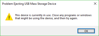
Uh Oh
The problem is, this dialog tell you absolutely nothing, other than something is using your USB drive. What are you supposed to do about this? Randomly shut down applications until it ejects properly? Save everything and reboot? What if the problem is not an open app, but a background process? How can you actually find out what app is causing this conflict.
Turns out, it’s not too difficult.
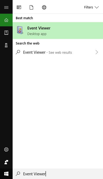
The first thing you want to do is open the Event Viewer, which allows you to see everything that is happening in your system, including recent alerts and what caused them. If you search from the start menu, it’s the only result you’ll see.
Click on the that, and the main Event Viewer interface will appear.
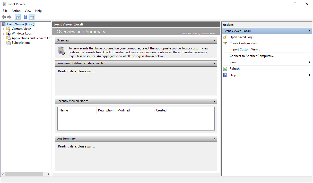
Main Event Viewer Interface
There are a lot of options, and a lot you can do from here. In fact, Event Viewer is a very powerful tool that it doesn’t hurt to become familiar with. For our purposes however, we will need to expand the ‘Windows Logs’ menu on the left hand side, then choose the ‘System’ log underneath that as non-ejecting is a system event.

System Log in Event Viewer
You’ll notice the fourth column in the main window is ‘Event ID.’ We need to see events that have an Event ID of 225. If you examine this log immediately after your USB drive fails to eject, you’ll see what you need to see right at the top of the list. However in the image above we don’t have that, so we have to filter the results to only show us events classified as 225.
In the right hand panel of the window, you can see the option to ‘Filter Current Log’ as the fifth entry down. Select that, and the filter window appears:
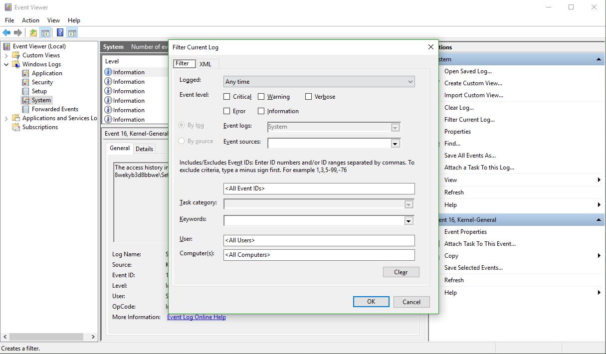
Filter Current Log dialog
There’s a lot you can do here as well, however all you need to do to determine the offending app is enter ‘225’ in the box that currently says <All Event IDs> then click [OK]. Once you do that, you’ll see every 225, or non-eject, event.

All events tagged 225
The top one is the most recent one that happened, and highlighting it will, under the general tab in the lower window, tell you exactly which program or process prevented the USB drive from ejecting. In this case, if you look at the full path you can see it is the ‘adobe_licutil.exe’ process, there at the end. Once you know that, it’s a simple process of the well-known [Ctrl]+[Alt]+[Esc] to bring up the task manager and shut the task down from there.
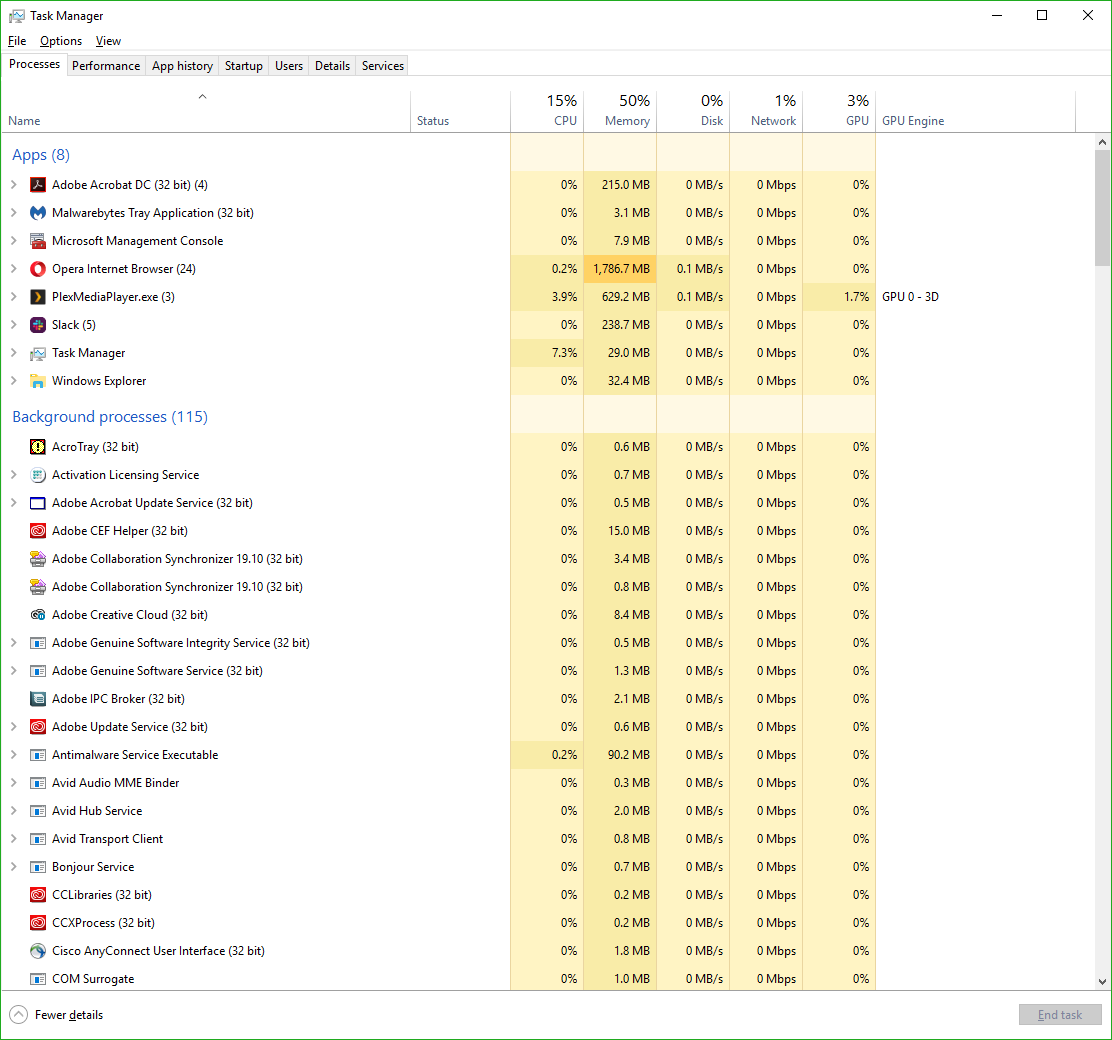
Task Manager
However, If it is still difficult to determine the specific process from the task manager because of a naming inconsistency, which has happened here, event viewer was also kind enough to provide us the Process ID, or PID, in this case 12592. In this case, if you want to be extra-double-sure, you can use Microsoft’s Process Explorer, a separate download, to identify the process by its PID instead of name, and shut it down from there.
Here’s an example of my Process Explorer, although out of habit I closed the task before taking the screenshot! But you can see the PID column and from there you can definitively ID the offending process.
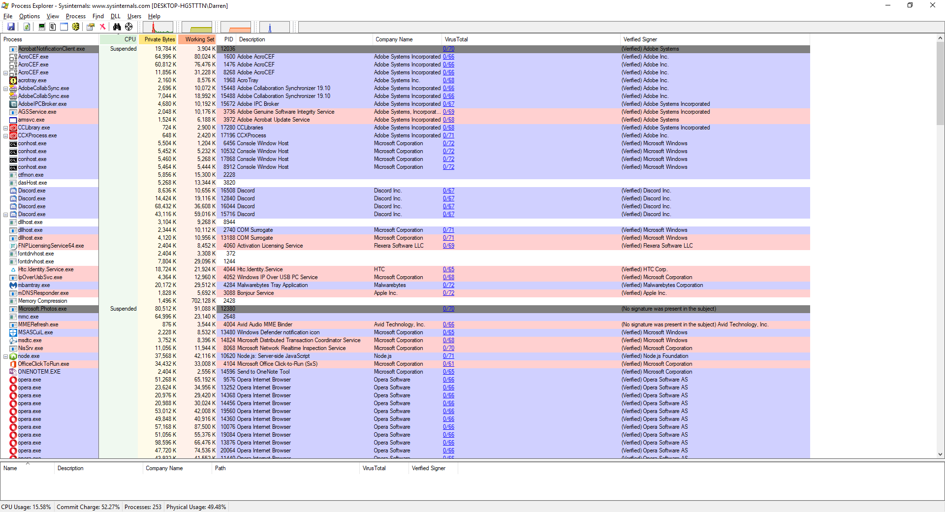
Process Explorer
Remember, having to go to the extreme of Process Explorer is rarely required, and simply identifying the process and shutting it down from Task Manager is usually all it takes.
I have no idea what happened
Recently, when trying to access this very site, I was met with a blank page. No error message, no half-loading, just a blank page. This site is set to run HTTPS, and even that wasn’t coming up, so I knew it was not loading right from the get go.
I had to doctor this a little now that the site works, but you get the idea:

This was all I saw
Strangely, the back-end CMS, sometimes known as the admin panel, was working fine. I could not figure out what was going on.
On the phone to GoDaddy I got, only to be told that debugging wasn’t showing anything specific, and that I would have to buy support tokens, at $50(!) each, for someone on their end to fix it. I should mention GoDaddy is usually quite great, so it seemed like a weird, opportunistic upsell considering they couldn’t pinpoint a cause.
After some poking around on the back end, I learned WordPress had updated, and all errors were coming from the theme I use, TechBits. I checked my theme version, 1.2, against the latest version, 1.5. Uh oh.
I downloaded the latest version of the theme, and it provided some instructions for updating. What I didn’t check before starting the process was the date of those instructions, which was 2015. After trying to figure out my FTP username and password, which required yet another call to support, and also taught me I now have to connect via FTP to the IP, not the URL, I was able to get in. I uploaded the files I was told to upload, however when I went to make the code edits they required, I discovered the back-end was no longer working, throwing a 500 (internal server) error!
That’s bad, but it’s also about the most generic error you can possibly receive, and it tells you absolutely nothing.
Luckily, I was able to revert to a backup from two days ago, something GoDaddy makes it really easy to do, thankfully. I then, after some sleuthing, found a blog on the site that owns the TechBits theme, and 2,200 others, that the upgrade to the new version of WordPress borked all their themes, and they were all now throwing errors. But they had an interesting solution.
They linked to a text file that contained some php, and therefore had to be renamed with a php extension once downloaded. Afterwards, I needed to FTP that up to my main theme directory, then navigate via browser to that specific, new .PHP file.

The Solution
Doing so resulted in the following screen.
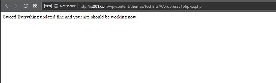
Sweet
The problem is, it didn’t work. The site still came up as a blank page. I had other things I had to do, so I figured I’d come back to it later. After a brief hiatus, I refreshed just for the hell of it, and lo and behold, it was working again!
Maybe it just needed time to propagate, or update, or whatever else, I don’t know. So no one touch anything, and hopefully it will magically stay up on its own. The Twitter feed widget no longer works, but that’s something I should be able to work around (in fact, the Twitter widgets are completely gone from the widget section of the CMS), and the Pinterest widget also crapped out, but I don’t care about that one, I don’t use the service anymore.
What a weird experience. Check your version compatibilities, people!
My experience with the Lifx no-hub smart light
Note: Review follows video
Disclaimer: I have no connection to this company, in fact never heard of them until about four months ago. They didn’t ask me for this review, they didn’t pay me, didn’t send me the bulbs, I bought them on my own, this is all my own opinion, as it always is.
I recently needed to get a smart light, one I could control remotely. You know the kind of thing; turn it off and on once in a while, make it look like someone’s home, give the illusion of life. The thing was, I had never looked into these kinds of lights too deeply, and I still haven’t so this isn’t a condoning or condemnation of other brands, but rather my impressions of the one I ended up getting.
I went to the local Best Buy, a store I rarely visit, because I knew they had a lot of them and I was going to be shooting into the wind. My need for this light happened rather suddenly, so I didn’t have time to research and just went in blind. I looked around at the options on display, from well known brands like Philips Hue and lesser known brands like Sengled. At least I think the latter is lesser known..I had never heard of them, but they have a lot of options, and to be fair I’d never heard of the brand I ended up deciding on either.
The issue I have with most of these lighting systems is that they require a hub, or as Philips refers to it, a bridge. I explicitly did not want that, as I was only intending to get a single bulb; no need to complicate it. That’s why I ended up taking a chance on another brand with which I was unfamiliar: Lifx.
Let’s just get this out of the way right now: I had no idea how to pronounce that. “Life-x?” “Liff-x?” No clue. After some Wikipedia-ing, I discovered it’s “Life-x,” and it’s a company that grew out of a successful Kickstarter campaign. I chose them because they do not require a hub and offered the basic functionality that I needed on short notice, and it turned out to be a good choice, with some important caveats.
The specific model of Lifx light I decided on was the Mini Color, which advertised a light output of 800 lumens. That’s pretty good; many LED lights advertise themselves as the equivalent of some wattage, but their lumens are absurdly low, sometimes rating at 300 or 450, which is very dim. 800 lumens is the actual equivalent of a 60-watt bulb, and that’s exactly what I was looking for.
I also liked the fact there was no hub. I wasn’t looking to set up some centrally-controlled network of devices, I just wanted a light bulb, and Lifx fit that bill. In fact, if I recall correctly, it was the only one that did; all the others required some kind of central device to which they would connect, yet since IoT devices like these form a mesh network anyway, the need for a hub when simply using light bulbs just isn’t necessary.
I took it home, screwed it in, and was guided through a relatively simple process (on Android; I can’t speak to IoS) to connect my phone to the light and the light to the network. Once that was complete, I was up and running.
I only wanted to get a light for a garage, but once it was set up I couldn’t help but go through the options available to me in the app. There are four separate screens for normal operation: ‘Colors,’ ‘Create,’ ‘Effects,’ and ‘Day & Dusk.’ There is also a main screen from where you can access groups, Nest integration, IFTTT features, as well as some other integrations and even buy more lights.
I discovered there was much to like about this bulb, and the more I experimented with the app the more pleased I became, even though I had no real need for any of the more esoteric features. I’ll start with the app’s individual feature screens and come back to the main page at the end, because one of the major issues I have manifests there.
The first screen, ‘Colors,’ actually gives you two choices: You can control the white temperature of the bulb, measured in Kelvin, which ranges from a very cold, blue 9000K, like the blue LEDs you see in icicle lights around the holidays, to a very warm 2500K that represents the more amber tone of an incandescent bulb, or even a candle. Incidentally, I know that the higher temperature is referred to as cold and the lower warm, but that’s just the convention here. Also, the ranges this light bulb offer are way past the choices you normally have, giving a much wider set of options for temperature.

Color temperatures
You can select the color temperature by spinning a wheel of temperatures, as it were, to select the temp you’d like. It’s very easy, however it’s also discreet selections, so choosing along a continuum isn’t available; you’d have to do that on the actual color screen discussed next. Not only that, when switching between the coldest blue and warmest warm, a sort of amberish, yellowish hue, the bulb flashed a BRIGHT yellow, which was curious.
Even with the choices it provides for white temperature, I still didn’t find the warm setting to be terribly accurate in terms of its similarity to a warm incandescent, or standard bulb. It isn’t bad, and it’s bright, but it still comes off as artificial. The cold temps, though, the blues, holy cow: They are BLUE. If that’s what you’re looking for, this bulb delivers in spades.
If you are feeling more festive, a Tinder-esque thumb-swipe to the right and you can select from a range of actual colors. It works the same as the white temp screen, by rotating a hue wheel and determining the saturation of the color you select by adjusting a slider on the color wheel. It’s ingenious, really, in its simplicity: Rotate the ring to the color you want, slide the slider to select intensity, and that’s it. It’s very responsive, easy to make adjustments, and easy to use.
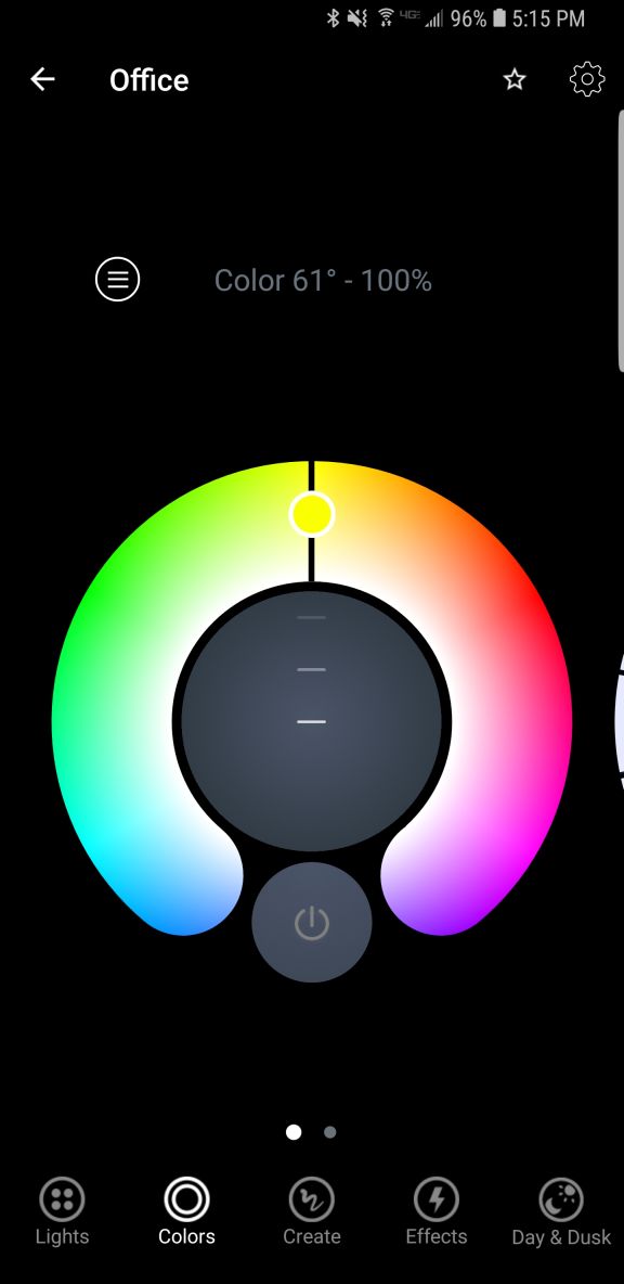
Color selection ring
Another nice thing about these screens is that you can dim the light from them as well, using a simple slider. It dims quite far, something not all LEDs can do. Normally, a light bulb dims by reducing power to it, but LEDs can often only dim to about 10% before being cut completely. The Lifx app claims the dimming goes to 1 percent, but it doesn’t look like that to me, although it does seem to dim further than most other LEDs.
The next option, ‘Create,’ I don’t use that much. It’s misnamed, as you don’t actually create anything here but select from pre-designed themes such as ‘Relaxing,’ ‘Energizing,’ ‘Peaceful,’ and ‘Powerful,’ the image for which is a tropical sunset for some reason. Doesn’t quite match up with Powerful but it’s a minor issue. There are others, and selecting one just changes the color of the light to match up to what I suppose will enhance the chosen mood, and you can change these in a different screen. The second screen under ‘Create’ is just a matrix of colored circles in a ROYGBIV arrangement that you can choose, although I don’t know why you would use this as opposed to the color wheel. Perhaps if you just wanted, say, pure orange and didn’t want to have to make fine adjustments to get it.
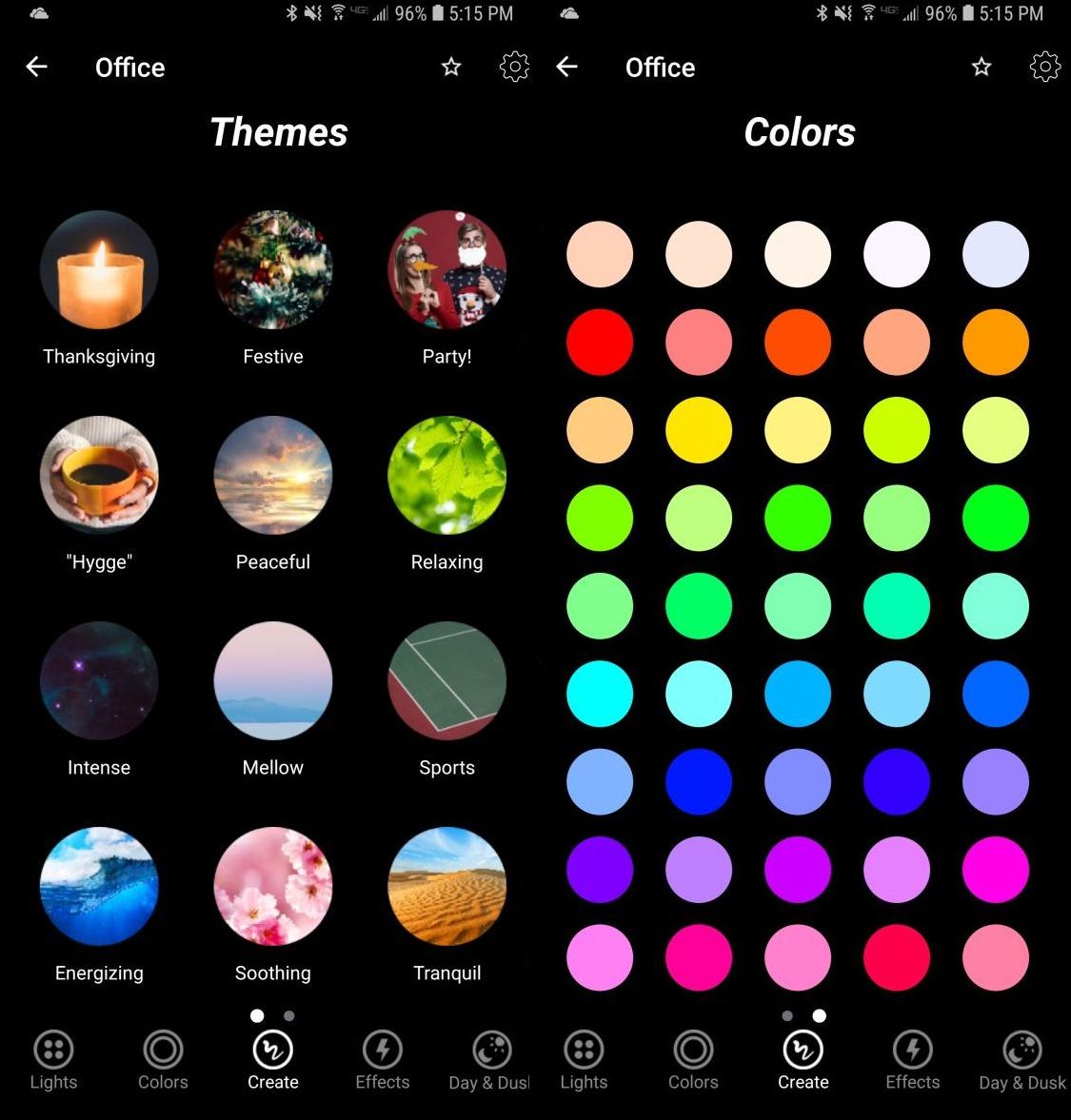
Themes / Colors
The next screen, ‘Effects,’ is my favorite because of one in particular. There are eight effects to choose from: ‘Animate theme,’ which allows you to modify themes from the previous screen, ‘Color cycle,’ ‘Flicker,’ ‘Music Visualizer,’ ‘Pastels,’ which I would never, ever use, ‘Random,’ ‘Spooky,’ and ‘Strobe.’ Because of the potential health issues that come with strobe lights, you have to hold that one down to use it.

Effects
They’re all self-explanatory, but I have to highlight one and call out another. I loved the ‘Spooky’ effect: Being a fan of horror movies, this one emulates the horror movie trope of the abandoned hospital or car park that has the flickering, randomly flashing light. When selected, it flashes the light randomly for 60 seconds (the minimum, which I REALLY wish could be shortened), then go bright red, then turn off. Beautiful. The big problem with it is that when controlling a grouping of two lights, the ‘Spooky’ effect only worked with one light, even when controlling them as a group. That needs to be fixed.
‘Music Visualizer’ is the one I have to call out. It flashes the lights all over the place when it hears noise, monitored, as it claims, through the phone’s mic. However, when I shut off all music and all sounds, and covered the phones mic, they still flashed randomly. Also, while testing using songs with a heavy rhythmic component from AC/DC and Metallica, the lights flashed randomly, not rhythmically. Therefore, I can only surmise that it is not actually monitoring the sound and just making random color changes. That’s a shame if true, because a visualizer would be a neat feature.
Finally, there is Day & Dusk, which gives options to have the lights come on and go off at certain times of day, intended as a wake up and sleep thing. You can also set timers to change color or temperature at certain times of day, which may be necessary based on ambient light, working conditions, or other factors. I don’t use this feature, but I like it, and feel it would be very useful to many people.
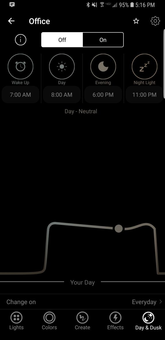
Day & Dusk
Finally comes the main screen. This shows you your lights, your groups (you can group lights together so any changes affect all lights in that group; it’s a fantastic feature and one that really elevates the usefulness of the app, as does being able to switch between multiple locations using a dropdown), create IFTTT (If This Then That) rules, and buy new bulbs. The IFTTT integration makes me worry for humanity: You can set the lights to react to various events, some of which are very useful like blink lights when your Uber arrives, or turn off the lights when you leave home. You can even blink the lights if it starts snowing! But blink when you’re tagged on Facebook? Or mentioned on Twitter? You might have a social media addiction if…
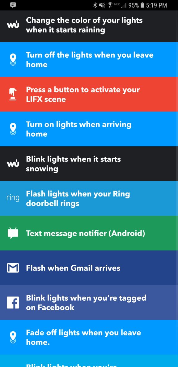
IFTTT Integration
What I really liked, though, and what turned out to be the biggest flaw in this whole setup, is the Nest integration that happens through a program called ‘Works with Nest.’ Lifx lights can be set to flash when a paired Nest smoke / CO2 alarm detects something amiss. As someone who barely survived a high-rise fire, I loved this feature, think it’s incredibly useful and potentially lifesaving, and as I have Nest smoke detectors in both locations where I use these Lifx bulbs, I couldn’t have been happier. HOWEVER: It appears you can only set up this connection at one location. Once you’ve done that, you can’t connect any others. So I connected the light to the detector in my office, but when I use the app to switch my location to home, there’s no option to connect the lights to the Nest detector there: Only to disconnect the other connection already made. I experimented and tested and connected and disconnected and reconnected and switched locations in the app and really tried to find a solution, but was unable, and I find this implementation to be absolutely baffling. So if this is a circumstance that applies to you, choose wisely: You can only connect these lights to a smoke detector at one location regardless of how many you have. This is a major oversight and desperately needs to be addressed.
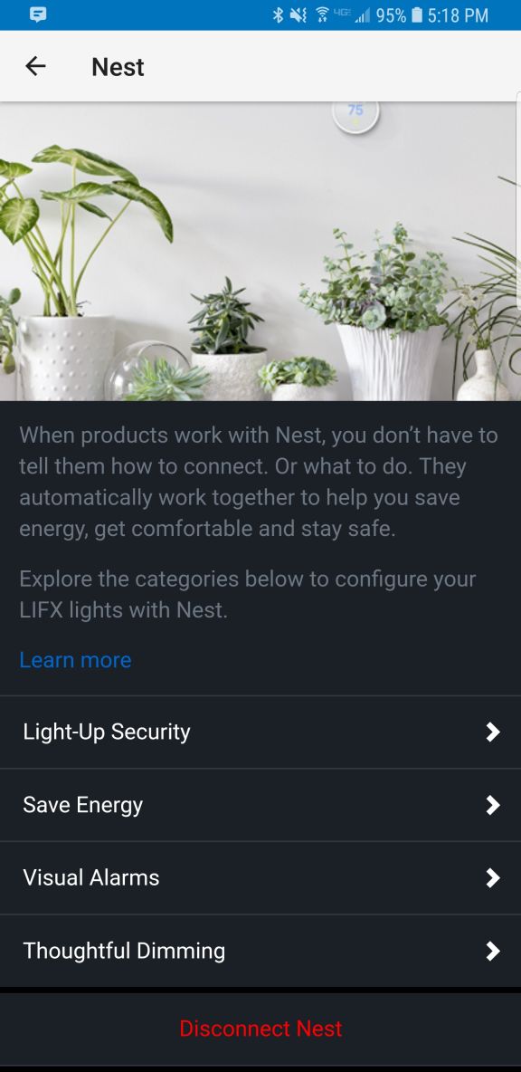
Nest Integration
Other than the fake visualizer, the single-light spooky thing, and the grossly limiting Nest integration, these are good lights and I’m happy with them. Even bought more after using the first one for a while. Bright, easily grouped and controlled, usable app, not overly expensive, and ultimately it’s the app and its features and functionality that needs some fixing, while the bulbs themselves are great.
Recommended.
Importing 3D models into Oculus Home from Sketchfab
A couple of weeks ago, I posted a video about importing items from Sketchfab, a site that hosts 3D models people have created, into Oculus Home. I meant to put up a companion post to that video, but as sometimes happens I was busy, and so the post didn’t go up as quickly as I’d hoped. Luckily, I recently had a five-hour flight from the east coast with many delays due to weather, and was able to start writing it up, and now that I’m back home there’s some time (but not much) to power through and finish. If you just want to see the video, it’s at the end of this post and linked earlier in this paragraph.
For those not familiar, Oculus Home is a personal space, sort of like an apartment, that appears when you first boot up the Oculus Rift headset. For a long while, Oculus has provided a wide range of additional items you could use to decorate your space, everything from furniture to suits of armor to completely new environments such as a gothamesque city or outer space. Even with all of that, one of the main requests users had over at the Rift Suggestion Portal was to be able to create their own objects and import them into their virtual living space. Here’s a crappy picture of an earlier version of my Home, taken off YouTube from this article’s companion video.
Oculus Home
(Side note: In the video I discuss the texture loading issues and choppy performance, however a Dash update released a week later fixed it all. No more issues!)
About a month ago, Oculus delivered. You can now import items created in some of the virtual modeling programs available on the platform such as Medium, as well as from website Sketchfab, and it is the latter that really opens up the possibilities. Because people can upload models created using any tool, there is a wide variety available, although be warned that as is the case with anything else, when the public can upload their own creations there are some that are of the NSFW variety. Also, some models must be bought, but there are many free ones as well.
Another nice thing about Sketchfab is that you can manipulate the objects in your browser before downloading, so you can get a very good idea how they will look in your 3D environments. It also holds developers to a standard to not cut corners on, say, the backs of things (which modelers will sometimes do if they know the object will be placed against a wall, for example – in fact, games simply don’t render what can’t be seen at both the object and world level!) and develop the whole thing completely. As with anything, quality varies, although I was, for the most part, very pleased with what the site offered. Also be aware that not all models are available for download, such as the notable ‘Old Truck and Gas Pumps‘ and ‘The Pumpkin House‘ seen in the screenshot below, but most smaller, decoration-style models are.

Some Sketchfab models
Importing models is not an overly complicated process, however there is an issue with scaling. Many objects you will import will be far too big to fit in the space, and will need to be scaled down. Because Oculus does not allow for scaling within Home itself, a third party tool is needed to do the scaling and there’s no way to determine whether the object is properly scaled other than to import it and test it in the space. If it’s too big or too small, you’ll have to go through the process again. My hope is that Oculus will soon allow for scaling within the Home environment itself. Until then, we have to do it the hard way.
So, we will first find the object we wish to import, scale it, then import it.
In the video, I imported what looks like a file cabinet that would be found in post-apocalyptia (remember Three-Dog?) or a building from the zombie apocalypse. It adds a nice yet subtle, creepy flair.
I found the model by doing a search for free downloads, but you can find the specific one in the video by searching for “Rusty Metal Cabinet” or simply click here. I should mention that if you decide to do the search and see what else is available, ‘Cabinet’ is misspelled for this particular model on Sketchfab, but you’ll find it anyway.
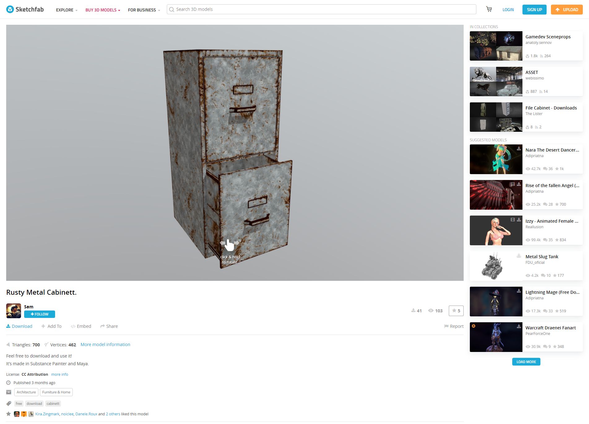
Rusty Metal Cabinet on Sketchfab
Once you have found it, you can rotate it and view it from all angles right in your browser, and when you are ready to make it yours just click on the blue ‘Download’ link under the author’s name, right under the model itself.
Downloading is the big catch here: When the download dialog appears, you want to be sure to download the ‘Autoconverted format.’ That glTF format is an open-source method for the interchange of 3D models for use in applications other than those in which they were initially created. What that means is, the format can be exported to the format we need for importing into Oculus Home, while the ‘Original Format’ will be for the tool used to create the model itself, whether Blender or 3DSMax, or whatever, and that’s not what we want.

Be sure to download the ‘Autoconverted format” option
Once downloaded, export the zipped file so you have the folder with associated files inside it. I use 7-zip, which for me is the easiest, provides the most control and options, and integrates nicely into the context menu. Their website, however, leaves much to be desired. However you extract it, once you have the resulting folder, open it up so you can see the ‘Textures’ folder, along with ‘Scene.bin’ and ‘Scene.gltf.’ Then, bring up https://glb-packer.glitch.me/ and drag all three of those onto the page: The folder, and the two Scene files. You don’t have to do anything else, it will automatically convert then download a file called ‘glb.out’ that has all you need. Because it generates an .out file, we know it’s a binary compaction of the original files and folders into a single file.
It couldn’t be easier. Seriously, this is the whole page, and if converting to GLB there’s nothing to do!

GLB packer. This is it.
Of course, that easy step shouldn’t lull you into a false sense of complacency, because now it gets cumbersome. You should have, in your Documents folder, an Oculus Home folder, then an ‘_Import’ folder, and you can make the _Import folder if it’s not there, but don’t forget the underscore! Rename your ‘glb.out’ folder to something that makes sense, for example in the video I renamed it to ‘RustyMetalCabinet,’ and drag it into the ‘_Import’ folder.
For now, that’s it! Go into home, check in the ‘My Imports’ tab of your inventory, and you will see it there just as you named it. Bring it into home, and…it will likely be way, WAY too big. And that means it’s scaling time, which is easily the most tedious part of the process; all you can do is scale it, hope it’s right, then re-import it back into Home. If it still isn’t the right size, you’ll need to do it again. Come on Oculus, let us scale in Home!
Anyway, to scale the object, you’ll need to bring up the threejs.org/editor site, drag your .out file onto it, then scale by clicking and sliding your mouse over the ‘Scale; numbers on the right-hand side, as you can see in the video and image below, then selecting ‘Export .GLB’ from the file menu. The problem is, there’s no real way to know how the thing scales regarding your particular Home: It could be too big, too small, all you can do is re-import it and check it, then do the scaling over again if it doesn’t fit. For example, I ended making a teensy file cabinet before I got the size right. I kept it anyway, though; it was neat, in it’s way.
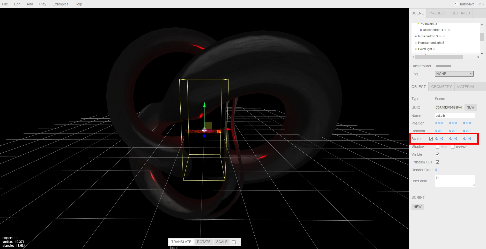
Adjusting scale in the threejs editor
Then, once you have found your scale, you’re all set! Another neat thing about doing this is that when imported models load into your home on startup, the do this futuristic materialization, like they’re being 3D-printed by light, into existence. It’s a really nifty effect.
So there you go! Have fun, there is a huge number of models to choose from, the recent Oculus update has fixed most of the performance issues, so the possibilities are almost endless! If we can just get scaling, perhaps even direct import, the icing will be on the cake, but until then, it’s still pretty fun.
Here’s the video: